If it doesn’t convert, it doesn’t work. Conversion rate optimization (CRO) goes hand in hand with a company’s revenue growth. To make an online business profitable, both marketers and business owners should be concerned about visitors performing certain actions such as subscribing, filling out a form, or making a purchase. Today we are going to single out seven factors that influence these actions and lead to a conversion rate increase.
What Is the Conversion Rate?
In online marketing, the conversion rate is the ratio of total visitors to visitors who take desired actions. For example, if your landing page receives 150 visitors per month and 15 of them complete the desired task, the conversion rate would be 15 divided by 150, or 10 percent.
Generally speaking, there are two conversion types: macro and micro. Macro conversions cover visitor’s actions aimed at completing tasks that are most important for a company’s revenue, such as making a purchase, filling out a contact us form, requesting a quote or signing up for a free trial. Micro conversions include actions that can’t directly result in revenue growth but can precede macro conversions. Examples of micro conversions include blog subscriptions, social media follows, case study views, or free ebook downloads. Depending on the business goal, marketers highlight macro and micro conversions that may bring the best results.
Now let’s look closer at seven components of any CRO technique.
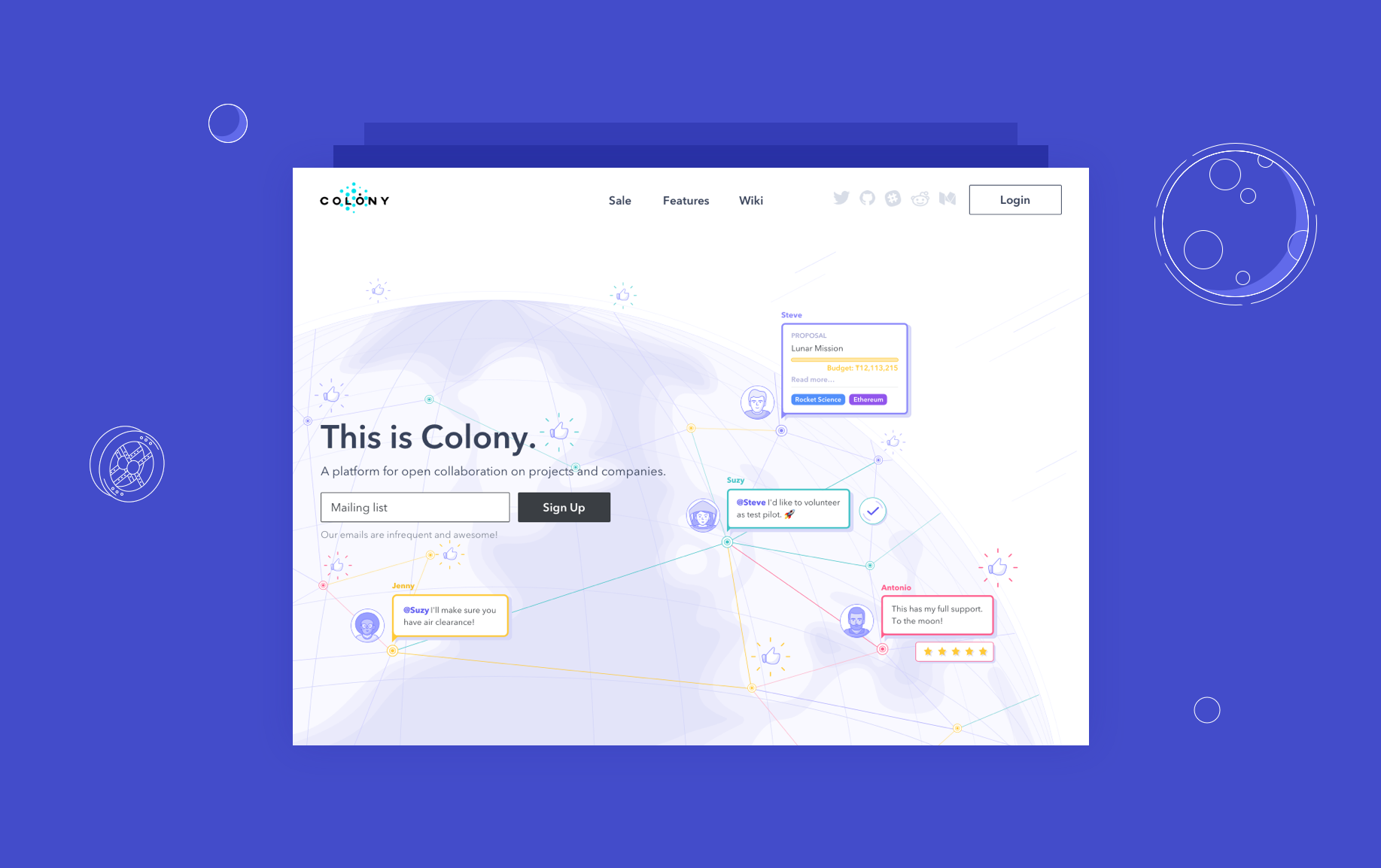
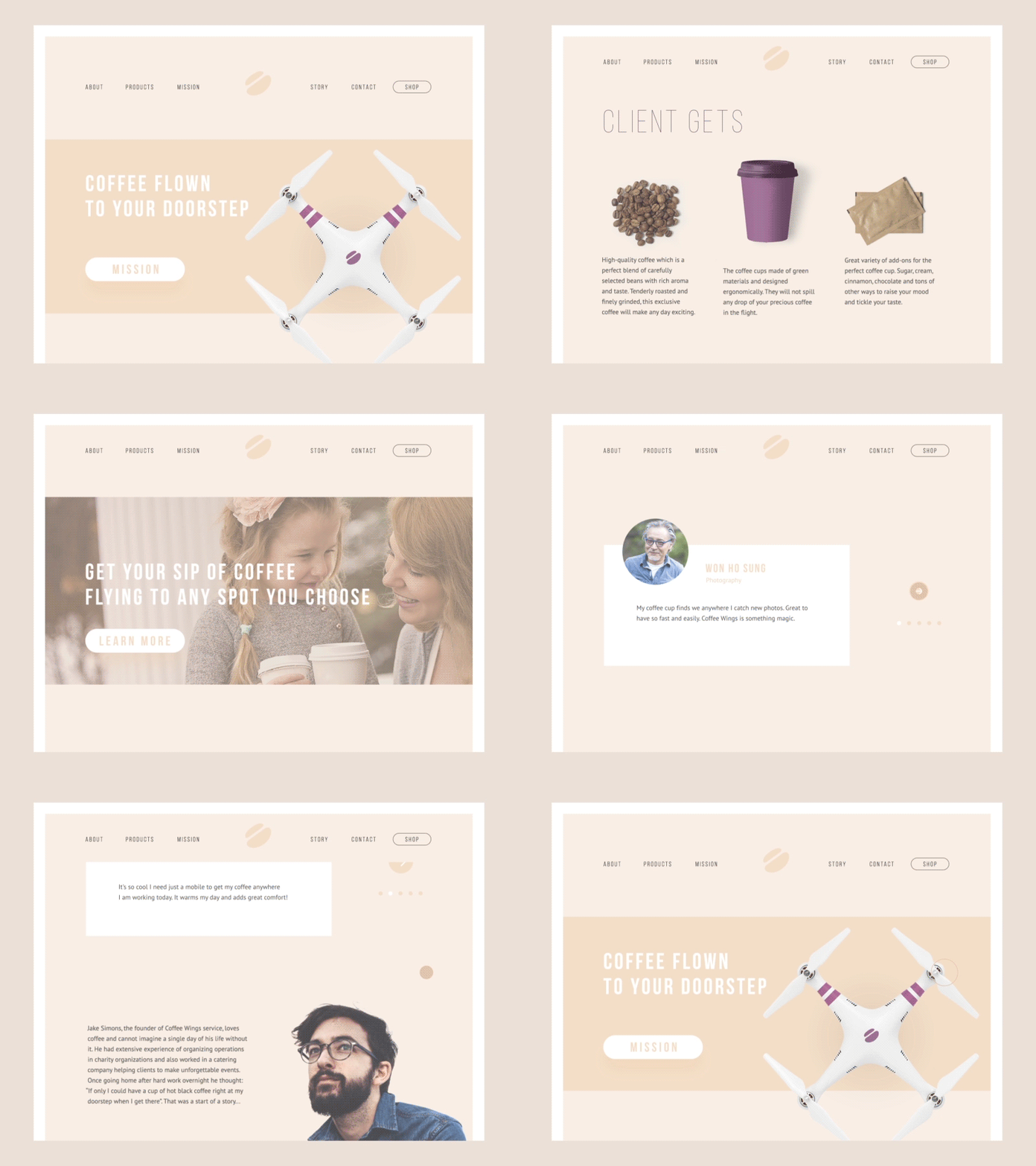
Colony landing page
Offer
Do you feel like your offer is attractive? This is the primary question you should answer. If the offer your company makes isn’t valuable to your customers, then all the marketing and design efforts made towards conversion rate optimization will be useless.
Today, when the market is packed with goods and services, it’s hard to offer something really unique and exceptional. That’s why you should think of what makes your offer special. From the very beginning, list the benefits your customers get from your product or service and define the advantages that distinguish you from competitors. In other words, establish your value proposition.
Do you want your value proposition to be attractive and competitive? Make it obvious. Ask someone to test your landing page to see if it converts. If people can’t tell you in a few words what you’re offering and what they can gain from your offer after looking at the landing page, then you should revise your webpage.
Make sure your value proposition speaks about:
- What your product or service does
- Who your potential client is
- What value you can bring
- What makes your offer different
Your promise to the client should be precise and manageable since it determines the potential of your conversion rate.

Relevant Traffic
What is better? Getting more traffic in hopes of more leads or increasing the conversion rate with the current traffic? Basically, the answer depends on where you get the most for your money.
First, check the quality of the traffic your website is receiving. If the traffic is targeted but the conversion rate leaves much to be desired, then focus on conversion optimization. If your conversion rate is high and you can’t think of any changes that can improve it at the moment, review your pay-per-click campaigns to drive more traffic.
Your chances to convert visitors into leads or clients are pretty high if those visitors are potentially interested in your product or service. Wasting your marketing budget on fake or irrelevant traffic will only cause a high bounce rate. As a rule, check the traffic quality and relevance consistently.

UI/UX Design
No doubt, design decides whether a landing page is going to convert or not. Working on UI and UX, designers should think about usability, user engagement, and key performance indicators, also known as KPIs. Based on the input data, like strategic marketing goals, value proposition, and buyer persona profiles, designers start developing UI/UX design.
As a design agency, we completed various projects and have extensive experience in making web designs that convert. Based on this experience, we’ve highlighted some tips that can help designers to come up with great UI/UX solutions.
Know the goal
Designers should go beyond the pixels and layouts and first think of business objectives. Once the strategic business goals are clear, creating a UI and UX design that will drive conversions becomes a lot easier. When analyzing the client’s brief, designers should clarify any misleading requirements that may take the project in the wrong direction.
Make the design responsive
Businesses don’t want to lose potential leads who access the landing page on devices other than desktops. That’s why the designer should take care of how the website looks on screens of all sizes. Moreover, Google is a strong advocate of responsive design. So, responsive design is useful for both conversion rate and search engine optimization.
Know what users expect
Designers shouldn’t try to re-invent the wheel. Regardless of who your buyer personas are, there are certain common navigation elements in UI and UX design that your site visitors are used to, like the cart icon or navigation toolbar location. If the landing page design is a challenge for your visitors, you will barely convert them into leads.
Balance business and user goals
Let’s say someone comes to your website for the first time. They want to quickly browse your blog or About Us section. But after three seconds of scrolling, a huge pop-up with an attractive offer appears on the screen. While this person is trying to close the offer, two more pop-ups appear on the screen one after another asking the visitor to subscribe to your newsletter and try your service for free. This approach will lead to poor user experience. In this case, the business goal is to get a lead and the user goal is to learn more about the company quickly. Designers should take into account user goals and balance positive UX with CRO techniques.
Test
There is no single correct approach to UI and UX design that converts. No matter how extensive their experience, both marketers and designers should accurately test any changes made to the interface design and track UX KPI metrics.
If you want to see more design strategies to make your landing page profitable, check out our previous article.
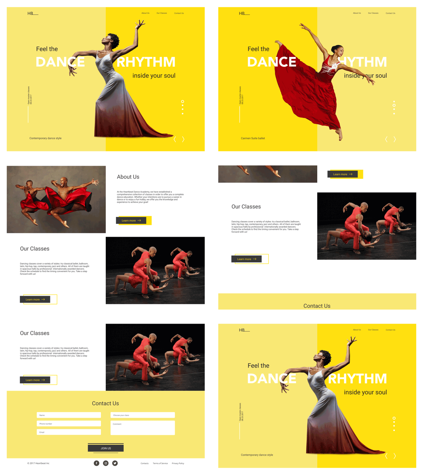
Call to Action
If you want your visitors to complete certain actions, tell them to do so. What could be simpler? Just be sure that you know when, where, and how to tell them.
The surplus of information online doesn’t leave users a chance to browse web pages thoroughly. Instead, visitors scan pages paying attention only to the key elements. That’s why marketers and designers know how important the call-to-action (CTA) psychology is in the competition for people’s attention.
A CTA can be text, button, image, animation or video. It can also encourage visitors to perform various actions depending on the nature of your business.
If you want your CTA elements to convert, you should make them user-friendly. Stay away from aggressive techniques that can frustrate your visitors even before they give your product or service a try.
You need a clear understanding of your target audience to use color psychology wisely. Depending on gender, age, location, and professional status, people tend to perceive colors differently. What works great with one group of people may fail to work with another. Besides, the design of CTA elements design should reflect the overall web design to make the entire page aesthetically pleasing.
Use action-oriented language and provide users with explicit instructions, like download, learn and check. Demonstrate the urgency. A limited-time offer is a powerful CTA tool because it uses the fear of missing out phenomenon and encourages visitors to take action immediately. Words used for limited-time offers include now, today, limited, while, etc.
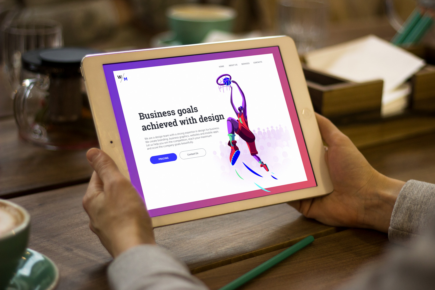
Content
After you’ve taken care of a friendly design and powerful call-to-action, it’s time to think about copy that’s going to help you on your way to conversion rate optimization.
Like any marketing strategy, a content strategy starts with identifying your target audience. When you know who your readers are, you can easily find out what their areas of interest include.
Determine the sales funnel stages your customers go through to pick the most interesting topics that reflect your audience’s pain. For instance, if you sell sports products, tell stories about outdoor activities, provide healthy tips, share how-tos, and publish interviews with experienced sports instructors and influencers. If you run a design service that is primarily targeted at businesses, talk about the design strategies aimed at growing conversions and publish case studies that give non-designers an understanding of the work and time estimation processes.
Share valuable information that your potential customers are going to look for. That is how you’ll show your expertise and willingness to help. That is how you’ll build trust.
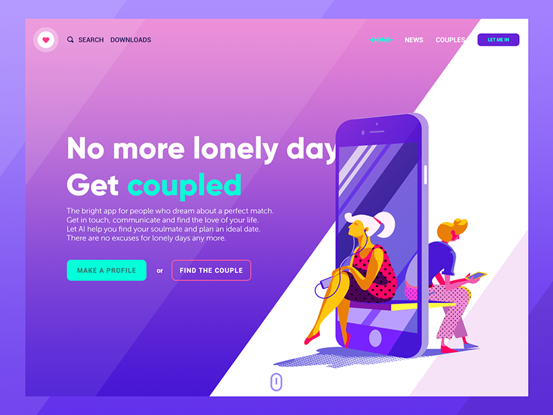
Trust
Trust is something you cannot code, design or embed into your webpage. Building trust around your brand is a decisive part of CRO; it requires time and consistency.
Keeping promises leads to brand loyalty. Don’t go for big pronouncements that can’t be backed by actions. Great promises might convert but in the long term, this approach will decrease the client lifetime value, and you’ll barely get brand advocates.
Make sure you have an about us section that contains brief information on how the brand was founded and what it stands for. Introduce site visitors to the team and show the people who stand behind the brand.
The company’s availability is one more way to boost trust toward your product or service. That’s why contact information should be updated and easy-to-find and live chats and hotlines should work properly.
By the way, social media networks can be a part of customer service too. Companies monitor their brand name mentions and customer feedback on social platforms. This helps to establish connections quickly and track reviews effectively. It’s worth mentioning that brands should react not only to negative feedback but also to positive. Always show appreciation for compliments made to your brand.
People rely on reviews a lot nowadays, and it’s natural for them to want to know what kind of experience clients have had with your brand. That’s why it’s important to have a section devoted to testimonials and interviews with your clients on the website. This will help you to strengthen your brand’s reputation and meet clients’ expectations.
Analytics
It’s well-known that each change you make to a digital marketing strategy should be tracked. If you change something in the copy, UI/UX design, traffic settings, or call-to-action mechanisms, you should monitor before and after analytics. Otherwise, all your efforts will come to nothing and the return on investment figures will never be precise.
Among the variety of web analytics platforms, Google Analytics is the most widely used.
It provides you with tons of quantitative data and allows you to calculate the conversion rate by setting goals. Data analytics will give you a better understanding of where to focus your CRO efforts.
Apart from a quantitative analysis, which provides you with numeric data, marketers also use a people-focused method known as qualitative data analysis. This method helps marketers to go deeper into user behavior research and see what’s behind this behavior. Data for qualitative analysis is gathered from customer surveys, user testing, in-depth interviews, and so on. The combination of quantitative and qualitative analysis gives marketers an opportunity to reveal the most powerful CRO techniques.

Conversion rate optimization is a never-ending process that requires a lot of experimenting. The success of CRO primarily depends on how much you know about your audience. Apply the tips listed above and you’ll see your conversion rate increase.
Useful Articles
Here’s the set of articles on more aspects and best practices of user experience design.
Take My Money: UX Practices on Product Page Design
Error Screens and Messages: UX Design Practices
Visual Dividers in User Interfaces: Types and Design Tips
Directional Cues in User Interfaces
How to Make User Interface Readable
Basic Types of Buttons in User Interfaces
Negative Space in Design: Practices and Tips
How to Make Web Interface Scannable
5 Basic Types of Images in Web Interfaces
Welcome to read and download our free ebook “Design for Business”


