Overwhelmed with the modern world’s rush and the incredible amount of information around, people tend to choose simplicity, sometimes even without thinking about that choice. To reduce the cognitive load, users seek shortcuts, patterns, and models that make interactions with a digital world and numerous channels of communication effortless and straightforward. In user experience design, one of the factors supporting that objective is consistency, and that’s the theme to discuss in our today’s article and show with the projects we did here in Tubik. Welcome to read what is consistency, why it is important, what types of consistency exist, and how to reach it in an app or website you design.
Web design for Mayple
What Is Consistency
One of the definitions Cambridge English Dictionary gives to the term “consistency” is the quality of always behaving or performing in a similar way, or of always happening in a similar way, aka “being the same”. And that’s perhaps the simplest way to put it. It means that the product communicates with the user in the same or similar way, whatever point or channel of communication. In terms of user experience, it means that similar elements look and function similarly, this way reducing the cognitive load and making interactions more smooth and intuitive.
Considering the fact that today people are overloaded with information, they tend to choose products that are easy to understand and interact with. What’s more, consistency builds a reliable foundation for the feeling of harmony in both how the product looks and how it works. And harmony is always a desirable part of any experience we have. Consistency makes user interfaces predictable and learnable while brands get a solid and united presentation and performance due to it.
Consistency is one of 10 fundamental usability heuristics, which are core principles for interaction design defined by Jakob Nielsen back in 1994. Consistency in this list is based on the principle that users should not have to wonder whether different words, situations, or actions mean the same thing.
Screens for Finance Tracker app
Why Design Consistency Is Important
Put shortly, the consistent approach to user experience design leads to the following benefits:
-
- the interface gets much easier to learn for new users
- fewer errors happen as users are less confused
- it reduces cognitive load this way, saving users’ time and effort
- consistency supports a strong brand image for a website or application
So, consistency connects different UI elements into a system of predictable and clear interactions. Actually, that’s what we do in the physical world too, to make our everyday life easier and avoid the need to focus on the same operations again and again. For example, we all keep dishes and utensils in our kitchens, so even coming to someone’s place for the first time, you won’t try to search for a cup and a spoon in the bathroom, just because it’s the pattern known and followed by most people.
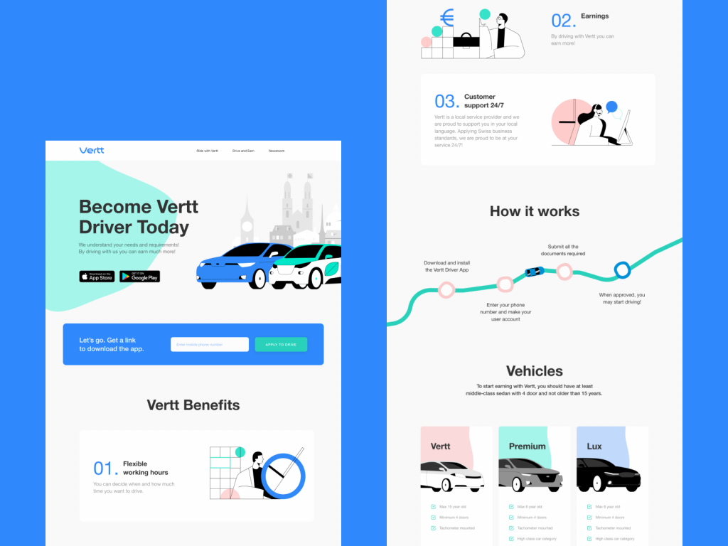
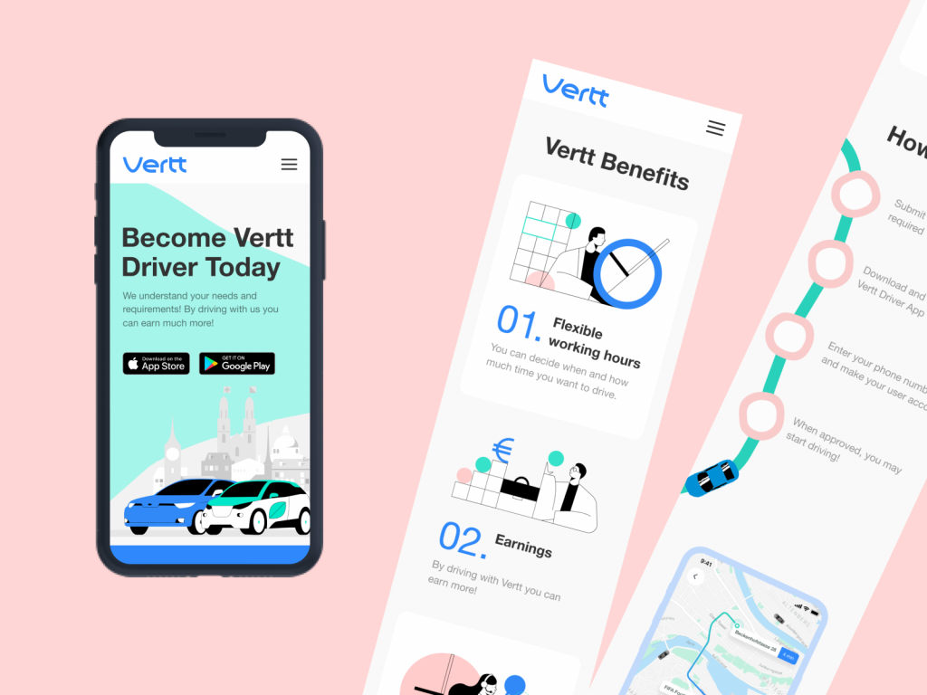
The consistent web, mobile and branding design for Vertt car-sharing service
Types of Consistency
From the perspective of the impact factors, consistency can be visual and functional.
Visual consistency is based on making similar objects or elements look the same. It is critical to make the connections between the elements clear and build a solid visual hierarchy. It’s about icons, fonts, image sizes, buttons, labels, and other vital stuff. For example, when you organize an article, all the types of text elements (heading, subheadings, main text body, quotations, etc.) should use the same typographic presentation system to be scannable and feel structured. If you are creating a blog or a media with multiple types of posts, they have to stick to the same system of visual performance so that they could be perceived as one whole publication, not a mess of random posts.
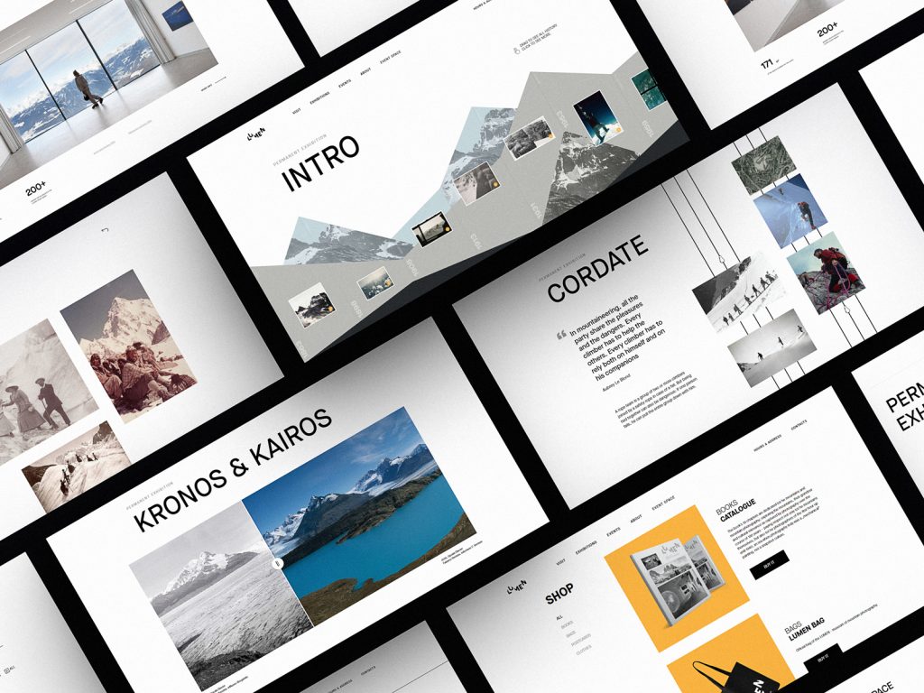
Web pages for Lumen Museum
Functional consistency means that similar objects behave the same way. For example, most websites use a logo or a publication name in the top left corner of the website header and by clicking it, users get back to the home page or refresh it. Most users are accustomed to this pattern and expect it to function that way, even at the websites they visit for the first time.
Glasses e-commerce website
From the perspective of connections and scale, consistency can be internal and external.
Internal consistency is about different parts of your interface or brand that look and behave as one clear system. For example, when you make all the CTA buttons on different pages or screens of your product colored and designed the same way, users will be able to quickly distinguish them at any step of their user journey.
External consistency is about parts of your interface that look and behave as typical patterns for most products of this kind. That’s, for example, when you use a shopping cart even on the website selling non-tangible products or underline the text links to give users a hint that they are clickable.
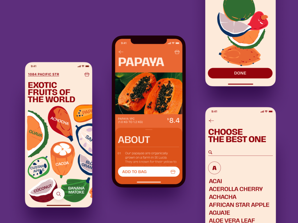
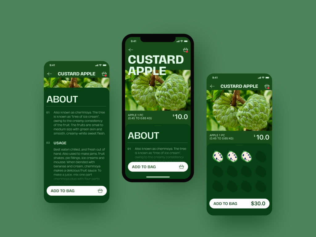
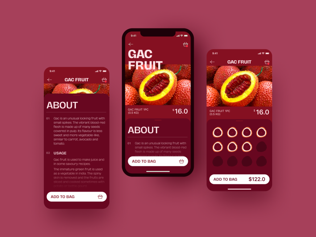
Screens for Exotic Fruit app
How to Make Design Consistent
Here is a checklist with 7 points you’d better consider if you strive to reach the consistency of your website or mobile application design.
Implement recognizable patterns
There are tons of behavior patterns and habits users already have before they come across your app or website. This set of knowledge is based on their previous experience and depending on how designers approach it, it may help or ruin the user experience.
For example, even before the popularity of digital products, for stats and charts most users associated red with a negative balance or decrease and green with a positive balance or increase. Using this pattern known to millions of people of different ages and nationalities, you support the product’s external consistency and make it easy to understand data visualization. As well, coloring the button of accepting an incoming call green and rejecting the call red reduces the cognitive load for the users as they are accustomed to such a model and won’t need to think about what button to hit.
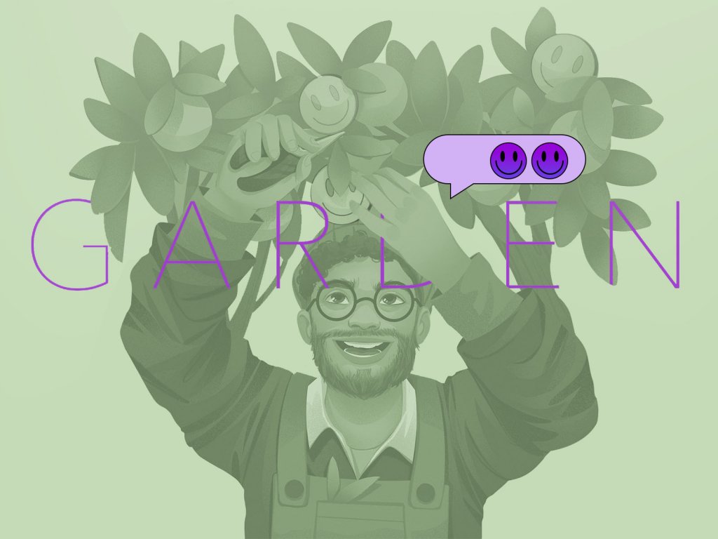
The app for taking personal challenges
Also, this point may deal with internal consistency, and it’s especially critical for complex products with a large number of screens and interactions. When you onboard the users, educate them on how to deal with the interface and use a consistent set of interactions from one page to another, they don’t need to focus on how to deal with each new page, so they feel the interface quite intuitive. But if you break that consistency, users will need time and effort to understand what’s going on.
For instance, when you use galleries of images with a vertical scroll on most pages but then use a not-so-obvious horizontal slider for them on another one, it can make users struggle with the content or miss it at all. Or let’s imagine that you used a plus button in the bottom part of the screens for a long time, and users got used to finding it there, but then you moved it to the top part and hid it in the hamburger menu. Or, let’s say, you make the phone number tappable and interactive at some screens and non-interactive on the others, although everywhere it looks the same. That is inconsistent. Sure, in this case, users will need some time to switch from one pattern to another. This experience may be quite annoying so take care of smoothing it with tooltips or other techniques.
Of course, that doesn’t mean that you have to stick only to known patterns. There’s always room for creative and out-of-the-box solutions; just keep in mind to think over their connection with what the target users already know and use, and if that connection is weak, think about how to support users and not to transform design creativity into user’s annoyance. What’s more, strive for logic and similarity of interactive patterns – even if they are non-common but consistent across all the product screens, the process of getting accustomed to them will be quick and easy.
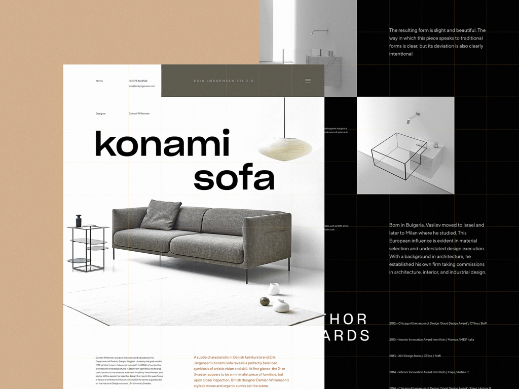
The concept for a website on furniture and interior decor
Be cautious with experiments on UI components
Based on the previous point, it is easy to see that any experiments with UI elements should be thought out twice for the sake of consistency. That’s especially true for the basic elements used across thousands of apps and websites. People know them so well that in most cases they don’t even need to think much.
For example, whatever website or app users deal with, when they need to find something, they will be looking for a magnifier icon marking the search button or field. In case you hide the search functionality behind another image or icon, it may ruin the experience and confuse the user. Instead of interacting with the content, they will be trying to find the field for searching it. Or, trying to find the way to contact, most website visitors will be looking for the link to the Contact Us page or form in the header or the contact data in the footer of the page; bearing that in mind, you can make a shortcut to conversion and happy customers. The same applies to other basic and widespread functions like bookmarks, shopping carts, chats, and messengers, saving items to wish lists, making calls, adding new items, and so on, and so forth. If you decide to experiment with their appearance, placement, and performance, test them well, and make sure users will be able to interact with them.
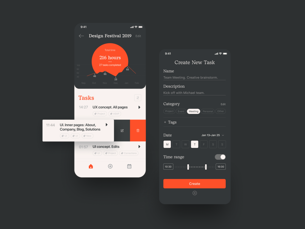
Task Tracker App
Mind typography and color similarity
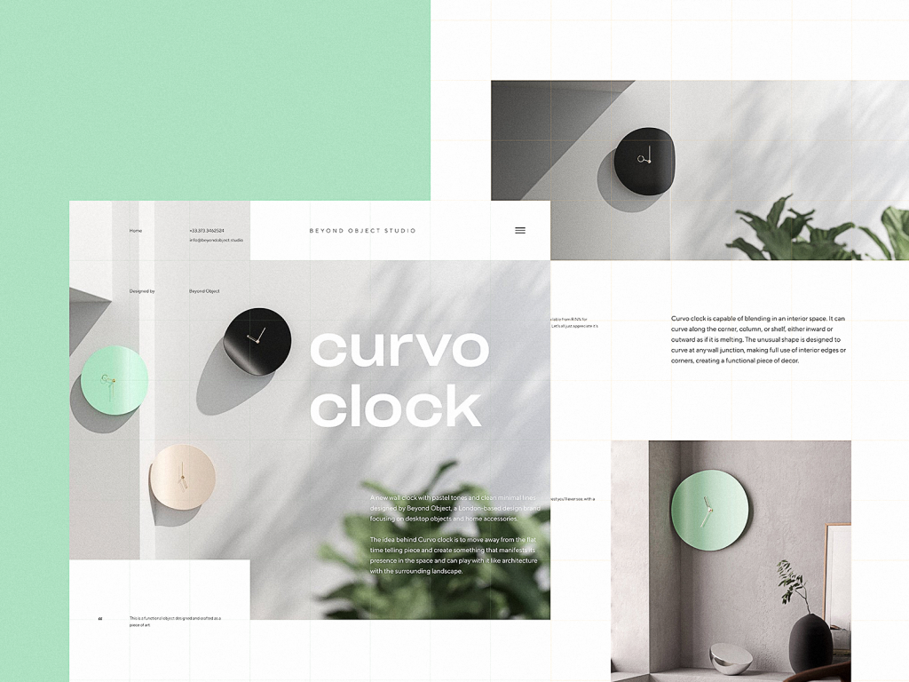
Among the most impactful factors of visual consistency, UX designers will often mention color and typography. No secret, they both have the power to influence the visual style and emotional background, and user behavior. Being that crucial for visual performance, both allow users to feel the product integral and united if used consistently. That’s why there should be a well-thought-out design system of using specific fonts and colors for text content and layout elements; this way the website or app will feel clear and the users won’t need to get used to new looks and combinations from one screen to another.
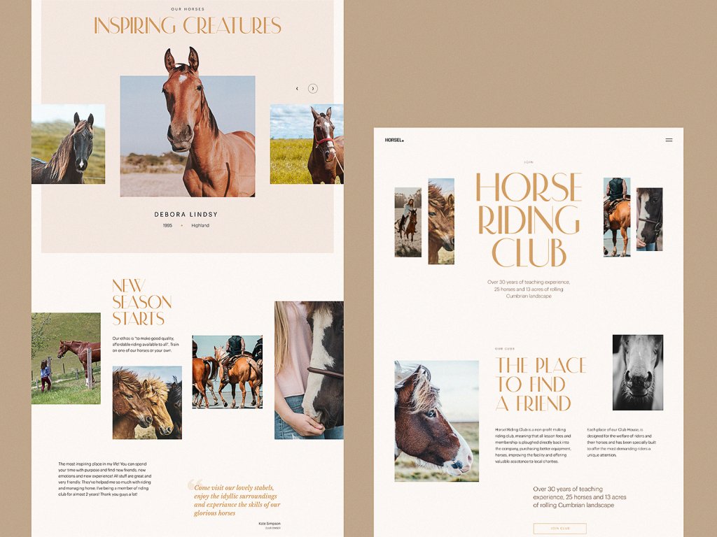
Website design for a horse riding club
As was already mentioned above, colors also can be a factor of external consistency. In the vast majority of cases, color is perceived by a human eye before the brain decodes the icons, images, or text, so it’s better to analyze this factor and make it helpful in building intuitive navigation and a positive user experience. Remember the example with colors for the buttons of accepting or rejecting a call? If you want to ruin that experience, just exchange their colors and make the button of accepting the call red, for example, justifying it with the fact that red is super noticeable. That can end up with a sort of fiasco: even if the icon looks absolutely clear, most users will mistake it for the rejecting button, just because they see and decode color much faster than the icon or text, especially for such a basic operation.
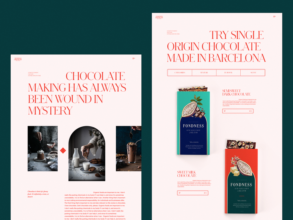
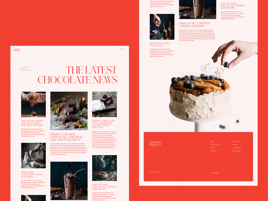
Website design for a confectionery
Build up a system with visuals
Images play a great role in not only adding beauty and style to the interface; being perceived faster and easier than text, they also support usability, amplify the message, and add their big two cents to setting the needed mood and atmosphere. However, it doesn’t mean that designers just take different images they like and put them into the interface. As well as typography, images have to present a system, not just a random set. In this case, they become another factor in providing a consistent user experience.
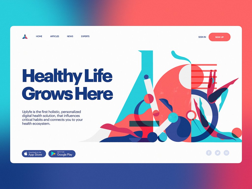
Design of identity graphics for Uplyfe
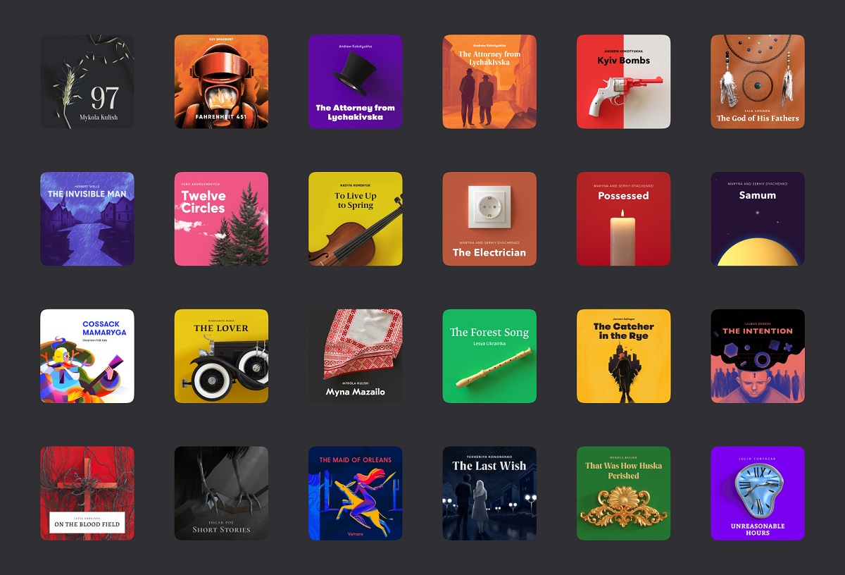
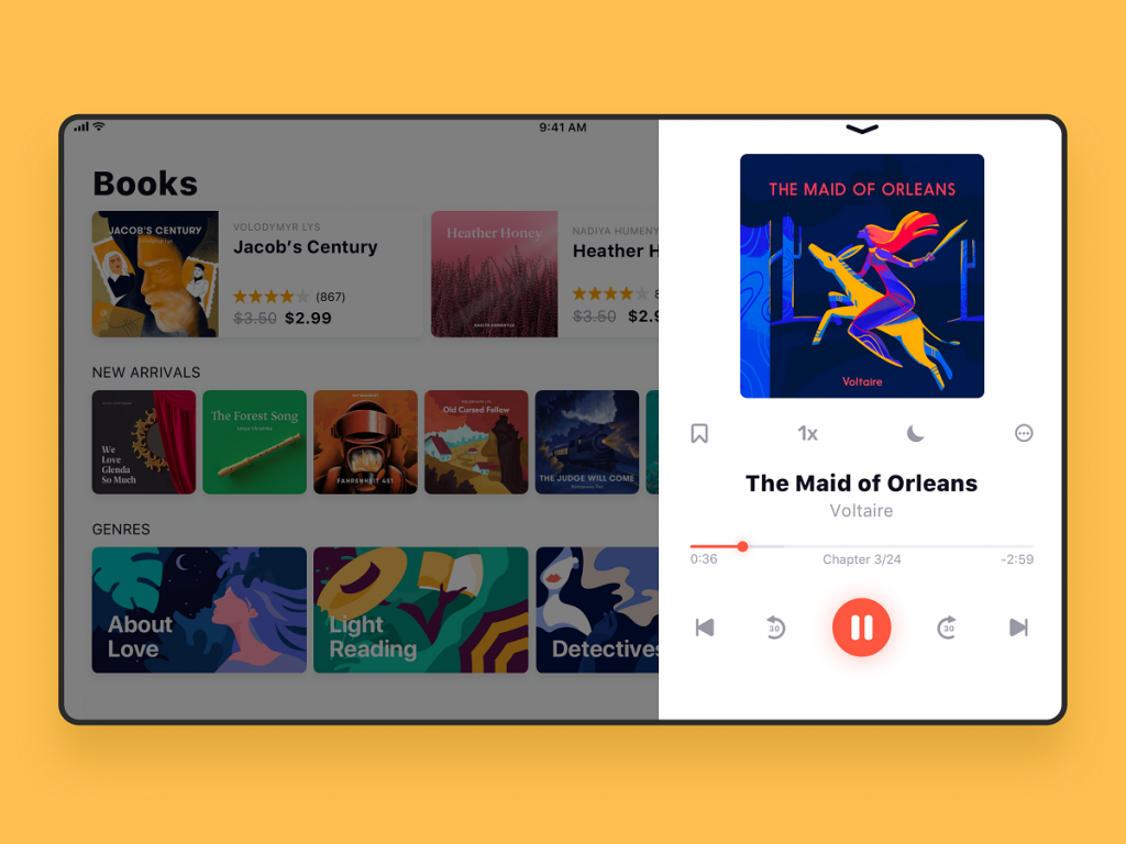
Custom book covers design for ABUK, audiobook app
Properly structurize content
Remember that classic picture explaining data visualization with Lego Blocks?
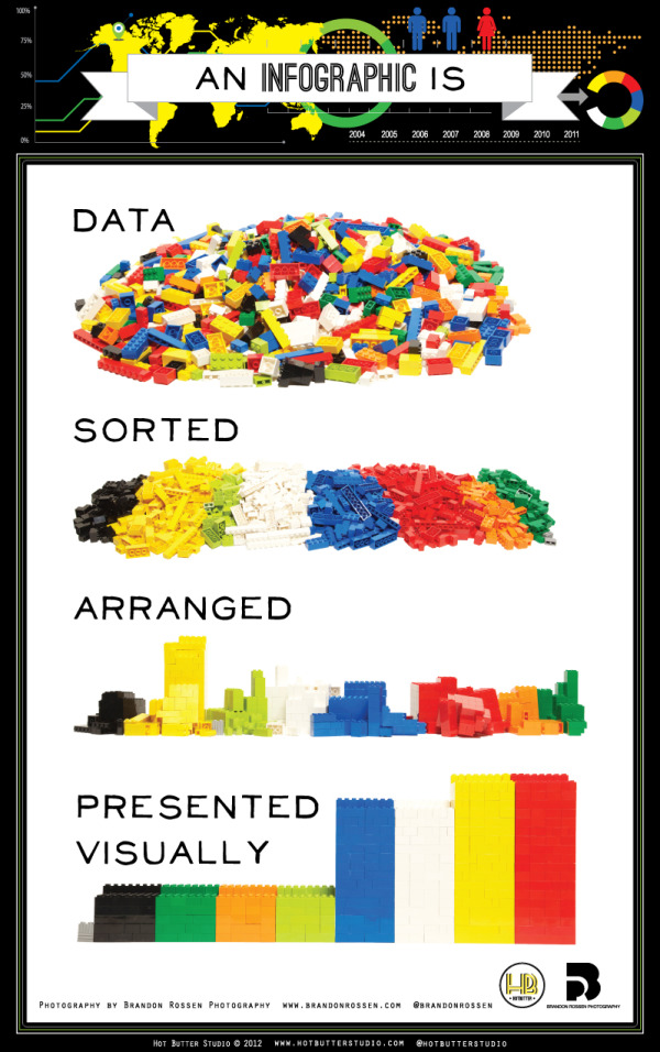
It’s always easier to deal with any data when it’s structured. Even fiction books present an organized system of chapters, so how could interfaces of any kind avoid it? Making the content well-structured allows the user to focus on the information without a preliminary job of trying to arrange it and understand the connections. And it should be done not for particular screens or pages but a website or app as a whole, making it feel straightforward and consistent at any point of interaction.
For example, using the consistent system of visual performance for different elements in an article (heading, subheadings, bullets, quotes, images and image galleries, text links, etc.), you make the interaction with a blog or news media effortless, as users can quickly catch how it works, scan pages, and find what they need. As well, using stats and infographics, make them look and work similarly across the app or website to reduce the cognitive load.
Follow one identity across multiple channels
A brand with a solid identity should demonstrate a consistent connection of it with its online presence across different channels: website, application, social networks, presentations, corporate documentation, and correspondence should all be united in one system, first of all, due to the consistent use of brand colors and fonts.
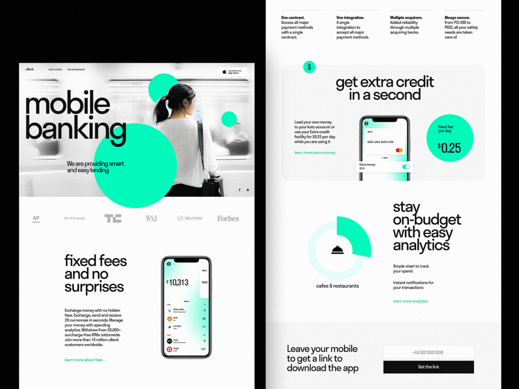
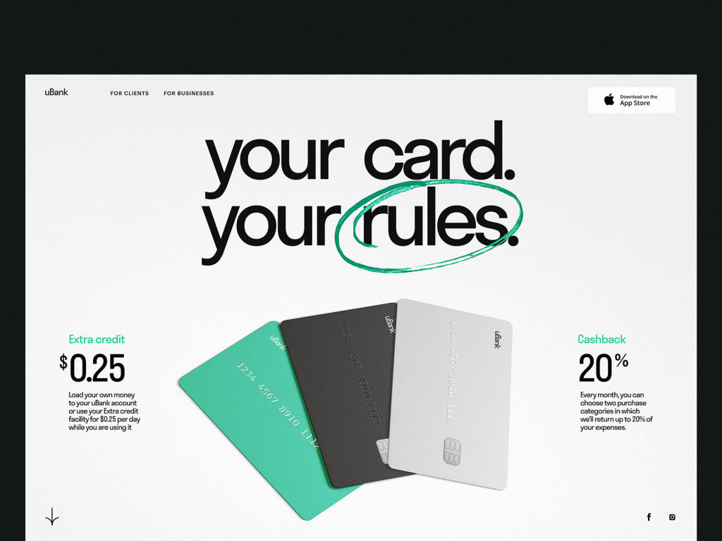
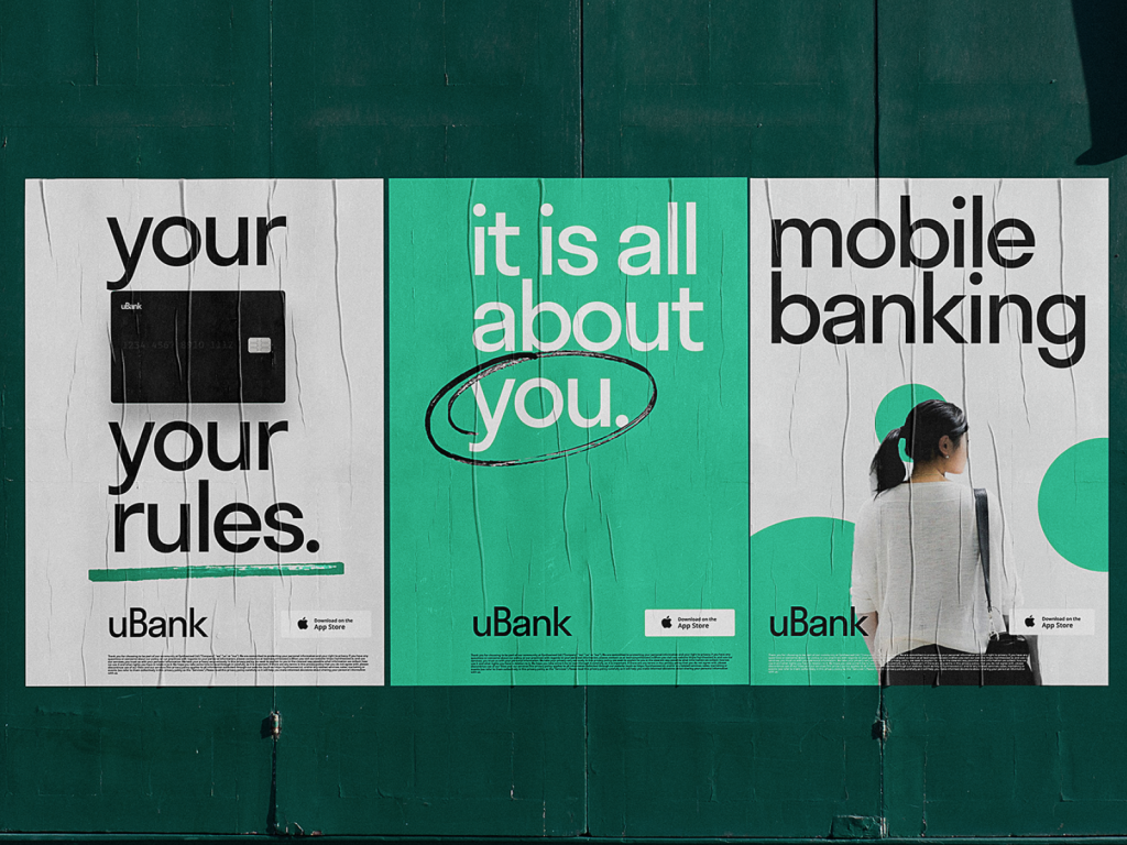
The consistent design of a landing page and posters promoting a mobile banking service

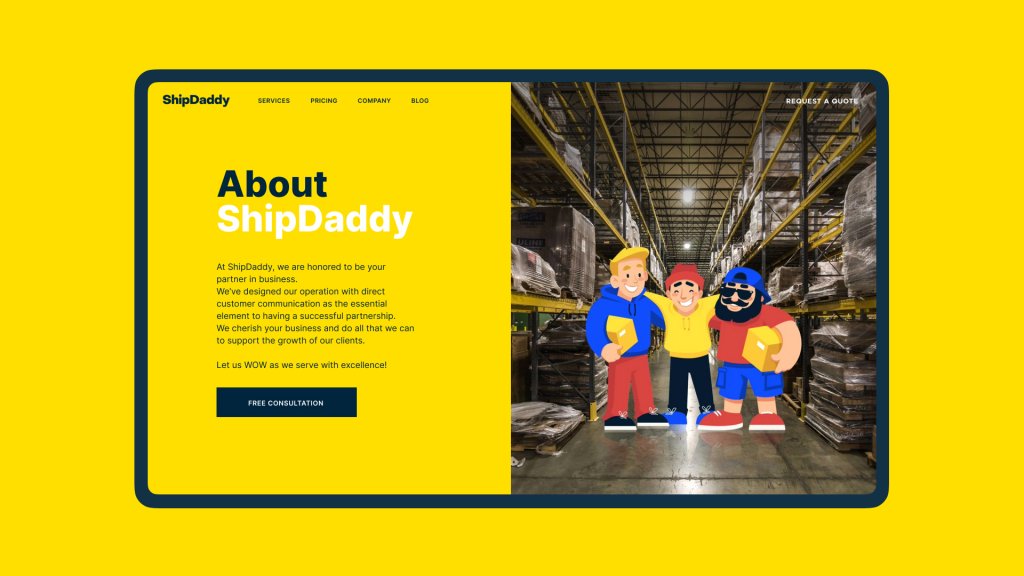
The consistent use for a company mascot in design for ShipDaddy
Work on effective UX writing
As we mentioned in the article about crafting good texts for interfaces, they are based on 4 foundation stones and have to be
- clear (users understand what you talk about, the core message isn’t blurred or complicated)
- concise (the piece of text is meaningful, laconic, and concentrated on the goal, no empty talk is included)
- useful (the copy gives users necessary information or helps with interactions)
- consistent (the copy within the interface of one digital product keeps the same style, tone, voice, and terminology)
UX writing defines how the interface communicates with the user, the brand’s tone and voice, and it is another factor that demands a consistent approach. As well as in communication with humans, with digital products, users expect friendly and somehow predictable behavior. Even the inconsistent use of title case and sentence case across the app may cause a sort of discomfort.
Order screens for the Tasty Burger app
We will talk about more design practices on reaching consistency in UX design in our future articles, so stay tuned and keep up with the updates!
Useful Articles
Here’s a set of articles on more aspects and best practices of user experience design.
Visual Dividers in User Interfaces: Types and Design Tips
Best Practices on Preventing Errors in User Interfaces
How to Design Effective Search in User Interface
Directional Cues in User Interfaces
How to Make User Interface Readable
Basic Types of Buttons in User Interfaces
3C of Interface Design: Color, Contrast, Content