Let’s get something out of the way: nobody asked us for a 23-item showcase. That’s not an elegant number. But here we are—because when your studio ships this much diverse, polished, purpose-driven web design work, you don’t leave great projects on the cutting room floor.
This isn’t a Pinterest board. It’s a tour through how we solve problems with pixels. Real projects, made for real clients (or very real experiments), spanning e-commerce, SaaS, art spaces, and everything in between. These aren’t just pretty interfaces. They’re business strategies you can scroll through.
Whether you’re a designer looking for UI inspiration, a brand manager scoping your next redesign, or a developer wondering “why the hell did they float that block?”—don’t just scroll for the eye candy. Read between the layouts. There’s UX strategy under all that pretty.
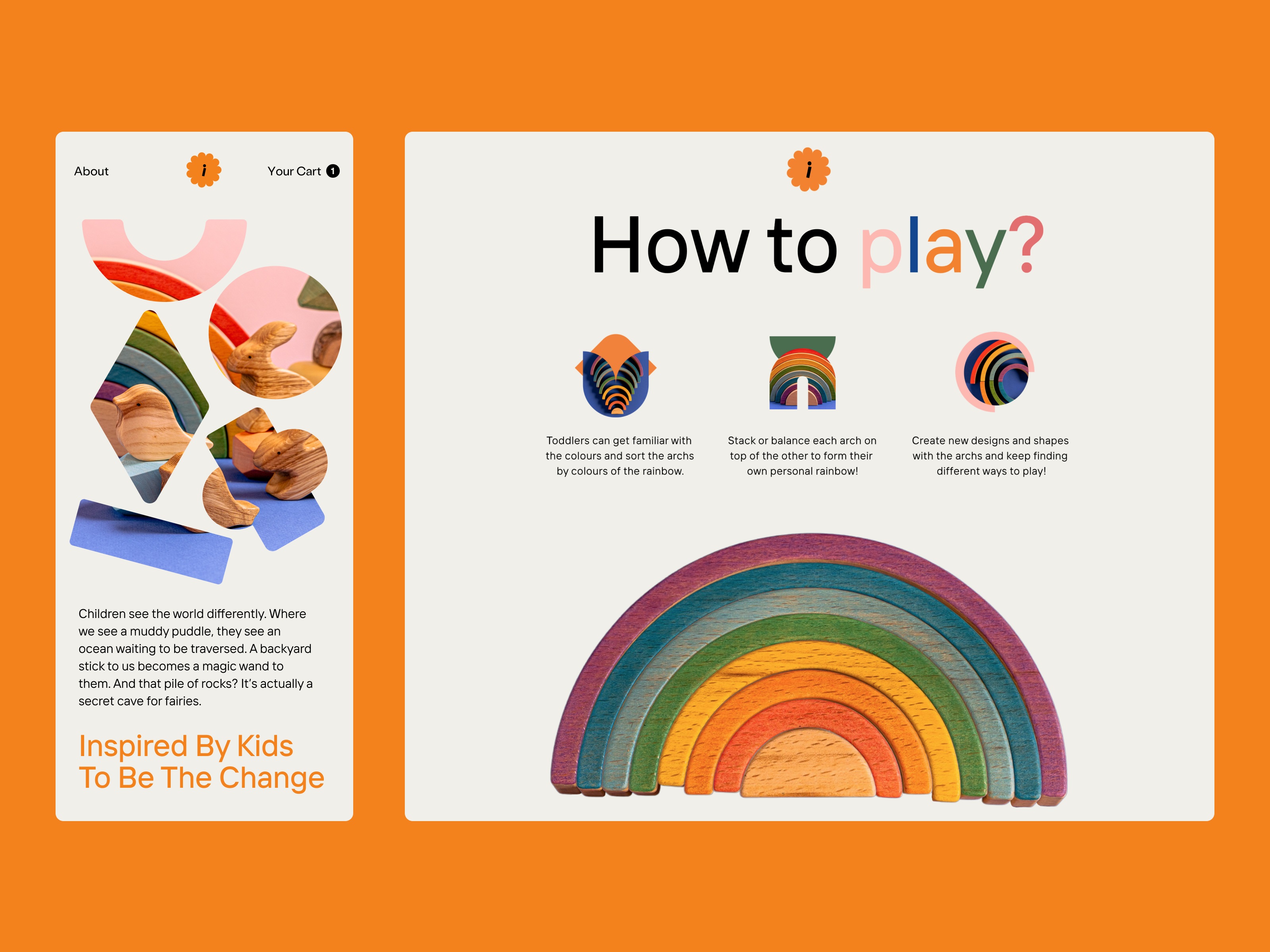
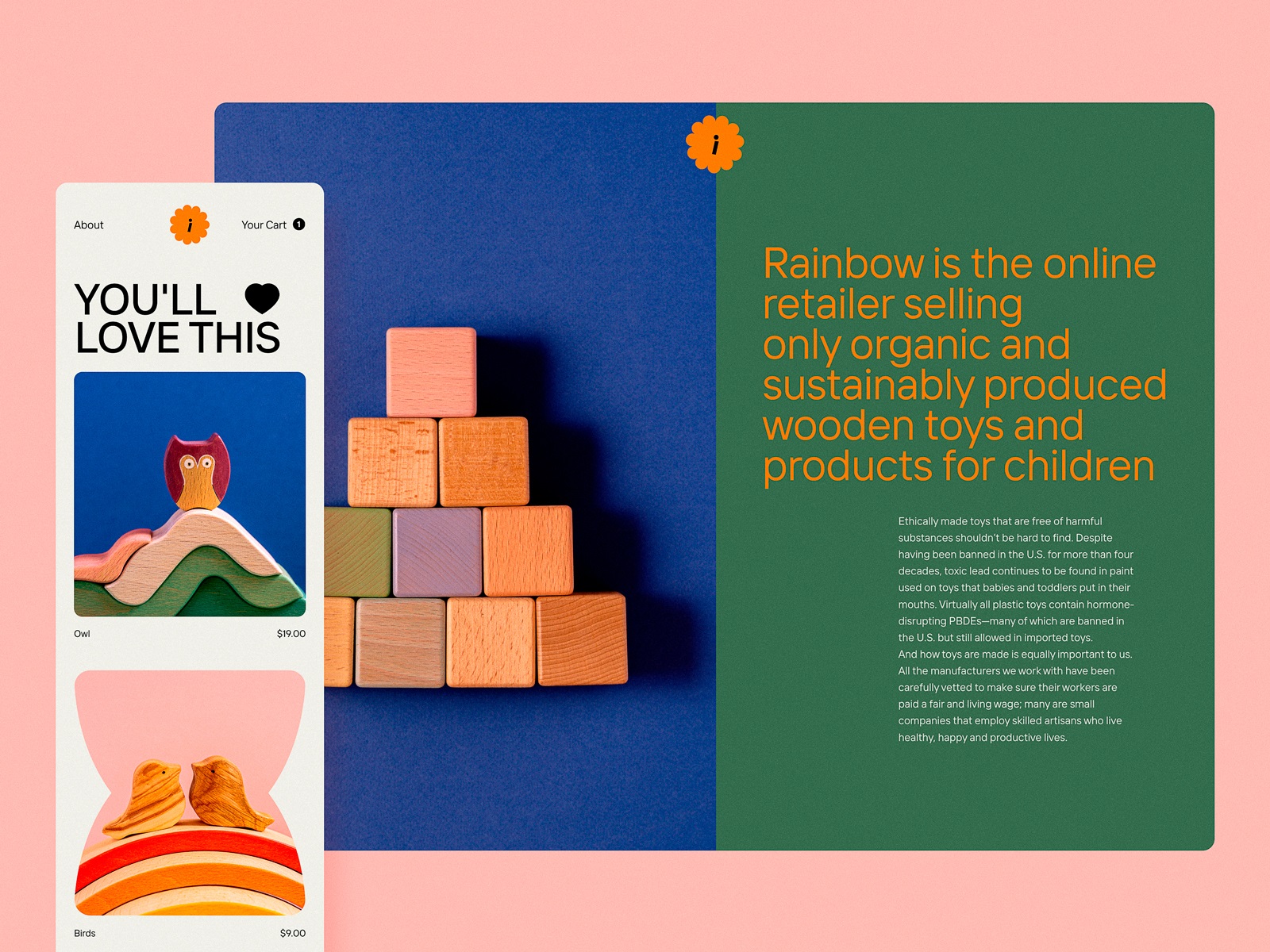
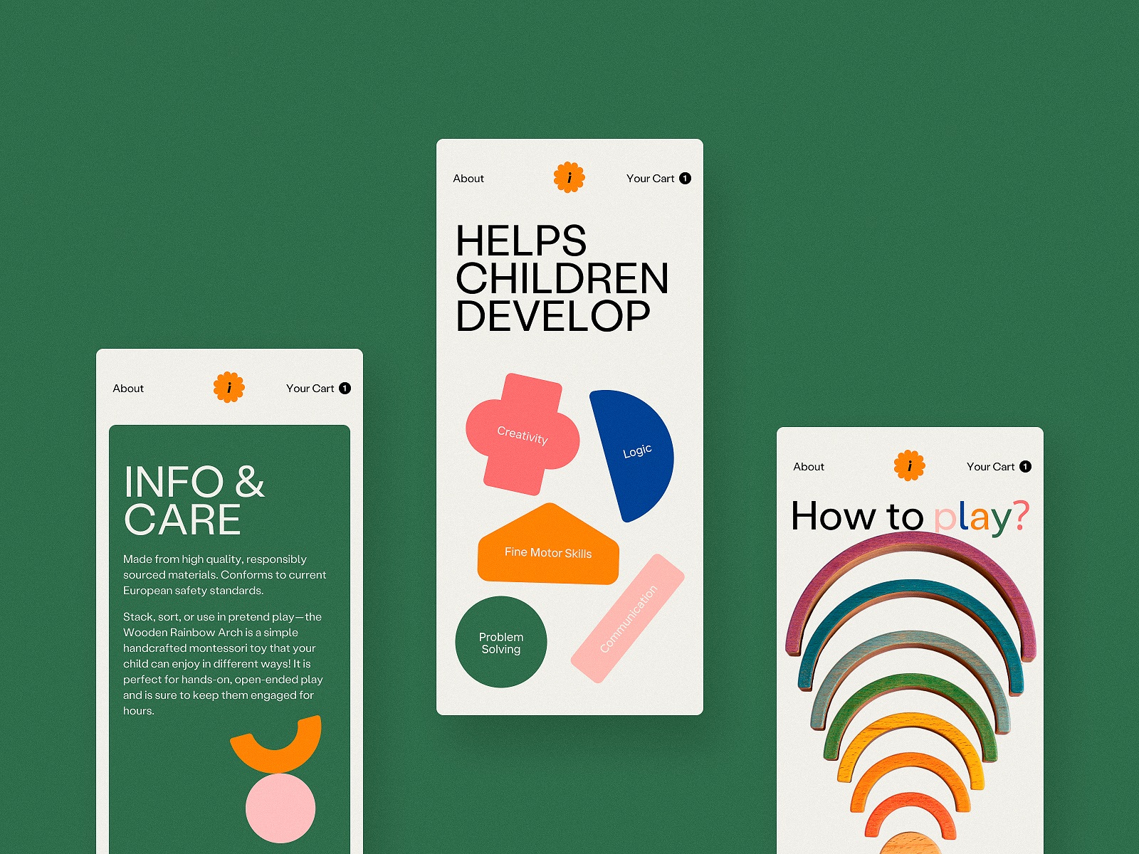
1. Toy Shop Website
This one was for the kid inside us all. A toy shop UI that doesn’t feel like a parental afterthought. We leaned into natural textures, chunky fonts, and playful shapes—all wrapped in a soft, eco-conscious color palette that says “safe for kids, but designed for grown-ups with taste.” The scannability? Effortless. Animations? Interactive, but not overwhelming. Like a pop-up book you want to keep flipping through.
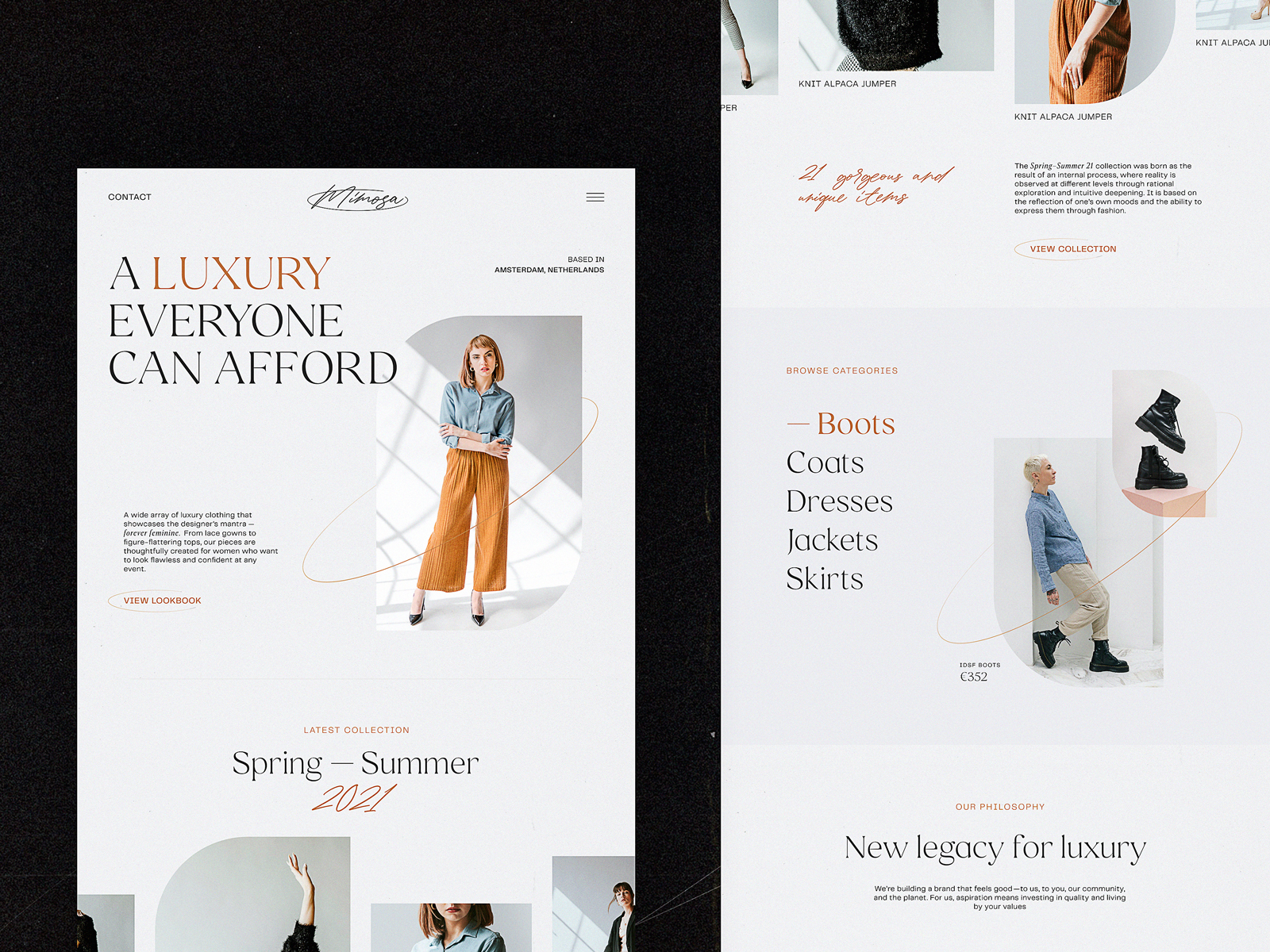
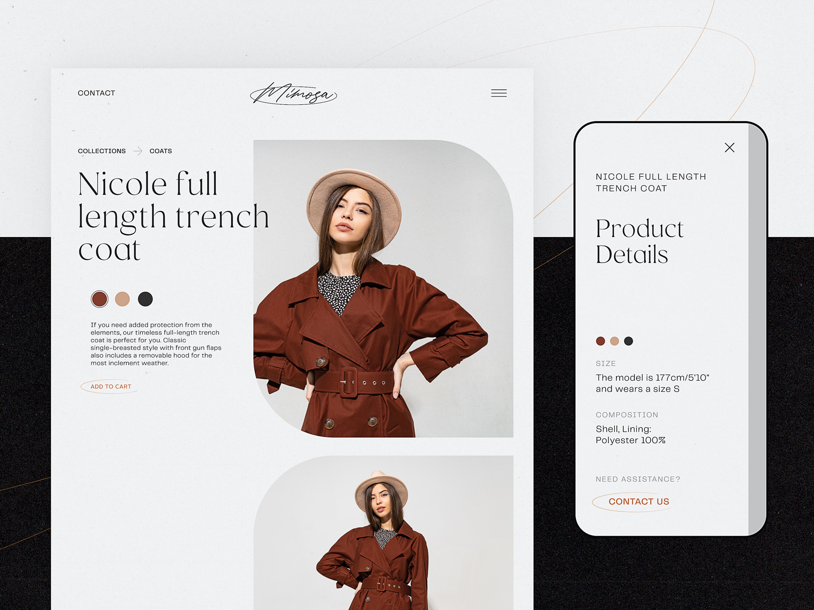
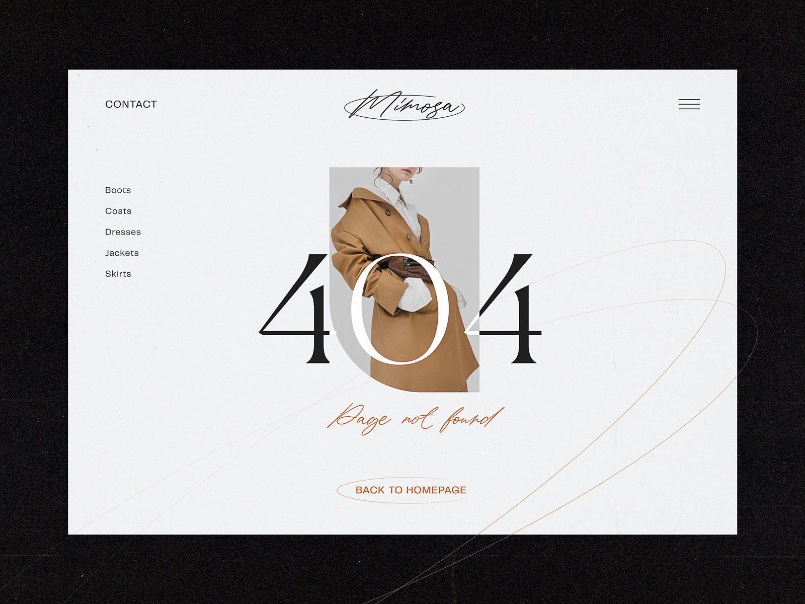
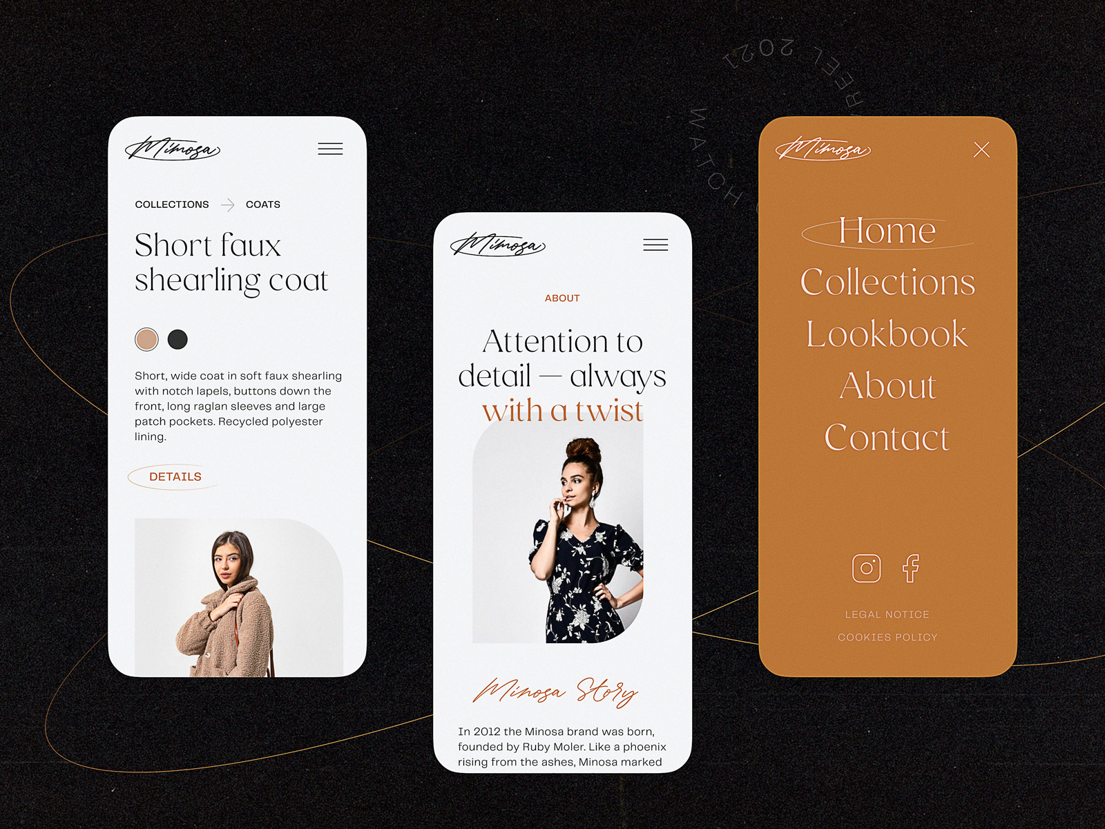
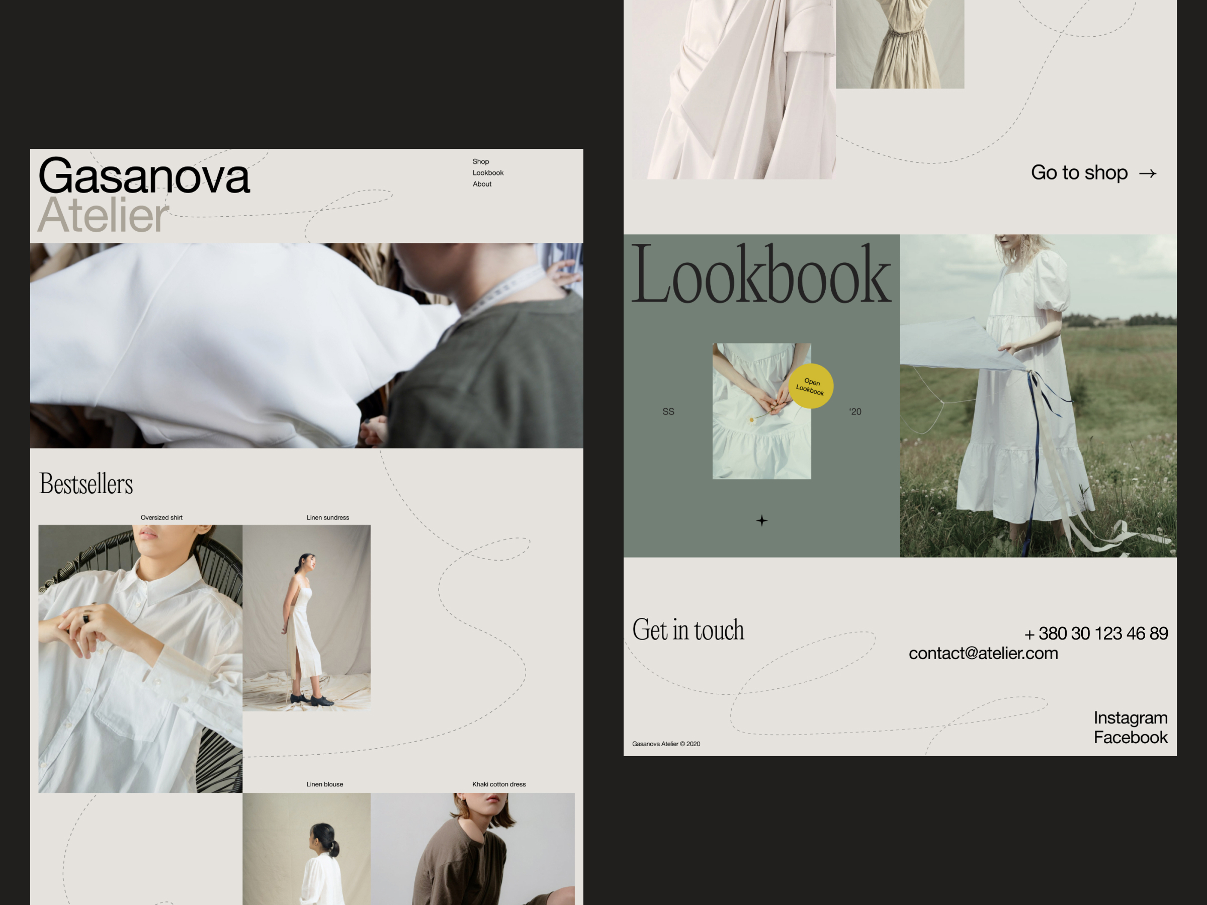
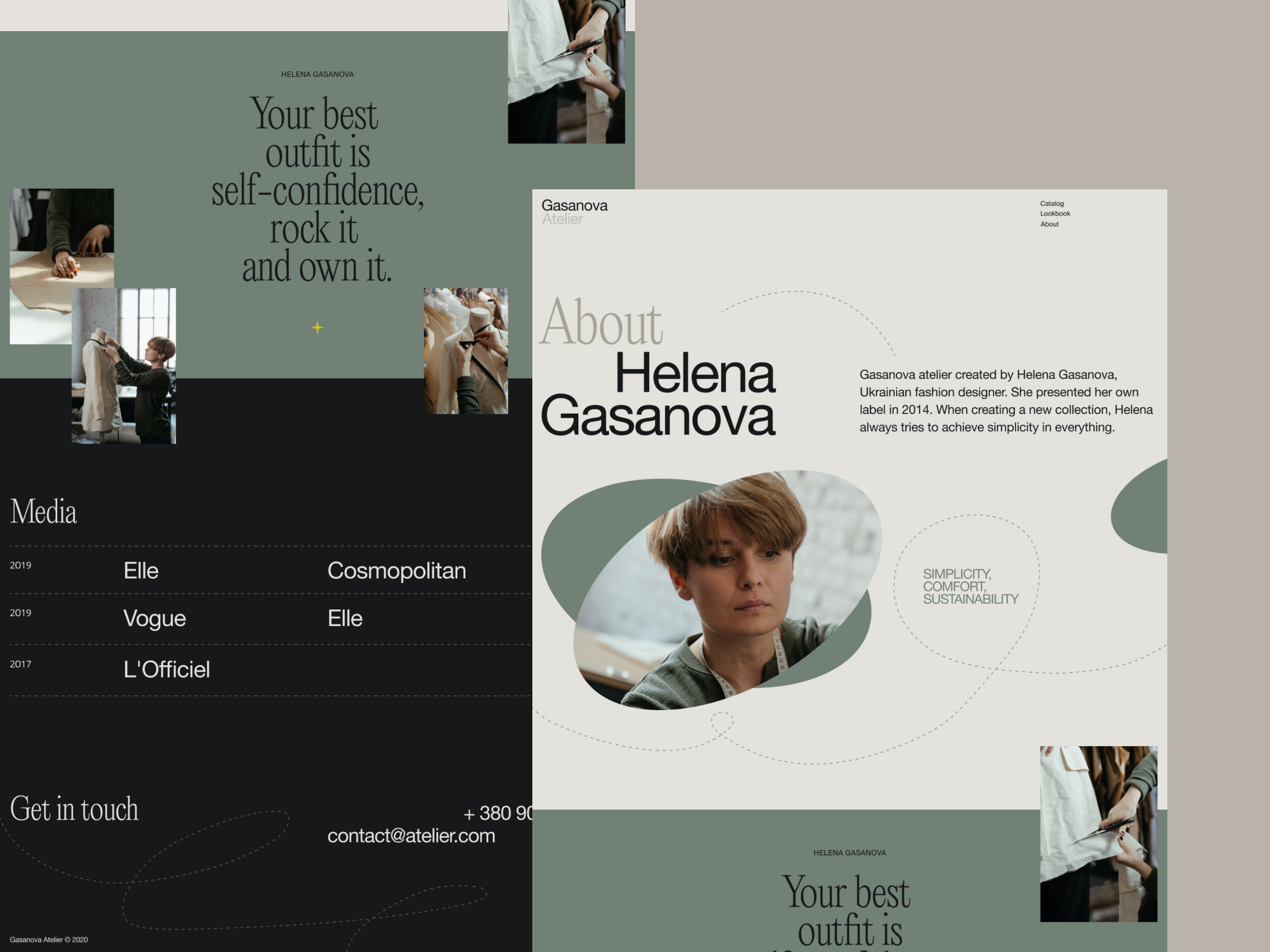
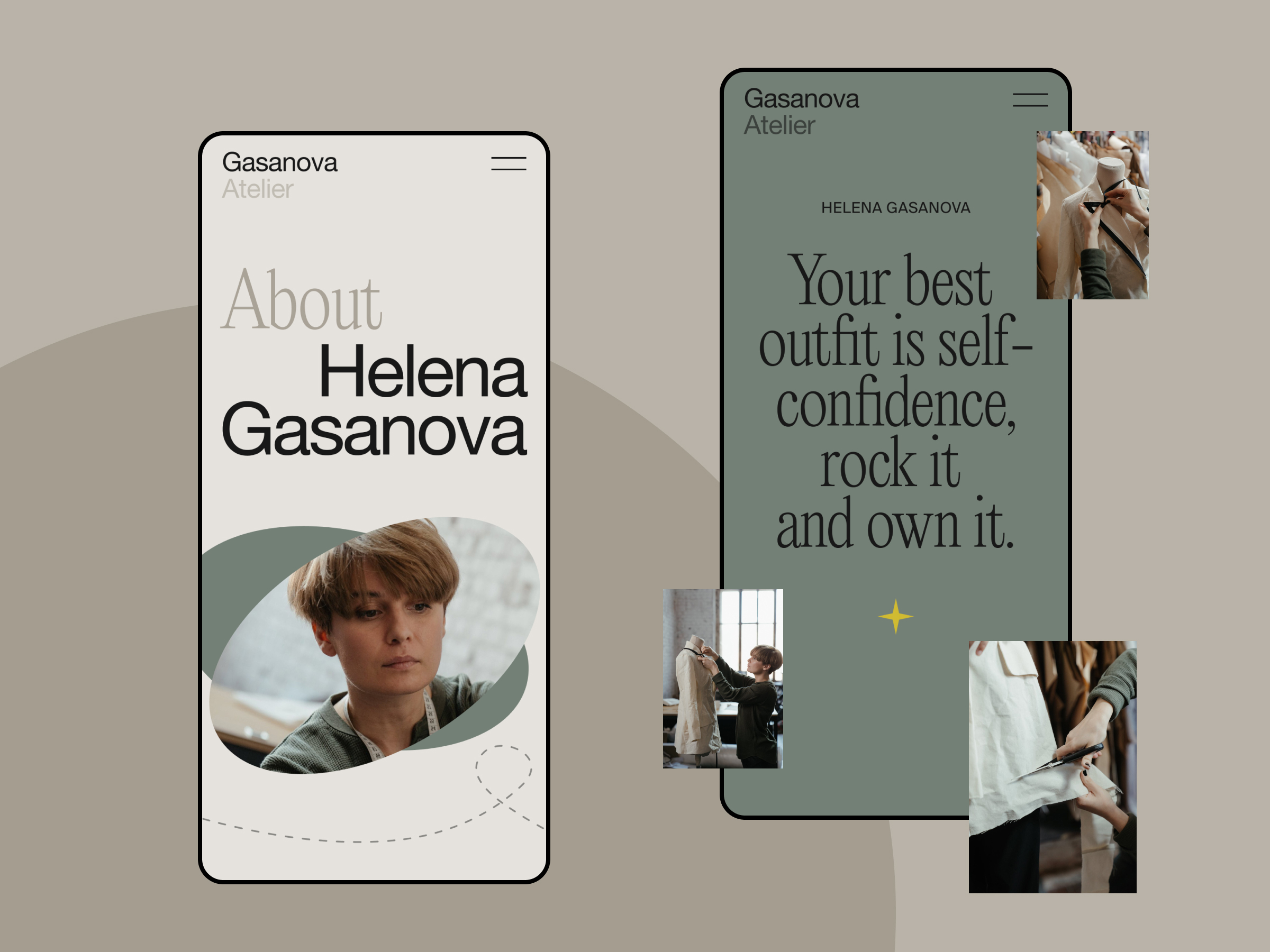
2. Fashion Store Website
Fashion brands love minimalism until they forget why they chose it. This design embraces minimalist fashion website design by using white space as a frame, not a void. Every photo tells a story; every grid feels like a curated outfit. Instead of a feed, you get an experience that flows like a runway. No carousel fatigue. Just visual clarity and beautiful restraint.
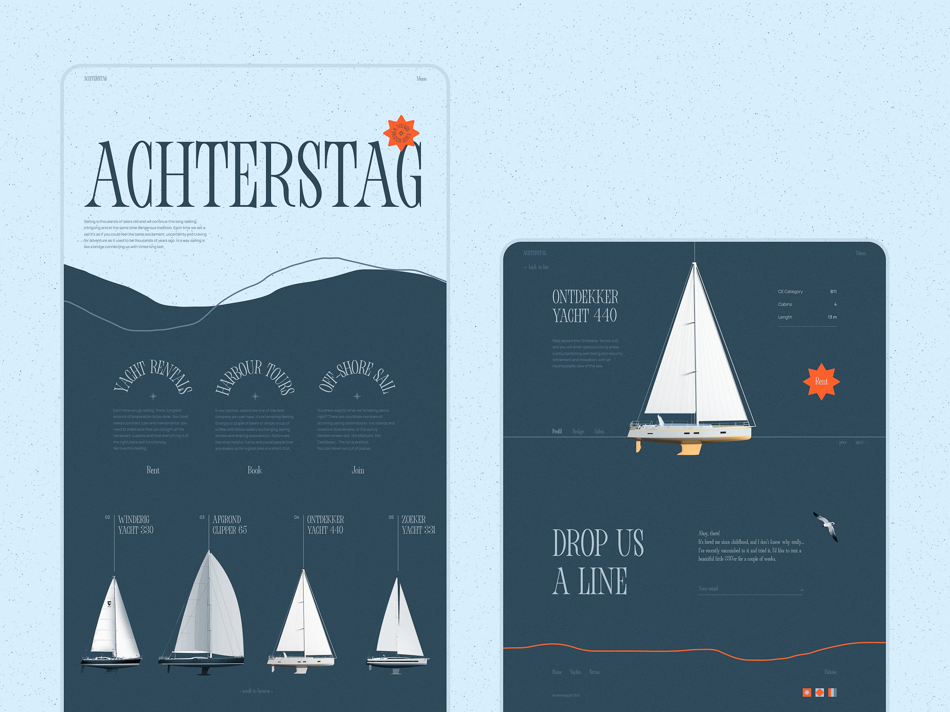
3. Yacht Charter Website
This isn’t a boat rental site. It’s a whole fantasy portal with luxury website design logic. When you land here, the motion says “breeze,” the video says “adventure,” and the interactive yacht selector says “yes, that one.”
Every detail—from the blue-toned palette to the fluid scroll—whispers luxury, but keeps conversion in mind. Even on mobile, the site adjusts with a gentle tap, not a jarring shuffle.
4. Art Galleries Website
Curating art events online is tricky. We built this creative website design to be more gallery than grid. Asymmetry gives it character. The type hierarchy holds back when the visuals need to shine. It plays with direction, shape, and color—just like the art it showcases. Scroll through, and you’ll find yourself pausing not for the site, but for the stories it holds.
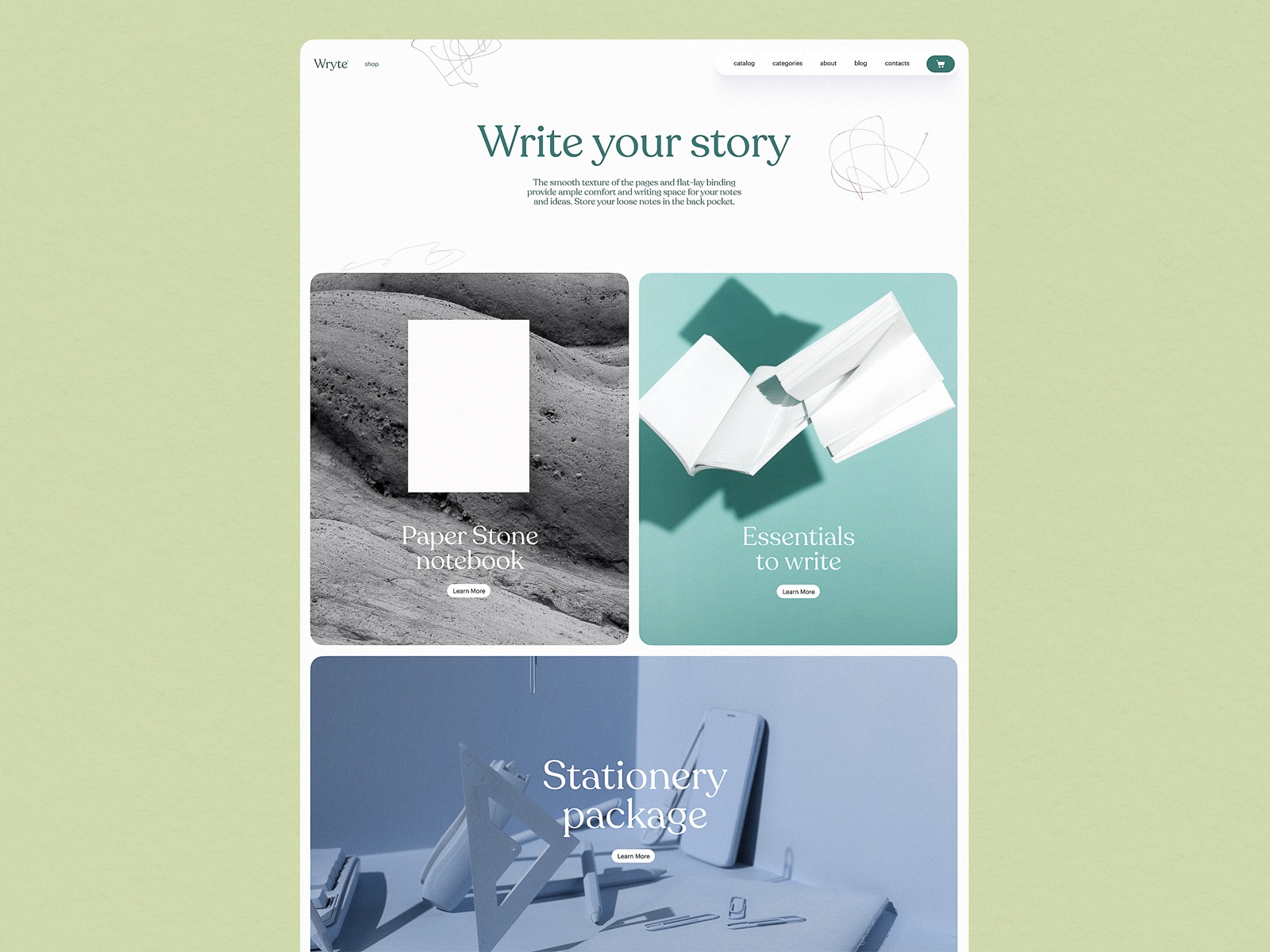
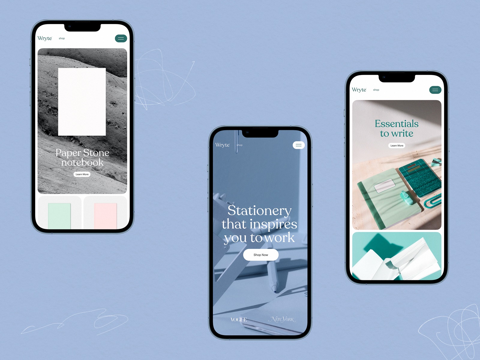
5. Stationery Shop Website
The modern e-commerce UI for this stationery shop starts with a giant, animated hero frame. Yes, it’s just office supplies. And still, you’re impressed. With slick 3D graphics, custom iconography, and ultra-clean navigation, this design turns a typically dry category into something aspirational. Less Staples, more lifestyle.
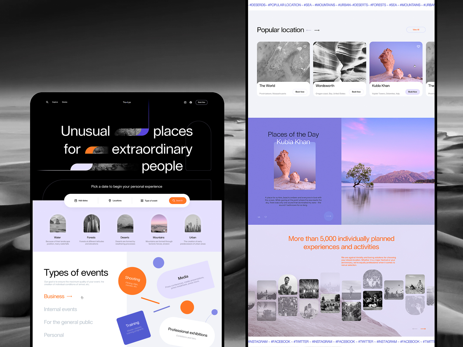
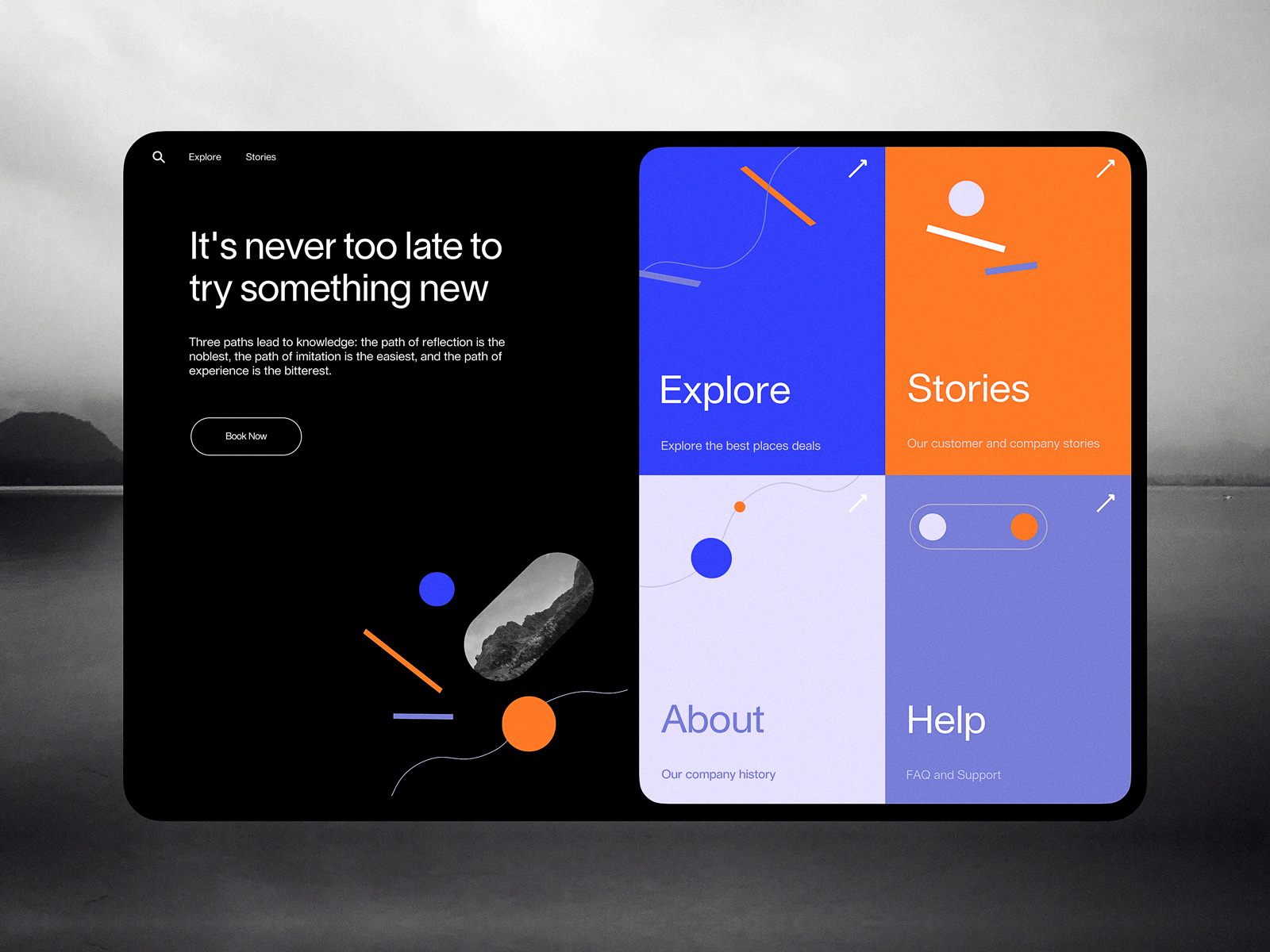
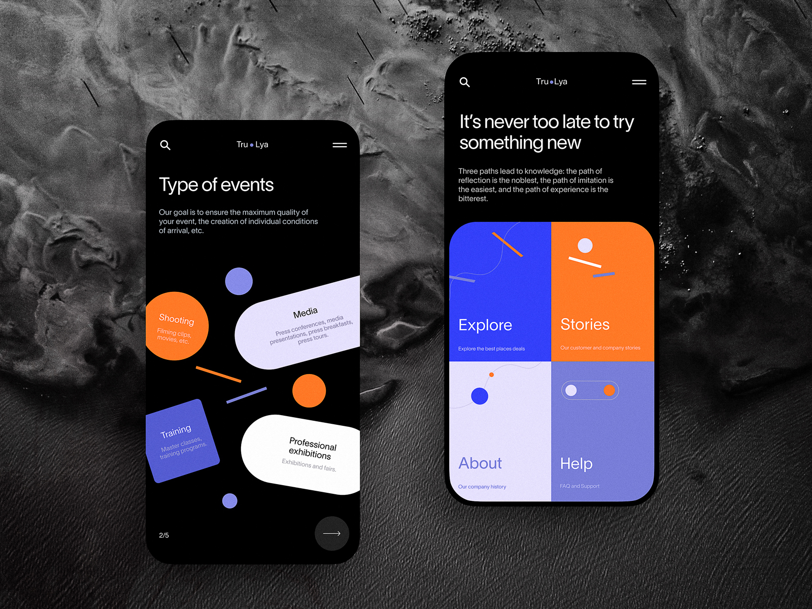
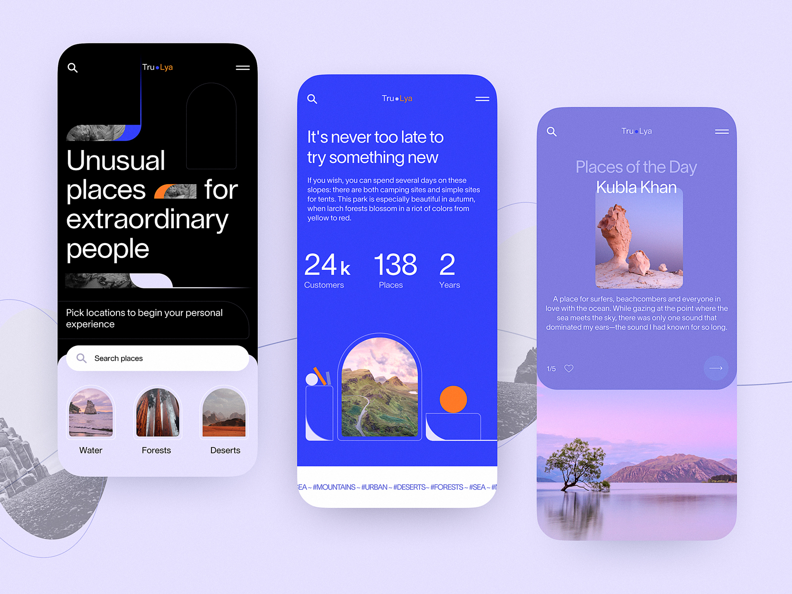
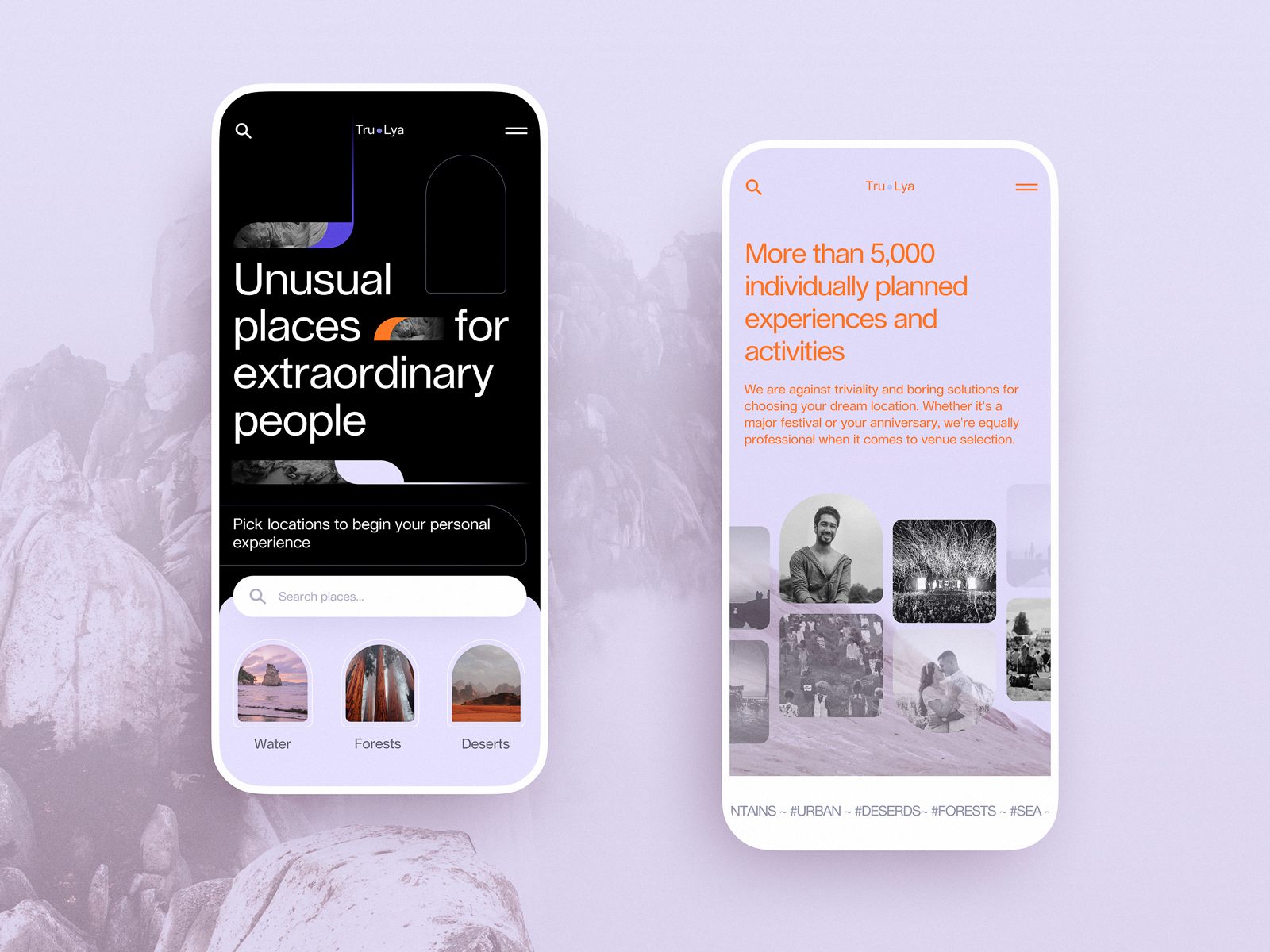
6. Event Booking Website
Event booking website design is often about urgency. This one starts above the fold with a functional, beautiful search UI that gets to the point. From there, geometric patterns and scroll-triggered animations keep the energy high without overwhelming the user.
7. Illusions Space Website
Entertainment website design has one job: make people feel something immediately. We built this illusions-themed concept with blurry edges, glitchy animation, and high-contrast typography. It breaks expectations—and probably a few accessibility rules—but it’s unforgettable. Which, for this niche, is exactly the point.
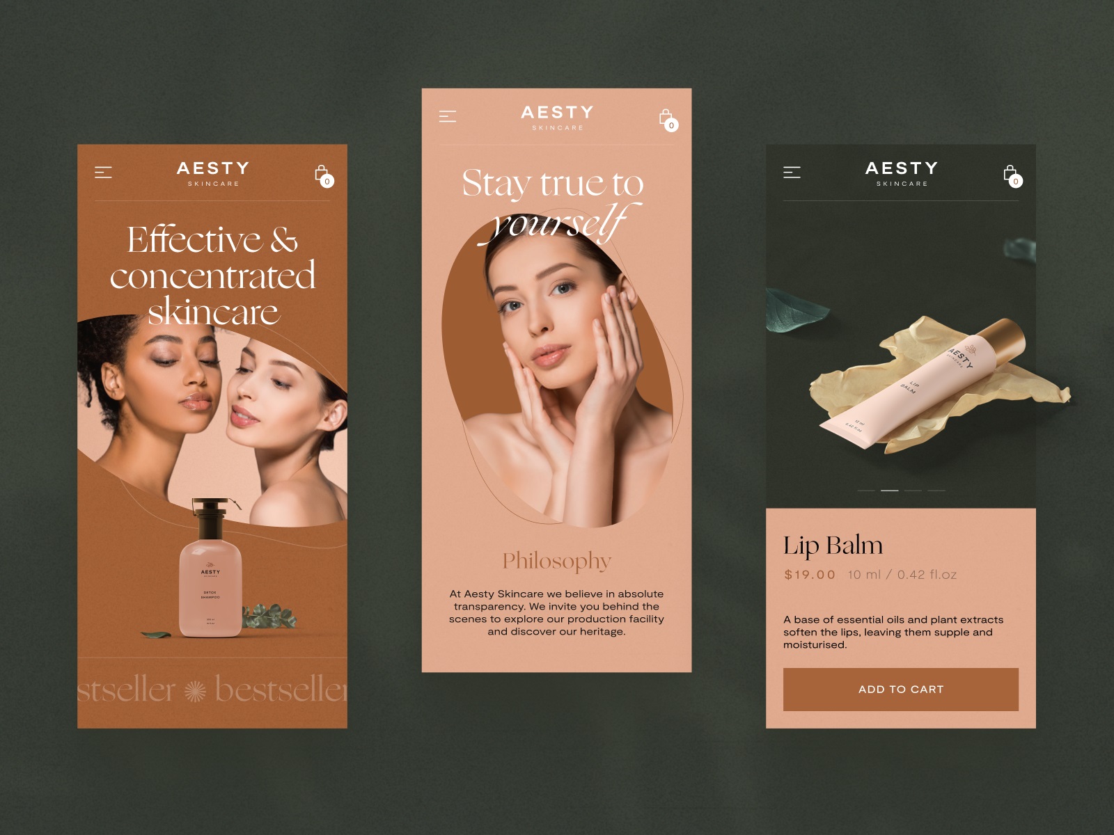
8. Cosmetics E-commerce Website
This beauty brand e-commerce website design is all soft light and smooth motion. The typography is elegant. The interaction pattern is clean, with horizontal scrolling and split-screen layouts that let the product breathe. It’s not selling a cream. It’s selling a feeling—of time, self-care, and a skincare shelf you’re finally proud of.
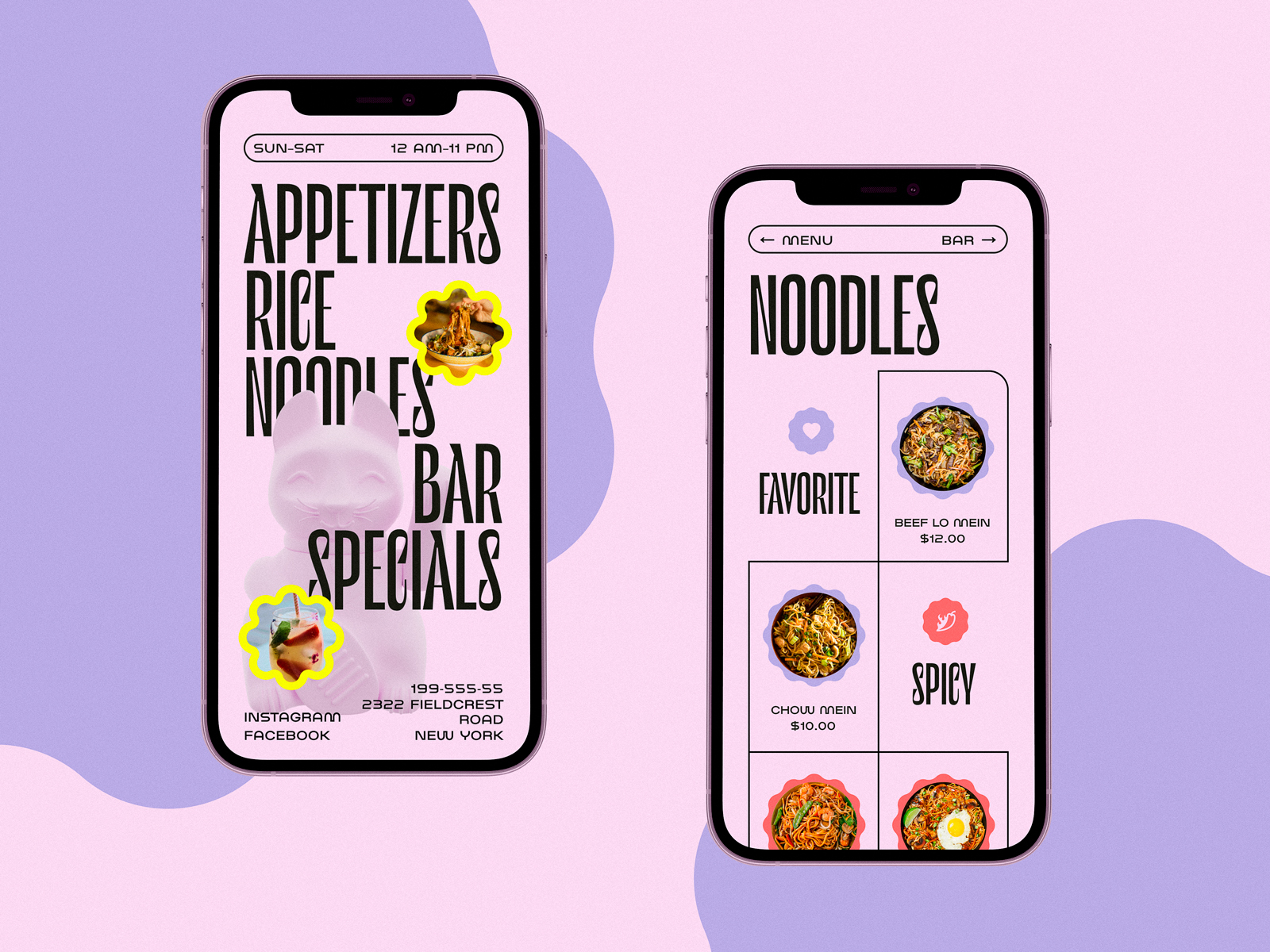
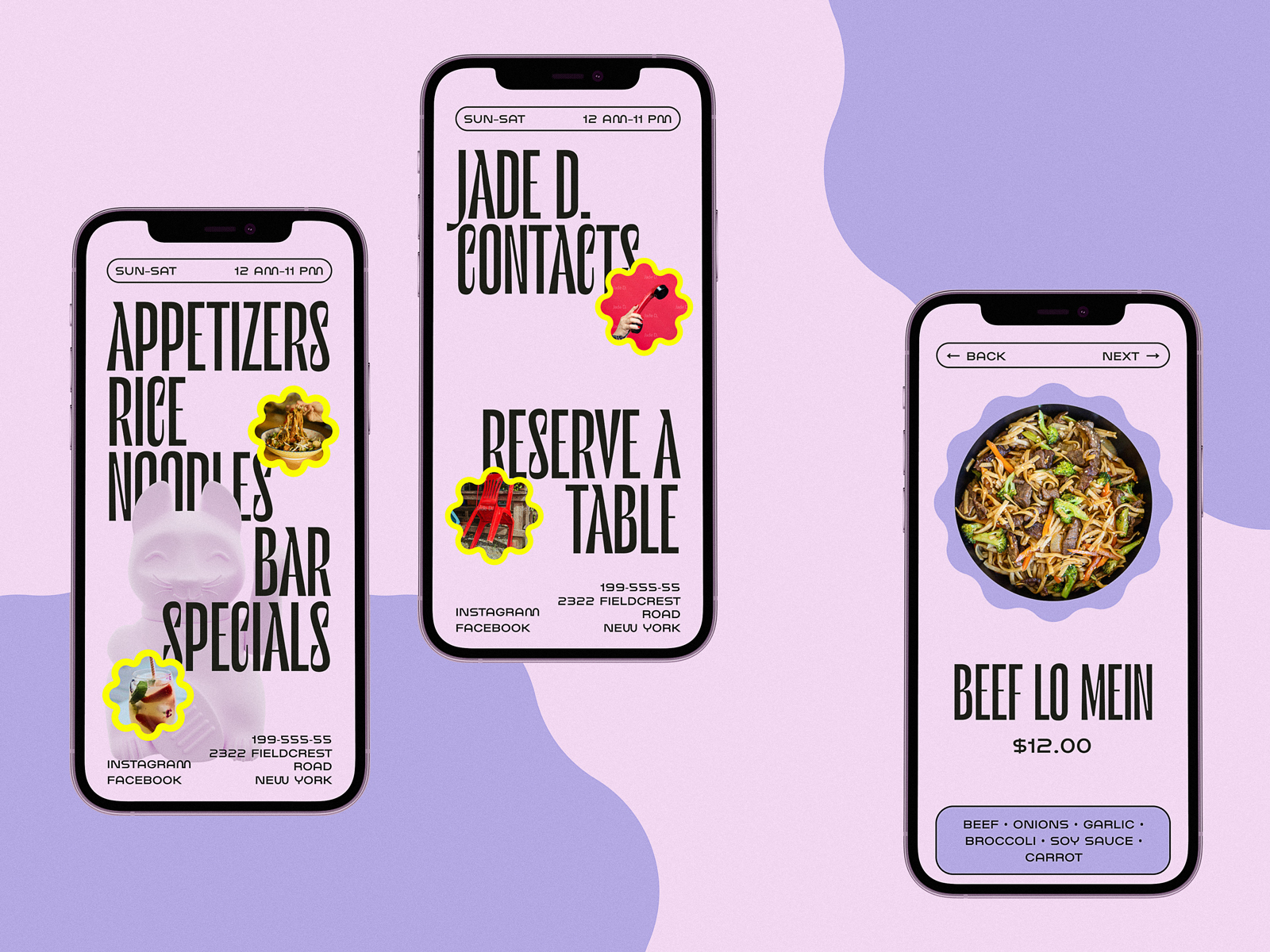
9. Chinese Restaurant Website
This modern restaurant website was built for a Chinese eatery trying to attract younger guests. We used a split-screen layout: food photos on one side, action on the other. Bright colors, asymmetrical grids, and animated CTAs bring the energy of a night out—minus the grease.
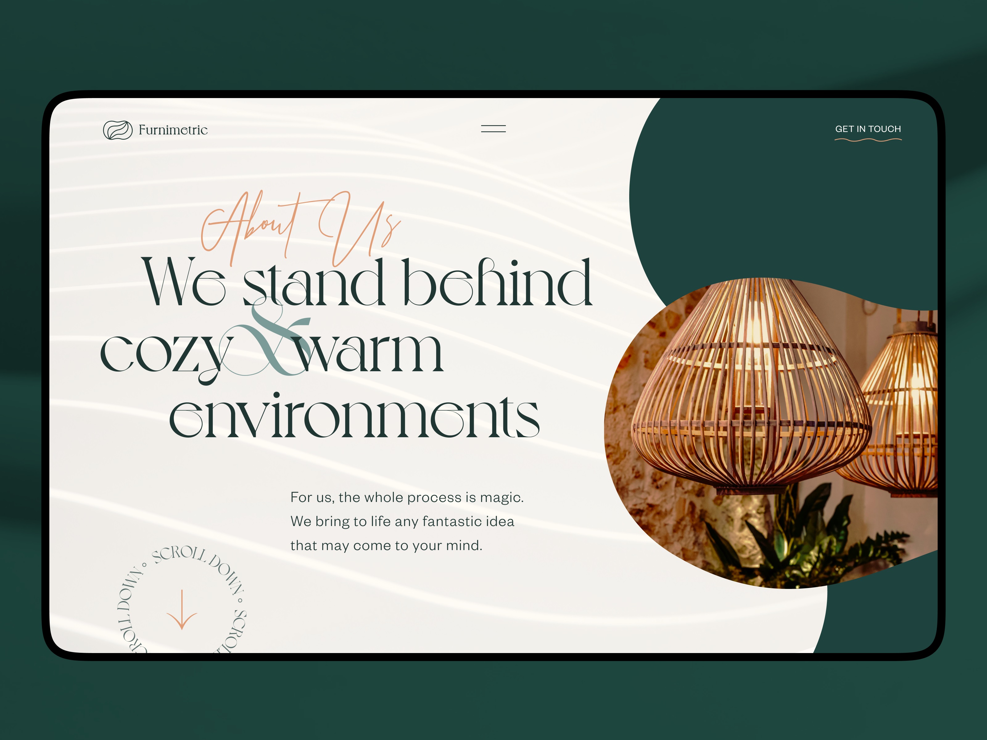
10. Furniture Studio Website
For this parametric furniture studio, we built a natural color palette website that echoes wood grain, felt, and steel. Curves in the layout match the products. Photos feel staged but never cold. Typography does the quiet work of positioning the brand as both avant-garde and approachable. Scroll slowly—it’s worth it.
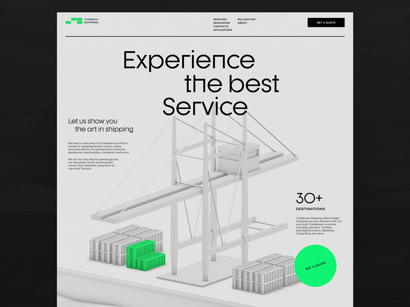
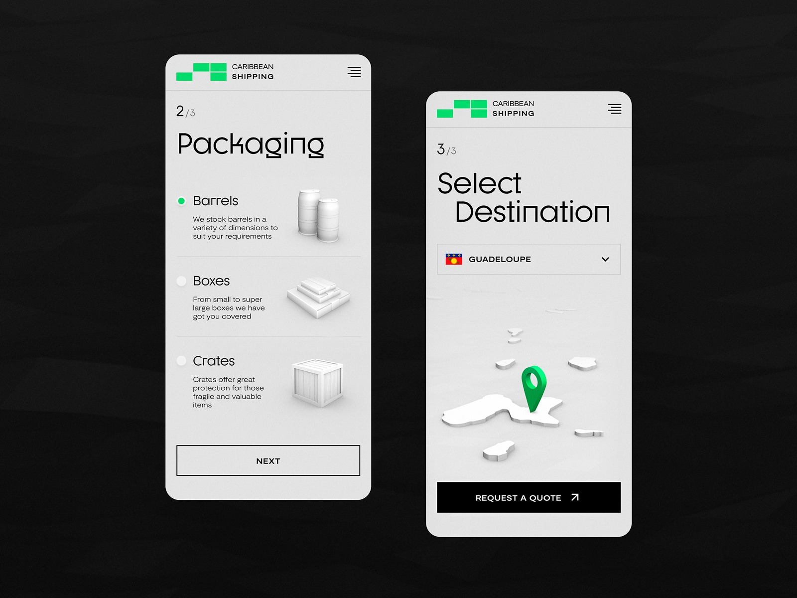
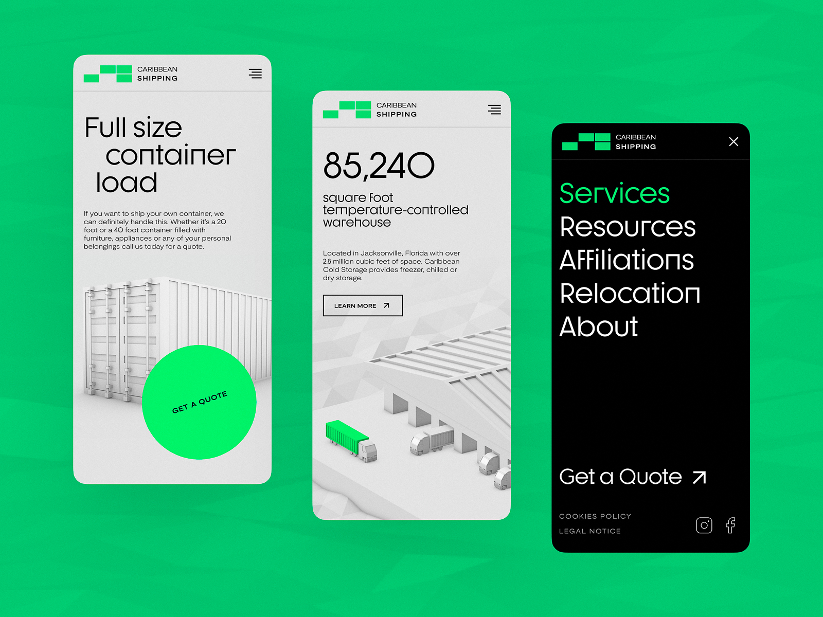
11. Shipping Company Website
Truth is, logistics websites are usually grayscale graveyards. Here, we added life: animated maps, strategic bursts of color, and clear, informative typography that actually answers questions. Plus, the 3D hero tells you what they do before you even read the H1.
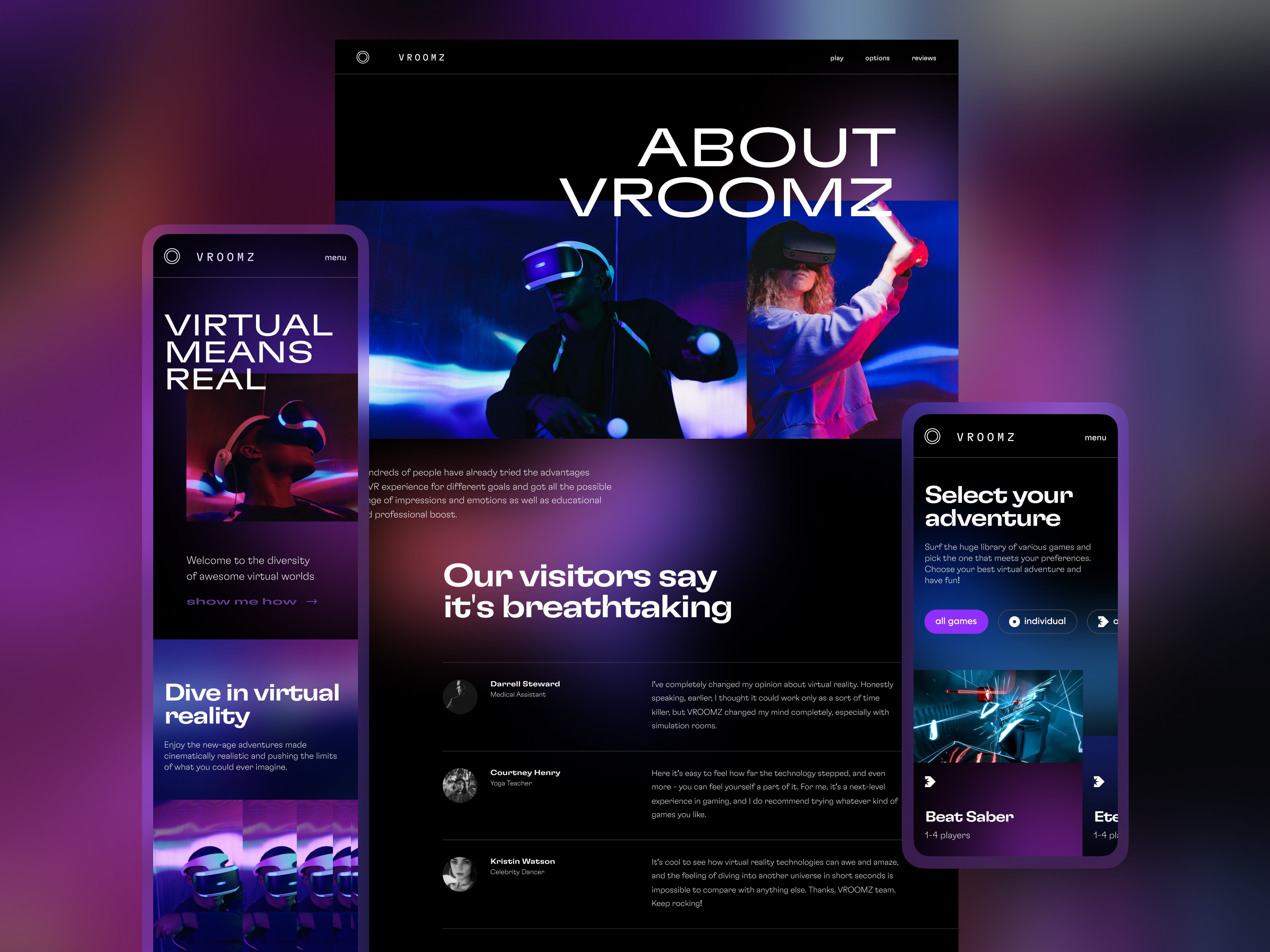
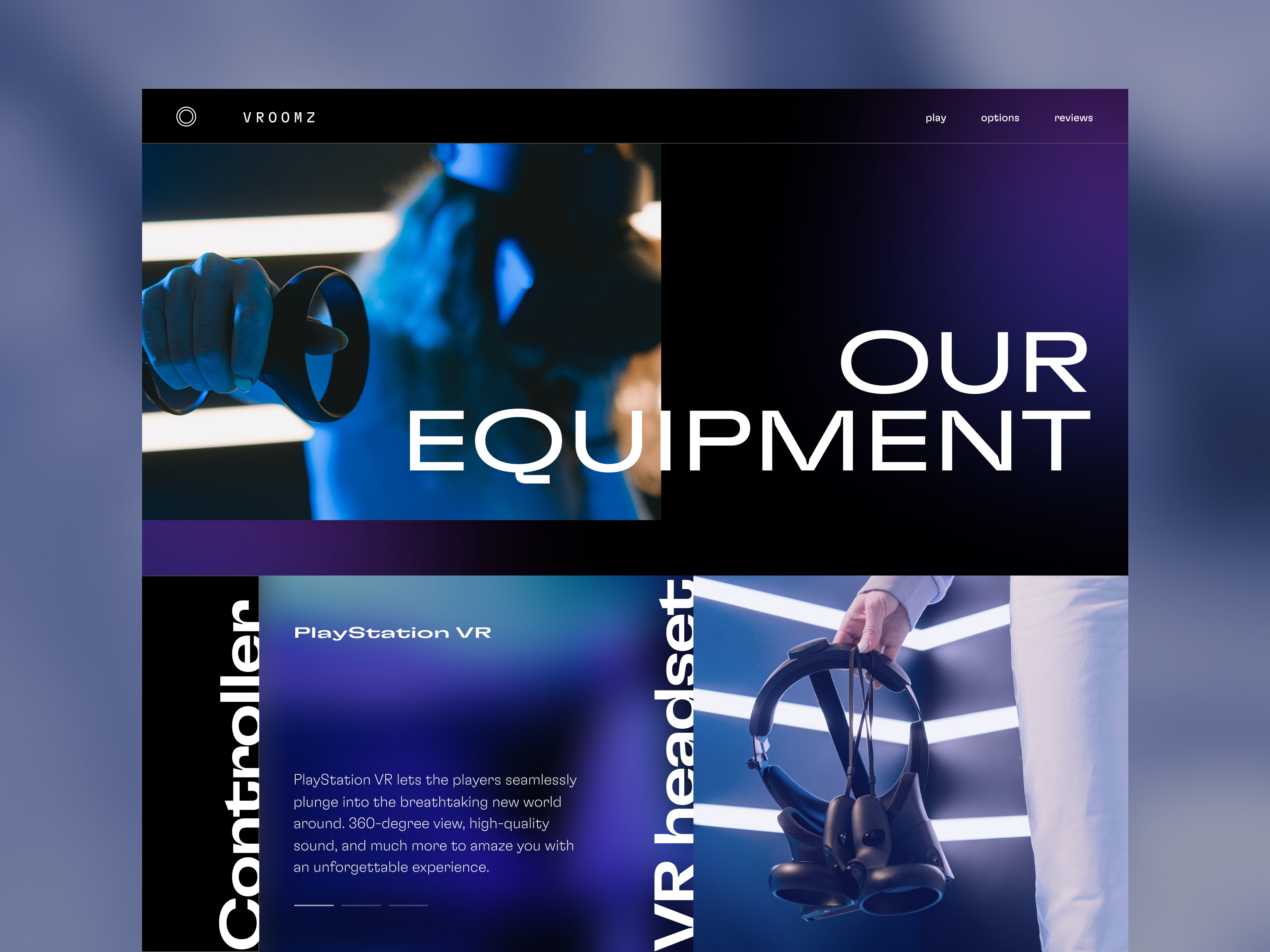
12. Virtual Reality Rooms Website
This virtual reality experience website leans all the way into sci-fi. Neon lines, dark themes, fast cuts. It doesn’t try to be sleek. It tries to be immersive. It is immersive. And somehow still loads in under 2 seconds.
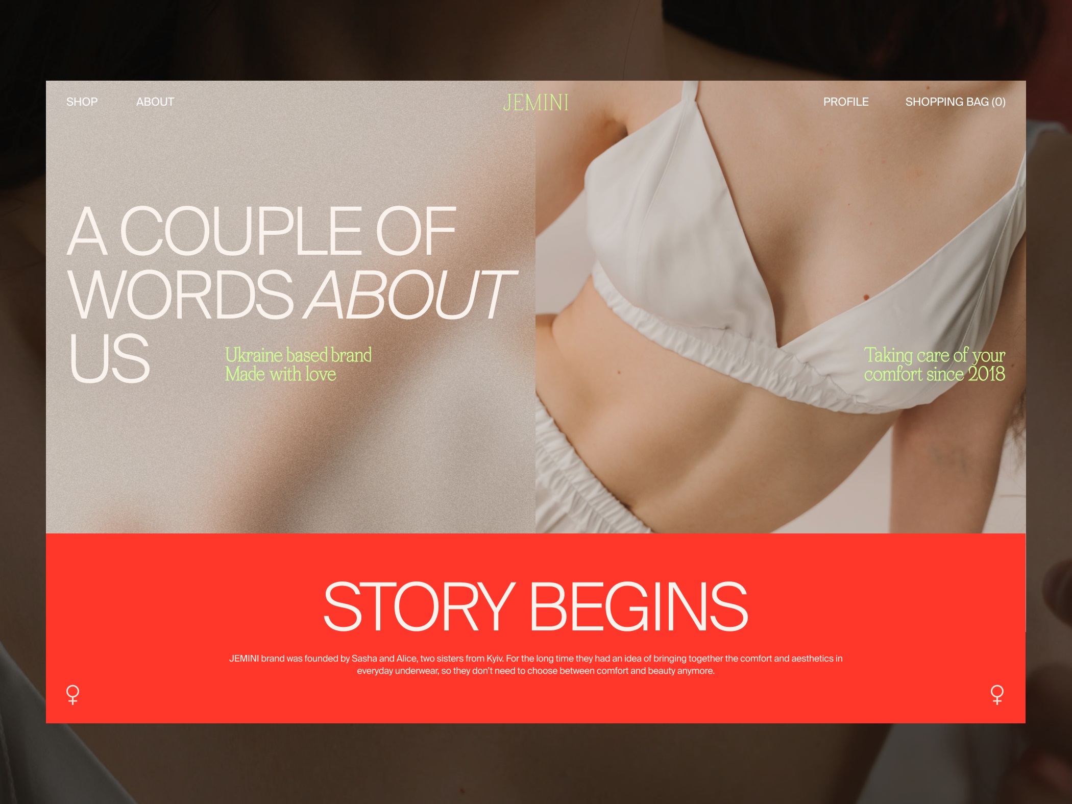
13. Underwear Brand E-commerce Website
Lingerie brand websites often feel stuck between Pinterest boards and Paris catwalks. This one stakes its own territory: passionate red accents, confident fonts, and a customer journey that’s smooth as silk. Visual cues lead you without hand-holding. Emotional design meets practical UX.
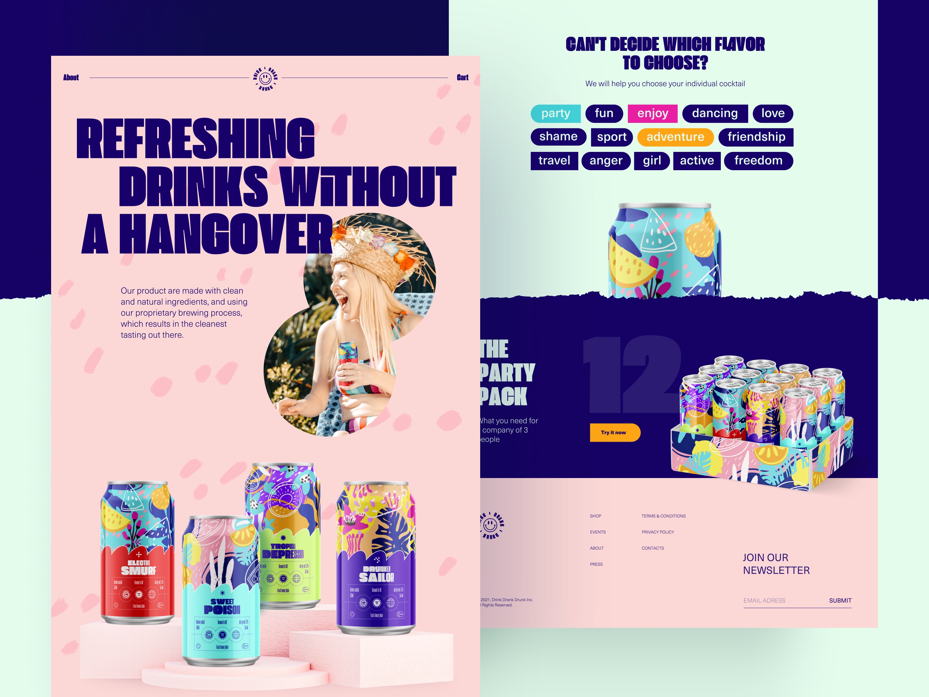
14. Party Drink Landing Page
This landing page for a beverage brand uses motion like flavor. Scroll down, and the energy builds. Color pops. Product cans glide into view like they’ve been waiting for their cue. And the filter tags? They don’t sort by category—they sort by vibe. It’s not a website. It’s a warm-up set. A visual pre-game. And it knows exactly how to build the buzz.
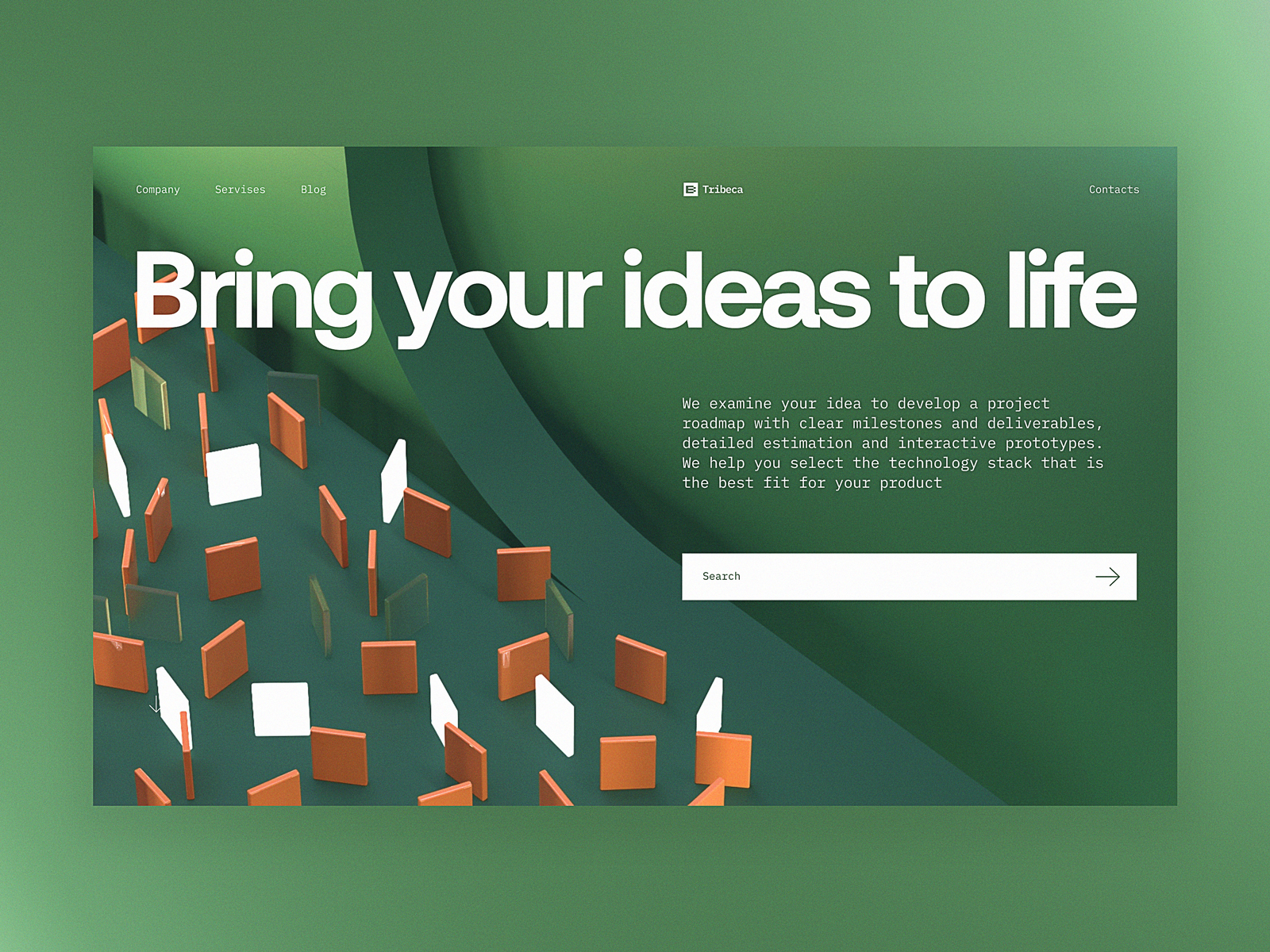
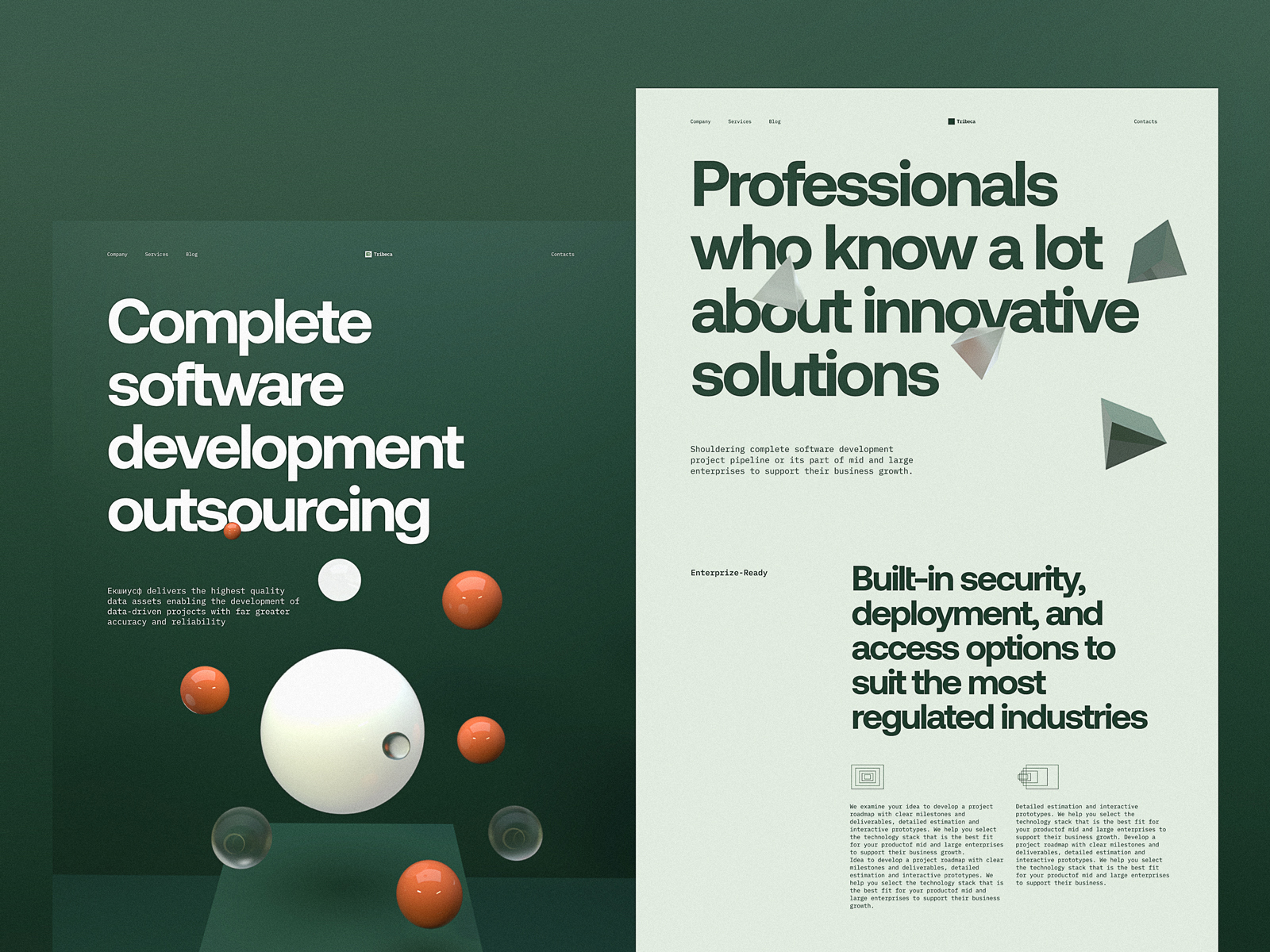
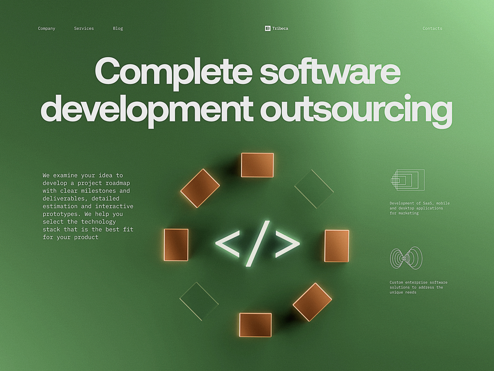
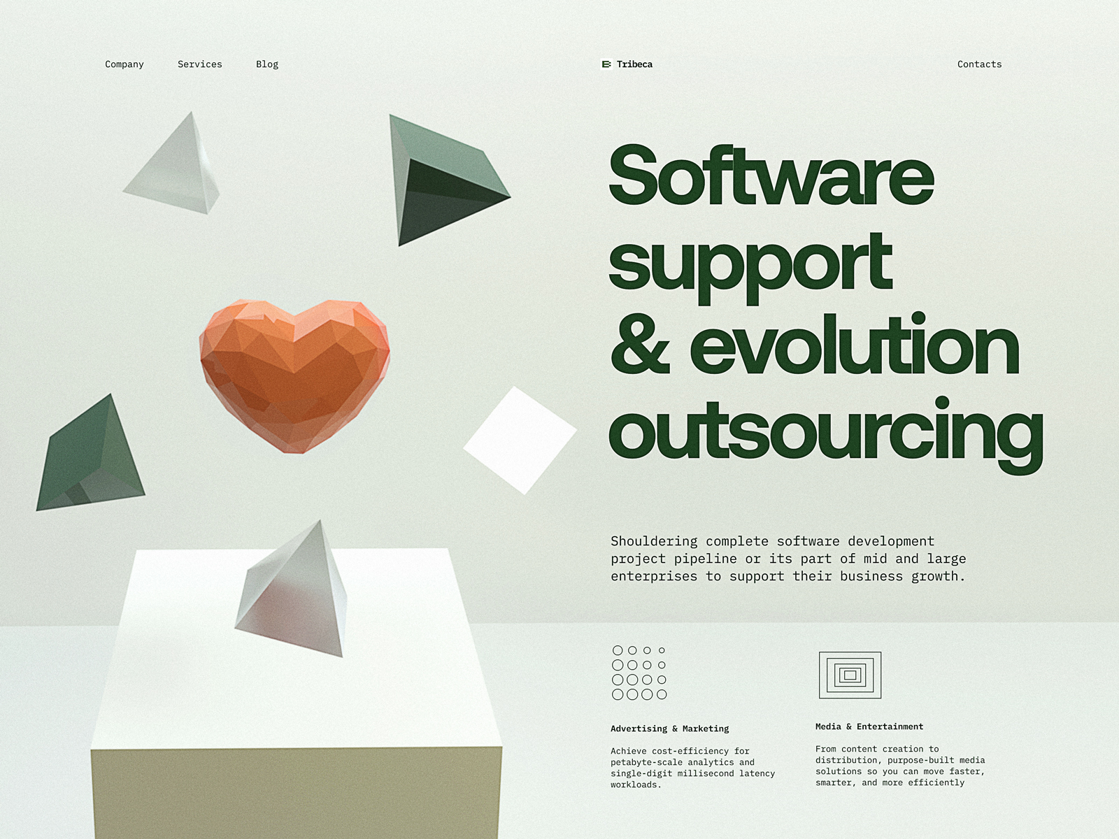
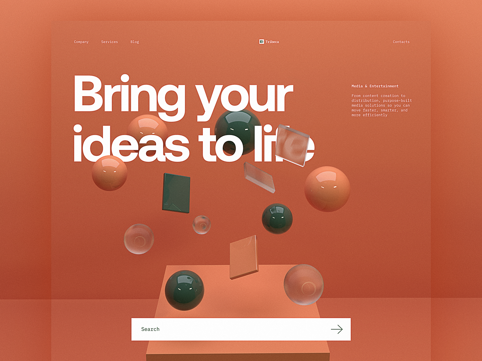
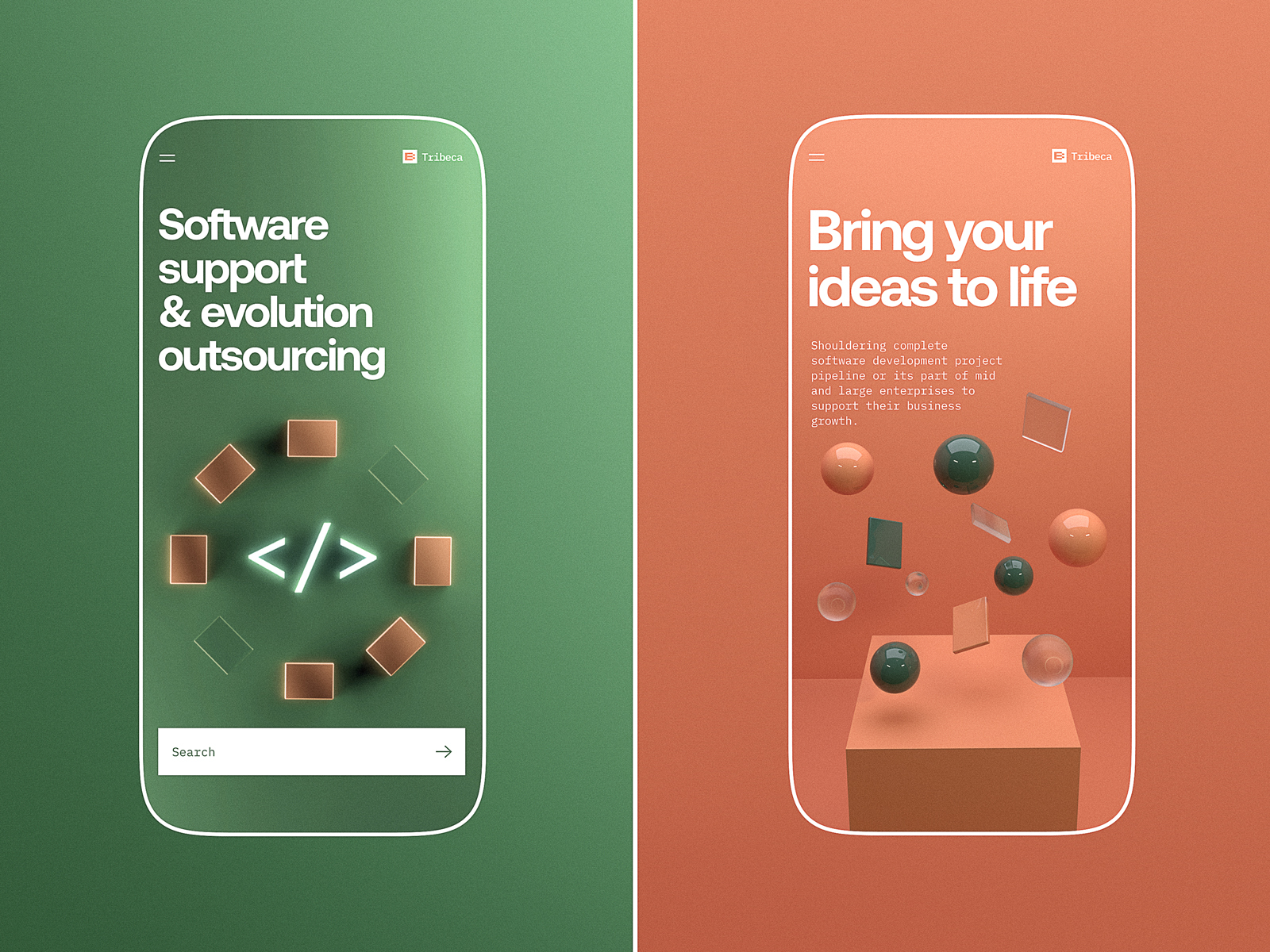
15. Software Development Company Website
This SaaS website design avoids the usual “blue gradient + rocket icon” trap. Instead, we use abstract 3D renderings, rich green tones, modular layouts, and real-world copy. It doesn’t shout. It informs. With a visual hierarchy so clean, even the backend devs approve.
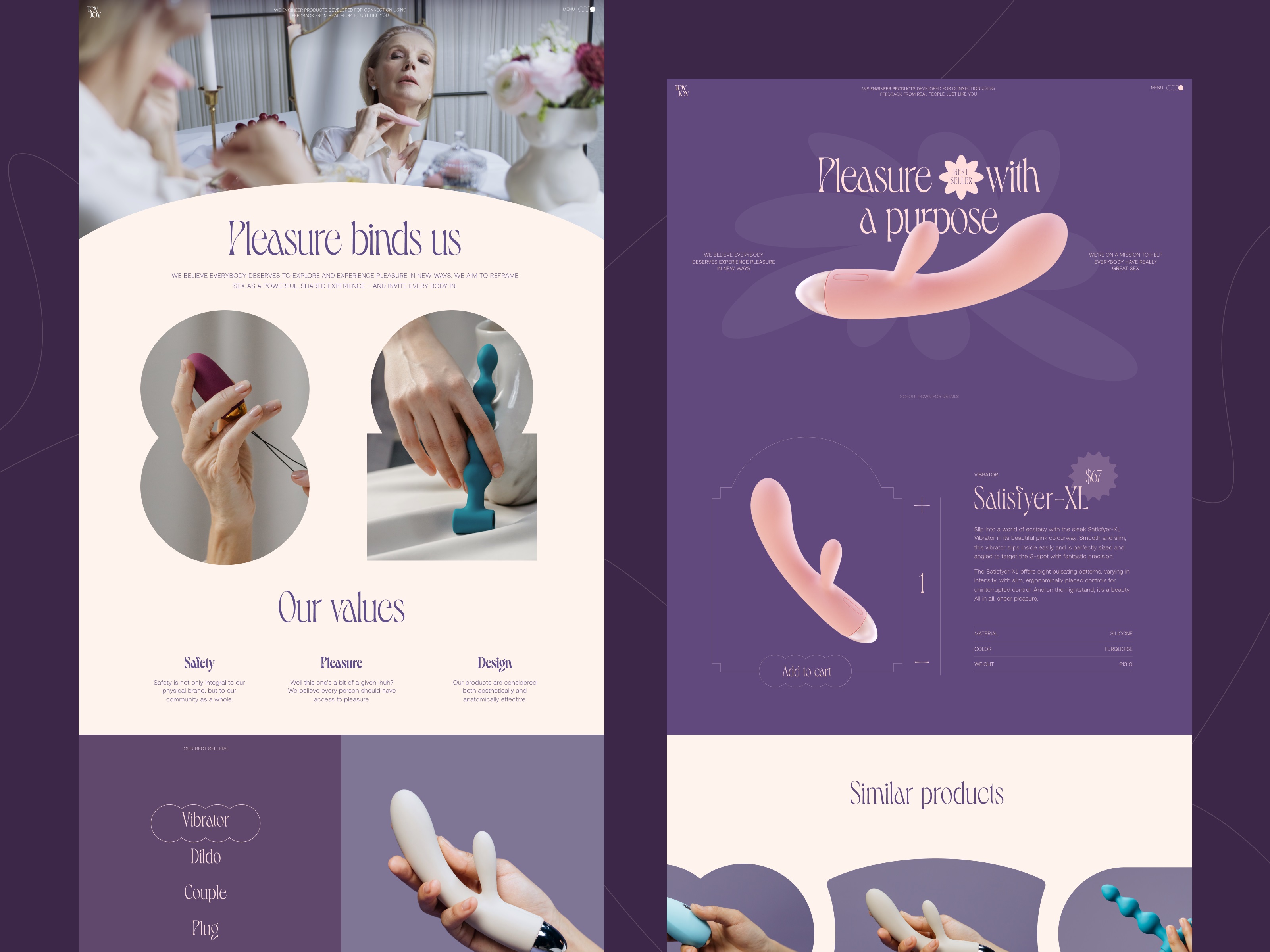
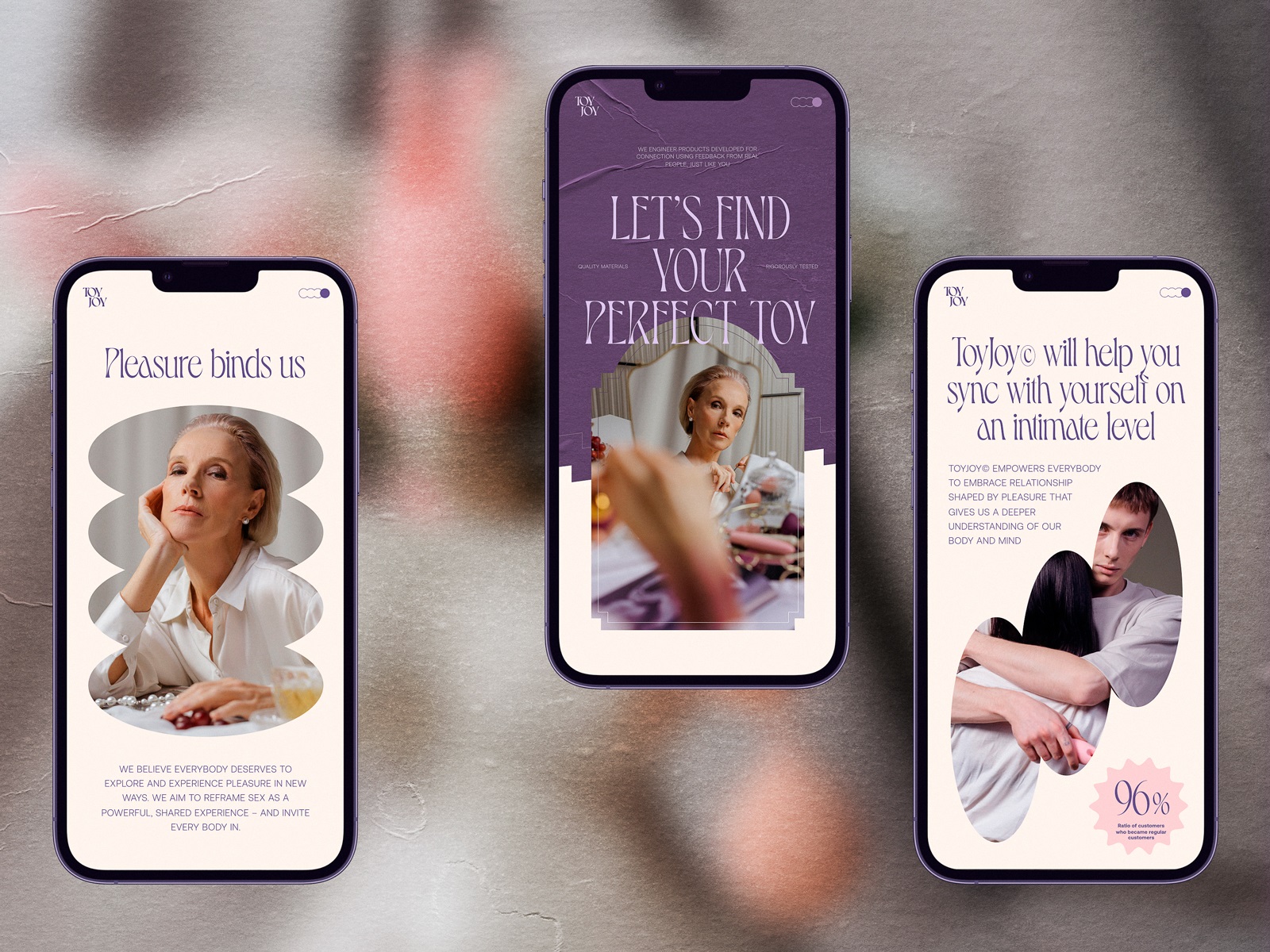
16. Adult Toys Website
Designing a bold e-commerce website for adults means ditching shame and aiming for elegance. We use dark purple tones, sleek transitions, and copy that respects the user’s intelligence. The vibe? Confident, not campy. Sexy, but classy.
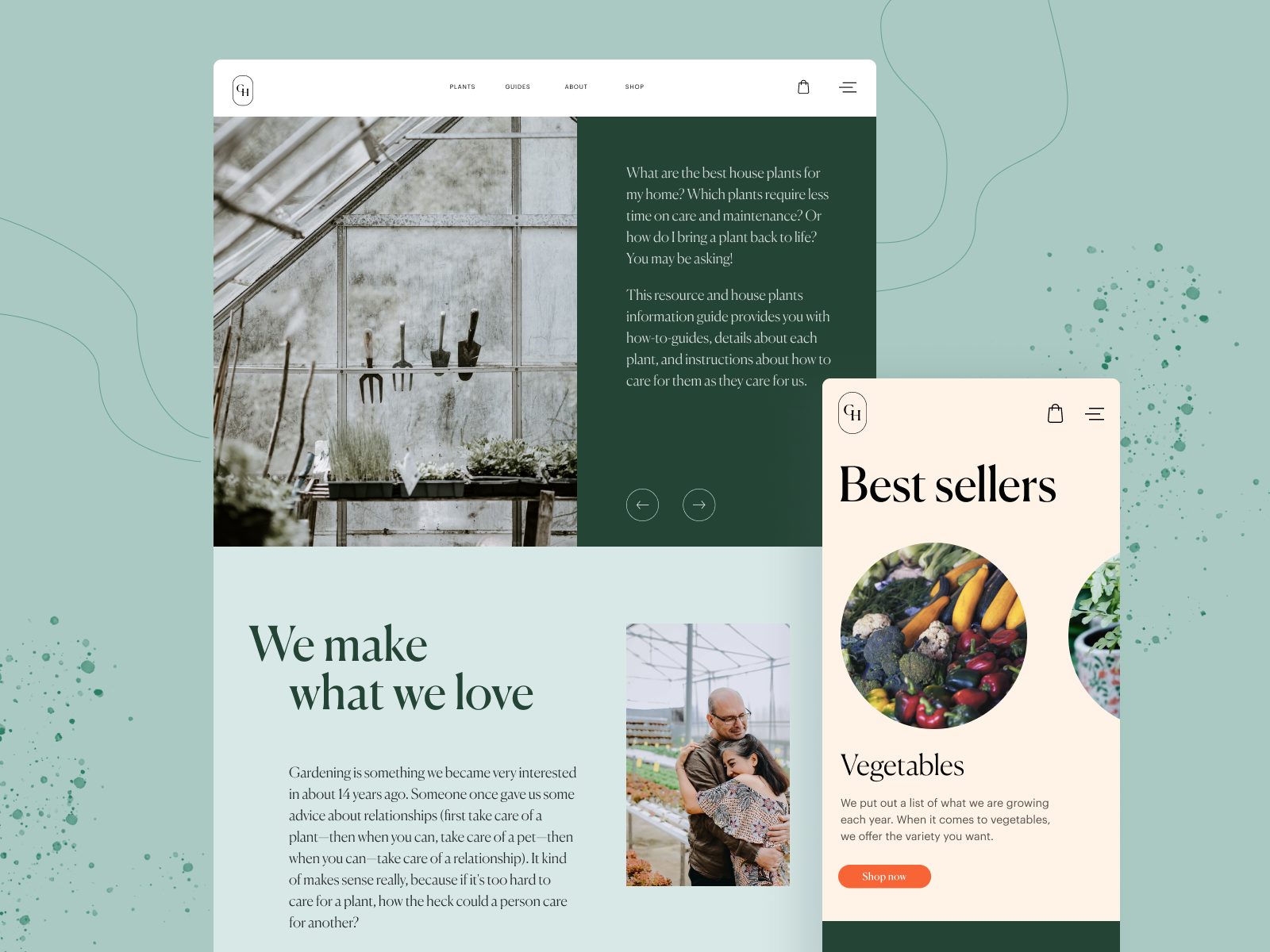
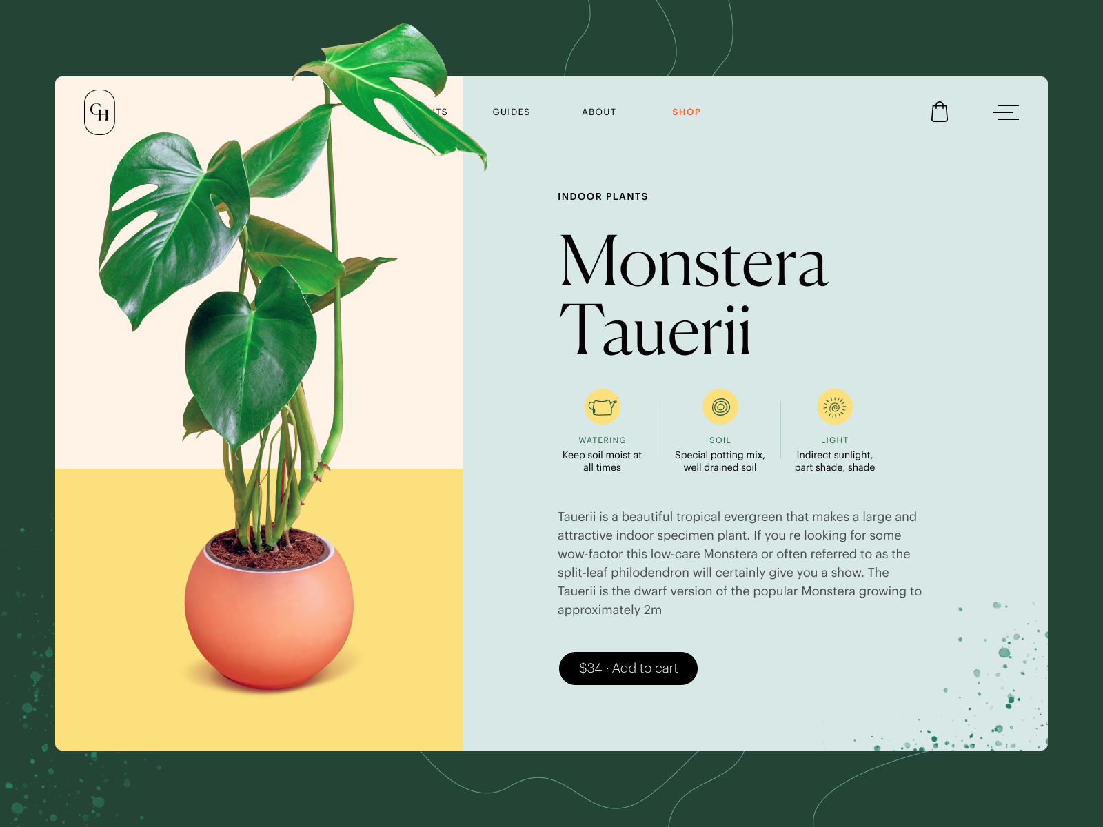
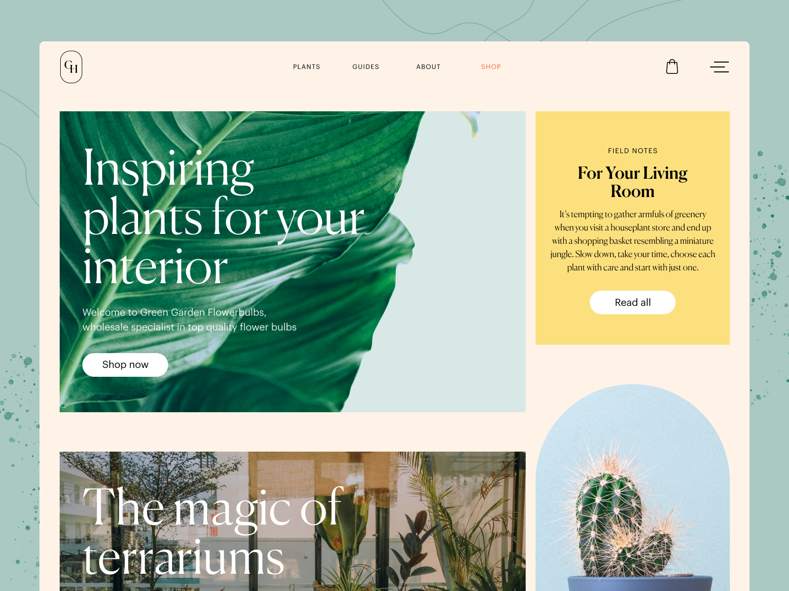
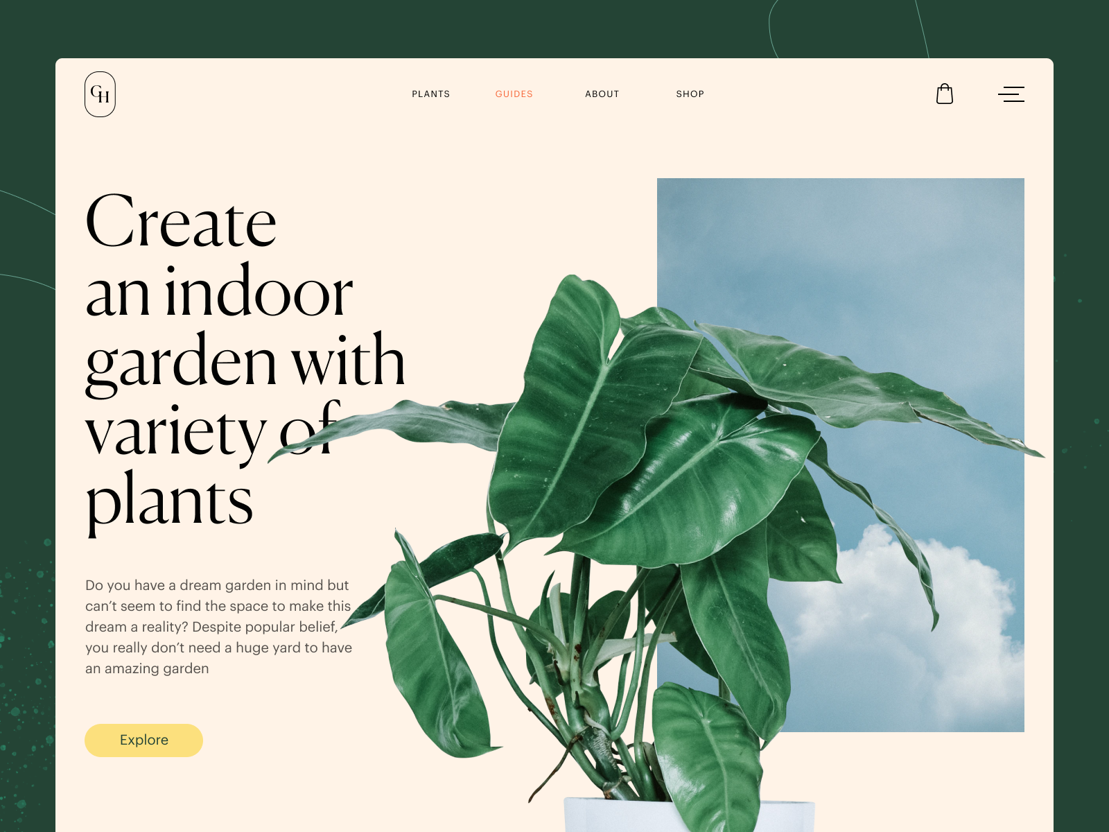
17. Gardening Company Website
Gardening sites usually scream “earthy,” but this greenhouse e-commerce website sings. Soft video loops, soothing typography, and scroll pace designed for calm browsing. Product categories feel like curated walks through the garden. You don’t even realize you’re shopping until you’re at checkout.
18. Winter Holidays Website
This travel booking website for winter holidays hits you with alpine visuals from the first frame. Video fades into search, maps fade into route planners. It’s a UX blanket with a booking engine inside, and you’ll leave wanting cocoa.
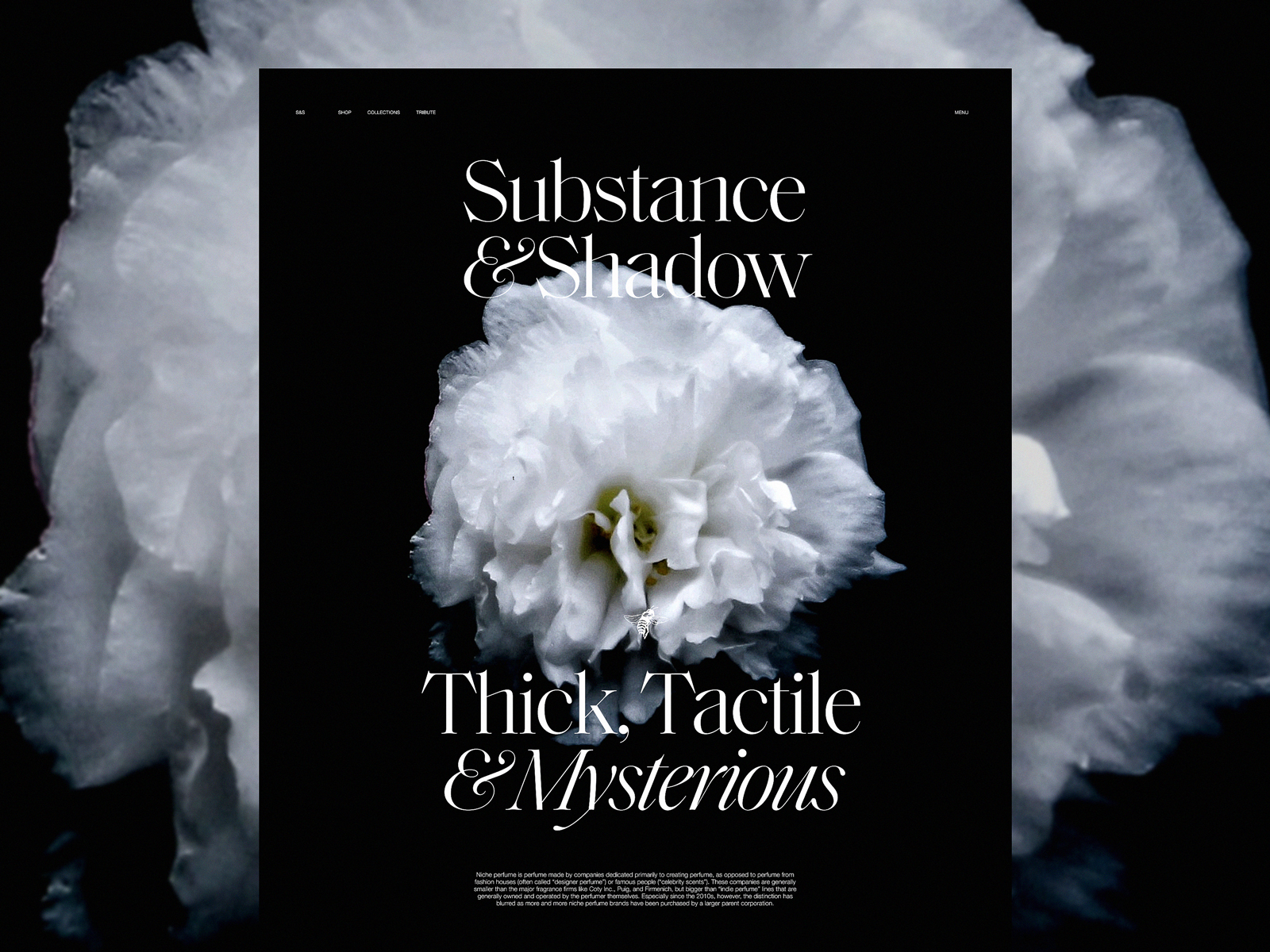
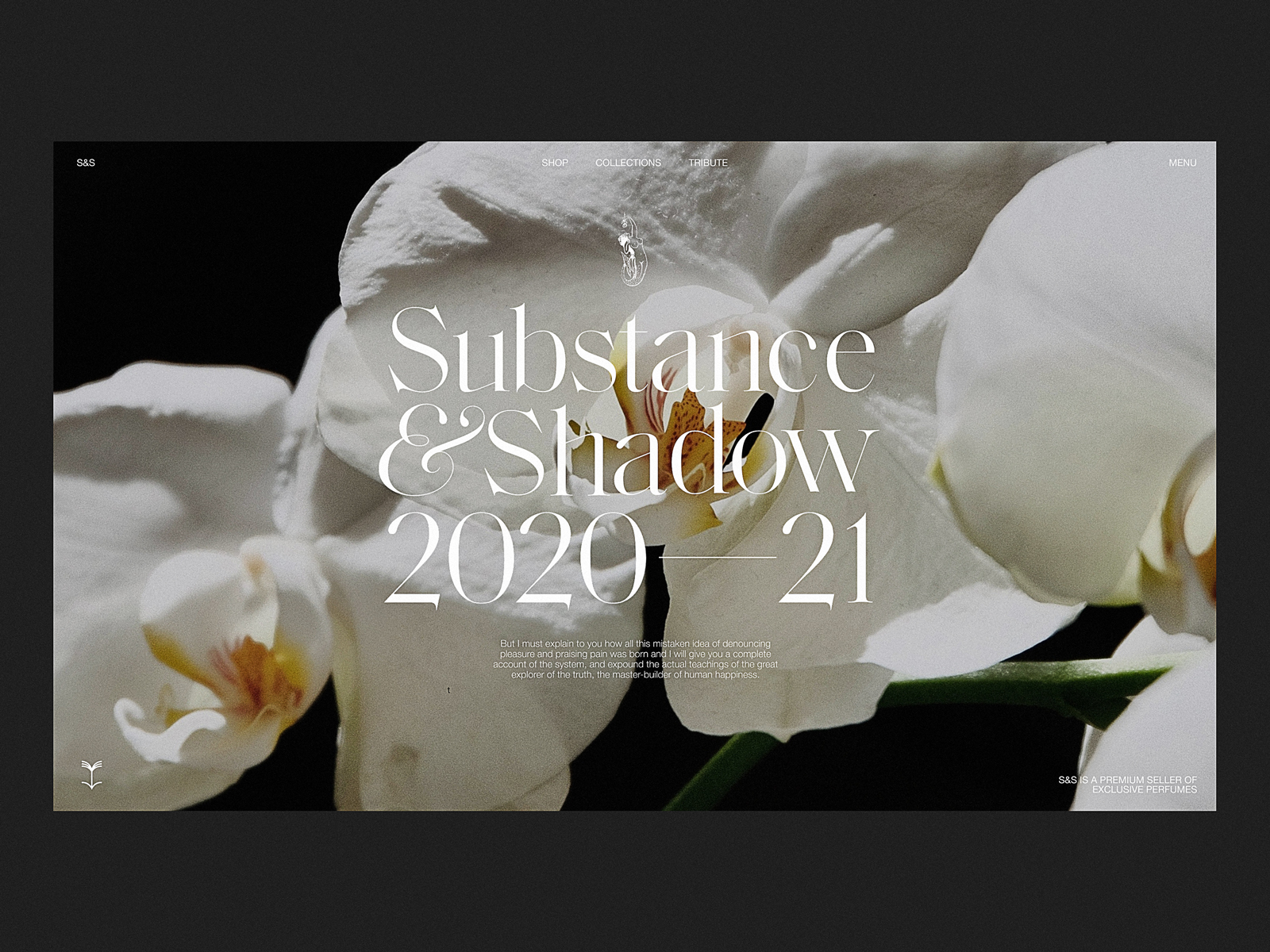
19. Niche Perfume E-commerce Website
Okay, it doesn’t actually smell. But the luxury e-commerce design here makes it feel like it could. Dark full-screen video, minimalist UI, ambient scroll. Product names drift in like vapor. You’re gonna want to light a candle after this one.
20. Juice Brand E-commerce Website
This juice product website is clean, bright, and full of fruit-forward personality. Scroll animations highlight each flavor, and bright visuals make the typography pop. It’s branded hydration in a scrollable form.
21. Clothing Brand Website
This apparel brand website treats fashion like infrastructure: graphic lines imitate thread, typography acts like scaffolding. Grids change with each collection drop. It’s not minimalist. It’s measured.
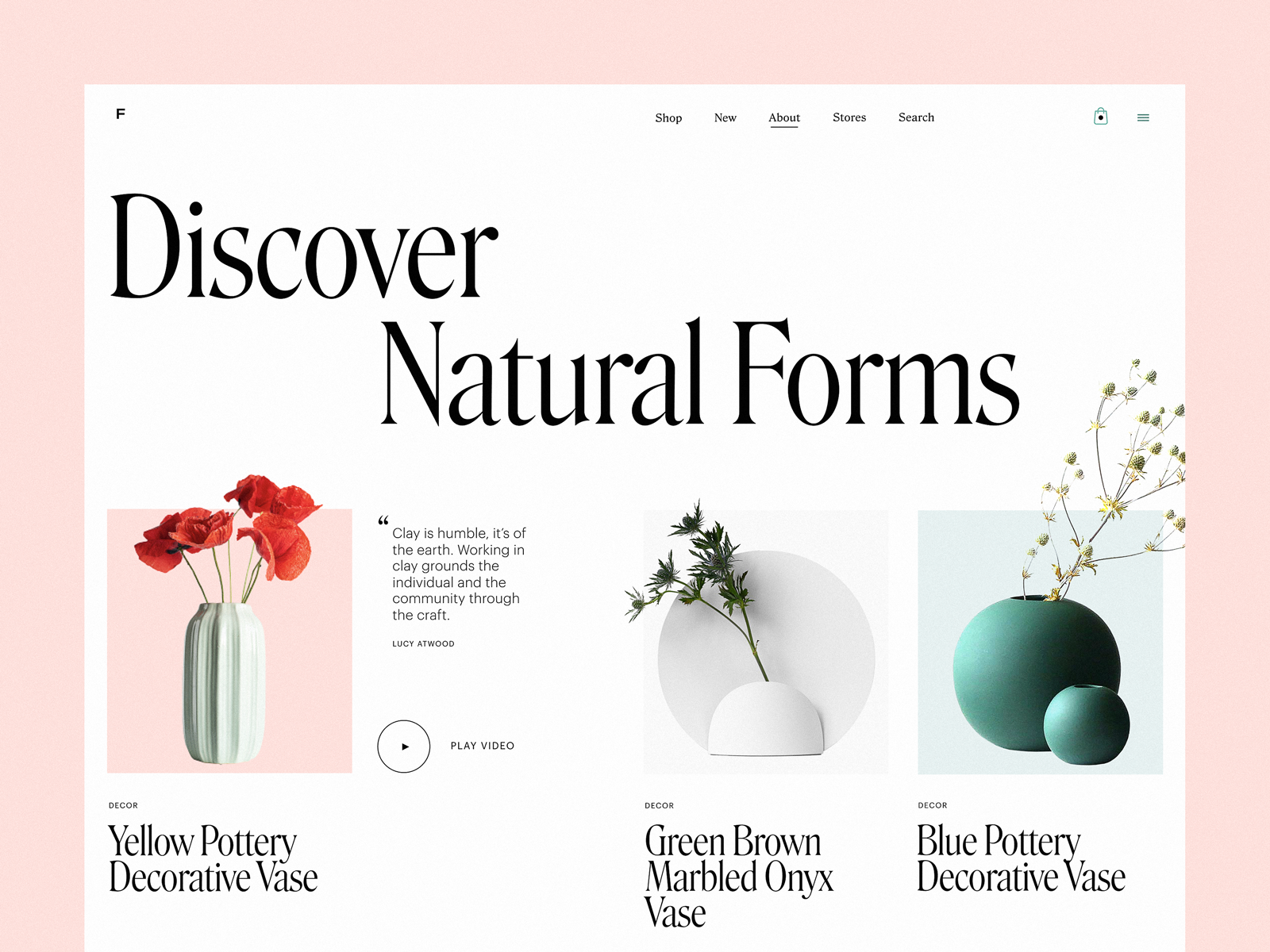
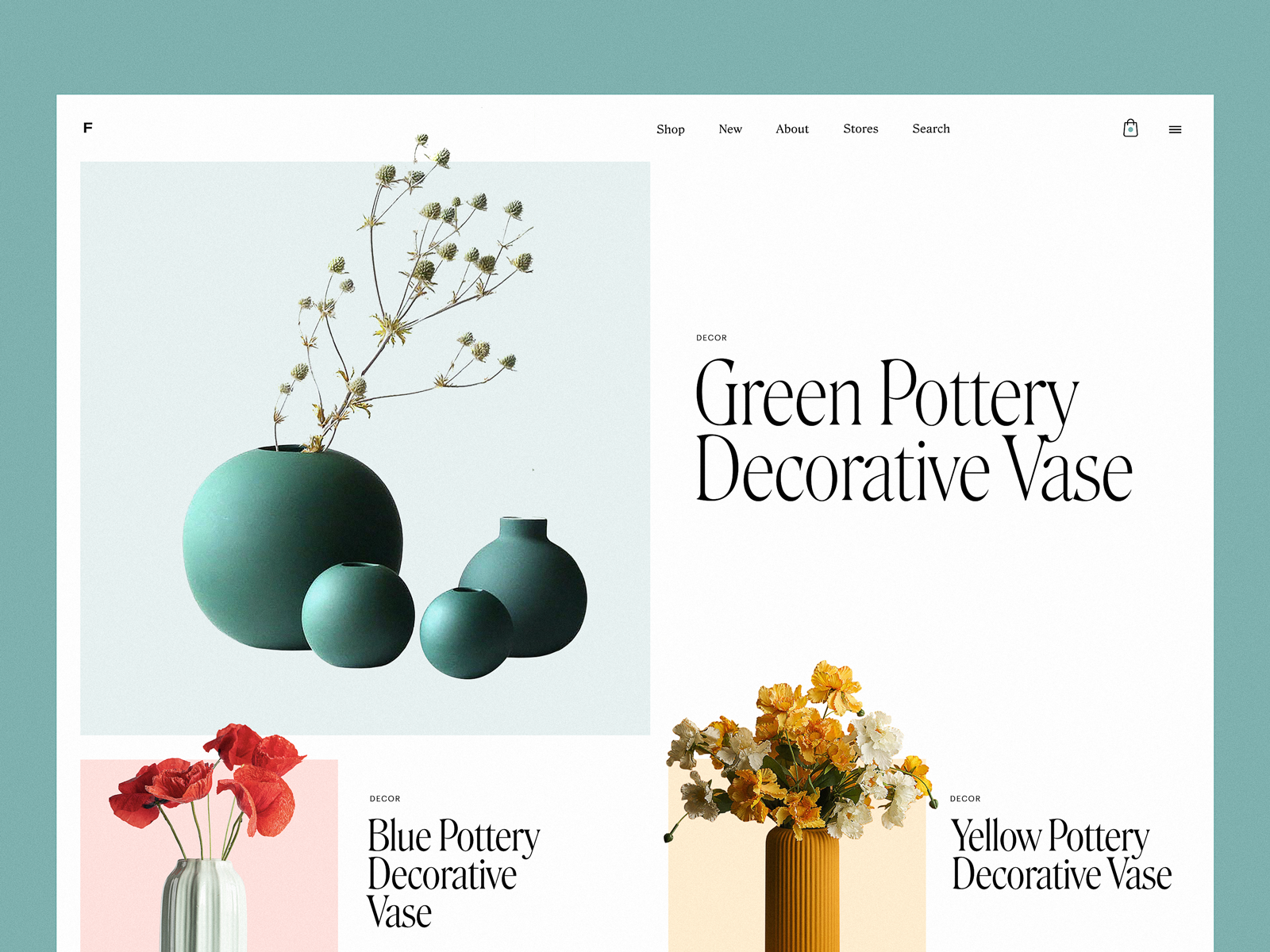
22. Interior Decor E-commerce Website
Functional minimalism done right in this interior accessories e-commerce site. The product is hero, but the grid layout makes it breathe. Photos are styled, not stocky. Fonts are soft but structured. Even the CTAs are aesthetic.
23. Cleaning Company Website
You wouldn’t expect it, but this cleaning service website with animation made our team weirdly proud. The hero animation transforms chaos into clarity—literally. Warm colors add a sense of comfort. Motion effects tell the story without needing a single buzzword.
Final Word
Design isn’t decoration. It’s strategy. Sometimes you need high-converting UI design for e-commerce. Other times, it’s about creative storytelling for niche products. The sweet spot is when both happen at once—and we aim for that every time.
Every project above started with a simple question: what’s the real job of this website? Once we know that, the design speaks.
So next time someone says “it’s just a landing page,” send them this link.
Recommended Reading
Still scrolling? Good. Here are a few more articles worth opening in the next tab:
Mobile Design: 14 Stylish and User-Friendly App Design Concepts
Design for Sales: 10 Creative UI Designs for Ecommerce
Save the Planet: Web Designs on Environment and Ecological Issues
Steal the Show: Creative Web Design for Diverse Events
Web Design: 26 Examples of Creative Landing Pages
UI in Volume: 3D Graphics in Creative UI Design Concepts
Logofolio: 16 Logo Designs for Different Business Goals