Some mornings, it’s less “pixels and perfection,” more “coffee on the keyboard and Figma refusing to sync.” But somehow, in between Slack chaos and last-minute client tweaks, the magic happens. Or at least the part that looks like magic—clean, intuitive, emotionally intelligent user interface design that works just as hard as the people behind it.
We’ve pulled together 10 of those moments. Real projects. Real users. And some really beautiful outcomes. You’ll see everything from e-commerce UI to AR social network apps, fitness platforms to educational UX. Some are punchy, some poetic. All are doing the hard, invisible work of solving for both user goals and business needs without looking like they tried too hard. (Which is the whole point, right?)
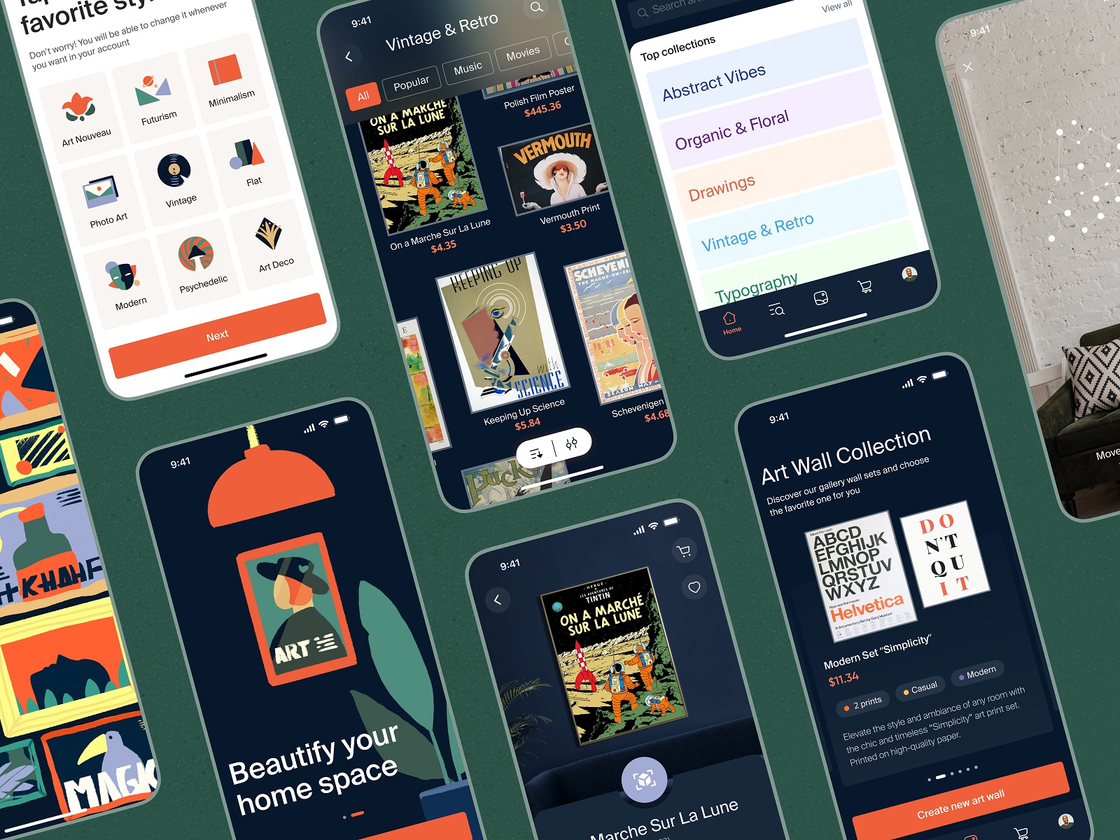
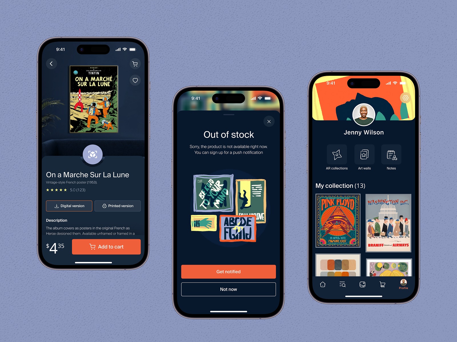
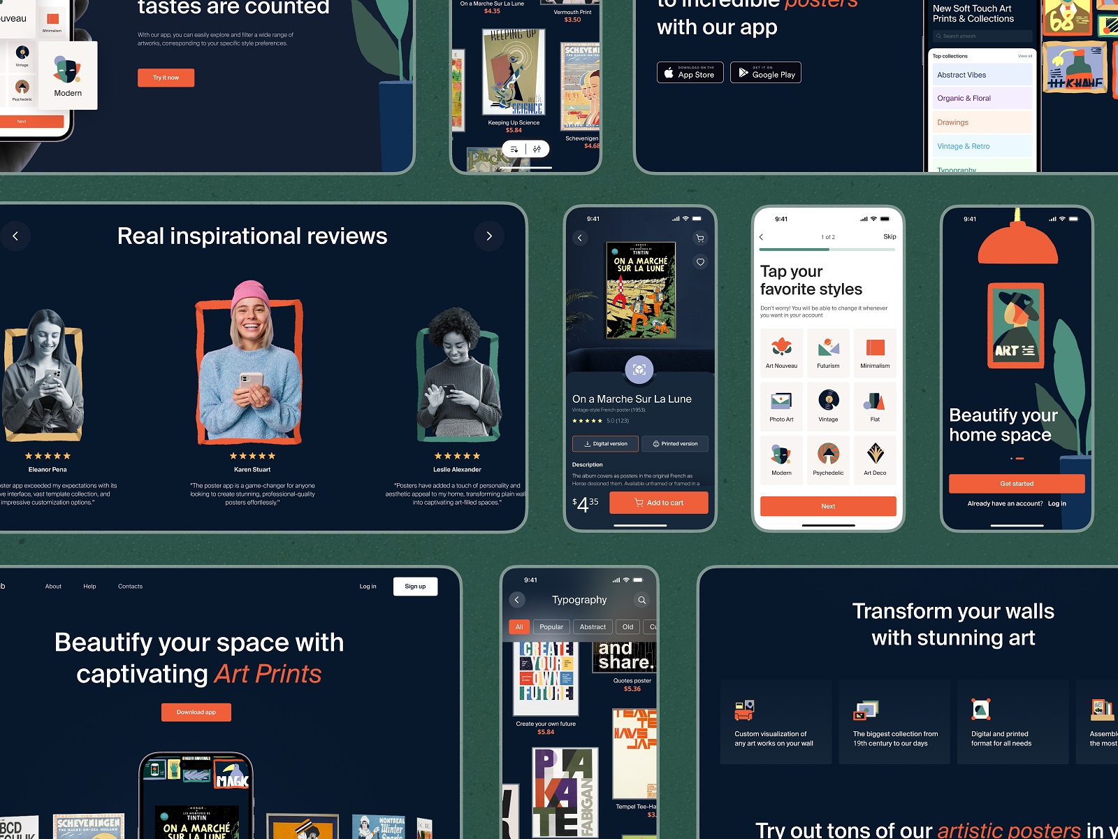
1. Poster Store App: Scroll, Tap, Try It on Your Wall
You know that moment when you see a poster online, love it instantly, and then remember your apartment has weird lighting and an inexplicably pink wall?
This e-commerce app UI design leans into that problem. It lets you try the art on, virtually. The product page doesn’t waste time—big visuals, high contrast, swipeable layouts. Dark mode UI isn’t new, but here it’s more than aesthetic—it’s practical. The posters shine, the text reads smooth, and the vibe feels moody in the best way.
There’s also a landing page, animated like a well-paced trailer. It doesn’t sell prints. It sells possibility. And that’s half the battle.
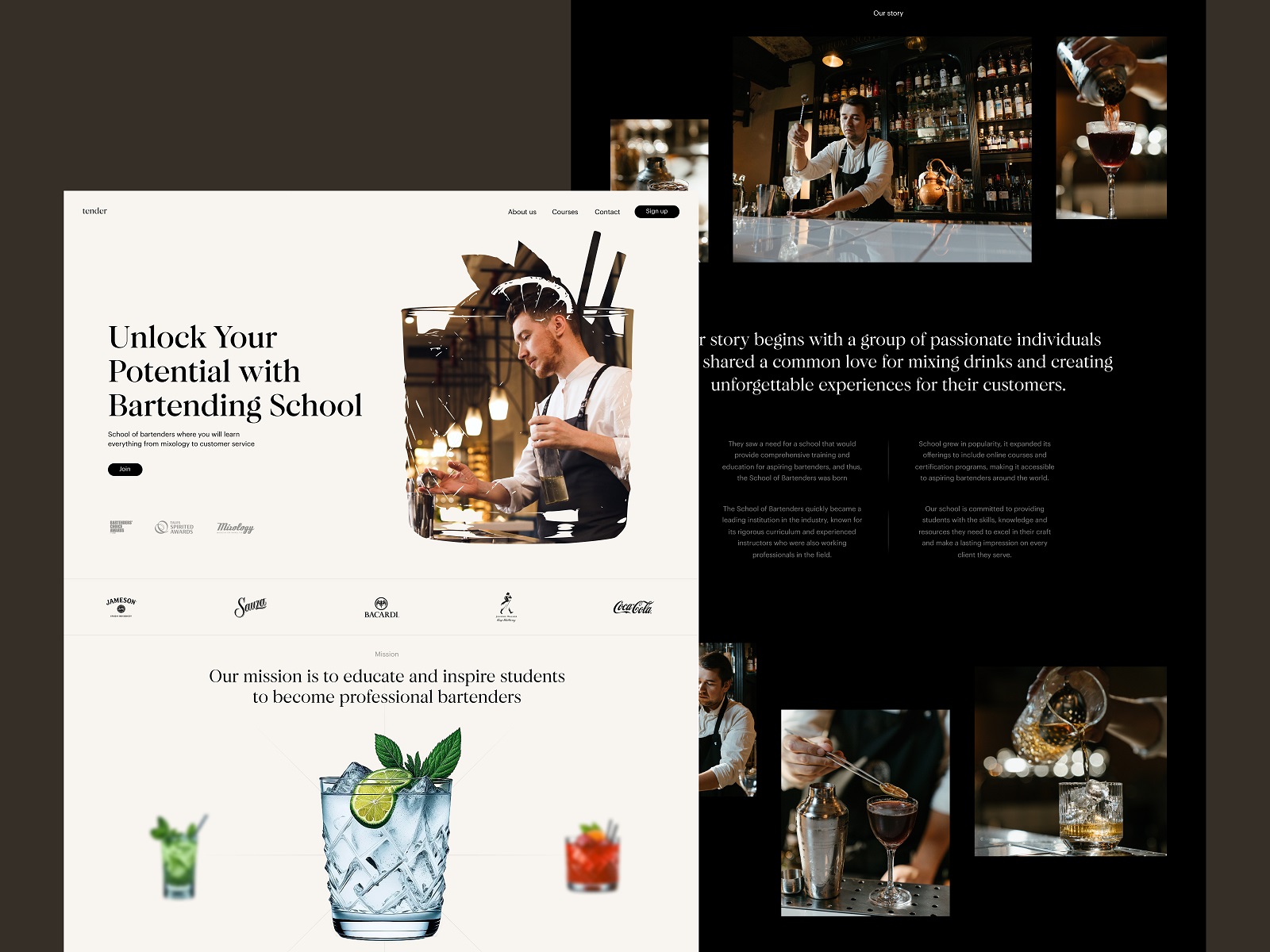
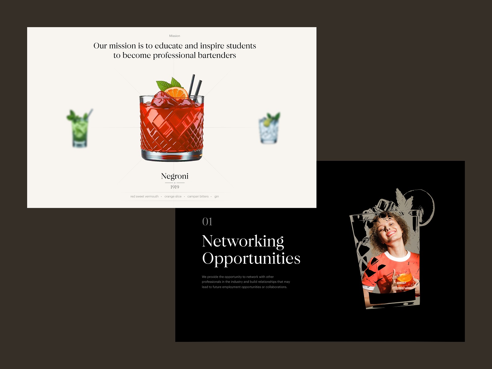
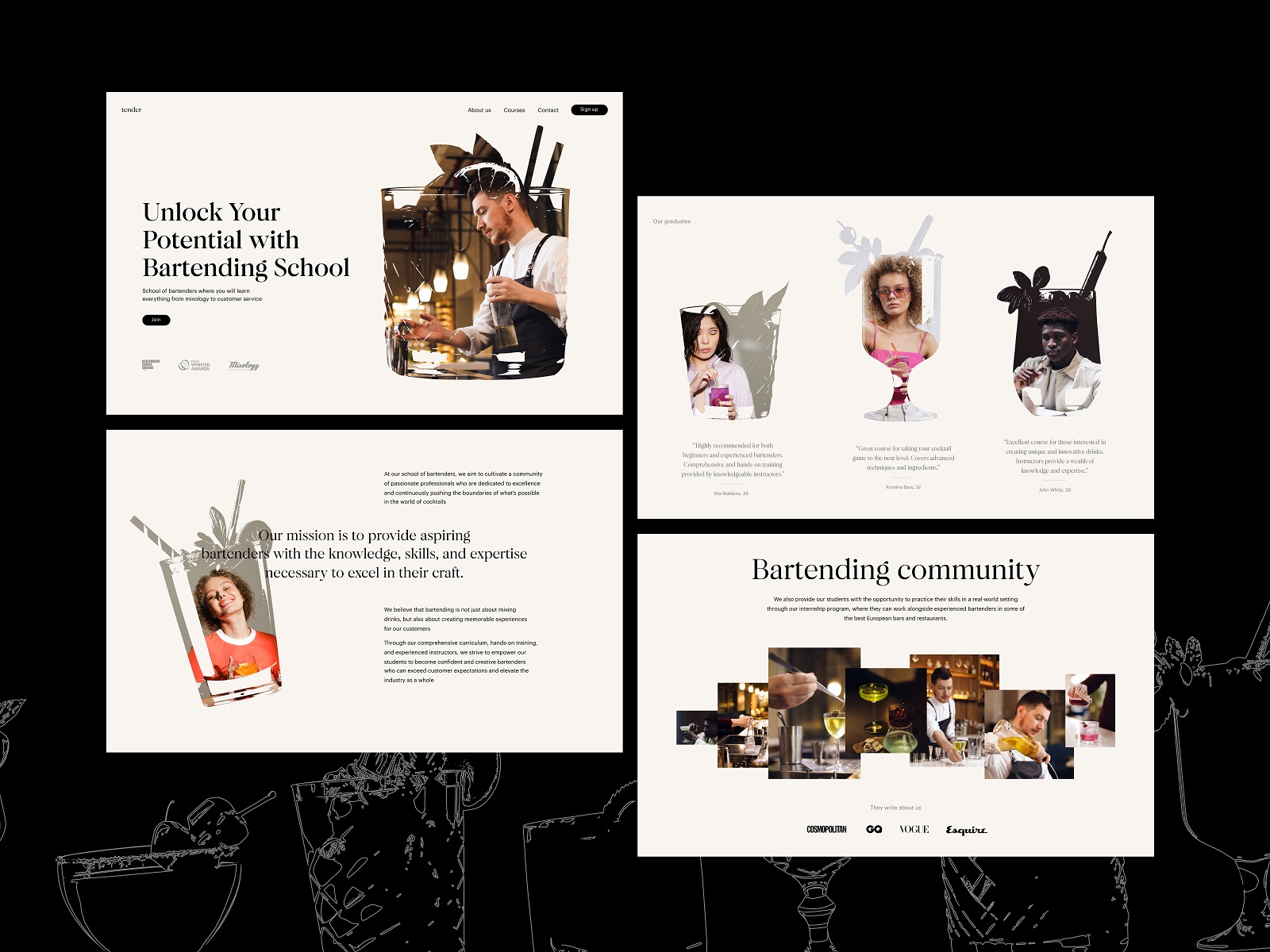
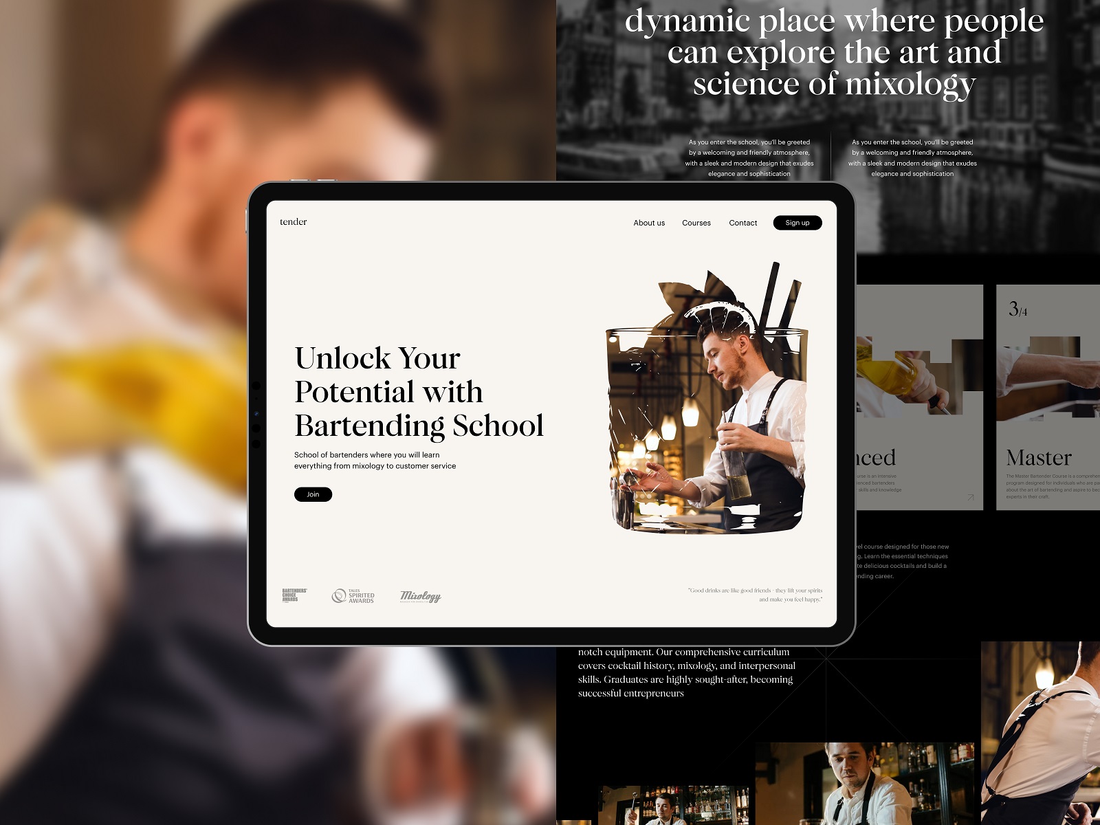
2. Bartending School Website: Type. Glass. Motion.
This one made us thirsty. Not just because of the cocktails, but because of the discipline in the layout. Strong typographic hierarchy, calm white space, and custom glass-shaped mask transitions that feel cheeky without being kitsch. This is UX design with personality—playful, but not drunk on itself.
The motion is subtle, but you feel it. You scroll slower. You stay longer. The call-to-action doesn’t shout. It nudges. Like a good bartender.
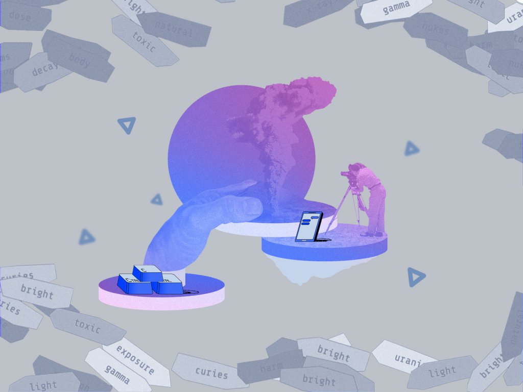
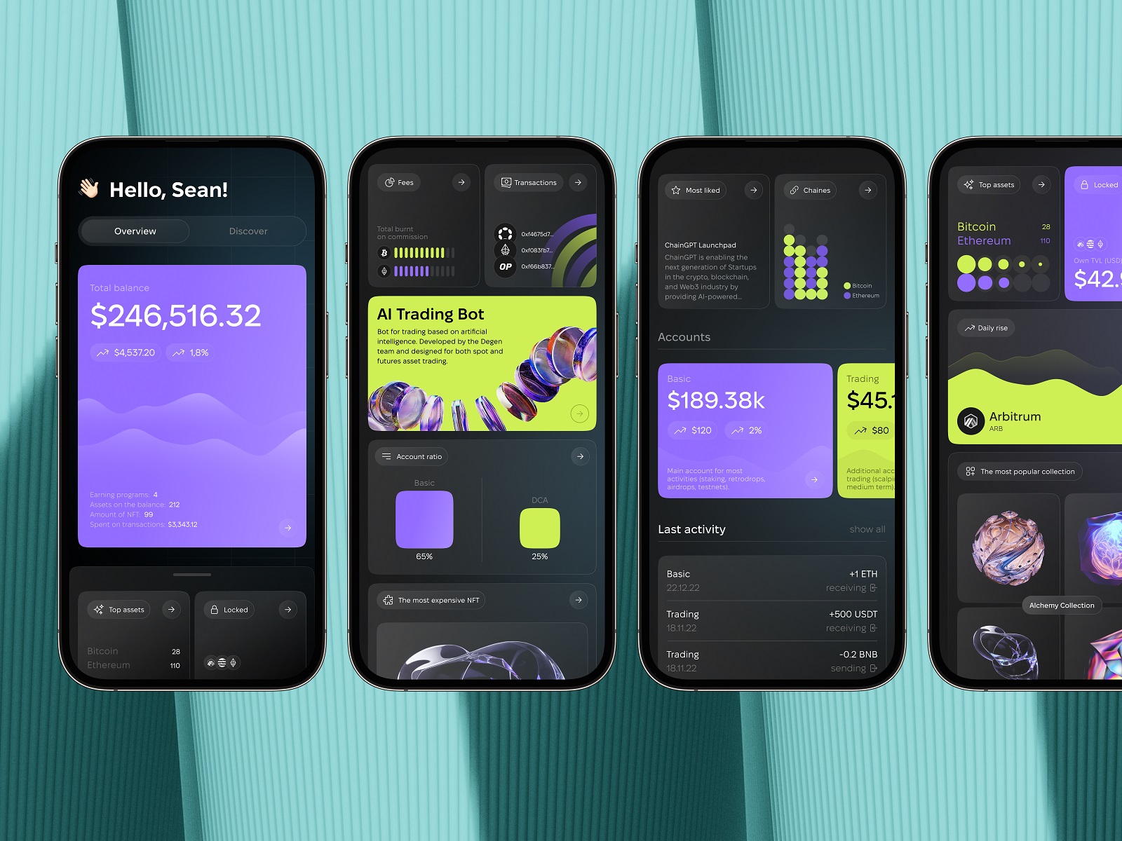
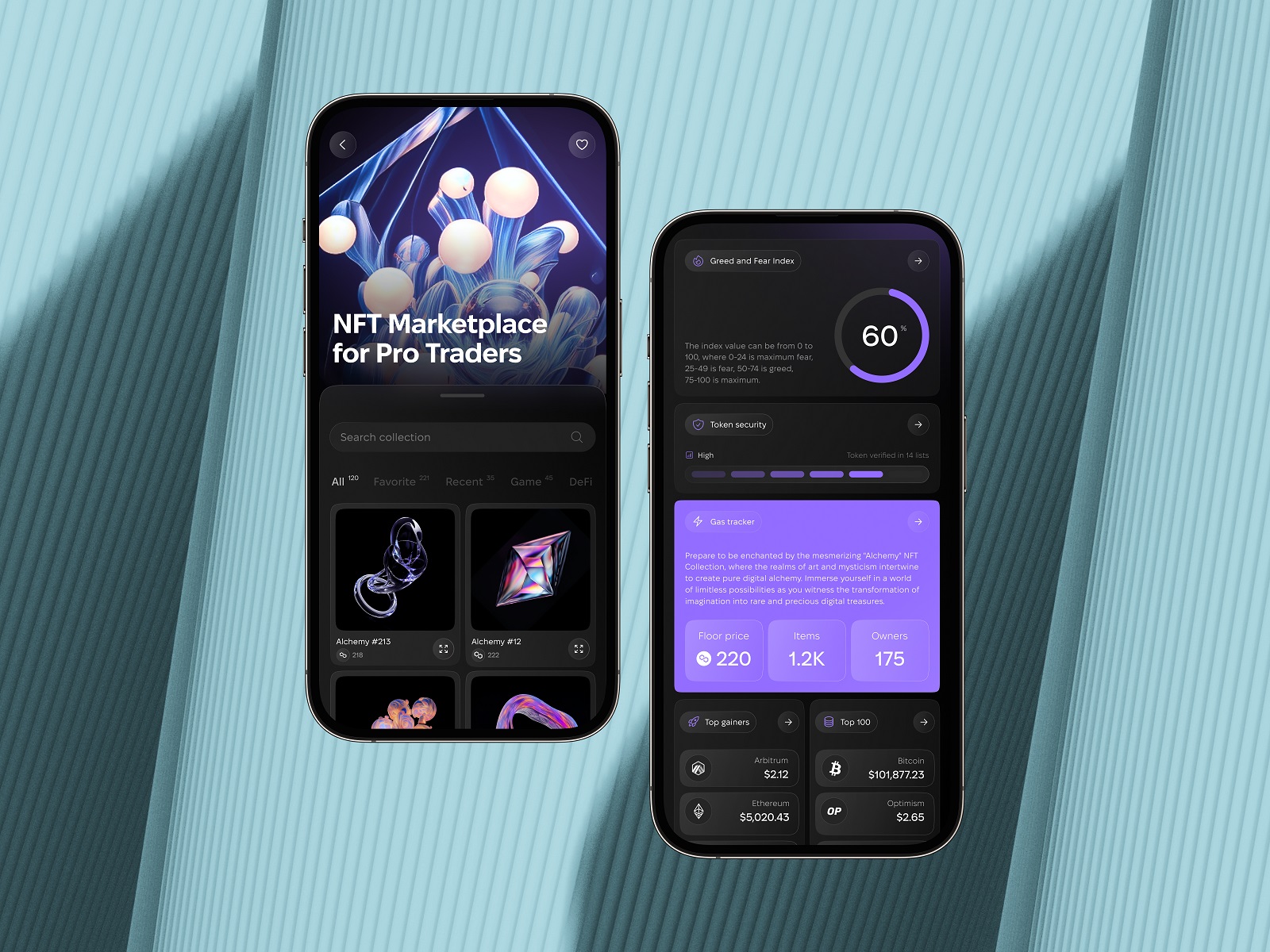
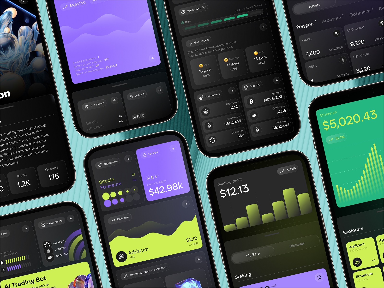
3. Crypto App: Data, But Make It Digestible
Crypto apps have a reputation: graphs that look like a heart monitor, color schemes straight out of a 90s rave, and copy that reads like someone fed ChatGPT the Bitcoin subreddit.
This one, however, is surprisingly calm.
It simplifies the chaos. Big buttons. Simple onboarding. Microinteractions that feel thoughtful, not gimmicky. And a visual rhythm that says: “Hey, we know you’re scared. Let’s make this easy.”
In a world of financial UX that often feels like solving a Rubik’s Cube blindfolded, this one is a palate cleanser.
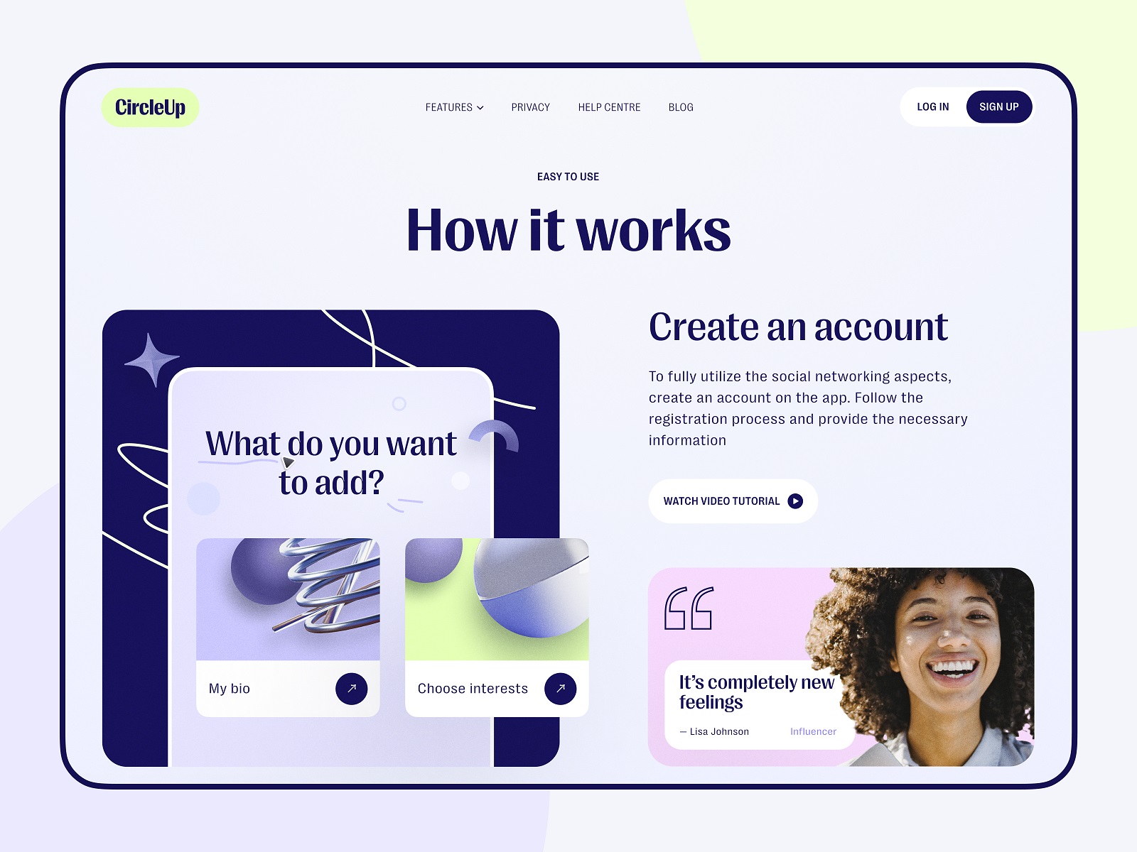
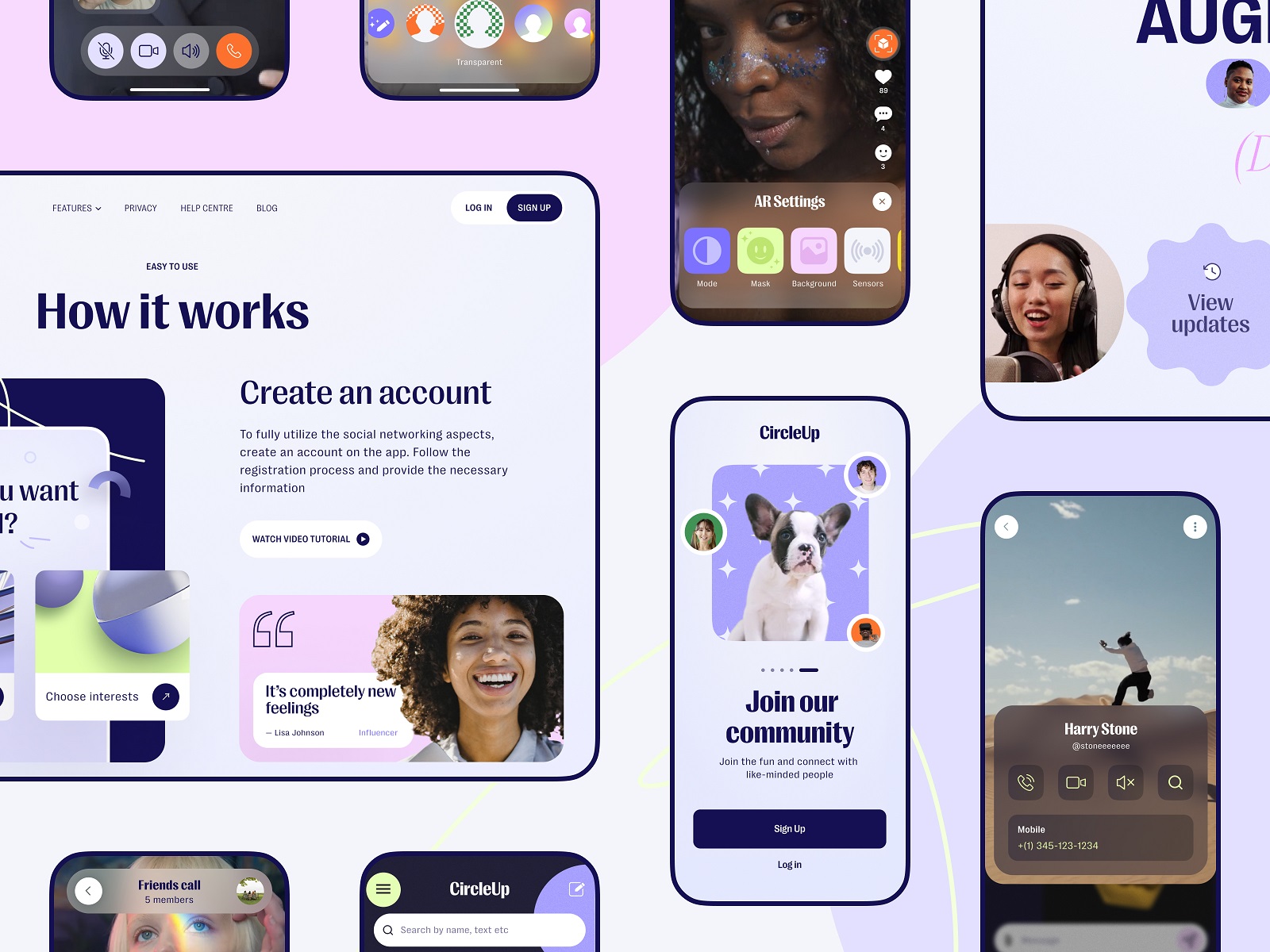
4. AR Social Network: IRL Meets UI
We’re skeptical of anything that sounds like “next-gen social.” But here’s what worked: it didn’t reinvent everything. It borrowed known patterns (chat bubbles, DMs, swipe cards) and layered them with AR triggers and camera-based interactions in ways that made sense.
The mobile UI design is color-rich without being loud, and the landing page mirrors the app logic. So when you scroll the site, you get a taste of what the app feels like. Not what it promises. That distinction? Underrated.
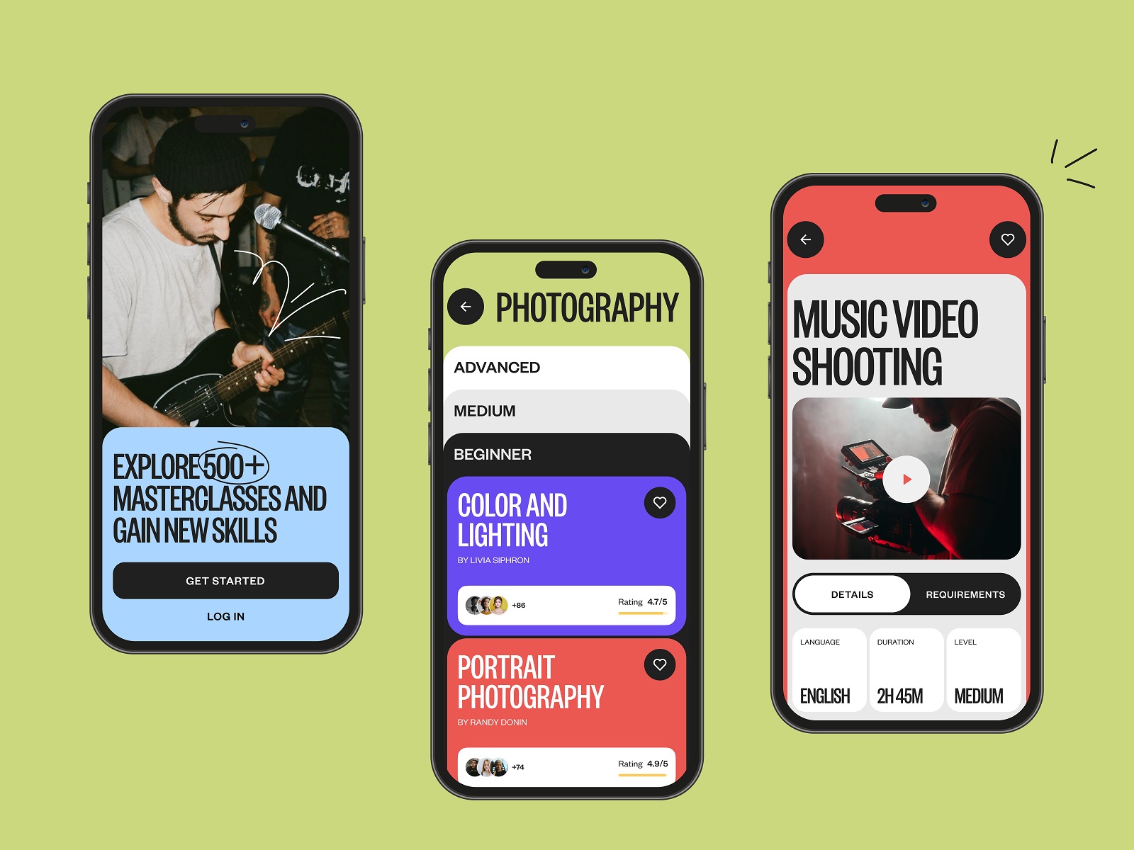
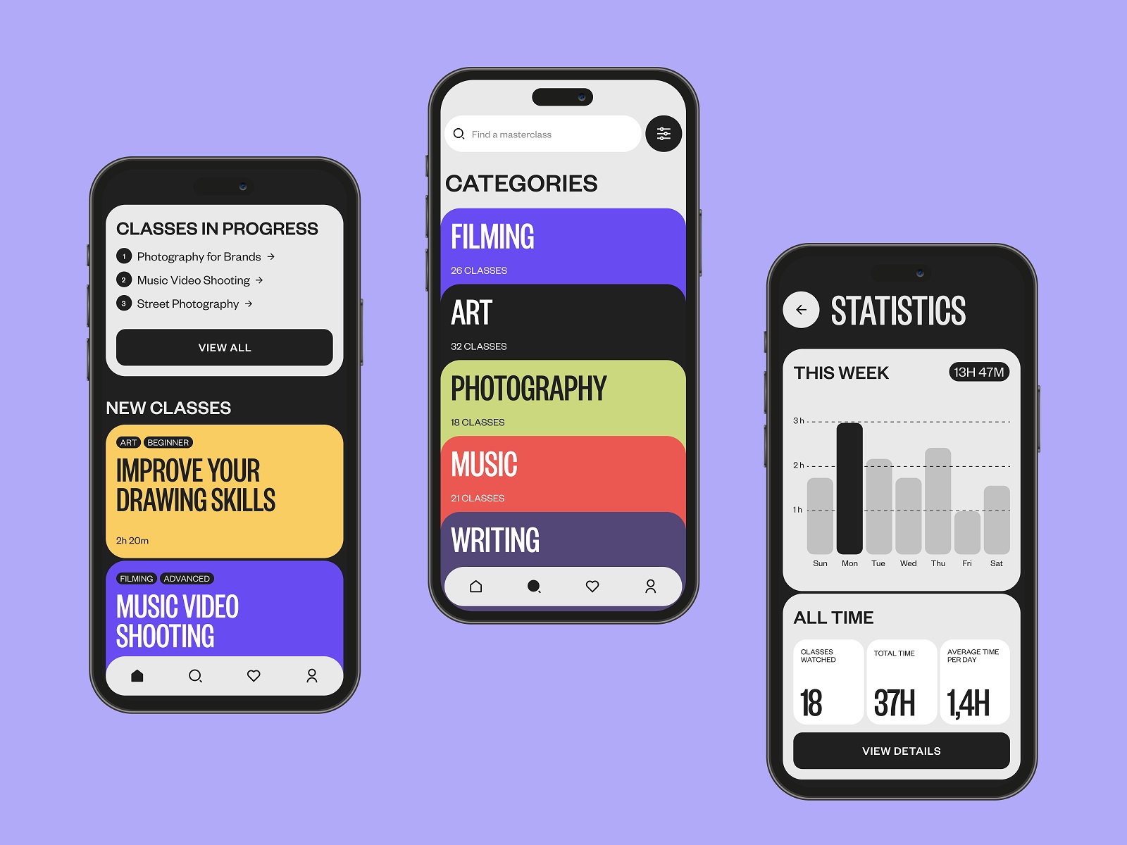
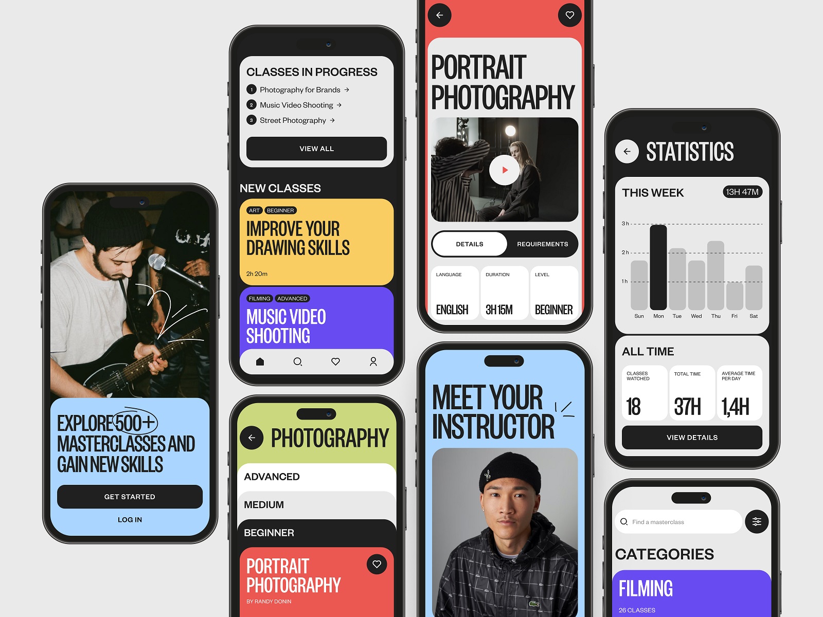
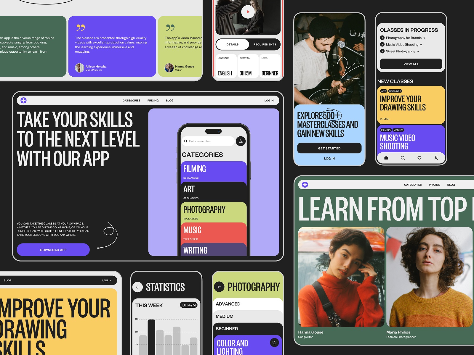
5. Masterclasses Platform: Netflix, but Nerdy
Some platforms teach you how to code. Some teach you how to bake. This one teaches you everything—and somehow avoids looking like a PowerPoint deck.
We loved how the UX layout leans into modularity: cards for categories, horizontal scroll for tracks, and video previews that load like they know you’re impatient. The mobile app interface is designed for mid-commute inspiration—watch a lesson, save a snippet, jump back in later.
Educational UI often over-explains. This one assumes you’re smart and skips the hand-holding. Bold move. We respect it.
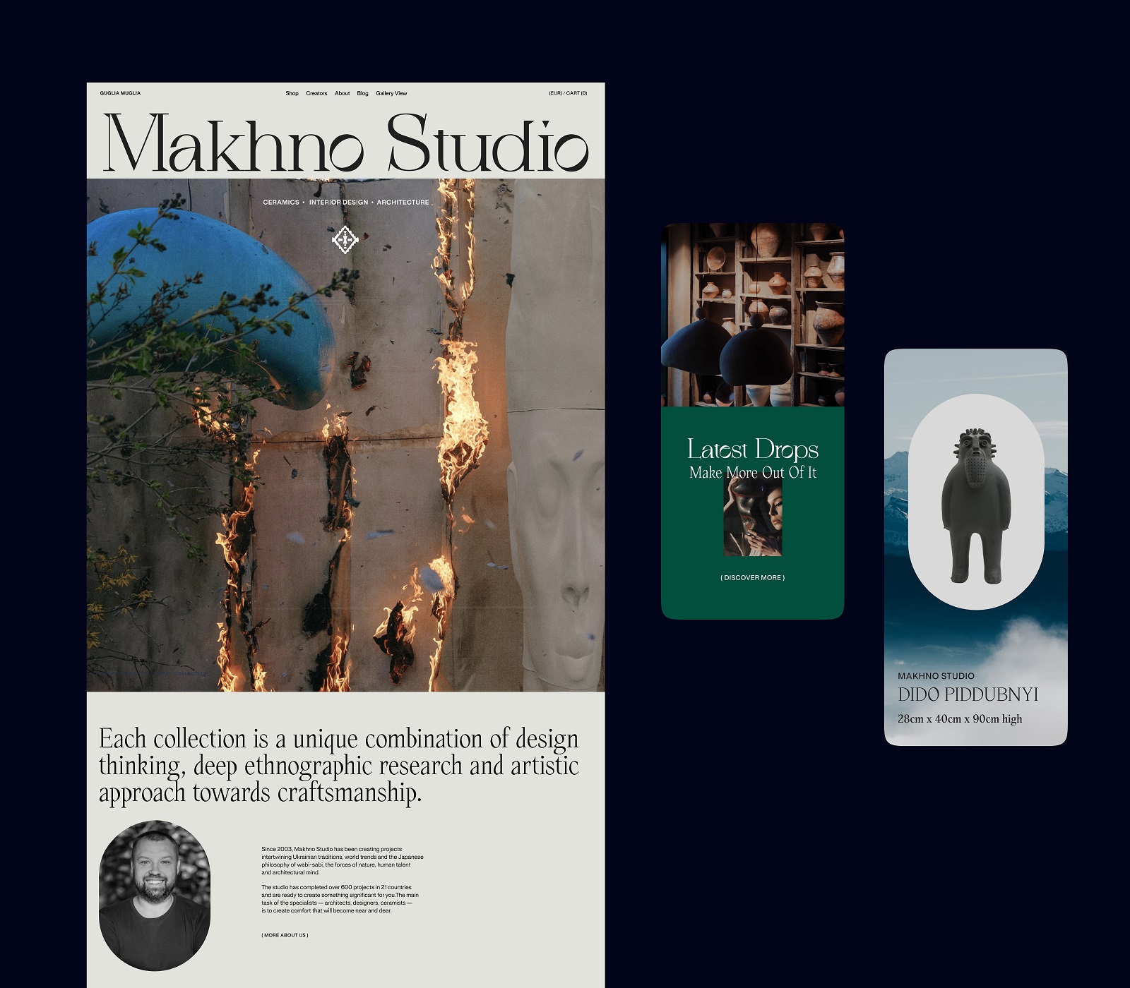
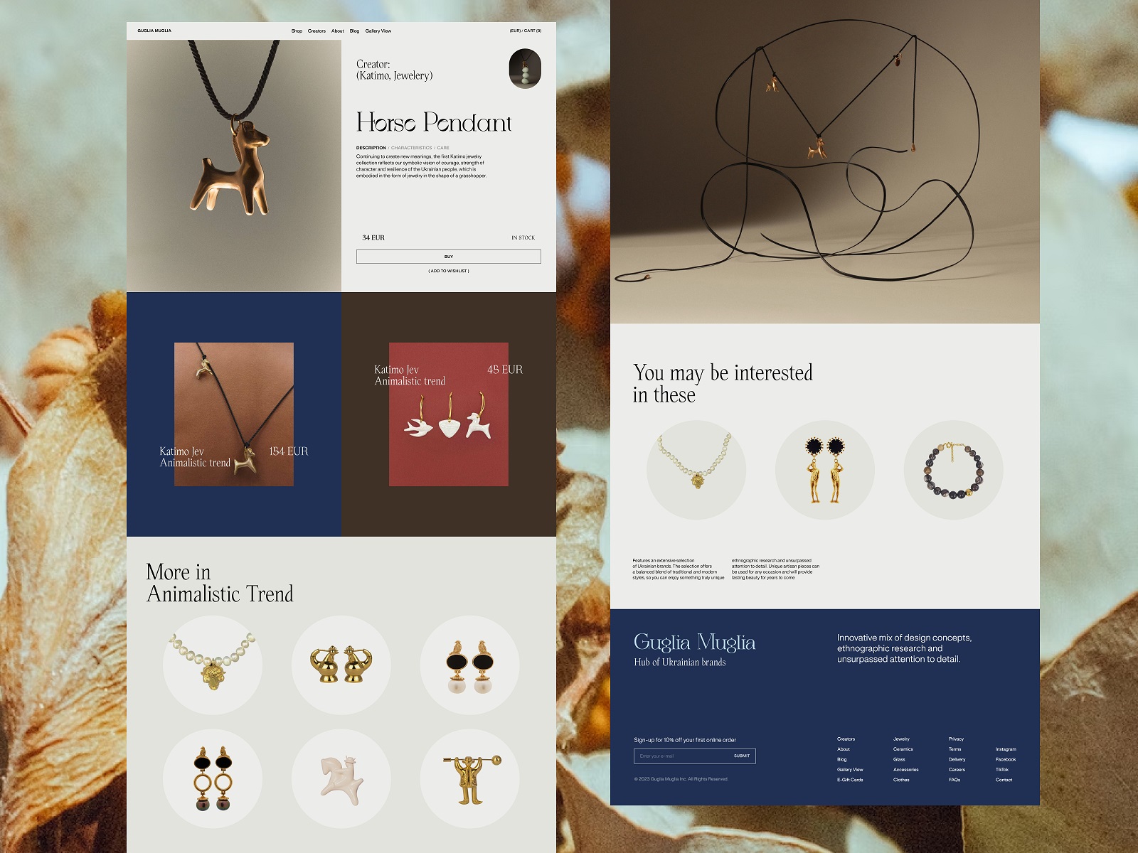
6. Fashion Marketplace: Bold, Local, Scroll-Stopping
The color schemes are sharp. The layouts are asymmetrical in a way that feels editorial, not broken. This fashion marketplace champions Ukrainian designers—and you can tell. Each product page feels like a portfolio piece. Think: less Amazon, more digital showroom. The UI design choices here (sharp lines, overlapping type, minimalist color palettes) echo the craftsmanship of the clothes themselves.
And there’s heart: every brand—from Gunia to Katimo—gets space to speak, not just sell. E-commerce UX done with cultural care and style.
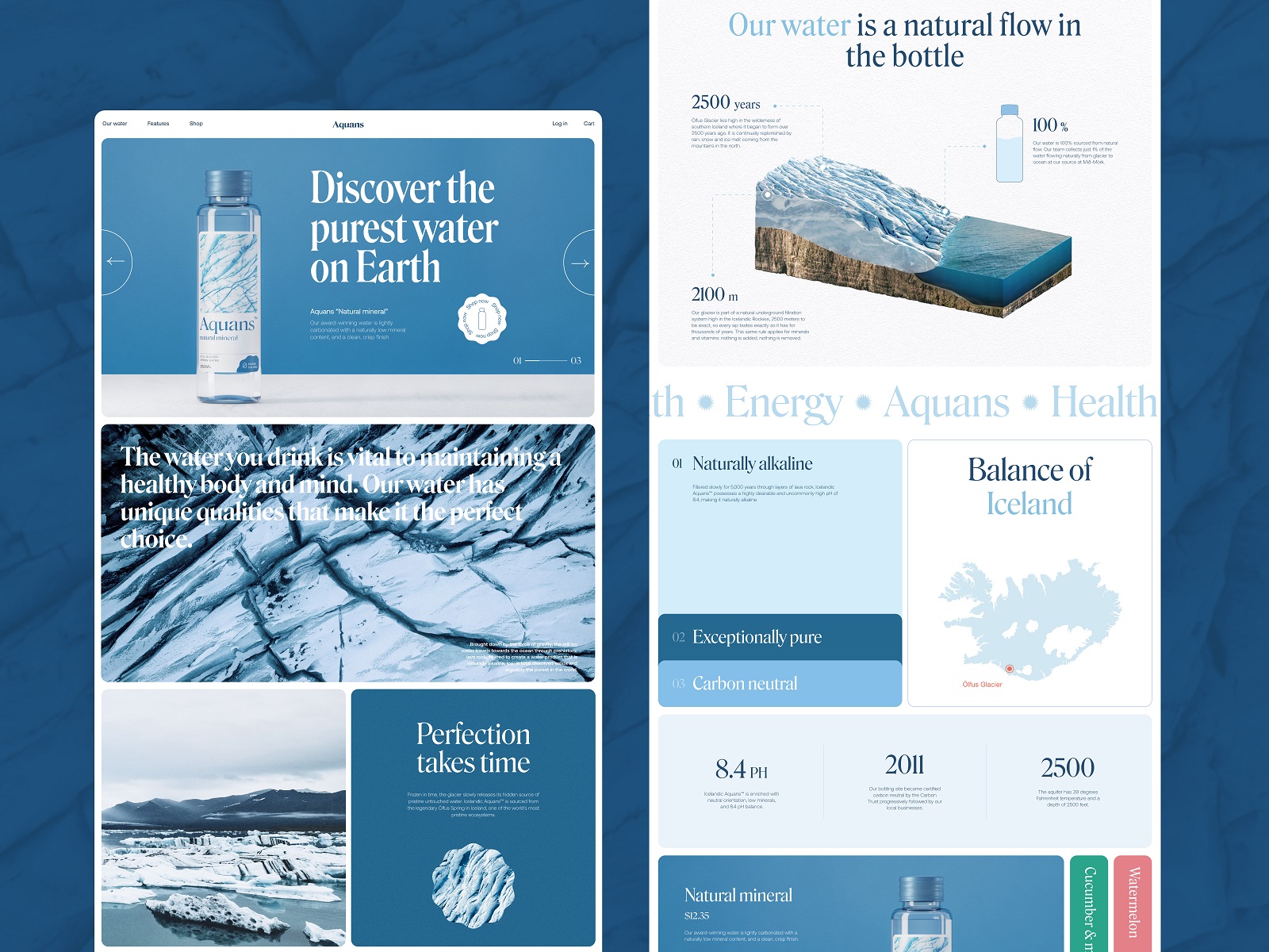
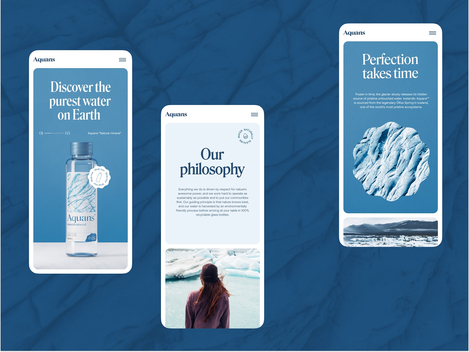
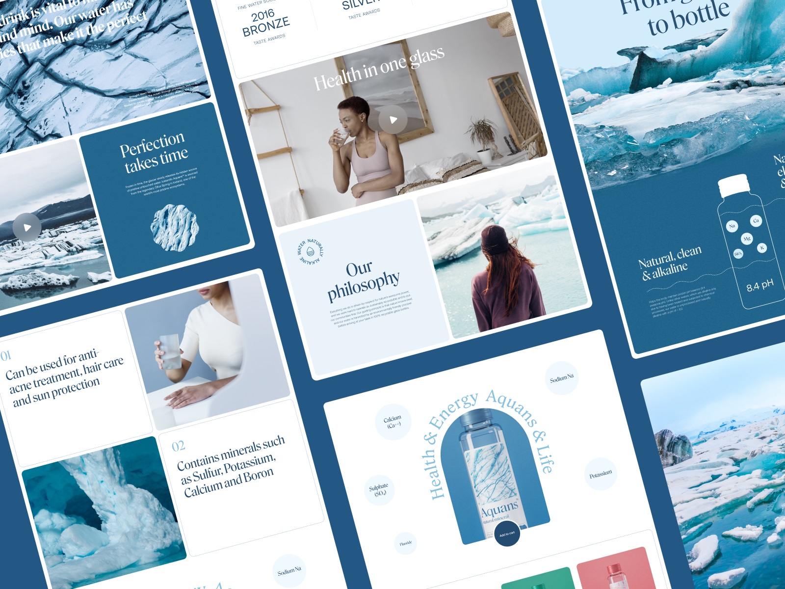
7. Water Brand Website: Hydration, But Make It High-Fashion
Minimal. Cinematic. And somehow it made us want to drink more water. This niche e-commerce website plays with cool tones, heavy air, and full-bleed video. You can almost feel the condensation. The site structure is simple—because it has to be. Water doesn’t need selling. But brand does. And here, it’s bottled like perfume.
The transitions are smooth. The text feels whispered, not yelled. This is digital branding through UI—letting emotion drive the structure.
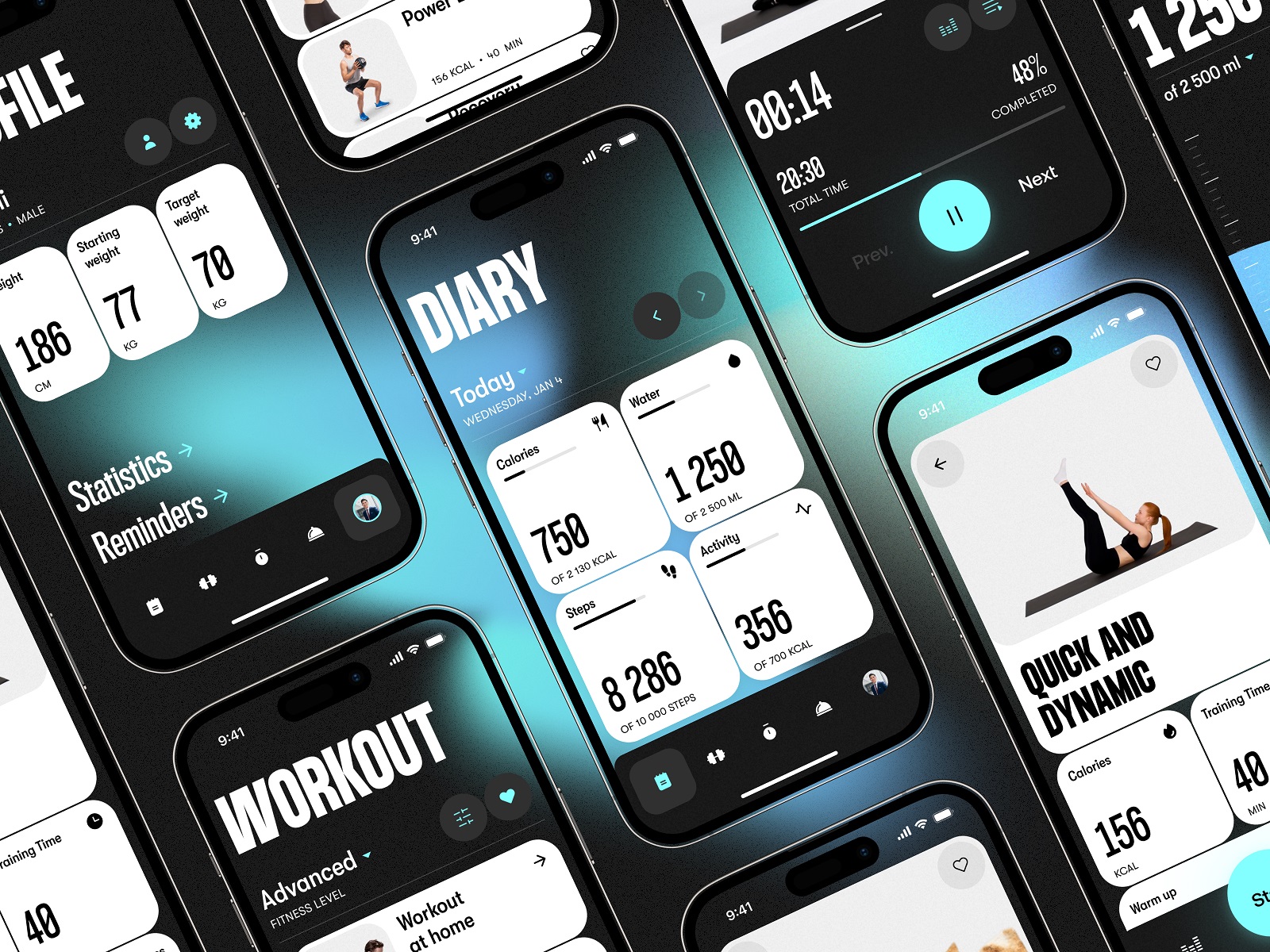
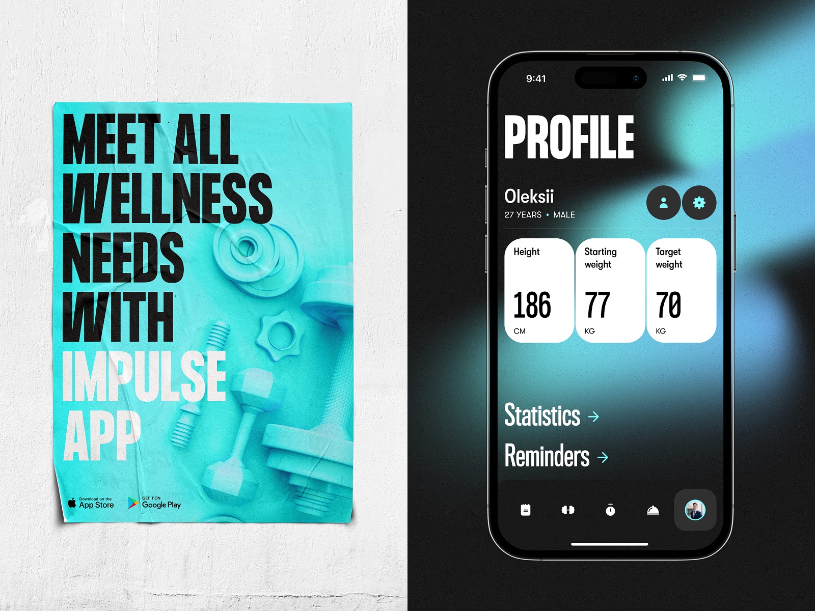
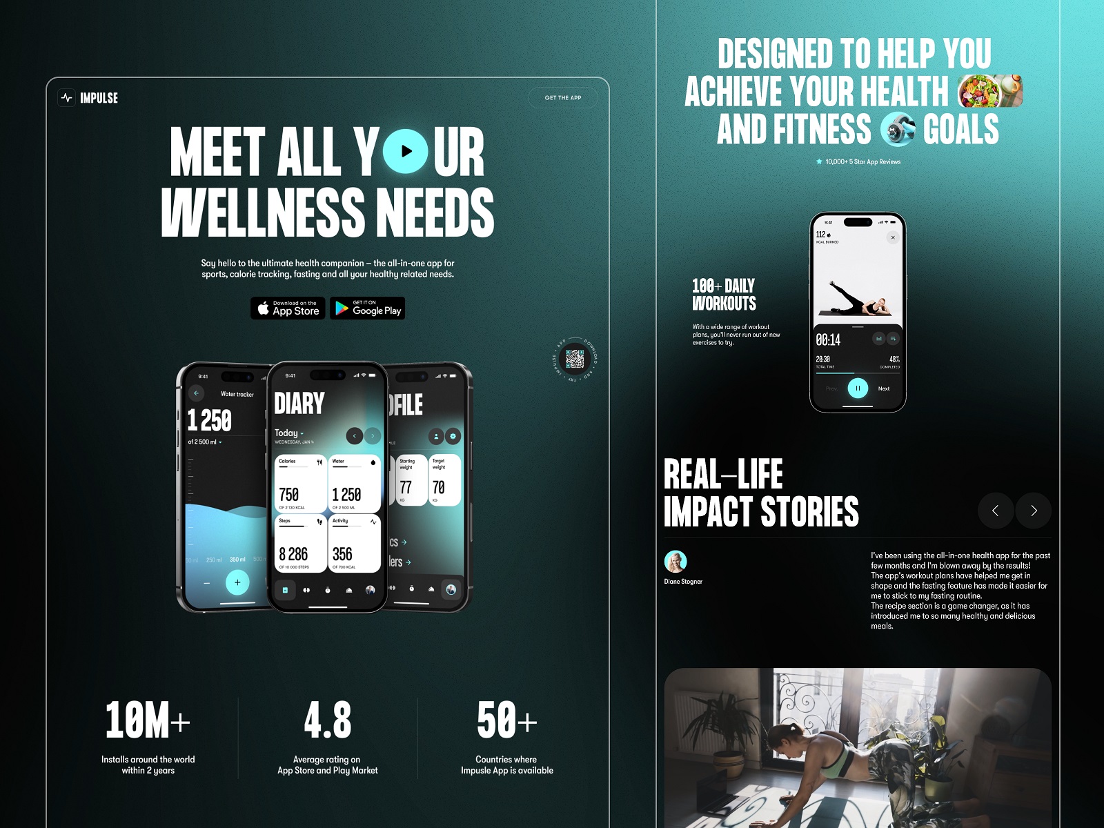
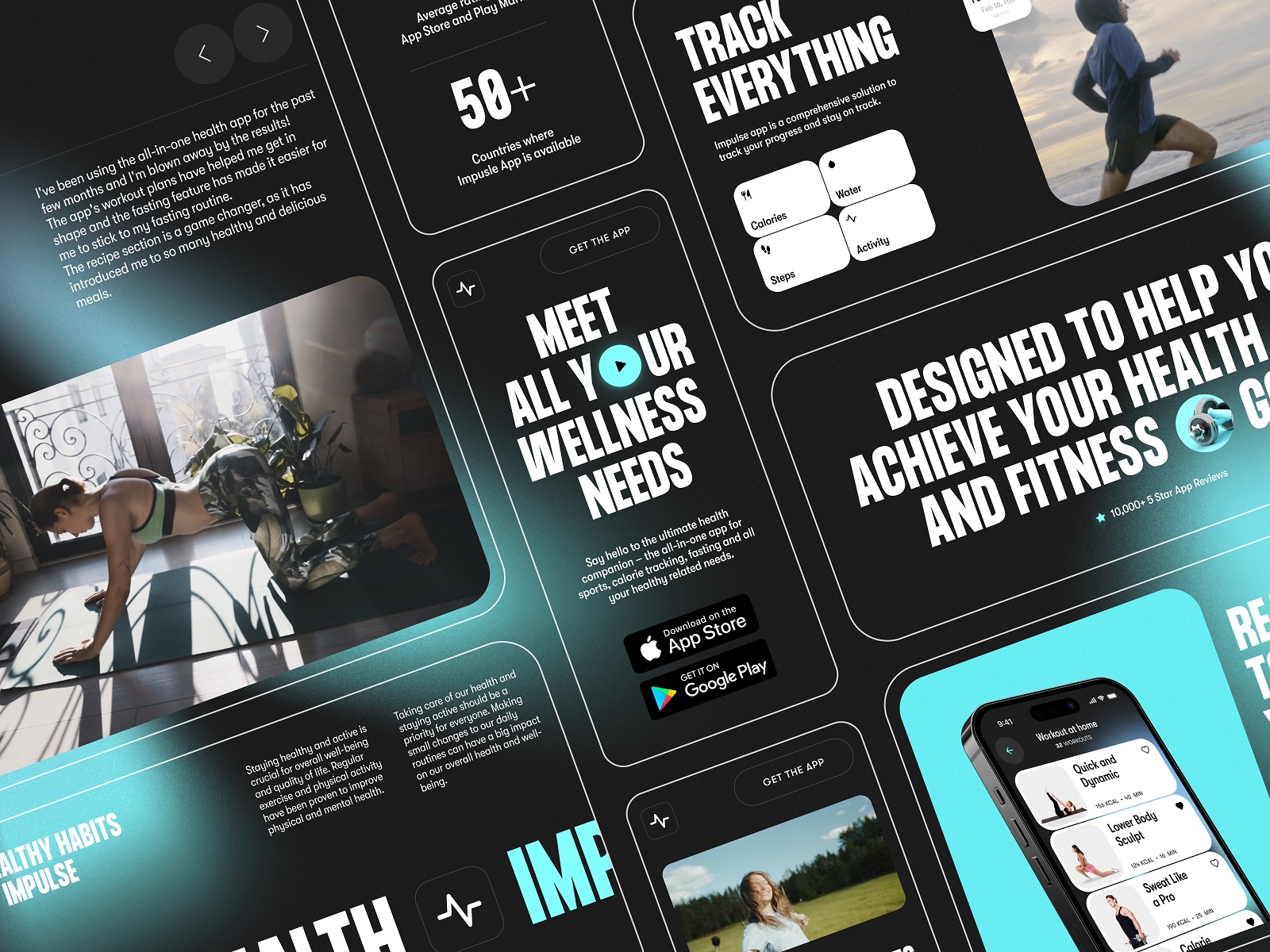
8. Fitness App: No Pain, All Gain
Fitness apps tend to overdo it. Neon gradients. Fake muscles. “GET RIPPED” in all caps. This one is elegant. The interface design focuses on simplicity: calming blues and grays, soft shadows, minimalist type. It’s like the Calm app got a gym membership.
You track your runs, your meals, your mood. You don’t get yelled at by a virtual coach. And the landing page actually tells you what the app does. Revolutionary.
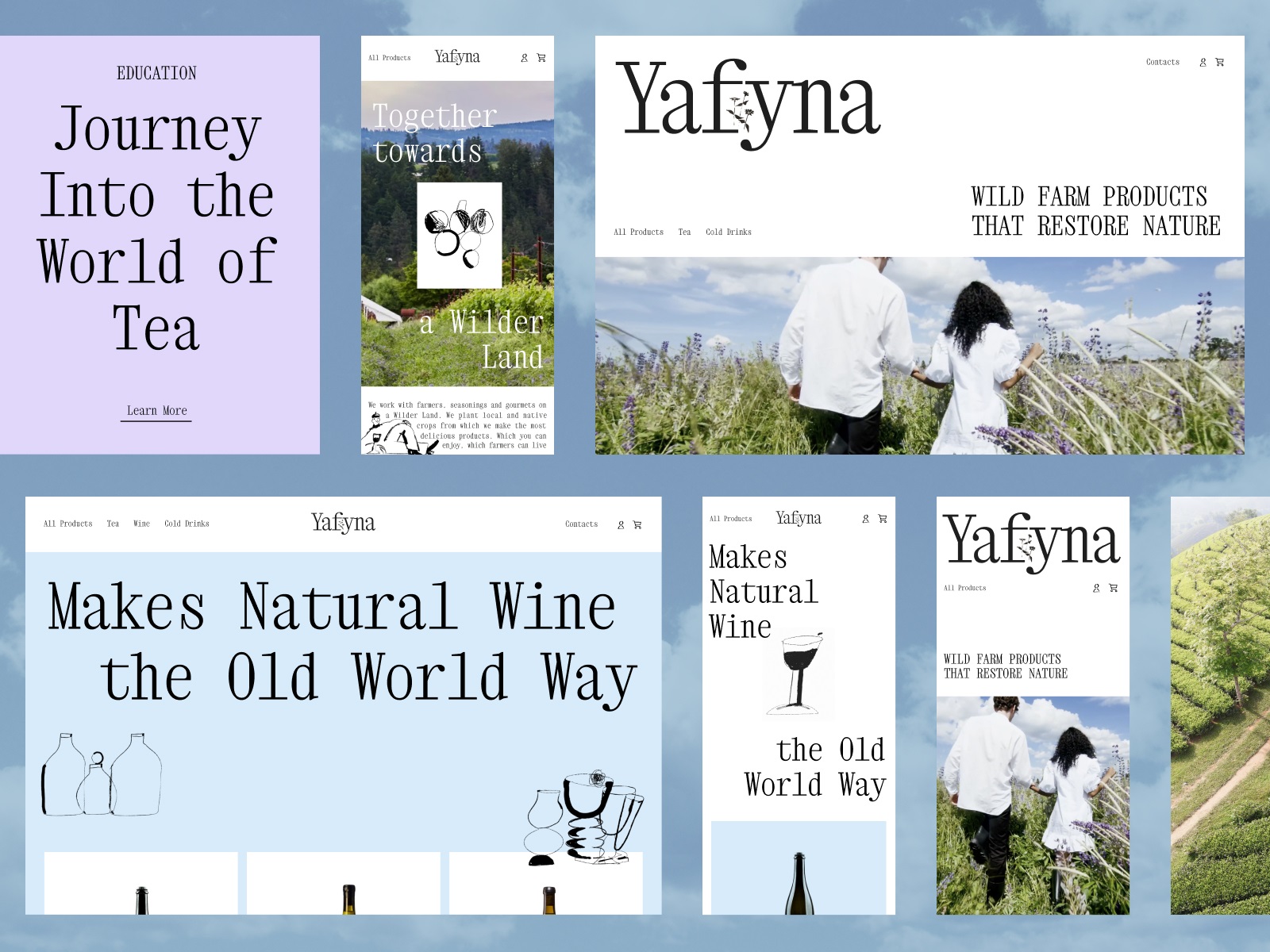
9. Wildfarm Drinks: Nature in Your Browser
This might be the most romantic website for tea and wine we’ve ever seen. It doesn’t try to be quirky. It leans into slow UX—pages that breathe, content that lingers, and a story-first layout that reminds you these herbs weren’t grown in a lab. They came from wild Ukrainian fields.
Typography in UI here deserves a mention: decorative, serif-heavy, and full of odd elegance. It doesn’t shout authenticity—it just shows you the dirt under its nails, then offers you a warm cup.
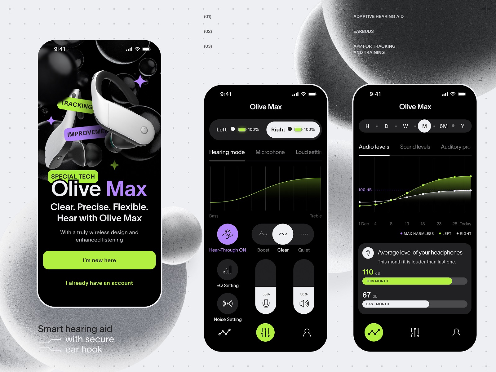
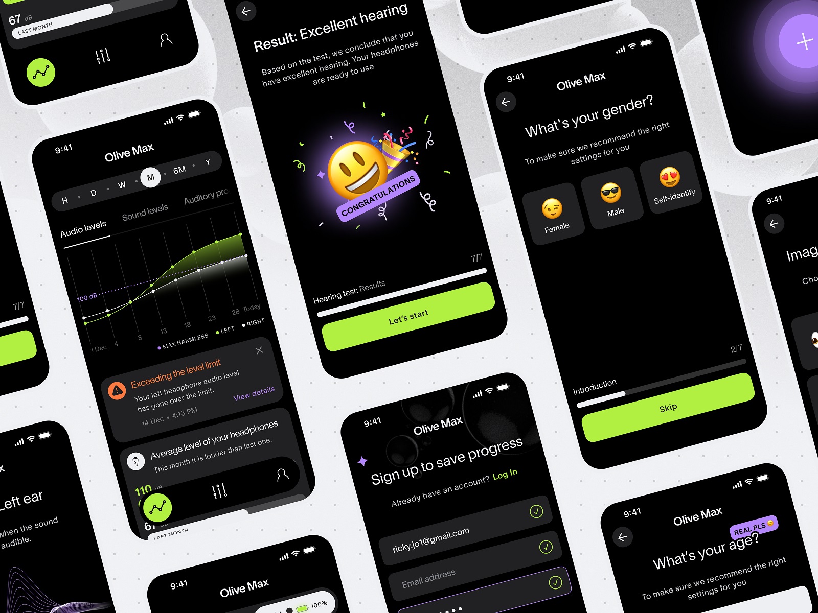
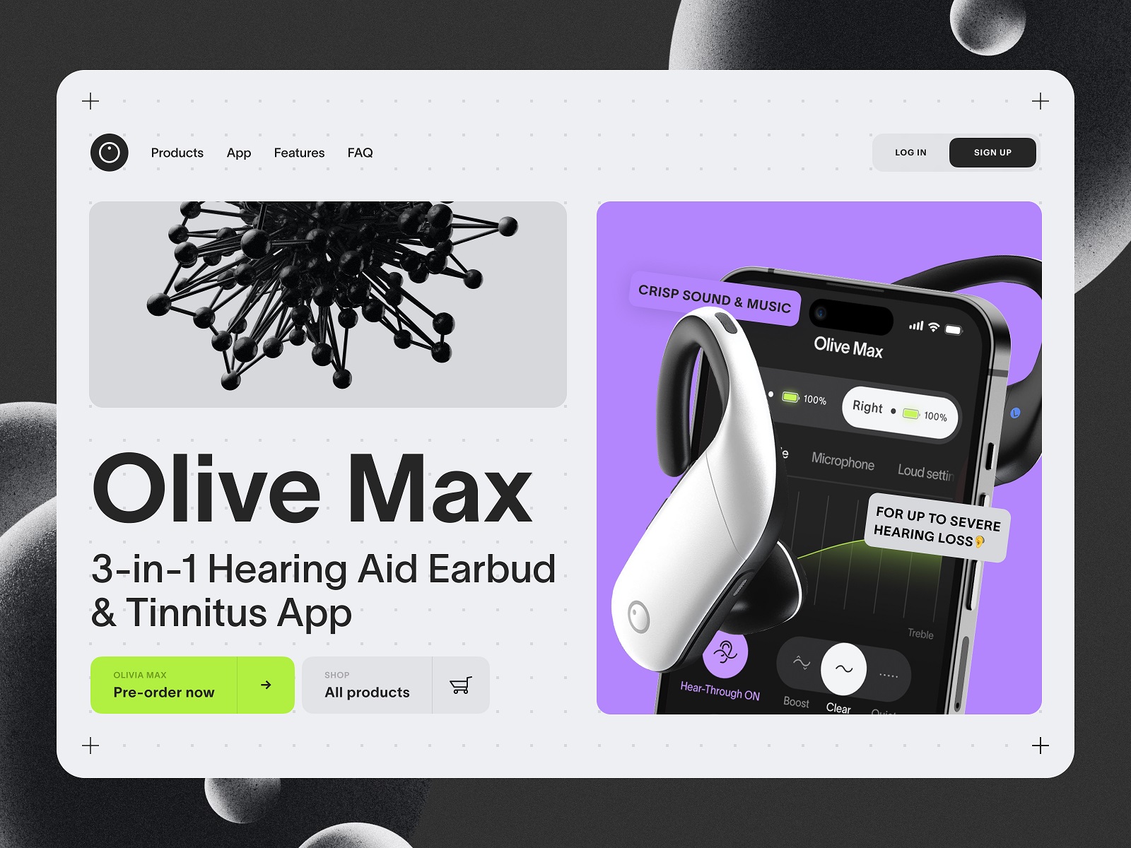
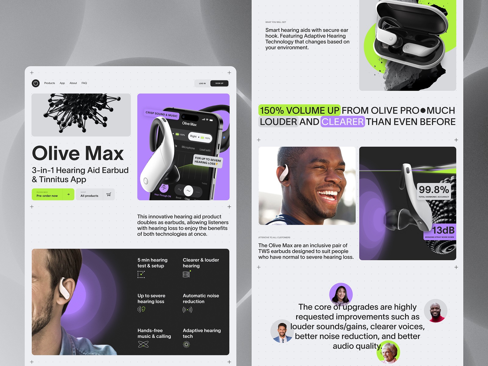
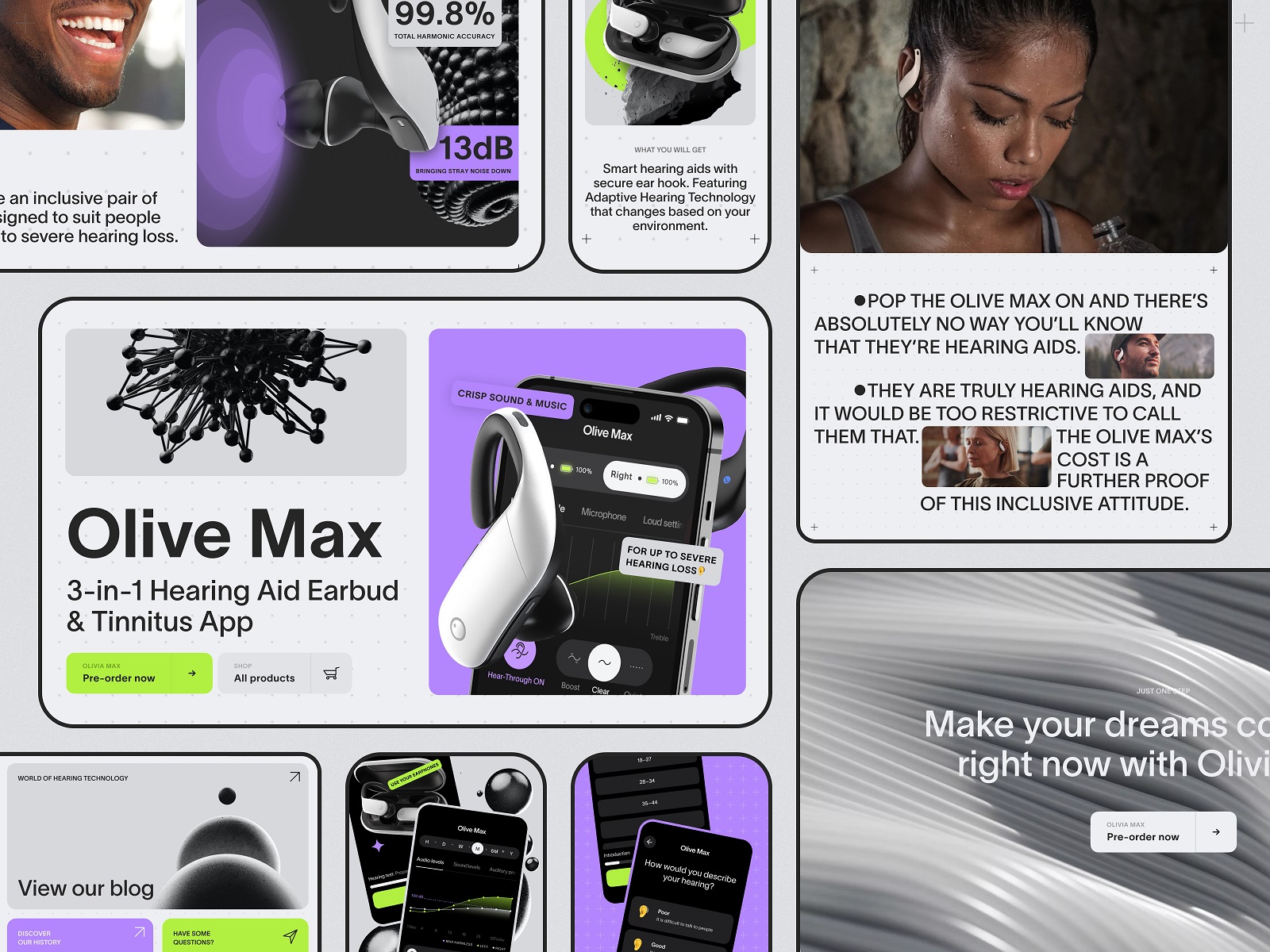
10. Hearing Tech App: Utility with Empathy
Designing for accessibility is not about ticking checkboxes. It’s about understanding. This UX/UI concept for a hearing aid tool balances clarity with dignity. Large tap targets, high contrast, voice-controlled nav. Subtle animations to signal changes without overwhelming.
The design here hits the right tone: hopeful, but not sentimental. Functional, but not sterile. It doesn’t say “we’re here to help.” It shows it—in every pixel.
Final Thought
We love user interface design that makes you feel something—without trying too hard. We love when UI patterns are reused because they work, not because someone forgot to be creative. We love weird ideas executed with restraint. We love quiet decisions that no one will notice but everyone will feel.
And above all, we love that there’s no one right way to do this. Because if there were, we’d probably quit.
So yeah. No frameworks. No “10 Golden Rules of UX.” Just a list of things that made us stop, stare, and maybe rethink a hover state or two.
Recommended Reading
Still hungry? Here’s more brain food for your inner interface nerd:
Web Design: 11 Diverse Functional and Awe-Inspiring Website Designs
App Design Ideas: 7 Nifty Mobile Application Design Projects
Product Page Design Inspiration: 17 Ecommerce Web Designs
Information Beautified: Media and Editorial Website Designs
UX Design for Traveling: Impressive Web Design Concepts
23 Impressive Web Design Concepts for Various Business Objectives
Design for Sales: 10 Creative UI Designs for Ecommerce
UX Design: Types of Interactive Content Amplifying Engagement
Motion in UX Design: 6 Effective Types of Web Animation