Mobile and web interfaces with color schemes based on dark background have incredibly grown their presence for recent years. First of all, we can often come across this design trend in digital products based on visual content more than text. Dark colors used as a background are widely associated with prestige and elegance. They enhance the perception of images, make them feel deeper. The dark palette can make the interface less contrast, which means it’s more natural to observe in different environments. What’s more, such a choice of basic color now corresponds to preferences and expectations for quite a broad target audience that likes this stylistic performance. Today to add a bit of practice to the issue, we have collected a bunch of UI design examples made by Tubik designers for web and mobile: all of them are based on a dark background.
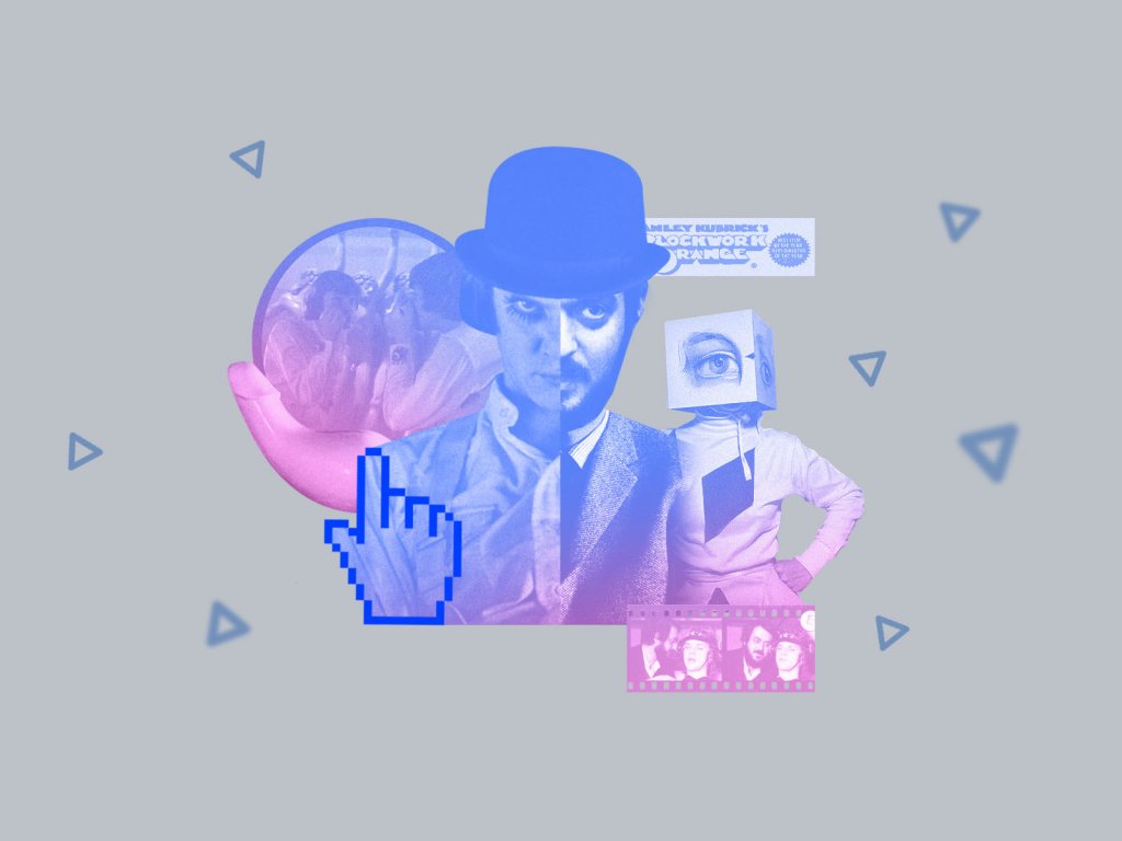
Designer Portfolio Website
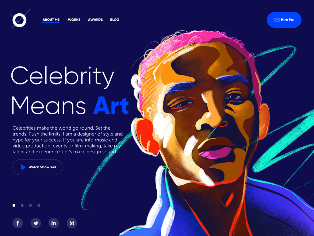
There are two vital things to sell design services: a well-done portfolio and happy clients. Here’s a web design concept focused on the first one: it’s a home page of a portfolio website for a designer that specializes in projects for celebrities, entertainment, music and film production. Dark background allows the custom hero illustration to look more vivid and catchy and creates an association with the atmosphere of a concert stage.
Museum App
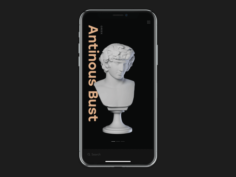
Do you like museums? What if you have the one right on your smartphone? Here’s a UI design of an interactive museum app supporting visitors: it helps to check the available exhibits, learn more about them in split seconds and can even make a route through all the museum to the exhibits you want to see. The dark base makes the 3D graphics look stunning.
Museu Landing Page
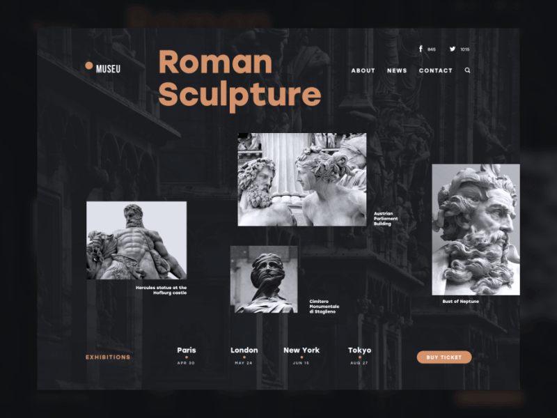
Another concept based on museum theme but oriented to web users. It is the UI design concept of a landing page promoting an art exhibition. The idea behind it was to make this sort of informative promotion aesthetic and unobtrusive for the user as well as highly informative. The general stylistic concept keeps the balance of minimalism and utility appealing via style, color, and motion. The dark background makes the photo visuals deeper and creates eye-pleasing contrast with the accent color.
Nature Encyclopedia App
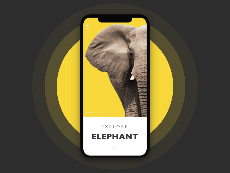
Technologies change but the thirst for knowledge never goes out of fashion. Here’s another educational concept: an encyclopedia app that presents interactive infographics for a variety of themes. The presented flow features the chapter devoted to elephants and based on graphics that are quickly scanned due to the great contrast of colors.
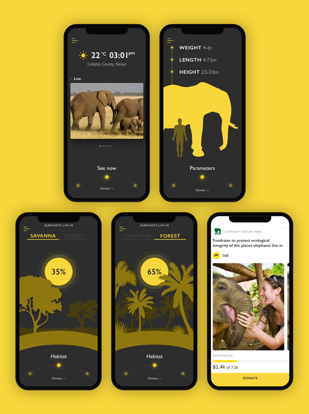
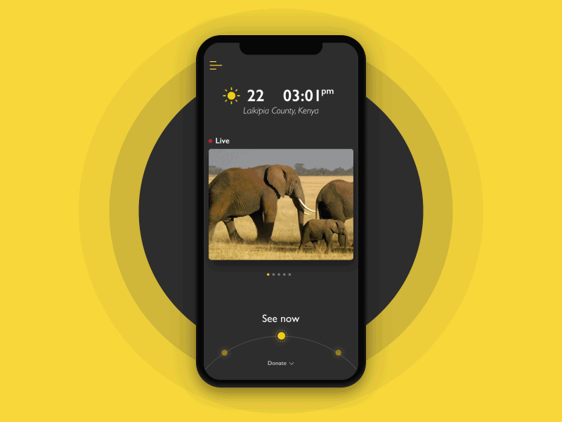
Dark background in combination with contrast yellow color chosen for graphics makes the screens highly legible. Instead of using a variety of colors, the designer keeps the palette limited and plays with shades and sizes of the elements to build a solid visual hierarchy.
E-Commerce Bakery Website
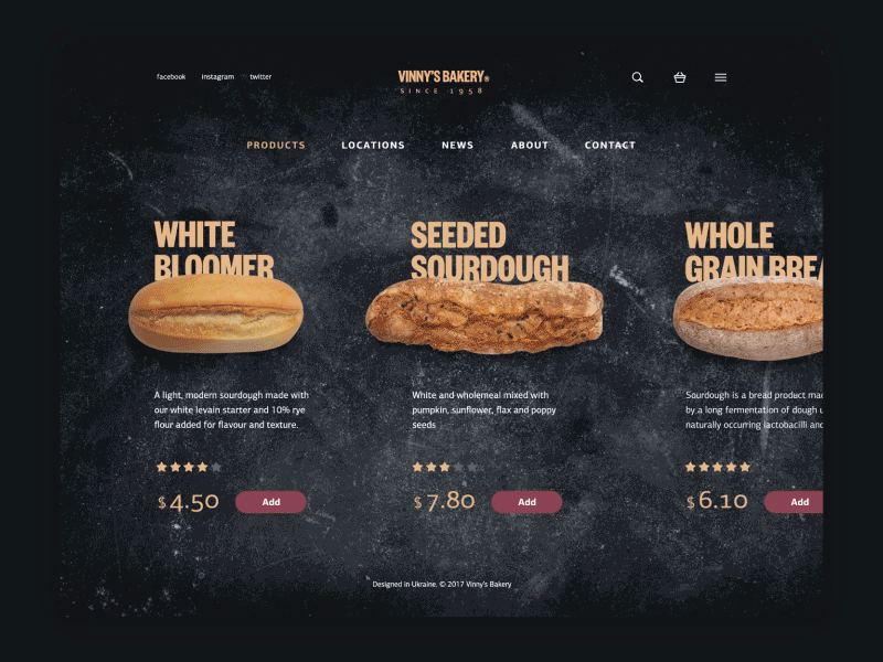
Here is the animated flow of interactions with Vinny’s bakery website, e-commerce for a small elite bakery selling homemade bread. On the basis of the design solutions, it is easy to assume that this is the service positioning itself as a producer and seller of upmarket products which are exclusively hand-made and presumably because of that reason cost higher than average bread in the supermarket. Harmony is the style provided by the webpage: dark background, branding element as a central element of a header, strong and clear headline establishing positive emotional message, visual elements enabling immediate perception of the theme and setting strong visual association with tasty pastry, short text block describing basic benefits of the product and clearly visible call to action.
Mobile App for Healthy Sleeping
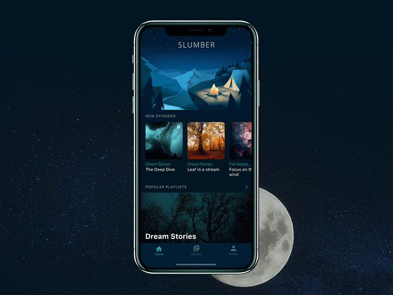
It’s a mobile app called Slumber with a gallery of music and meditations to relax and good sleep. As for the choice of colors and background, the mobile user interface is designed in accordance with app functionality: it is based on the dark color palette to transfer the atmosphere of the night and subdued lighting. The screens also feature corresponding graphics that look deep and stylish with dark skin.
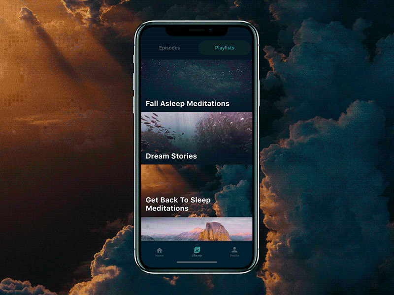
The screens present a harmonic combination of high-quality photo content with dark basic color and thoughtful typography which is one of the core issues for interfaces with such a color scheme; so, the app layout uses highly readable fonts for copy content.
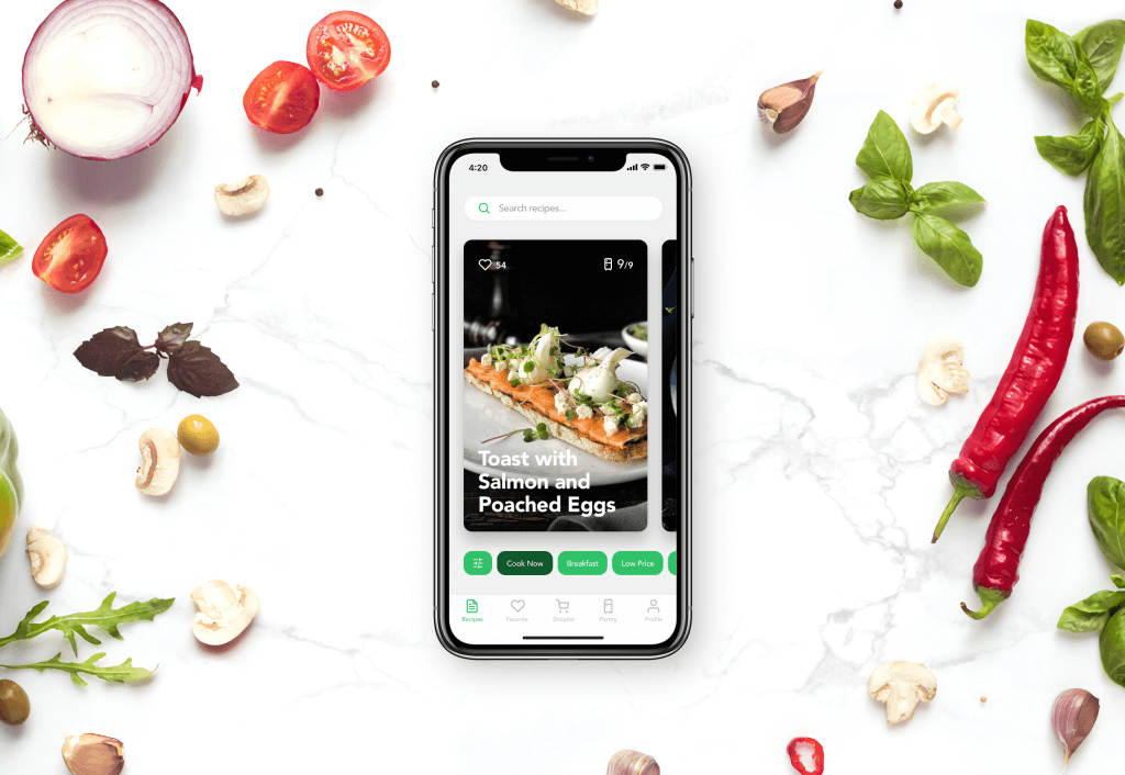
Recipe and Cooking App
This is the interface of a social network for people that like cooking, want to communicate and exchange opinions on it in a fast and easy way. The app allows using all the scope of social functions: sharing recipes, making discussions, chatting, following, uploading images, collecting favorites and so on. Again, we observe how delicious the photo content looks in the chosen dark palette.
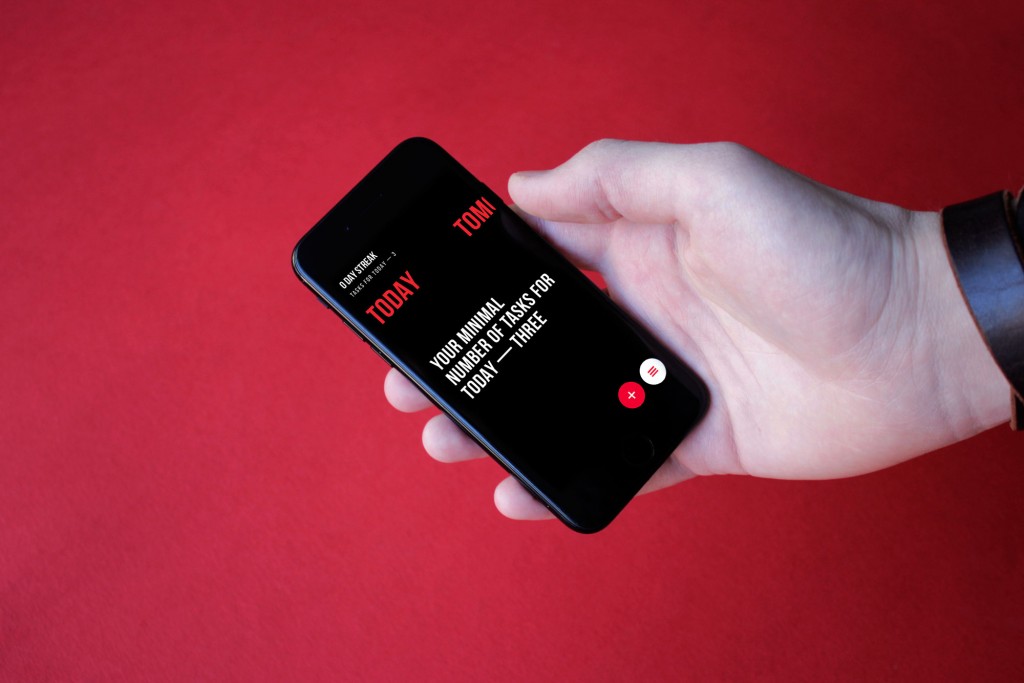
To-Do List App
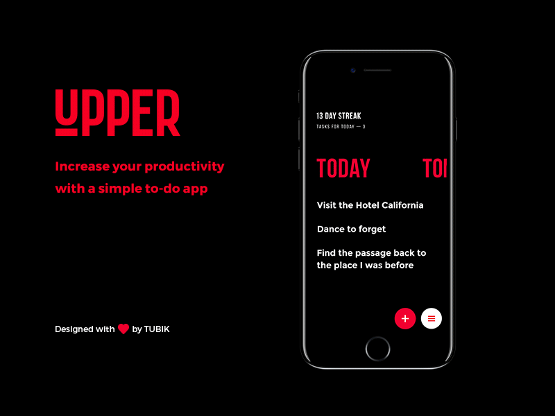
Here’s Upper, simple and motivating to-do list app. The task list design is performed in the minimalist and elegant style of the layout based deeply on quick functionality and intuitive navigation. The designer uses a limited color palette made of three bold and contrast colors.
Not only does this approach support aesthetic satisfaction and elegance of looks but it also makes all the content on the screen scanned in split seconds.
Cinema App
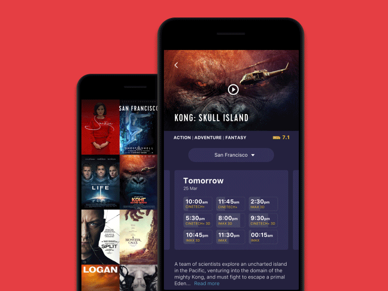
This UI concept was designed for a mobile application of a cinema chain. Here you can see the flow of choosing and booking the seat. Choosing a particular showing, users can see the available seats, choose the ones they like and book them, paying right from the app. The dark background sets a strong visual association with the atmosphere of the cinema hall and creates a good contrast with the accent color of the CTA button.
Book Swap App
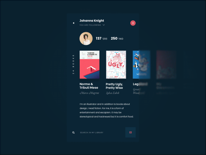
This one is the interface of a social network for readers focused on book swapping. The dark background was chosen as a basis of the color palette because the application is image-driven and features a lot of diverse pictures including numerous book covers and users’ avatars, so the dark environment creates the eye-pleasing style for all that stuff.
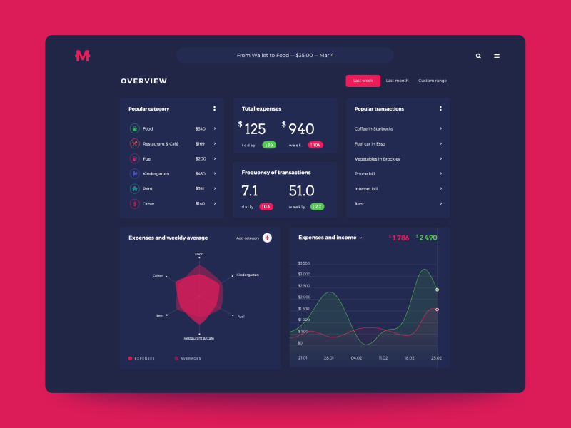
Finance Management App

Time to talk about money: here’s a set of interactions of a Finance App, the application enabling people to track their expenses and income individually or in a group. Here you can see a group mode, which may be helpful for family use, joint budgets and even small business needs. Deep blue background color supports the feeling of balance and a businesslike mood. What’s more, it creates a good basis for contrast with bright color accents used for data and interactive elements.
Home Budget App
One more interface focused on finance is Home Budget app. It allows users to manage their expenses and incomes, creating an extended database for tracking financial flows or changes and getting comprehensive stats. The choice of generally dark interface enabled the designer to create an attractive layout with prominently visible colored details drawing users’ attention to the interactive zones of key importance.
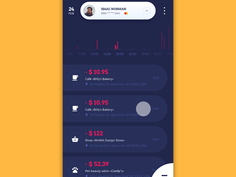
The other direction of the creative process was focused on the UI for a mobile app concentrated on having the user informed about the operations of the current day and adding new data in different environments and on the go. The color palette keeps its consistency. The notifications are presented in different colors that mark the nature of the message, for instance, applying orange for warnings and blue for reminders. They work effectively with the background color in various conditions of perception.
Smart Home App
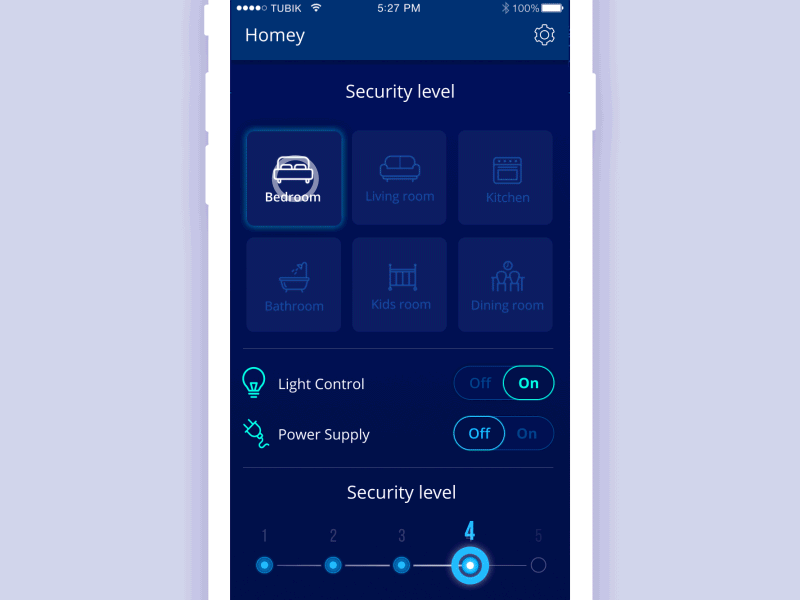
Here’s a UI design for Homey App, a mobile application with “smart home” functionality. The featured screens show that users can choose the room and see the basic data about them like temperature, humidity, and energy consumption, can tune the settings and see the expenses as well as turn saving mode and security of different levels. The concept applies dark background which makes the interface look elegant and creates a nice contrast with visual layout elements and color accents.
Explore Universe Website
The presented UI concept was created for Explore Universe, the interactive online encyclopedia devoted to the Solar System, its planets, interesting facts, and stats. Here you can see the entry page on Jupiter. Photo and graphic assets are integrated into the dark background to support the visual connection with the theme. Smooth animation supports the impression of diving into the endless outer space. Again, the typography aspect demanded the designer’s attention and testing to make sure the content is easily readable.
Useful Reading
If you want to learn more about the best practices of using a dark background in user interfaces and how to deal with colors in UI, here are handy articles on the topic.
Light or Dark UI? Tips to Choose a Proper Color Scheme
Dark Side of UI. Benefits of Dark Background
Color Matters. 6 Tips on Choosing UI Colors
3C of Interface Design: Color, Contrast, Content
Color Theory: Brief Guide For Designers