Animation in UI is a tool of great power, breathing life into the process of interaction. It helps a user to get fast feedback, provides opportunities for fast and easy microinteractions, marks out key elements of the layout, and adds the engaging feeling of the live and dynamic process. Used wisely, it is able to add more positive vibes to the user experience. It is especially true for mobile applications, which have to be organized along guidelines in terms of limited space on the screen and, at the same time, provide an informative and functional interface.
In our previous articles, we have already provided ideas about the role of animation in UI design, its potential to boost effective microinteractions, and popular purposes for using animated microinteractions. With the rapid growth of mobile devices, animation got even more significant popularity and diversity, enabling fast and easy processes for touchable interfaces, especially on the go. Therefore, animation is an effective way to make the product simple, clear, bright, and user-centered. Today we would like to support that idea with a bit of practice via the set of design concepts by studio designers. It includes motion design practices for animated interactions in mobile user interfaces of different kinds, stylistic choices, and functionality. So, welcome to review!
Blogging App
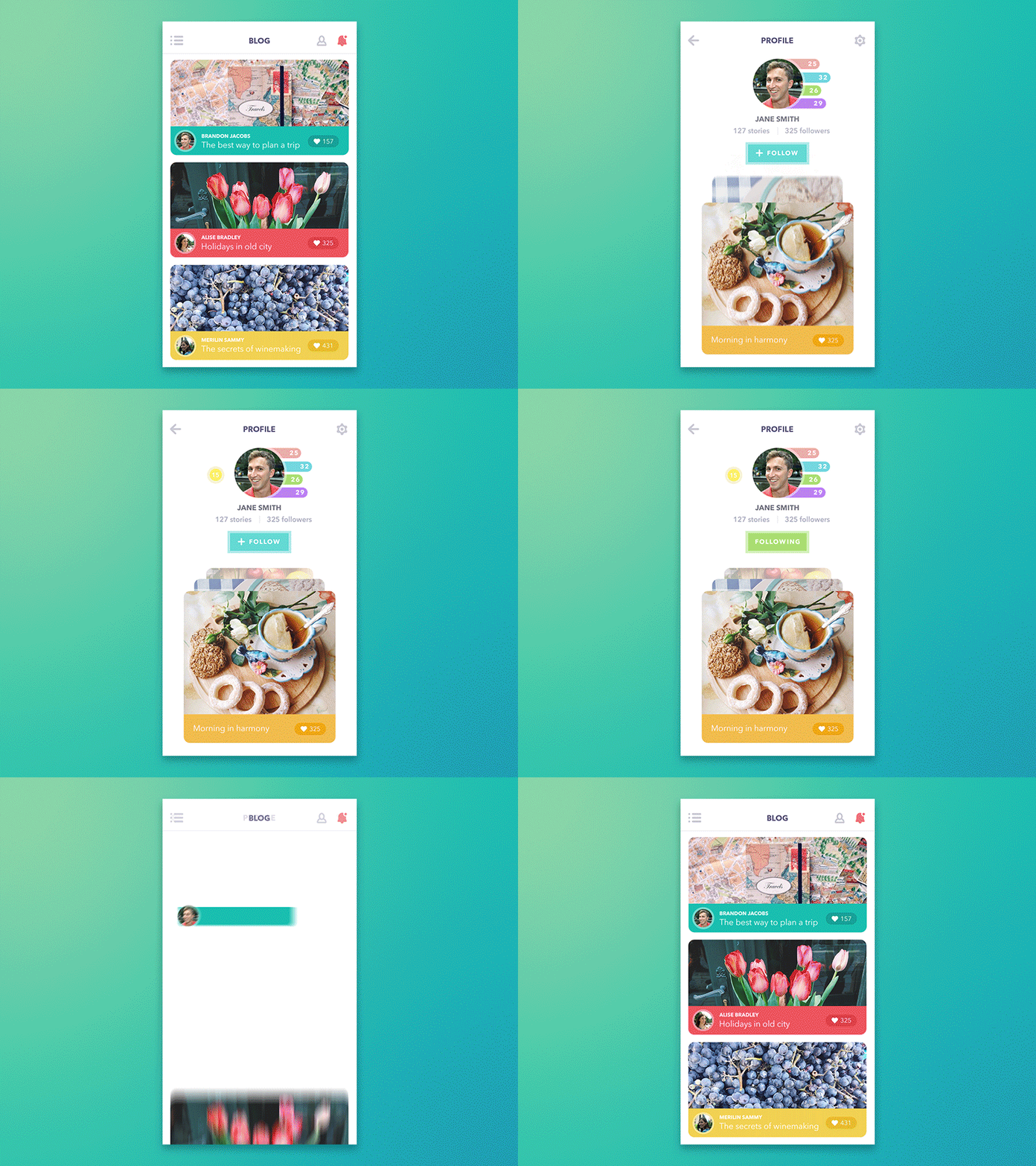
Presented UI features the concept of a blogging app for everyday use. It features lots of images, and the news feed consists of topic-colored tiles for the posts. By tapping on the post author, the users are brought to their profile where like in any other social network they can follow/unfollow the person and browse through their recent activity. Slight motion effects add the unobtrusive feeling of interacting with physical objects and liven up the visual presentation.
Social Network App
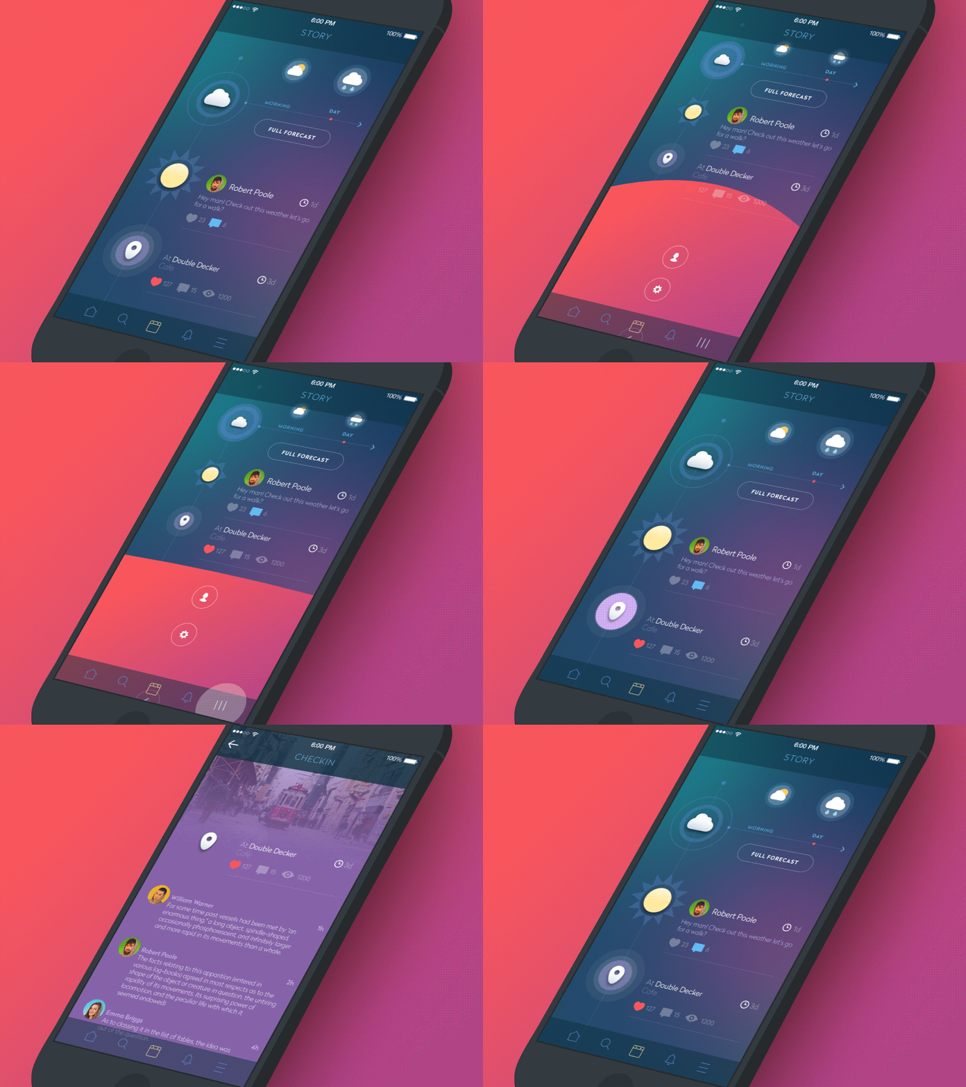
Animation features user interactions with a mobile application presenting a social network. People usually want to see this sort of app fast, dynamic, and clear. Interactions are presented here by simple motions based on colorful UI accents. They show the functionality of the screen and add slight lively vibes to the interface.
Art Gallery App
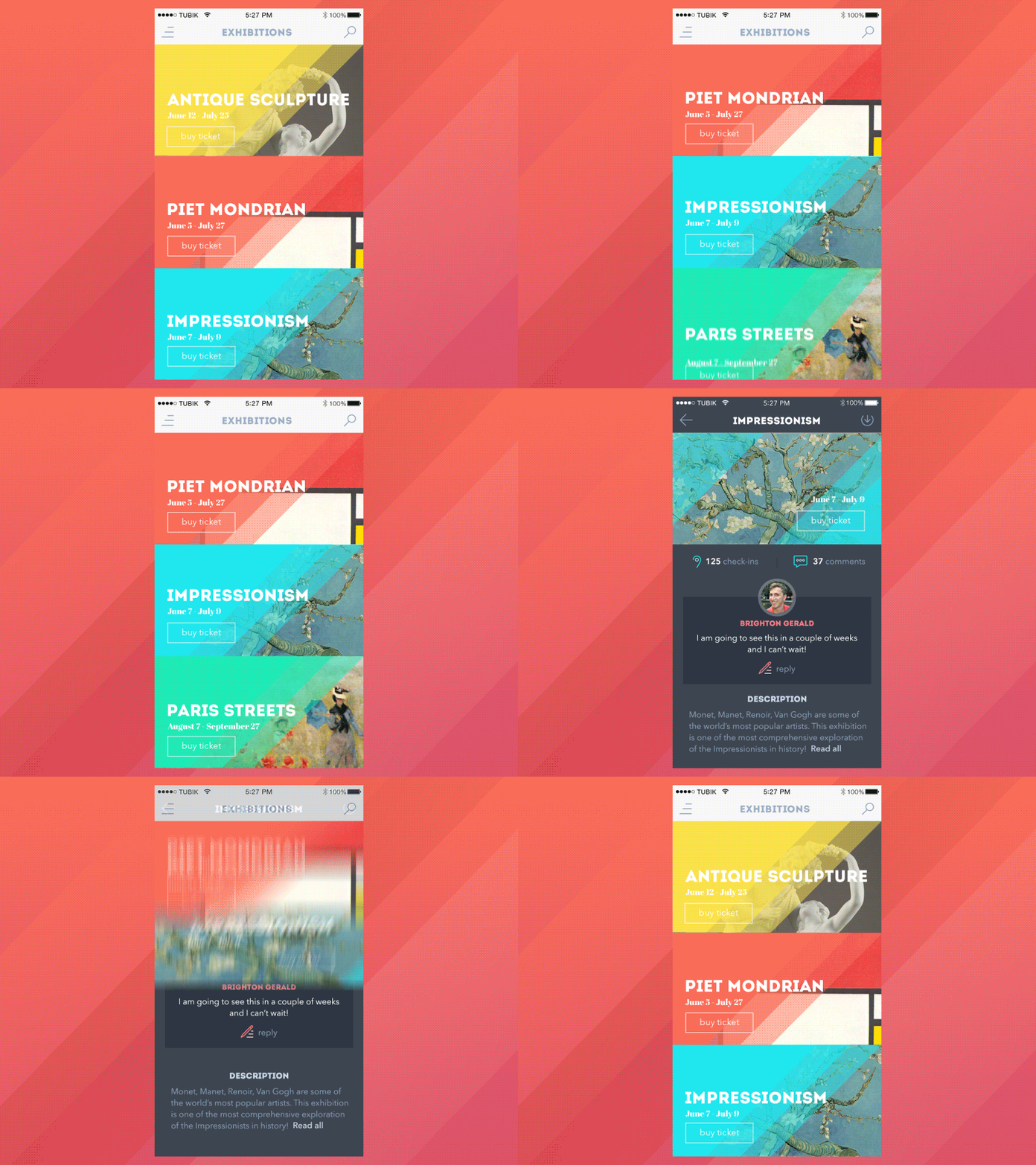
It is well-known that designers should be careful with animated elements in UI as too much animation confuses a user, but if a motion accent supports the general layout, it brings better conversions. Here designers showed animated interaction in the art gallery mobile application featuring the set of events previews and transition to more detailed information about the particular event. The vertical movement is highlighted with colorful diagonal lines, which are keeping the same structure across all the screens.
Sports App
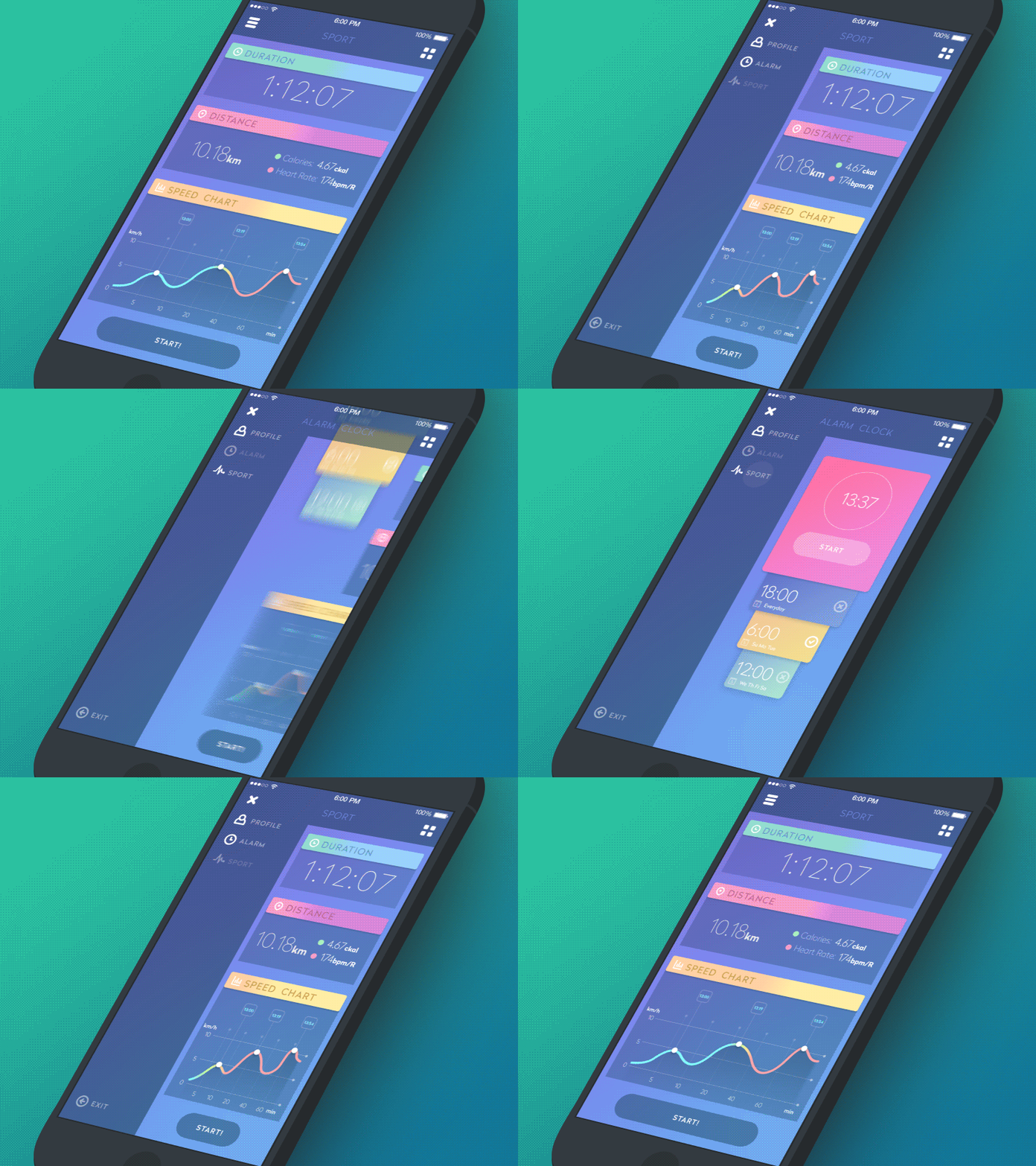
Sport apps are popular nowadays as more and more people use their devices to support their training, keep data and track their progress. So, here is the design concept for such an app demonstrating functionality via animated interactions. The structure is very simple: it consists of a side menu and content. The menu moves from left to right to show all the app sections. The main idea is to make some “rubber effect” for the content when the side menu opens. It serves one goal — to make all content details visible even when the menu is open on the screen. The color palette is all about a fresh and bright scheme to motivate users to act, and in combination with slight motion accents, it creates a good mix.
Product Card
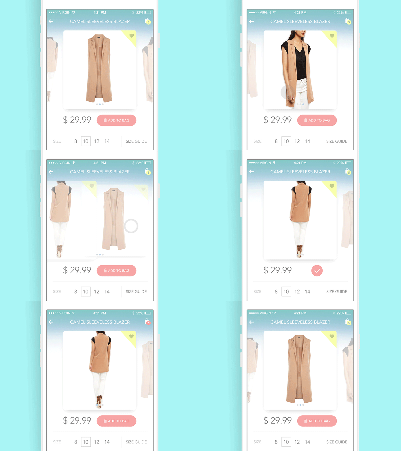
Presented design concept features animated interactions within a product card in the shopping app. Users can move the photos showing catalog items, set the size, see the price and add to a cart. Here animated elements support the high level of usability: they immediately inform the user about the completion of the action. That provides fast and easy microinteractions and saves key data within one screen. At the same time, the animation doesn’t overload the interaction process and supports clear navigation.
Calendar App Animation
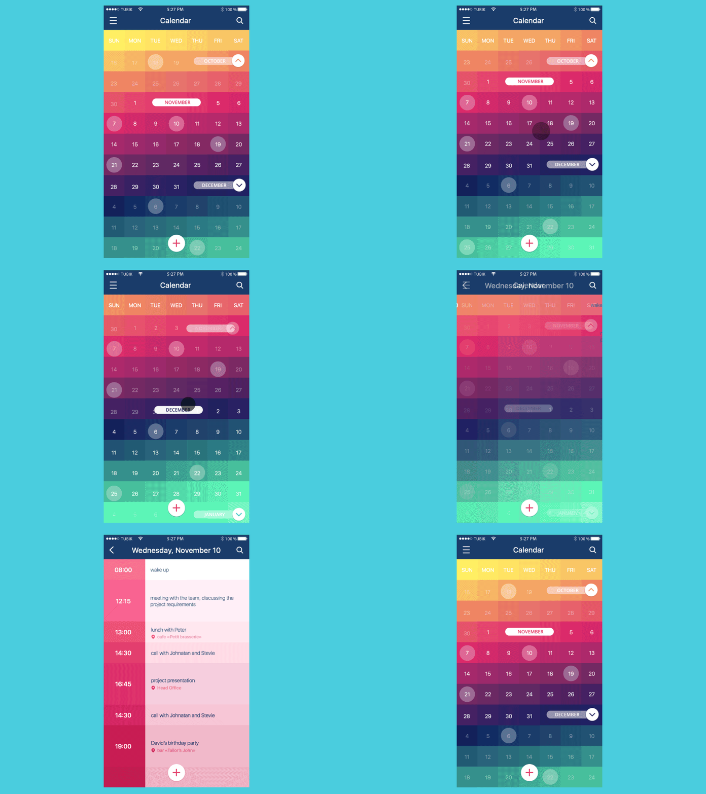
This concept presents one more design idea for the app of everyday use with a calendar enabling the person to schedule appointments and add notes. Bright interface playing out the rich palette and gradients is supported with smooth and stylish animated accents providing harmonic support to a general visual presentation.
Timeline App
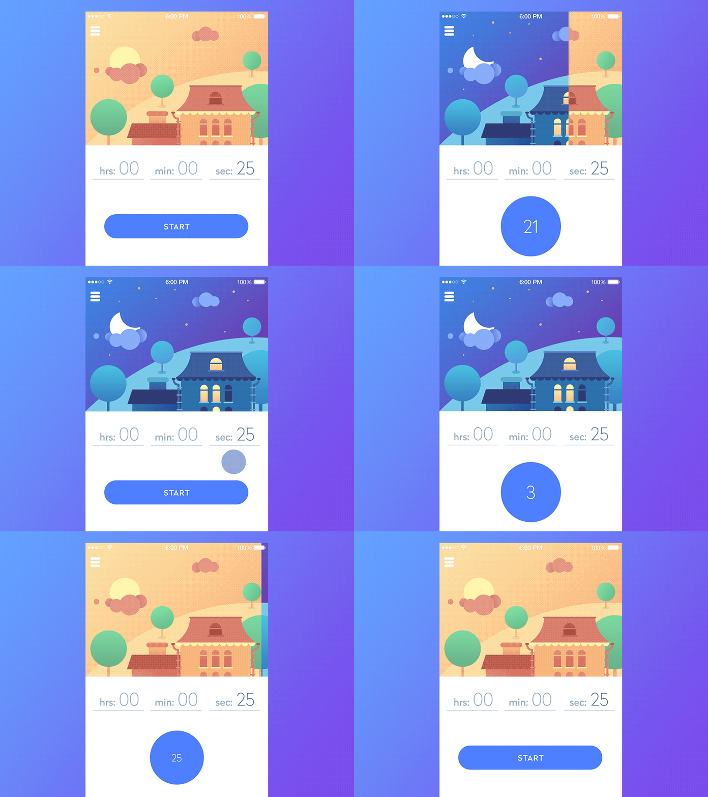
This example shows two UI interactions inside one animation: timer progress and pull down. This is a one-screen app with the minimum functionality (timer) and the maximum animation to concentrate user’s attention on the “time flow”. Timer can be started by Start button or by the pull-down. Of course, such transitions are much more fun, but they will definitely attract users who like visually original solutions and custom graphic design.
UI Navigation Concept
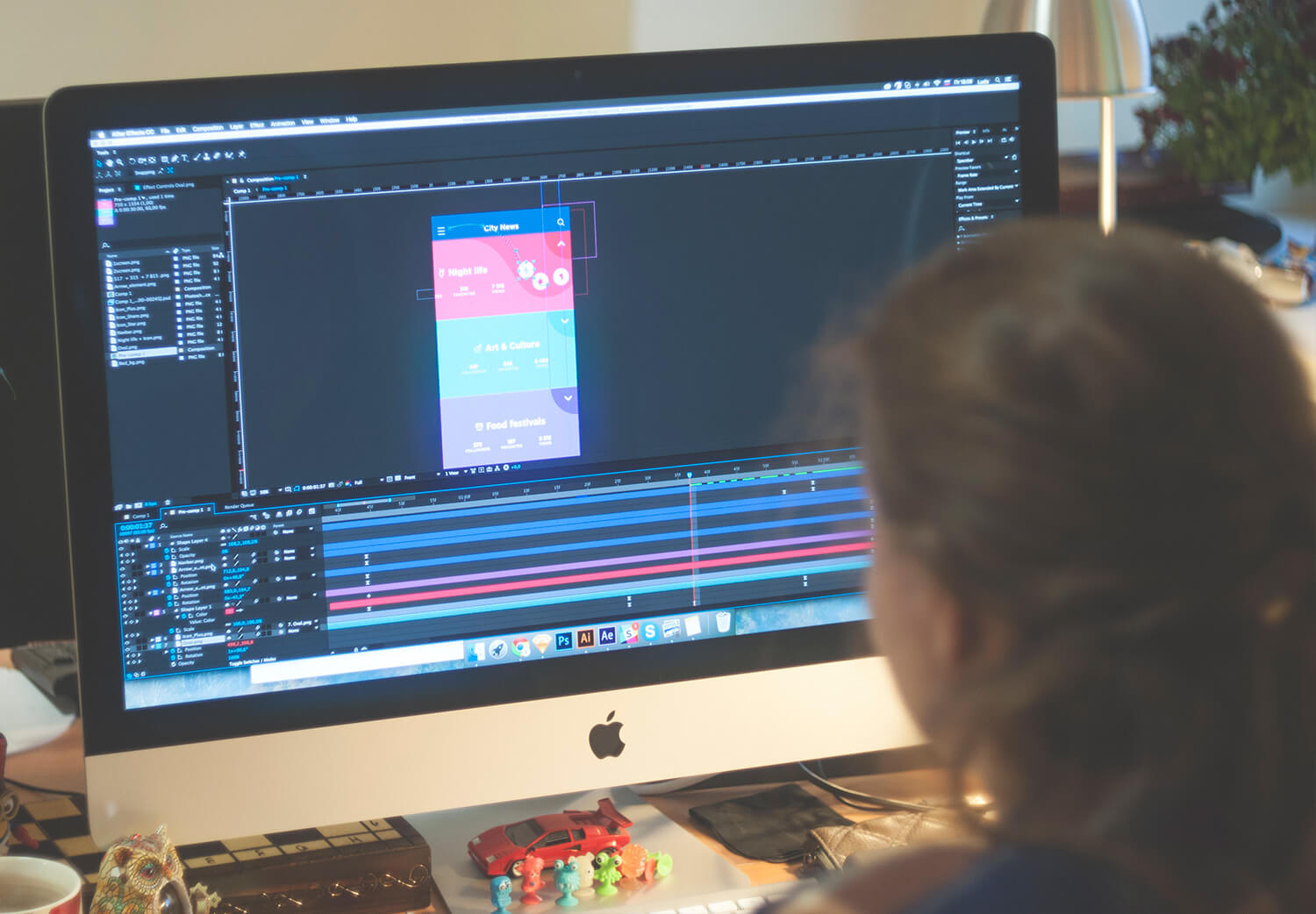
One more bright animated concept shows navigation design within the mobile application informing the user about city news. Catchy colors and stylish icons are strengthened with an original motion design solution for active elements appearing on the tap and enabling further directions of transition.
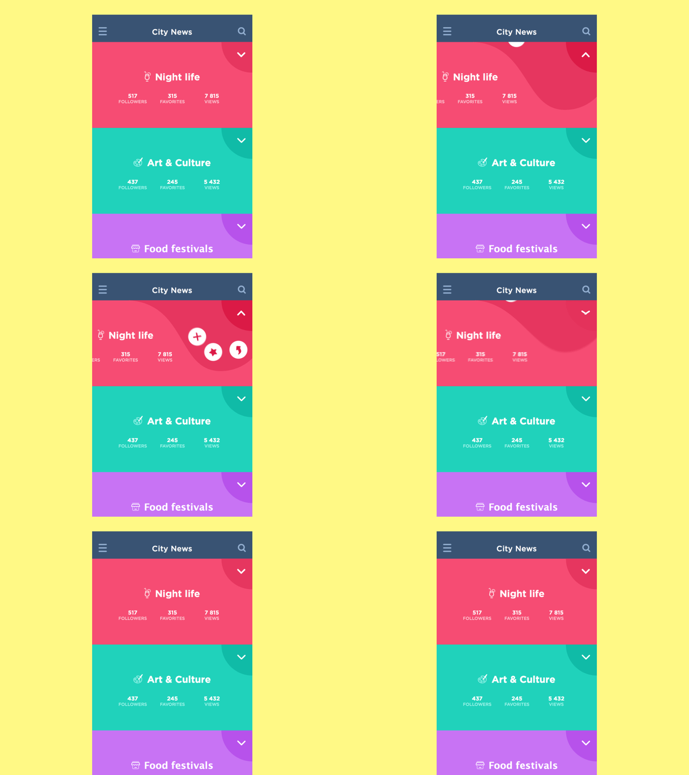
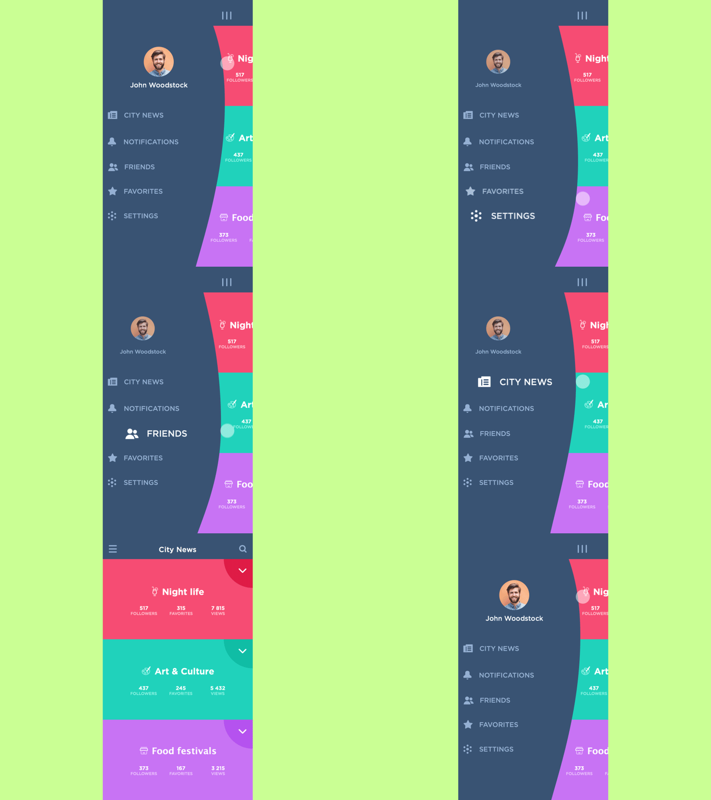
Another animation concept for the same city news app activates one-touch interaction and shows one more interaction in the navigation of the app, this time adding a transition to a user profile.
Buon App Social Network
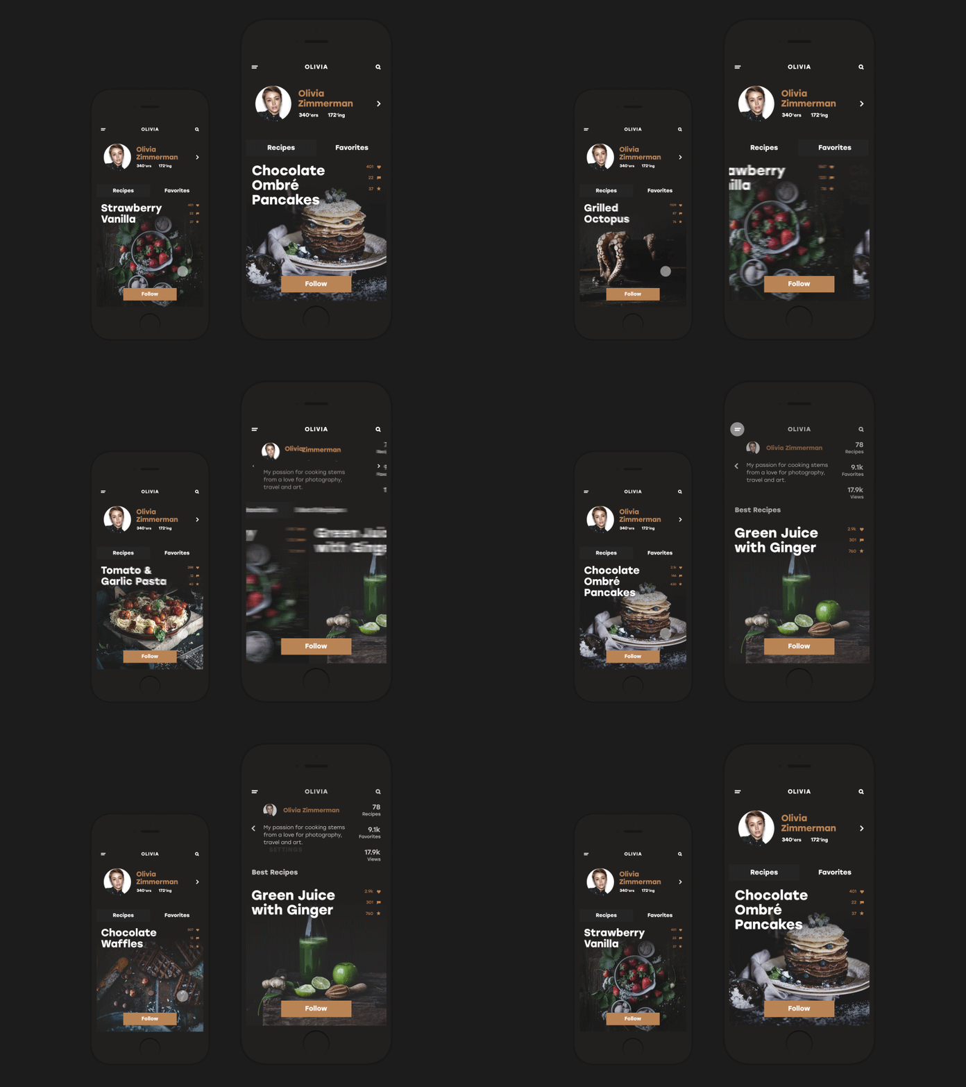
Here is the interface of a social network for those who like cooking and want to communicate and get updated about this topic in a fast and easy way. The app enables using all the scope of social functions: sharing recipes, making discussions, chatting, following, uploading images, collecting favorites, and so on. Nice and smooth animations support the general stylistic concept and show interactions within app functionality.
Dynamic Scroll
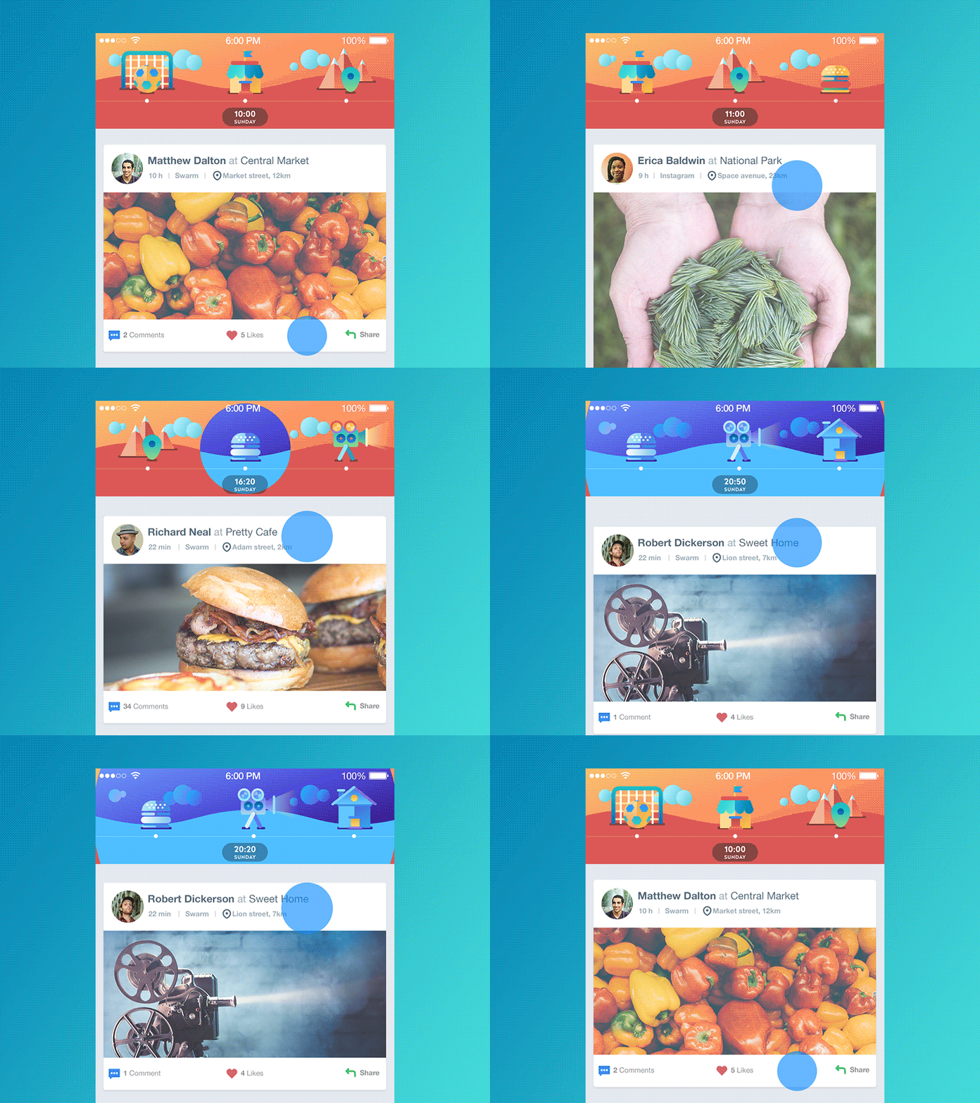
This concept features a screen of a global social network. The idea was simple: to show user’s timeline with different kinds of posts such as check-ins, media content and stuff from user’s friends or their own. The task here was to add simple game accents which wouldn’t make the simple network too cluttered and would not distract the user. The final decision was to make parallel timelines: the main vertical timeline and bright animated horizontal one. The function of the latter is to show the user where the last post was in terms of place and time.
Cafe Coupon App
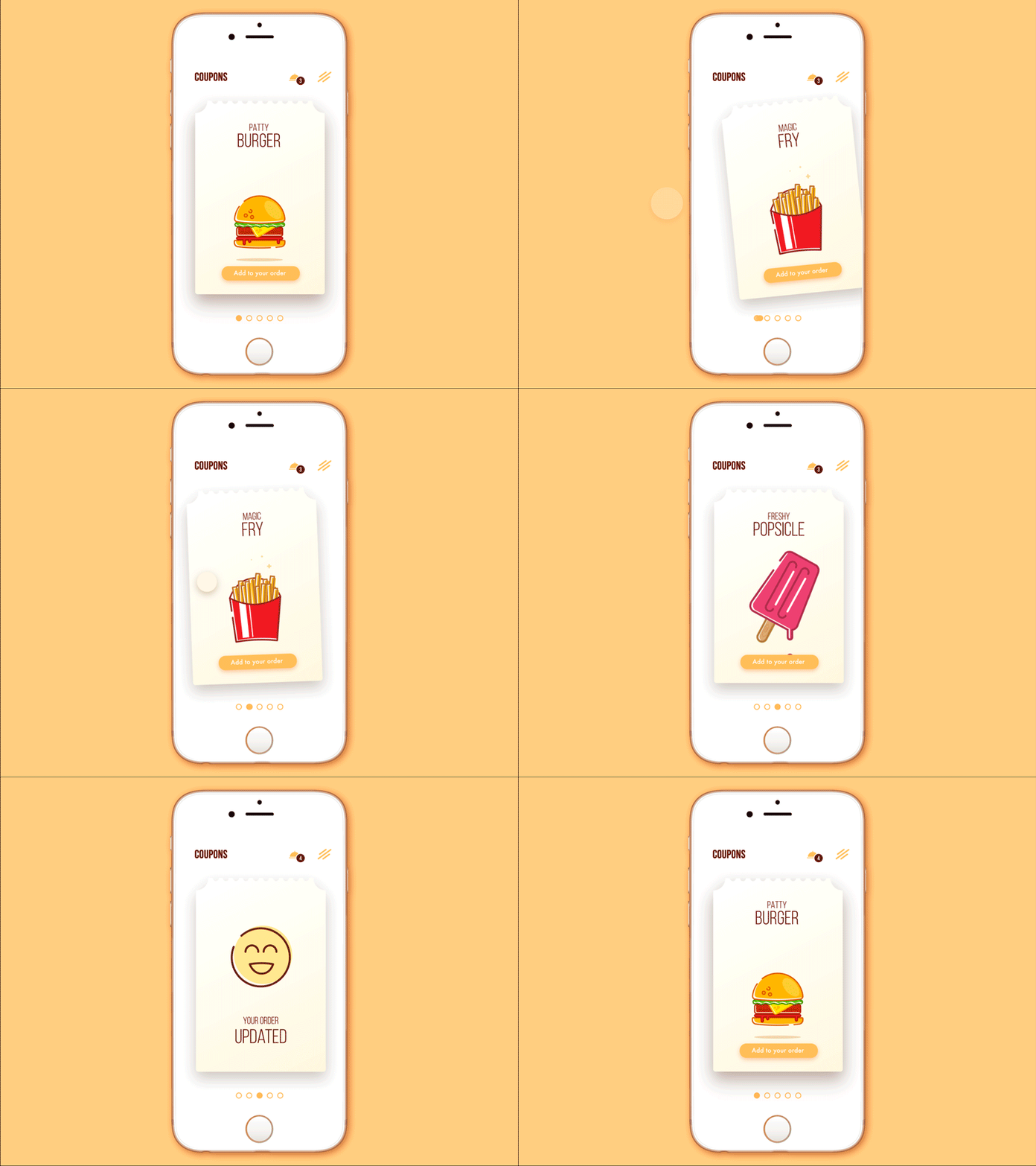
No doubt, good food is a great way to feel the world more positive and that is the message behind the presented animated interface design. This is the concept of a mobile application for a chain of cafes providing the functionality for saving coupons and discounts and then using them to buy tasty stuff. Interface animation is added to make the screen and interactions more lively and engaging and enable easy microinteractions.
Contact List Concept
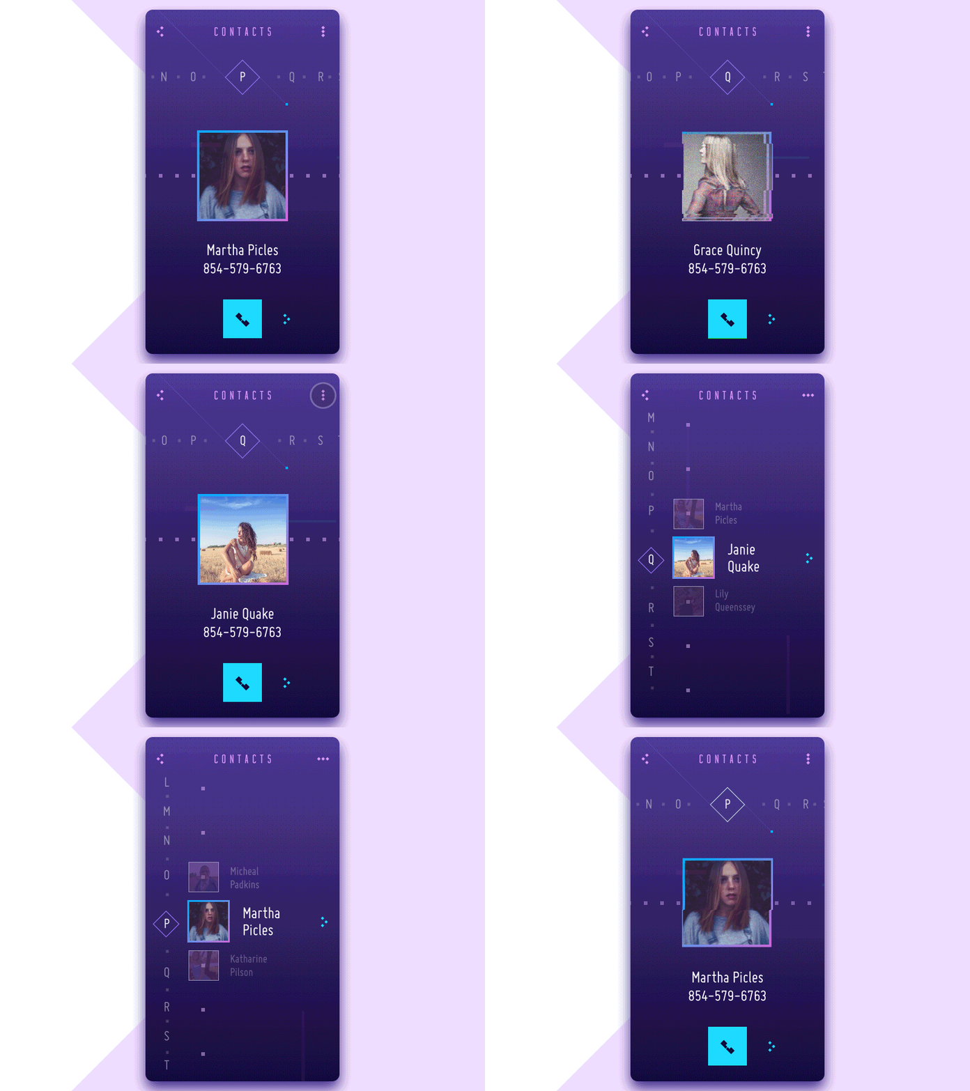
This concept is the animated version of the user interface for a contact list app. It features variants of the vertical and horizontal scroll as well as other interactions with the application. Animation not only livens up the process of interaction but also strengthens the stylistic concept of the app with special visual effects.
Location App
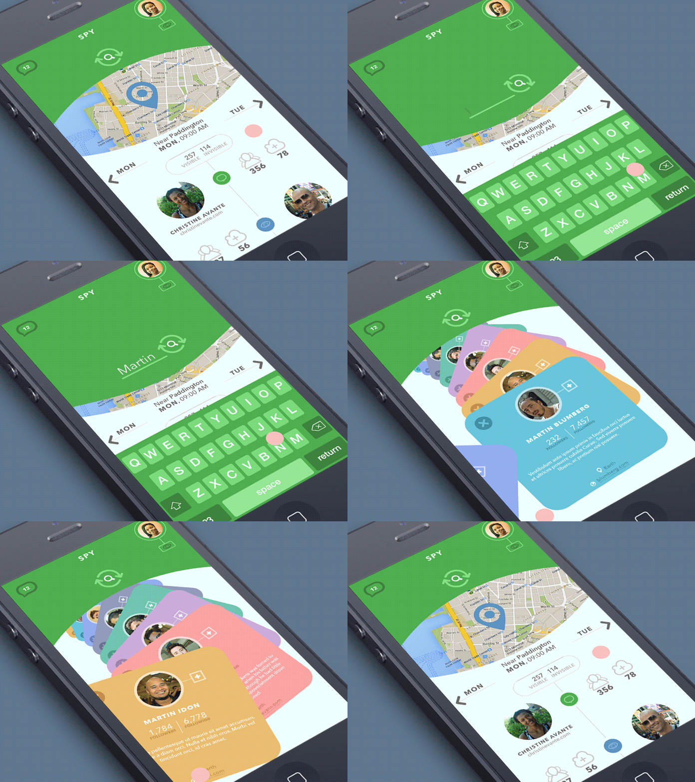
This simple mobile app consists of just a couple of screens and simply allows you to track the current location of your followers on the map. Here is the home screen animation and its dynamics in the process of search, as also the search results gallery. Animations imitate the movement of physical cards, which makes interaction with a neatly organized data base engaging and clear for the user.
Healthy Food App
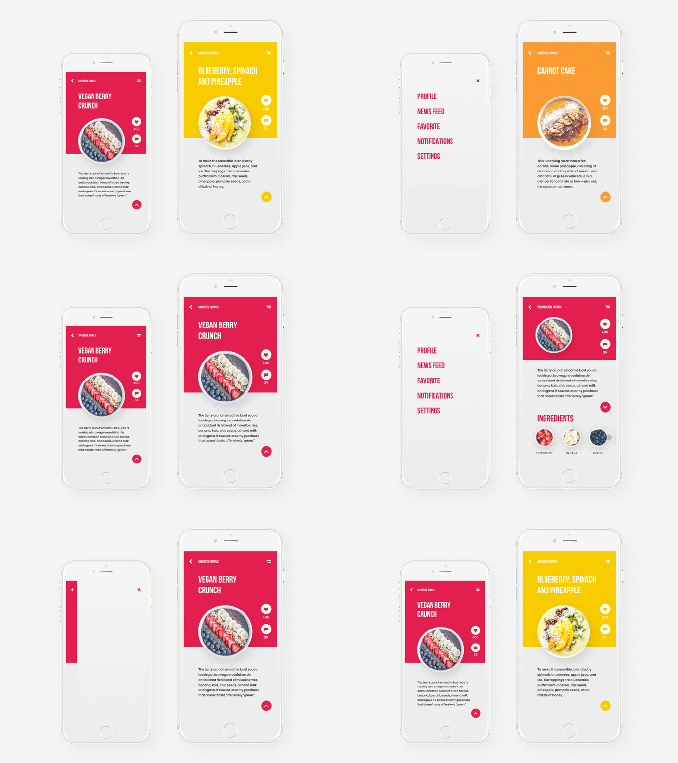
Here you can see the screens of the mobile app organized around the idea of a healthy lifestyle and providing recipes and tips on healthy food. Engaging graphic elements and correspondent color solutions are used to set the theme as well as enable fast visual perception of information which is supported with unobtrusive motion design accents. Animation is also used to show various interactions with a product. Together all those features support a user-friendly, attractive, and informative interface design.
In bottom line, it’s important to remember: animation, which is applied in the interface, should have a clear purpose in enhancing the general user experience. In the vast majority of cases, UI designer and motion designers try to find design solutions in which animated elements will satisfy multiple options increasing the usability and desirability of the interface.
Today’s list is over, but studio practice is full of many other interesting examples of design concepts for different purposes and needs of modern users. Don’t miss new presentations and design case studies in our future posts.
Tubik Design Collections and Articles
If you want to check more creative sets and useful articles on UX design for web and mobile, here are some of them.
App Design Ideas: 7 Nifty Mobile Application Design Projects
Information Beautified: Media and Editorial Website Designs
UX Design for Traveling: Impressive Web Design Concepts
23 Impressive Web Design Concepts for Various Business Objectives
Design for Sales: 10 Creative UI Designs for Ecommerce
UX Design: Types of Interactive Content Amplifying Engagement
Motion in UX Design: 6 Effective Types of Web Animation
5 Pillars of Effective Landing Page Design
The Anatomy of a Web Page: Basic Elements
Save the Planet: Web Designs on Environment and Ecological Issues


