Design isn’t just styling. It’s suggestion, intention, structure. And behind every interface that feels “right” lies a quiet architecture of shape—circles that soothe, squares that ground, triangles that point the way. Whether you notice them or not, shapes speak.
That’s the foundation of shape psychology—a field that explores how visual forms affect human emotion, cognition, and behavior. It’s less about art history, more about pattern recognition hardwired into our brains. We’re taught to read these cues long before we learn to read words.
This article dives into the psychology of shapes in design. Not as decoration, but as tools of perception. We’ll explore what different shapes communicate, how they shape experience, and why smart designers lean on form as much as function.
Because the human mind doesn’t scroll through screens like a robot. It responds. Reacts. Builds trust—or tension—in milliseconds. And shape is one of the oldest, fastest signals it responds to.
Let’s unpack that.
The Psychology of Geometric Shapes
When most people think of “shape,” they picture geometry: squares, circles, triangles. The kind of forms you first drew in kindergarten and now unconsciously scroll past on your phone. But in design, these forms aren’t passive. They anchor the page, steer attention, and carry meaning.
Understanding the psychology behind geometric shapes gives designers another tool for emotional precision. It’s not guesswork—it’s perception science, wrapped in pixels.
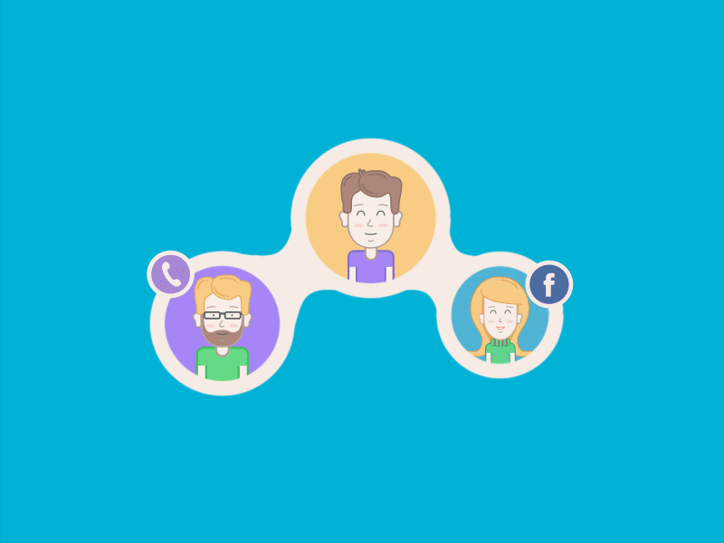
Social network tutorial animation
Squares and Rectangles
These are the pillars of visual design—literally and metaphorically. From screens and windows to walls and UI cards, squares and rectangles dominate our environment. Their straight lines and 90-degree angles feel safe, intentional, constructed. We associate them with architecture, structure, and systems that work.
Their presence in UX often communicates order and predictability—traits users subconsciously trust.
Common meanings:
- discipline—like a calendar grid or a tidy bookshelf
- strength—think concrete buildings and street signs
- reliability—the shape of books, apps, packaging
- security—windows, doors, and bank vaults
- order—spreadsheets, checkboxes, frameworks
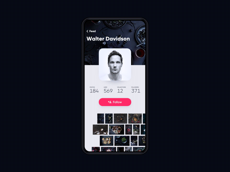
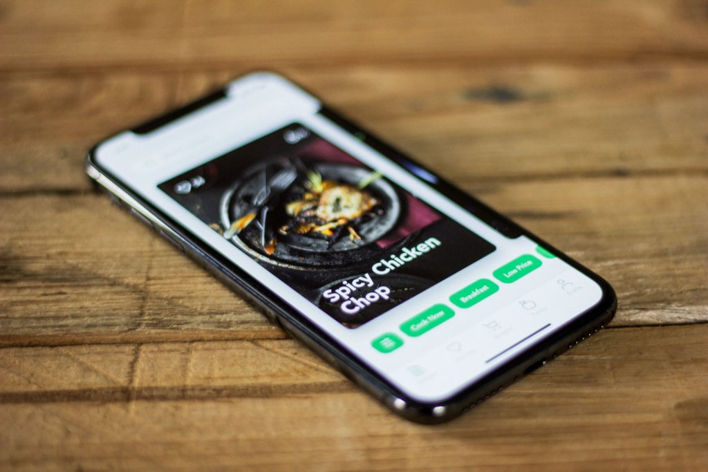
Photo App
Triangles
Triangles are directional. They don’t sit still—they point, climb, push forward. In UX design, a triangle tells your eye where to go. Its shape creates tension by default: a tip that leads somewhere, or a balance that could collapse if flipped.
An upright triangle feels stable, like a pyramid. Inverted, it becomes sharp and precarious—perfect for warning signs or attention grabs.
Common meanings:
- excitement—arrows, play buttons, “new!” icons
- risk—hazard signs, mountain peaks, yield triangles
- movement—road signs, fast-forward, pyramids
- balance—yoga poses, bridges, the recycling symbol
- alert—warning icons, caution tape, traffic cones
Circles, Ovals, and Ellipses
The circle is timeless—literally. No corners, no edges, no beginning or end. It echoes the sun, the moon, the Earth. Ovals and ellipses stretch that concept wider, hinting at orbits, cycles, and continuity.
In interface design, rounded shapes soften the mood. They feel human, intuitive, less machine-made. That’s why circular buttons often signal safety or friendliness, and why logos shaped like rings suggest unity or infinity.
Common meanings:
- eternity—wedding rings, clocks, planets
- feminine energy—womb shapes, soft gestures, Venus symbols
- the universe—orbits, cosmic cycles, full moons
- magic—crystal balls, potion seals, ritual circles
- safety—buttons, badges, rounded avatars
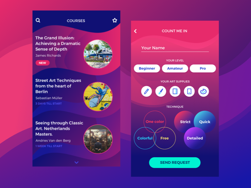
Art Courses App
Spirals
Spirals are where geometry gets organic. You find them in seashells, galaxies, fern leaves. Their structure feels natural yet expansive—always growing, always turning.
In visual design, spirals hint at motion and evolution. They can be playful or profound, depending on the pace. Think of them as the shapes of transformation.
Common meanings:
- growth—ferns, DNA, sunflower seeds
- creativity—doodles, whirlpools, brainstorm maps
- calmness—snail shells, gentle motion, labyrinths
- transformation—galaxies, tornadoes, personal change
Natural Forms in Design
Not all shapes come from geometry. Some come from the ground—organic, uneven, imperfect in a way that feels human. Natural shapes mirror the curves of a leaf, the ripple of a wave, the outline of a stone softened by time. They bring an instinctive calm, a quiet reminder that design doesn’t always need to be rigid to feel intentional.
Designers often borrow from nature when they want to evoke a sense of authenticity, freshness, or emotional depth. A swirling vine in a logo. A pebble-shaped button. A flower-inspired icon set. These aren’t purely aesthetic choices—they’re subtle psychological cues. Because our brains read natural forms as safe, familiar, and alive.
And within those forms lie symbolic echoes: a rose becomes shorthand for love and desire. A lion carries pride, power, and protection. Even when stylized, their roots remain emotional.
Common meanings:
- originality—the asymmetry of a fingerprint, the pattern of bark
- organic—flowing rivers, veins in a leaf, hand-shaped clay
- balance—a tree’s symmetry, the curve of a shell, yin and yang in nature
- refreshment—ocean waves, fresh grass, morning light through leaves
- warmth—soft pebbles, driftwood, petals resting open
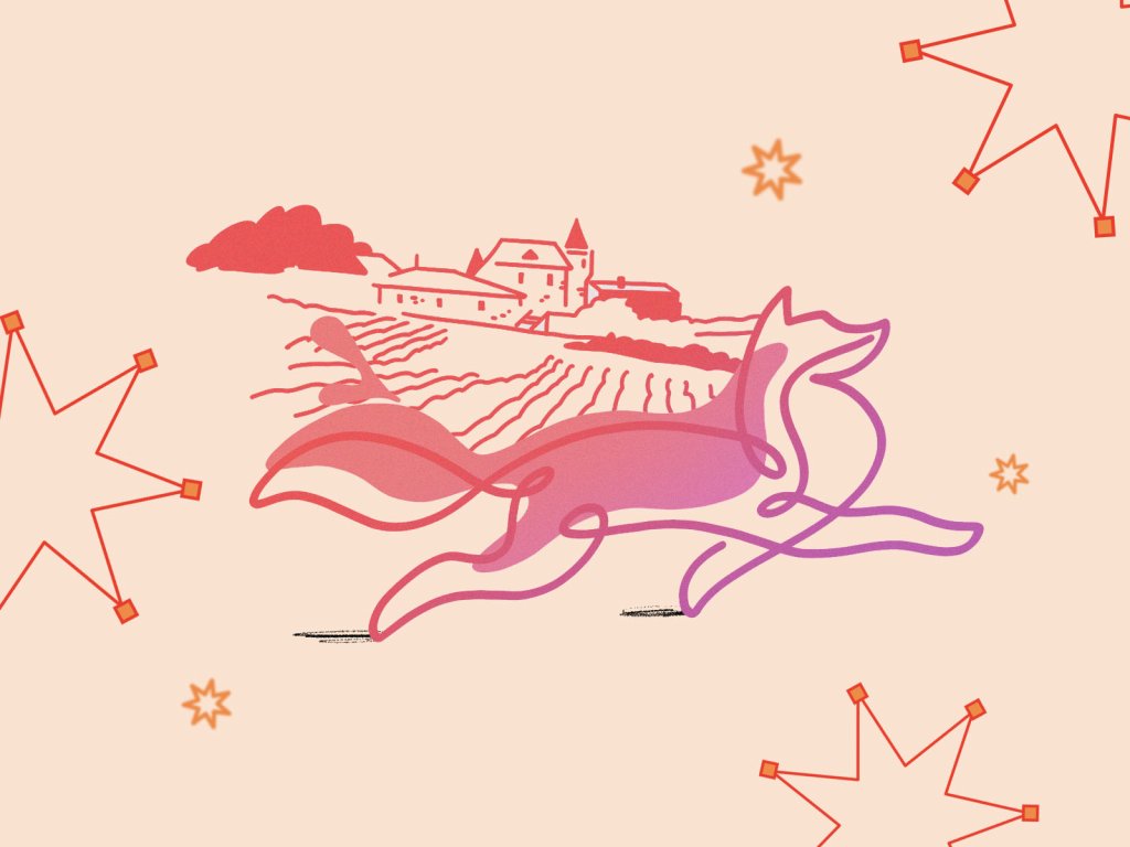
![]()
Andre landscape logo option
Abstract Shapes Meaning
On the other end of the spectrum sit abstract shapes—the distilled, symbolic cousins of nature and logic. They’re often stylized beyond recognition, pared down to the essential line or curve. You might not immediately know what you’re looking at, but you feel it.
In branding and UI, abstract forms are everywhere: logos that hint at infinity, icons that suggest movement, shapes that evoke duality or paradox. They give just enough information to spark interpretation, leaving the rest to intuition. That’s their power—being figurative without being obvious.
Common meanings:
- duality—overlapping shapes, optical illusions, yin-meets-yang geometry
- uniqueness—symbols that defy categories, forms that feel invented
- emotion through suggestion—a spiral that hints at motion, a line that feels like tension
- future-forward thinking—infinite loops, stylized infinity signs, abstract logos in tech
- complex simplicity—something minimal that makes you pause
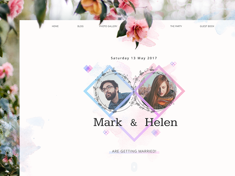
Wedding theme
How Designers Use Shape Psychology in Interfaces
In design, shapes aren’t passive—they guide, group, separate, emphasize. A well-placed form can become a signpost or a whisper. It can structure chaos or pull the eye toward meaning. That’s why smart designers don’t just draw—they engineer visual hierarchy using the psychology of shapes.
Take branding. A logo isn’t just a mark. It’s the first impression of a voice, a tone, a promise. A circle might signal community or continuity. A triangle? Precision, momentum, even risk. Squares? Stability, trust, groundedness. When you’re designing for a finance app, a law firm, or healthcare brand, these subtle cues become critical.
In interfaces, shapes are structural. Rectangles define grids, form cards, hold copy. Buttons rarely deviate from circles or soft-edged rectangles because they invite tapping. If content flows in a triangular layout—peak at the top, base below—users instinctively scan from priority to detail. That’s not guesswork. It’s cognitive patterning at play.
Shape is the invisible UX—you feel it before you think it.
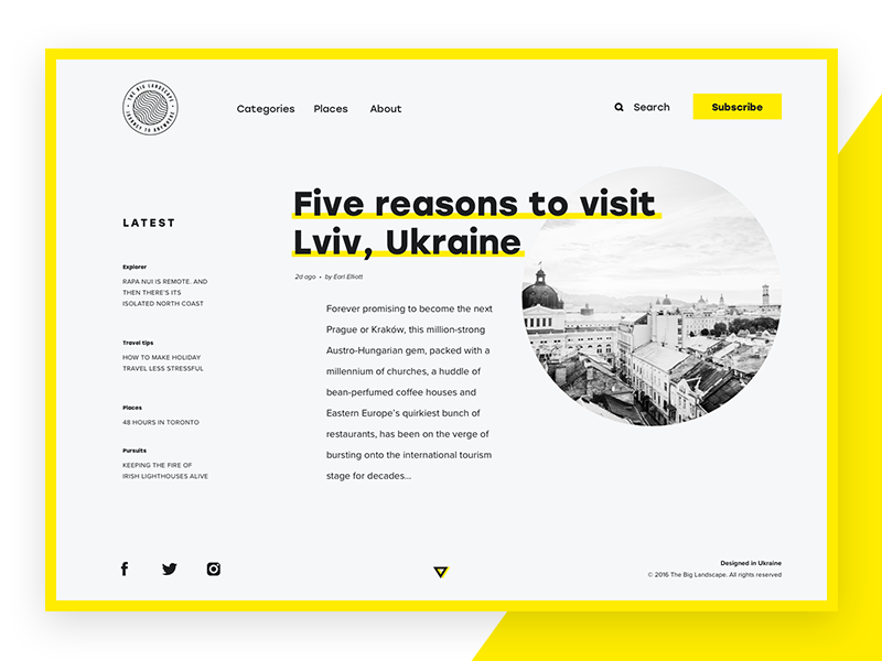
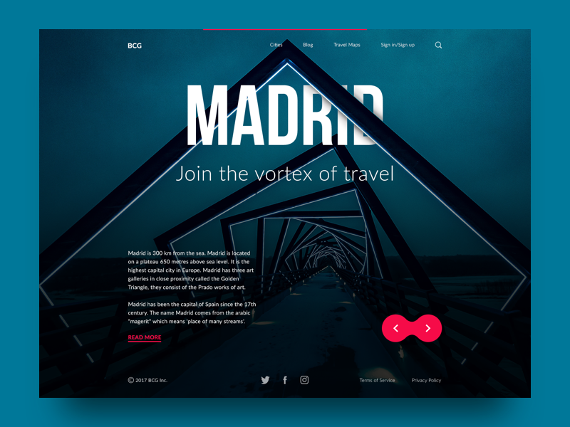
The Big Landscape
Typeface, Tone, and the Emotional Geometry of Fonts
Typography is where shape psychology gets especially personal. Every letter is a shape, and every shape says something. Fonts with soft, rounded forms tend to feel warm, open, even gentle. They often work well in wellness apps, lifestyle brands, or anything that leans human and emotional. Meanwhile, sharp-angled typefaces—with crisp diagonals and geometric cuts—can feel assertive, modern, even cold. Perfect for high-tech, legal, or industrial spaces.
The trick isn’t picking a beautiful font. It’s choosing a shape language that matches the message. If your copy says “relax,” but your font screams “alert,” users feel the dissonance, whether they know it or not. Understanding the psychology of font shapes isn’t aesthetic theory. It’s clarity, tone, and trust.
Designers don’t need to guess how people might react—psychology offers a map. And when you learn to read it, you design systems—logos, layouts, letters—that don’t just look good. They make sense.
Recommended Reading
If the psychology of shapes got you thinking differently about design, you’re in good company. We’ve written more deep dives on all things UX and branding—each one built to sharpen your eye and stretch your creative instincts:
Color in Design: Influence on Users’ Actions
Psychology in Design. Principles Helping to Understand Users
Directional Cues in User Interfaces
How to Make User Interface Readable
Basic Types of Buttons in User Interfaces
3C of Interface Design: Color, Contrast, Content