“Contrary to popular belief, designers are not artists. We employ artistic methods to visualize thinking and process, but, unlike artists, we work to solve a client’s problem, not present our own view of the world.” (Erik Spiekermann)
Modern design has multiple faces, sides, and directions. Some of them are more artistic than the others which are deeper concentrated on profits and goals. However, any way it goes, the design is the sphere with a different perspective. Design is a goal-oriented and problem-solving activity applying art to serve people.
“Whether you are helping to launch a new business from scratch, or making incremental changes to an existing product, or something in between, any design task you undertake must serve a goal. It’s your job to find out what those goals are.” (Mike Monteiro)
Talking about the sphere of web and app design, one of the most practical and goal-oriented fields of creativity is design for e-commerce. In this domain, there are many factors influencing design decisions and lots of relevant aspects to study and research. Designing a product for e-commerce, be it a website, a web or mobile application, branding design, advertising materials, designers work within various limitations built by a particular product or service features, target audience, marketing and promotion strategy, business goals, budget and investment plan, etc. Design becomes a tool working when used properly. Therefore, to use it efficiently, the designer needs to know the basics of business and economy as the goal of the design process, in this case, is creating an app or a website raising money and built on business techniques and methods. Moreover, quite often designers creating e-commerce platforms and products work in teams with marketing specialists, advertisers, researchers, analysts, and psychologists all of whom have a purpose of increasing the level of profit brought by the final product.
So, today we decided to start collecting and explaining here basic business terms that are important in the process of digital design for e-commerce. Considering this list can make the designer much closer to marketing specialists and provide great help for better communication. In addition, keeping the aspects mentioned below in mind on the earliest stages of design such as UX research and wireframing is a good way to effective solutions increasing profits on the solid well-thought-out logic of interaction. The set of terms can be also useful for project managers involved in the process and managing collaboration between different sides of the same process.

Business Basics
Today’s section is focused on basic terms used in the domain of economics and business strategy mostly concentrated on sales in their broad understanding. Taking them into account and analyzing significantly increases the chances of creating an efficient digital product.
“A satisfied customer is the best business strategy of all.” Michael LeBoeuf
E-commerce (Electronic Commerce)
“If you do build a great experience, customers tell each other about that. Word of mouth is very powerful.” (Jeff Bezos)
Definition. E-commerce is the direction of business activity when the process of providing customers with goods or services is done by means of electronic devices and the Internet. This sort of communication and finalization of sales adds some new aspects to data management, sales channels, advertising, presenting goods and services, and moreover – enabling the full cycle of commercial operations, including payments, delivery, and refunds.
The last decade witnessed booming e-commerce development. Today it provides opportunities for not only e-trade both from businesses to buyers but also online auctions and user-to-user sales platforms. E-commerce systems and activities today include presenting and booking a wide range of services, e-banking, commercial operations with e-money and e-wallets, diverse forms of e-marketing, and many other things that customers are using more and more often on an everyday basis.
Design aspect. Obviously, the success of e-commerce activity depends on several factors, among which:
- the quality of the product or service offered
- the quality of the content presenting the offer to customers
- the quality of design for the electronic platform – website and/or mobile application – via which the sales are going to be delivered.
So, it’s easy to see that the UI/UX design part plays a vital role. Thoroughly thought-out logic and transitions, simple and straightforward microinteractions, fast feedback from the system, attractive product presentation, easy payment flow, and plenty of other details and features can directly influence increasing profits for the business involved in such a popular e-commerce game. This is the field where designers and business experts can work as one team for the good of everyone, first of all the target user.
Designing an e-commerce website or mobile app, designers should definitely consider the following aspects:
– operational simplicity
– strong branding
– security of users’ data
– effective use of visual elements
– clear data presentation via menus, catalogs, etc.
– user’s ability to leave feedback about goods and services
– easily available general and contact information about the business providing goods or services
– design that supports the offer, not overshadowing it.
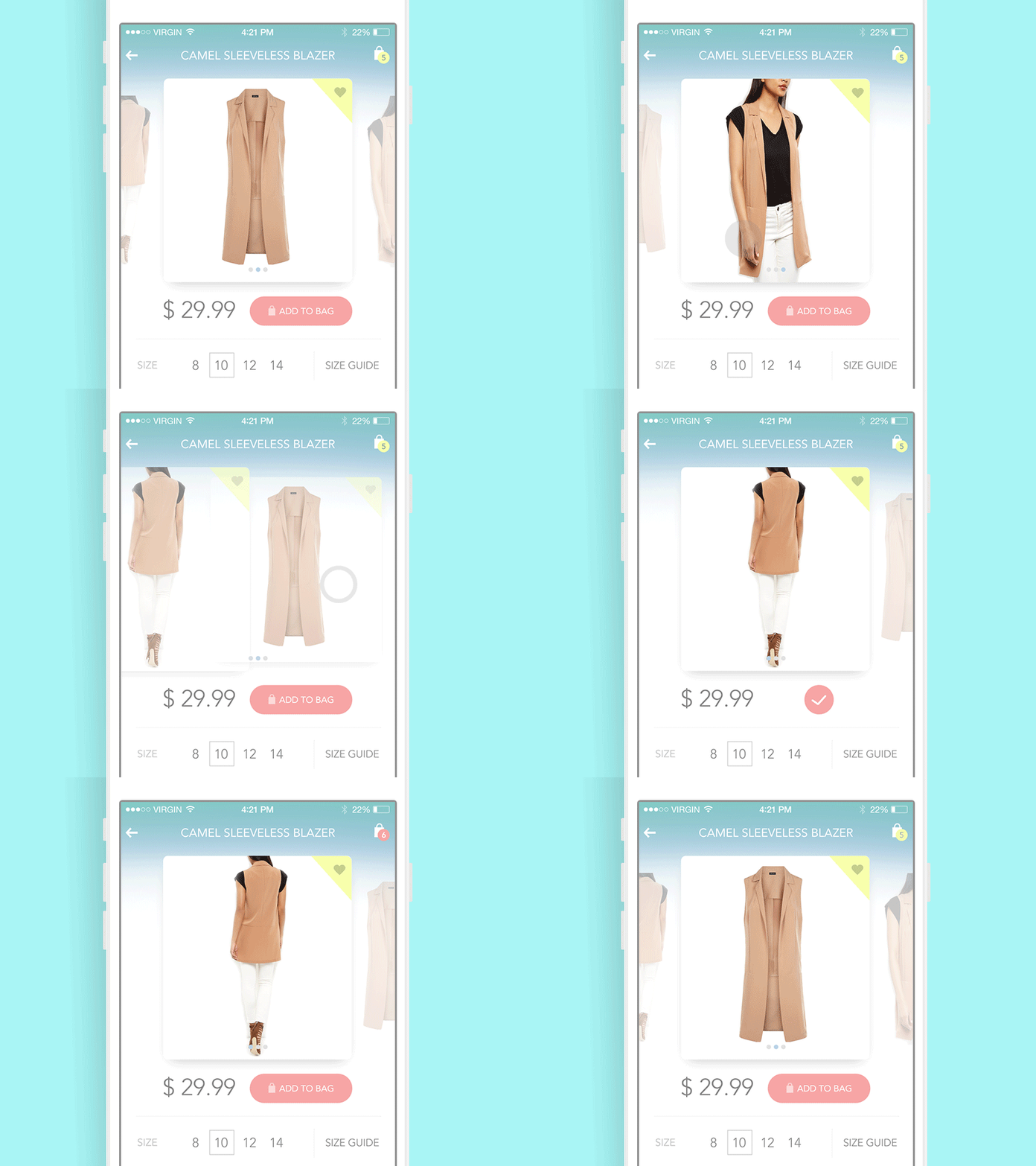
Product Card Animation
Conversion
“It’s much easier to double your business by doubling your conversion rate than by doubling your traffic” (Jeff Eisenberg)
Definition. Initially, in terms of e-commerce, the conversion is the index showing how many visitors actually moved to the end of the way they were offered actually buying a product. So, e-commerce conversion transforms visitors (users) into buyers.
Design aspect. Today e-commerce uses a wide range of techniques, so in terms of web or app platforms, the meaning of conversion also gets broader. In modern terms of comprehensive and numerous functions and needs, which users are able to fulfill with online resources and digital products, the conversion is the rate of cases when visitors did the action they were called to. And that can be not only buying something.
For example, in our article about landing pages which are recognized as one of the strong tools for e-marketing and e-trade, we mentioned that conversion can be also fixed in case of:
- moving to direct use of a product
- subscription
- transition to the other page
- downloading an app or a file
- providing some information
- answering the question in the survey
- starting free/discounted trial use of a product
- browsing a library
- reading a more detailed description of the product or service, etc.
Therefore, conversion for a webpage or app screen can mean different actions that correspond to the sales or marketing strategy of a particular business.
Conversion means that your page transforms passive users into active ones. They don’t just observe the information given to them but also do the action which is offered by this page. So, the conversion is one of the most important indices of the web page or app screen efficiency, which is vital for business. It is a metric reflecting focus on engaging visitors with data performance and stimulating them to make the action, which is a part of a business plan.
For designers, the factor mentioned above means that if they create a design concentrated on conversion rates via positive user experience, their work will result in a website or app bringing profit both for user and business.
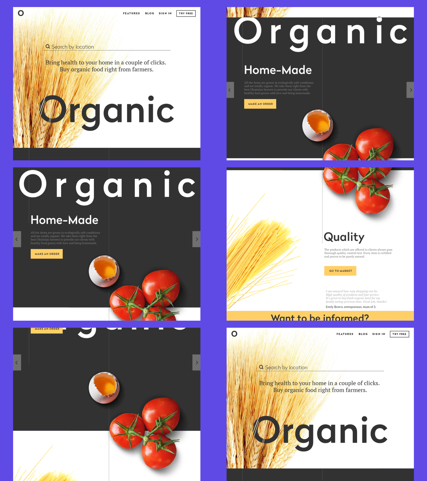
Landing Page Animation
Read more and review the examples on this topic in our previous article
Sales Funnel
“Communications is at the heart of e-commerce and community.” (Meg Whitman)
Definition. Sales funnel (in other words – purchase funnel) is a technique that is deeply customer-focused and based on the gradual involvement of a customer into the process that potentially gets finalized with the act of actual purchase. When this technique is applied, the customer moves through several stages of involvement providing him/her with necessary information about the product and benefits, persuading them to make a purchase.
Basic sales funnel includes the following stages:
- Introduction (Awareness). User gets the initial information about the product, its brand name, and nature. In other words, the user learns that the product or service exists on the market.
- Education (Interest). User is provided with more detailed information about the features and benefits of the product or service that can potentially interest them and solve their problems.
- Evaluation (Analysis). User gets the chance to compare the offer with its competitors and obtain the information about USPs (Unique Selling Points) of the offered product or service.
- Decision (Engagement). User gets final vital arguments engaging him/her to make a decision; it can be short summing-up about core benefits of the offer, data about additional bonuses or special offers, engaging calls to action and explanation of purchase process.
- Purchase. User makes a decision and takes the ability to make a purchase. The sale is done.
- Retaining (Repeating the experience). Users get the opportunity to leave feedback, obtain additional contacts supporting the offer, subscribe to updates, get the chance to repeat the purchase easily if desired.
Design aspect. In terms of e-commerce, the sales funnel is a highly effective commercial technique supported by the diversity of functions digital products can offer. Knowing the principles of sales funnel leads to customer-centric, informative, and engaging design solutions. Sales funnel can be either fully represented on the website or landing page as well as in mobile application or from the outer source, for example, social media taking over the mission of awareness and interest and directing engaged traffic to the platform enabling the product.
In addition, sales funnel stages thought out and applied properly can work as a sort of filter letting quickly inform users about the product or service and move to the next stage those who are potentially more interested while saving time and effort for those who are looking for something other.
However, sales funnel designed carelessly can play the opposite role: it can confuse users who are potential buyers and turn them out of the website or app without taking a chance to know proper information about the offer.
Sales funnel should be applied and designed on the basis of thorough research of the target audience and market segment. Moreover, it should be carefully tested from the very start of its implementation to measure if all the stages work efficiently. Practice proves that even minor design changes can bring big changes.
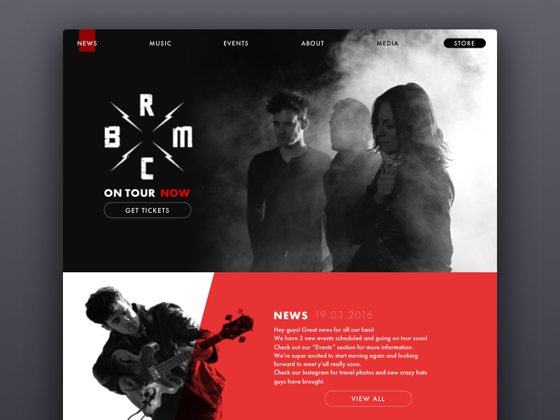
BRMC Website
Sales Channel
“It is not your customer’s job to remember you.It is your obligation and responsibility to make sure they don’t have the chance to forget you.” Patricia Fripp
Definition. Sales channels are the ways through which the potential customers come to the point of e-commerce, be it a website or mobile application with which they can realize the actual purchase.
Design aspect. Designing for e-commerce, it is important to take into account the maximum of the possible sales channels, which are really numerous on the Internet, from social networks to specialized forums, influencer reviews, and tailor-made advertising campaigns. Researching and understanding those channels gives broader prospects to the actual point of sale which you are designing for.
There are several vital aspects to remember:
- Sales channels should be initially concentrated on the target audience. There is always a place and time to broaden the perspective as soon as the core target audience is involved. However, the attempts to “sell for all” and “design for everyone” from the launch can bring to waste of effort, time, and money spent on design and promotion. Move gradually and measure the efficiency of design solutions at every step.
- Sales channels will work effectively from the initial awareness stage if they witness a strong connection to general brand identity. That is the reason to develop guidelines for online sources presentation in the brand book considering all the details of visual presentation and mission statement. Consistency is a powerful tool for both design and marketing.
- Sales channels should direct traffic to the place that enables users to quickly get informed and make the actions they come for. For example, if the post on Facebook invites users to participate in the summer sale, they should be directed right to the landing page of this sale, not to the home page of the website.
The mentioned factors thought out at the stage of thinking over UX design solutions are able to make a good impact on conversion and sales rates.
Niche
“We will continue to see a convergence of the digital and physical world. Those who conquer that trend will be market leaders.” John Phillips
Definition. In business, niche means the concentration of the offer on specific needs, wishes, and problems of a specific target audience. A niche market is a specialized market segment that is aimed at specific market needs with a close view of its demography, education level, level of income and purchase abilities, etc. For example, when one company produces software generally used for creating and editing textual materials for a broad target audience while the other is adapted for specific needs of copywriters and editors (grammar checking, plagiarism analysis, synonyms prompts, etc.), the latter one presents the niche business.
Design aspect. Designing for a niche market and niche product, it’s important to learn all the details about the target audience as it is going to be quite specific and more details are usually influencing the process of design and marketing. Applying psychology of color, copy targeted at potential clients, deep analysis of their needs, and providing efficient layout, easy transitions, clear data presentation, and aesthetic features that suit this particular audience is a good way to high profit. In addition, creative ways to emphasize the specific nature of the product or service by means of design such as branding and original UI solutions can help the product to stand out from the crowd and stay competitive.
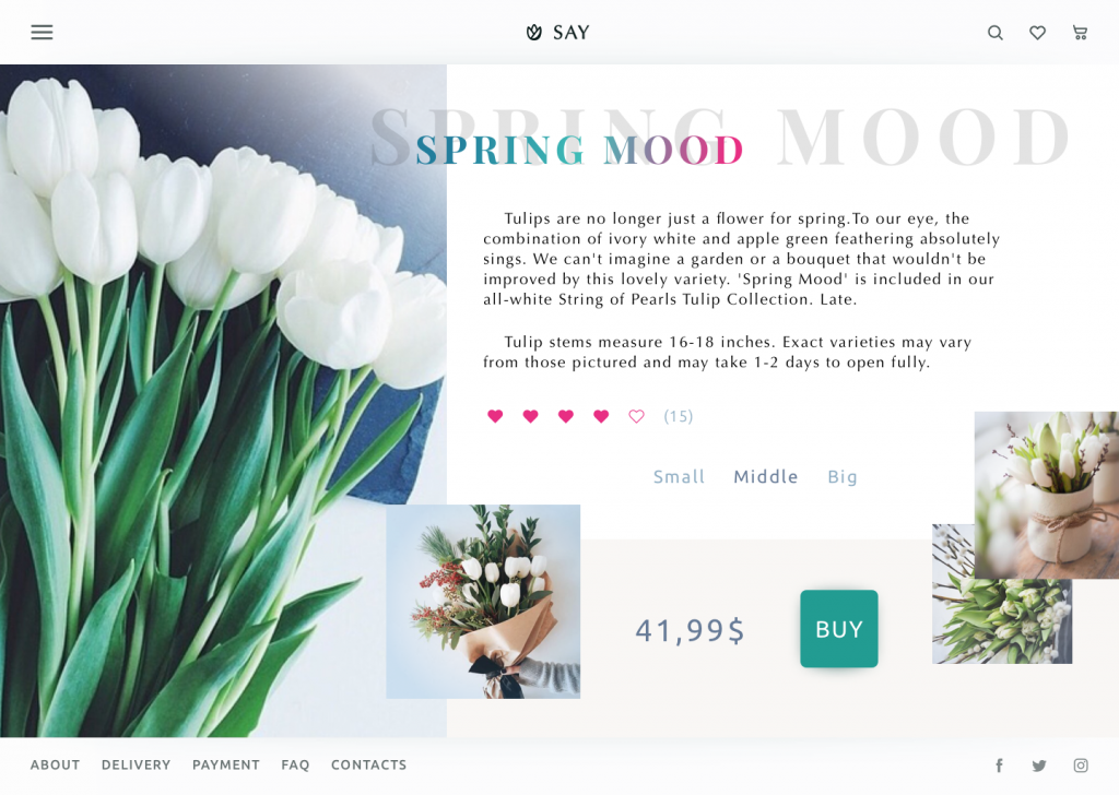
Florists’ e-commerce website
Maslow’s hierarchy of needs
“It is quite true that man lives by bread alone — when there is no bread. But what happens to man’s desires when there is plenty of bread and when his belly is chronically filled?
At once other (and “higher”) needs emerge and these, rather than physiological hungers, dominate the organism. And when these, in turn, are satisfied, again new (and still “higher”) needs emerge and so on. This is what we mean by saying that the basic human needs are organized into a hierarchy of relative prepotency” (Abraham Maslow, 1943).
Definition. One of the basic psychological theories widely applied in business on both micro and macroeconomic levels. Developed by Abraham Maslow, it is focused on the hierarchy of human needs and consequently factors of motivation.
Its presentation found on the Simply Psychology website features 5 levels of human needs featured by the theory:
1. Biological and Physiological needs – air, food, drink, shelter, warmth, sex, sleep.
2. Safety needs – protection from elements, security, order, law, stability, freedom from fear.
3. Love and Belongingness needs – friendship, intimacy, affection, and love, – from a workgroup, family, friends, romantic relationships.
4. Esteem needs – achievement, mastery, independence, status, dominance, prestige, self-respect, respect from others.
5. Self-Actualization needs – realizing personal potential, self-fulfillment, seeking personal growth, and peak experiences.
Design aspect. Having read the points of the theory, it’s easy for a designer to ask: “What does it have in common with the design process?” The link perhaps doesn’t look really obvious, but it is fundamental in motivating people to use or buy products or services on different levels of the economic relationship. Designing for e-commerce, which is one more type of human relationship, with a specific goal and ability to apply the mentioned theory can produce user-friendly and customer-centric products achieving its target audience and solving its problems.
Certainly, it’s great when the designer is able to involve professional marketing specialists in all the stages of the creative process and apply their professional knowledge and skills in design form. However, this opportunity isn’t always available. Moreover, the designer able to analyze economic basics and business factors influencing the design scheme and logic gets a higher level of proficiency.
In the design for e-commerce, it is good to understand from the early stages of the process what stage of Maslow’s pyramid the core target users are at. Answering this question, the designer is able to talk to users’ in their language and find the solutions that resonate in their hearts and minds the best. Users’ needs determine their motifs, triggers that can catch their attention, words that can touch them, the length of copy, and calls to action that they are ready to accept and follow. Analyzing the level of needs and expectations, the designer is able to find the most efficient layout and informative graphic elements. Knowing and feeling the user is the solid foundation for problem-solving goal-oriented design.
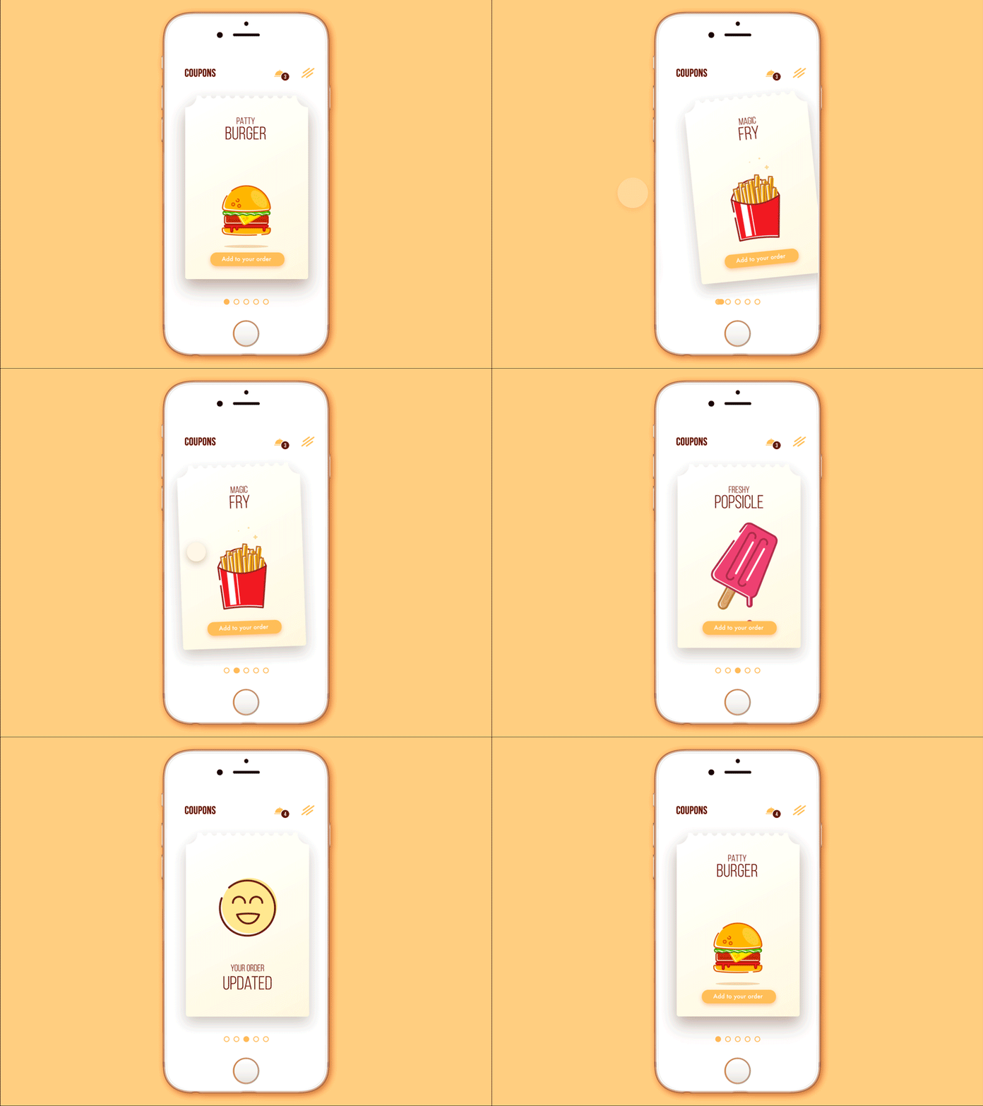
Cafe Coupon App
4P Theory
“People don’t call it e-commerce anymore. It’s called omni-commerce, and it’s the idea that digital permeates every step of the purchase chain from product discovery to trial to pricing to actual purchase.” (Tolman Geffs)
Definition. Famous 4P theory, presented by Neil H. Borden and later grouped by E.Jerome McCarthy, also known as the marketing mix, has become highly popular and efficient in business strategy, including the e-commerce sphere. It states that product launch and lifecycle is based on four “P” factors: product, price, place, promotion. Business Case Studies website simply formulates it the following way:
“When marketing their products, firms need to create a successful mix of:
- the right product
- sold at the right price
- in the right place
- using the most suitable promotion.”
Marketing case studies prove that missing even one of the four mentioned positions can waste all the effort and reduce the levels of profit and brand awareness significantly.
Design aspect. No doubt, the 4P theory is highly applicable in design for e-commerce. The Price of the product is usually the furthest from the designer’s decisions as it is decided and given by the stakeholders ordering the design part of the work. In the perspective of Product it works only partly being applicable to those cases when users buy digital products or services, let’s say mobile applications, which also need UI/UX design.
However, talking about the other two factors we can see how actual they are in terms of design effort and creativity. Indeed, designers creating websites or apps for e-commerce, create the right Place for trading and are responsible for making this place comfortable, attractive, and correspondent to the product nature as well as target audience expectations. As for the Promotion, today online marketing features numerous ways of presenting the product and achieve the target audience; its effectiveness also significantly depends on design decisions.
Neglecting close interconnection and mutual influence of all those factors on the final result increases the risk of poor rates. Design decisions made on the basis of those factors supporting each other help to provide pleasant, positive, easy-to-use, and user-focused e-commerce platforms.
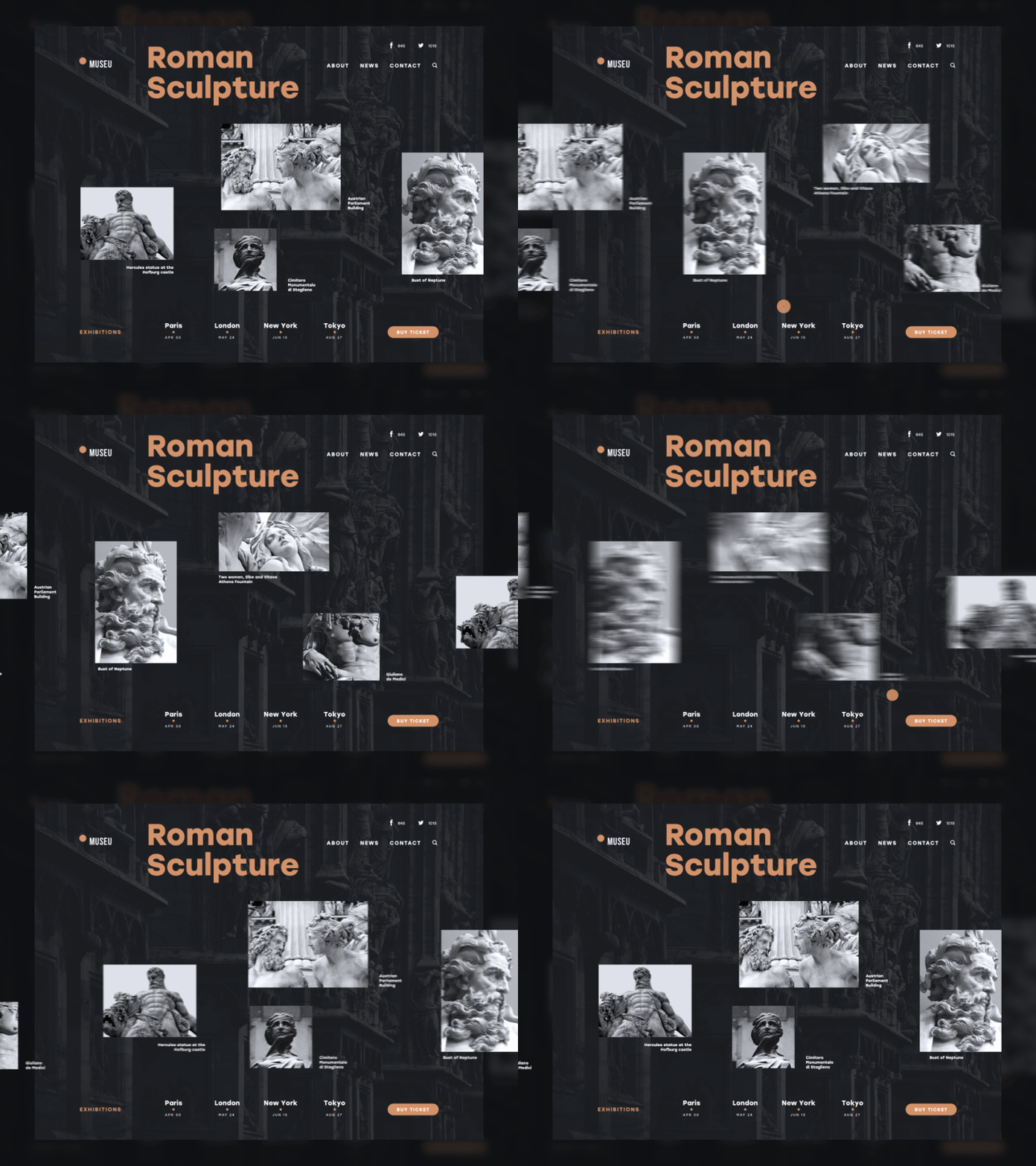
Museu
The bottom line
The set of business terms and their definitions given above builds the bridge between business strategies and designs able to efficiently support them. However, it’s very easy to get overwhelmed with all those techniques and forget the first and most important thing. There are no sophisticated design solutions, marketing techniques, and any sort of magic that will sell bad products for a long time. Surely, there can be some effect, but it will never retain the users. The positive experience of interaction with a website will not overcome the bad experience of interaction with a low-quality product or service.
The offer is the key. Design is an actionable and helpful tool on every stage of launching, presenting, and promoting the product, informing users about it, and selling it in a fast and easy way. Nevertheless, if the product is of poor quality, the successful design of an e-commerce platform isn’t going to make it better. Think about the product and its user first, only then the design will give it the chance to beam at full.
“To satisfy our customers’ needs, we’ll give them what they want, not what we want to give them.” Steve James
Don’t miss our next article, which presents a set of business abbreviations useful for UI/UX and graphic designers in terms of marketing and user research. Stay tuned!
Welcome to read or download the free ebook Design for Business


