‘Content isn’t King, it’s the Kingdom,” Lee Odden said. We couldn’t agree more: without content, design will be just a wrapping. On the web, good design doesn’t exist in a vacuum. It’s only as powerful as the content it carries. And when we say content, we don’t just mean words.
Visual content is everywhere. From the moment your site loads, users are scanning for meaning, hierarchy, emotion—all within milliseconds. That’s the unspoken magic of images in web design. Whether they’re photos, icons, custom illustrations, or slick 3D renders, images do more than decorate; they communicate.
But not all images are created equal. Different image types serve different roles in user interface design—some guide, some sell, some just make your site feel alive. So let’s zoom in and dissect the five most common (and crucial) types of images used in web content today. Starting, of course, with the one that usually sits in the top-left corner.
Images aren’t just a factor of beauty: in user experience design, pictures play an important part in building up usability. Most web users are visually driven, they perceive pictures faster than words. So, quite often images are the layout elements that are seen and scanned first. What’s more, they are informative and emotionally appealing, they transfer not only a message but also particular aesthetics. Also, images used on the web pages positively influence website SEO ranking.
Depending on the goals behind the website design, creative and marketing teams choose among different types of images. The following ones are the most typical to see on a webpage.
Logo: Your Brand’s Handshake
In UI design, the logo is functional, recognizable, and—let’s be honest—expected. You can go wild with creative layout grids and next-gen animations, but if your logo doesn’t sit up in the header like a loyal golden retriever, users will start to wonder what else you’ve messed with.
At its best, a website logo acts like a compass. Tap it, and you’re back at home—literally, to the homepage, or at least to the start of your scroll journey. That’s UX logic shaped by decades of browsing behavior. Break this pattern, and you risk annoying users before they even engage.
Logo image tips for better UI design:
- Header placement is non-negotiable. Unless your site is art-school-experimental, put the logo top-left (or centered on mobile).
- Make it clickable. It’s 2026 and users still expect to click logos to return “home.” Don’t make them use the back button.
- Subtle hover animations add life. Think fade-ins, scale pulses, or icon reveals—just enough to say “I’m interactive” without screaming.
- Don’t forget dark mode versions. Light-on-dark logos can smudge into the abyss if you’re not careful. Always prep dual-color variants.
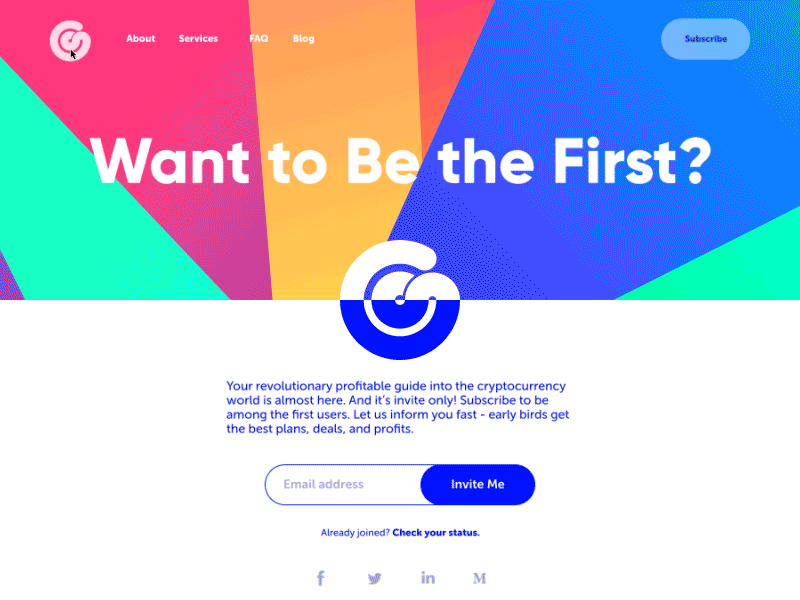
Here’s a landing page we designed for a crypto service with a morphing, animated logo. It doesn’t just sit there. It breathes. When hovered, it playfully spins and shifts hue—subtle enough not to distract, but alive enough to feel part of the ecosystem. That’s what we mean by visual communication, not decoration.
Photos: Reality Check (with Style)
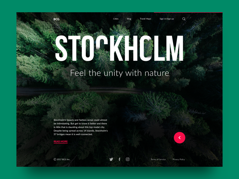
Photography is the visual comfort food of the internet. It’s familiar. Tangible. No matter how sleek or minimal your interface is, a well-placed photo grounds it in the real world. That’s especially vital in e-commerce design, where the whole business model rests on one principle: “what you see is what you get.”
Photos have range. They can be:
- Hero shots on landing pages (think sweeping landscapes or smiling faces)
- Product images on shop listings
- Editorial banners for blog articles
- Background textures for emotional atmosphere
- Lifestyle shots for services or platforms selling less tangible things.
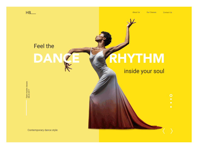
Dance Academy Landing Page
And beyond utility, photos carry culture. Everyone today is a photographer—at least by smartphone standards. We’re wired to interpret the world visually, frame by frame. So when a site features authentic, well-composed photography, it taps into something primal. You trust what you see.
But let’s not romanticize. Not all photos are created equal—and some come straight from the stock photo uncanny valley. You know the ones: the man in a suit laughing at a salad, the weirdly excited call center girl with a headset. That’s not web design. That’s filler
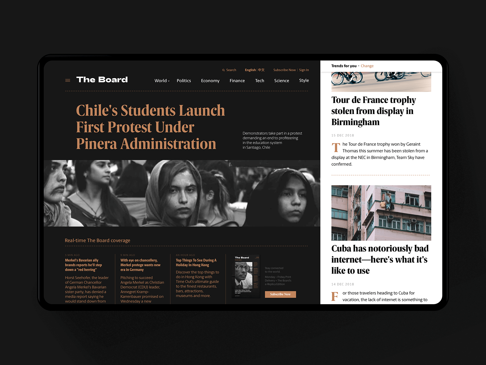
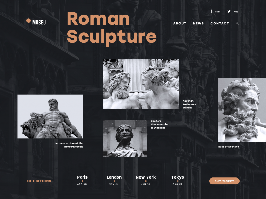
News Media Website
3 typical sources for website photography:
- Original photos. Best-case scenario. Tailored to the brand. Total control. Also: expensive.
- Paid stock photos. More affordable, but finding the right match often means sifting through visual clutter.
- Free stock libraries. Great for budget projects and prototyping, though originality takes a hit.
Here’s a shortlist of free photo sites we actually use (and don’t hate ourselves for):
- Unsplash – High-res, curated, rarely cringey.
- Pexels – Massive variety, especially good for tech/lifestyle themes.
- Pixabay – Includes vectors and illustrations too.
- PikWizard – Commercial-safe and searchable, with over a million visuals.
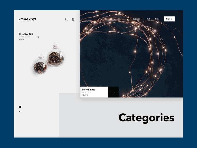
Home Craft Website
Web design tips for using photos like a pro:
- Always compress. Use tools like TinyPNG or ImageOptim. A beautiful site means nothing if it takes 12 seconds to load.
- Mind the mood. Match color grading to your brand palette. Don’t drop a warm vintage filter onto a clean, clinical fintech site.
- Keep them responsive. Test how your image crops across devices. Nobody wants to see a hero shot cut off at the eyebrows on mobile.
- Let them breathe. Balance photo-heavy layouts with negative space. Cramped = cheap.
- Make them speak. A photo should support your brand message or tone—not just fill a blank area in the grid.
Photos also make great background visuals, but this can backfire if you’re lazy with contrast. Ever tried reading white text on a sunset? So, if you go for a photographic background, double down on text legibility—use overlays, shadows, or blur effects to maintain clarity.
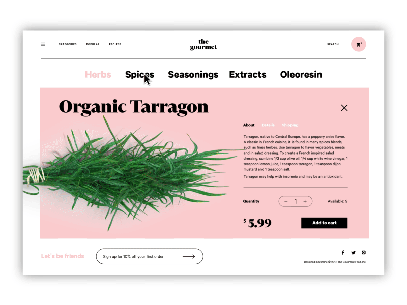
The Gourmet website, an e-commerce store selling herbs, oils, and spices, applies photo content for goods presentation.
Illustrations: The Voice of Visual Originality
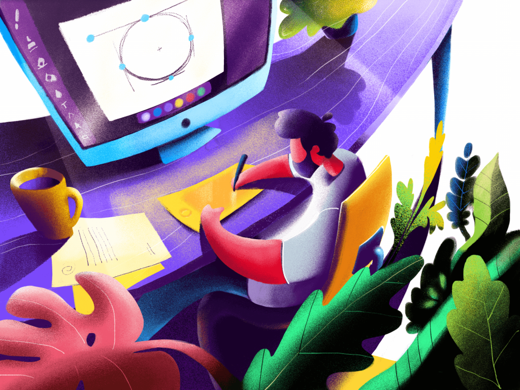
If photos are the default, illustrations are a more creative option. They tell stories, carry tone, and open up a universe of visual metaphor that’s impossible to achieve with literal imagery.
And right now, custom illustration is having a serious moment in web design. Not just because it looks good (though it really does), but because it gives brands a signature. When used well, illustrations differentiate a site in a sea of sameness. It’s how you make your fintech product feel a little less fintech-y, or your B2B SaaS dashboard a little less soul-crushing.
We’re seeing this everywhere—from slick landing pages to gamified dashboards to educational platforms trying to look less intimidating. Think hero characters, storytelling scenes, explainer graphics, even mood-driven micro-illustrations baked into empty states or 404 pages. No more default sad face icons—now your 404 can wear a party hat and look confused.
Popular illustration use cases in web design:
- Hero sections (aka the first impression)
- Blog headers and editorial images
- Empty states or onboarding flows
- Gamification (badges, progress visuals)
- System feedback (success/failure messages)
- Content category markers or UI tags
- Product explainers or infographics
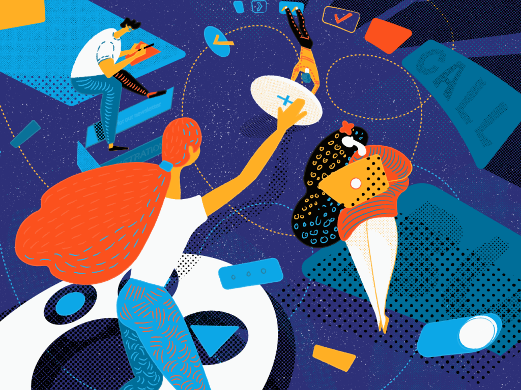
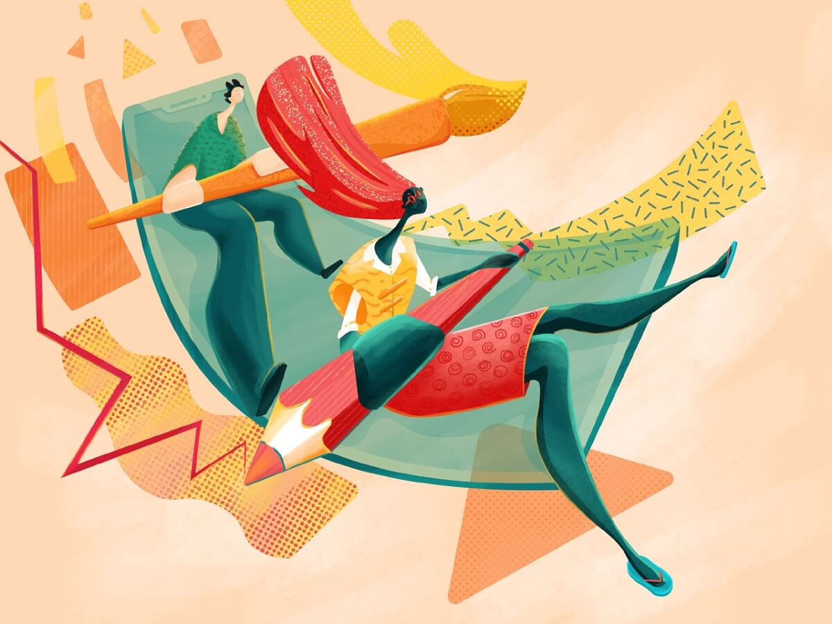
Take, for instance, a landing page we built for a digital art conference. We used a vibrant, animated illustration of an artist mid-creation, their tools floating around them like a constellation. Because that’s the energy the event needed.
The landing page for a conference where illustrators and digital artists share their experiences.
Or a web portfolio for a designer who works in entertainment and celebrity branding. Dark background, neon accents, and a custom illustration of a stage spotlight in motion—it captured the industry vibe better than any headshot ever could.
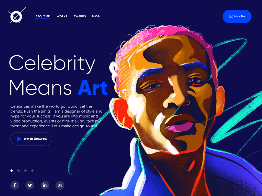
A concept of a portfolio website for a designer that specializes in projects for celebrities, entertainment, music, and film production.
Illustrations also work wonders for platform storytelling. We once designed a series of onboarding scenes for a healthcare startup. Instead of showing medical gear or hospital interiors, we used characters—nurses, patients, managers—interacting in simplified yet human scenes. That human touch made the platform instantly feel more trustworthy, less sterile.
Of course, not all illustrations are made equal. Beware the generic-flat-style-guy-doing-something-weird epidemic. You know the ones: stiff poses, random gradients, nobody has a neck. These used to be fresh in 2017. Now they just signal laziness. Go custom or go clever—otherwise, you’re blending in.
Illustration tips for UI design that works:
- Match style to voice: minimal for fintech, playful for edtech, textured for publishing, etc.
- Avoid over-detailing. UI illustrations are there to support the layout, not hijack it.
- Test color contrast and scaling on mobile. That beautiful thin line might just vanish on a phone.
- Use animation sparingly but smartly. Motion can hint at interactivity or add personality—but keep it fast, smooth, and lightweight.
Mascots: When Your Brand Grows a Face
Let’s talk about mascots—the unsung heroes of memorable UX. In user interface design, they can do a surprising amount of heavy lifting. Not just for fun, but for function.
You’ve seen them—winking foxes, wise robots, sleepy pandas—characters that pop up in onboarding, offer encouragement when you hit a milestone, or soften the blow when something breaks.
In an era where AI assistants are everywhere and most websites want to feel human, mascots offer a literal face to talk to. They speak in tooltips, they wave in pop-ups, they wear sunglasses when you’re winning. And users remember them. Which, in branding, is half the battle.
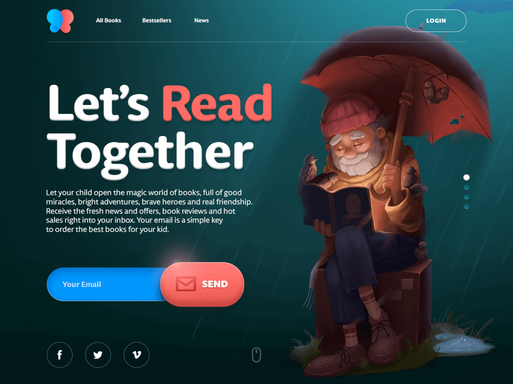
Cute and friendly mascot used as a hero image for an e-commerce website selling books for children.
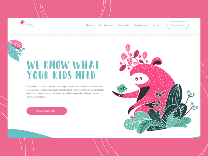
Originally created characters used as mascots for a babysitting service
Here’s why mascots work:
- They make interactions feel less mechanical.
- They add narrative without requiring paragraphs of text.
- They create emotional continuity across screens and actions.
- They can evolve with seasons, moods, product states.
You can also build visual variation through a mascot system: different facial expressions, costumes, moods, even holiday themes. Suddenly, your UI has range—and personality.
Mascot design tips for UX pros:
- Build a flexible character system with interchangeable parts.
- Keep expressions readable even at small sizes.
- Use speech bubbles or gesture cues for communication.
- Maintain accessibility—don’t rely solely on mascot emotion for UX feedback.
Mascots aren’t always right for B2B dashboards or high-security platforms, of course. But where there’s space for warmth and humanity, they do more than delight—they connect.
3D Renders: Elevation Through Dimension
Nothing says “premium” like a well-executed 3D render on a website. Done right, it’s the digital equivalent of turning your product into a sculpture.
3D graphics in web design are no longer reserved for gaming or architectural studios. Today, they’re everywhere—from fintech startups with virtual cards that spin in space to productivity apps that visualize abstract workflows as tactile objects. And they work.
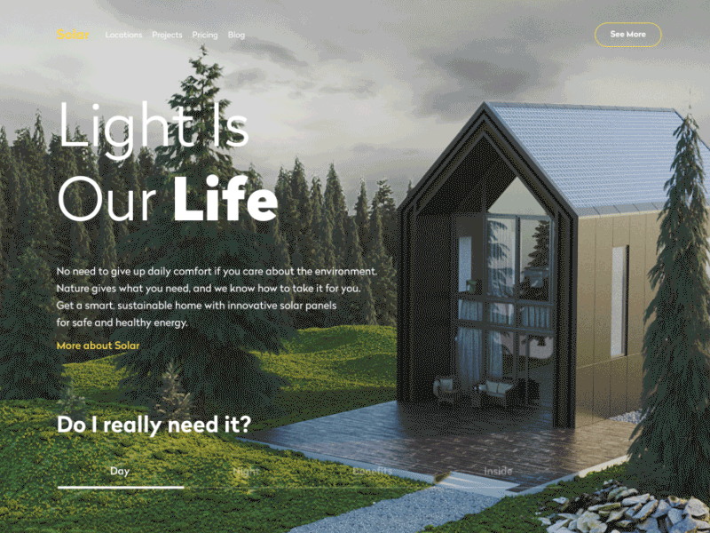
We once designed a site for a sustainable housing startup. Instead of showing static images of solar roofs, we built an interactive 3D model of the house that toggled between day and night mode. Suddenly, the value proposition was visceral. Users didn’t just read about energy savings—they felt it.
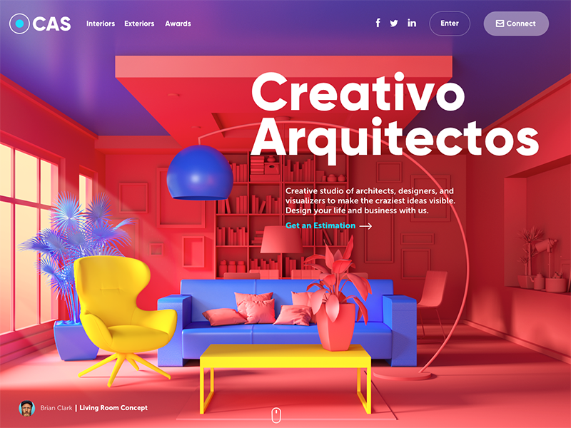
Here’s the website for the design studio specializing in exterior and interior design visualizations. The high-quality 3D graphics rendered for the page take all the background area: this way the image immediately sets the theme and presents the company services.
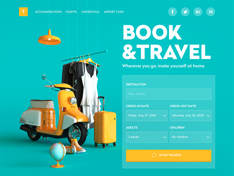
This website of a booking service uses 3D graphics as a big theme image that takes the left part of the page and catches the user’s attention at once. Not only does the artwork set the theme but also makes the interface beautiful.
Why 3D visuals work in web design:
- High realism = high trust, especially for product-based businesses.
- Interactivity turns passive browsing into active discovery.
- They enable storytelling where photography can’t go (e.g. visualizing software infrastructure or abstract concepts).
- They signal investment, modernity, and confidence—especially in crowded markets.
But fair warning: 3D comes at a cost. Not just money, but weight. File sizes, load times, browser performance—it all matters. And not every team has a 3D generalist with the modeling chops and rendering pipeline to pull it off.
That said, tools like Blender, Spline, and Three.js have lowered the barrier. You don’t need a Pixar team. Just a good designer with curiosity and taste.
Pro tips for using 3D in interface design:
- Use simplified lighting and background to highlight the object, not the render.
- Bake in performance optimization (lazy loading, image sprites, compressed assets).
- Don’t use 3D for the sake of trendiness. Use it when it tells your story better than flat design ever could.
Why Images Matter (And Always Will)
Here’s the science behind the pixels:
- Humans process images between 6x and 600x faster than text.
- It takes just 1/10 of a second for a user to form a first impression of your site’s visuals.
- Visuals boost long-term memory. That’s why you remember logos but forget taglines.
- Images cross language barriers, helping you build inclusive interfaces.
- Used right, visuals improve SEO rankings, reduce bounce rates, and boost conversions. Every SEO expert will tell you: ALT tags, file naming, and compression matter.
Oh—and let’s not forget accessibility. Images are often the entry point for users with dyslexia, neurodivergence, or early-stage literacy. A strong visual system is inclusive design in action.
Recommended Reading
Already thinking about your next layout, illustration, or UI decision? Here’s more from the Tubik archive that dives deeper into the visual side of web design:
Functional Art: 10 Big Reasons to Apply Illustrations in UI Design
7 Basic Goals Behind Photo Content in User Interfaces
UX Design: How to Make Web Interface Scannable
The Anatomy of a Web Page: 14 Basic Elements
How to Create Original Flat Illustrations: Designer’s Tips
The Role of Branding in UI Design
Design Me Live: The Power of Mascots in UI Design and Branding
Negative Space in Design: Tips and Best Practices