Any post we have previously published here in Tubik Blog has one major thought standing behind any case of efficient design: designing for users, you should keep the user in mind every single step of the process.
Starting with UX research, moving to UX wireframing, prototyping and on to UI design and testing, designers should always remember that along all the way they are not just artists, creators, or conceptualists. They are problem solvers. Every decision they make should be based on one simple but vital reason: it has to make the user’s life easier and/or happier.
In the vast majority of cases, neither designers nor customers are the ones around whom all the fuss is going on and all the hard work is being done. It’s all about users. The better we know them and wish to know them more, the better is the result. Period.
Today, we decided to publish a little statement. It is done “on behalf of a user” and based on long-term user research and analysis, practical work on diverse UI/UX projects as well as studying new publications about the theme. Here, we have gathered some points that designers hear or could have already heard from users. We are talking about the basics right now, but really vital basics that can become a solid foundation for a popular and efficient product or vice versa, if not considered, make even great design solutions shaky and non-efficient.
I’m a User. I want it simple. But not simpler.
No doubt, Albert Einstein had nothing in common with the sphere of UI/UX design in its modern understanding. However, in this particular field, his words “Everything should be made as simple as possible, but not simpler” are as applicable as they could only be. This is actually the basis of the efficient user interface design providing a positive user experience. For user researchers, designers, and QA specialists, it is important to remember that simple doesn’t mean primitive – this is a big trap to be careful about. Making a product simple, you find the shortest and the best way to solve users’ problems or satisfy their needs. Simple product means that you make sophisticated solutions that are invisible for a user and felt as natural as breathing. Simple means helping to do something without additional efforts, confusion, and loads of specific operations. Primitive means oversimplified that often annoys users with their conscious or subconscious feeling of being treated like fools. Keeping this balance is vital for creating a positive user experience.
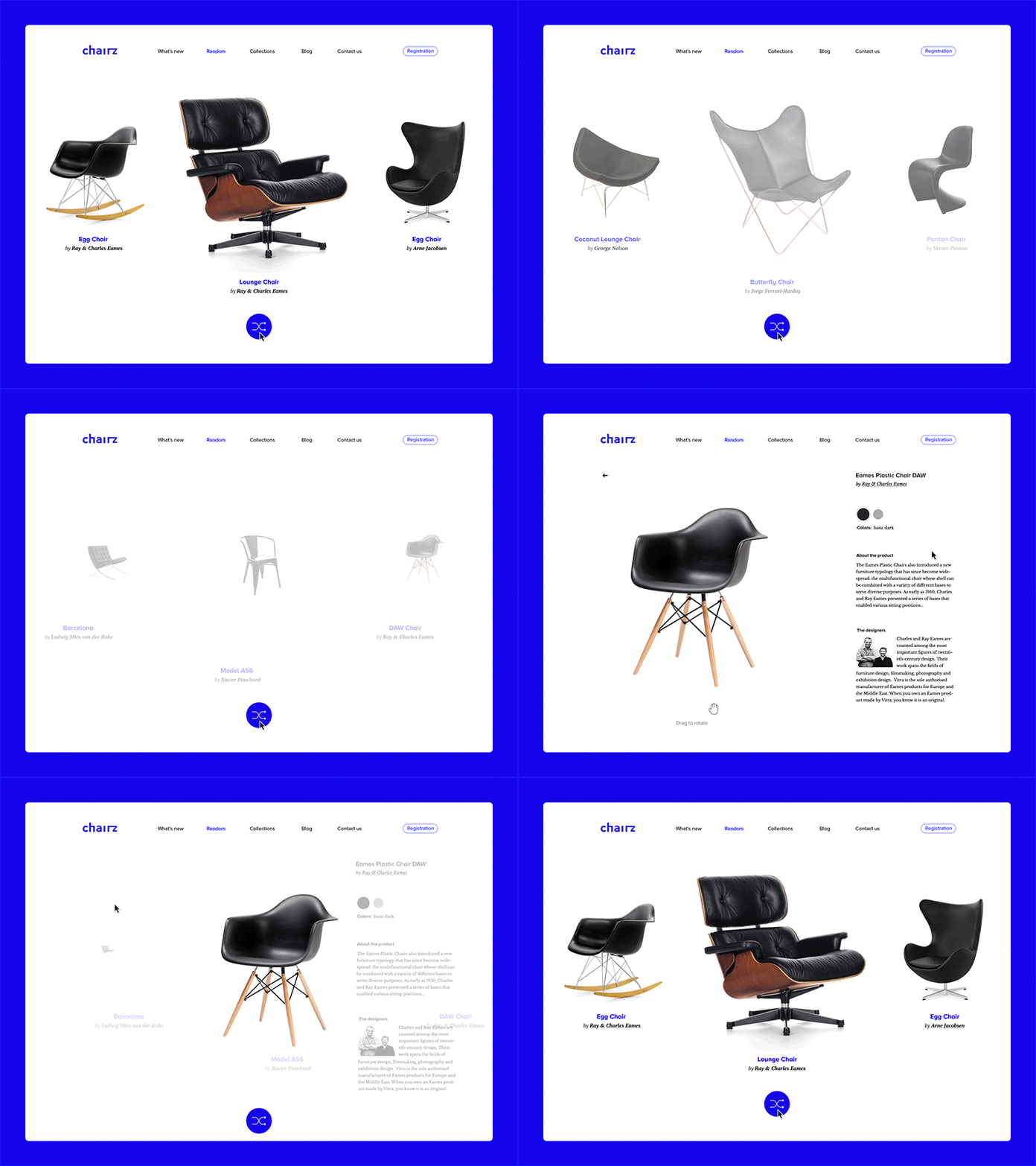
Randomizer concept
I want it easy to start with.
In most cases, for many users, the first experience is the high noon. The first impression on appearance and first actual interactions are able to engage a user in a long-term relationship with your product. That’s why a designer should make the start of interaction with the product as pleasant, encouraging, user-friendly, and smooth as possible. It is vital to make this stage natural and informative, to show the best features attractive for users, and at the same time don’t take too much user’s time for this sort of operation. The solid foundation enabling this feature is understanding what is the core target audience and what are the problems that users will be able to solve with the product. Analyzing the abilities and specific features of the target user will help to find an efficient solution for the fast and easy start of interaction and understanding how the product works. Different kinds of tool-tips and tutorials, wizards, mascots, infographics, animated interactions, and the like can become a good way to make the user feel good and comfortable with your product.
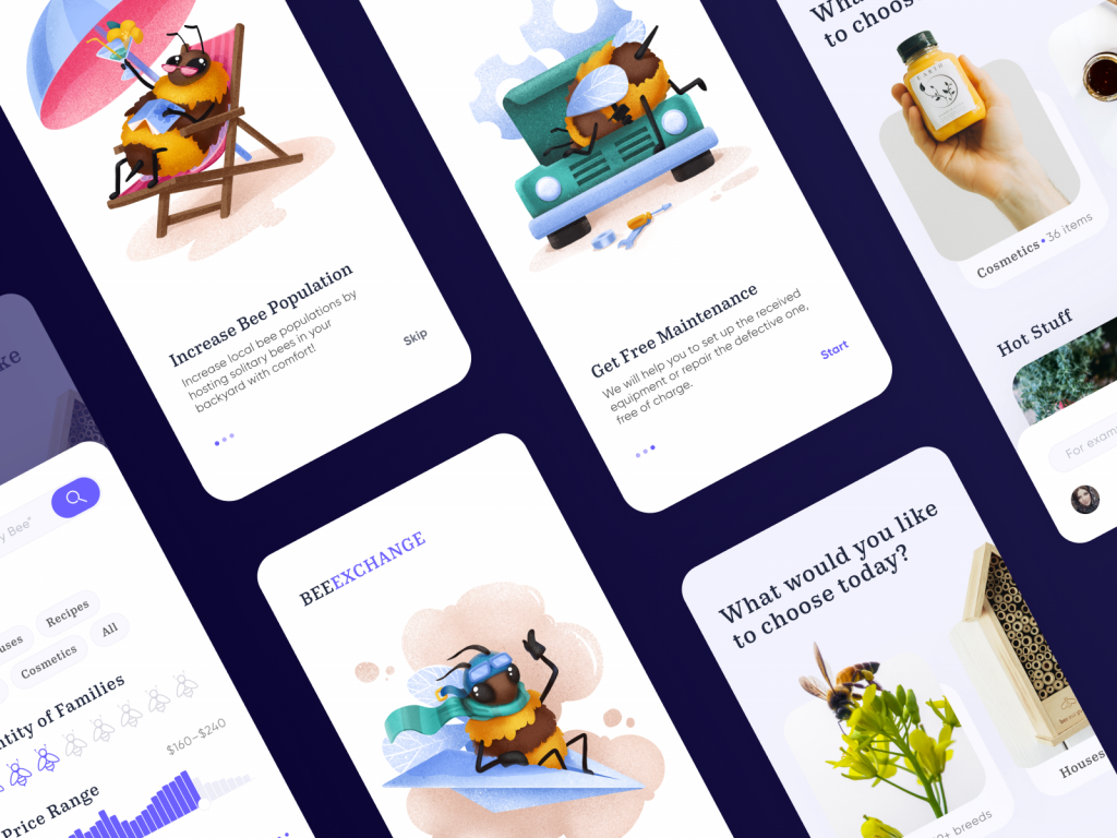
Onboarding tutorial for Bee and Honey app
I want it clear and understandable.
Here it’s time to remember the words from one of the famous pioneers in information design and data visualization Edward Tufte who told that “Good design is a lot like clear thinking made visual.” Users should feel understanding what’s going on at every stage of the way. It should be a nice and pleasant walk instead of hard and stressful going through the wild. And this particular task is probably the most important aspect of the designer’s job.
It doesn’t mean that every design should be accomplished as plain as a day – without the analysis of the target audience, its needs, wishes, and habits you risk making it boring. Sometimes a bit of challenge, the elements of gamification or problem solving and the like can engage the user; however, all of them should still be doable and acceptable.
Moreover, every microinteraction should provide the user with fast and clear feedback. That is actually the way how the product communicates with the user. Pushing the button or uploading the file, adding a follower, or searching the necessary item users should clearly see how the system has reacted and what is the next step. Other aspects to consider in this perspective are the issues of readability, navigation, conventions, affordances, and signifiers.
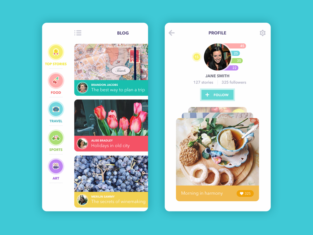
Blog App
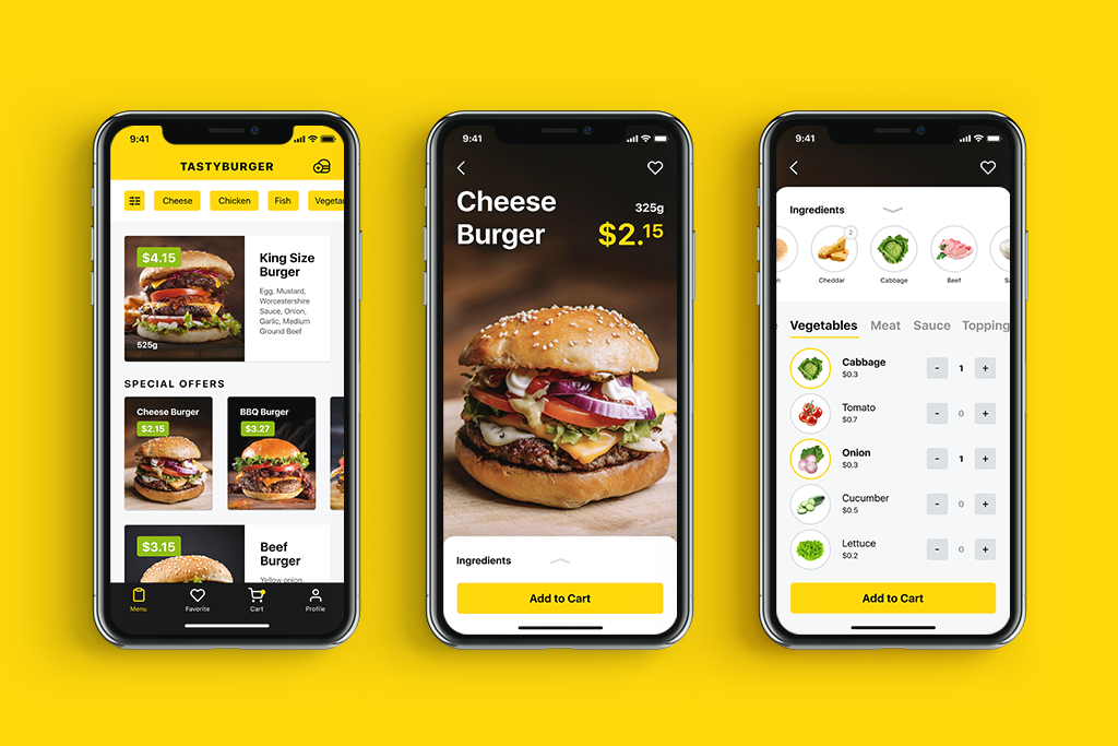
I want it helpful.
In the vast majority of situations, people see the technologies, in particular applications and websites, as a helping hand in their everyday life and/or professional routine. This help can be totally diverse: from literal assistance in buying things, ordering tickets, connecting with friends, or saving important data, to a bit more metaphoric, like helping with good and suitable ways of entertainment, chatting, self-improvement, and aesthetic satisfaction. As soon as users see what kind of help your product provides to them, they are ready for the next steps. This is the good ground for enhancing a positive user experience.
One more aspect of helping is forestalling and preventing possible user’s problems, errors, and points of confusion in the process of interaction with the product. Efficient and intuitive navigation, fast and clear feedback already mentioned above as well as various tips, auto search, prompts and other stuff of this sort could make the experience natural and help the user to avoid negative emotions.
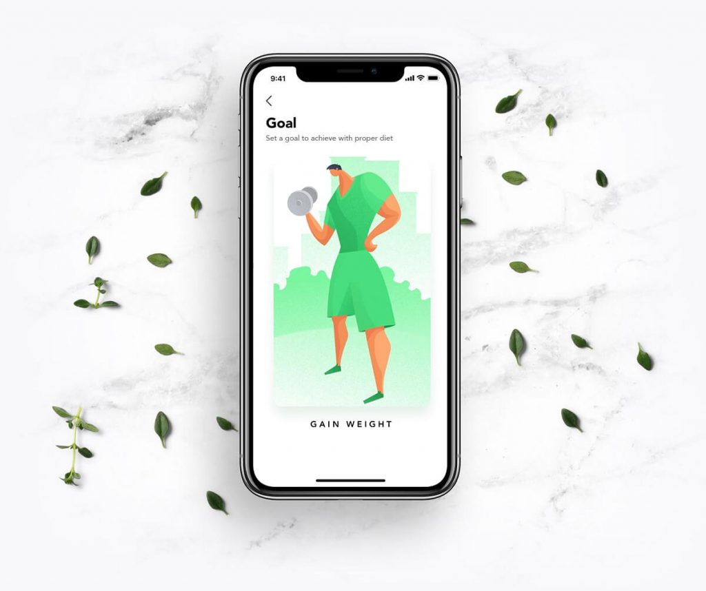
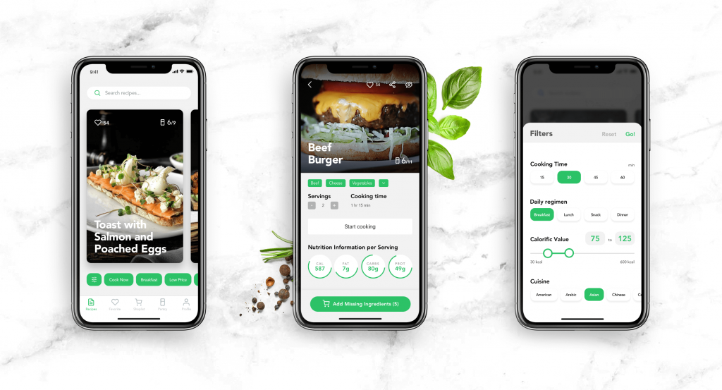
I want it useful.
The first and foremost thing behind any product is providing some useful features. It’s easy to say that there are a lot of applications and websites which have no purely practical use and exist only for entertainment or other “not-serious” aims. It is one more huge trap. Entertainment, rest, aesthetic pleasure, presentation, collecting and loads of other things or activities which seem to be “not-serious”, “not-useful”, “time-wasting” and so on, are also as important for the person’s full life scope and routine as “serious” and “business-like” stuff.
When adults see how the kid is fiddling with the simple set of building blocks, most of them do not realize that this kind of “non-serious stuff” is highly useful for the child’s development and, what is more, the correct design of the blocks can influence and improve this process. The same happens with applications and websites. To create a successful product, it’s needed to find not only well-known unique selling points but also unique useful points. No matter what kind of product is created and designed, they always exist. That is why user research and analysis is an important stage of designing an effective user interface. It helps to find the problems that could be solved and the wishes that could be satisfied with the product, which is the most important feature for retaining the user. Nothing can make the users stay with the product if they do not see the personal interest and benefits.
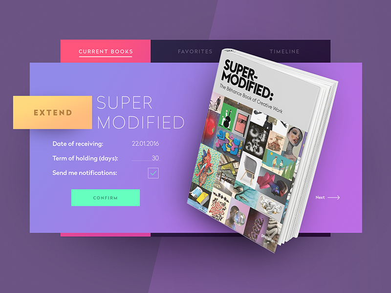
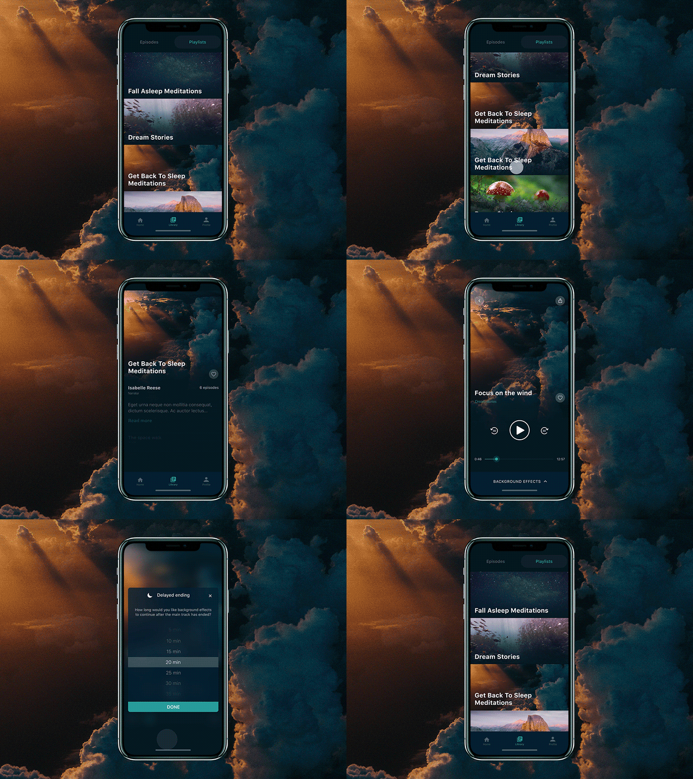
Library Widget
I want it fast.
Creating designs, it’s important to consider what are going to be technical and physical conditions of the product use. Out of this data, designers and then developers should make important decisions on how to make design working fast. And it’s not only about the fast interactions and navigation enabling users to find the quick way of transition to anything potentially important in a couple of swipes or clicks. It’s also about the time of loading the pages, screens, animations, complex images, etc. No user is going to keep around your product for long if he or she needs to waste their time waiting for downloading. It is forgiven in exclusive cases but not on regular basis. Neglecting this aspect can kill even the product of great importance and functionality.
I want it updated.
In the fast-paced world of technology, it is vital to stay tuned and trim the sails to the wind. Certainly, the power of habit is a great thing retaining users, but the regular shade of minor changes aimed at improving usability supports the feeling of refreshment in the experience.
There are, nevertheless, two things to keep in mind about this aspect. Firstly, the changes should improve and support positive experiences via usability or attractiveness. Secondly, adding something new, in most cases, it’s better not to do it as a bright revolution bringing a totally new life, since for a particular segment of users it can become a shock and will be the reason for rejection. Being careful, user-friendly, and consistent is a great policy of change.
![]()
I want it nice and stylish.
The famous guru of usability Don Norman once mentioned that “It’s not enough that we build products that function, that are understandable and usable, we also need to build products that bring joy and excitement, pleasure and fun, and yes, beauty to people’s lives”. This is actually a philosophy we support here in the studio.
There are lots of tips, proverbs, and sayings assuring that wise people do not judge the book by its cover, but in reality, a good dress is still the card of invitation. Certainly, this sort of good dress for the app or a web will mean nothing if it is empty in content, useless and not solving any problems. However, if the product is not attractive, the users will not even turn their eyes to your product. They will not identify it among the others in AppStore or PlayMarket. They will not feel that flash of interest and curiosity that is the start of so many great meetings, events, and relationships, including choosing the products for everyday use.
So, appearance really matters as it stands among the most important factors encouraging the user to try your product. Moreover, beautiful, attractive, and appropriate to the target audience, nicely done and consistent visual style of all the design elements satisfies aesthetic needs and beautifies everyday life. Practice shows that this is a great factor of retaining plenty of users.
I want to have a choice.
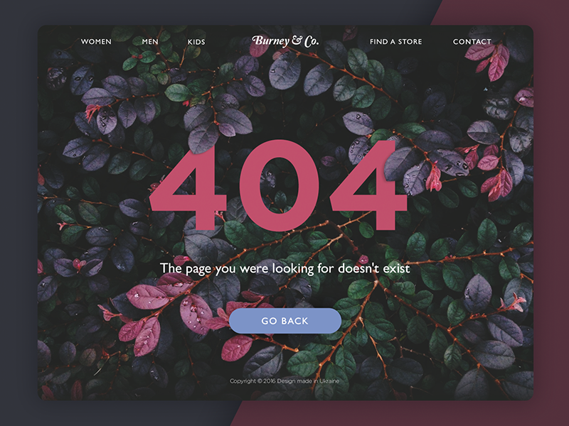
The last but not least position here is the choice ability. There are loads of discussions on simplification and unification of UI/UX solutions in the design sphere, in which we often read that designs should be minimalist and limited to activating only basic and necessary operations. Application or website should do only what is really necessary and the additional stuff is always the element of distraction, they say. Users do not need complex animations, users do not want funny illustrations, users do not wish bright and unexpected color combinations, they say. And so on, and so forth, here and there.
There are loads of arguments and proofs, examples and debates, criticizing and preaching. The only thing is missed. There is no user behind all this stuff. User, who can be totally and absolutely different, who can have millions of different preferences, likes and dislikes, various cultural and educational backgrounds, diverse environments, and abilities to use technology. And all of them, as well as in any sphere of human activity, are keen to have a choice looking for the applications and websites. Users are those who really benefit from the diversity of offers and designs on the market of digital products. They really adore the opportunity to choose. And hope not to see it killed with ubiquitous unification.
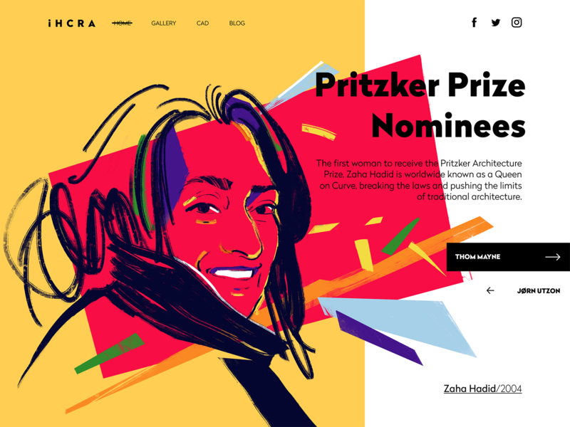
Landing page for an architectural magazine
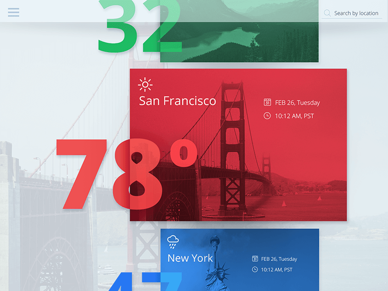
Weather app design
No doubt, the topic is really deep, so today’s post has been concentrated on the major basics leaving more details for further posts. However, considering those factors provides good support in creating efficient UI/UX design solutions. Designing for users, we should keep a user and only a user as the highest priority. This is the best way to get all the features of the efficient and popular product via usability, utility, and desirability.
Useful Articles
Here’s a bunch of articles to dive deeper into the theme of usability and user experience design.
5 Basic Types of Images for Web Content
How to Make Web Interface Scannable
The Anatomy of a Web Page: Basic Elements
How to Design Effective Search
Web Design: 16 Basic Types of Web Pages
Directional Cues in User Interfaces
Negative Space in Design: Tips and Best Practices
Error Screens and Messages: UX Design Practices


