A new case study is up, and this time it will share a story about creating a funny character for marketing goals. Welcome to check the design story behind creating a mascot for the brand identity of PackYak, a shipping and fulfillment service.
Project
Design of a friendly animalistic mascot for branding and marketing goals of the shipping service PackYak aiming at providing faster shipping times, lower shipping costs, and hands-off order fulfillment for e-commerce stores.
The tubik creative team assigned for this project included Marina Solomennikova, Roma Chornyi, and Anastasia Ostapenko.
Process
For years, both marketers and designers have been aware that most people like communication focused on their needs and directed to them personally. The element of personification thoughtfully applied to the product or service can boost a positive user experience as well as enhance brand recognizability and brand awareness. That’s why creating a mascot becomes a part of the general marketing and content strategy.
Basically, mascots are images that visually represent the brand, product, or service identity and become its symbolic convention on various marketing channels and promotional activities. They represent the element of identity and work as an interconnector between the customer and the product. Moreover, mascots can reflect any character traits, follow any style needed for product positioning, and communicate with the customer via a broad set of visual techniques. These branded characters push the limits of personification and give a chance to create unexpected combinations of elements or make fantastic and non-existing characters alive.
PackYak shipping service also strived to take advantage of a mascot as a part of its brand identity. As a hint that it was already hidden in the brand name, it seemed natural to create the yak character that would work as a part of a logo and across the website or other channels of communication. The character had to look young but not childish, playful, and cheerful but also experienced and confident, transferring the vibes of trustworthiness and reliability.
The mascot design included two global tasks: the image for the brand logo and the set of illustrations for various communication goals and website pages.
Logo Design
For the logo, it was decided to work on the headshot image. Here’s a glance at some of the early sketches in the creative search process.
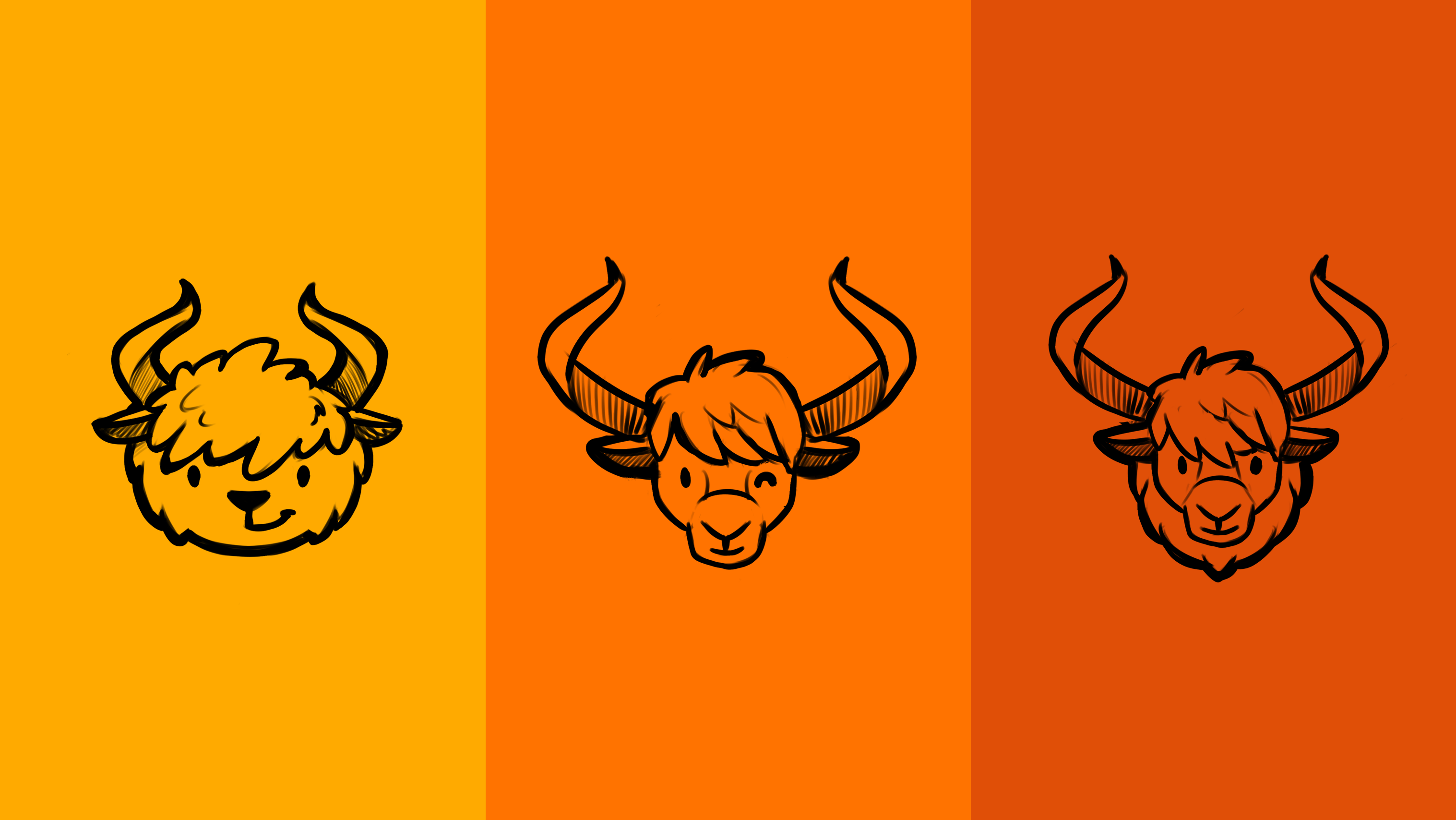
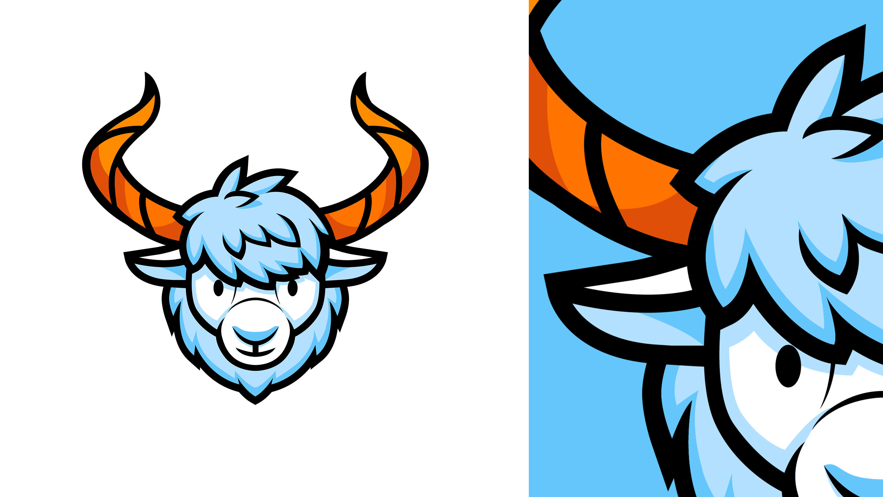
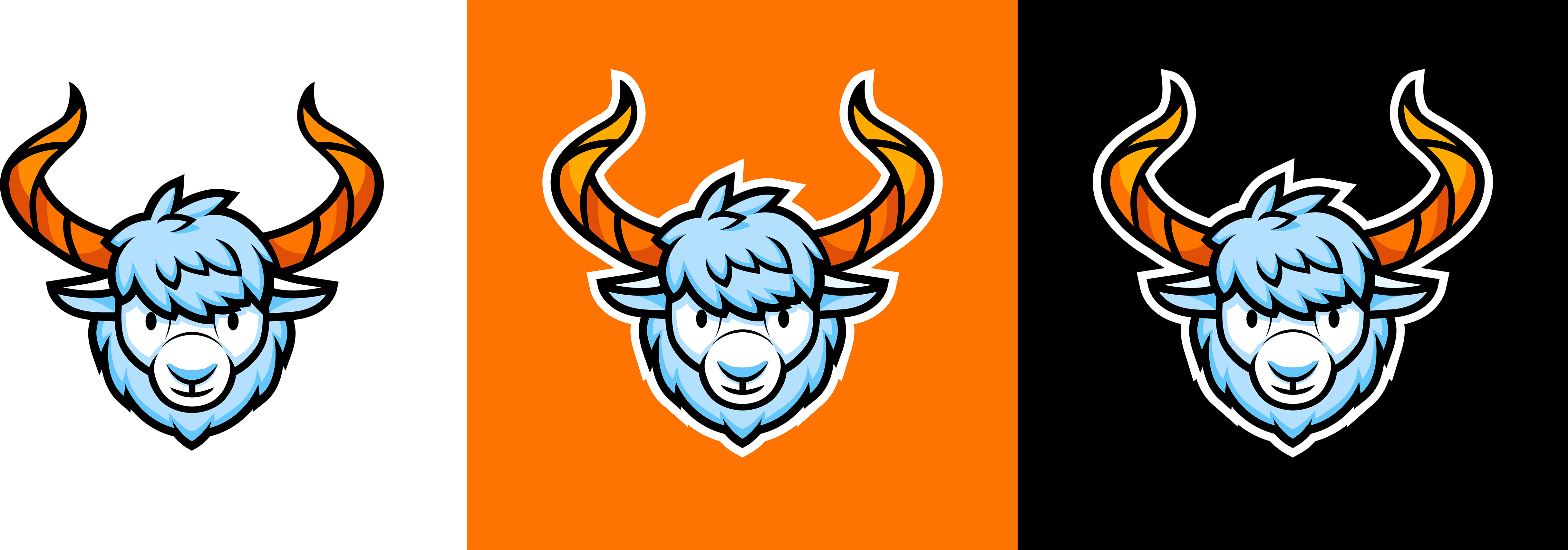
After discussions and some research, the creative team and client decided upon the more detailed option with long horns and thick fur around the neck, open and friendly but serious and confident at the same time. Here’s the final version of the logo image.
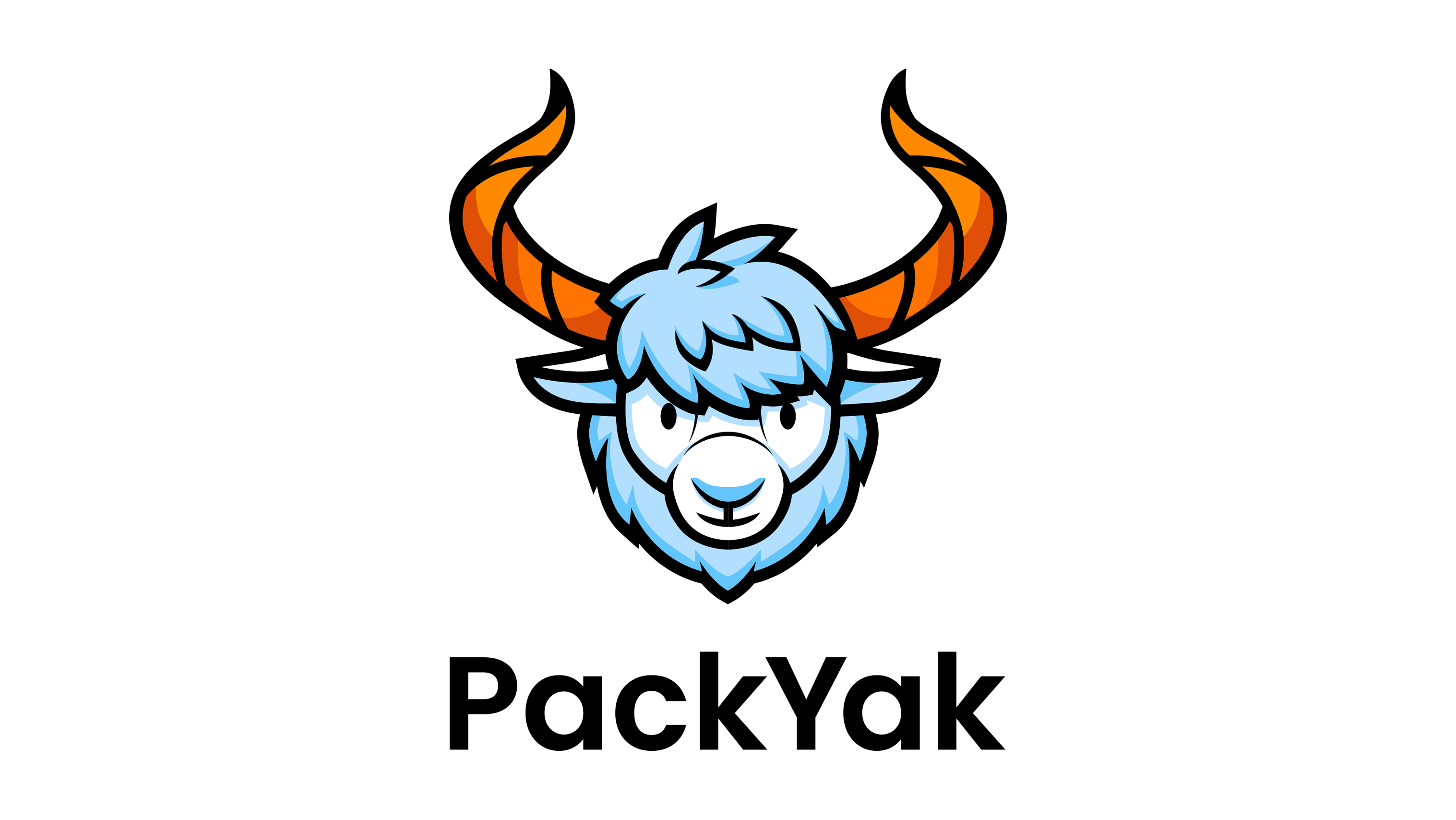
Here’s how it looks with the typographic part of the logo. It uses a solid and highly legible geometric font, which supports the icon and doesn’t compete with it. The mascot image can be used both with typographic part or independently if the particular case of usage needs it or there is not enough space for the whole combination mark. Here’s the primary version of the logo, with the vertical placement of the elements.
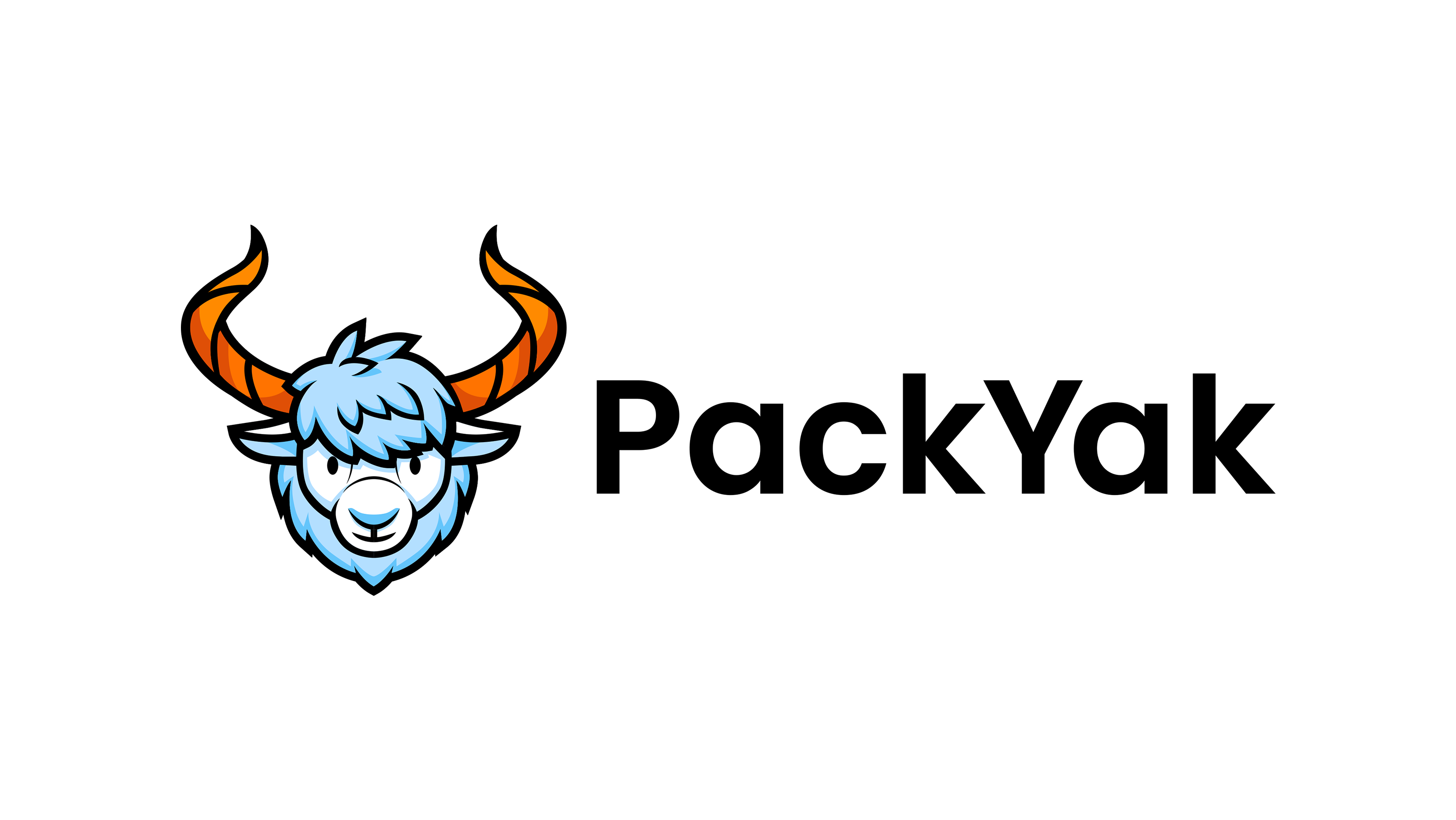
Another version with horizontal placement was also developed for higher flexibility of the identity design. This option sets more focus on the wordmark. In particular, it is used in PackYak’s website header.
And here are some brand color background versions to see how the logo effectively works in different environments.
Mascot Illustrations
Users of both digital and physical products or services usually appreciate the element of direct communication and personal attention to them, and a mascot is one of the effective ways to provide it. There are plenty of ways to strengthen the element of personal communication using a mascot: it can communicate directly, provide visual prompts via posing, dynamics, and various facial expressions, reflect the mood with different graphic variations, provide helpful instructions, and congratulate on the achievements. For users, it can make a big difference in interaction with the brand: communication with a particular character often provides a much more positive and dynamic user experience than impersonal instructions sent by the system. What’s more, mascot used across various website pages, branded items, and social networks helps make the brand more memorable and recognizable.
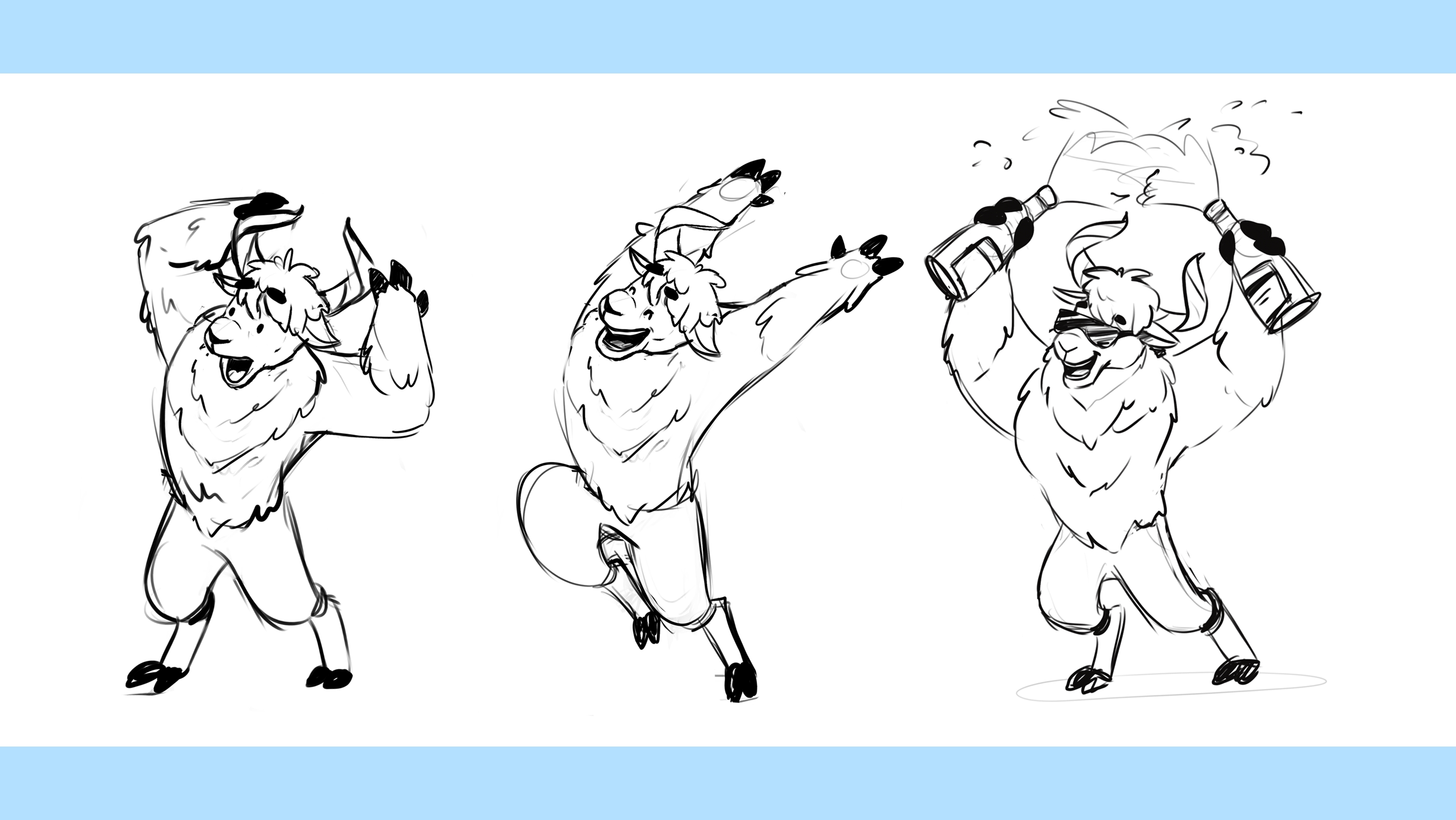
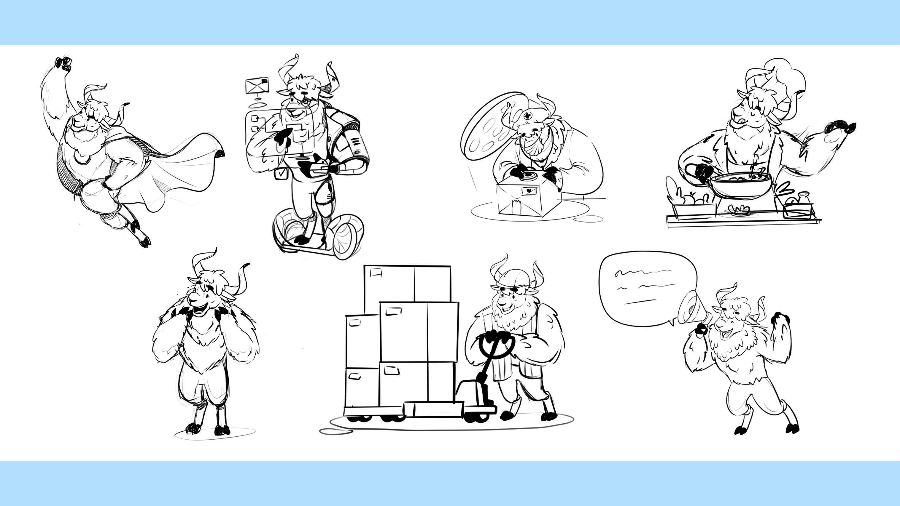
So, another stage of PackYak’s mascot development was creating a set of illustrations sharing different visual hints and metaphors as well as setting the proper mood and powerful emotional connection with the customers of the service. Here’s a sneak peek at the sketches for the variety of situations where mascot could work: unlike the logo, this set uses not the headshot only but the full figure of the yak in diverse posing, states, moods, and compositions.
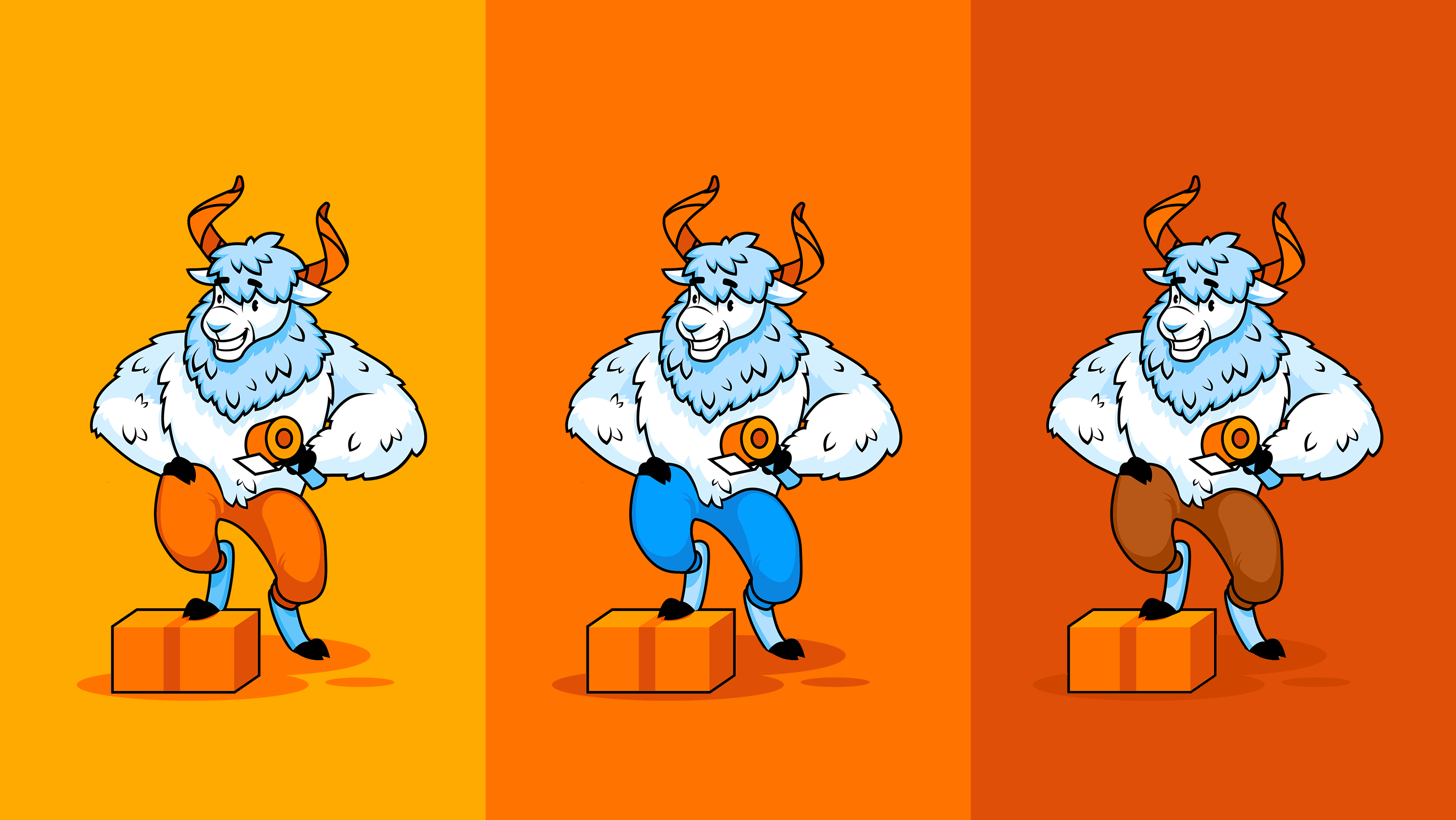
After discussing and approving the set of general ideas and compositions, the illustrator developed the polished and detailed color versions of the 2D artworks presenting a mascot in various plots and situations, accomplishing various tasks or solving problems, which made it flexible for a variety of marketing needs. Take a look at the set below and catch the vibes.
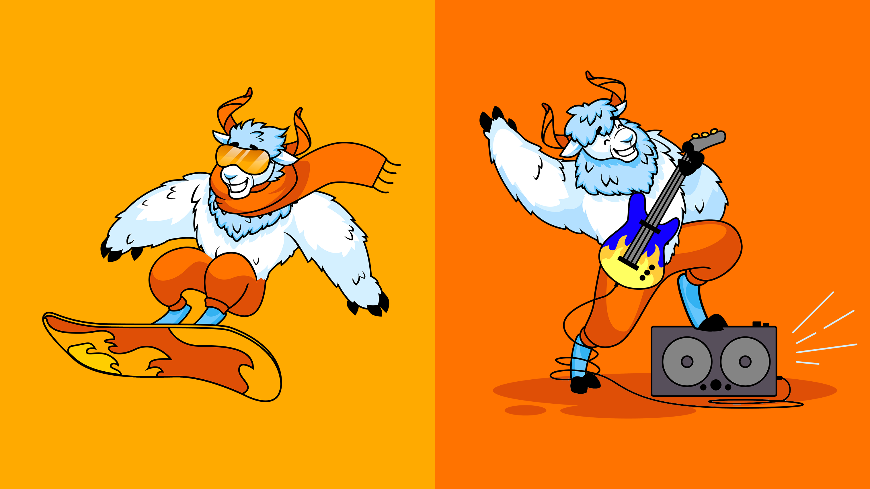
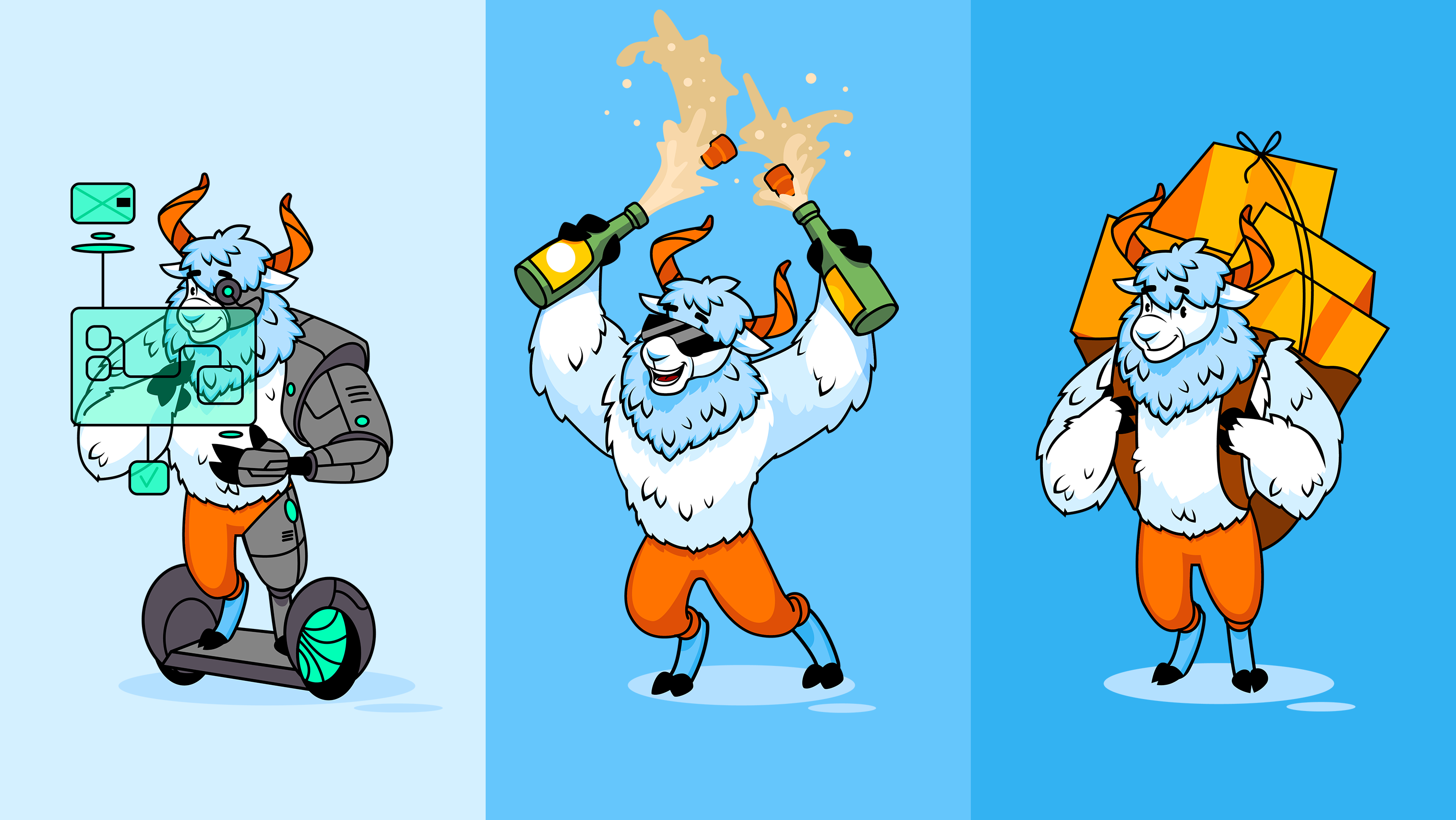
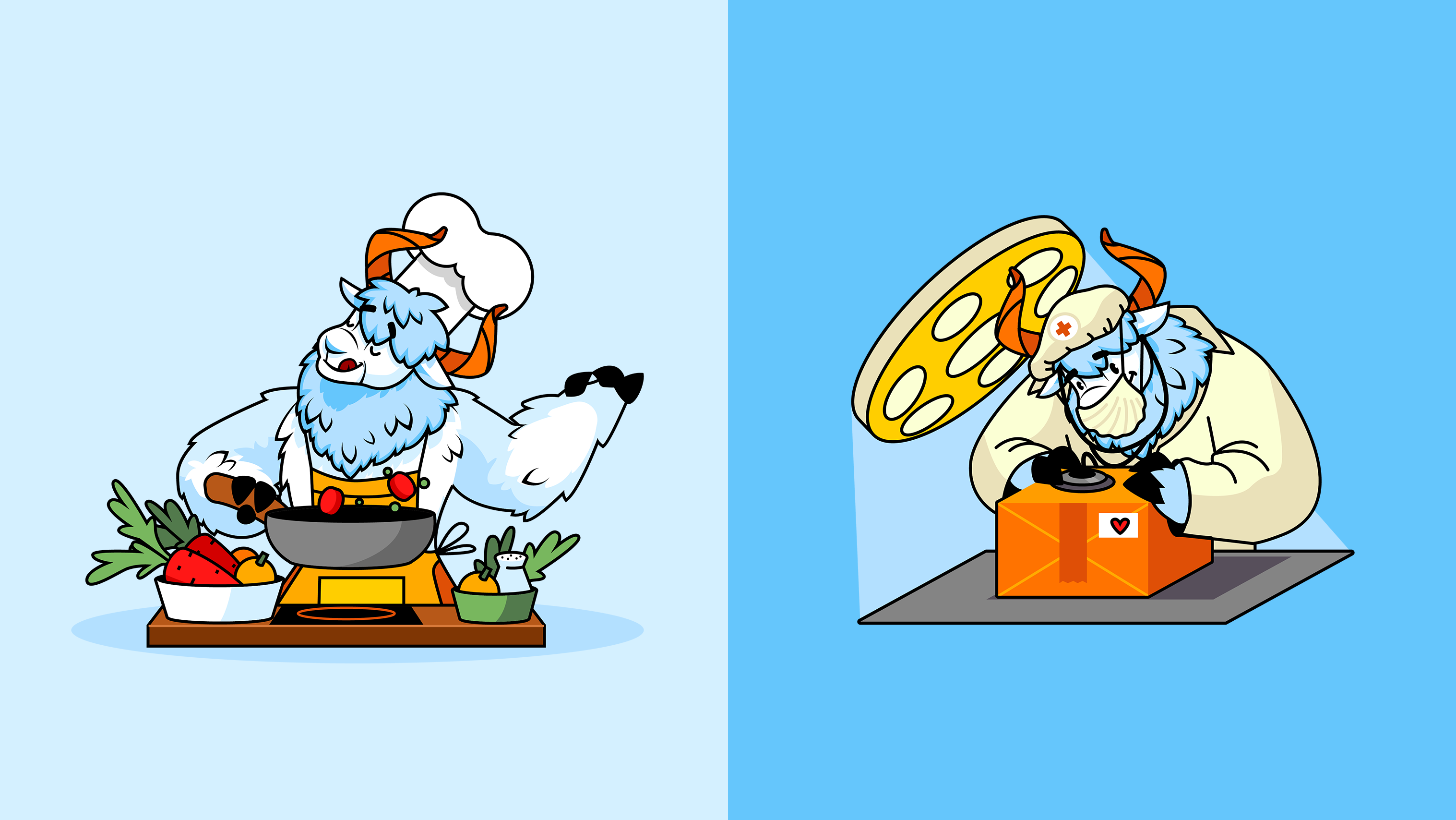
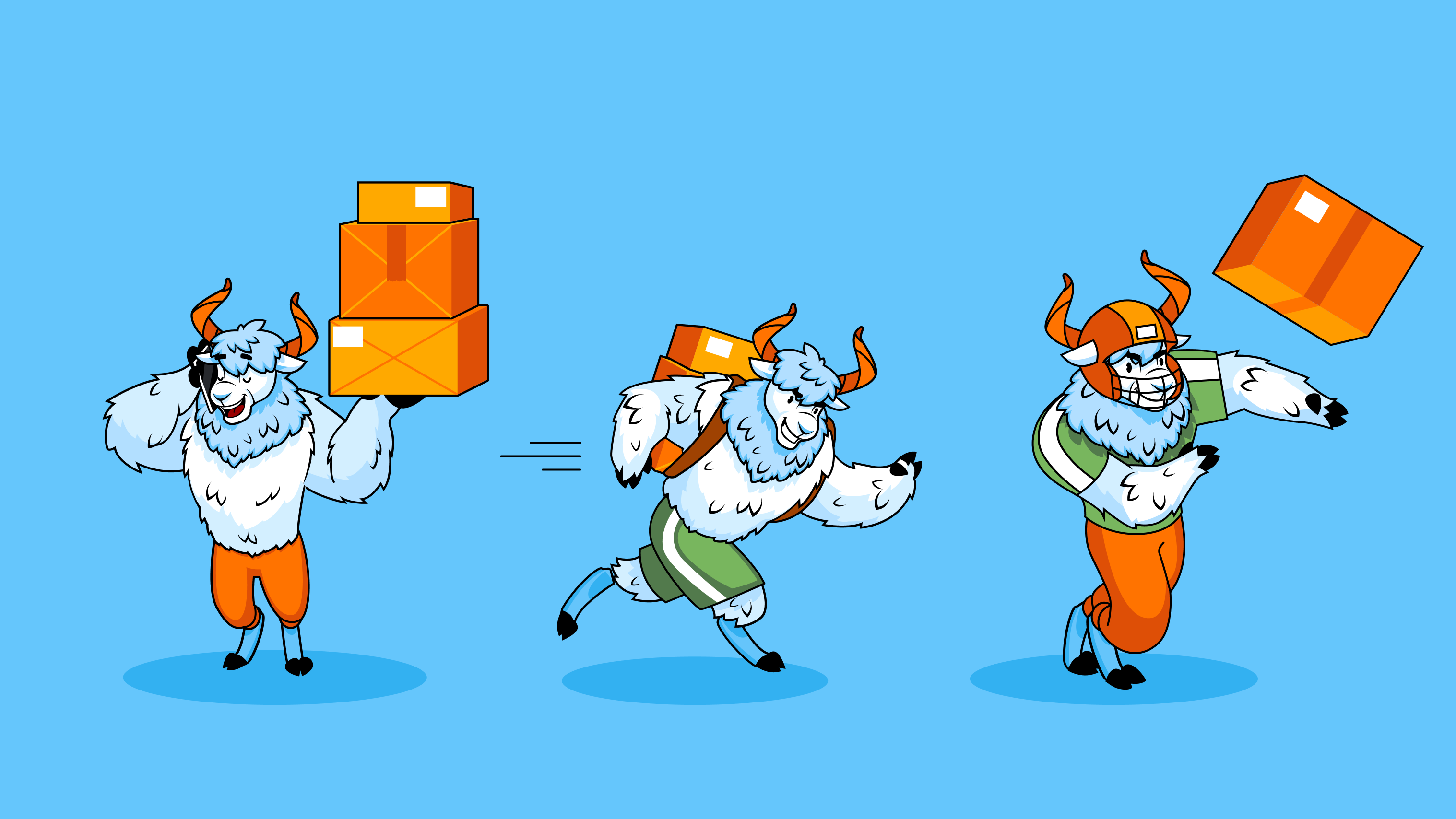
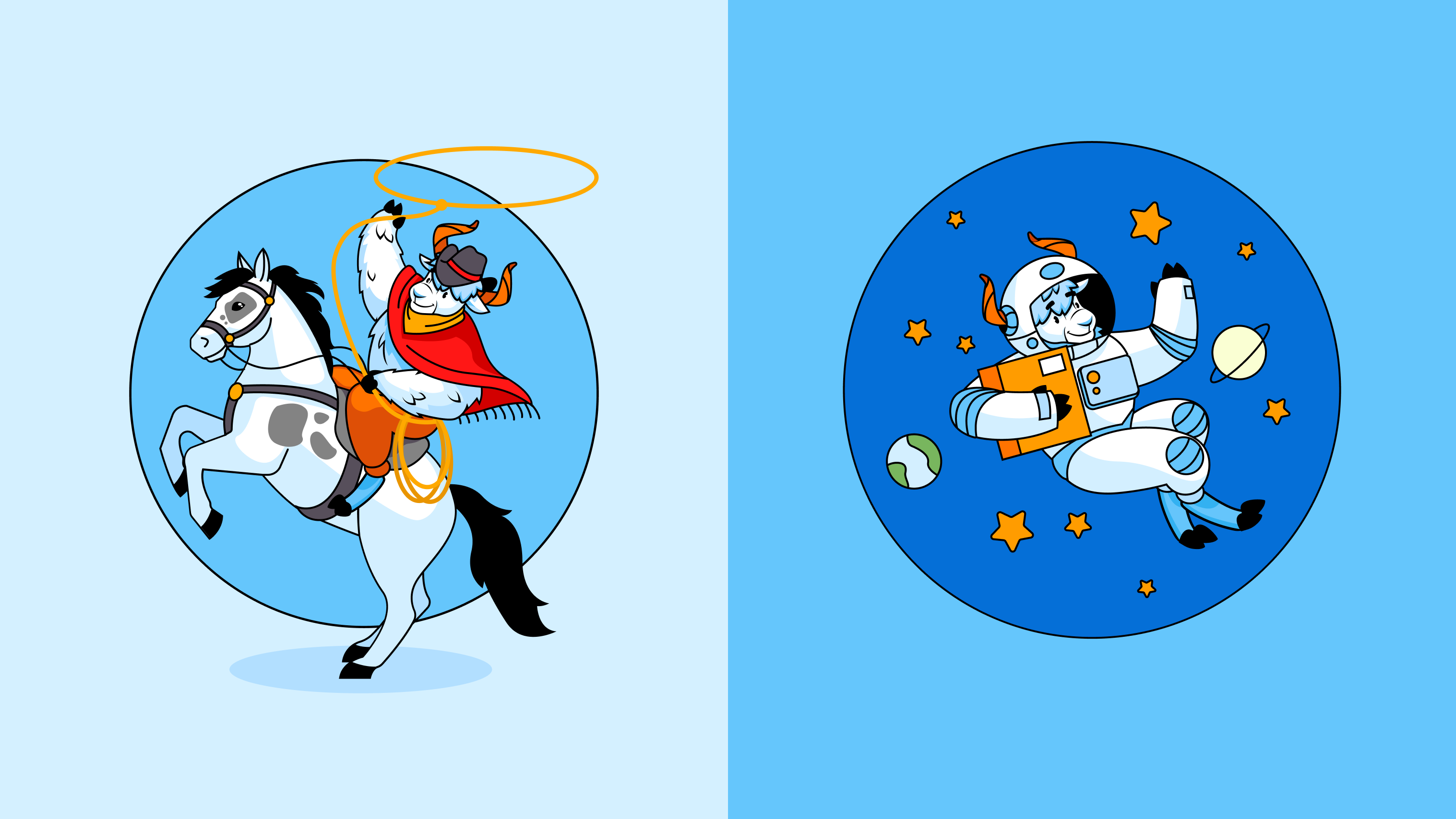
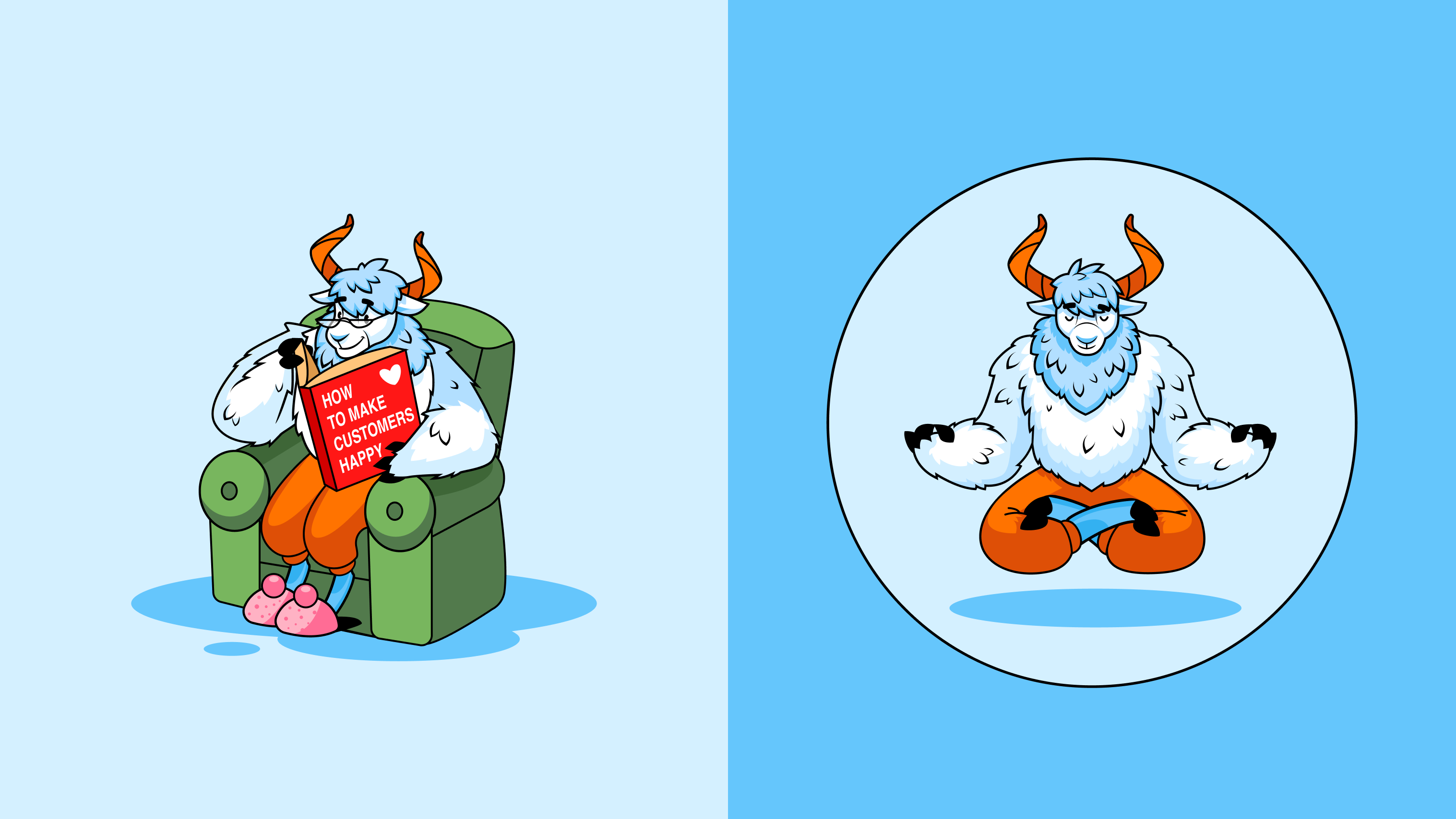

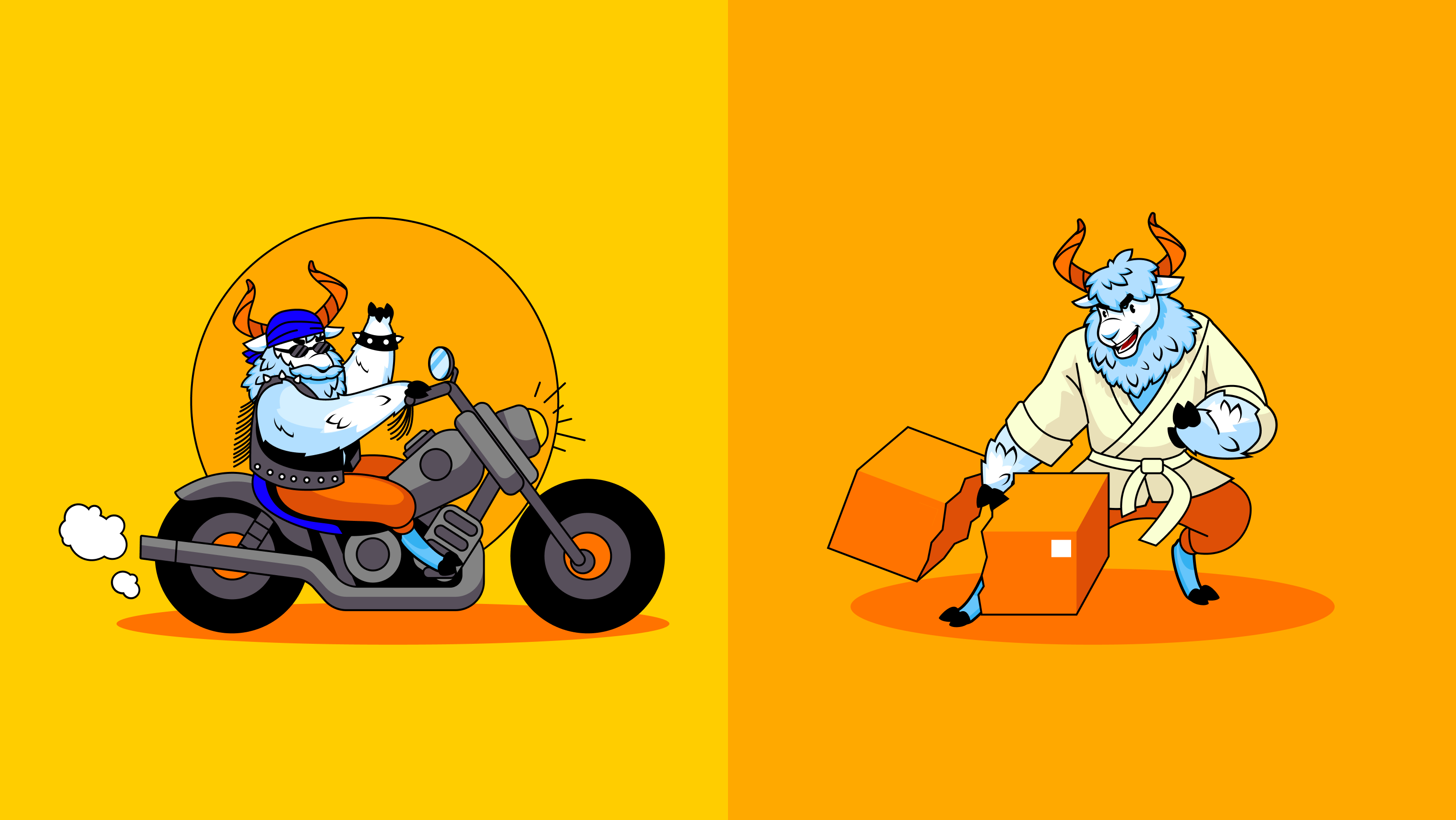
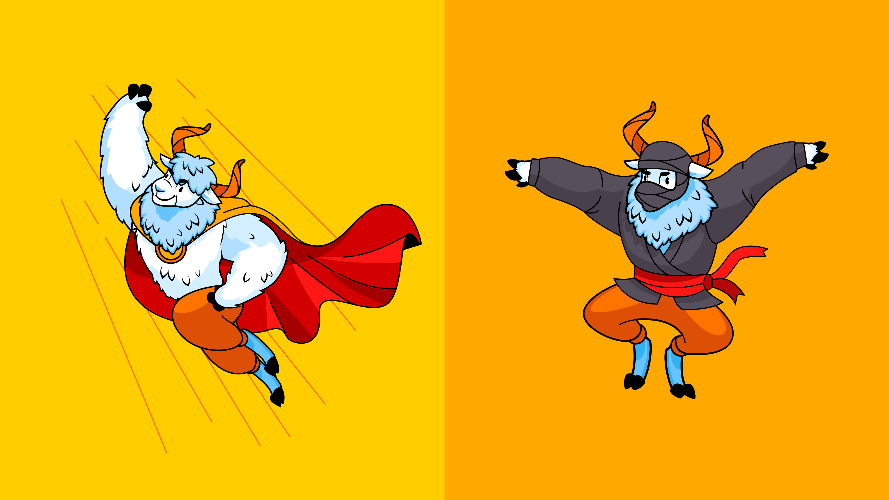
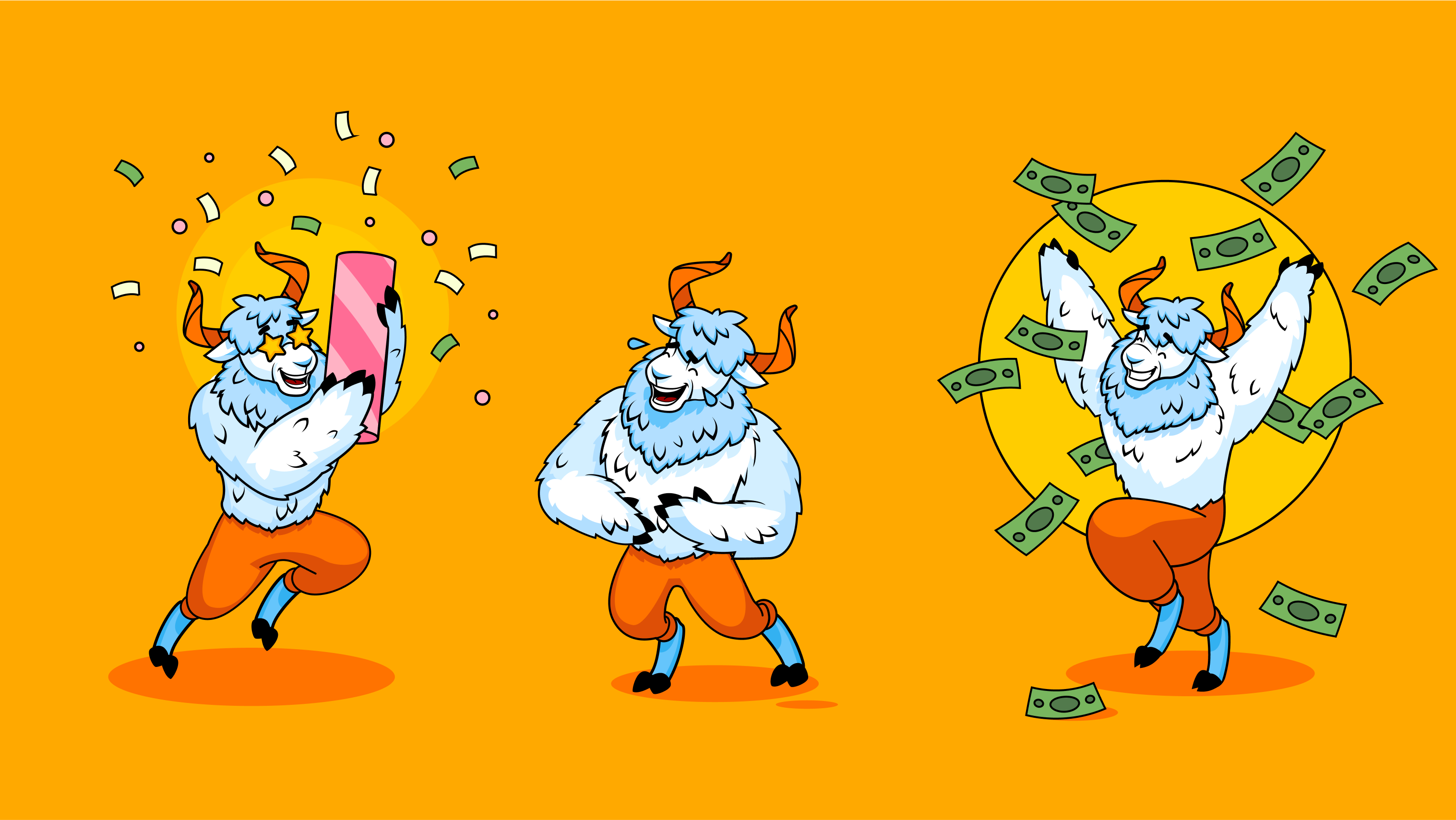

PackYak branding design was another great opportunity for our team to work on a cool mascot from scratch and give it not only the face but also a character and story by means of original graphics.
New design case studies from our team are coming soon. Stay tuned!
More Design Case Studies
Here’s a set of more case studies sharing the design solutions and approaches for some of the design projects done by the Tubik team.
Carricare. Identity and UX Design for Safe Delivery Service
Real Bitcoin. Creating Website Illustrations
Dicey. Logo and Mascot Design for Party Game
Uplyfe. Identity Design for Health App
Devpost. Hero Illustrations for Hackathons Platform
ShipDaddy. Identity and Web Design for Shipping Service
Bennett. Identity and Website Design for Tea Brand


