The time has passed when people received knowledge only from print books. Due to technological progress now, useful information can be obtained from various sources, including websites and mobile applications. Today we’d like to show you such an app: the case study is devoted to user interface design for the Nature Encyclopedia App developed by Anastasia Zhyltsova, UI/UX designer for Tubik.
Project
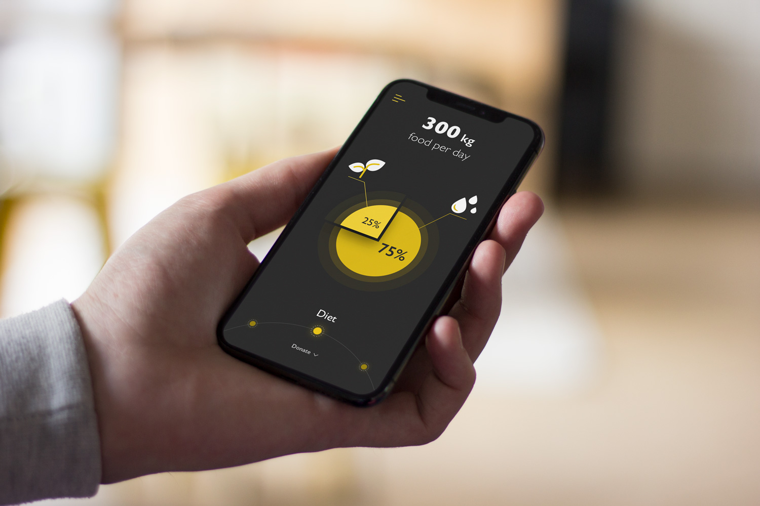
The task was to design a mobile user interface of an encyclopedia app that presents interactive infographics for a variety of animals with the opportunity to donate to charity organizations.
Undoubtedly, the main task of educational applications is a convenient and understandable transfer of information. One of the best ways to convey data quickly is to use infographics. We also took on the goal to not only educate but also interest and engage the users. Practice shows that the thoughtful use of illustration, bright colors and clear interactions cope effectively with this task. Combining all these elements, we got a simple, convenient and user-friendly application.
Style
Despite the fact that most educational applications are made in a light theme, Nature Encyclopedia App has a dark theme. The dark background intensifies striking visuals, has better contrast and supports visual hierarchy.
The illustrations are made in a flat style with the use of bright colors and their shades. Every animal has its own color theme. This approach allows users to visually divide content and contributes to a better perception of information and makes it more memorable. Also, using a dark theme with contrasting colors in the case of an educational platform gives an association with a game-like style that may attract a younger generation.
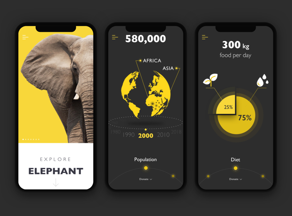
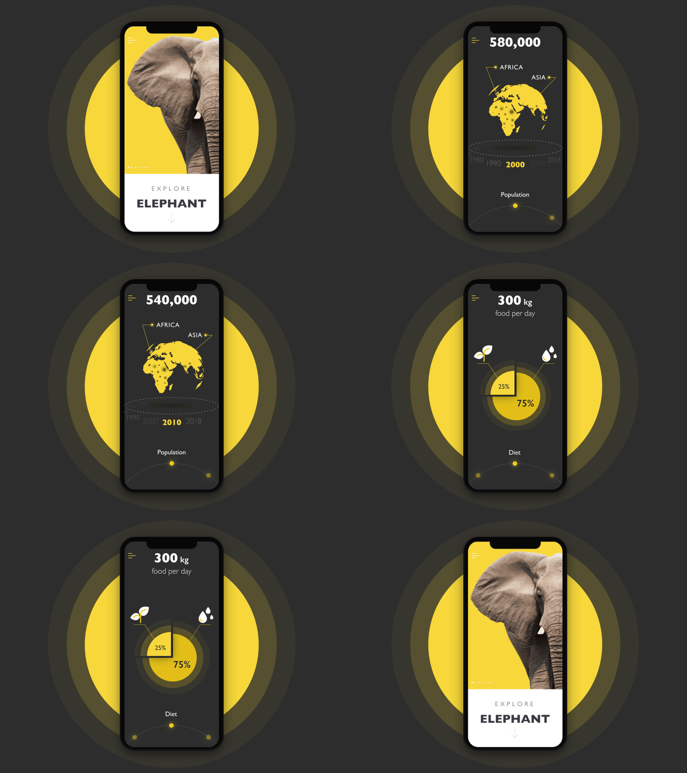
The section devoted to elephants
By the way, the elephants also inspired the idea of an app icon designed for the encyclopedia.
![]()
Screens
Explore Animals
The app presents users with a variety of animals. By selecting one of the animals, the user can see well-known facts as well as non-obvious and surprising data. Intuitive navigation on animal facts is represented by buttonless interactions. This approach saves precious space on the screen for more information. As we mentioned in the article about hot UI design trends, it is even believed to be the initial step to the virtual interfaces based on gestures only. Also, the clear visual hierarchy makes the UI easy-to-use for a learner of any age. Here are the screens of some infographics of the animals.
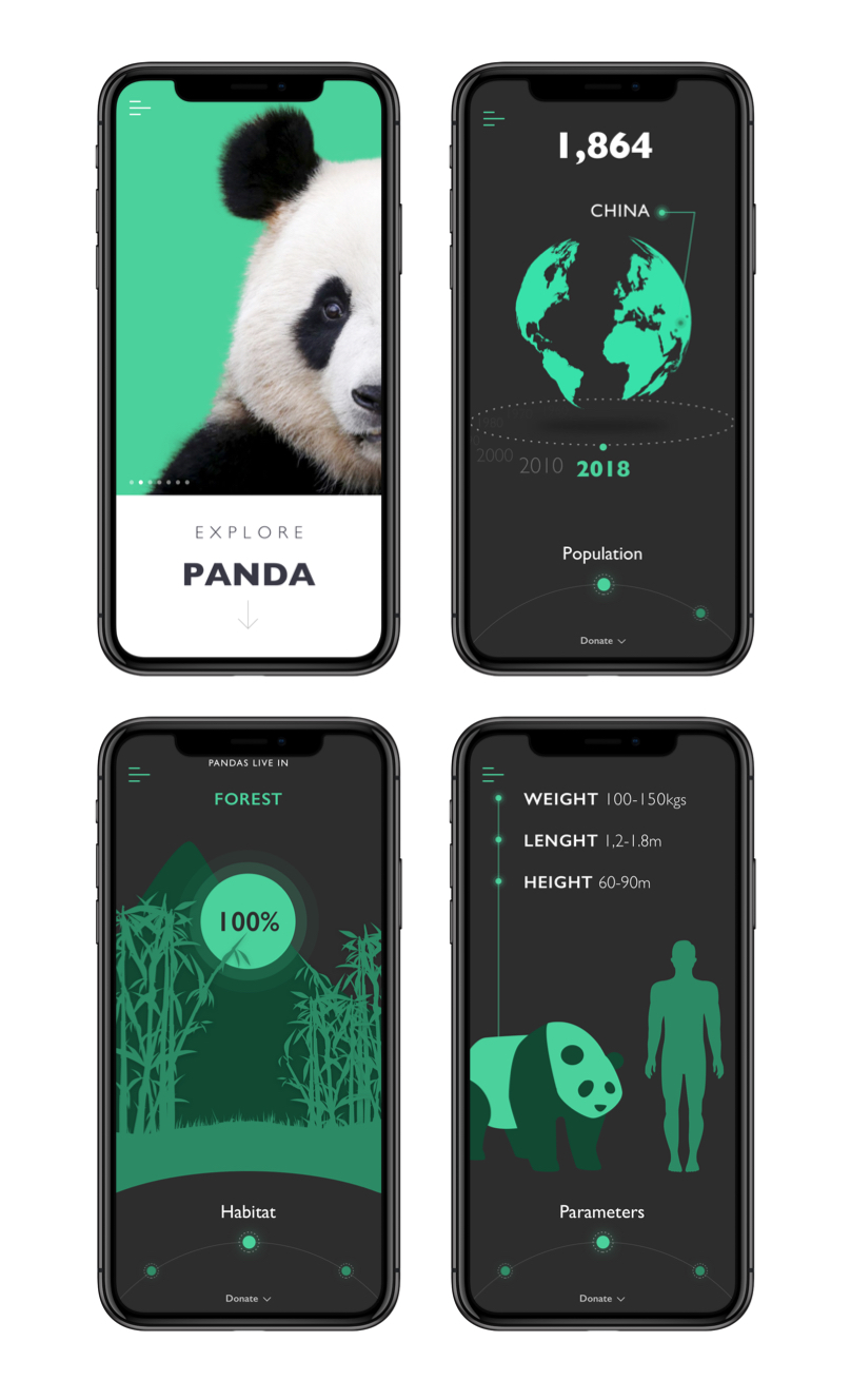
Screens for the section about pandas
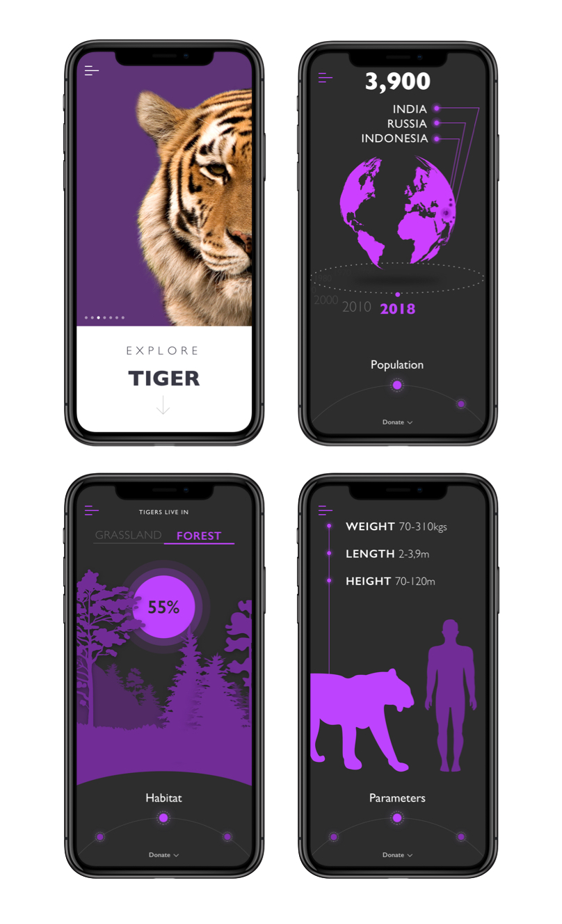
Screens for the section about tigers
Donate
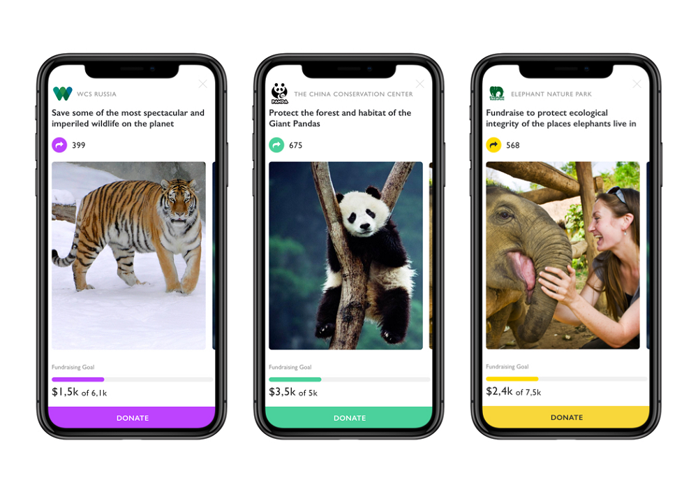
In addition to the educational part of the application, it contains charity aims. The user can go from any screen to the Donate tab simply by swiping up. The screen contains cards that display various programs, reservations, and sanctuaries that help animals suffering from natural disasters.
The screens with organization cards preserve color marking of the section and look as follows. The contrast is a navigational solution here: using the light background for this type of screens lets users quickly distinguish them from educational screens all based on the dark color palette.
Live Streams
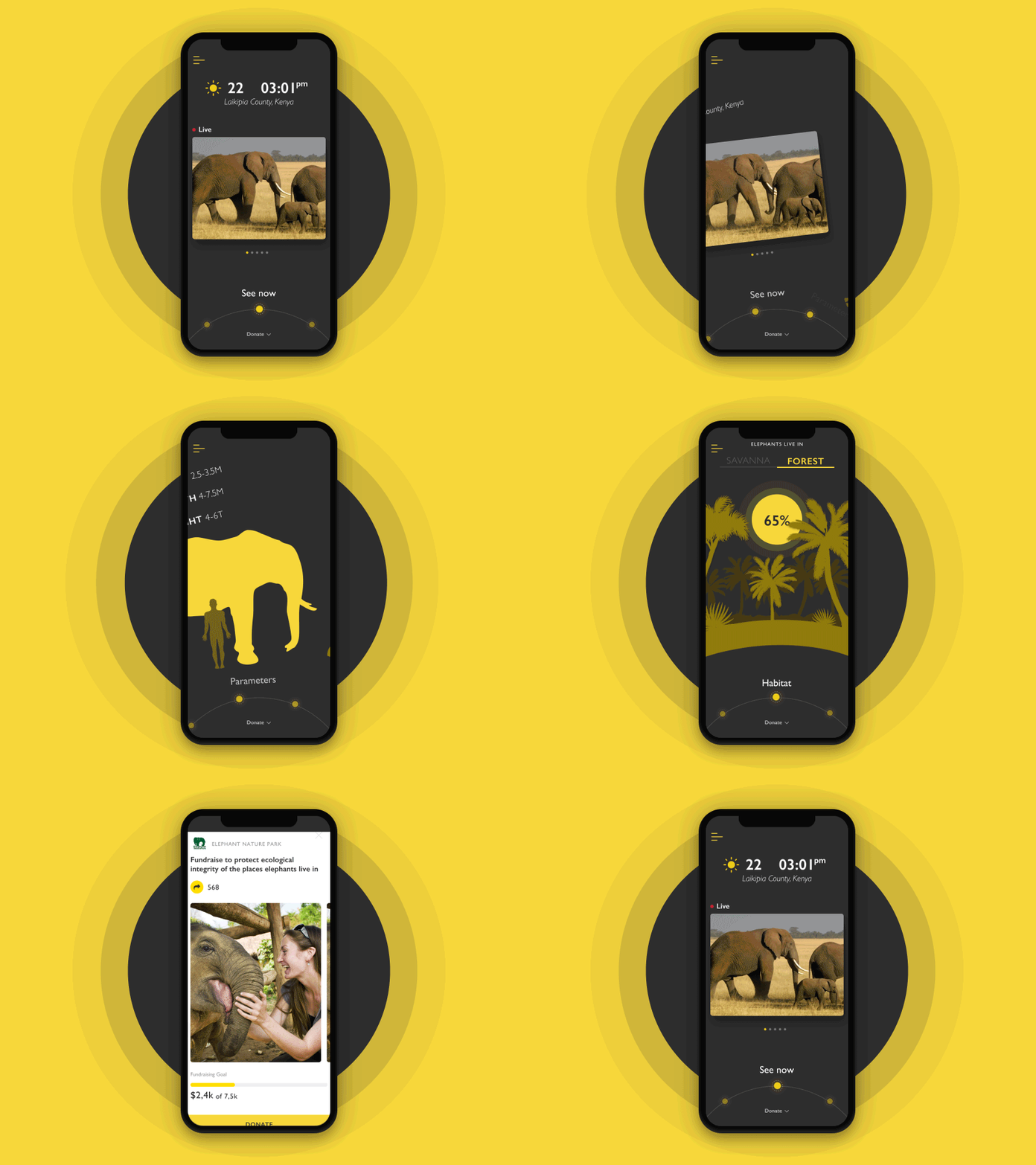
Nothing lets you touch the world of nature (of course, if you do not have an opportunity to move to Africa, for instance) better than the animal live streams. Adding educational live streams enabled the creative team to diversify graphic content and integrate it into the exploration process even more positively and deeply.
Animation
As it’s easy to see from the previous screens that the information flow is solidly based on informative visuals and super minimalist navigation. To make the layout and graphics even more engaging and catchy, the team worked on animation that enhances the interaction process. The example below shows how it looks for the encyclopedia section sharing facts about elephants.
Creating innovative products for educational goals, we strive to find solutions that would balance informativeness and attractive looks, traditions and trends, logic and emotional appeal. Whatever is the source of getting knowledge, its first goal is to present data in a clear and digestible way. Yet, making it beautiful and interactive, we engage different generations of users to learn more and do it with fun and pleasure.
Useful Case Studies
If you are interested to see more practical case studies with creative flows for mobile UI design, here is the set of them from Tubik.
Inspora. Brand and UI Design for Virtual Stylist
Bitex. UX Design for Stock Analysis App
Slumber. Mobile UI Design for Healthy Sleeping
Letter Bounce. UI Design for Mobile Game
Real Racing. UX and UI Design for Mobile Game
Manuva. UI/UX Design for Gym Fitness App
Cuteen. UI/UX Design for Mobile Photo Editor
Tasty Burger. UI Design for Food Ordering App
Watering Tracker. UI Design for Home Needs


