One of the life aspects whose importance is never faded or lost in any country is the issue of health care. This is the factor having, perhaps, the biggest impact on not only the personal and professional life of an individual but also general productivity and welfare of the whole country. With the rapid growth of technology, it would be irrational not to apply the great potential of modern innovation in the sphere of health care and medical services. Recent years have shown increasing interest of professionals and stakeholders in setting creative experiments and searching for new innovative solutions helping doctors to take advantage of technology in saving lives, enhancing and speeding up health care. As a result of this massive concern, the bunch of apps and websites useful for doctors and patients have already come into play, and the field is still actively progressing. The role of design is literally vital here, in many cases providing real support in the matters of life and death.
Our today’s case study is devoted to this vitally actual theme and presents the design concept of the web application for doctors called HealthCare App. Having explored the specific nature of this type of digital product, Tubik designer Eugene Cameel thought over the solutions concentrated on fast and intuitive interaction for making communication between a doctor and a patient easy and fast while saving and looking for the data optimized and organized. Let’s look at the details of the concept closer.

Task
UI/UX design of a web application for doctors
Process
UX Wireframing
As we mentioned in our recent article about UX wireframing, this initial part of the creative process lays the foundation of future functionality before the aspects of visual performance and style are approached. Work over wireframes is based on the definition and analysis of the target audience and its potential pains which the future product is going to solve. The target audience of the HealthCare App was primarily doctors and the key objective of the product was set as optimization of the huge amount of data that doctors deal with on a regular basis. Every single piece of information about every patient is vital for making the right decision, so creating the interface, the designer was focused on making it organized, clear, and easy-to-use. Intuitive navigation was set as the biggest priority to make the app applicable even for people with low or medium levels of tech literacy.
Basically, the app provides doctors with the functionality of saving and organizing data about patients with the ability to find it quickly in a database when it’s needed. Also, doctors can plan and save appointments in the calendar as well as the history of medical examinations for patients under supervision. The application also saves the history of diagnoses, prescribed medicines, personal data, and complex medication plans with marking the stages. Another useful feature is that the users of the app get access to the stats and explorations on different issues at different levels of coverage, from local to general statistics and recommendations by WHO.
Let’s check UX solutions for three basic screens presenting appointments, calendar, and statistics.

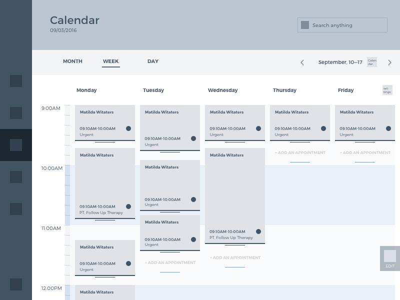
The app features the sidebar with five tabs located on the left side of the screen and the header featuring the title of the information field (calendar, appointments, etc.), the current date and a search field, well-seen and easily accessible in case any data should be found quickly. The main field of the Calendar screen presented below organizes data about all the appointments in three modes along the period of time reviewed – month, week, and day switched via top menu. This part also gives particular dates shown on the screen. All the data is organized in special cards while the timeline located on the left lets to catch the timing. The user can review all the planned appointments or things to do, getting more extensive data after tapping the necessary tab or add new appointments to the free spaces in the schedule. In the preview, notes show the full name of the patient, the time of the planned appointment and mark of the visit nature (urgent, follow-up therapy, etc.)
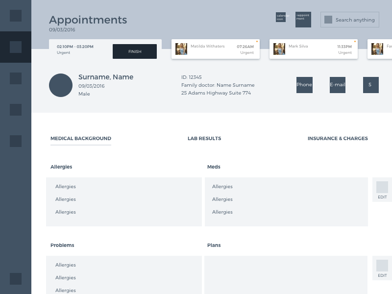
The screen of a particular appointment shows the dynamic head menu which can be scrolled horizontally and presents the list of patients. Then lower we can see the tab presenting detailed information about the current patient, who is being examined, including name, gender, doctor’s name, ID number, address, and contacts. The biggest interactive field on the page shows three basic categories to organize data: medical background, lab results, insurance, and charges.
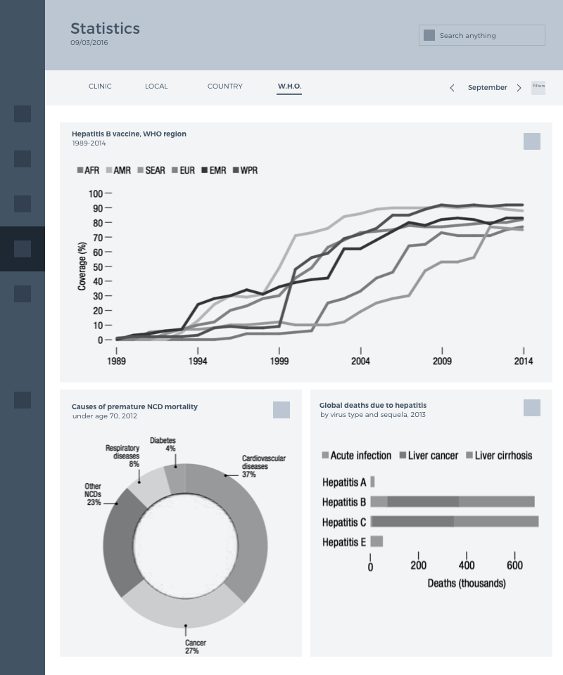
The third screen shows various stats that can be useful for the doctor in the exploration of a particular case or diagnosis. The tab below the header allows a user to switch between the categories of stats coverage and set a particular month or year for the required data.
UI design
The essential issues to consider about UI design, going deeper into a convenient and functional visual presentation of the data in the app, were color palette and typography. As you can see, the designer made his choice in contrast color palette with the deep blue general background including the sidebar and header part, that worked well for creating deep contrast with bright orange active icons and basic data in header written in white. Contrarily, the main operative field of the app uses a white background which looks natural for the app in the health care sphere and serves several important goals:
- it supports the high level of readability and quick perception of text-based content, which is crucial for healthcare operation with patient’s data, especially in cases of emergency;
- it provides the great field of creating prominent contrast for key interaction elements, such as buttons or icons;
- it creates the strong association with paper on which the data is fixed and in this way sets the pleasant feel of interaction close to typical operations with physical paper documentation, which can be beneficial for people of the older generation, who usually tend to feel better in a well-known environment;
- it adds the space and air to the screen which is helpful to avoid the feeling of the screen overloaded with information and can hinder a quick perception of core data fields.

The screen of the current appointment shows for main areas of data: diagnoses, problems, medications and complex medication plans.
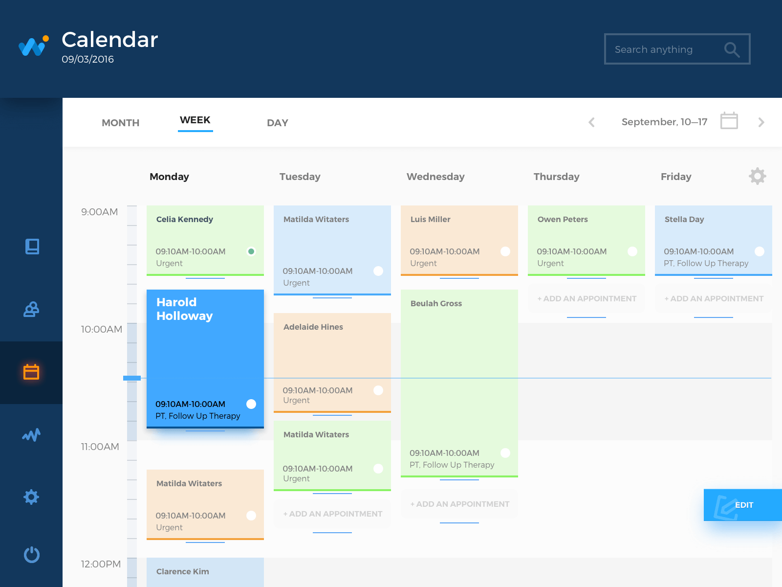
The calendar screen uses light pastel colors for cards which again set the association to the traditional interaction with physical objects when doctors and receptionists use colorful notes to mark the data and organize it on the noticeboard.
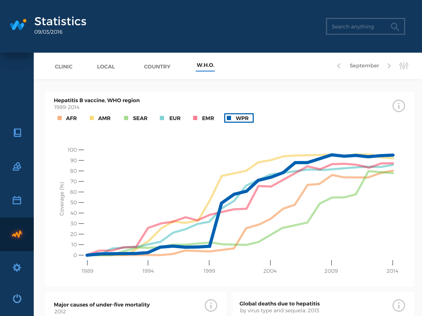
Statistics screen shows graphs and charts in a minimalistic manner with the appliance of contrast colors easily distinguished by human eye. For all the screens, the designer uses simple san serif font, highly legible and readable. Concentration on functionality doesn’t prevent the designer from giving the app simple and elegant appearance with the touch of style and creativity.
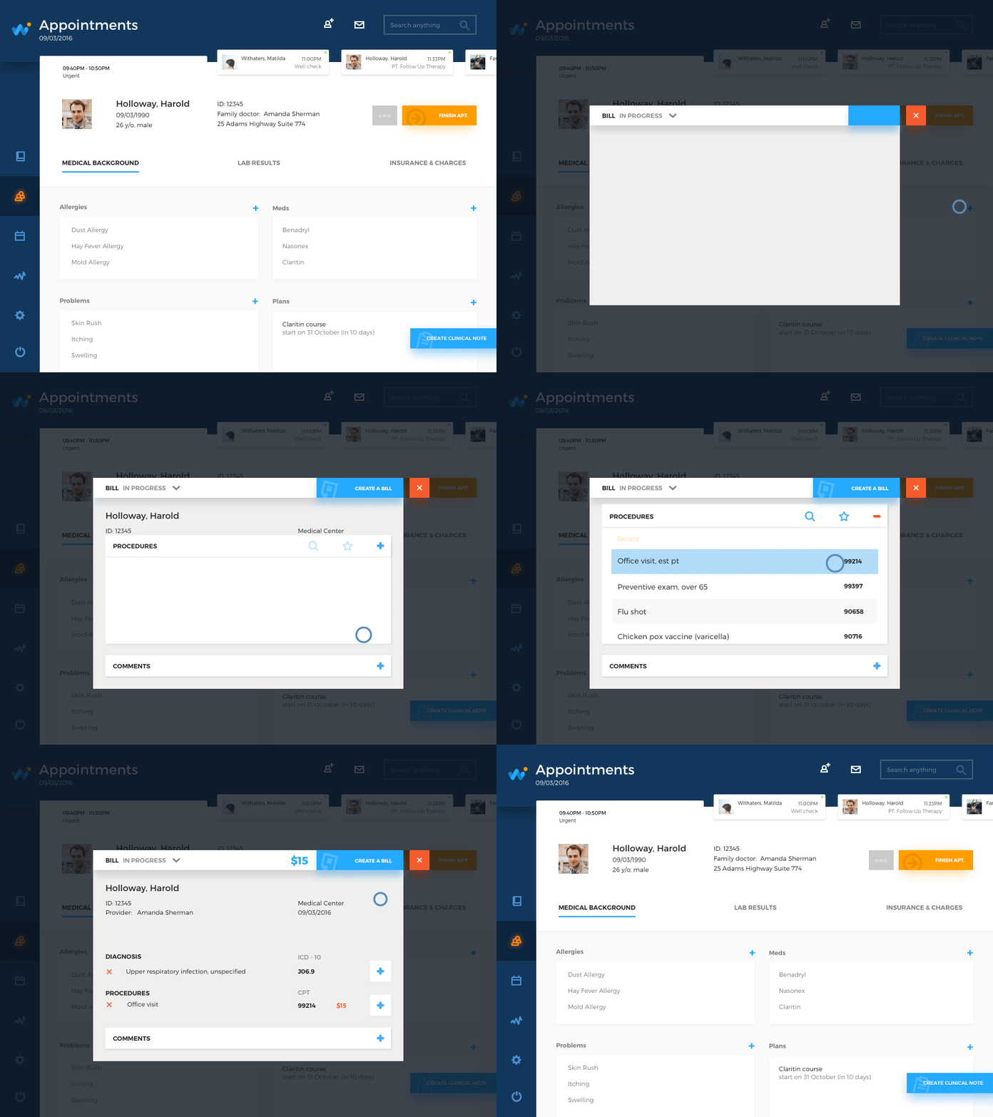
Animated transitions were also added to present some basic interactions with the app: inputting data, operating with pricing and completing the reception.
This case has actively opened the direction of design for the medical industry and healthcare here in Tubik and proved how many special features and aspects of the job should be taken into account by the designer. The tasks of this kind are definitely challenging, but highly rewarding in both creative and humanity values. No doubt, a new day will bring fresh challenges which will result in practical case studies for Tubik Blog readers. Stay tuned and healthy!
Useful Case Studies
If you are interested to see more practical case studies with creative flows for UI design, here is the set of them from Tubik.
Slumber. Mobile UI Design for Healthy Sleeping
Home Budget. UI Design for Finance
Letter Bounce. UI Design for Mobile Game
Real Racing. UX and UI Design for Mobile Game
Manuva. UI/UX Design for Gym Fitness App
Cuteen. UI/UX Design for Mobile Photo Editor
Tasty Burger. UI Design for Food Ordering App
Watering Tracker. UI Design for Home Needs
Bitex. UX Design for Stock Analysis App


