Custom illustrations created for websites and mobile apps have numerous advantages. And among them, the big one is their great potential in telling the bright and clear story to the user. Today our case study is right about that: let’s check a fresh project on storytelling illustrations for a healthcare service Florence based in the UK. The Tubik designer for the project was Yaroslava Yatsuba who earlier shared with you the tips on creating blog illustrations and working out personal artistic style.

Project
Creating original digital illustrations presenting the features and benefits of the healthcare service connecting nurses and patients.
Process
Florence is an online marketplace where self-employed nurses can find high-paying shifts across the UK. It removes the hassle of booking through agencies: nurses connect directly to clients and choose suitable shifts. The task for the designer was to create illustrations in which characters will reflect the nature of the service and the benefits it brings to improve life for both nurses and patients.
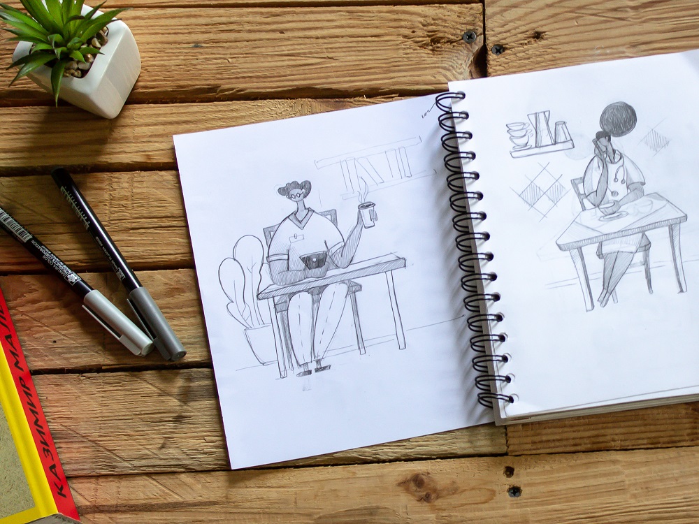
The first stage of the task required creating a set of sketches of nurses doing typical activities and elderly patients enjoying life.
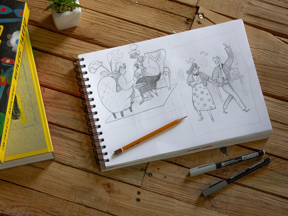
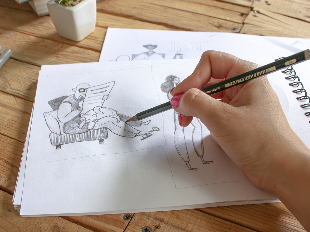
At this stage, the graphic designer created six quite detailed sketches and then added two more. There weren’t too many alterations for them: just little changes were made in the nurses’ uniforms to give them more modern looks and also the male nurse character was added.
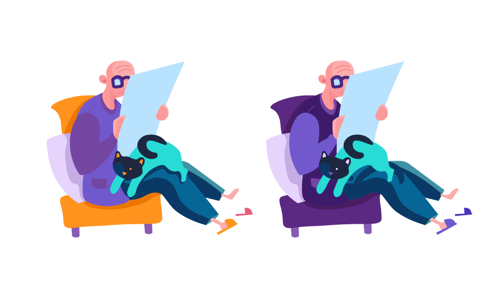
Having discussed the hand-drawn sketches with the client, the designer made one of them digital and presented in two color palettes based on the corporate color of the company (#7158CD) and its shades. Two-color schemes were chosen for it: four-color contrast harmony and analogous colors. The choice turned next to the four-color contrast harmony.
The next stage involved digitizing and detalization of the sketches.

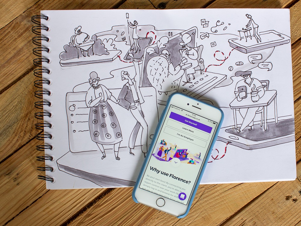
Then the designer moved to creating an extended and complex illustration that would unite many sketches into one integral composition. The artist defined the task for herself to combine all those separate scenes harmonically and this way to transfer the message about the core idea behind the app – connection with health workers that care about elderly people.
After the process of creative search in the aspect of the effective composition, the designer came up with the idea of placing the characters on various gadgets. This way each pair of elderly people would be connected to a nurse and this way will transfer the key message: we are close, in the one-click distance, don’t worry, enjoy your life.
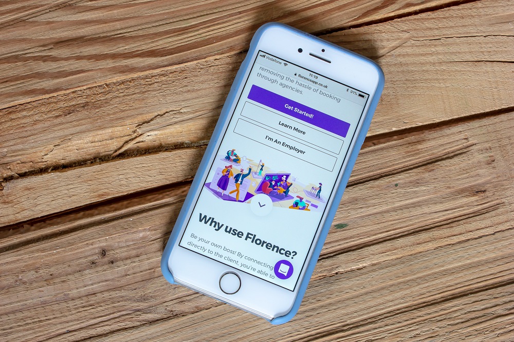
When all the parts of the image were digitized, and details were polished, the designer provided the clients with two options of the background color – cold and warm. The clients made a choice upon the warm one.

The variant with a cold background color

The variant with a warm background color
As we mentioned in the article devoted to hot UI design trends, the trend of custom graphics has opened a wider perspective of storytelling in the interfaces. More and more websites and mobile apps turn to specially designed characters showing the story, setting the atmosphere, sending the message, or presenting the benefits in a way that corresponds to the mood, tone, and voice of the platform. Original characters help to make the interactions more human-like, set strong visual associations with the real world, and instantly transfer the needed mood. What’s more, depending on the composition, the characters may become an effective tool to make the page or screen dynamic and lively.
Useful Reading
Here’s a bunch of handy articles and case studies on graphic design and digital art:
Design Process: How to Create Illustrations for IT Blog or Landing Page
Graphic Design: 24 Elaborate Flat Illustrations for Your Inspiration
How to Create Original Flat Illustrations: Designer’s Tips
Real Racing. Graphic Design for Mobile Game
Winter Olympics Illustration. Step-by-Step Process
OK Boomer. Trivia Game Design and Branding


