Design is one of the spheres that constantly evolve and transform. Sometimes it seems you have just got used to a trend or a standard – and the next moment the sphere makes a twist and changes the approach. On the one hand, it always keeps us bright-eyed and bushy-tailed. On the other hand, it demands flexibility and open-mindedness from designers. To share some practical stuff, today we have collected several of our fresh UI design concepts for websites aimed at diverse business goals and different target audiences.
Company Website of Design Studio
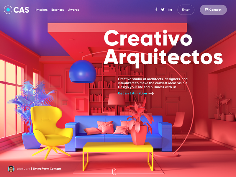
What’s stronger in design, shape or color? That eternal battle inspired this UI concept. It’s the website of the design studio specializing in exterior and interior design visualizations. Those guys know how to make shape and color work at maximum – you can catch it from the first seconds due to the visuals on the page. The designer applied the techniques which are quite trendy this year – full-screen background image and 3D graphics. The high-quality original 3D graphics created and rendered for the page take all the background area.
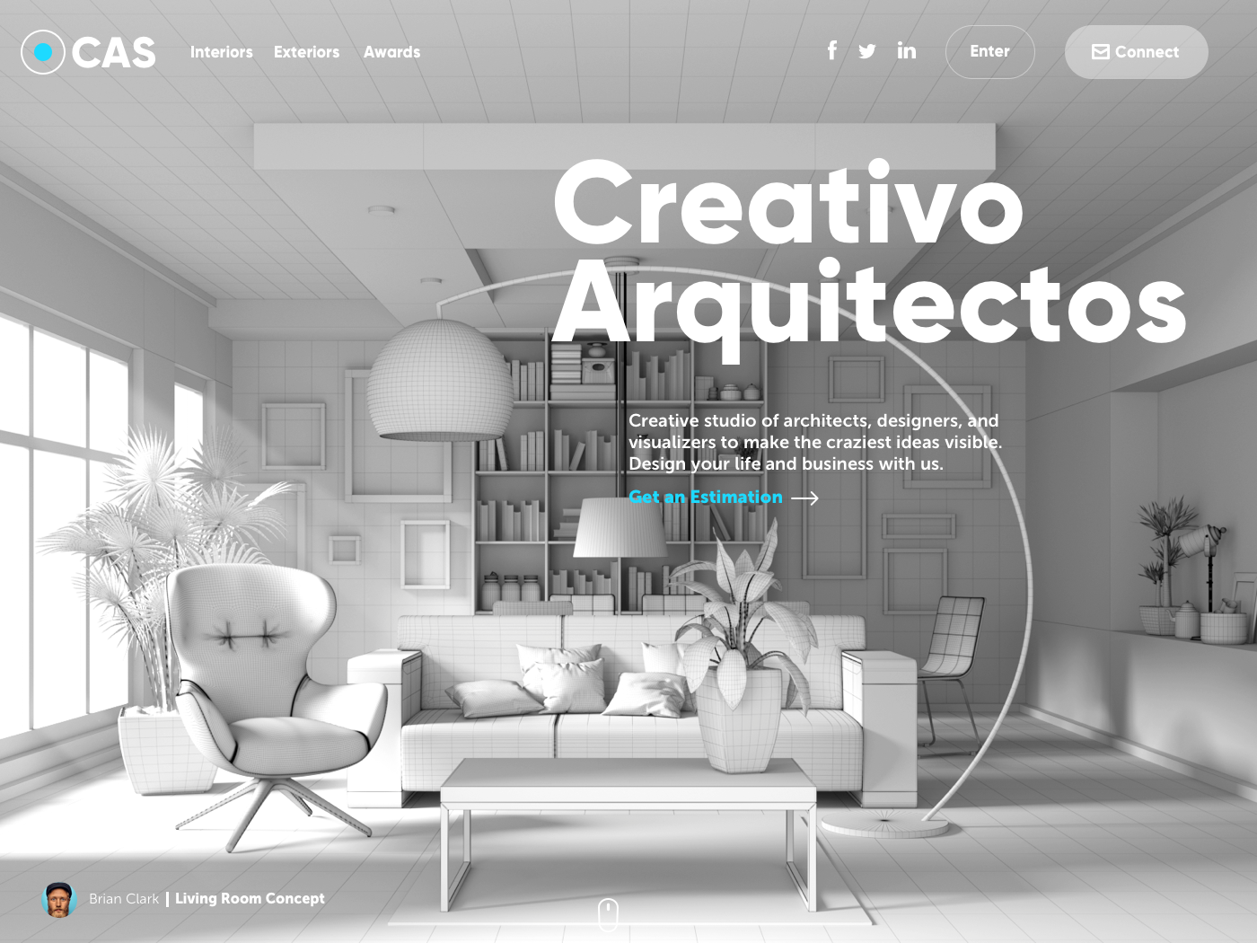
This way the image immediately sets the theme and presents the company services.

The closer look at the home page shows attention to the typography and visual hierarchy of the copy blocks to make the page scannable. The bold and catchy headings of each block quickly inform users about the nature of services. The header gives a look at a company logo, links to the core website pages and social network accounts. Also, we can see two buttons in the header: the ghost button allowing already registered users to enter their profiles and the key CTA inviting users to connect the studio.
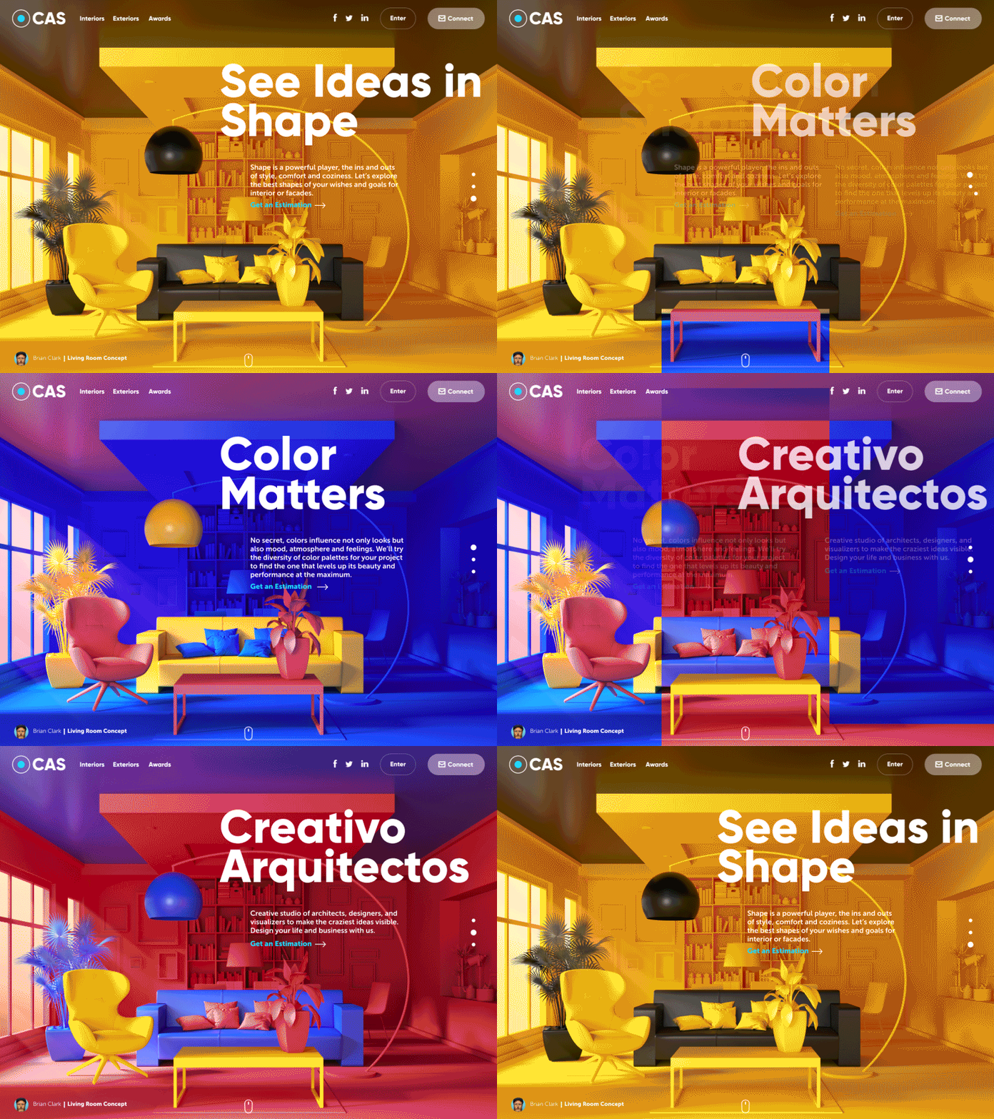
To make the interaction with the page even more engaging, it gets a pinch of motion based on colored vertical stripes when users check the slider. Also, mind the little but important animated UI detail – the page indicator that gives users fast feedback about the changes of slides.
Website of the Booking Service
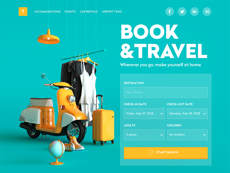
Traveling is not only an exciting experience but also a great challenge of booking accommodation, renting a car, buying tickets and tons of other things to do. Here’s a web design concept of a simple and bright booking service for travelers. It also uses 3D graphics, but this time the big theme image harmonically takes the left part of the page, while the right part features the form to fill in for the first search of accommodation. So, users may start interaction right from the pre-scroll area without the need to search for this functionality. The contrast of the chosen colors makes the page original and lets it stand out among the competitors. The bold and catchy tagline is immediately scanned to inform users what they can do with the service.

Scrolling down, users can learn more about the benefits of the service, special features, and bonuses. Each information block is supported with catchy visuals following the stylistics of the hero image, this way strengthening the consistency and integrity of the page. CTA buttons enable a user to move to particular pages right from every part of the webpage.
Biography Website
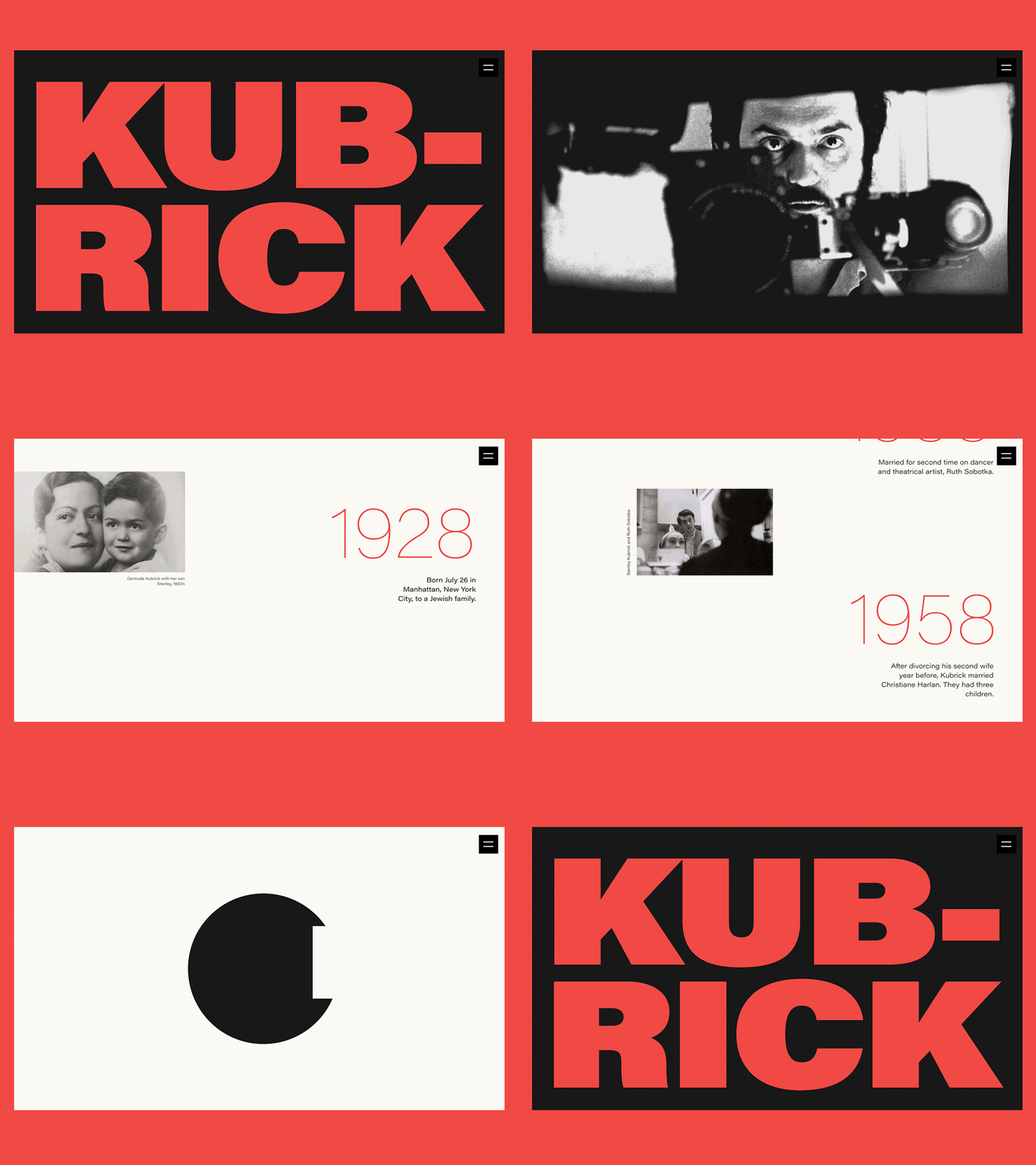
On the 26 July, the world cinematography marked the 90th anniversary of Stanley Kubrick’s birthday. To add our two cents, we present all the fans of the famous film director, screenwriter, and producer with an elegant biography website devoted to his path of glory, his life, and his creative heritage. Here you can see just a sneak peek of it – the full version is live here. It’s easy to see that contrast and elaborate typography were chosen as the main tools of expressiveness in this design.
Landing Page for a Babysitting Service
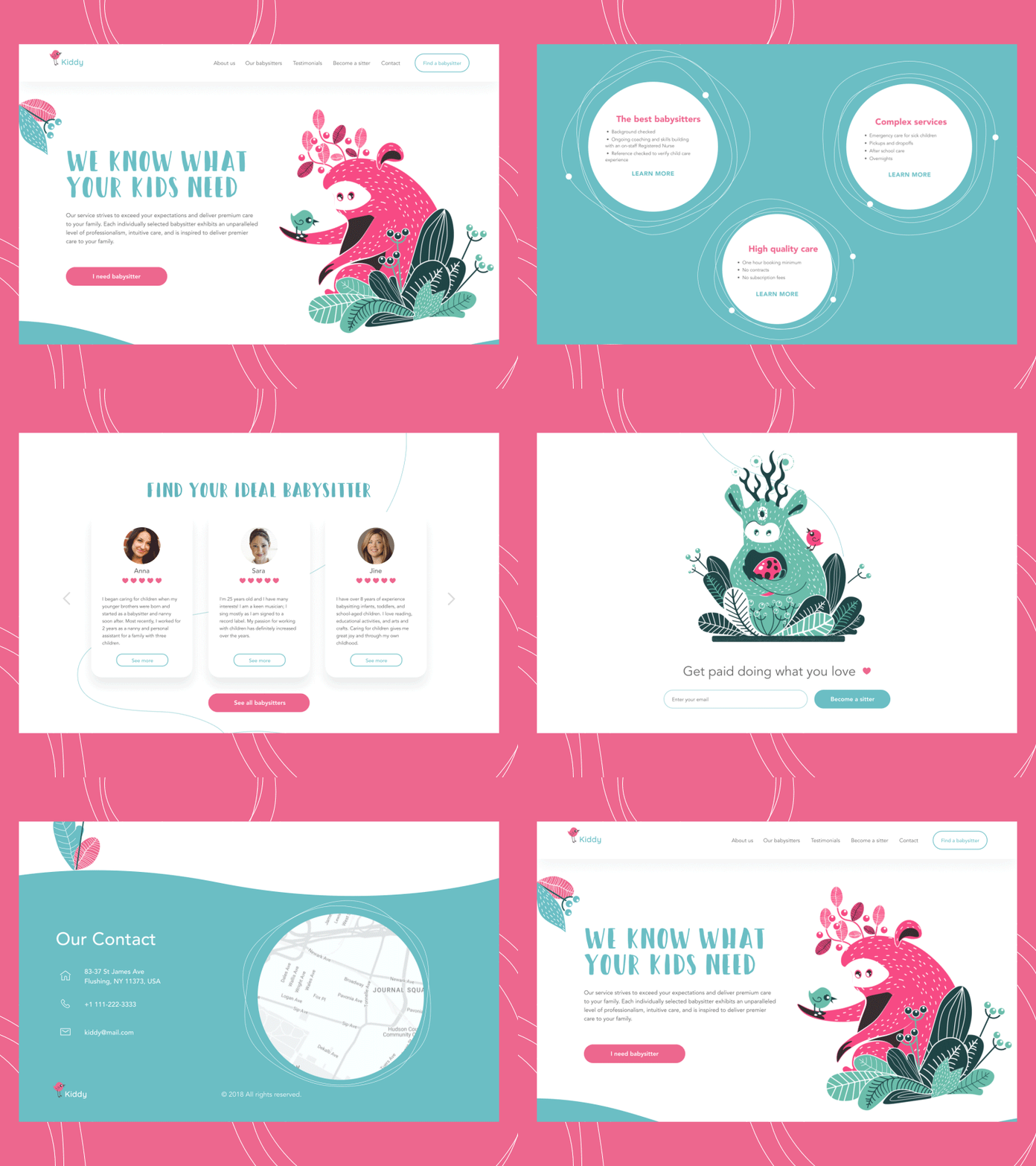
All parents want the best for their kids, including babysitters that are bright and caring. This design concept presents a landing page for Kiddy, a platform that makes hiring a babysitter just a piece of cake. Isn’t it cute? The feeling of cuteness and positivity is supported by several factors, among which animated custom illustrations with funny characters play a key role. They transfer the message and the mood, create the needed atmosphere before the user starts reading about the service, and give all the page a unique look. Although the color palette is quite a pastel and peaceful, it gives enough contrast to scan the core details quickly. Smooth scroll animation enhances the feeling of integrity.

The landing page includes all the classic components: it describes the service, gives the direct connection to the top professionals, features testimonials from clients and shows users how to contact the service representatives. What’s important, users aren’t forced to scroll all the page if they want to apply for a babysitter quickly: they get the needed buttons to do that right from the first pre-scroll screen.
Website for Virtual Chatrooms Service
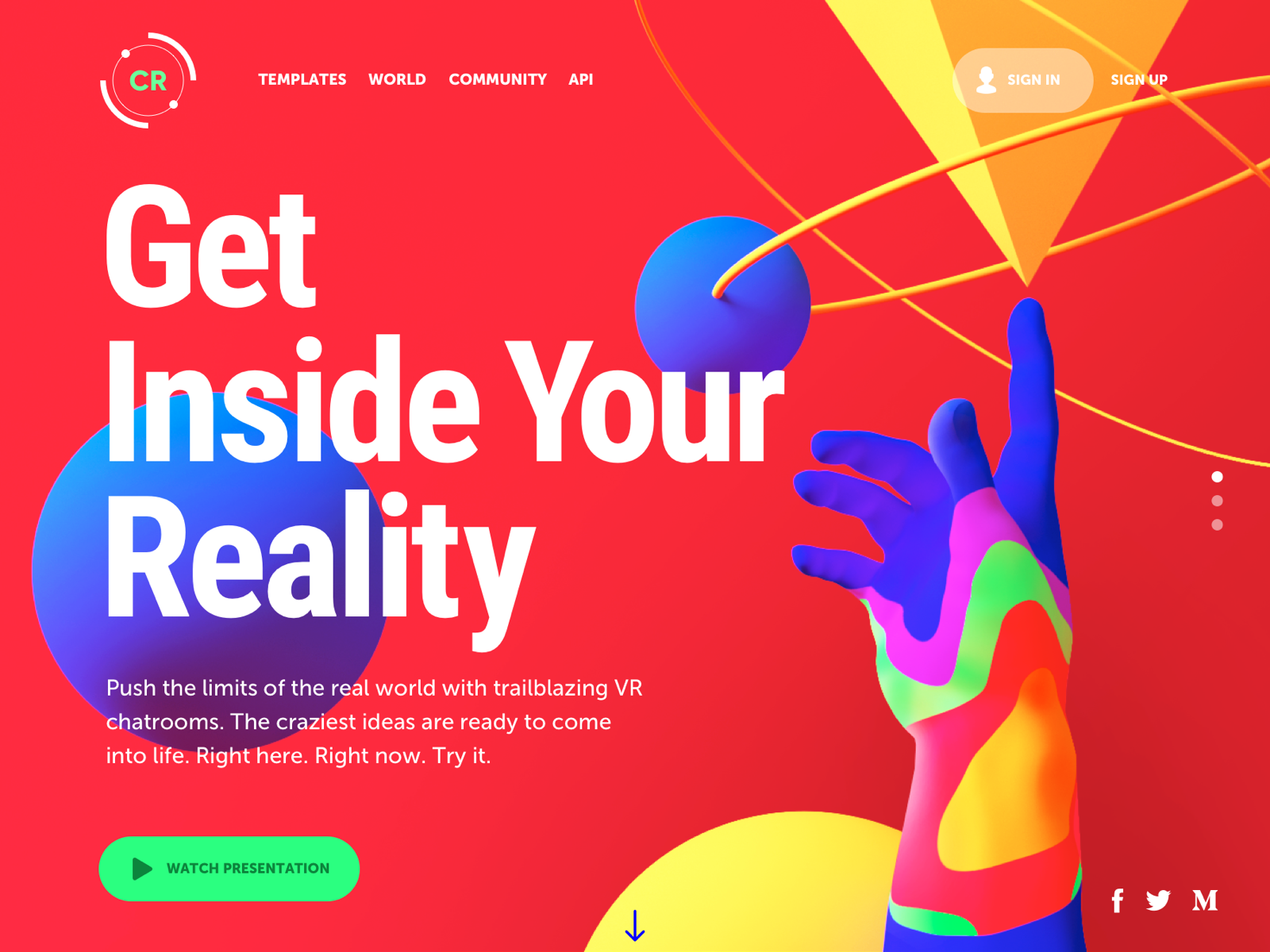
We all sometimes feel the urge to move out of our reality and see what’s beyond. What could help better than VR with all its endless opportunities? This concept presents the design for a web platform sharing templates for virtual chatrooms based on the craziest ideas. The visual presentation is made out of the world with bright and even psychedelic color combinations and catchy 3D graphics connecting the human-like element – hand – with geometric shapes symbolizing the variety of modern technology. To check the benefits, users can watch the presentation right from the first screen without scrolling more: that’s an effective strategy for the case, as video content is highly popular with the target audience of the project. The home page gives the initial introduction to the product and links to the popular VR chatroom templates. Also, for the sake of better marketing, the users are offered to subscribe to get regularly updated about new templates and upgrades.

Website for the Marketplace of Home Craft
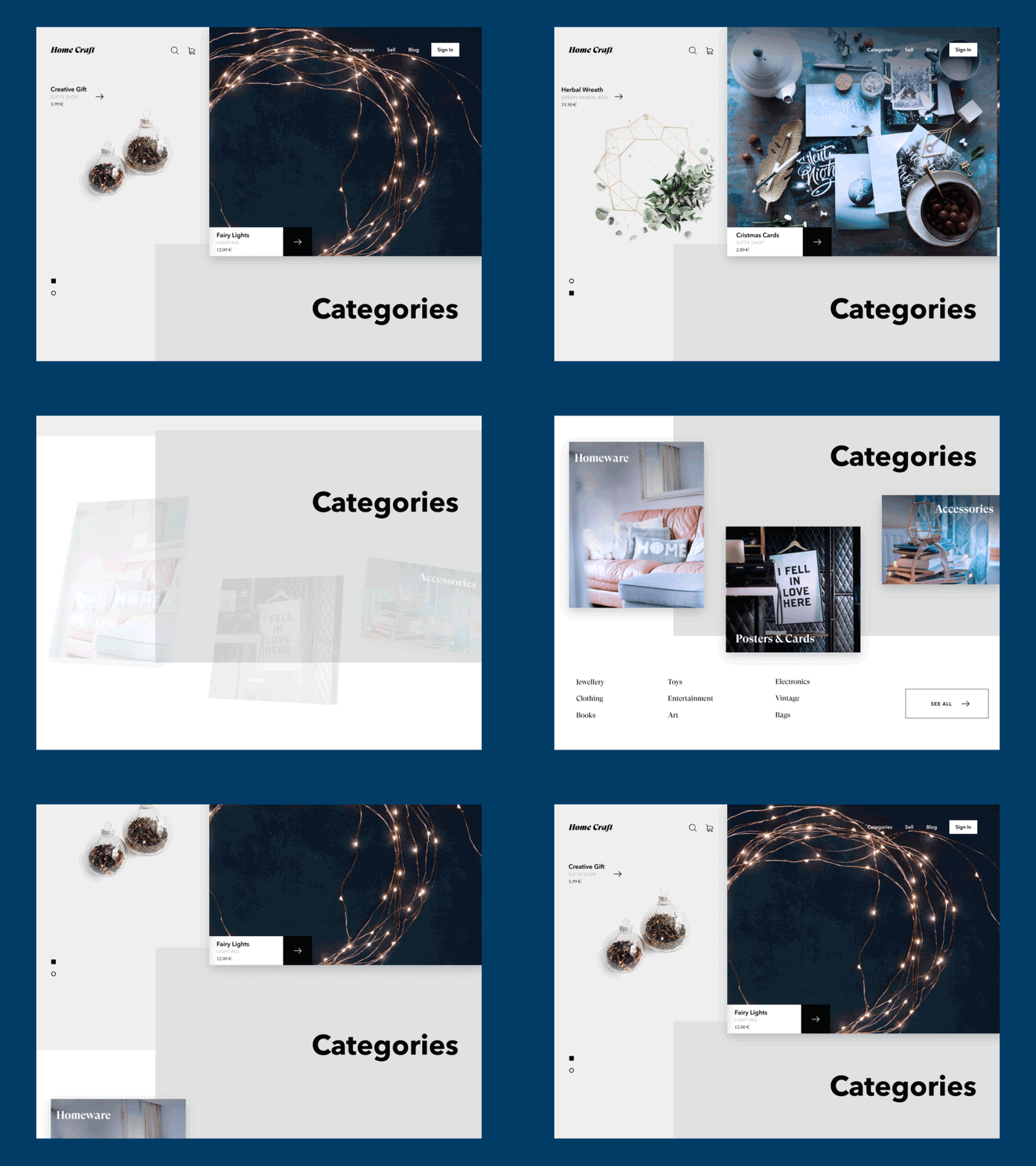
Here’s the website for the C2C platform via which producers of different home craft can sell their stuff, and buyers can find exclusive goods for their homes. The design looks elegant and catches the eye due to the broken grid and smooth scroll animation.

The light background is applied to most space on the page to ensure the effective presentation of the items, which present user-generated content and may feature a variety of styles, colors, and shapes. The dark background is applied only to the footer area that provides the description of the service benefits and gives links to useful information.
Company Website for Web Development Service
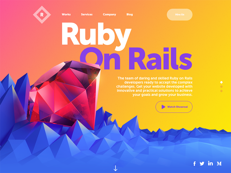
Who said that the website for a company of web developers should be simple, colorless, or boring? This concept shows it doesn’t need to. It’s UI design for a website of a company specializing in Ruby on Rails development: the big 3D image of the gem immediately sets the visual association. The pre-scroll area features links to different information sections of the website, a short description, links to social networks, and two buttons. The primary one is placed in the header and marked out to give quick access to hiring options; the secondary one performs as a ghost button and lets users watch the video presentation of the company.

Scrolling down, users learn about technologies the team applies, get testimonials from the company clients, feature the set of clients’ logos, and provide the form to fill in and connect with the team. The visual performance of the hero image, layout details, and background unites all the page elements and sections in one integral composition.
Educational Website of Online Encyclopedia
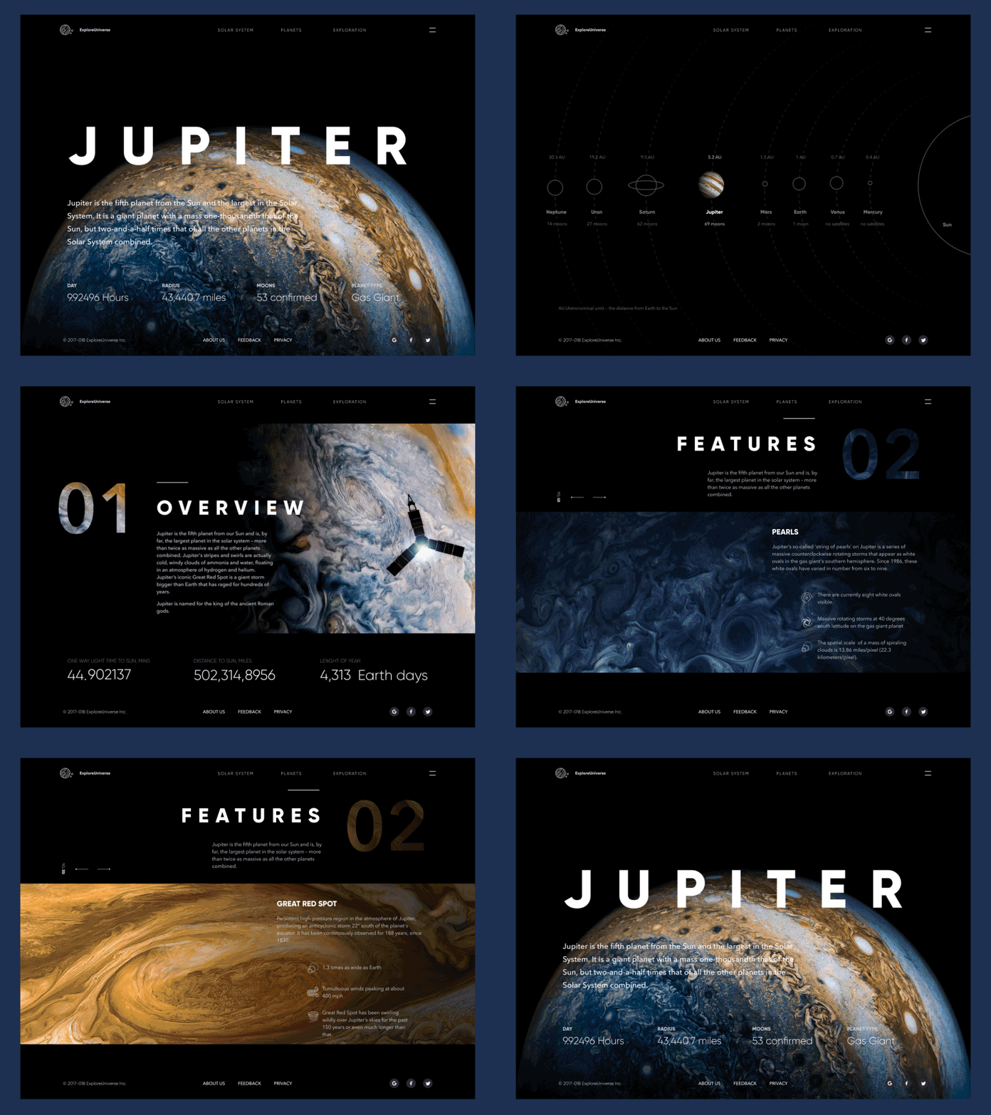
Time to catch some cosmic vibes: check our fresh UI concept for Explore Universe, the interactive online encyclopedia devoted to the Solar System, its planets, and interesting explorations. Here you see the entry page about Jupiter. Photo and graphic assets are integrated into the dark background to support the visual connection with the theme. Smooth animation supports the feeling of diving into endless outer space.

The closer view shows how much attention should be paid to educational projects in terms of visual hierarchy and scannability. The designer chooses clear and easily readable fonts testing that they work well on a dark background.
Landing Page for a Music App
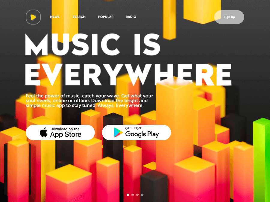
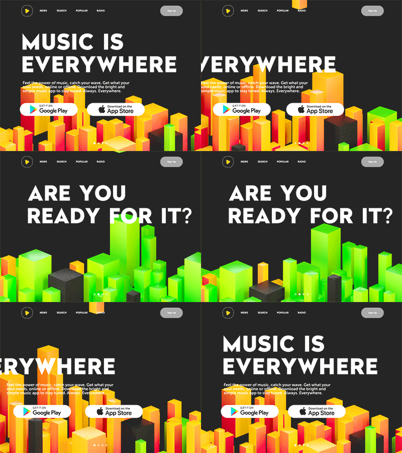
Feel the beat with this UI concept, a stylish landing page for a music app. It transfers the mood and rhythm from the first seconds with bright abstract graphics and slick animation. As the product is quite simple, the page isn’t overloaded with much copy: a short tagline catches the user’s eye with bold typography, and nothing distracts from seeing core CTA elements – buttons for app downloading from AppStore or GooglePlay.
Trends change, users want more, and designers push the limits. Perhaps, this is how design turnover could be described in short. New concepts are close – don’t miss the updates!
Tubik Design Collections
If you want to check more creative sets of UI and graphic design concepts and projects, here they are for you.
Motion for Mobile. 20 Creative Concepts of UI Animation
Helping Hand: 15 Creative UX Design Concepts for Everyday Needs
Graphic Design: 24 Elaborate Flat Illustrations
Soft Landing. 10 Design Concepts of Landing Pages
Web of Life. Creative Web Design Concepts
State of the Art: 15 Creative Graphic Design Concepts
Creative Motion: 12 Concepts of Interface Animation
Food for Thought. 10 Tasty UI Concepts for Eating and Cooking


