Perhaps, one of the most diverse objects of modern digital design is the weather. Graphic designers work out loads of icons and illustrations in different styles, UI/UX designers create new concepts of weather applications and widgets, so users get more and more options for getting such simple but vital information as weather forecast and the like. Despite the bulk of numerous weather apps growing bigger and bigger, it is still one of the most popular topics for designers as it goes to the basics of human everyday life.
Users have a great benefit, being able to choose among loads of weather apps and services of different complexity, style, features, colors, and so on. Moreover, the target audience of this sort of product is almost unlimited and totally diverse, therefore different ideas and concepts if done according to the laws of basic visual efficiency and common sense, will find their users.
Tubik designers, working on various UI/UX projects, have also presented different design concepts for weather applications. So, this post is sharing our works and ideas on the topic.
Basic points of UI for weather applications
The design of the user interface for a weather application is usually concentrated on the idea of being informative and clear. This really is the thing that does not include a lot of copy on the screen, so it is very important to find the scheme and layout in which the user will need just a quick glance to get all the data he or she needs. That provides a broad space of creativity for designers as well as becomes a great challenge as any kind of weather app requires keeping the wise balance between the creative visual representation and extremely high level of usability.
Both aspects – visual and usable – need to be taken into account. If the designer doesn’t think thoroughly enough on solutions providing an easy and pleasant user experience and enhancing usability as the basic point, the app will risk losing the audience because the functionality is the first thing that retains users to such kinds of basic apps. On the other hand, concentration only on the layout and transitions while seeing visual design as the secondary and minor aspect is also a high risk, since being usable and well-thought-out but visually boring and usual the app will not attract users’ attention and could get lost among the numerous competitors. So, the designer should think over both perspectives and look for ideas to make the design concept pleasant-looking, clear, efficient, and understandable.
Practice shows that the limitations for a designer’s creativity in the case of weather applications are much lower than in a lot of other types of products. As weather apps do not usually use long copy on the screens and apply a lot of visual details, the aspects of readability and efficient data presentation are different from for example the screens of a blog app or a social network. Therefore, designers can try various color pallets and combinations, different forms and shapes, interesting textures, visual effects or interface animation, original fonts, or unique icons – anything that will support the clear visual perception of the data necessary for a user.
Colors and shapes
In the case of UI design for weather applications, there is no strict trend, requirement, or recommendation about using light or dark background. It happens, for instance, with more copy-based products in which the aspect of readability is activated with the perception of a big amount of text: in this case, it could be recommended to try light background for making the layout more user-friendly and text more legible. In the case of weather apps and widgets any combinations of colors, sometimes very unexpected, could work efficiently as far as they provide visual support for the data and enable the user to see and understand what they need in a fast and easy way.
Moreover, interesting combinations of colors and shapes can also provide a kind of aesthetic pleasure for the user that can become a reason to choose this particular product among the competitors along with the personal user’s taste. So, the range of colors is perhaps one of the widest in this case of design work. The weather concept accomplished by Sergey Valiukh for Fuse has become a good case of practical example.
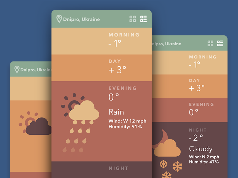
Weather App Screens
The organization of the data on the screen is one more important aspect to think over. One of the fresh design concepts by Tubik designer Tamara features the organization of the data along with the cards with the basic and additional information needed for the user. The user can choose the place (filtered as a city, region, country, and the like) and get the card which shows basic data such as temperature and weather characteristics (sunny, cloudy, cold, etc.) and additional data such as date and time according to the local time zone. It can be especially useful for users who travel a lot and need to know how to estimate their time and routines considering the local situations.
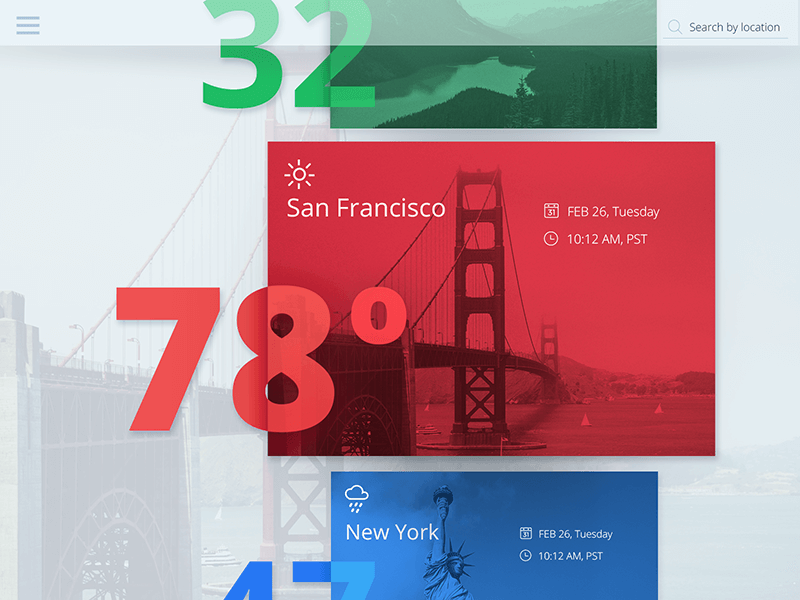
Weather Concept
Graphic elements
Graphic elements for weather applications are among the most essential things to put time and effort in. Weather apps, as was already mentioned, are highly visual and data perception has to take seconds so graphic elements should first of all be concentrated on increasing usability. A designer has to remember that this kind of app could be used on different devices, in different environments (bright or poor light around, for example), very often on the go. People with different levels of sight will need to use it. So, to be useful and usable, the app should apply graphic material which will be not only visually appealing and stylish but also easily perceived in various conditions.
Among the graphic elements vital for the efficient weather app, icons should be mentioned first. In one of our previous articles, we have already described the importance of elaborate work on this vital element of an interface. In the case of weather apps icons have a great field of expression as they actually become highly informative elements. Being aware of this, designer Arthur Avakyan created the original set of weather icons for Tubik. All the icons follow the laws and standards of proportions and composition and will look recognizable and meaningful in different variants of color pallets and combinations. Also, they all were tested by the designer in the range of sizes to check that their recognizability doesn’t decrease in any case of use.
![]()
Weather Icons Set
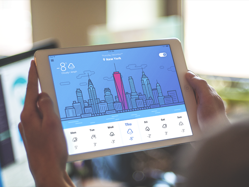
To represent how these icons work in layout, UI designer Valentyn Khenkin presented the concepts of weather app seen on the iPad screen. It shows the location, the weather around – the temperature, pressure, and other details. And the majority of screen space is covered by the illustration of the city which creates a nice style and is recognizable as a support of the feature of the location.
![]()
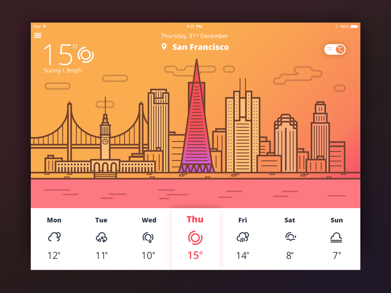
Weather Icons Presentation
Interface animation can become a good way to liven up the graphic elements as you can see in the animated interface by Sergey Valiukh. Animation adds movement and action, enhances efficient and fast microinteractions, and makes the perception of the data even faster and somehow entertaining.
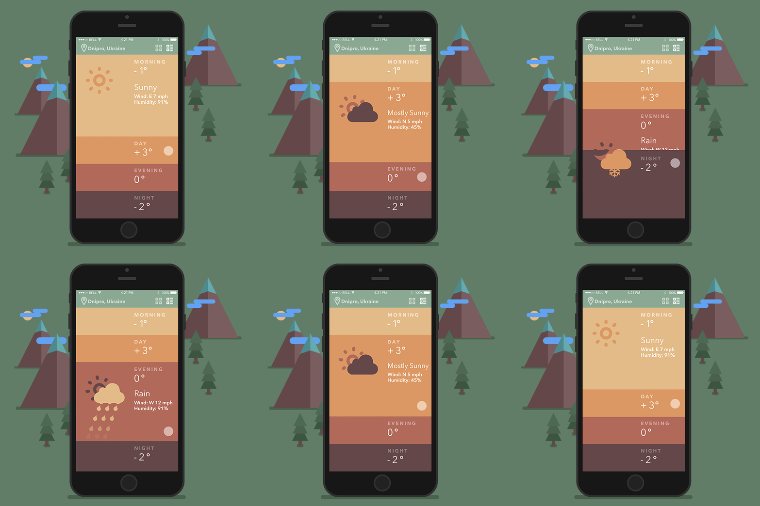
Weather App
So, designing UI for weather applications, designers have a broad perspective on their ideas and concepts, choosing different design solutions and it is rather easy to move out of the box. However, any ideas made about the layout, graphic elements, and animations have to pursue the goal of creating a user-friendly, fast and clean interface that could preferably have the great support of attractive and stylish looks.
Extensive discussions appear and follow the topic — and certainly, they will move on to the future — about the weather apps design and finding the best solution which could be universal for everyone. Nevertheless, every day millions of users, having different tastes and preferences, different favorite styles and characters, different feelings of what feels comfortable and looks nice for them in particular, use this kind of simple apps as a part of their routine. The more variants of looks and features will be designed, the wider range of diverse options that endless target audience will get to find the one which fits their particular needs and wishes. And that is, obviously, a user-friendly way.
Useful Reading
If you want to learn more about the best practices of user experience and user interface design for mobile, here are handy articles on the topic.
Mobile App Branding: Tips, Strategies, and Examples
Mobile UI Design: 15 Basic Types of Screens
7 Tips to Enhance Mobile Interactions
The Ultimate Guide to Creating a Mobile Application
Mobile Typography: 8 Steps Toward Powerful UI
UX Design: How to Use Animations in Mobile Apps


