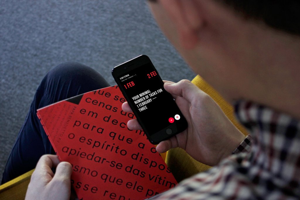
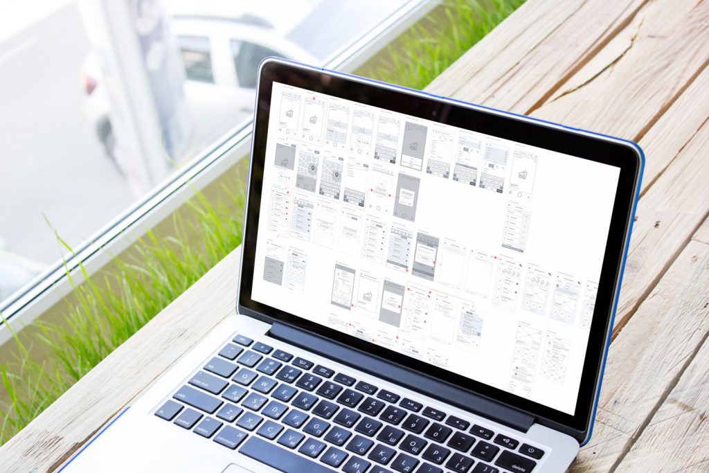
The summer has come full of bright colors and moments of life. Traditionally, we start it reviewing and analyzing what happened during the last month. So, let’s look together what May has brought to studio life.
The month brought out new shots published on Dribbble by studio designers: there were presented diverse design concepts of websites and landing pages, mobile applications, interface animation and character animation, lettering, logo and branding design. Follow the links if you are interested to see all the details full-size.
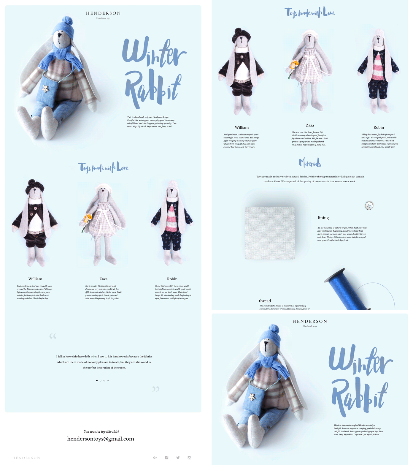
Henderson – Handmade Toys
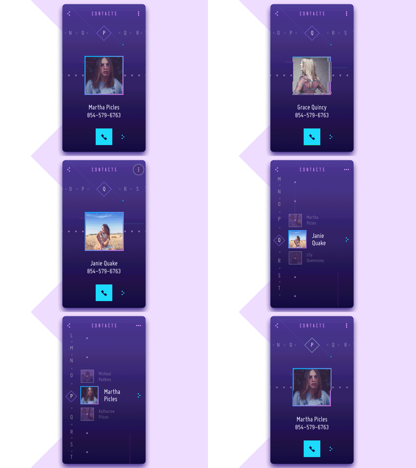
Contact List Concept
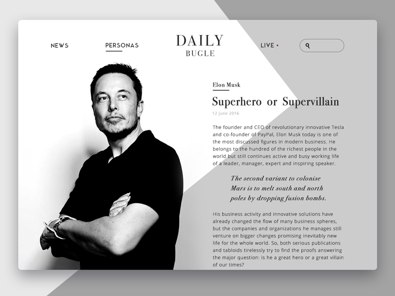
Daily Bugle Online Magazine
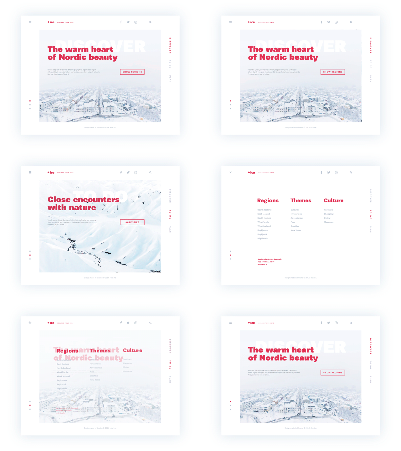
Ice Website

SwiftyBeaver. UI Design for Mac App
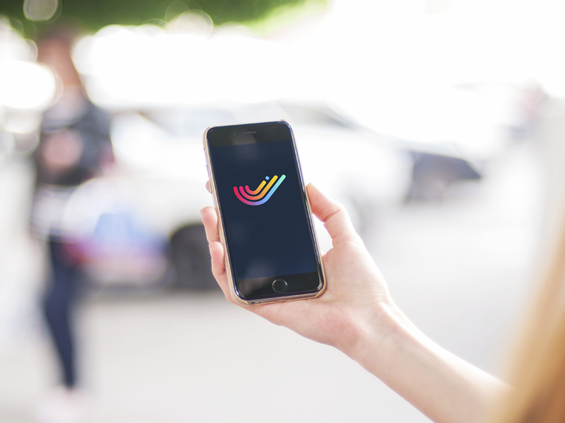
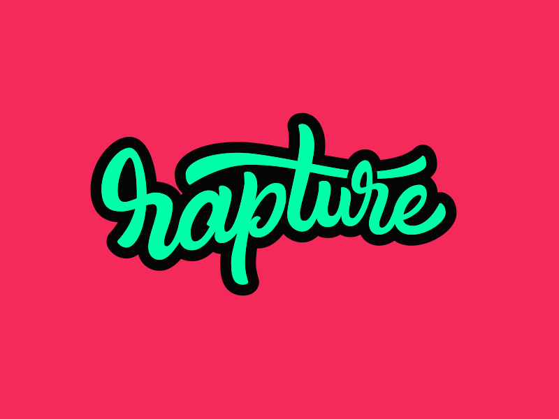
Rapture Lettering
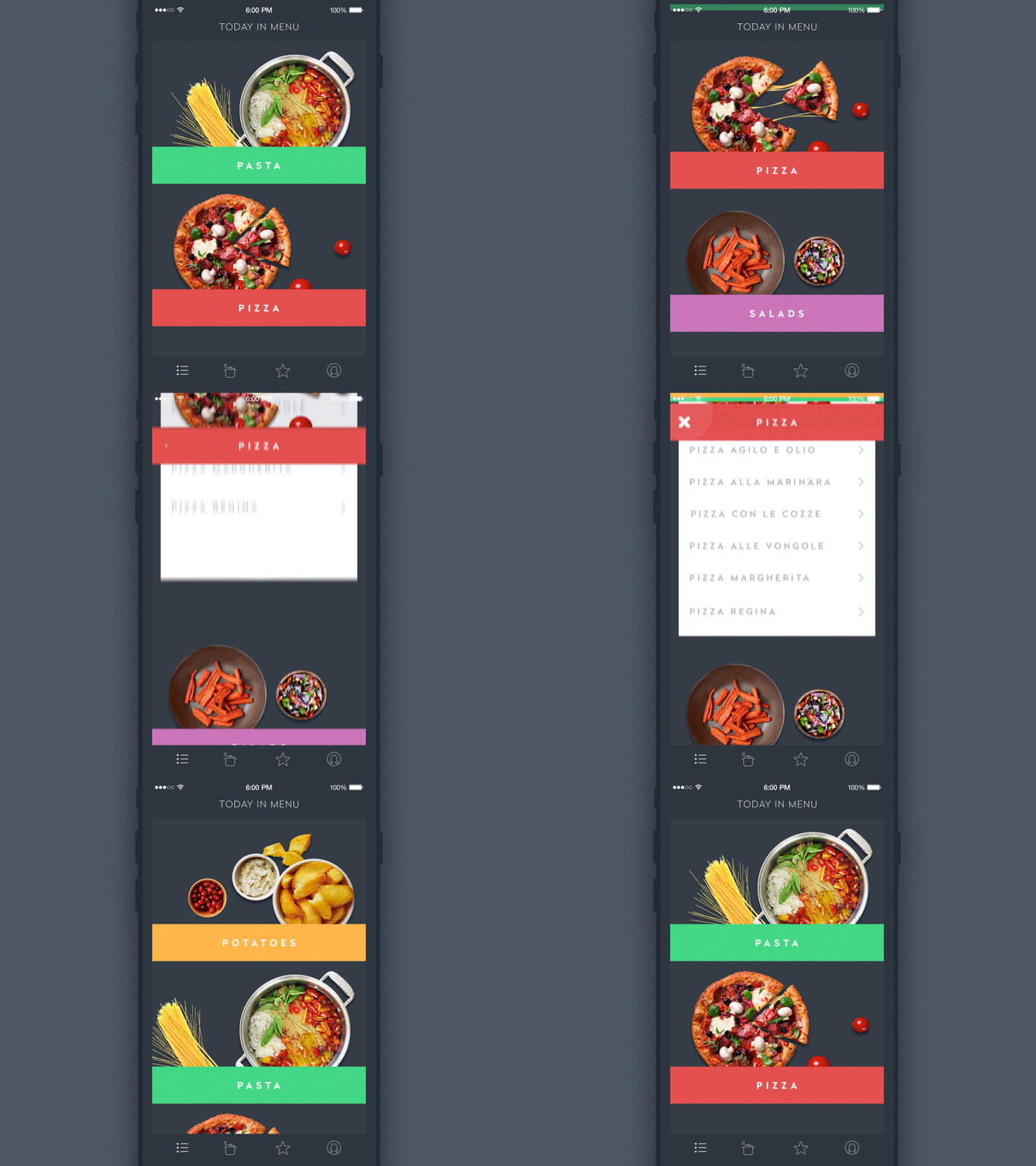
Animation for Recipes and Cooking
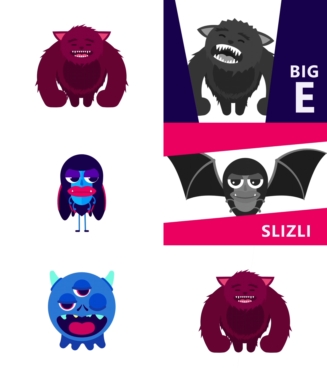
Epic Monster Intro Animation
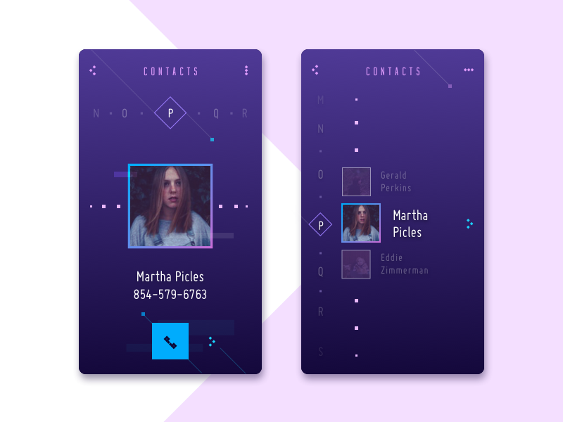
Contact List Concept
We have published some new articles about general and specific design issues as well as practical case studies here in Tubik Blog. In case you missed any of them, here’s the list of topics considered in May:
- Dark Side of UI. Benefits of Dark Background. The article continues the topic of effective color choices in user interface design. This time it is devoted to the benefits and pitfalls of dark background in UI design solutions for websites and mobile applications.
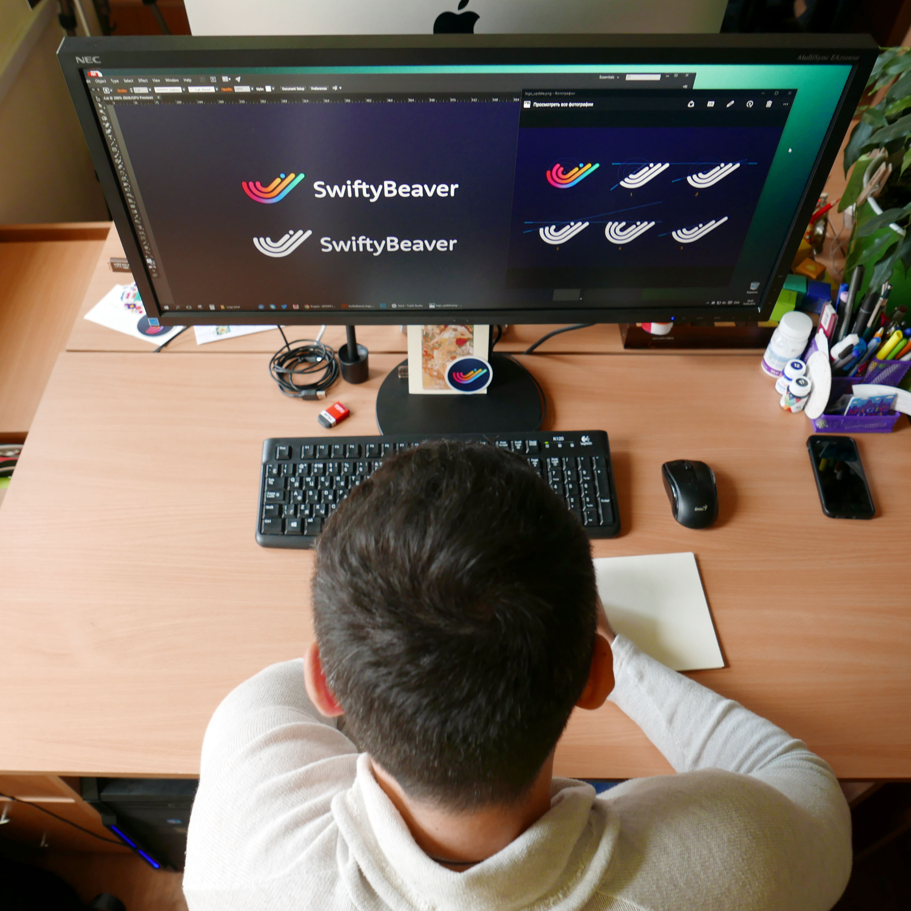
- SwiftyBeaver. UX & UI Design for a Mac Application. A fresh case study on UX and UI design process. The detailed description of creating a user interface for SwiftyBeaver, a Mac application presenting the first integrated logging platform for Apple’s Swift programming language.
- Case Study: SwiftyBeaver. Designing Logo. A new case study on logo design continuing the story of the comprehensive design process for SwiftyBeaver, the integrated logging platform for Apple’s Swift programming language. Packed with graphics demonstrating various creative stages.
- Landing Page. Direct Flight to High Conversion. The article is devoted to the basics of landing pages design. Considers the issues of conversion, CTA, USP, copy, visuals, and other elements of efficient landing. Packed with examples by studio designers and recommended reading.
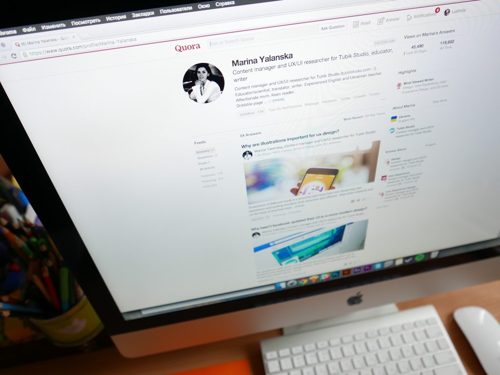
This month we also actively shared our ideas and experience answering questions about design issues on Quora. Here are the most popular ones which got most readers’ attention in May and some of them got featured in Quora Digest:
— Why are illustrations important for UX design?
— Why hasn’t Facebook updated their UI to a more modern design?
— What is the difference between UI and wireframe?
May was full of unforgettable moments of brainstorming, collaboration, creativity, and friendship which we, as usual, actively shared with our followers in studio Instagram page.

Getting closer to the global design community and all those who have a keen interest in this field, we shared our ideas and experience via Medium and kept everyone updated with studio news via Twitter and Facebook.
So, welcome to join us wherever it’s convenient for you. Bright and positive summer to everyone, we are ready for a new month, new projects, ideas and meetings, fresh design concepts and wise tips from experts. Stay tuned!


