There’s something disarming about working on a picture book. You sit down at your desk—same desk where you’ve designed dashboards, landing pages, branding systems—and suddenly you’re thinking about first-day-of-school anxiety. About how it feels to be small in a big hallway. About whether a puppy’s ears should droop more when he’s nervous.
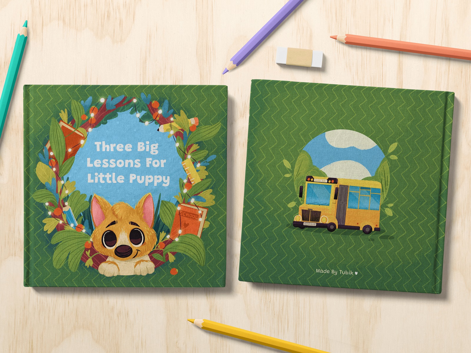
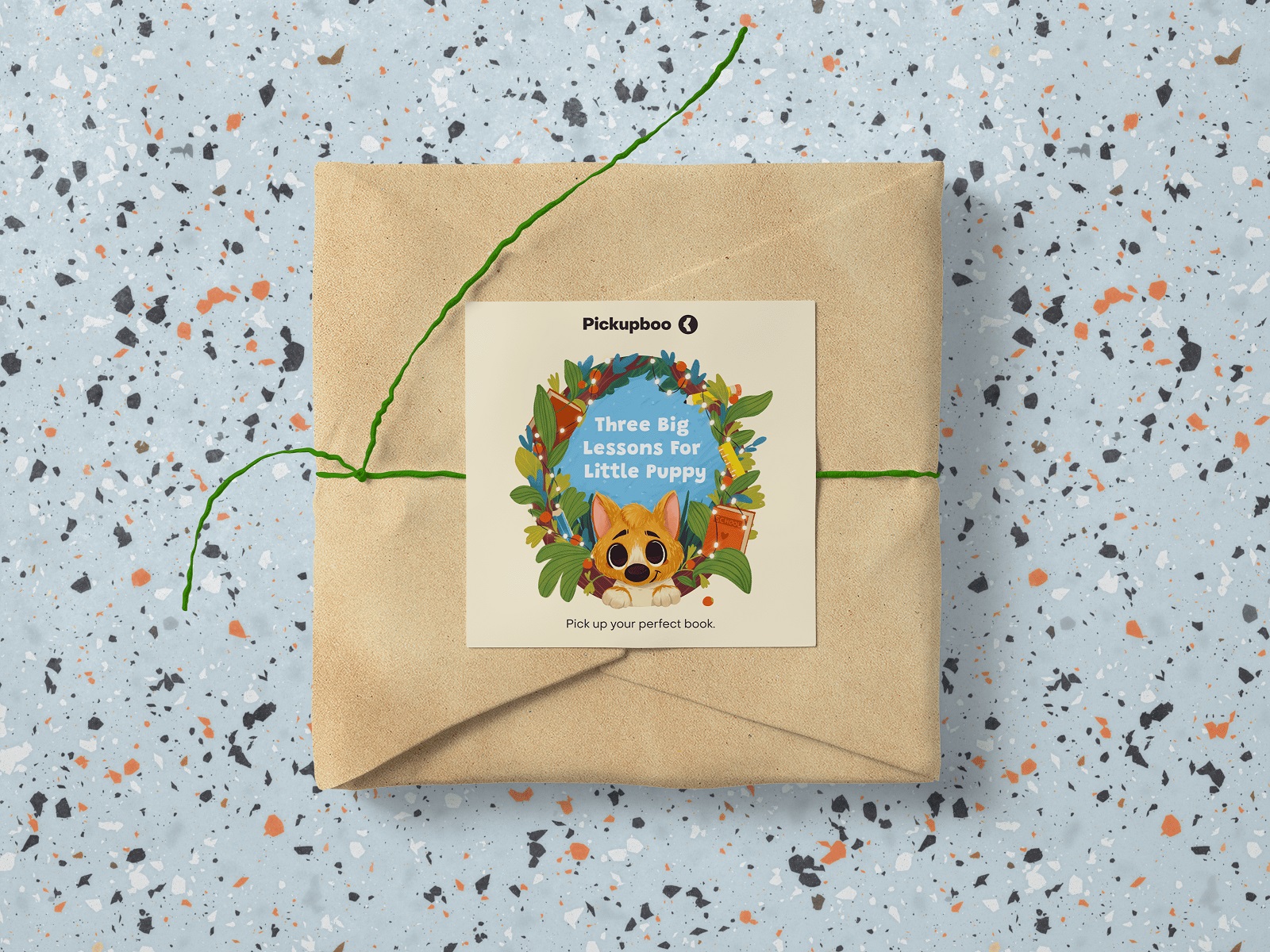
That was Fairytale. A children’s picture book project where we handled the full scope: writing, character art, illustrations in multiple formats, and graphic design. A complete creative process, from the first idea to the final book spread.
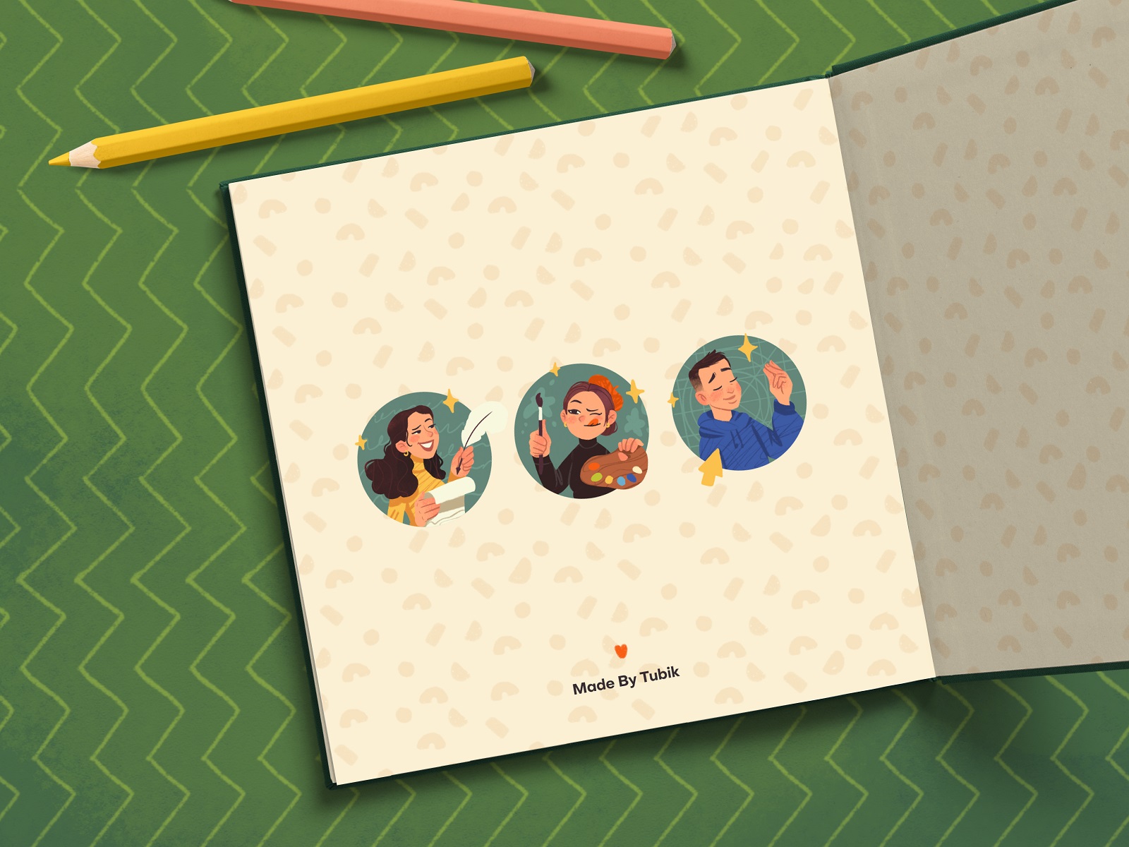
The project was created by Maryna Solomennykova, Marina Yalanska, and Arthur Avakyan, with art direction by Sergii Valiukh. It felt less like “a task” and more like stepping into a small universe we had to build carefully—emotionally and visually—from scratch.
Idea and Story
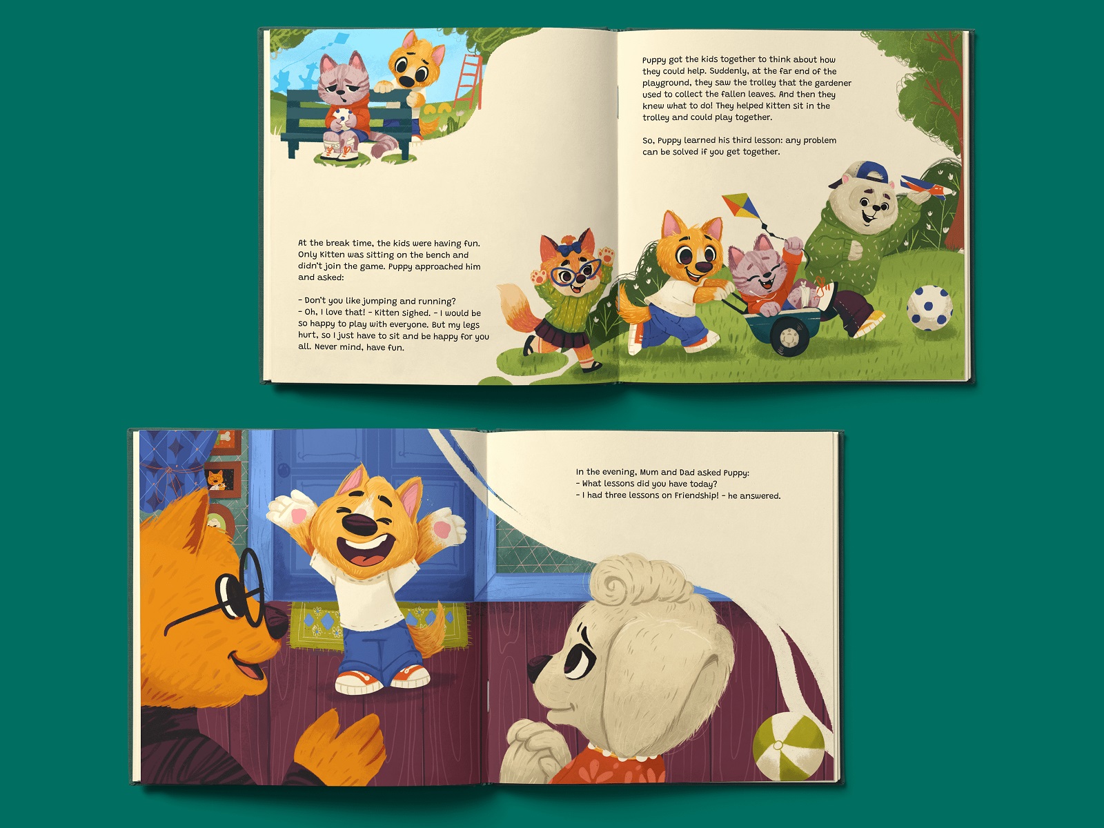
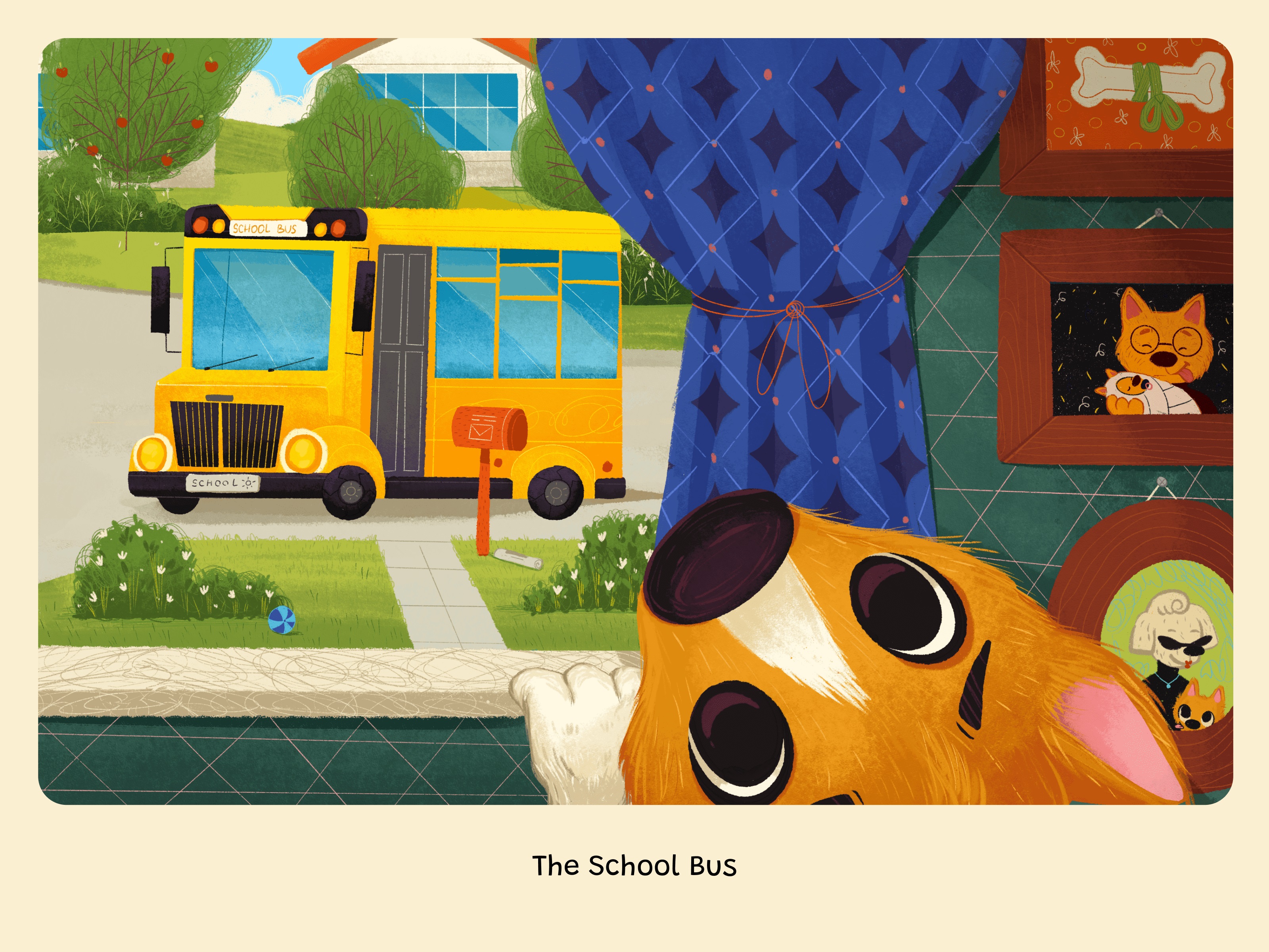
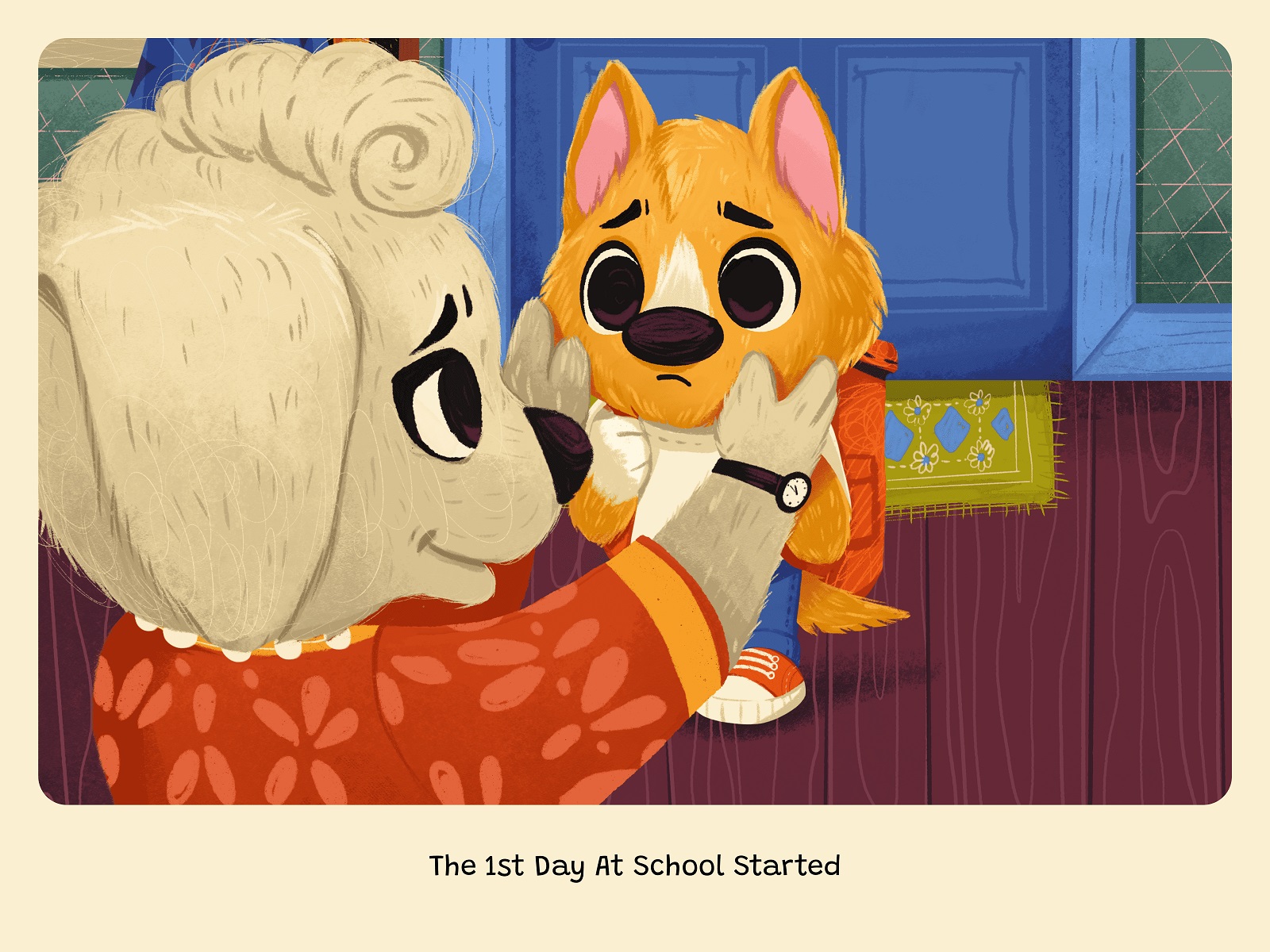
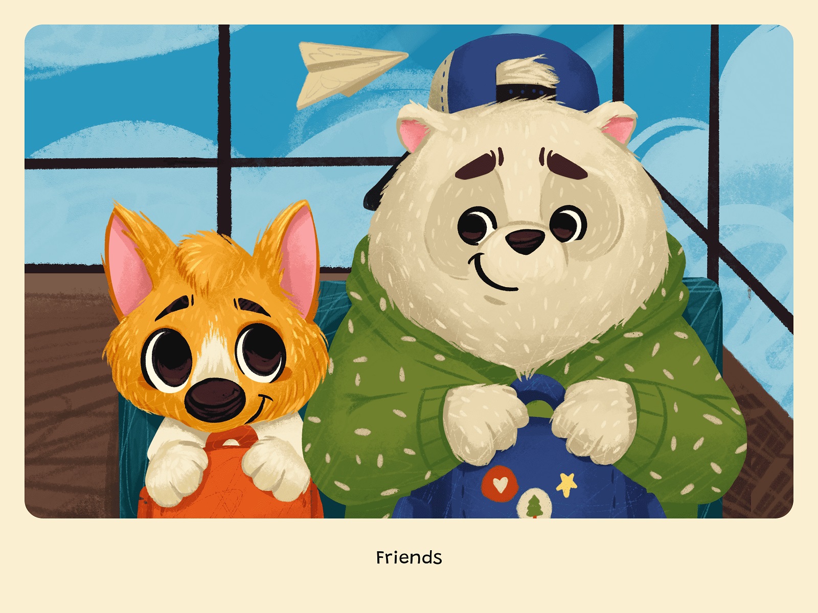
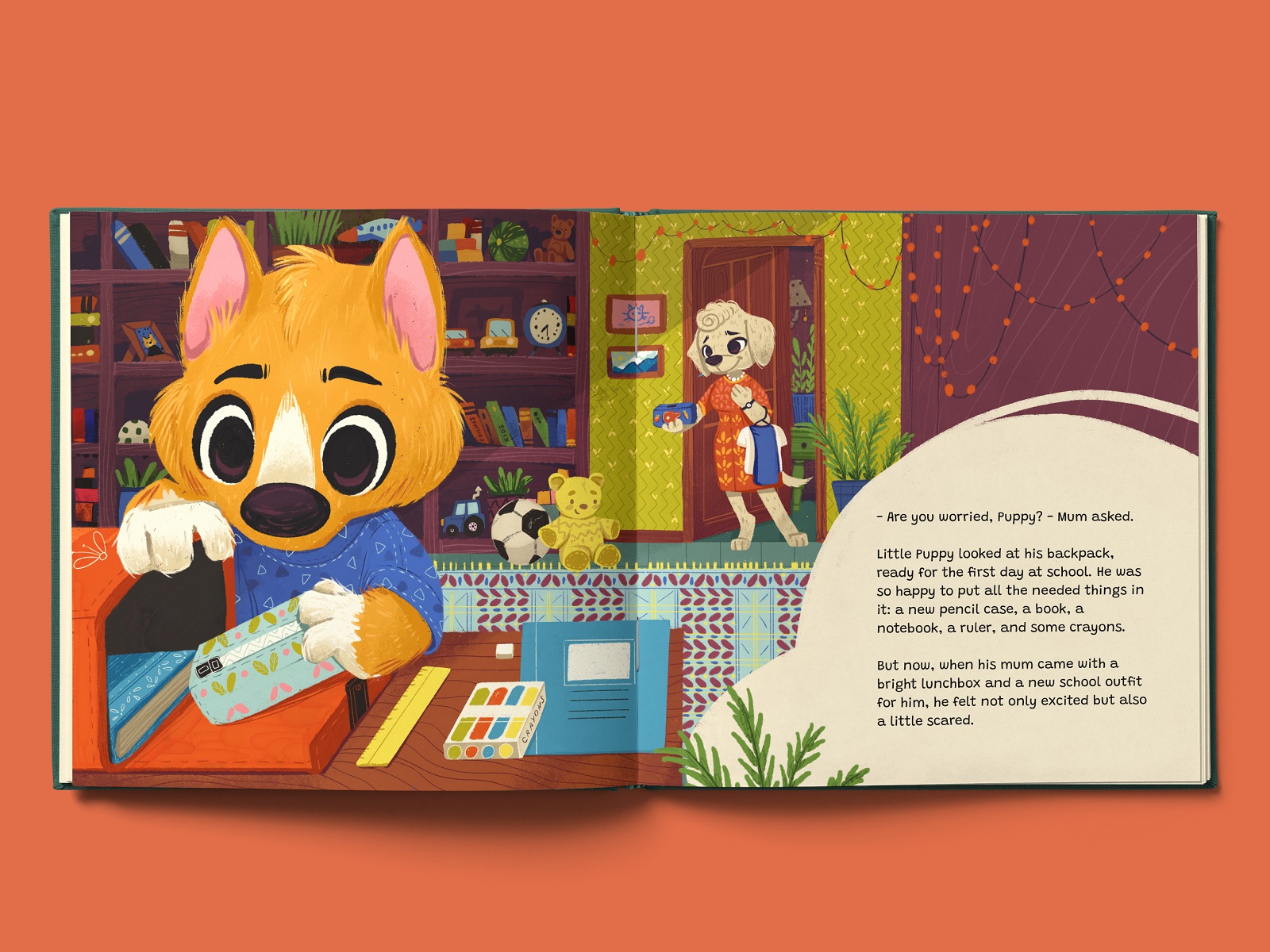
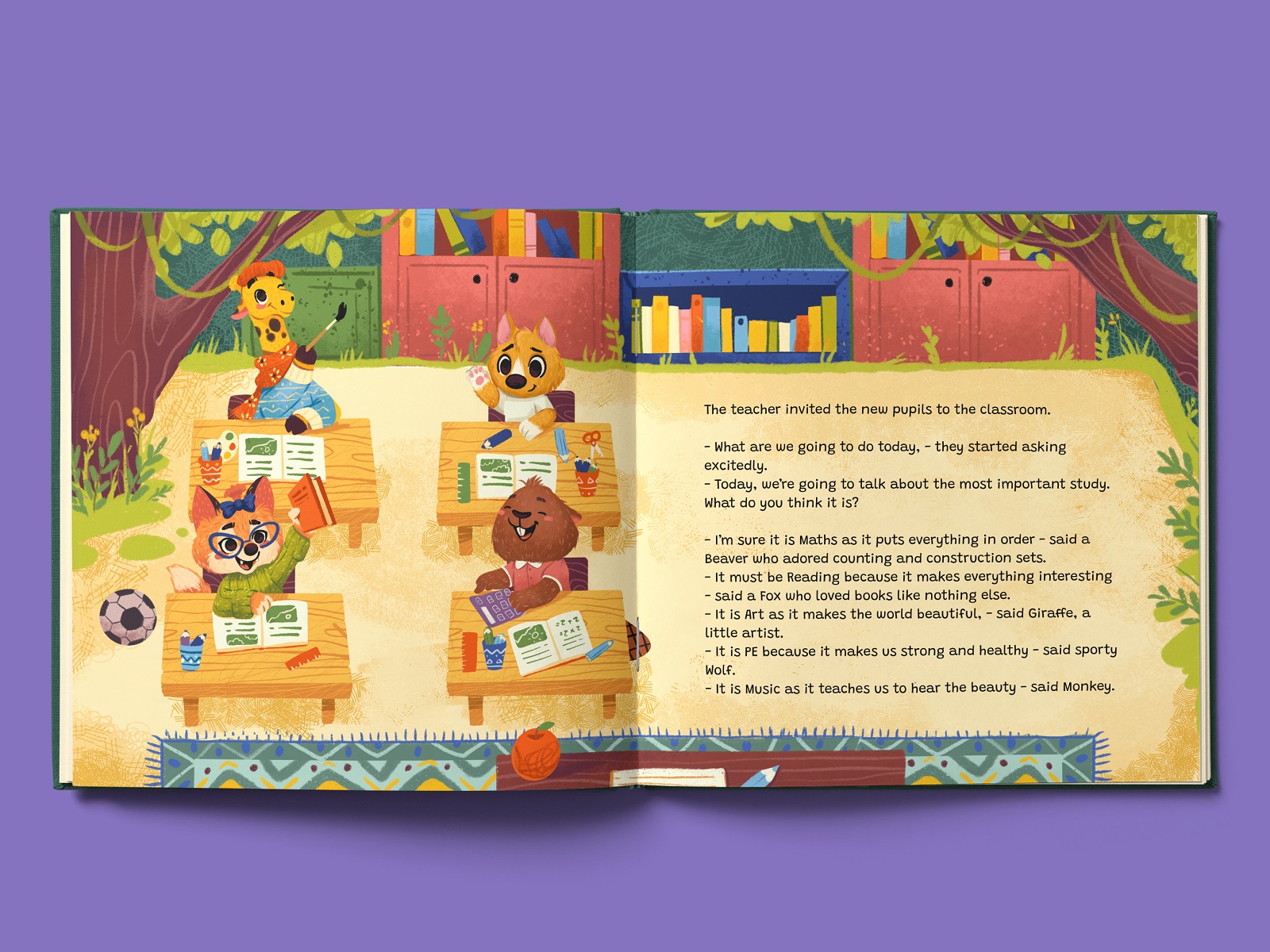
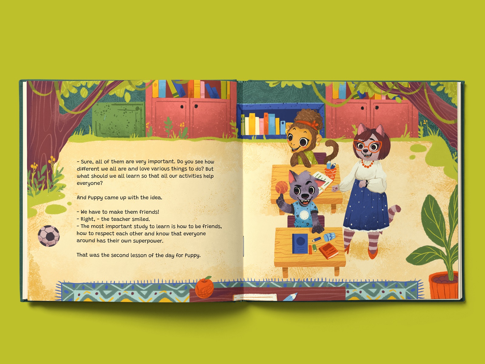
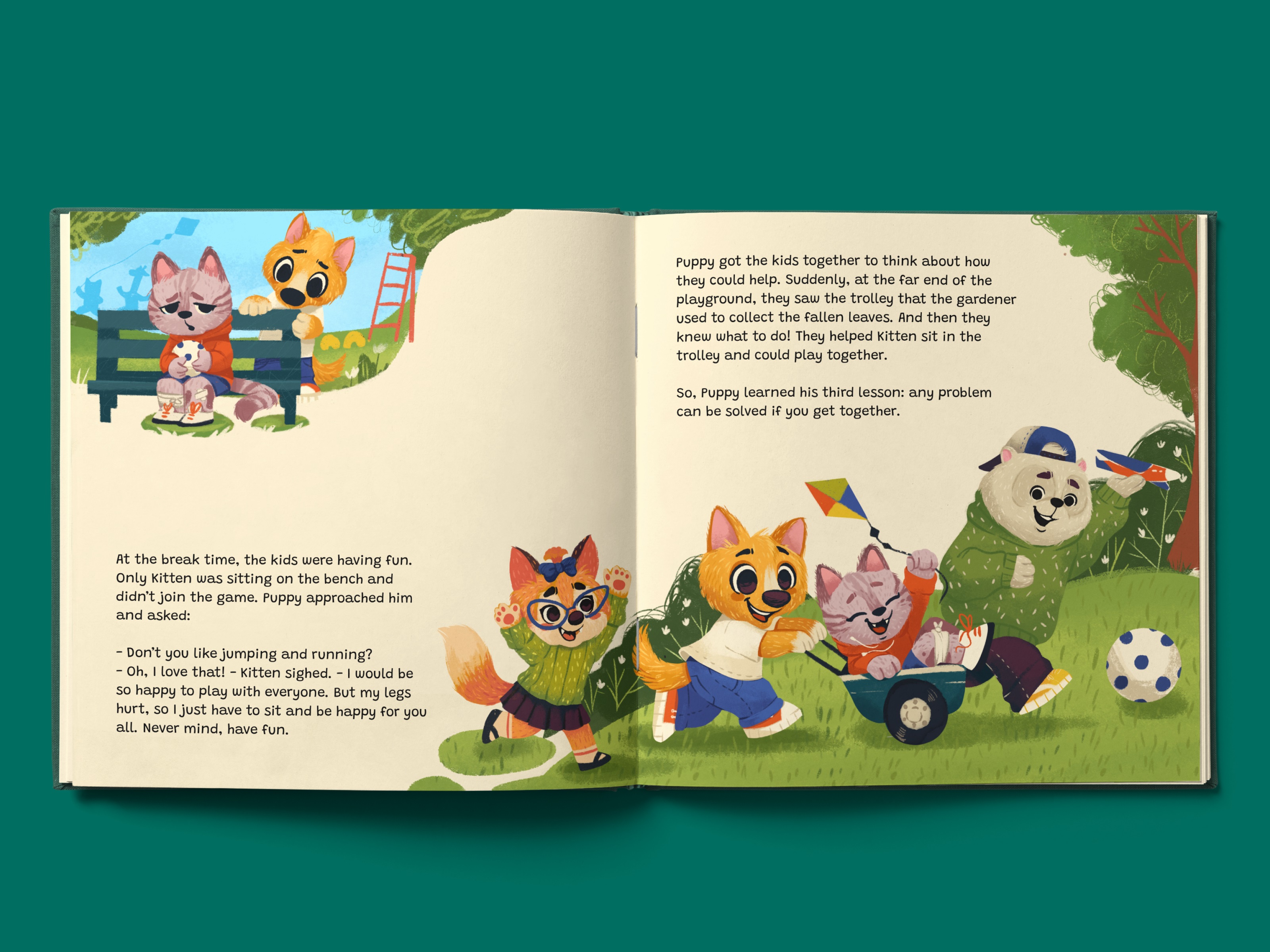
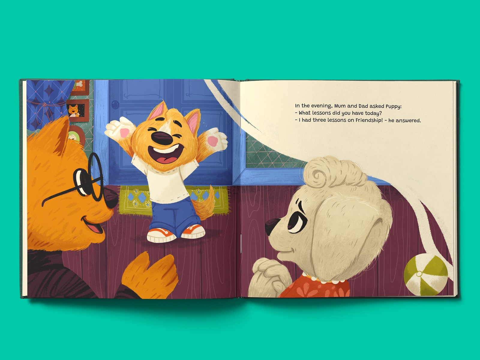
At the center of the story is Little Puppy, preparing for his first day at primary school. He’s worried. Unsure. Overthinking every possible disaster. Through a day full of small challenges, he discovers friendship and learns three simple but powerful lessons.
Classic kidlit territory—animals with human traits, a soft moral arc, a fairytale tone. But “classic” doesn’t mean easy, it means precise. Preschool and early school readers feel everything deeply. The emotional tone has to land exactly right.
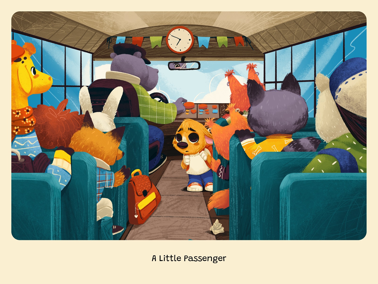
We began with the idea and plot. What kind of fear are we talking about? Is it loud panic or quiet worry? Is Little Puppy shy or impulsive? What does “friendship” mean in a six-year-old’s world—sharing crayons? Defending someone on the playground? Sitting together on the school bus?
We started with the script. We needed to understand the rhythm of the narrative before touching visuals: where tension rises, where it softens, where silence says more than dialogue.
Writing and illustration evolved together. We cut lines because a single classroom illustration could carry the emotion better. We adjusted scenes because they needed stronger visual anchors. It was collaborative, iterative, occasionally messy — in the best way.
Once the story felt alive, we moved to visual development.
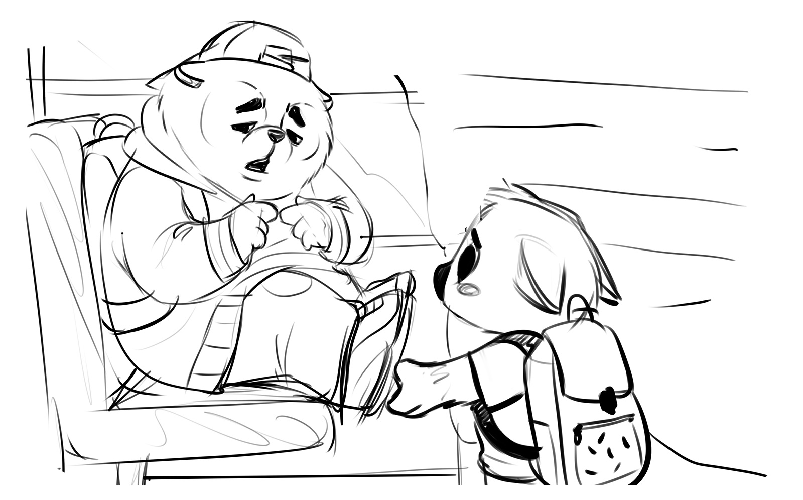
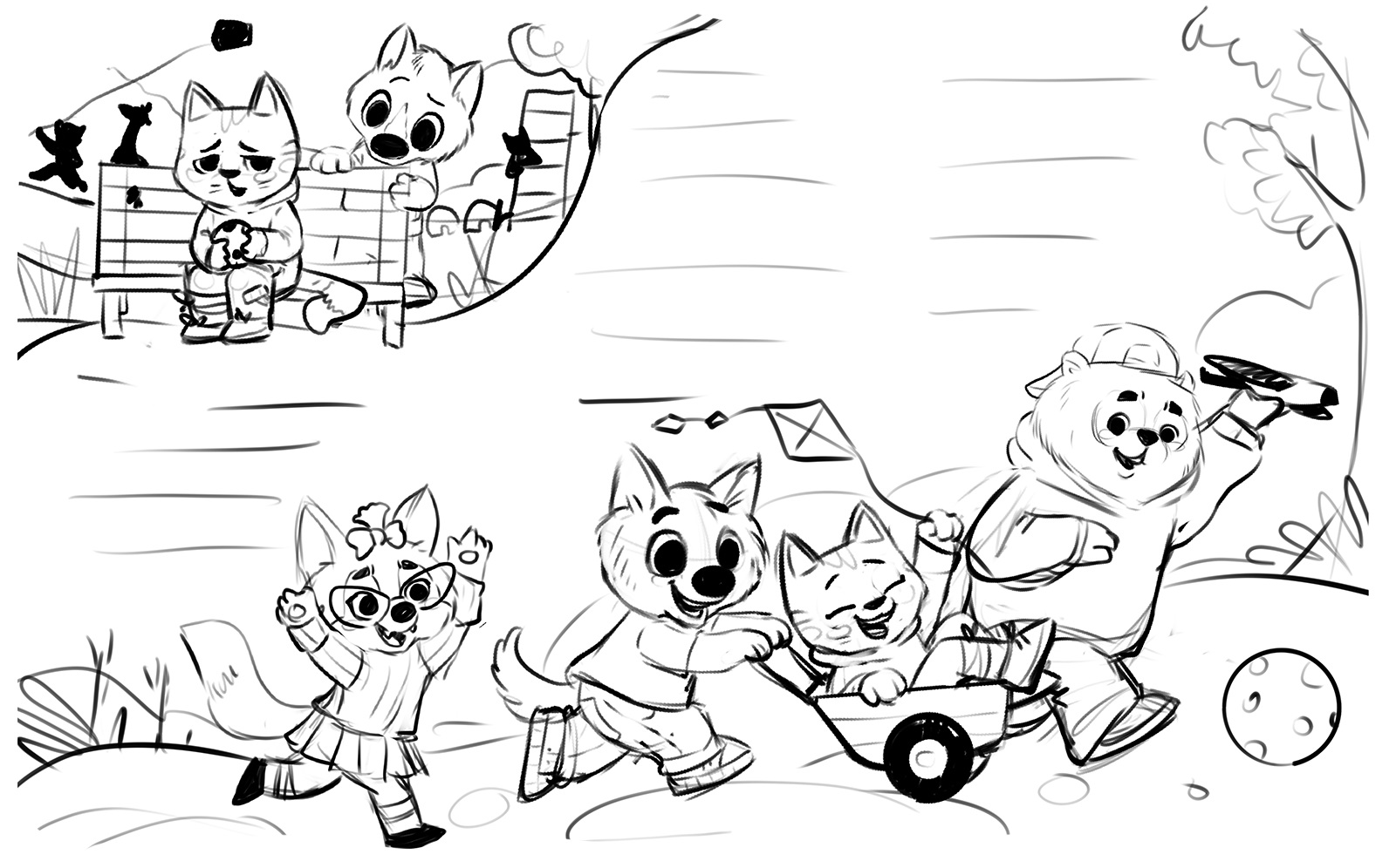
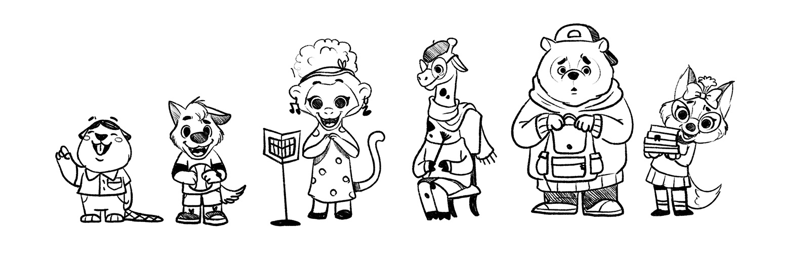
Sketches and Character Development
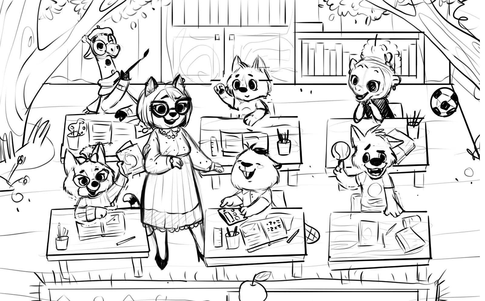
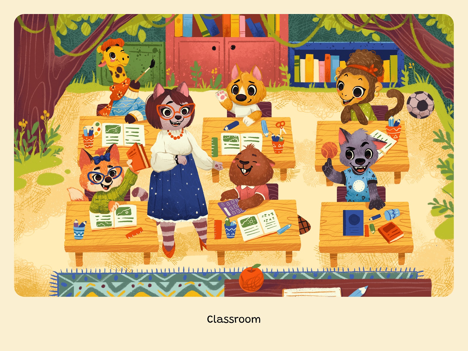
We began with scene sketches: morning at home, the school bus, the classroom, recess. At this stage, composition is everything. Where does the eye move? Where does the text sit? Does the character lean inward or pull away from the page?
At the same time, we shaped Little Puppy. He had to look vulnerable but not fragile, curious but not clueless. Expressive enough that a child who can’t yet read could still understand his feelings instantly.
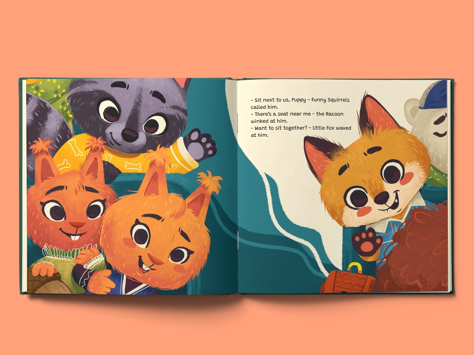
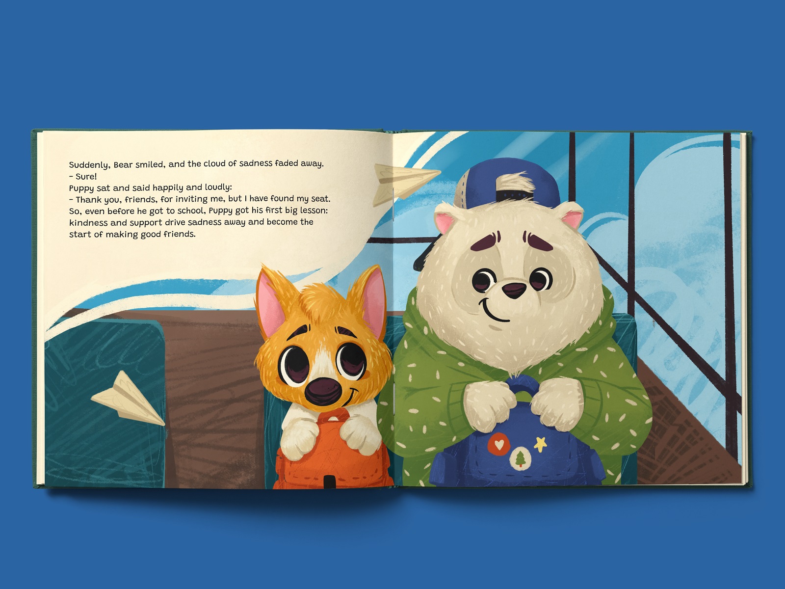
Small adjustments changed everything—a softer curve of the snout, slightly lowered ears, a subtle shift in posture. In picture book illustration, micro-details define emotional clarity. We also treated the characters as a system. They appear across multiple spreads, in different moods and environments. Consistency mattered as much as charm.
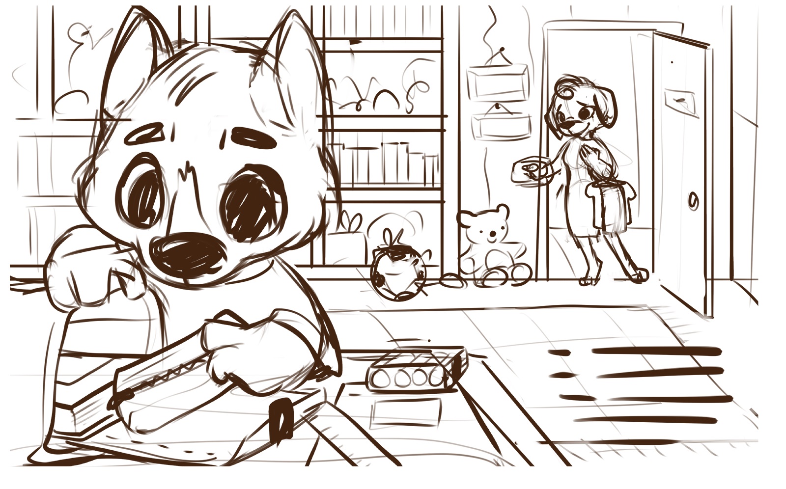
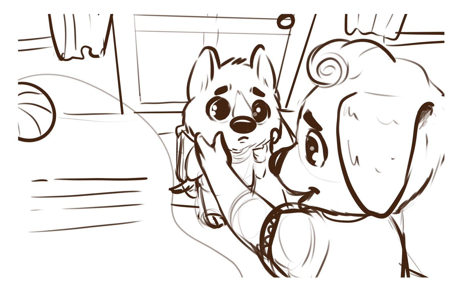
Even at the sketch stage, we planned text placement directly within compositions. Typography and illustration aren’t rivals in children’s book design—they share the stage.
A lot of erasing happened here, too. That was a good sign. And then came color.
Illustrations and Character Art
When the major scenes were locked and character development felt stable, we moved into full illustrations. Colors, textures, patterns. Atmosphere.
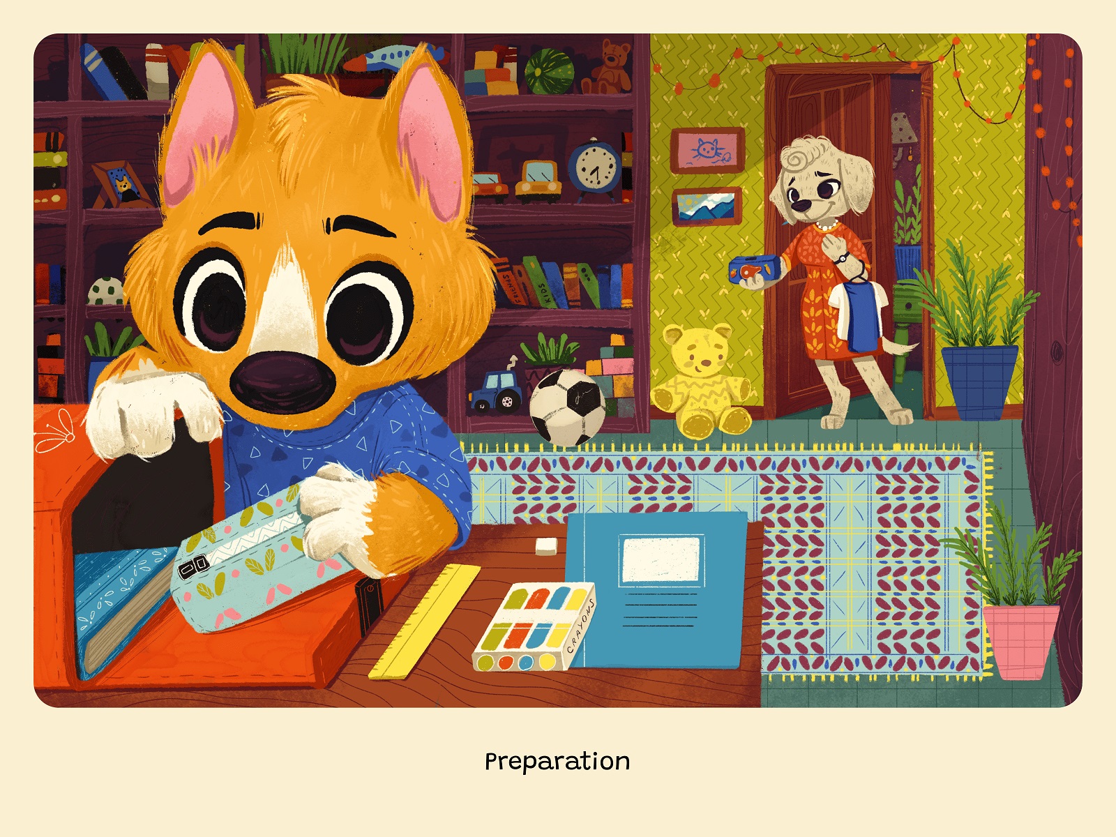
The palette was vibrant and multicolored—because childhood is rarely beige. But it wasn’t chaotic. We balanced contrast carefully so spreads remained eye-pleasing and readable.
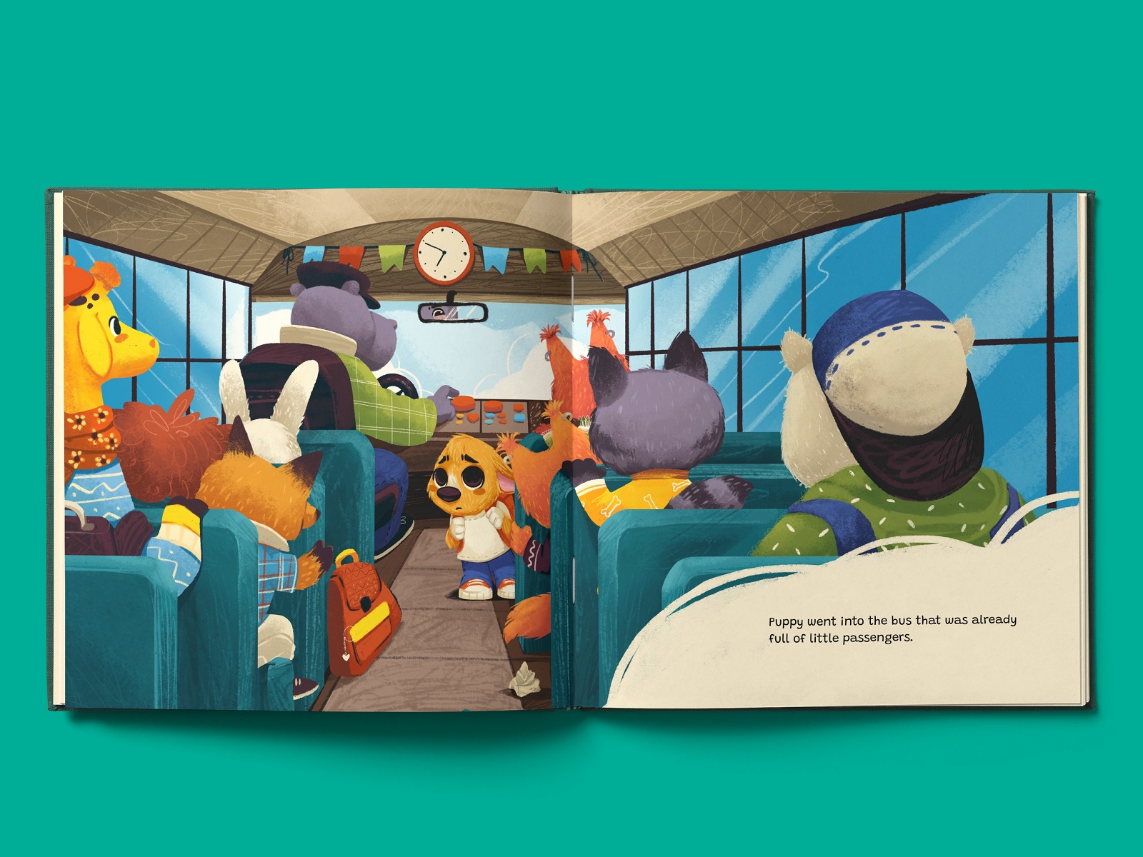
Home scenes had warmth—softer tones, gentle transitions. School introduced more dynamic colors. Playground moments were brighter, more saturated. Subtle visual cues help young readers distinguish environments even before they consciously register them.
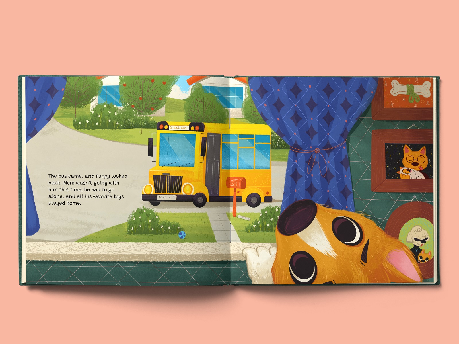
One of our favorite parts of children’s book illustration is environmental detail. Small objects. Wall decorations. A backpack leaning slightly to the side. A window view suggesting traffic beyond the school bus. In picture book storytelling, illustrations often do the heavy lifting. When a parent reads aloud, the child scans the visuals, invents side stories, connects with background characters. We layered the world with intention—not clutter, but texture.
Patterns, soft textures, and gentle imperfections gave the spreads warmth. The world of Fairytale grew scene by scene, until it felt cohesive and lived-in.
Book Design
We chose typography that feels playful yet highly legible. Readability was non-negotiable. Bright illustrations were balanced with lighter text areas to maintain clarity and visual comfort.
There was no strict grid forced across the book. Each spread was designed individually, responding to the illustration’s composition and emotional weight. Some pages breathe with open space. Others lean into richer visual storytelling. Consistency came from rhythm—margins, spacing, type hierarchy—rather than rigid structure.
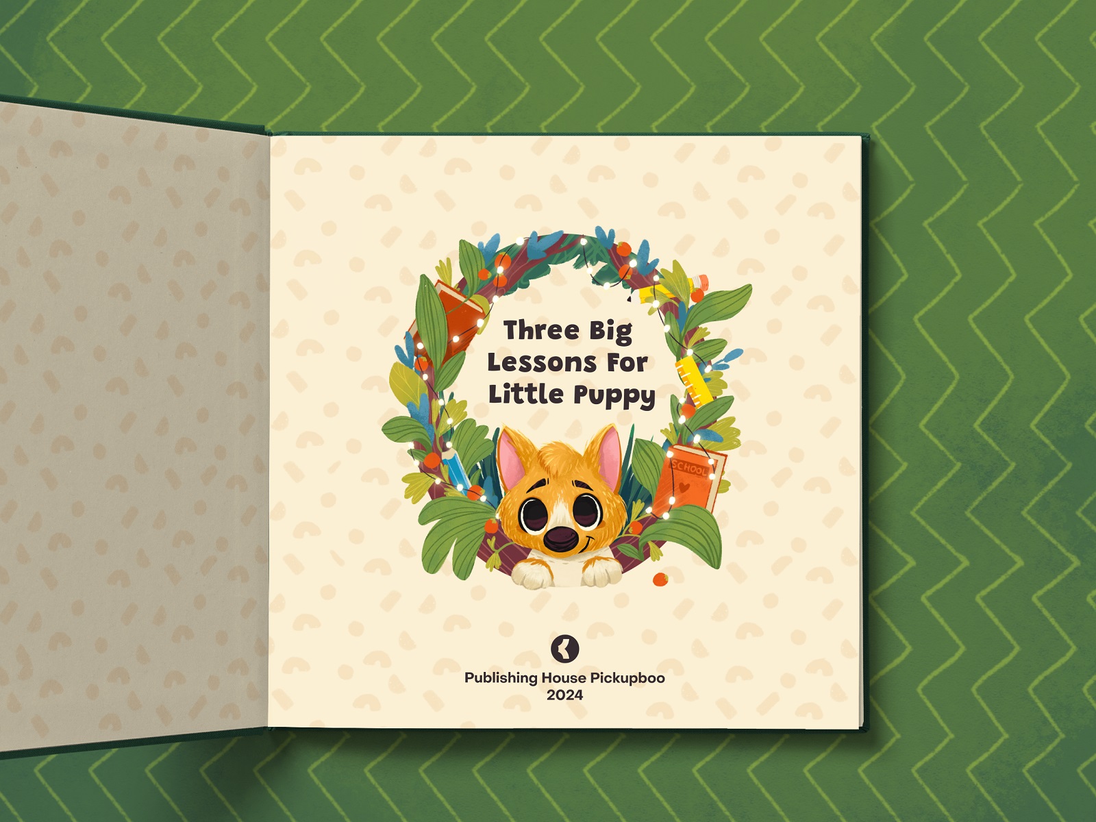
We designed the cover and endpapers with equal care. Everything—text, illustration, layout—had to move in sync.


What Working on Fairytale Taught Us
Children are honest audiences. They don’t fake it. If something feels off, they close the book and disengage. That’s why every decision here carried weight: the composition, the color palette, the illustration style, the emotional tone. It all had to feel real.
We also learned that writing and visual storytelling shouldn’t be separated by departments. When the illustrator is involved in the writing stage and the writer considers visual rhythm, the result feels cohesive and alive.
And most of all, we felt the privilege of shaping a story that might sit in a child’s hands the night before their first day of school. A story that says: it’s okay to be nervous. It’s okay to be small. Friendship will find you.
Fairytale was bright and cheerful, yes. But it was also careful. Thoughtful. Built on craft and curiosity. And sometimes, the most meaningful design work begins with a little puppy who’s afraid of his first day at school—and ends with a book that makes that fear feel manageable.
More Design Case Studies
Explore more case studies where we break down the thinking, illustration techniques, and graphic design decisions behind the work our Tubik team brings to life:
Nova Post. Interactive Christmas Advent Calendar UI Design
Book Illustrations for Visual Storytelling
MYWONY. Storytelling with Brand Intro Design
Tubik in Paris. Design Process for Narrative Illustration
KOISI Tokyo. Packaging Design for Japanese Restaurant