
The desert wind hits different when you’re scouting location shots at golden hour. That’s where Hyperion works best—in the heat, the light, the unpredictable now. A talented crew of producers, directors, and artists, they get things made wherever the shoot calls them—from Palm Springs to Paris, from Soho to CDMX. Hyperion’s client decks speak for themselves, and so do their shoots—commercials, editorial campaigns, print ads, augmented reality.
While their old website was okay, it was static. Flat. Quiet in the wrong ways. It didn’t capture the pulse of a team that’s as much about creativity as it is about logistics. So when Hyperion came to us, the ask was clear: help us build a site that matches the scope of what we do—and how we do it.
Mapping Out the Fix
We began with research—not the kind you delegate to ChatGPT, but the kind where you open Figma tabs and Webflow backends and run click-paths on competitor sites all day long. We looked at the state of production company websites, creative management portfolios, and hybrid studios that work between fashion, content, and tech.
A pattern emerged: too many tried to look like galleries, or worse—startups. But Hyperion didn’t need hype—it needed clarity.
We knew the bones had to do more:
- A modular system that could scale with projects, talent, and services.
- A CMS structure that wouldn’t buckle under new locations or last-minute campaigns.
- A typographic and motion language that respected editorial standards, without mimicking them.
We built accordingly.
Credits
Art Direction—Vladyslav Taran, Daria Tsehelna
Web Design—Daria Tsehelna
Motion Design—Ladamyra Kunytsia
Web Development—Ivan Shvindin, Olha Bryzhko
Project Management—Olha Syrotkina
Scroll as Structure
From the first frame, the site makes a decision: keep the user moving. Scroll replaces the sitemap. There are no dead ends, just a vertical rhythm that mirrors how Hyperion works in the field. Location to location. Scene to scene.
For the design phase, Daria, who was responsible for UX/UI design, worked entirely in Figma. The process, as she puts it, wasn’t revolutionary, but it was meticulous. A core part of the work was sorting through hundreds of production stills, experimenting with layouts, and finding a rhythm that let the visuals speak without being overshadowed. The goal wasn’t to design over the work, but to support it. Hyperion’s old site had tucked their best photography behind generic frames; this one brings it forward. Loud images, quiet interface. The art direction was about restraint, not reduction.
A Cinematic First Impression
The opening section is cinematic by design. A full-screen video, sand dunes, a model walking toward the camera at dusk. Not a showreel—a statement of mood. Production lives in light and terrain, and this is what it looks like when done right. Typography sits over it like a masthead: large, cut-kerning, and unmissable. HYPERION spans the screen in all caps, flanked by a minimal service list on the left and contact cities on the right—Los Angeles, New York, Miami, Palm Springs, London, Paris, Mexico City. The presence is global, but the interface is quiet.
Scroll down, and you hit Featured Works—a wide-format showcase with horizontal interactivity. Cases sit side by side like editorial spreads: glossy, sharp, textured. Hover, and each one swells slightly. A subtle zoom, like leaning closer to a lightbox. The rhythm is visual, but controlled. No carousel autoplay, no scroll-jack. Just you, your mouse, and the work. The Contact button appears right after—deliberately placed before the partners section. Elegant sans-serif, all black on a soft white screen. Minimal by layout, maximal by visibility.
Motion That Responds, Not Distracts
Motion design played a vital role in making the interface feel alive. Ladamyra led the animation work, starting with early concept motion and continuing through to the hover interactions seen throughout the site. All animation was created in After Effects, which gave the team full control over timing, scale, and transitions. One of the standout details: object resizing animations that preserve spacing between elements. It’s a small touch—technically simple, visually powerful—that adds a layer of polish and depth without overwhelming the layout. The hover animations in particular add a tactile, responsive quality that makes the experience feel not only dynamic but deliberate.
Partners as Proof
Next comes the grid: the brands they work with. No long-winded paragraphs about trust. No testimonials in quote marks. Just logos. Tommy Hilfiger, Google, Nike, Adidas, RCA, Condé Nast, Claire’s, Benefit, Mavi, and more.
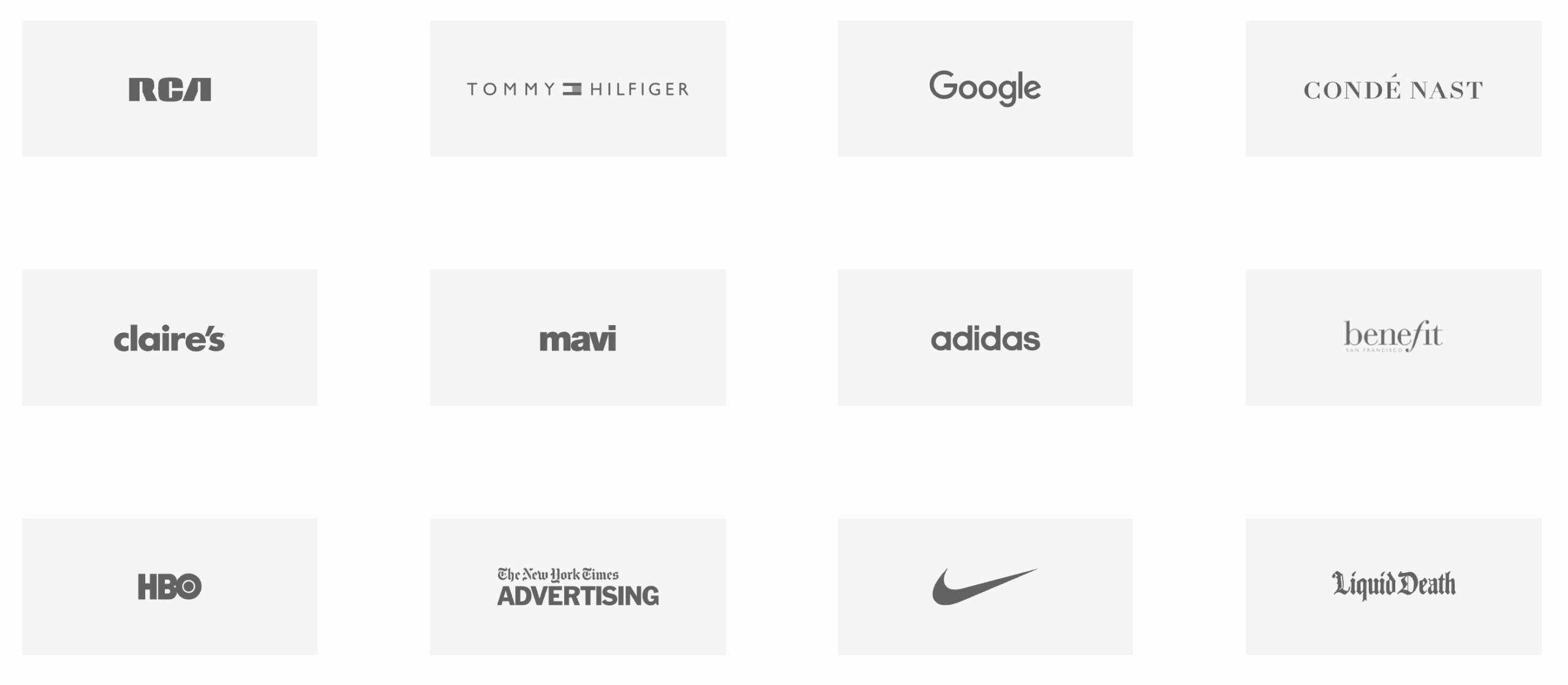
All rendered in monochrome, perfectly aligned. Clean, factual, almost editorial in how it lets the names speak for themselves. Hyperion doesn’t need to convince anyone, this section exists to confirm what’s already implied: they’re booked by the best.
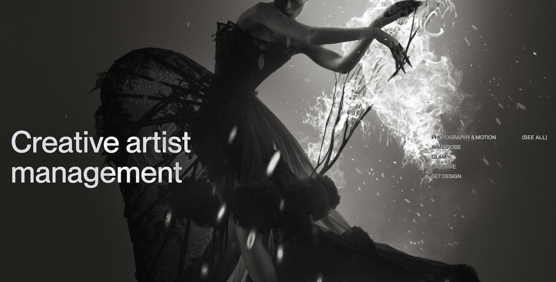
Creative Artist Management
Keep scrolling, and the tone shifts again. Now we’re inside the creative machinery. The Creative Artist Management section reads like an agency directory, but with better art direction. Dark backdrop. Full-bleed hero image of a performer mid-motion, lit like a runway show or a still from an avant-garde short film. Overlaid text: Creative Artist Management. It’s followed by links to service-specific subpages:
- Photography & Motion
- Wardrobe
- Glam
- Creative
- Set Design
Each link leads to its own space. The navigation remains lean, but behind it, there’s depth. This isn’t a brochure. It’s an operational tool disguised as an editorial platform.
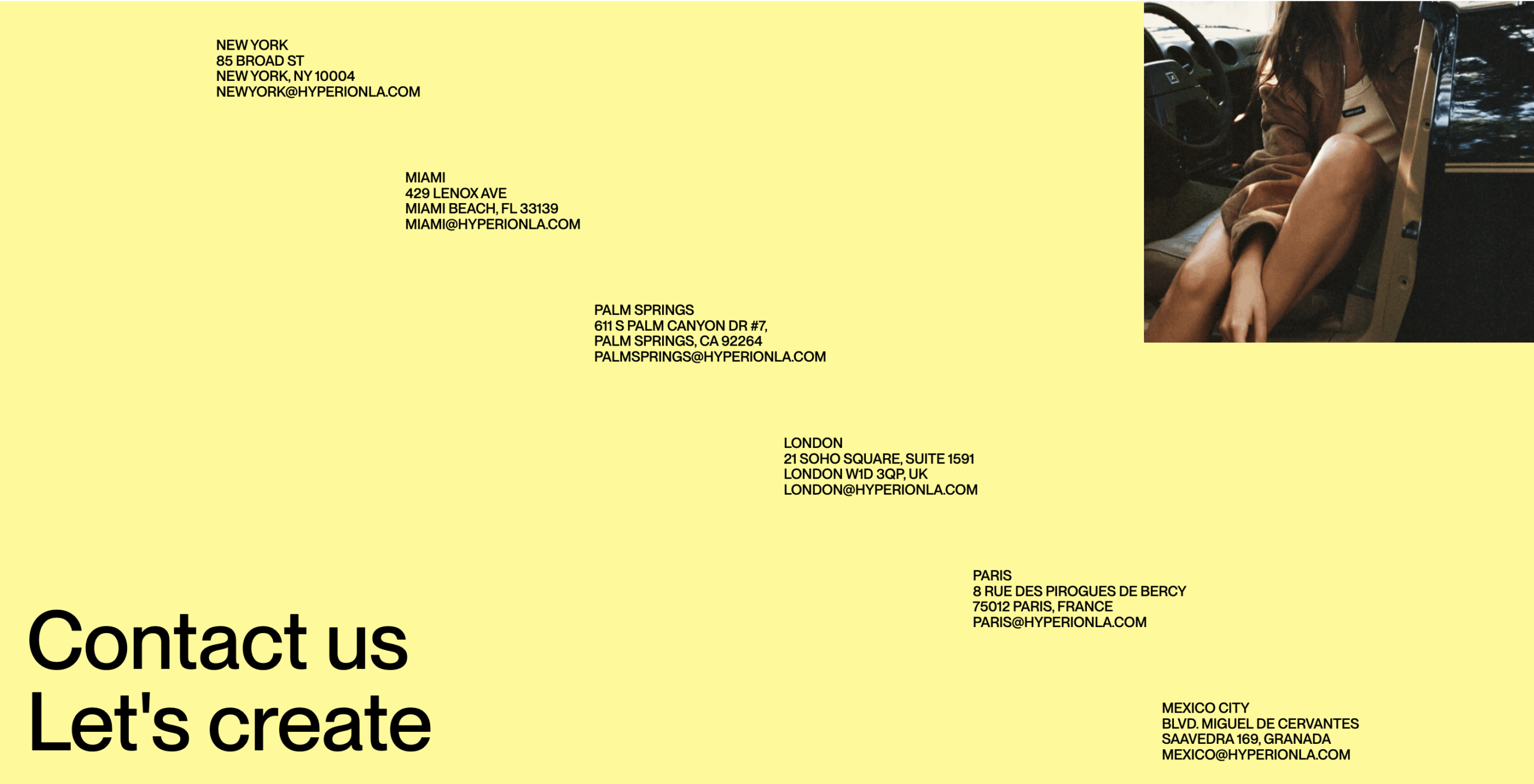
Location Isn’t Just Branding. It’s Infrastructure.
Further down, we get logistics. A yellow map-free grid of office locations: addresses, emails, cities. It’s straightforward, legible, and geographically balanced. Each office gets the same visual weight. No city outshines another. The system treats Paris the same as Palm Springs—because in production, the work matters more than the skyline.
The Stack Behind the Scroll
The modularity was intentional. We built the site with Webflow, prioritizing reusability and maintenance without compromising craft. Every scroll section is a container. Every container has rules—spacing, alignment, typographic behavior—that make the whole thing hold together under pressure. Whether Hyperion is updating a new artist, adding a shoot, or launching a service, the CMS can take it.
On mobile, everything adapts: layouts collapse, grids reflow, and scroll pacing adjusts. The design doesn’t mimic desktop, it reinterprets it.
And the load speed is lightweight enough to run smoothly on spotty Wi-Fi in the middle of a Mexico City casting call. Because good design isn’t about how it looks in the studio. It’s how it performs in the field.
Final Word
The Hyperion website isn’t flashy. It’s functional with finesse. Built for people who don’t have time to dig. Built for teams who know what a crew call looks like. Built for brands who need to move fast, think visually, and trust their vendors.
It’s a production tool disguised as a design object. A scrollable portfolio that respects the time and intelligence of its users. And a case study in what happens when content strategy, interface design, and operational logic align.
Want more?
Read other case studies from the Tubik team:
Case Study: Adam Braun. Creating Personal Website for Entrepreneur
Case Study: HotelCard Service Illustrations. Digital Art for User Experience
Case Study: Serra. Identity and Product Design for Financial App