From the very childhood, people start playing games, and they never really stop. Game spirit follows us in every sphere of our life, revealing its facets such as challenges, achievements, or rewards from time to time. Trying to transfer game features into everyday life is a habit helping people deal with complicated situations. Such a tendency could possibly cause the appearance of the gamification concept.
The word “gamification” stands for the technique of exerting game mechanics into the non-game environment. Designers often use gamification to create effective digital products and secure a high level of user engagement. In one of our previous articles, we mentioned common game mechanics such as challenges, points, badges, leaderboards, and journeys. Each gamification element serves certain goals and has a different influence on users. Today’s article is devoted to one of the most commonly used game mechanics called user journey. We’ll define its essence and find out how it works for UX improvements.
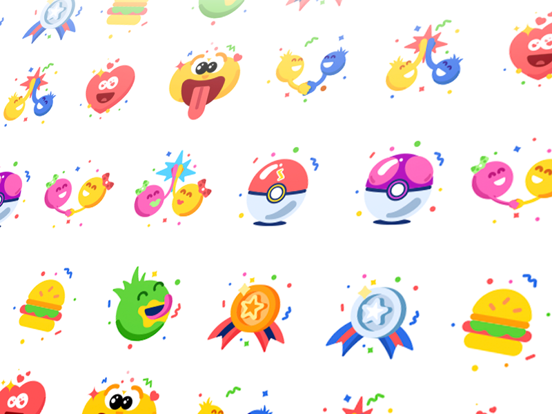
PukaPal Badges
What’s user journey?
To make a pleasing UX design, it’s vital to think out all the stages of user interactions. The thing is that one person may use a product to accomplish different goals each day, even more, they apprehend the product differently every time. Designers and researchers noticed that experience and user interactions gradually evolve as people gain more skills in using the product. Such characteristics make it similar to a journey that players go through in games.
Considering this fact, designers come up with the idea of applying a game mechanic called the user (player) journey in digital products. User journey can be defined as the user’s progression stages over the time of product usage. Designers create UX that way so that people could go step-by-step through the various features and interactions, which gradually change depending on users’ needs.
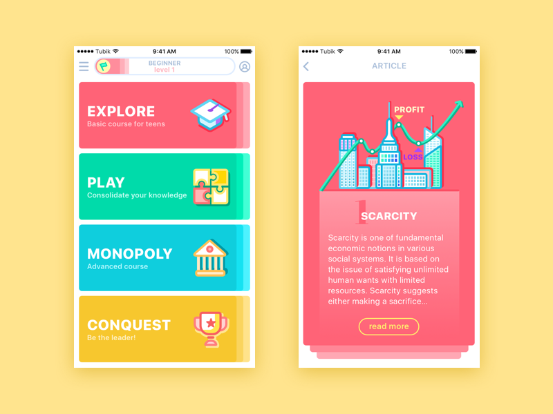
Moneywise App
Let’s look at the example. A standard video game always has different levels, from the easiest to the most complicated one. This way, a player can adapt and easily comprehend how the game works on the easy levels and then constantly learn and make progress. By the end of the game, a player is usually a skilled competitor who can deal with more complex tasks. If people receive difficult tasks at the beginning, they cannot handle them. Or, in case a game only consists of easy challenges, players will soon be bored.
The same works with digital goods. A product with a simple system of interactions often attracts users with its convenience. However, if people use it for a long time and there are no changes at all, they may get bored. In case a product has an enormous amount of features at the start, it may just get lost within it. To avoid such problems, designers need to think of UX as a user journey, guiding them step-by-step to the point of achievement.
Stages of a user journey
The user journey is a game mechanic which aims at making the process of interaction with a product easier and more understandable. A user feels like a real player starting the personal journey of product usage. Designers plan different stages that a player (user) will gradually go through. Let’s look at the common steps which a user journey includes.
Onboarding stage
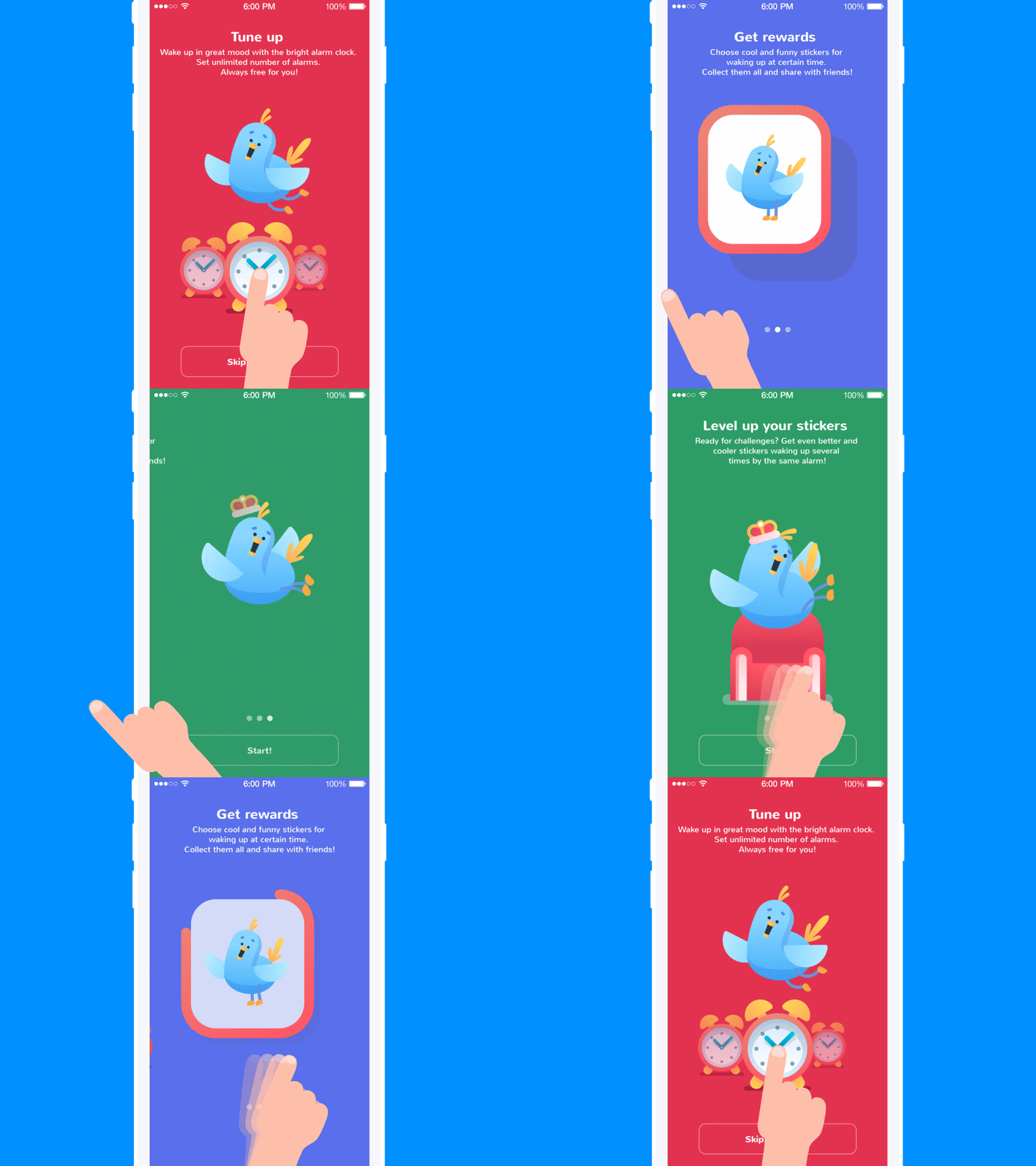
People who only start their journey within a product need to be actually onboarded. It means that users should be offered an introduction to the features so that they wouldn’t be afraid to make a mistake. Also, it is good to present a navigation system if it has some peculiarities.
Designers use onboarding tutorials for various digital products. Tutorials appear to users who launch an app or a web product for the first time, helping them get oriented within unfamiliar features and controls. One more task designers need to accomplish at the stage of onboarding is user motivation. The product should be presented that way so that people had the motivation to use it more than once. That’s why onboarding tutorials need to contain short but clear info describing the possibilities of a product helping users to understand if a product can be useful for them.
Scaffolding stage
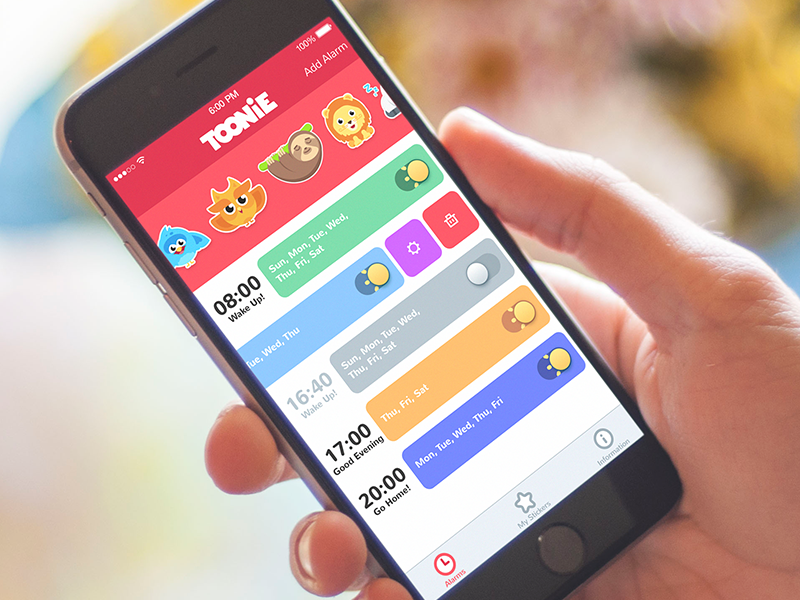
When users continue their journey, they go to the next stage of interactions, called scaffolding. The step includes disclosing features progressively as the users become more experienced in using the product. Unlike the onboarding stage, users don’t get long instructions. Scaffolding is more like a practical part. Users are trained to use a product proficiently, and the more they learn, the more tools (features) they receive. This stage allows users to gradually learn more about a product and receive more features as far as they need to use them. Users don’t get a great number of features at once, so the interactions system won’t seem too overloaded or complicated.
Progress stage
No matter what tasks people do, they always want to know about their progress. By providing feedback on the results of a user journey, we can inspire them to continue. It’s a core step since people lose the enthusiasm of a beginner pretty soon, and they need to be motivated to stay.
Some may ask what progress can be in non-game digital products? For example, a social app can notify users when they gained a certain number of new followers or friends. Meanwhile, educational applications can inform users about how much they’ve learned from time to time. All small details matter. Just tell people they achieved something, and they get a dose of enthusiasm to continue.

Blog App
Endgame stage
Designers usually stop at the stage of scaffolding and progress, uniting them in the endless loop where users constantly learn and receive feedback. However, sooner or later, people get bored of such patterns and may quit the product. Here is why the endpoint of a journey is also important to be thought out.
The endgame stage doesn’t mean that users will receive the message “Thank you for being with us! Bye-bye.” At this stage, proficient users are recognized as experts or veterans and they are usually given some privileges for loyalty. People like to be valued, and they often give it right back. It’s not a secret that loyal customers are the best marketing managers for a product. New users willingly follow satisfied users’ testimonials.
Why a user journey?
User journey is a complex game mechanic which requires deep attention to detail. Each stage should be carefully planned and connected to the others. Moreover, it requires long-term plans for future updates, so the process of user journey development may take a long time. Of course, some may ask if it is worth the effort to bring it into a product. Let’s see what user journey can give you back.
Clear interaction system. Users receive features gradually at the stage of scaffolding, and users learn to utilize a product step-by-step. An approach helps to avoid problems with incomprehensible interactions and functions.
Increased user engagement. One of the gamification principles is to make users always motivated and involved in the “game”. User journey is usually full of different tasks and achievements which people can gain, so users can’t resist game spirit.
Customer loyalty. If a product is constantly improved for its users, people really appreciate it. Moreover, if a product has some privileges for loyal customers, people trust it more.
Product recognizability. As we said above, satisfied customers are effective marketers for a product. Users willingly share their pleasant experiences, and they won’t stay unnoticed.
The element of fun. As with any other game element, the user journey is a good way to bring an emotional aspect to a product. People always need some kind of recreational activity so that they could escape from their everyday routine for a bit. By adding the fun element into a casual product, you help people reduce some stress and relax for a moment.
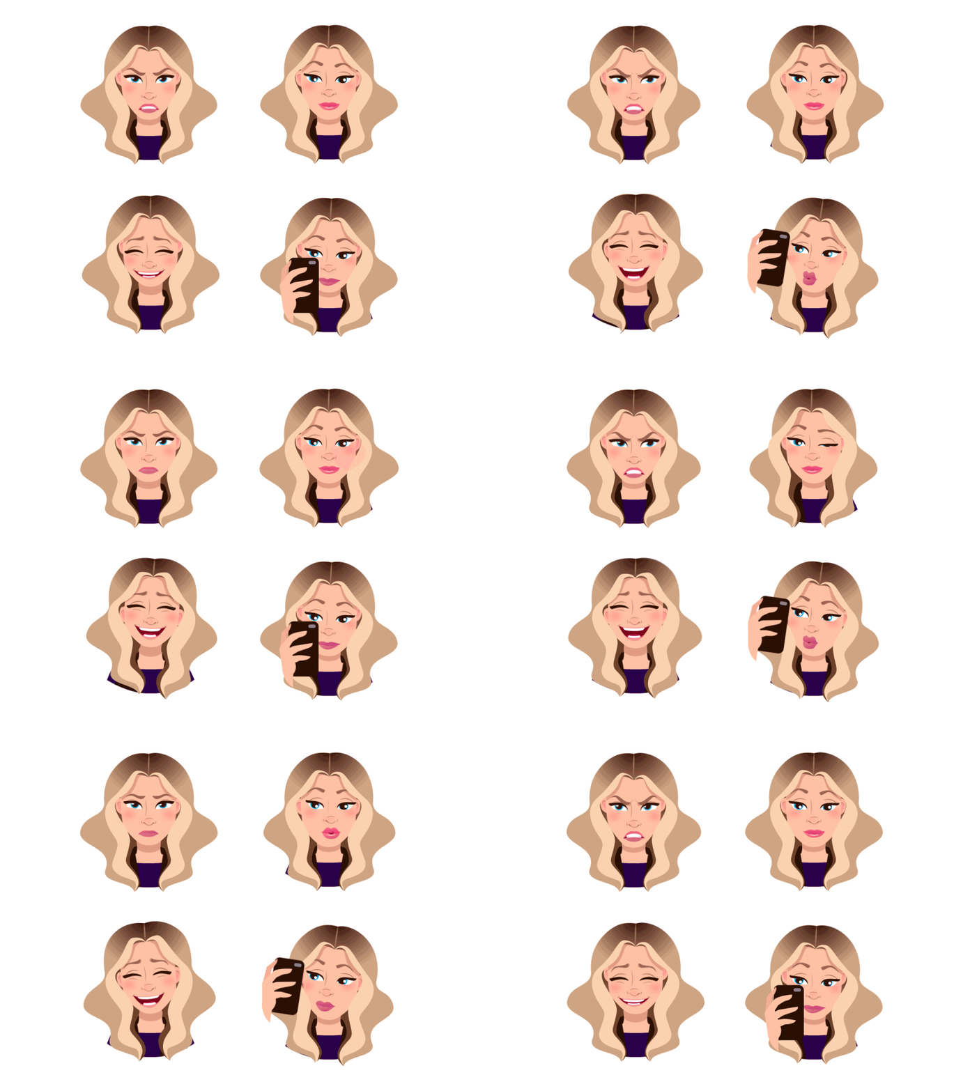
Animated stickers for Mood Messenger
All in all, we can say that the user journey is an effective method for UX improvement. However, a designer and a client should consider the fact that gamification works well, not for every product. It depends on the type of interface, its target audience, and business goals. For more detailed information, check our previous article, where we’ve defined the tasks that gamification helps to accomplish, and don’t miss the updates on gamification in UI coming soon.
Recommended reading
UX Design: Types of Interactive Content Amplifying Engagement
Aesthetic Usability: Beauty on Duty for User Experience
Gamification by Interaction Design Foundation
Gamification in UX. Increasing User Engagement


