More and more companies now turn to artificial intelligence as a way to make products for a new generation and a new level of problem-solving. Our today’s case study will unveil the one of a kind: this time, we will show you the creative process for Designer AI, the service that uses artificial intelligence to help fashion designers. For this project, the Tubik team worked on branding, illustrations, and dashboard design. Welcome to dive into design solutions.
Project
Creating a system with which fashion designers can make mood boards with the help of AI and get all the needed information
Process
Designer AI is a digital service that connects fashion design to the power of artificial intelligence. It allows fashion designers and brands to communicate with the relevant consumer base, gain knowledge of their needs and preferences and create what buyers want. The design solutions had to appeal to the meticulous and aesthetics-driven target audience of fashion designers, as well as get solid and super-intuitive user interface design for users that could be of various tech-literacy levels.
Logo and Identity
The first strategic task was to agree upon the general visual stylistic concept and brand image. So, the first stage of design was devoted to logo and identity development assigned to graphic designer Arthur Avakyan.
The brand sign presents the typographic logo in which one part becomes the background for another. This way, the logo designer reaches the harmonic and artistic combination of elements that reflect the idea of fashion and technology working together. The biggest challenge was to find the perfect combination of the solid font for “designer” word and the custom created lettering for AI part that would make the needed contrast.
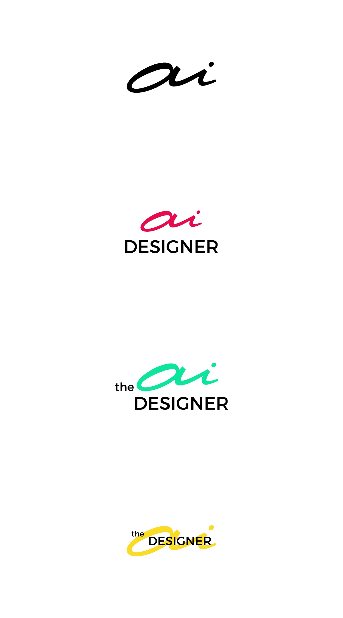
Font and color explorations for the combination of two parts of the logo
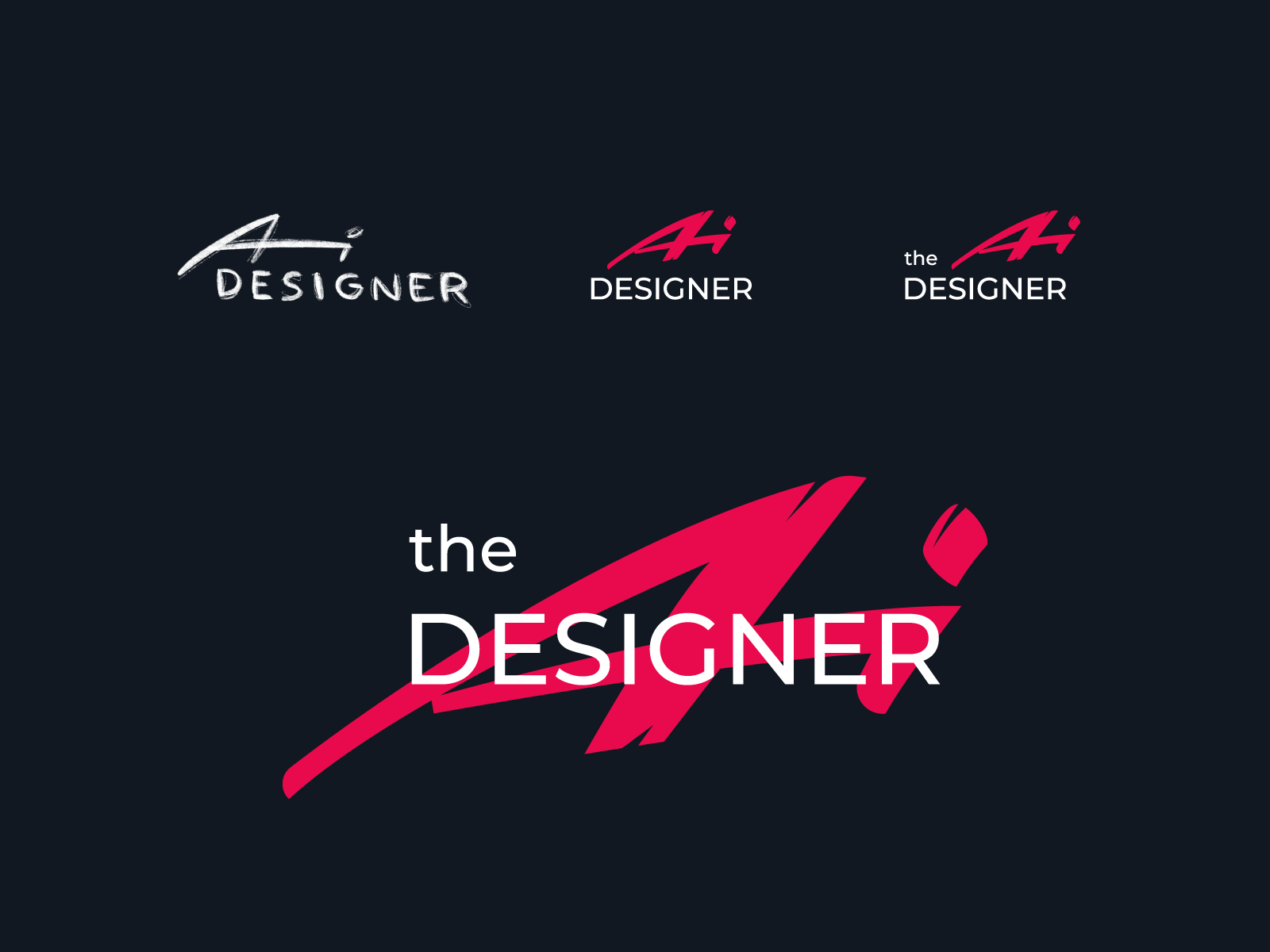
The stages of logo design from sketching to the polished final composition
For the identity, it was agreed to take bold color contrast as a visual basis.
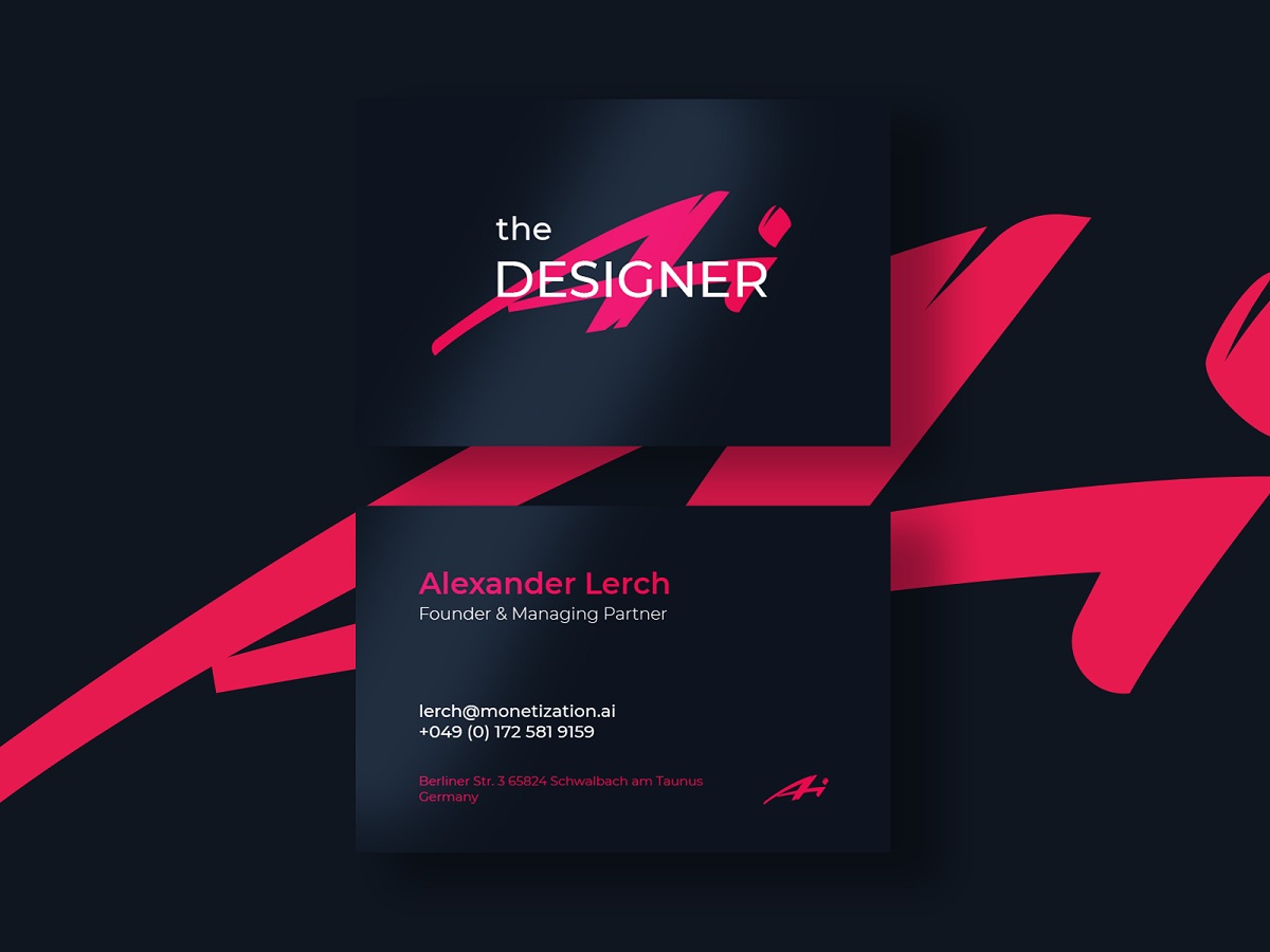
Business card design
Dashboard User Interface
Clear, minimalist dashboard design by Tubik UI/UX designer Anton Morozov was based on a dark theme to enhance the perception of visuals, intuitive navigation, and trendy branding.
The header contains several critical elements: easily found search icon, the control for language choice and the control to access the profile menu. For navigation through the functionality, the dashboard uses the sidebar giving quick access to core zones of interaction: projects, storyboards, invoices, transactions, and payments. It doesn’t hide into a hamburger menu or any other interactive element so that the users could switch between the pages quickly. What’s more, it makes the navigation super simple for users with middle and low tech-literacy level. The currently active page is visually marked with the color prompt in the sidebar, and the icons support the titles in the menu: this way different zones of visual perception are activated, as icons set the elements quicker to see while the text helps to decode them correctly. The sans-serif font is clear and easily readable.
The Projects screen uses a simple scannable structure featuring the tabs of existing projects in the workspace and the tappable zone of creating a new project with a schematic prompt: a frame, a plus icon, and the textual explanation specifies it. The tab informs the user about the project name, participants, the number of storyboards made for it, and the star icon to mark the favs or the most actual project.
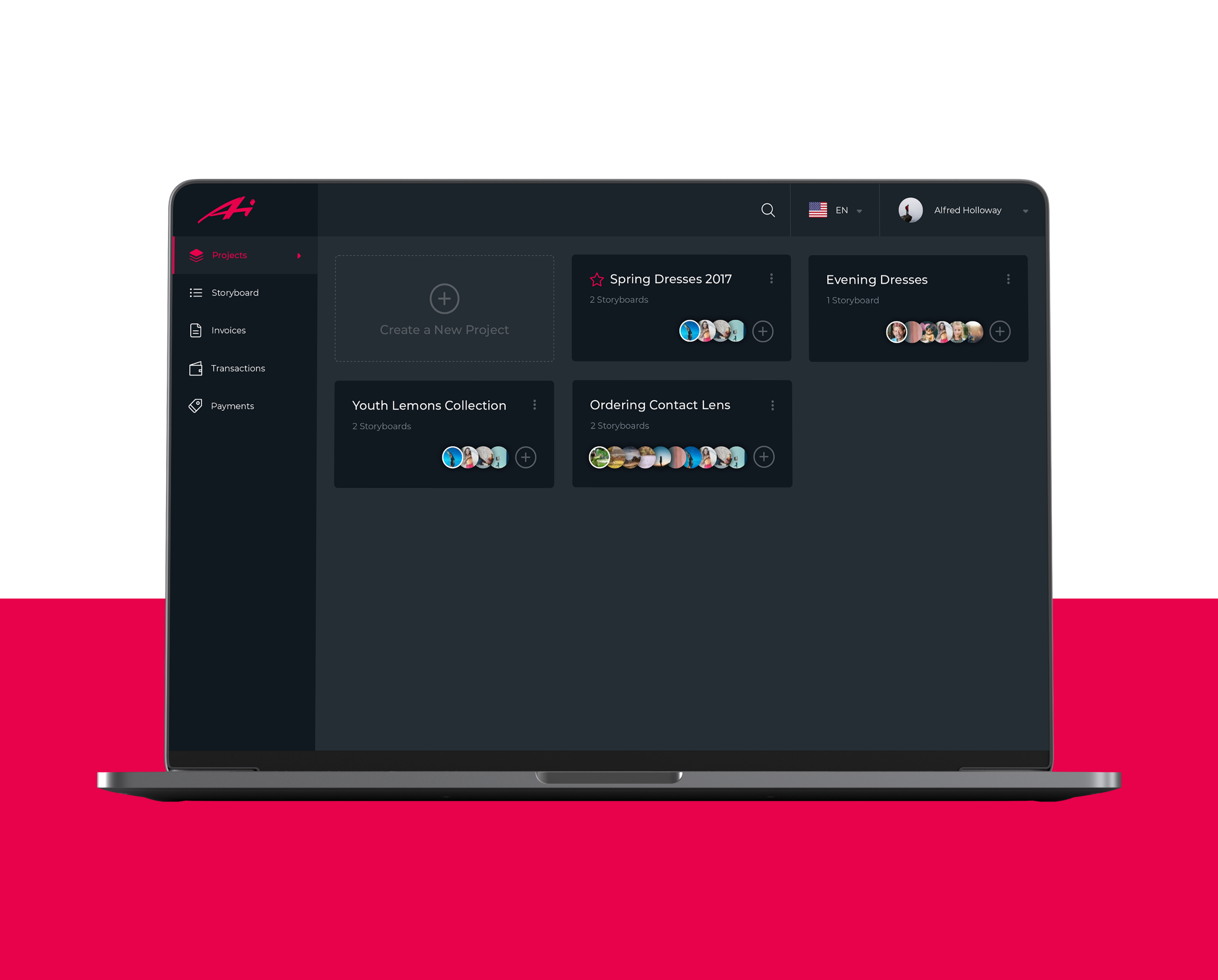
Projects screen
Inside the project, users can see the storyboards giving an instant visual connection to the style with images preview that gets colored when hovered. The same visual prompt is used for the functionality of adding a new storyboard and the plus icon in the avatar-based list of participants allows for adding more of them.
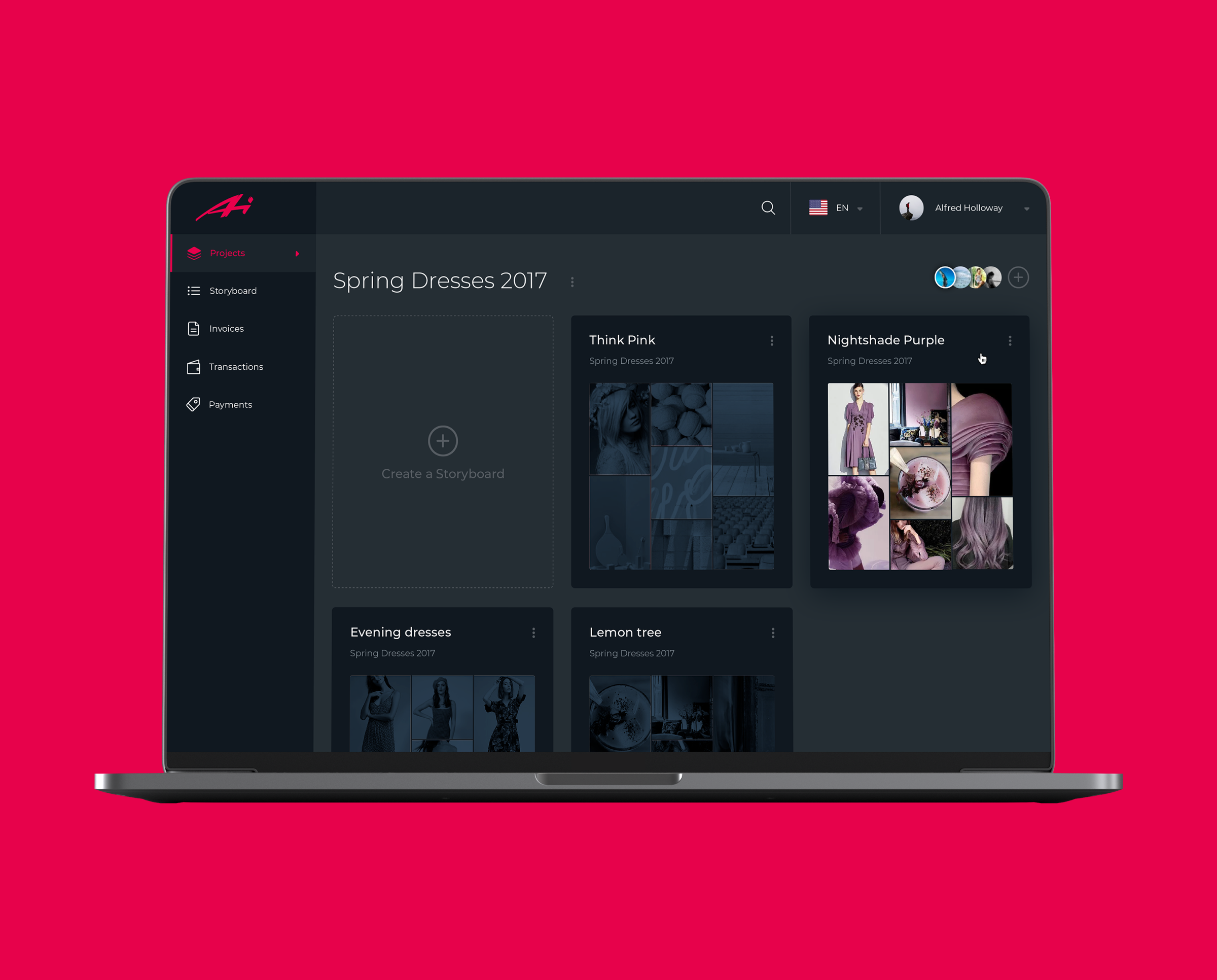
A particular project screen
Creating a storyboard, the designer sets the needed requirements. Again, the outline icons organizing the options are presents with text labels for perfect clarity, while the bright and catchy CTA button has no chance to be left unnoticed. The custom icons were designed by Tubik graphic designer Yaroslava Yatsuba.
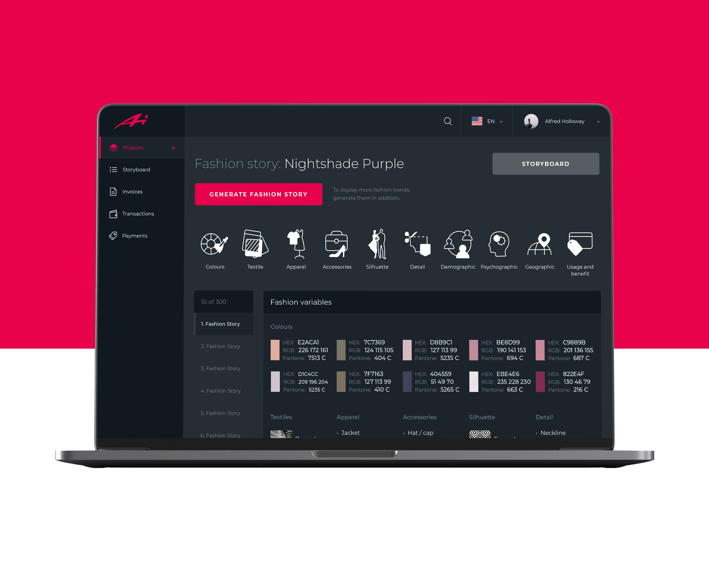
So, to sum up, the dashboard is all built around the visuals, which will be manipulated, and the convenience of usage for people with different tech-literacy levels. High readability, dark background making photos even deeper, elegant custom icons, and well-balanced grid all help users to feel it like home.
Here’s the set of interactions to let you see how it looks in action. Smooth motion for loading and feedback by our motion designer Kirill Sunny makes the interactions more dynamic and sets clear communication with the product.
Landing Page and Illustrations
Another important task was designing a beautiful and informative landing page that would support a web marketing strategy. The client wanted to amplify them with custom hero illustration and storytelling illustrations, so that was another design task for Arthur Avakyan.
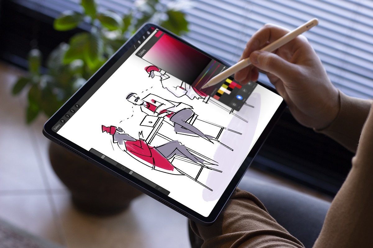
The illustration had to reflect the visual connection to fashion illustration style to set the needed emotional appeal, user the brand colors, and attract users’ attention with its aesthetic elegant style.
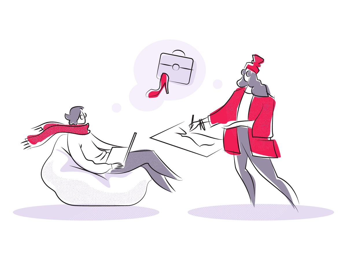
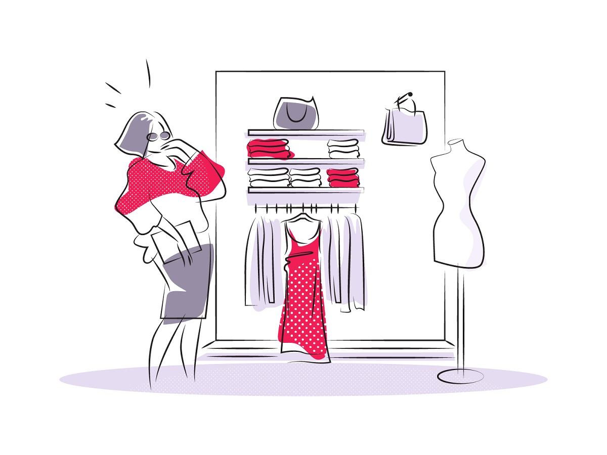
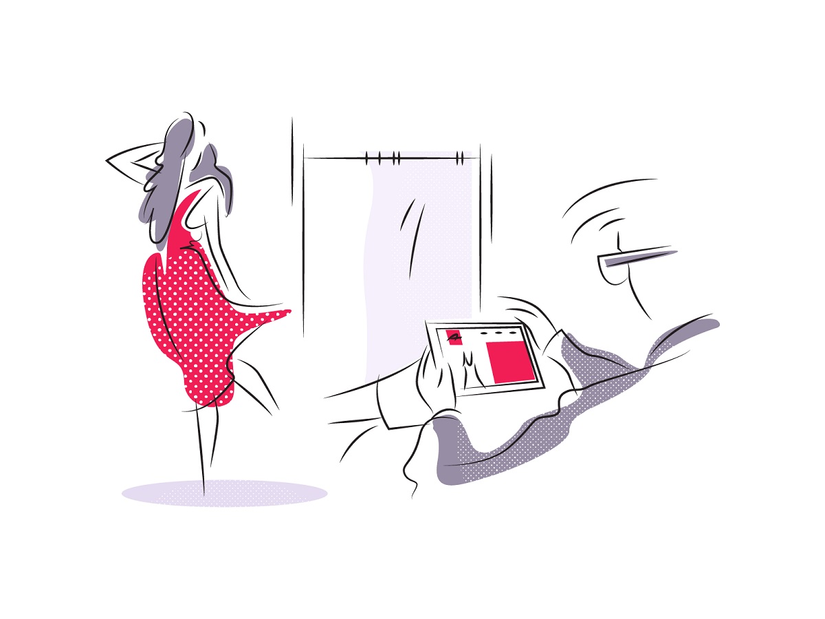
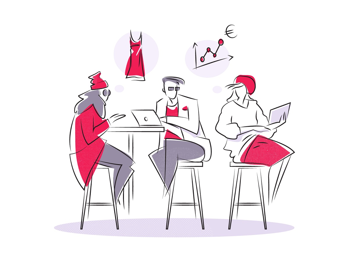
Neat outline illustrations with color accents reflecting different benefits and aspects of using the tool
Hero illustration for the above-the-fold area needed special attention as it was the first prominent visual to attract the target audience. It was also developed in style close to the classic fashion illustration and moved through several iterations of the creative search for a catchy and informative image.
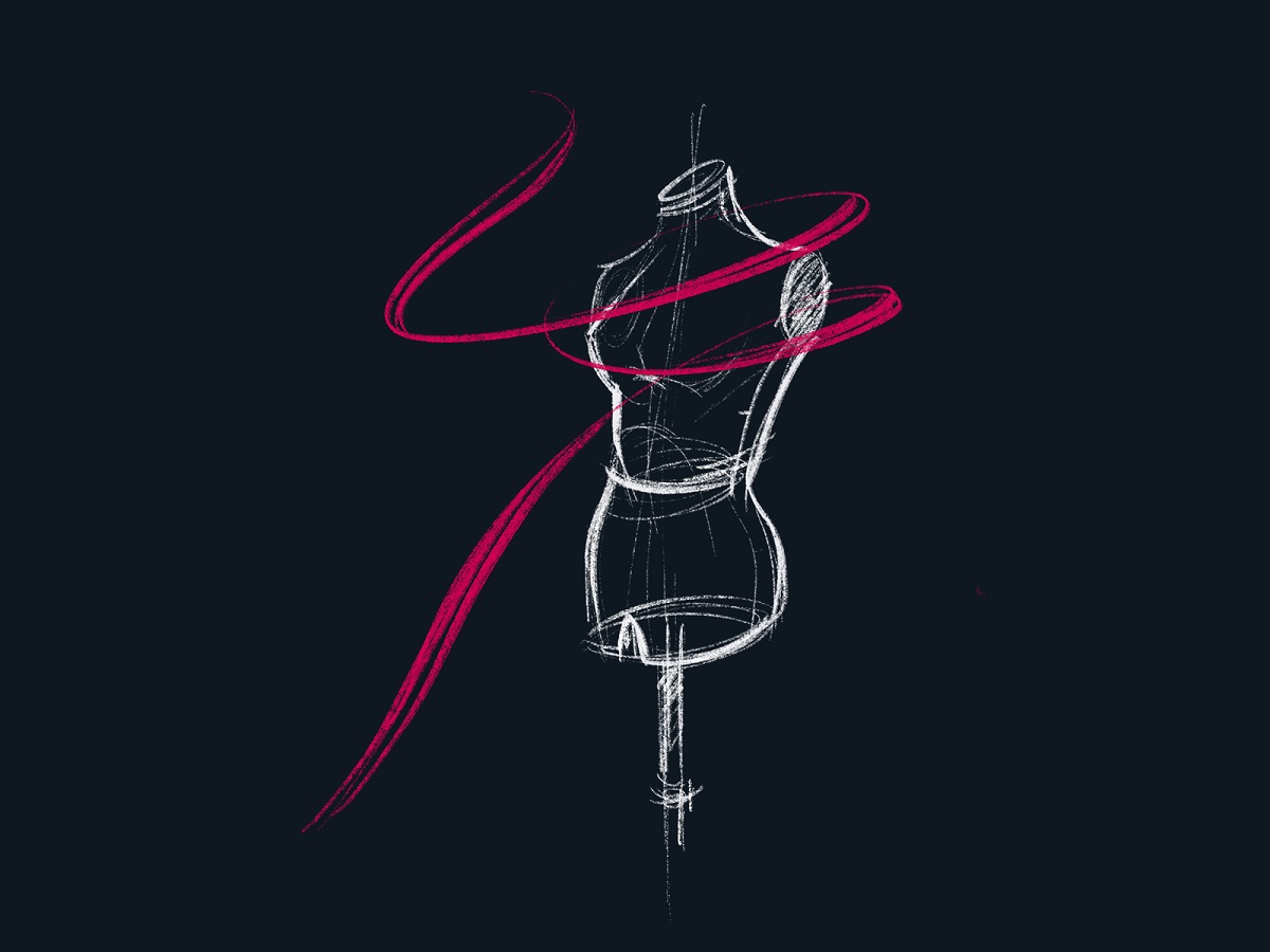
Chalk-style outline illustration of the mannequin with a dynamic color accent
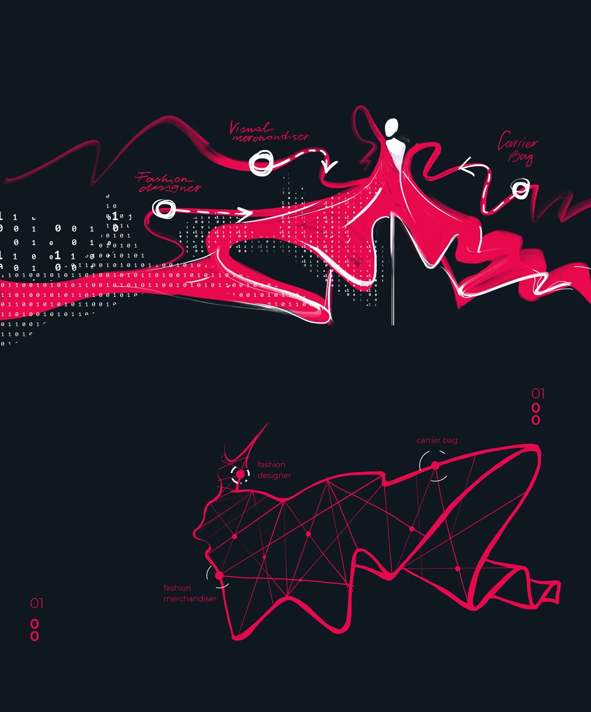
Digital sketch of the model character wearing the bright dress and visually integrating the elements of artificial intelligence involved in the design process
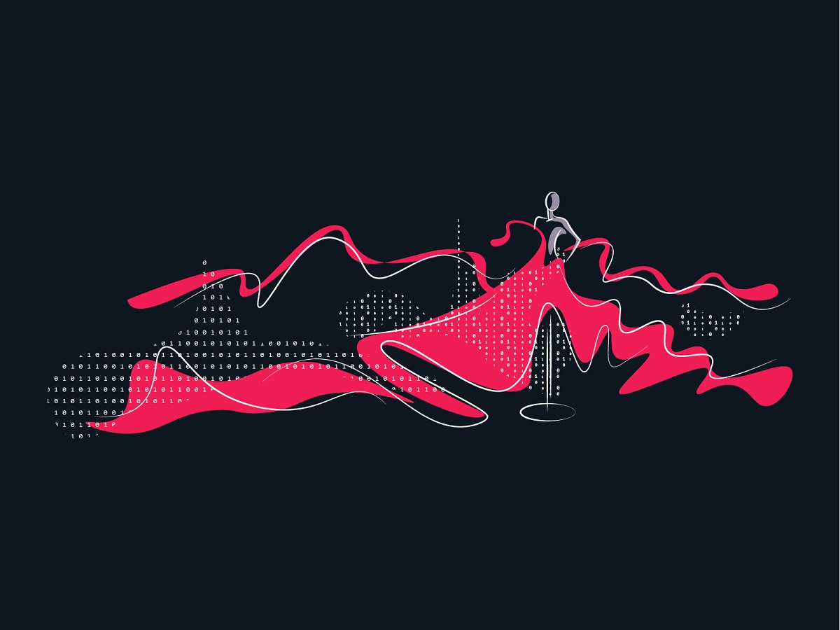
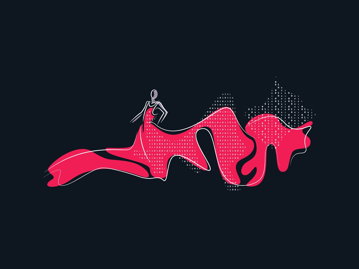
Two versions of the composition for the hero illustration
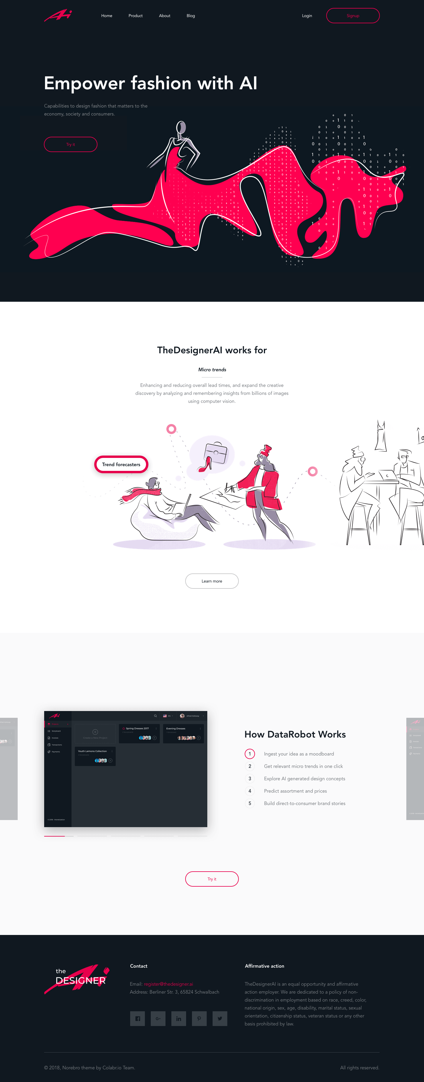
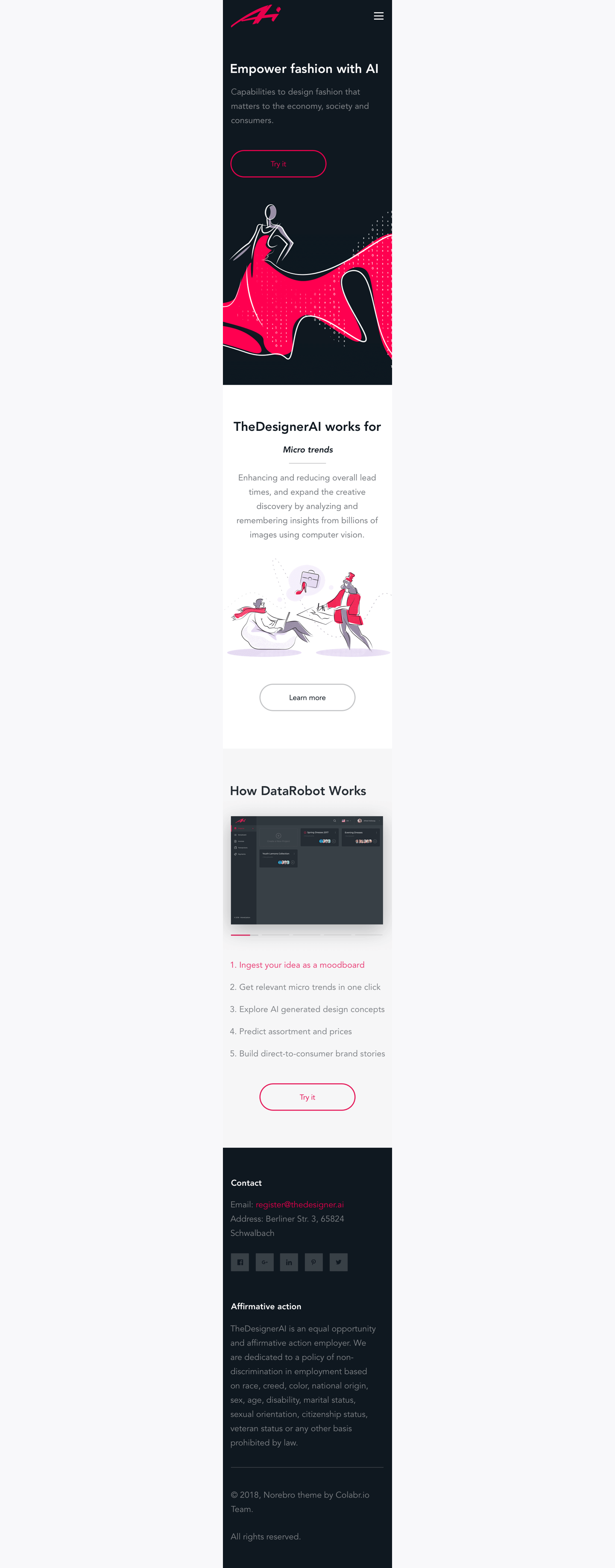
The landing page uses contrast color blocks for different pieces of content and charming artwork, instantly setting the theme. Above the fold, the page uses the dark theme echoing the one in the dashboard, minimalist airy composition, and solid visual hierarchy allowing the visitor to scan the page in split seconds. Outline minimalistic CTA buttons are visually highlighted with color contrast.
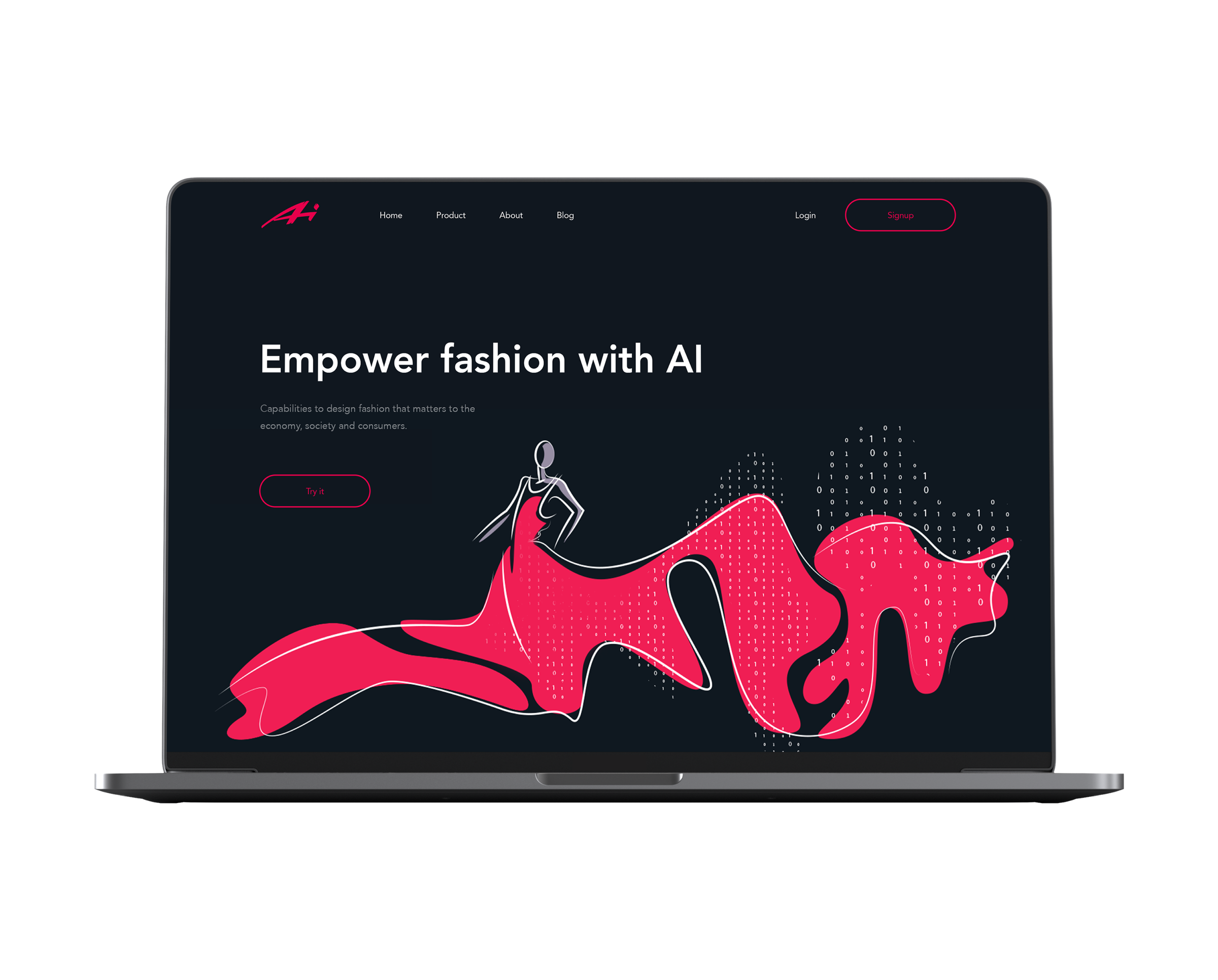
Here’s the structure of all the landing page when you are scrolling it down, based on color contrast to separate the content yet giving a consistent eye-pleasing look.
With the mobile-first trend, sure, the designer also paid attention to responsive mobile design as well.
You are welcome to see more insights into the design process and details as well as animated interactions in our Behance presentation for the project.
More Design Case Studies
Pazi. UX and UI Design for Vehicle Safety Mobile App
CashMetrics. UX Design for Finance Management Service
Bitex. UX Design for Stock Analysis App
Inspora. Brand and UI Design for Virtual Stylist
Nature Encyclopedia. UI Design for Education
Perfect Recipes App. UX Design for Cooking and Shopping


