Being a good designer means constant learning various sciences and methodologies helping to improve professional skills. One of the essential studies recommended to designers is information architecture. In our previous articles, we’ve defined the essence of IA and described the efficient techniques assisting designers in the workflow. We discovered that information architecture is believed to be a foundation of efficient UX and UI design. Moreover, the appropriate IA may become a compelling tool for designers when all its principles are considered. Today’s post continues this theme unveiling useful tips for designers on IA implementation.
What is information architecture in UX?
Information architecture in design can be defined as a science of structuring content of the websites, web and mobile applications, and social media software. The science aims at organizing content so that users would easily adjust to the functionality of the product and could find everything they need without big effort. This way you can form a skeleton of a layout ensuring the sufficient user experience. Information architecture is a guarantee of a high-quality product since it reduces the possibility of usability and navigation problems. IA skills are essential for professional designers since UX and information architecture go hand in hand on the way to create a user-friendly product with a clear navigation system.
Keep product goals in mind
The definition of product goals is a core stage that influences every team working on the project, be it developers or designers. So, before you start building the website information structure, you need to learn what your client expects from the website or mobile application. To achieve the product vision and see the whole picture, the product goals should be established. They should respond to the product strategy, be understandable to all the members of the creative team and achievable. Awareness of the goals gives a clear idea of what the tasks are and where to start. When the goals are set, designers can agree on the content elements and the purposes with the clients so that they could avoid possible misunderstandings resulting in additional work hours in the future.

Conduct user research
IA experts consider the specifics of the target audience needs because IA puts user satisfaction as a priority. To learn more about potential users, designers are recommended to conduct user research. It’s a process of collecting information about the consumers of the product via various techniques. When the data is gathered, the design team analyze it and work on the optimal solutions which will make the product user-friendly and attractive.
User research helps to dive deep into the details of the core target audience to understand their needs and psychological peculiarities. Considering the preferences of the users, designers are capable of creating a user-friendly product that will stand out of the crowd and draw potential customer’s attention.

Consider cognitive psychology principles
To comprehend the nature of the visual perception and the factors affecting users’ attention, designers learn the сognitive psychology principles. It is the science studying information processing that goes inside people’s minds. Cognitive psychology experts state that there are various ways of data perception and different factors influencing people’s attention.
Based on the cognitive psychology studies and principles, designers developed many techniques helping to create powerful content. In article Psychology in Design, we described some effective psychological principles often applied in design including Gestalt principles and recognition patterns. The former theory explores users’ visual perception of elements in relation to each other. In other words, it shows how people tend to unify the visual elements into groups according to their similarity, continuation, or closure. Speaking of recognition patterns, people visiting a website or using an application are expecting to see certain features associated with the definite kind of product. That’s why designers apply various recognition patterns to help users be oriented in the structure.

Plan the navigation system
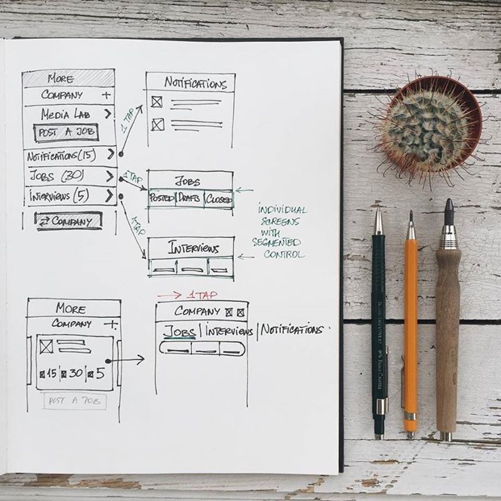
Information structure and navigation are two essential components of any digital product. In one of our UX Glossary articles, we’ve defined navigation as the set of actions and techniques guiding users throughout the app or website, enabling them to fulfill their goals and successfully interact with the product. The navigation system, in terms of IA, involves the ways how users move through the content.
Navigation of a digital product is based on the information architecture, so it’s vital to make sure it reflects and supports IA, otherwise the product may be unsolid. Therefore, designers are recommended to plan the navigation system while creating information architecture of the product.
Don’t forget about visual hierarchy
To organize and prioritize content in interfaces clearly for users, designers apply a well-known technique called visual hierarchy. Its main goal is to present the content on the carrier, be it a book page or poster, web page or mobile screen, in such a way that users can understand the level of importance for each element. It activates the ability of the brain to distinguish objects on the basis of their physical differences, such as size, color, contrast, alignment, etc. This allows users to see where the needed information is so that they could navigate easily.

Visual hierarchy plays a significant role in the visual performance and readability of the copy content in digital products. Giving tips on applying copy content in UI, we distinguished core aspects helping to build powerful visual hierarchy. One of the essential points to consider for designers is scanning patterns. Lots of studies have shown that before reading a web page people scan it to get a sense of interest. According to different studies, including the publications by Nielsen Norman Group as one of the pioneers of this field, the UXPin team, and others, there are several popular scanning patterns for web pages, among which “F” and “Z” patterns. Detailed information about scanning patterns you can find here.
Knowing the principles of visual hierarchy, designers can create effective information architecture placing the key components of the content on the most scanned spots making users take expected actions.

Things to consider
The science of information architecture may seem too complicated and demand much efforts but when you learn its basics and start applying them to design projects, you see how useful it is. Summing up the set of Tubik articles devoted to this theme, we’d like to single out a few main points.
- IA forms a skeleton of any design project for a digital product. Visual elements, functionality, interactions, and navigation are built according to the information architecture principles.
- Powerful IA is a guarantee of a high-quality product since it reduces possible problems of poor usability and navigation.
- Good information architecture is a foundation of efficient user experience.
- Information architecture is like a blueprint of the layout which needs to be generated by a visual scheme like a wireframe.
- Defining product goals is a core stage before IA creation.
- User research and cognitive psychology principles assist in predicting possible users’ reactions to the product and creating a user-friendly outcome.
- Clear visual hierarchy plays a significant role in the visual performance of the content.
Useful Articles
Here’s the set of articles on more aspects and best practices of user experience design.
Visual Dividers in User Interfaces: Types and Design Tips
Directional Cues in User Interfaces
How to Make User Interface Readable
Basic Types of Buttons in User Interfaces
3C of Interface Design: Color, Contrast, Content


