A picture is able to tell a lot instantly. It can inform, call associations, set the mood and atmosphere, give insights and wake up curiosity, get people inspired or engage further considerations, and do that all in a beautiful and attractive manner. Still, to spark all that amazing potential, the picture needs to be created by a professional, who knows how to do that magic via talent, skills, and experience.
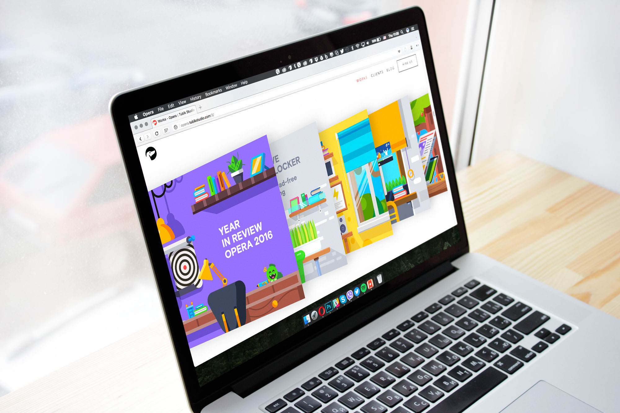
Having the whole set of such professionals on-board, we finished the last year with an interesting and challenging project. In December 2016 Tubik team got the chance of creative collaboration with Opera to work on the bright and catchy year-in-review video. You could already have seen the video and design process presentation in Tubik Portfolio, and today we invite our readers to take a deeper look at this design story in a new case study.
Task
Design of a short animated video “Opera 2016: Year in Review” within a tight timeline.
Process
Introducing a customer, Opera is a web browser developed by Opera Software. According to Opera Software, it had more than 350 million users worldwide in the 4th quarter of 2014. Total Opera mobile users reached 291 million in June 2015. According to SlashGeek, Opera has originated features later adopted by other web browsers, including Speed Dial, pop-up blocking, browser sessions, private browsing, and tabbed browsing.
The initial stage of project discussion with the customer showed that they needed an animated video accomplished in an attractive manner immediately setting a positive and cheerful mood. The video had to present the essential milestones of the year when Opera, one of the actively used web browsers around the world, presented fresh innovative features to its numerous users. Opera team enjoyed bright colors and lifestyle object compositions and the approach they wished to use for the video was to devote each composition to a specific month when a particular feature was delivered. It was agreed that the visual performance should feature the 3D flat style, minimalistic animations, and lush colors – everything that the Tubik team is strong at.
Meanwhile, the early stage of discussions on the creative process also established the biggest challenge of the project: the timeline was extremely short. The team of designers had only 5 days for the design and animation of 8 complex flat illustrations full of details, transforming the company message, looking bright and fresh, and keeping visual consistency to look natural in one video. This was the type of project that proved the great power of teamwork when all the participants of the creative process worked like a clock.
Illustrations
The first creative stage of the project had to result in a set of flat illustrations presenting the prominent innovations of the year: Ad Blocker, Battery Saver, Video Pop Out, Personal News, VPN, Faster Startup, Currency Converter. All the illustrations had to present the interiors decorated with bright details close and clear for every user, and also set the atmosphere of the particular season and the visual element showing the presented browser feature. In this way, combined in the video and replacing each other, the illustrations would support the feeling of the year flowing. Here is the final set presented to motion designers who had to do further work on breathing life into the pictures.
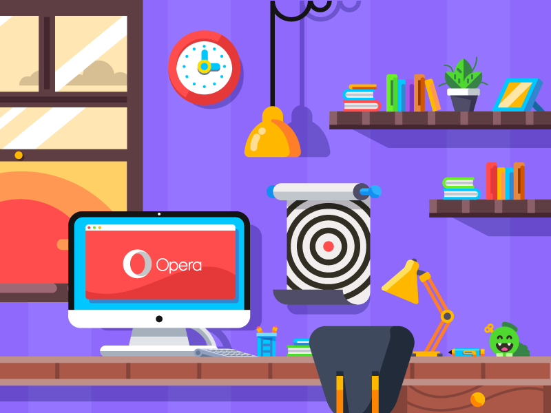
This is the intro illustration opening the video, setting the cheerful mood, and giving a strong link with the brand.

This illustration presents the feature of native Ad-Blocker, which Opera presented in spring, so the color palette corresponds to the shades traditionally associated with this time of the year.
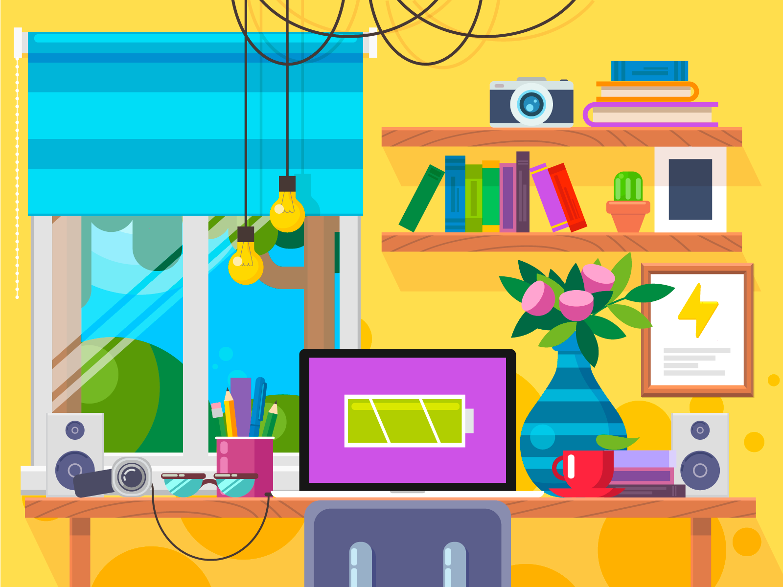
The next illustration presents the feature of Battery Saver, which got active in late spring: the season is supported with a general bright and sunny color palette, flowers in the vase, and green trees outside the window.
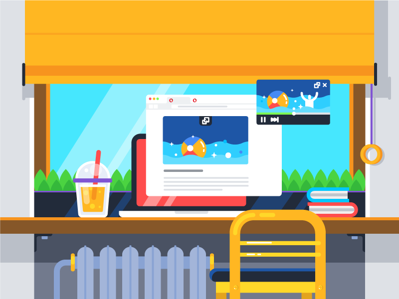
Another illustration was designed to present the feature of Video Pop Out, enabling users to watch videos while browsing. A big window shows the green plants and blue sky and the diagonal light shadows let us guess the shiny sun, the table sets the scene with a couple of books and a glass of lemonade, and even the video on the screen shows the seashore and people having fun – everything allows viewers to understand easily that this user-friendly innovation was added in summer.

The next artwork is associated with the feature of a personal newsreader. A bit darker sky, a bit longer shadows, some clouds, the cup of tea, and red-ripe apples on the tree say: when users got the ability to read the news right from their browser, the summer had almost finished.
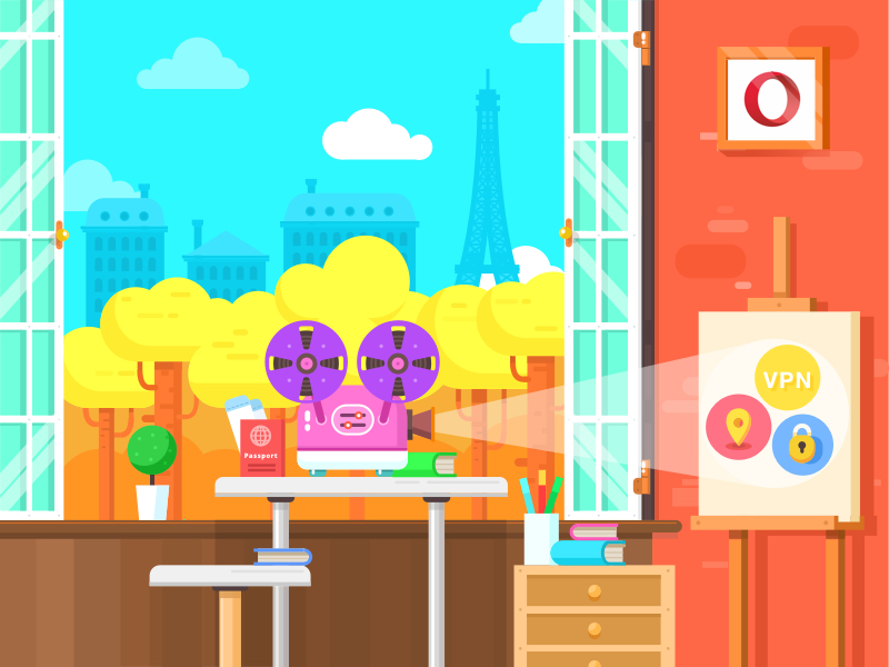
The feature of a built-in VPN enhancing the privacy of browsing was set up in autumn, which is immediately clear from the view with yellow trees outside, while the passport seen on the table sets the strong connection with the matter of privacy.
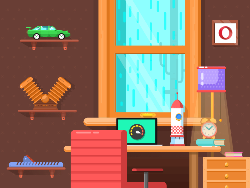
The next illustration featured the faster speed of start-up loading, so the key visual element of the composition is the speedometer shown on the computer screen. It immediately sets the association with the issue of speed while the color palette chosen for this artwork enables users to feel the vibes of deep autumn.

The last innovation to present was the built-in currency converter enabling users to shop online faster and easier. Some details in the picture, like the calculator, the decorative recognizable model of a shop placed on the shelf, the delivery truck behind the window as well as the layout on the screen set the atmosphere of shopping, while the outside view and the gifts let us know it’s the busy time of buying Christmas presents.
Having a full set of illustrations approved by the client, motion designers came into play and presented the variants of transitions, while graphic designers worked on the fonts for the short descriptions to be used in the video. The fonts had to look highly readable and correspond to the general stylistic concept.
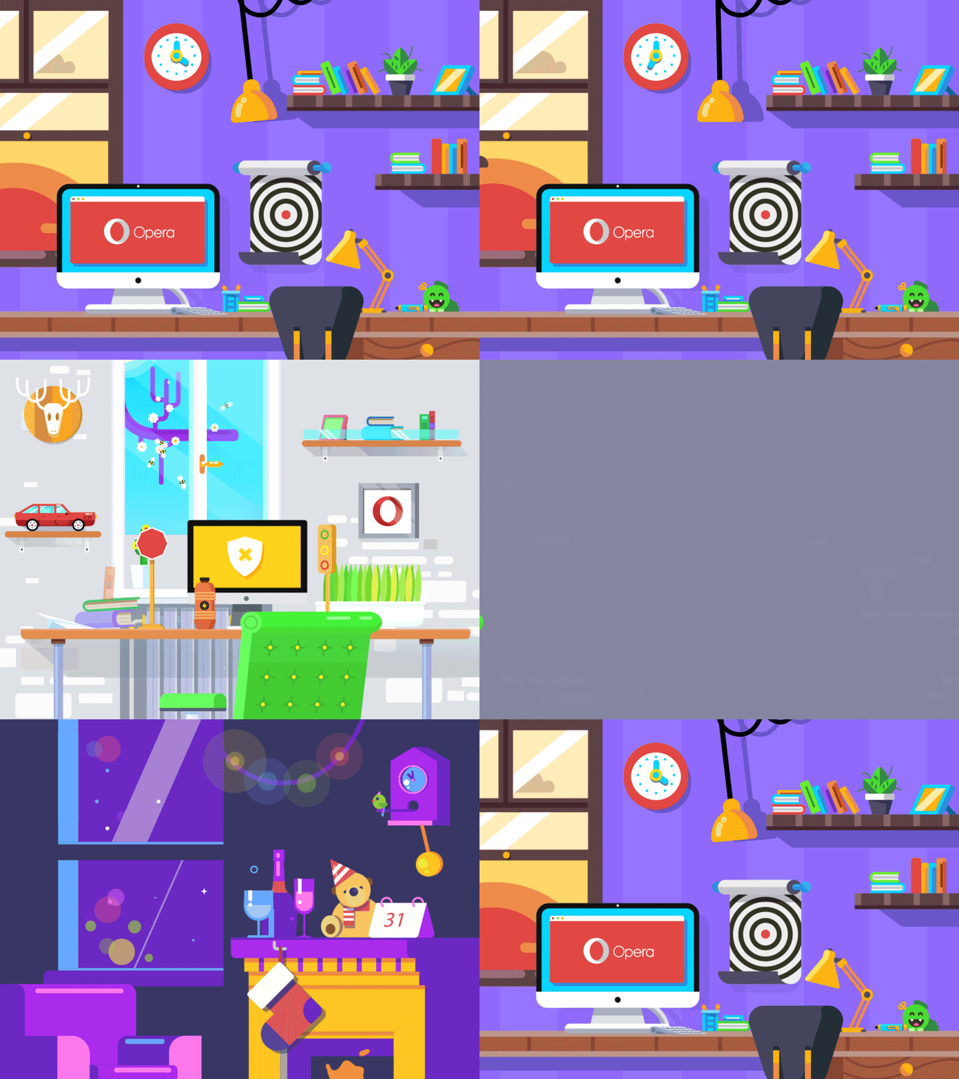
The sample of animated transitions between the slides livened up with the natural movements of the details close to motion in real life.

The sample of the fonts used on the slide in combination with the illustration
Final video
Five days of hard and coordinated work of the design team resulted in the final video of about 40 seconds showing the full set of key innovations Opera presented in 2016.
In one of the previous articles, devoted to designing processes and work styles, we mentioned: the studio experience lets us believe that teamwork organized wisely and thoughtfully doesn’t take away designers’ individual space or freedom — vice versa, it adds to it the power of solid support and prospective ways for bigger and more complex, therefore more interesting and challenging projects and tasks. The project for Opera became one of the convincing proofs.
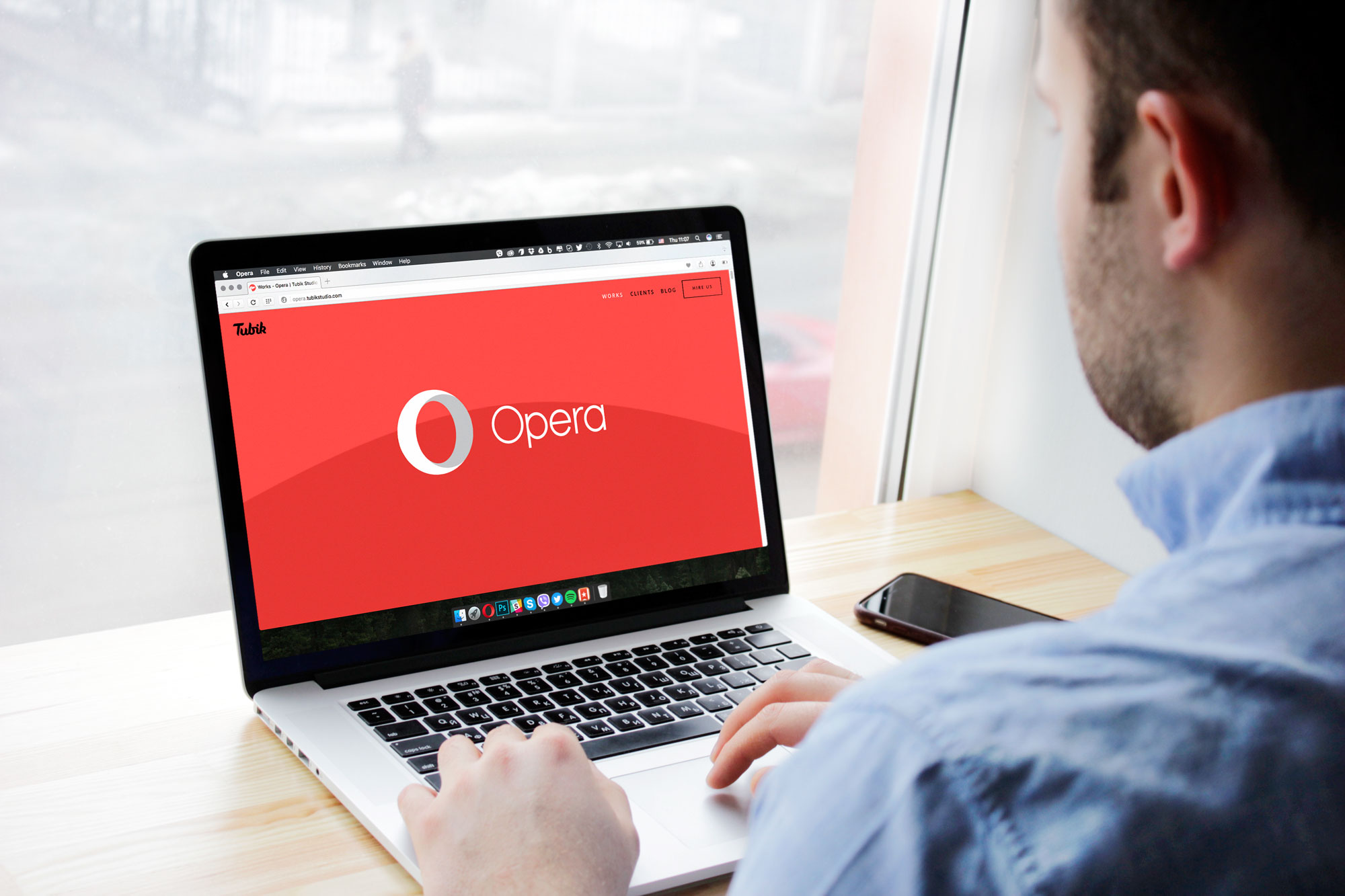
In their testimonial to the Tubik team, the Opera Software team mentioned: “The loose storyboard and tight timeline we presented you with were undoubtedly a challenge, but everyone is very happy with how well your team delivered on it!” No doubt, this project became not only a great and absorbing challenge but also a case of fruitful collaboration and a bright finale for the extremely busy design year.
Useful articles and case studies
Step by Step Guide to Custom Promo Video Design
Case Study: OffCents. Explainer Video for a Mobile App
Case Study: Binned. Design for Promo Video Production
5 Reasons to Make Animated Video for Your Product
How to Create Original Flat Illustrations: Designer’s Tips
Don’t Stay Still. Why Brand Needs an Animated Logo
Welcome to check out the presentation of Opera project in Tubik Portfolio


