When a brand decides to establish an online presence, first and foremost it develops a website. An e-commerce website handles financial transactions made over the Internet. If you buy products or services online, you deal with e-commerce.
Business strategists, marketers, and designers try to create a perfect place for their audience to shop. In the pursuit of an ideal solution, they tend to overdo it and fail to make online shopping enjoyable.
Working on any e-commerce website, you should remember that people don’t ask for the impossible; people want their online shopping to be fast, easy, and safe. To make this happen, your home page should be engaging, your search should be precise, your visuals should be high-quality, your payment system should be reliable, and your UX design should be intuitive.
Now, let’s look closer at each of these five elements that are must-haves for any e-commerce website.

Home Page
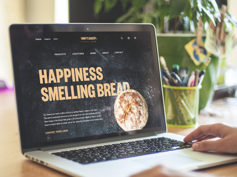
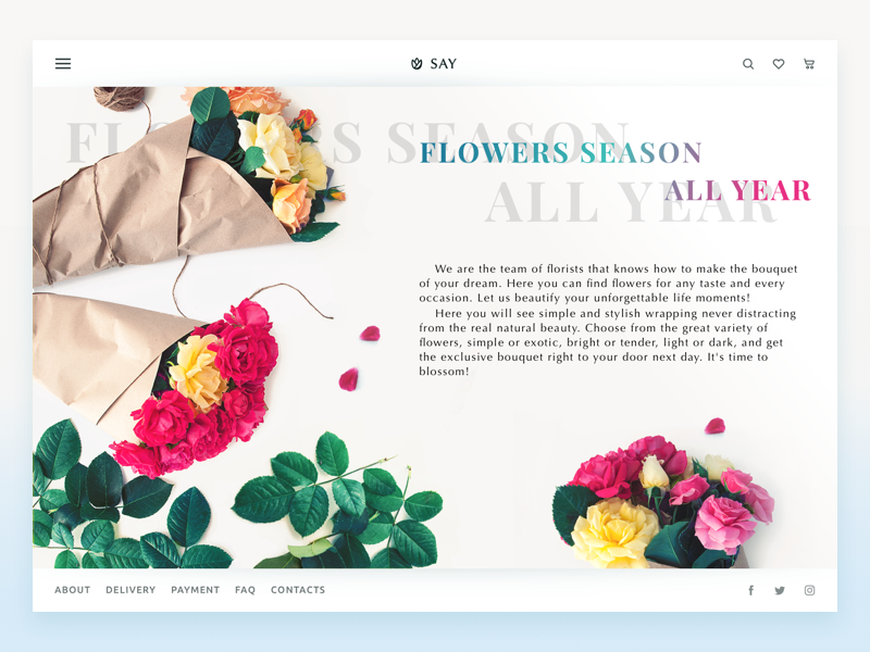
Owners of brick-and-mortar shops pay solid attention to the window dressing. They style their storefronts to attract people walking by and make them come in and take a look. A website’s home page should have the same effect.
The home page is the start of a customer’s journey; that’s why it should be encouraging. Don’t expect your website visitors to know what your company does. So use the home page to tell people what kinds of products and services you deliver.
Since a home page is often a customer’s starting point, make sure that your navigation is nice and clear. People should be able to reach all important sections of your website from the home page and search for items without sifting through categories. In the article Home Sweet Home. Strategies of Home Page Design we’ve listed all basic elements that should be placed on a home page; make sure you don’t miss any of them.
Don’t save the best for later. Put your best offers on the home page. If you provide free shipping or a free trial, let people know about it from the very beginning. Motivate users and make them want to explore more of your products and services.

Search
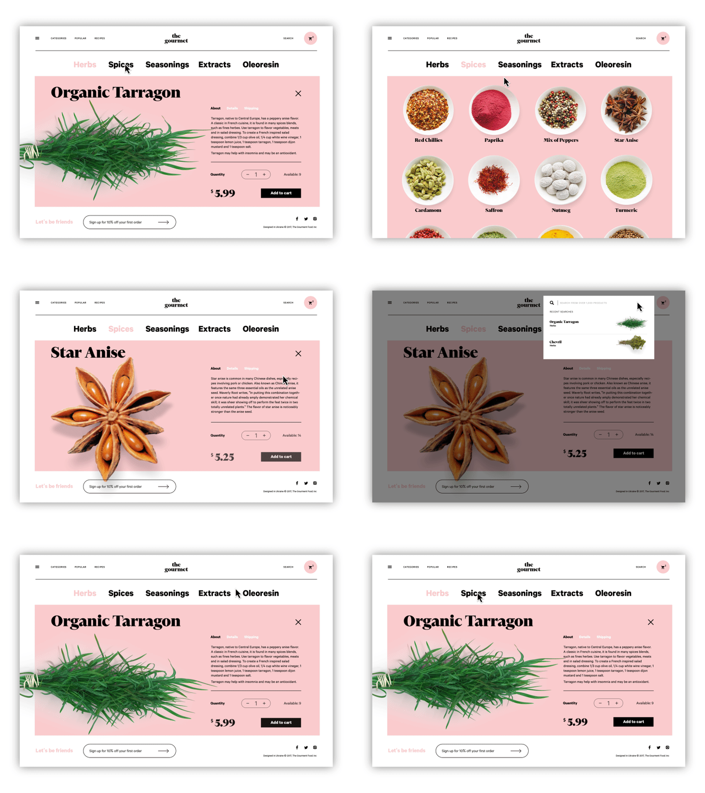
The proper site search is incredibly important for an e-commerce business. People who use the search box are more likely to convert into leads and customers because they are shopping with intent. If the search box doesn’t work properly, visitors won’t find the information they are looking for and will leave the website unsatisfied.
Here are some ideas to help you improve your visitors’ site search experience.
- Draw attention to the search box
- Make the search box big enough to fit most queries
- Let visitors see search results in a grid or list format
- Provide a Sort By option (e.g. sort by price, relevance, rating, availability)
- Show the status: in stock, out of stock, or back in stock soon
- Add a Quick View option to let visitors see more information without leaving the search page
- Display search suggestions
- Allow users to search within a particular section
- Let people search using product codes
- Let people click for more item images without leaving the search page
- Make sure your search returns relevant results for singular, plural, and misspelled words
- Use a search autocomplete feature to save shoppers’ time
- Offer a list of related items to help people discover more of your products or services
- Analyze user behavior on the website to keep improving the user experience.

Visuals
A picture is worth a thousand words. And this is true when it comes to online shops because the demonstration is everything for e-commerce.
Brick-and-mortar shops have the biggest edge over online shops and this edge lies in the visual aspect. In stores, people can view, touch, and try products, which is impossible when shopping online. That’s why e-commerce business owners should make product demonstrations as realistic as possible. And here is how they can do it.
High-quality photos
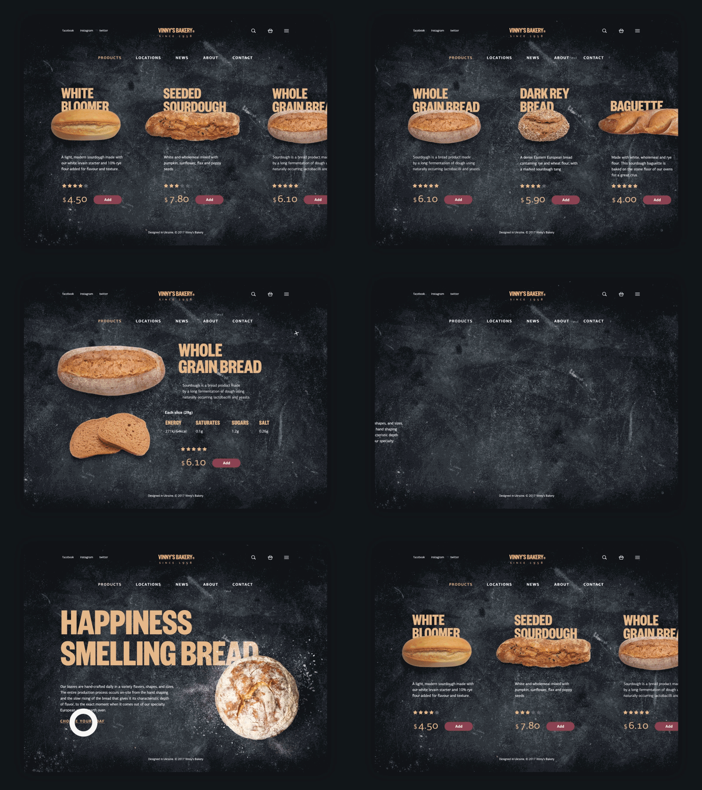
Let your customers get a better understanding of your products. Include several HD photos made from different angles, highlight any important or unique details, and don’t forget to include photos of your products taken in realistic environments.
Demonstration videos
One of the largest e-commerce websites, ASOS, adds clothing try-on videos in order to make their customers’ choices easy and enjoyable. This type of content not only lets customers imagine how clothing is going to look on them but also shows more details of products.
Video reviews and instructions
Simple review and instruction videos are extremely popular on YouTube. According to Animoto, 73% of respondents are more likely to make a purchase after watching a video that explains a product or service. So why are you still waiting to make videos a part of your website content?
360-degree view
Did you know that touching things makes people want them? Of course, your customers can’t physically touch the products through the screen, but you can get customers closer to them with a 360-degree product view. The all-around perspective gives your site visitors the feeling of first-hand experience as they explore products.
User-generated content
77 percent of consumers prefer to see photos taken by customers rather than photos taken by professional photographers. Encourage your clients to share their experience with your products or services on social media, monitor your brand’s mentions, and share this content on your website to help your potential clients to make a choice.
Augmented and Virtual Reality
This type of content is still pretty new in e-commerce, but it has great potential in providing a high-quality customer experience. As an example, the IKEA Place app allows users to actually see the pieces of furniture in their houses and decide if they are going to fit in.

Payment
Now that your site visitors have picked the item they want to buy, it’s time to place the order and proceed to payment. And at this stage, you want to make sure that your website provides a trusted payment environment.
The Secure Sockets Layer (SSL) certificate is a must for any e-commerce website. It’s used to encrypt the data between your server and users’ computers or smartphones, so the payment information will be protected from any external interference.
When the website is secured by an SSL certificate, HTTPS will appear in its URL.
In addition to secure payments, the existence of the SSL certificate will also help your website to be favored by search engines.
UX Design
People won’t engage with your home page, use your search box, click on HD product photos, or make a purchase unless the user experience design is user-friendly. UX design for e-commerce is incredibly important on the way to more purchases.
First, put your user in focus. Bear in mind the goals your site visitors have and think of how you can fulfill these goals. Second, prioritize functionality above all else. Going for design trends such as parallax scrolling or ghost buttons don’t always make sense. These kinds of design trends may increase load time, be overlooked, or distract attention. If design solutions hurt functionality, you’d better not implement them. Amazon and eBay are not the fanciest when it comes to design; however, it doesn’t prevent them from being leaders among e-commerce platforms.
Just because you’re selling electronics, doesn’t mean that all your customers are tech-savvy. That’s why UX design should be intuitive. Don’t challenge your site visitors to deal with your complicated design solutions. They’ll be irritated with not only your website but also with your brand and will leave it for good. That’s why designers work so hard to make UX so simple.
According to the Baymard Institute, a lot of e-commerce sites still have problems with mobile UX. Seventy-eight percent of mobile e-commerce sites perform poorly when reviewing the combined mobile product finding experience.
Think of these practices when creating UX for mobile e-commerce:
- Simplify the UI design
- Provide convenient physical interactions with your mobile UI
- Support image zooming by double-tap gestures
- Prioritize content (search box, categories, shopping cart, favorites list, log in, my account, etc.) and make it easily accessible from every page
- Disable autocorrect at checkout
- Pay special attention to cross-device and cross-browser testing
- Make sure your web pages load quickly
- Save customer information for future visits
- Make a guest checkout option
- Add a save shopping cart feature
- Apply microinteractions to improve the shopping experience
- Let users scan their payment cards to avoid entering card details manually
- Apply color psychology in design to convey the feeling of security on the payment page
- Always test and analyze user behavior

Provide quality products and services, learn your customers’ goals, make the process of reaching these goals easy and enjoyable, and you’ll see your e-commerce business grow.
Useful Articles
Take My Money: UX Practices on Product Page Design
11 Profitable Strategies for E-Commerce UI Design
UX Design for E-Commerce: Principles and Strategies
The Role of Branding in UI Design
Business-Oriented Design. Know Your Target
Short but Vital. Key Abbreviations in Design for Business
Business Terms in Design for E-Commerce. Sales Basics
Two Types of User Motivation: Design to Satisfy
Sell Like Hotcakes: UI Designs for E-Commerce
Feel Homey. Handy Tips for Home Page Design


