One more bright week has passed for the global design community and again we have collected some fresh tips on useful reading for those who are interested in design news in our weekly reading list. Enjoy your reading!
Recommended articles
How Adding Personality Can Make UX Design More Relatable and Engaging – the article concentrated on benefits of adding some personality to the user experience design process, analysing the reasons that make user research the step of great importance.
Key thought: The needs of people in Kenya are different than the needs of those in Egypt or Scotland or Canada. This is different groups, different ecosystems, so we had to spend time to understand what do these people need the most because ultimately you want to build something useful, not just something cool that’s a good story to tell. Not everyone understands the need for user research. They want to see something right away.
Showing your imperfections, working with your users to make things better, and being human is not just good relationship building; it’s good business.
Designing With Color Contrast for Improved Usability – the informative article analysing the power of color contrast in enhancing usability, navigation, dealing with categories and visual hierarchy.
Key thought: The best sites can combine gorgeous colors and usability to create a user experience that’s smart, considerate and increases the quality of navigating the site. All designers can get to this level of proficiency; it’s just a matter of understanding the basis of good color design.
Designers Shouldn’t Code — They Should Study Business – the post providing considerations around the importance of getting into the details on business for which UX design is created.
Key thought: In general, our focus on user research and analytics has helped a ton in giving more credence to the voices of designers. We’re also seeing great examples of design-led companies and designers impacting the core of big businesses, like Airbnb, Pocket, Facebook, Google, Slack, and a loads of others. I would argue that those companies are as successful as they are because they have designers who are focusing more on what those businesses need than on how perfect every pixel will look.
6 Reasons Not to Test with Users (and Why to Test Anyway) – the article moving around the idea of efficient testing applied to design solutions. Provides informative and practical explanations on popular objections to user testing.
Key thought: Every design ever made has a user – but not every experience is designed with the user in mind. Sometimes it’s because designers don’t know enough about their users; sometimes it’s because deadlines are too tight to bother. But in the end, users are the ones who interact daily with designs, and users are the ones who can help make designs better.
Mobile Navigation: Tab Bar and Pictorial Icons – the article considering important features of effective mobile app navigation. Practical design tips and graphic examples.
Key thought: Navigation is generally the vehicle that takes users where they want to go. Always think about your user persona, and think about the goals users have when using your app and use your navigation to help them meet those goals. You’re designing for your users. The easier your product is for them to use, the more likely they are to use it.
22 Web Trends Every Designer Should Know – the article analysing some design trends necessary to consider for different design tasks in 2016. Based on ideas and opinions by famous experts in modern global design community.
Key thought: We’re thinking about the web we build as a utility. It’s not about building for specific browsers, but for all users, even those with tenuous connections or weak devices. Sites will increasingly be tiered experiences, starting with a functional baseline for all, and enhanced where and when they can be.
The beginner’s guide to UX prototyping – thoughtful practical explanation of prototyping basics: purpose, techniques, types and methods of prototyping in the process of UI/UX design. Supported with highly helpful review of useful resources and tools.
Key thought: Their purpose is not so much to get prospective customers to buy a product, as to help you make a better one. You build a prototype of a website or app to make sure that the concept will work as intended. You also use it to show your clients, or potential investors, how it’s supposed to work.
UX Best Practices: Designing the Overlooked Empty States – the blog post thinking over the significance of empty states as the integral part of user experience with practical examples of their presentation.
Key thought: Empty states represent a pivotal point in the user journey. Each is an opportunity to build rapport, drive engagement, educate, entertain, or delight the user.
Design must-read book of the week
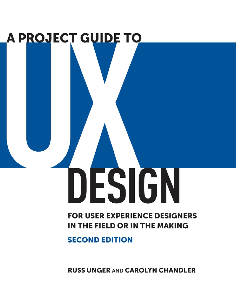
A Project Guide to UX Design (Second edition) by Russ Unger, Carolyn Chandler

The book we recommend today is now a sort of comprehensive classic one, especially for those who start their careers in the field of UX design. Set at the crossroads of numerous kinds of human activity such as design, psychology, logic and analysis, art, communication, etc., this sphere can reveal many talents of designers but also requires deep knowledge and various skills. The book provides a nice introduction to the domain of UX design, from the most basic definition of UX design and describing the parts of the design process to small but significant details playing big role in creating efficient user-friendly products and providing effective teamwork.
Wish you a nice time spent reading! Hopefully, you haven’t missed our updates here on Tubik Blog, but in case it has happened, welcome to read about some aspects and aims of copywriting and animated interactions in UI design as well as the basics of graphic design as the tool of communication via visual means.


