Design is the job whose aim is to achieve the goal and usually, it is done by multiple means, techniques, and tricks. Anyway, design is a professional activity that has to solve a problem. From a design perspective, even purely artistic elements have to perform some tasks and play their role in achieving the goal. In the vast majority of cases, we design not for ourselves or our clients: we design for users who have pains, needs, and wishes and our task is to set the goals and find effective solutions. It’s like math: you get the problem – you find the formula and way to solve it – you work over the solution – you get the result. To get the result you need to set the goal at the very first step of a design process.
Plenty of websites and mobile applications are created with a sort of business idea or scheme behind them. That makes them goal-oriented and customer-oriented. For designers it can be both help and challenge: they get a clear goal, which means they know what result is expected, but with the goal, they also get a set of limitations and restrictions to consider. Designing for business, it is necessary to understand not only user experience and behavior, the psychology of interaction and decision making, but also business goals and processes which influence the general result. It is important to understand the business language to have quick contact with customers, who sometimes don’t know much about design, but definitely, know what are their business goals and expectations.
In our previous post devoted to basic business terms, we have already started building the bridge between business and the design process. There you can read about business and design relations in e-commerce, get the definitions of conversion, sales funnel, sales channel, niche market, 4P theory, etc.

Today’s post continues the topic with vital abbreviations which are now an integral part of business communication. Making orders for design and development services, customers can mention those abbreviations in the scope of work and philosophy of the product, they should be included in business and content strategy. Understanding them and knowing the design aspects of their realization results in a goal-oriented and user-centered design that is able to solve problems and bring profit.
So, let’s get started!
USP
=Unique Selling Point / Unique Selling Proposition
Definition. Unique Selling Point (Unique Selling Proposition) is the element of marketing and promotion strategy that presents the most important benefit (or set of benefits) that people can get with the product or service. This is actually a feature that makes the offer unique and different from the others on the market. This is what marks the offer out of the competition.
The article published by Kissmetrics Blog and giving several practical examples mentions: “Instead of attempting to be known for everything, businesses with a unique selling proposition stand for something specific, and it becomes what you’re known for.” That is a good explanation of how USP is beneficial for the business itself and why it should be also considered at the design stage. For most cases of business practice, the attempt to offer everything for everyone is a utopia that goes nowhere. Specific offers to a definite target audience give much more, especially at the start of the way.
Design aspect. USP is an important thing to define at the first stage of ideation and development of business strategy and design solutions that correspond to it. Outlining the USP is one of the hardest tasks as it actually influences all the design process as well as ways to present and promote the product. However, starting work without understanding what is going to be the USP is mostly like starting traveling without any particular place or destination in mind: it can be a sort of exciting experience, but nobody knows what it will bring in the end. Business trips are never planned like this and business goals are hardly achieved that way.
If USP is defined at the pre-design stage that means that all design solutions can be made to support it. That is a good foundation for efficient branding supported by recognizable and consistent interface design which enhances better interaction and memorability. USP directly influences:
- design of a logo and brand identity
- understanding the mission of the offered product, its tone and voice which directly influence visual and graphic design presentation
- application of identity in the elements of interaction (website, mobile application, interactive displays, presentation in social networks, etc.)
- building up principles of interaction and user experience in terms of efficient presentation and providing benefits of USP
- creating a user interface that clearly reflects USP and provides a fast and easy way to get it
- creating and selecting content that will support the general design concept and show users the advantages of the product
- design of a landing page that will have the structure and content directly presenting USP to the target audience
- applying design tactics that increase conversion of the web pages or app screens
- the strategy of SEO and copywriting which will support design solutions and consistency of the offered benefits, etc.
It’s also important to realize that USP is not a business statement or business goal itself. It is the benefit that the provider shows and outlines as essential and beneficial for users. The business goal is the result which company wants to obtain, a business mission statement is a sort of 3D presentation (the directions of business development and its results for the company’s clients, employees, and owners), while USP is what the company shows to clients and users as good and worthy for them.
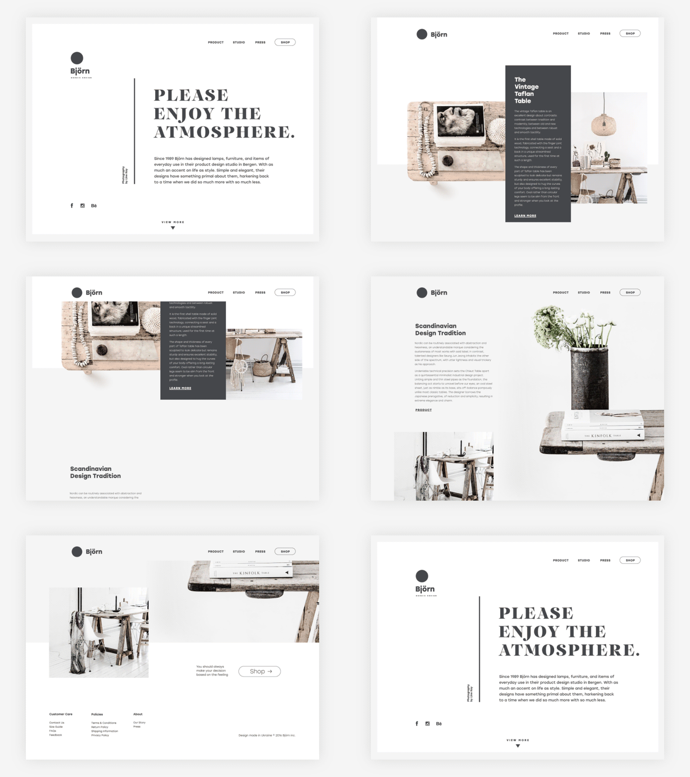
Björn website
For a practical example, let’s imagine a company launching a website selling books. Suppose, the business goal is to sell 5000 books via the service for the first year. To do it, the company needs to attract visitors with a feature that will differentiate it from the others on the market. Say, the website will provide the ability for live communication support in choosing books provided 24/7. A user will be able to ask any question about the range of presented books at any moment when it’s desired and get immediate feedback, which is very convenient for customers. That is what the service chooses as its USP and declares to users as the feature differing it from the competition. Buyers do not need to know the business goal as to how many sales are expected to be done or how much profit the company wants to earn. Buyers need to know what is especially good and comfortable for them so much that they should come to this company and not to the other. When it is defined at the first steps of creating the product, design becomes the powerful tool to inform users about the benefits, strengthen their power, make them look as attractive as possible for this particular target audience.
Moreover, knowing the USP with which the product is or going to be positioned on the market, UX designer is able to find the best ways and techniques to provide users with the ability to get what they want quickly and easily. Navigations, usability solutions, layout, and transitions – everything will make the user experience more positive and efficient while the business goal is more achievable. This is how thoughtful design works for business.
Therefore, at the earliest stages of the design process, project documentation should definitely include the data about USP. If design and marketing are done within one company, it is highly advisable that management, marketing specialists, and designers get together and discuss the general strategy of work to avoid misunderstandings. If the design is outsourced and provided by the other side it is recommended for designers and project managers to get as much information about the USP as possible. This will save money and effort for both sides as this way reduces issues of redesign that can come up when the task is very general and blurred as well as will provide the result which is more customer-oriented and adjusted to the business goals of the company.
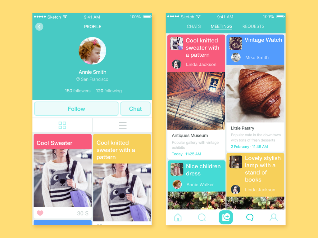
As a practical example, we can remember the story of creating new branding and UI design for the Saily App. This is a local service of user-to-user e-commerce. The customers defined its USP from the very start: it is a local community app allowing neighbors to buy and sell their used stuff, so it provides people with the ability to sell their own things or quickly search for the needed ones sold in their location. This idea became the solid basis for all the design solutions around branding and user interface of the app, setting bright experience and friendly communication. If you are interested to read the details and see the visual design process, welcome to read case studies on logo design and UI design for the app.
MVP
=Minimum Viable Product
Definition. MVP is a product with a set of minimal functions and features that are logically completed and sustainable providing the most important and basic functions for the core target audience. This means that the basic version of the product, able to fulfill key operations which are solving the target audience’s problems, is created as live and starts real functioning as soon as possible. The approach is opposite to the strategy of creating the full design and comprehensive functionality for all the product features for the broader target audience and only afterward launching it on the market.
Design aspect. MVP approach has several benefits:
– as it starts from the simple and basic version of the product, it doesn’t take a long time to provide design and development and makes it possible to start playing on the market faster. It’s especially actual for diverse technological ideas and concepts as they are always at risk to outmode by the time all the design, development, and testing cycle is finished;
– it enables designers, testers, analysts, managers, and marketing specialists to collect data of real users’ interaction with a product, reveal the bugs, understand their wishes and pains deeper, and use all that information in the design and presentation of further, more complex versions of the product. Although testing should be done at the stage of development, it is impossible to predict all the potential problems of interaction with a product before real users start this interaction. MVP enables to do it faster and make the next versions more efficient;
– if thoughtfully made and carefully presented, MVP can play the role of bait attracting target customers and allowing its creators to see whether the target audience was defined properly and analyzed deeply enough;
– next versions of MVP usually present quite massive functional additions so depending on the target it may work as a way of positive and dynamic user experience, different from slight changes in the products whose functionality was fully developed before the launch.
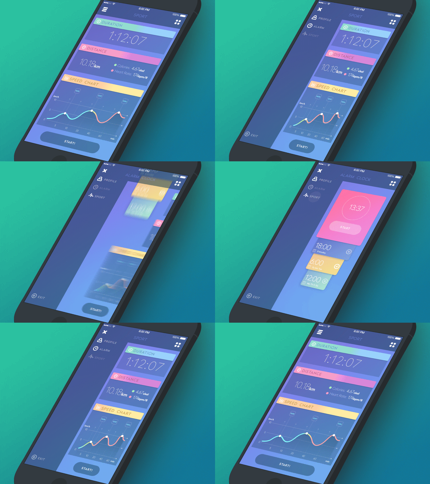
Therefore, in terms of design MVP is the strategy of step-by-step movement on the market, when every next step is based on the analysis of the previous one from the actual data collected from real users. That means that the designer should also apply the strategy of gradual design, carefully applying only core features which are really vital for the MVP as the start of the journey. It greatly influences the number of screens and content on them, necessary transitions and notifications which users really need at this stage of using the product, level of complexity and sophistication of graphic materials and animation, etc. UX designers should remember that MVP always has a definite core target audience and the solutions to interactions, experience, visual perception, etc. Knowing these core users makes the design task more particular and the result will be more customer-oriented thus efficient. Next versions of the product will provide broader functionality and in this way will broaden the circle of users, but it will work in the case when the core target audience is caught by MVP.
Successful MVP is directly connected to the USP of the product. Here USP plays an even bigger role as it enables to make the product user-centered and in this case the chances of making it efficient and attractive to users get much higher. Presenting the product solving particular problems of a particular group of people in many cases proved itself as an effective strategy with the perspective of further growth of both functionality and audience. This strategy works especially well for various startups which start with a limited budget used wisely for the practical presentation of the vital features of the product: if MVP is thought out properly, at this first stage they already start monetization of the product, attract users and at the same time apply practical data analysis in further stages of design. It’s easy to see that the role of UI/UX design here gets even higher as MVP is actually the chance of making a good first impression. Spoiling it with bad design can have a crucially bad result for product’s promotion as well as good design can build up a solid foundation for product growth.
Sport App
B2B
=Business-to-Business
Definition. B2B is the term used in business, marketing, and economy to mark the relations of the sides in the business process like “business-to-business”. B2B means that one company provides products or services aimed at the other companies’ business activities. The target audience of the offer is not individual customers but businesses. Nature of relations has a direct impact on business process, strategy, promotion, and therefore any design stages involved in this scope. Actually, if we are talking about outsourced design and development services, they are a direct example of B2B.
Let’s mention the same company which sells books. They need a website that will provide quite broad functionality for a big amount of users. They monitored the market for web services and found out that hiring an outsourcing company for design and development is cheaper for them than creating an in-company department of such specialists. This is the start of B2B relations as design studio provides their services for another business – a bookshop.
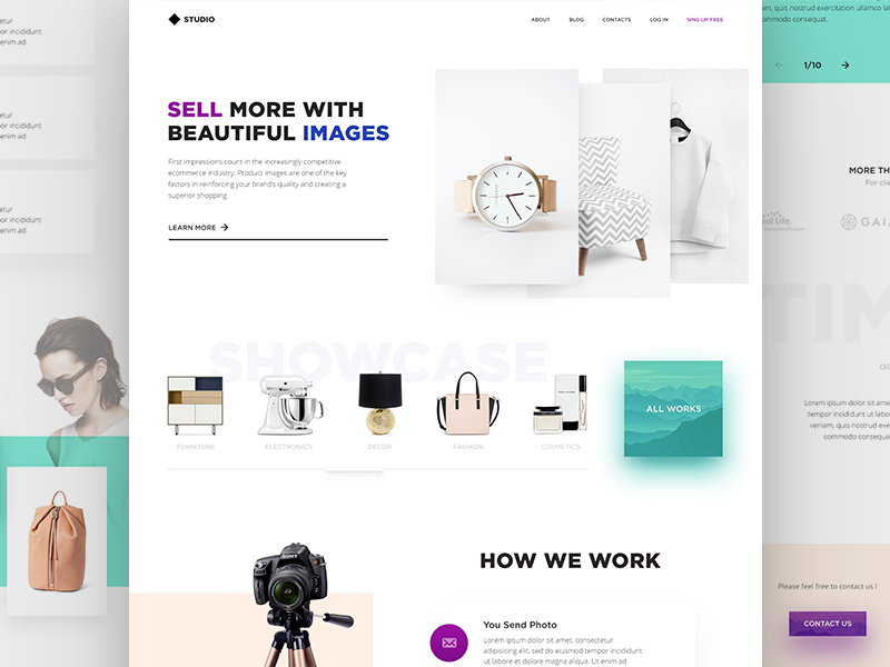
Photo Retouching Service
B2C
= Business-to-Consumer
Definition. One more way of business relations in which a business provides products or services directly to individual buyers or end consumers.
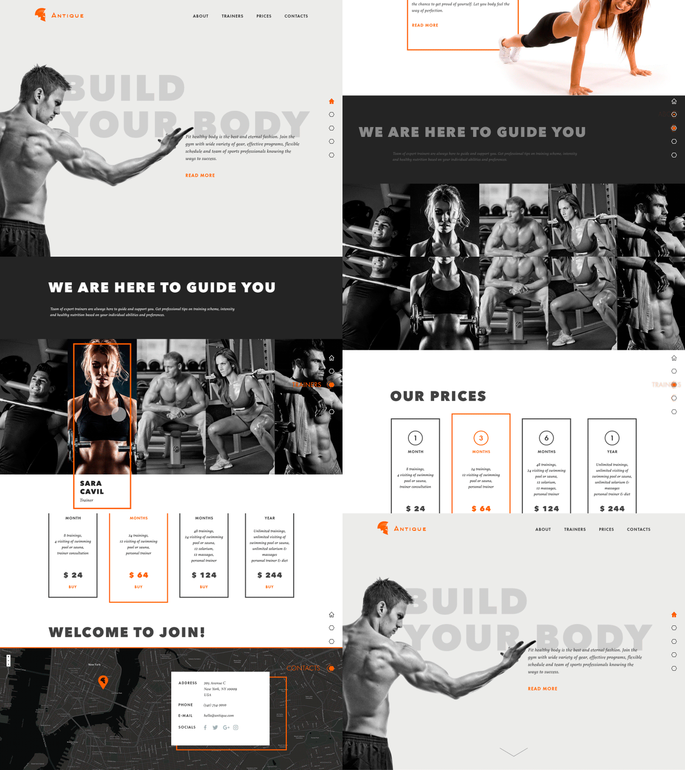
Remembering the case with a bookshop selling online, its business is built on the B2C scheme. It presents and sells books to individual buyers and its aim is to involve as many customers as possible. It needs to strengthen its presence online communicating directly to potential buyers so for this aim it can use online e-commerce spots, blogs, forums, social networks, etc. The graphic material, ways and style of communication, visual presentation, and brand identity will work differently than for B2B and will need another approach because the psychological background of the interaction is different.
Gym Landing Page
C2C
= Consumer-to-Consumer
Definition. It’s definitely clear that the presented term features one more type of business relationship when operations are done directly from consumer to consumer. This term has grown its presence significantly with the boost of e-commerce because nowadays the internet provides broad opportunities for such sort of business. The best-known way of C2C relationships is platforms for online auctions, sales, etc. Creating such platforms, designers have to consider peculiarities of interaction in terms of this business scheme. Design, in this case, is usually done for the third party which creates this platform allowing users to operate on it selling and buying their stuff.
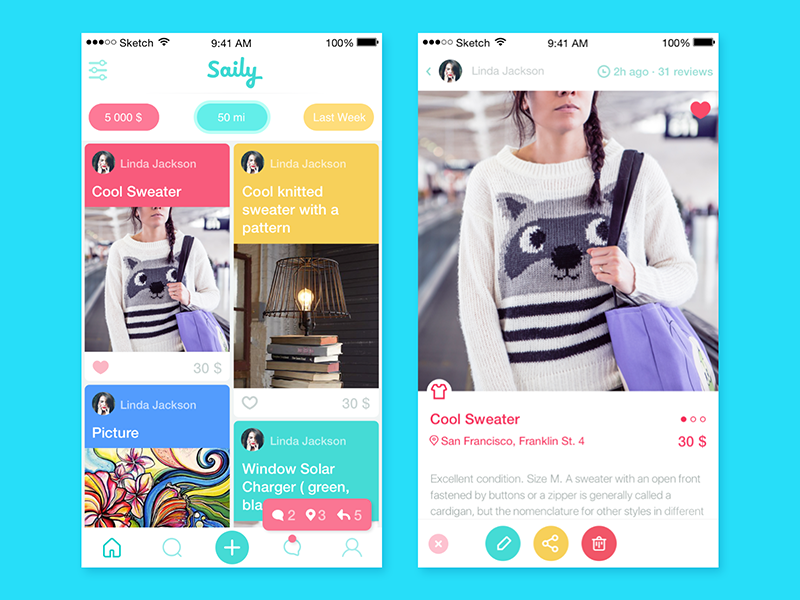
Design aspect. People involved in the design process for products and services have to consider the types of relations chosen for the particular project. Actually, the type of business scheme initially defines the target audience and the nature of interactions which are key factors for efficient and user-friendly design solutions. Designing for business should supposedly involve methods of visual and content presentation that are different from the one presented directly to end-users. It’s easy to see by examples of numerous landing pages: the ones aimed at companies use content, language, visual and graphic elements, placement of data blocks different from those which are targeted at individual buyers or users.
Neglecting the aspect of business relations increases the risk of creating a design that will not provide a high conversion rate even being sophisticated, stylish, and attractive visually. The psychological background behind design solutions has to support particular business schemes or strategies. Here in Tubik, we have had broad experience of design for all the mentioned schemes so below you will find some ideas we would like to share on the basis of that practice.
Designing for B2B, it’s important to remember that:
– design solutions should consistently strengthen branding and company policy which is important for another business side. If a website or landing page represents, let’s say, a service as accomplished by a well-prepared and professional team of specialists with their policy and statement, it is appreciated and trustworthy so builds the better bridge for collaboration;
– implementation of design elements in social network marketing of B2B company, using the same style, voice, corporate colors, and graphics, specially designed branded items, etc. is one more way to strengthen brand awareness by means of design;
– consistent and thought-out content strategy combining visual and textual material with the careful selection of visuals and copy is able to fulfill all the stages of sales funnel and bring better conversion of the website, landing page, or application of B2B company;
– concise and minimalistic solutions in design and copywriting work efficiently in most cases because they save time and effort for busy stakeholders and entrepreneurs. The good variant of the scenario is when they are given concise core information at the first stage of interaction but always have the chance to read more if they are interested (as well as avoid reading huge copy blocks if they don’t want to). Surely, this solution should be based on thorough user research, but anyway it has a high potential to make the user experience more positive and effective;
– business is done differently in different countries. It should be always considered together with the nature of business relations as the factor making a considerable impact on the level of trust and wish to collaborate. Selection of graphic content and layout of the elements on the screen or page should go under analysis in this perspective as some graphic elements, photos, gestures, word combinations, color choices which are efficient and clear for one region or culture can be totally unacceptable or even offensive for the others. The creation of several landing pages targeted locally can be an effective solution;
– the aim of a website or other piece of design presenting a B2B company is not to grow a huge flow of traffic but to engage and direct leads that belong to the target audience and are potentially open and able to take part in business collaboration or partnership good for both sides. It’s important to keep in mind that retaining customers, in this case, plays not less role than involving them in the game.
Designing for B2C it important to consider that:
– the target audience can be more diverse so design solutions that will effectively transfer the necessary message to the user can require more universality;
– the visual presentation should be catchy and original as in this sphere competition is very high;
– in many cases, a website or platform for B2C provides a full way up to the process of buying and delivery. Terms of data protection and security need high attention here. Neglecting this aspect will get the company name associated with bad service so will make a big hole in its reputation;
– the website has to be technically ready to support a really big number of users simultaneously as frequently more offers are available than in B2B so the flow of users potentially interested in buying it can get higher quantities;
– strong and consistent presentation of the brand in social networks featuring the same design solutions is a certain must-have. Not only does this strategy offer more marketing opportunities, but also supports better direct communication with consumers and shows the company’s openness to the discussion as one more reason to trust. The same visual design should be used consistently across all the platforms to increase brand awareness and create strong associations;
– the aspect of virality works effectively in this type of business relations and can be used via design features like interesting animations, engaging illustrations and characters, brand mascots, Easter eggs, funny or encouraging videos, etc.
Designing branding and interfaces for C2C, it’s advisable to consider that:
– the platform should be intuitively navigated and clear to use for people with different levels of tech abilities and on various devices;
– engaging and original UI design solutions are a good way to set the first contact and involve users in active interaction;
– thought-out placement of layout elements and visual hierarchy can increase conversions, and that will be a strong reason for user retention;
– UX of user-to-user communication (chats, discussions, comments, sharing, etc.) should provide diverse features and broad possibilities;
– user interface visual design should provide a good universal background and environment for the presentation of various products and services;
– the platform will need an efficient and quick system of user support.
Recommended reading
Here are some more articles we could recommend for those who would like to get deeper into the topic:
What a Unique Selling Proposition Really Means & Why Your Business MUST Have One
6 Incredible Examples of B2B Web Design
10 MUST DO’s Before You Start Designing Your B2B Website
The Importance of Design in All Marketing Campaigns
The Role of Design in Business
Welcome to read or download the free ebook Design for Business


