Paul Rand said that design is the silent ambassador of your brand. Continuing his thought we can add that a logo design is a heart of a brand identity that presents the personality of a company or a product. If you want to set the connection with the target audience and tell the story of a brand, starting with a logo would be a good choice.
Today we describe visual components of a logo that are vital for compelling visual perception and also show practical cases of applying the psychology of color and shapes in design for branding.
Psychology in logo design
To make an effective logo, designers have to consider the tiniest components which it is built of and think about the influence they will have on potential clients. The science studying the impact of various factors on the human mind and behavior is known as psychology. Knowledge of psychological principles helps to understand human aspirations and motivations which means designers can predict the possible users’ reactions to certain solutions.
People may not notice but the mind often reacts to visual objects affecting the emotions and behavior. In our previous articles, we described two psychology branches which study the impact of shapes and colors on people’s visual perception. In short, each color and shape tend to be perceived with its own meaning, so when we look at a visual object our brain receives a certain message and reacts according to what we see.
Comprehending the role of the color and shape psychology, design expert can control the meaning a logo contributes. Each component chosen thoughtfully helps people read the meaning of the logo right.
Color in logo design
The research provided by Colorcom showed that it takes only 90 seconds for people to make a subconscious judgment about a product and between 62% and 90% of that assessment is based on color alone. That’s why the success of the brand strategy depends largely upon the colors chosen for the logo design.
Colors are a vital factor for not only the visual appearance of products but also brand recognition. In the article Color in Design: Influence on Users’ Actions we described the meanings of common colors in branding and here is a short sum up.
Red. Confidence, youth, and power.
Orange. Friendly, warm, and energetic.
Yellow. Happiness, optimism, and warmth.
Green. Peace, growth, and health.
Blue. Trust, security, and stability.
Purple. Luxurious, creative, and wise.
Black. Reliable, sophisticated, and experienced.
White. Simple, calm, and clean.
The color choice shouldn’t be based on the common meaning alone. Visual perception is quite individual for everyone so the color effects may be different because of factors such as age, culture, and gender. For example, children like yellow color pretty much, but as we become adults it usually seems less attractive. Moreover, there are many cultural differences in color definition. To make sure the color will work effectively for a brand strategy, it’s vital to consider the preferences of the target audience.
Shape in logo design
As we already mentioned in the article devoted to the psychology of shapes, all the visual objects can be analyzed in terms of shape. People may not always notice what figures and shapes surround them still they have a great impact on our consciousness and behavior. Many years of research and tests have helped professionals to define what meaning each shape typically brings and how it can influence human perception. Let’s take a closer look.
Squares and rectangles meanings: discipline, strength, courage, security, reliability.
Triangles meanings: excitement, risk, danger, balance, stability.
Circles, ovals, and ellipses meanings: eternity, female, universe, magic, mystery
Spirals meanings: growth, creativity, calmness, intelligence
Natural shapes meanings: originality, organic, balance, refreshment
Abstract shapes meanings: the duality of meaning, uniqueness, elaborate.
Creating a logo, designers should work on the shapes applied as well as pay attention to the typeface chosen for the wordmark.
Practical cases
Tubik designers have great experience in creating compelling brand signs. Let’s see the logo design examples applying color and shape psychology.
LunnScape
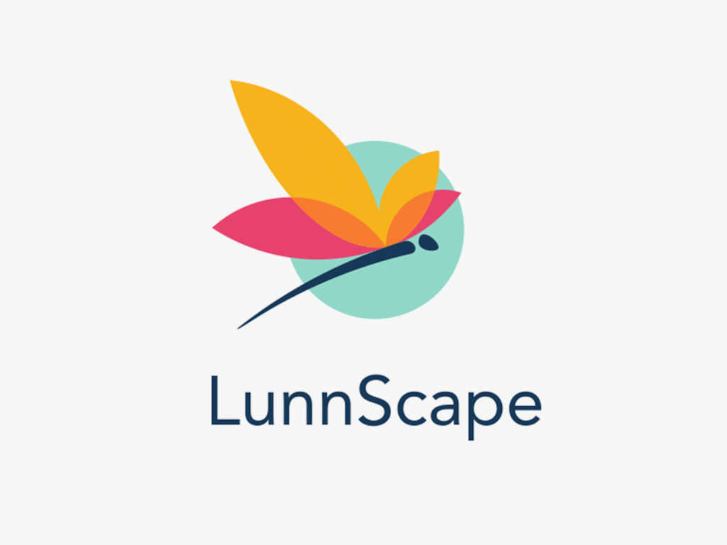
The logo was created for LunnScape company specializing in landscaping services to commercial properties like office and courtyard spaces, parks, etc. A brand sign is presented with a mascot of a dragonfly. LunnScape company is based in Florida and the creature is a perfect representative of a regional fauna. Moreover, a logo with an insect helps customers understand the nature of the services.
The dragonfly illustration has a simplified style so its wings look like flower leaves. The logo consists of several colors. Turquoise circle with a dragonfly gives a solid stamp effect and brings calming feelings. Also, the color is associated with refreshment and energy, so it creates the right mood around the brand. The wings of the dragonfly combine yellow and pink colors. Together these colors symbolize joy, warmth and a bit of sensitivity making a dragonfly look playful. The wordmark typography complements and also unveils the core brand services of the company due to the thin and elegant font.
Andre
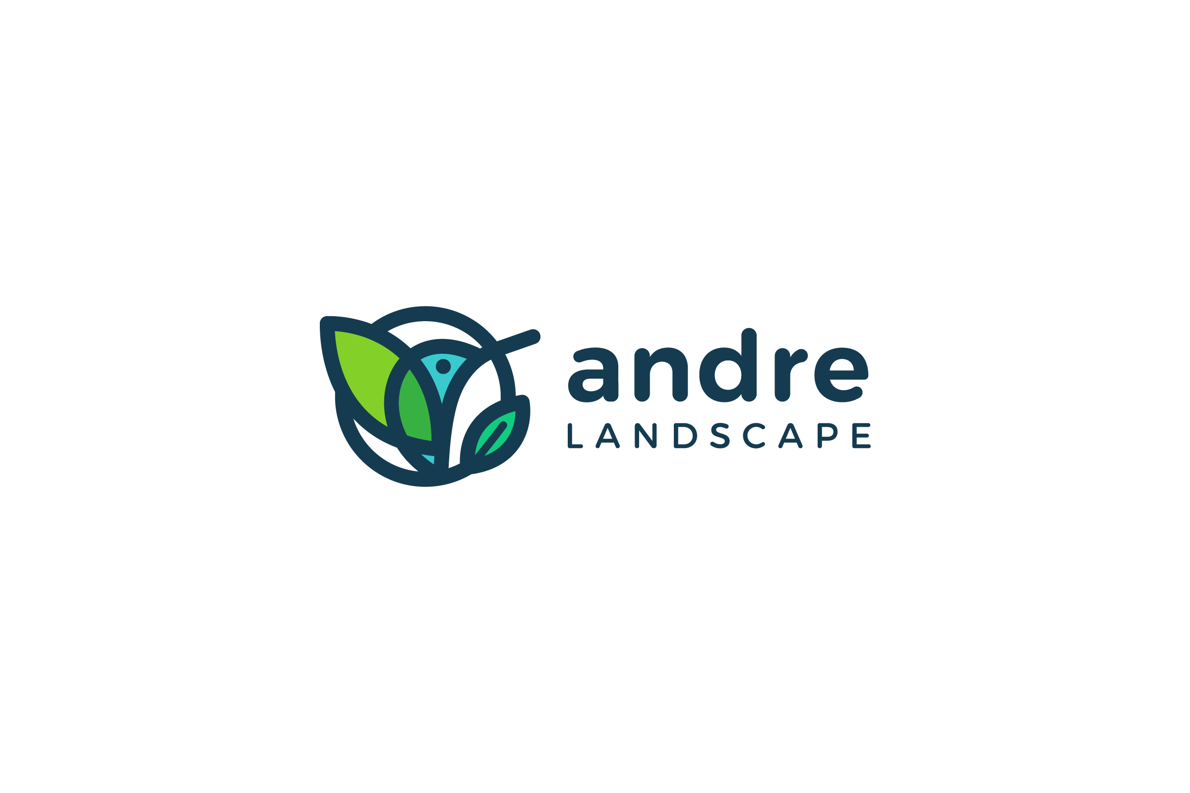
One more identity design project connected to the theme of landscape and nature was the logo for Andre Landscape. The final choice was made on the combination mark presenting the mascot in clear simple forms and elegant lettering echoing the rounded shapes. Symbol resulted in a new shape combining the visual concept of a bird and of a leaf in one image based on the circle. The rounded shape is easily associated with the universe and eternity, quite positive stuff to transfer the idea of professional land care. Color combination is also connected with the nature of the offered services with vibes of green and natural background.
Binned
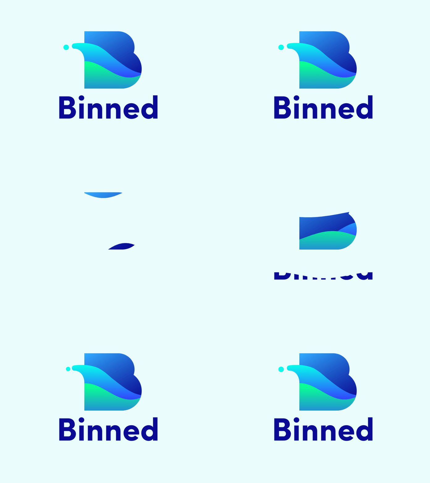
This is the brand sign for trash bin cleaning service called Binned. A logo is presented with a lettermark featuring capital B as it associates with the brand name. The lines in the letter take the shape of waves evoking a sense of water and cleanliness. The logo is followed by the wordmark of the entire brand name. The chosen font is simple yet bold which makes it look neat and reflecting the mood of a brand.
The color palette includes tints of blue and green which give string associations of cleanness and refreshment. In addition, the blue color often represents some corporate images since the blue is the color of trust. It usually shows reliability, may give users calming feelings.
Reborn
The logo presents a self-service Chinese restaurant Reborn. The major philosophy of a brand is bringing in the modern way of automated ordering food in the restaurant industry and setting the link between traditions of healthy food and innovations. To transfer all these ideas and create an effective brand image, the red silk ribbon was featured as the initial letter in the wordmark.
The ribbon creates spiral shapes that bring a feeling of creativity and innovation. Moreover, it features a slight movement showing the restaurant as a modern business that moves with times.
Red is a traditional Chinese color so a logo lets customers understand the specifics of cuisine served at the restaurant. Also, red color demonstrates the confidence and youth of the service as well as contributes to better brand awareness due to its brightness.
![]()
Motion
This is a logo concept for a modern dance studio called Motion. The company participates in multiple directions of the dancing sphere like organizing classes and workshops, events and tournaments.
The brand sign has a shape of a circle. Originally, this shape symbolizes eternity since it has no beginning or end. This way, a logo highlights the diversity of company services. Moreover, one of the common meanings for circles is motion so it perfectly reflects the brand’s name.
This logo concept provides the variety of color performance showing the flexibility of general brand strategy. The presented options include yellow, green, and blue colors. Yellow is a principal color which brings warm and playful emotions. Green and blue colors symbolize balance and harmony.
![]()
OrBeat
Another round logo was designed for OrBeat, the online platform for sharing digitized sound material like music, speech and specific sound sets on the Internet. In addition, the service has the functionality of a social network so the shape sets the association with the circle of friends. Users can create their unique playlists, leave comments, listen to the tracks online and share their sound collection with friends from other social networks.
So, setting the connection with the themes of music adding dynamics to everyday life, communication and expressing the metaphor of orbit, the logo is based on rounded shapes and features the variety of shades associated with diverse content on the platform.
![]()
Whizzly
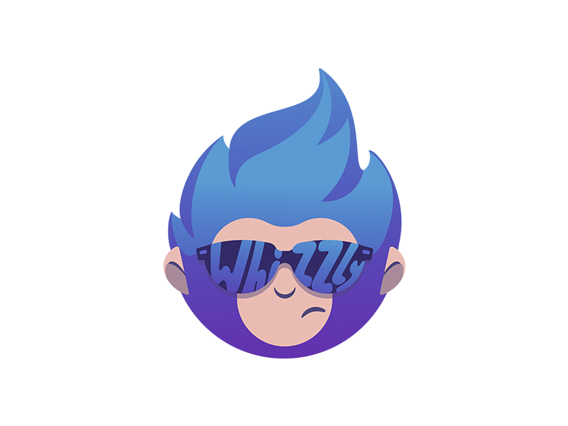
The logo is made for the social network Whizzly showcasing talents and sharing creative projects. The mascot is a monkey which looks quite pretentious because of the sunglasses. The choice of the character can be explained by the common associations connected with this animal. Monkeys are energetic funny representatives of fauna and they know how to draw attention. Rounded forms make the image dynamic and friendly.
As the brand’s target audience is talented people, the monkey displays their eccentricity. The colors include the gradient of violet and blue. They are easily associated with the lights which are often used on the stage. Also, we can see the reflection of the brand’s name in the sunglasses. It ensures better brand recognition.
fOxygenic
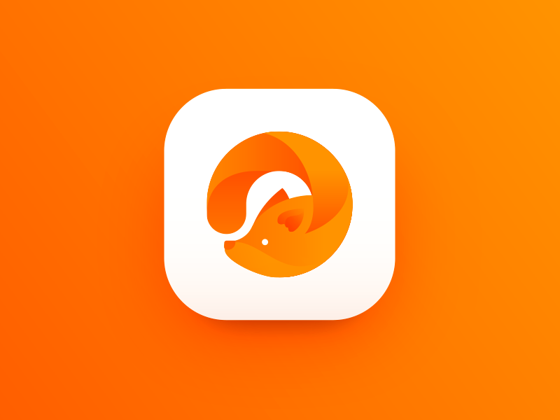
Here’s the concept applying a branding symbol for an app icon. It features a logo for fOxygenic, a mobile application that represents a social network for people loving the active life, open-air sports and events. As you see, the mascot is based on a round shape. It may set different levels of association by the resemblance with the “O” letter for the word “oxygen” applied in the brand name, motion and active life and the circle of friends as well as in the OrBeat logo. Bright warm orange color reflects not only the traditional vision of a fox coloring but also the idea of dynamic life, joy, and great mood. Moreover, the color has high visibility potential which strengthens the icon’s recognizability.
SwitchUp
This is a branding sign for a music app SwitchUp with broad functionality on generating and sharing playlists. A logo features a wordmark and the form of a play button. This shape helps to set the link with the nature of the application. In addition, the keywords behind its branding are “bright”, “dynamic”, “fun” and “positive”, the reason why the triangle is an accurate choice. The thing is that the triangle is an energetic and dynamic shape that is associated with motion and direction. The color palette supplements the brand image bringing the feeling of energy and freshness.

Meditrack
The logo concept was designed for a medical app Meditrack used by doctors for planning and organizing the flow of appointments as well as tracking and saving health data for patients. It features the stylized track sign where straight lines go up and down similar to the heart rating graph. The combination of blue, light blue and red colors is often associated with the health care industry so it creates a professional image for a brand.
![]()
The success of branding highly relates to logo design. Considering the influence of colors and shape on human psychology, you can create compelling brand signs which set the connection with the target audience by transferring accurate messages and emotions.
Recommended reading
Knock Design Into Shape. Psychology of Shapes
Color in Design: Influence on Users’ Actions
Don’t Stay Still. Why Brand Needs an Animated Logo
Psychology in Design. Principles Helping to Understand Users
6 Creative Stages of Branding Design: Step-by-Step Guide
Logo Design: Collection of Creative Logos for a Variety of Brands
If you want to know more about the creative stages of the design process for logos, welcome to read our free e-book «Logo Design»


