A story doesn’t have to start with “once upon a time” to change someone’s future.
This project started on paper and grew into pixels—a children’s book that became a scrollable, interactive web experience, voiced by kids and shared across continents. At the heart of it: Pencils of Promise and their belief in education as a universal right. A belief that stories, told with honesty and heart, can build empathy across borders. And Tubik team that took that brief seriously.
From Guatemala to Ghana to Laos, this story spanned formats, languages, time zones, and technologies. But it all started with a single idea: make something beautiful and useful enough that a child might remember it. And that an adult might be moved to share it.
And we delivered.
About the Client
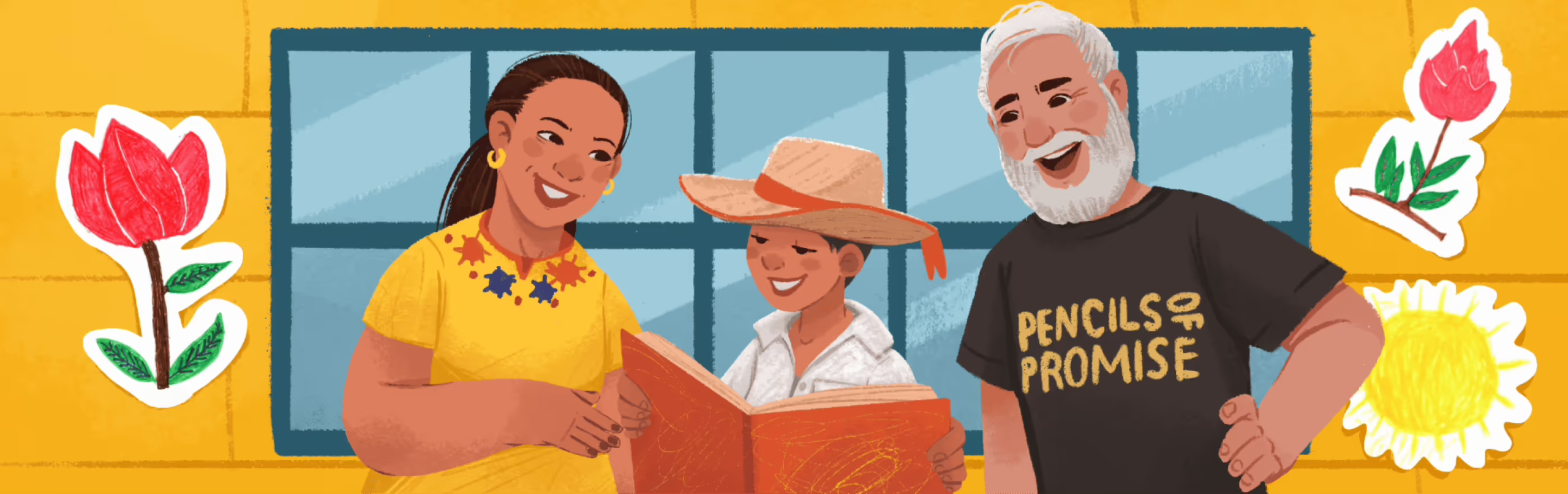
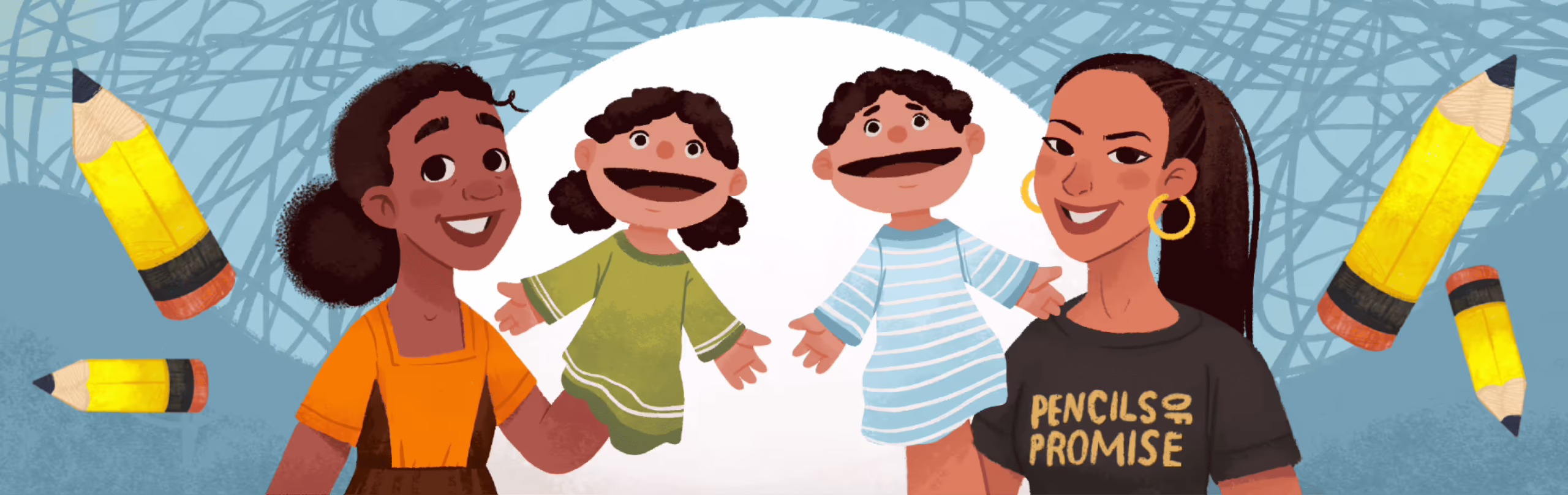
Pencils of Promise is a US-based nonprofit on a mission to expand access to education by building schools and programs across Ghana, Guatemala, and Laos. Since 2008, they have already built over 600 schools, creating access to learning for those who need it most.
But their mission, besides being about brick and mortar, is also about changing perceptions. Empowering communities. And telling stories that help the world understand why access to education matters. That’s where we came in.
The Brief
The initial ask was simple: illustrate a children’s book. Custom characters, real-world backdrops, and community-first storytelling. But by the time we were halfway through sketching the final chapters, the idea had grown—organically—into something way more expansive.
We collectively realized: a physical book has limits. What if we could bring it to more people, in more places, through screens? What if this book could be shared at events via QR codes, or read aloud at home through a web browser?
So the project grew—from print to e-book to a responsive, animated microsite. Each version informed the other. The soul stayed the same. The form adapted.
Illustration & Graphic Design
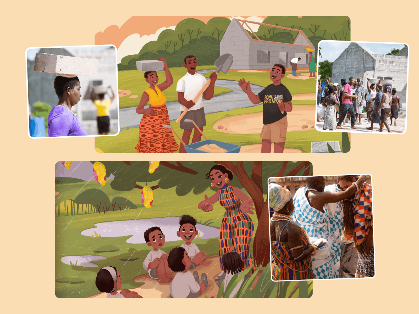
We built the visuals like we were building homes—layer by layer, with texture and intention. The character designs leaned toward classic picture-book aesthetics: warm, textural, slightly rough edges, like colored pencil on tactile paper.
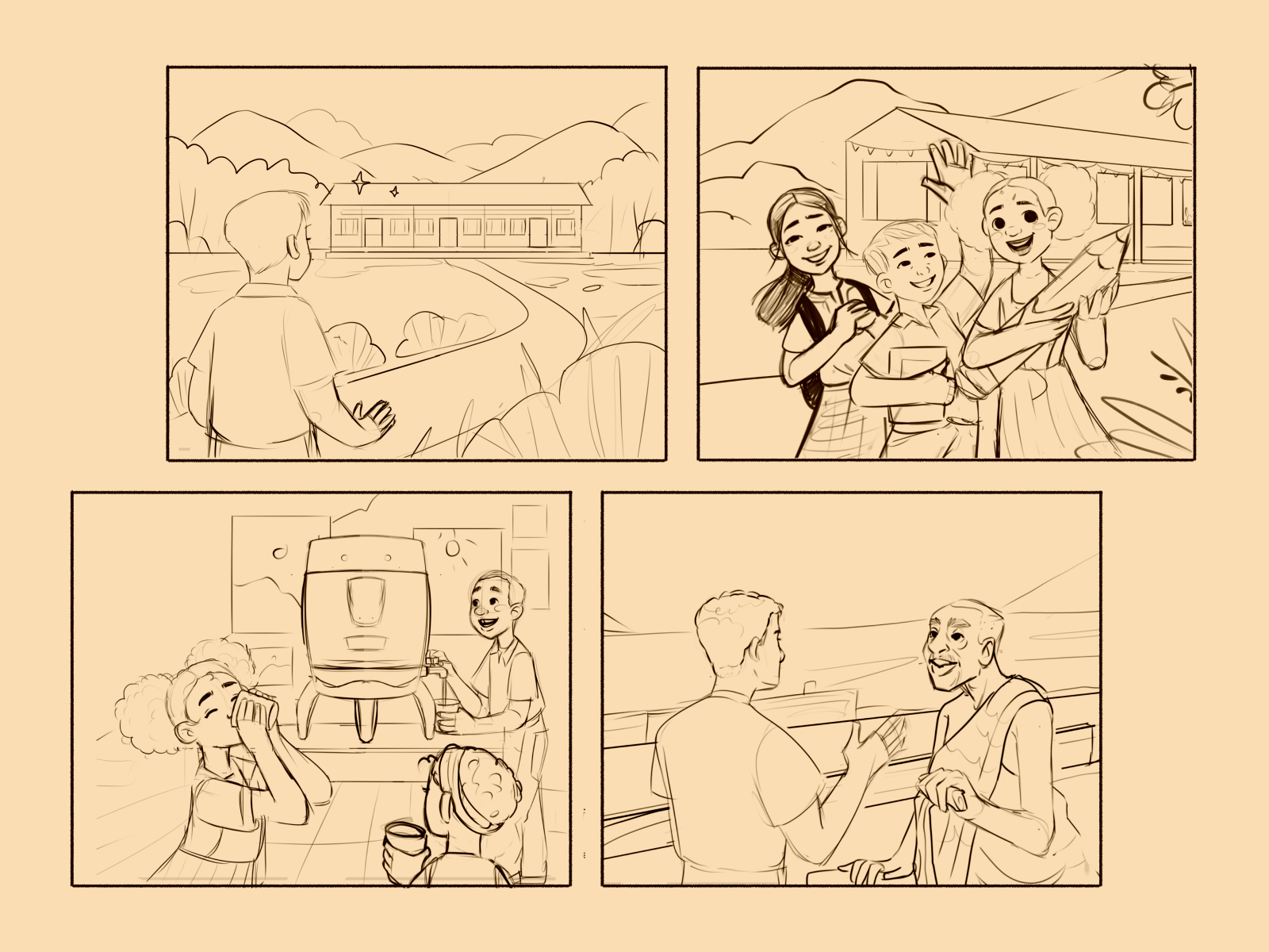
The collaboration with the PoP team was exceptionally close—they built the story with us, side by side. Real photos of field workers, notes on indigenous flowers, clothing references, down to tribal patterns. Specific characters—like Ms. Lanoy, Mr. Freeman, or village chiefs—were based on real people, with real names and stories. From school uniforms to the exact flags flying over a rooftop, everything had a reference. And every detail mattered.
This was cultural storytelling through co-creation. And we treated it with the depth and care it deserved. From day one, the illustrations were sketched with text placement in mind, leaving intentional breathing room that made storytelling seamless across formats. Roughly 80% of those early placements held till the end.
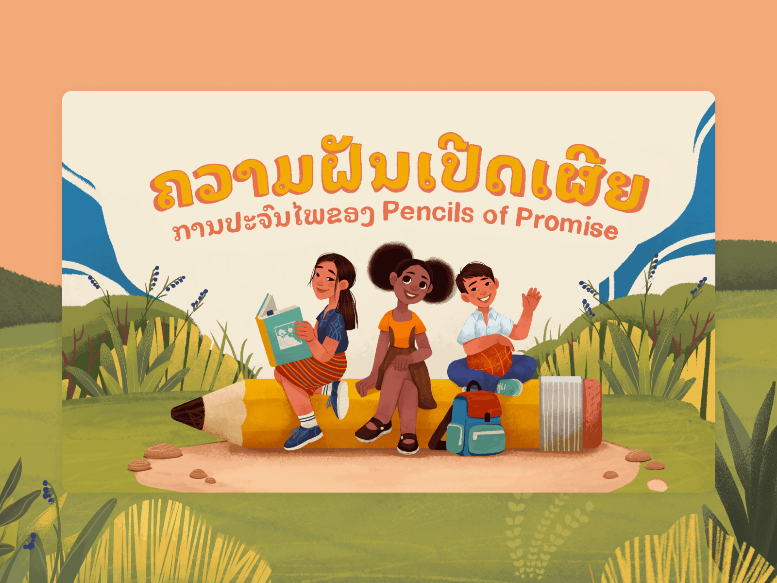
For typography, we wanted a slightly playful, handwritten feel—childlike, but legible. When it came time to localize the book into Spanish and Lao, the visual consistency held. But Lao brought new challenges: few fonts support it, so we turned to Google’s Noto family. Our illustrator, Maryna Solomennykova, also hand-drew several Lao-language elements so they would match the illustration style seamlessly.
Then came the e-book adaptation, with its own challenges. We color-corrected every page for e-ink readability, adjusting contrast for Kindle screens. Several export tools were tested, glitched, and retested. At one point, we were toggling between Amazon’s previewer and InDesign, hoping a paragraph wouldn’t disappear. After enough trial and error, the digital version finally clicked—behaving on e-ink the way it did in print: clear, tactile, and alive in a child’s hands.
Interactive Web Design
The web version was never an afterthought. It became a full reimagination. We kept the illustrations but gave them breath: leaves swayed gently in the wind, rivers shimmered, kids waved. A quiet hum of motion kept the world alive.
Interactive pop-ups were peppered throughout the experience. Tap a drum in the background, and learn about traditional Ghanaian djembe. Click a tree, and discover the Atewa Range Forest. It was a way to invite curiosity without demanding attention.
Instead of a classic vertical scroll, we built a horizontal storybook layout. This allowed for variety in pacing: some screens had oversized text with small details, others leaned into visuals with floating speech bubbles. The rhythm made reading feel less like flipping pages and more like watching a story unfold.
For readability, we adjusted the font for digital: slightly more modern, easier to scan, less “storybook” and more universal. We also added an audio version, voiced by child actors, available with a tap in the lower-left corner. It felt personal—as if the story was being told by a peer, not an adult.
And because this was a story meant to grow, we added a Gallery section, where kids could submit their own drawings, along with their name, age, and country. The platform became more than a book. It became a space to share.
What We Learned
Making something that feels “universal” is hard. It often ends up bland. But this project showed us the opposite: the more specific we got, the more it resonated. Every fabric fold, flower species, school uniform color—it all mattered. Because someone, somewhere, would see themselves in it.
The challenge was to design with heart, but without ego. To illustrate through the eyes of a child, not just for them. To let the visuals carry emotional weight, without overexplaining.
We learned that when stories are rooted in real places, they travel farther. When illustration is used with care, it creates connections. And when you mix education, empathy, and design into one system, you don’t just tell a story.
You give it a future.
After the main project, we went on to design materials for World Book Day 2024, the Annual Gala, and a Back to School campaign. We even illustrated custom coloring pages for the 2025 Gala event.
Because when a story is told well, it never really ends.
Recommended Reading
If you’re curious how illustration, branding, and digital storytelling intersect in other projects, explore more of our case studies:
Case Study: Orakle. Modern Web Design for Medical Education
Case Study: ABUK—Designing Ukraine’s Leading Audiobook Platform
EternaCloud Case Study: Calm Design for Complex Systems