
We rarely notice air—until we’re gasping for it. The same goes for good interfaces. Without breathing room, your design suffocates. Negative space in design isn’t an afterthought or filler—it’s the invisible architecture that holds everything together.
It’s the pause that lets the punchline land. The silence that makes the drop hit harder. In this guide, we’ll break down the real power of negative space—not as decoration, but as a precision tool. From typography spacing design to full-blown UI design negative space decisions, here’s how you use it to make your work smarter, sharper, and more intentional.
What Is Negative Space in Design?
Let’s get one thing straight: negative space (also known as white space) isn’t “the empty part.” It’s not the leftover. It’s the space you don’t fill—on purpose.
It lives between your headlines, inside your letterforms, and around every button, margin, and paragraph. It’s not passive. It’s doing work.
As Mads Soegaard from Interaction Design Foundation puts it, “White space is like a canvas: it’s the background that holds the elements together in a design, enabling them to stand out.” That’s not a metaphor—it’s literal. Without negative space, you don’t have a layout. You have a cluttered panic attack.
And no, white space doesn’t have to be white. It can be black. Beige. A full-bleed image. A chaotic gradient, even. What matters is intentional absence, not color.
Why Negative Space Matters in UI/UX Design
Imagine walking into a room crammed with signs, banners, blinking lights. That’s your interface without white space. Every element screams. Nothing lands.
Visual hierarchy white space is the difference between a scannable page and a cognitive traffic jam. It lets your brain sort things fast: “This is the headline. That’s the CTA. Here’s the navigation.” Done. No friction.
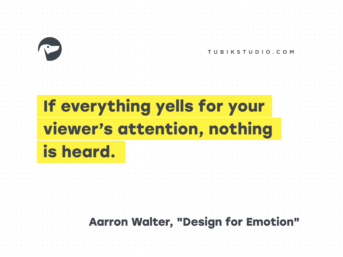
Aarron Walter said it best: “If everything yells for your viewer’s attention, nothing is heard.” Negative space helps you shut up strategically.
Engagement, Tone, and Flow
UI design negative space does more than organize—it tells a story without words. Is this app calm and focused? Or loud and data-heavy? The space answers before the content does.
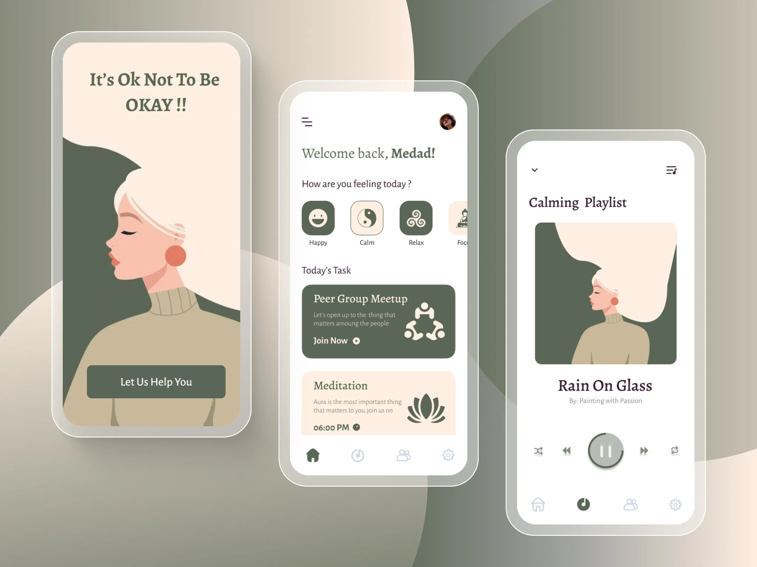
Look at this wellness brand app: floaty layouts, generous padding.
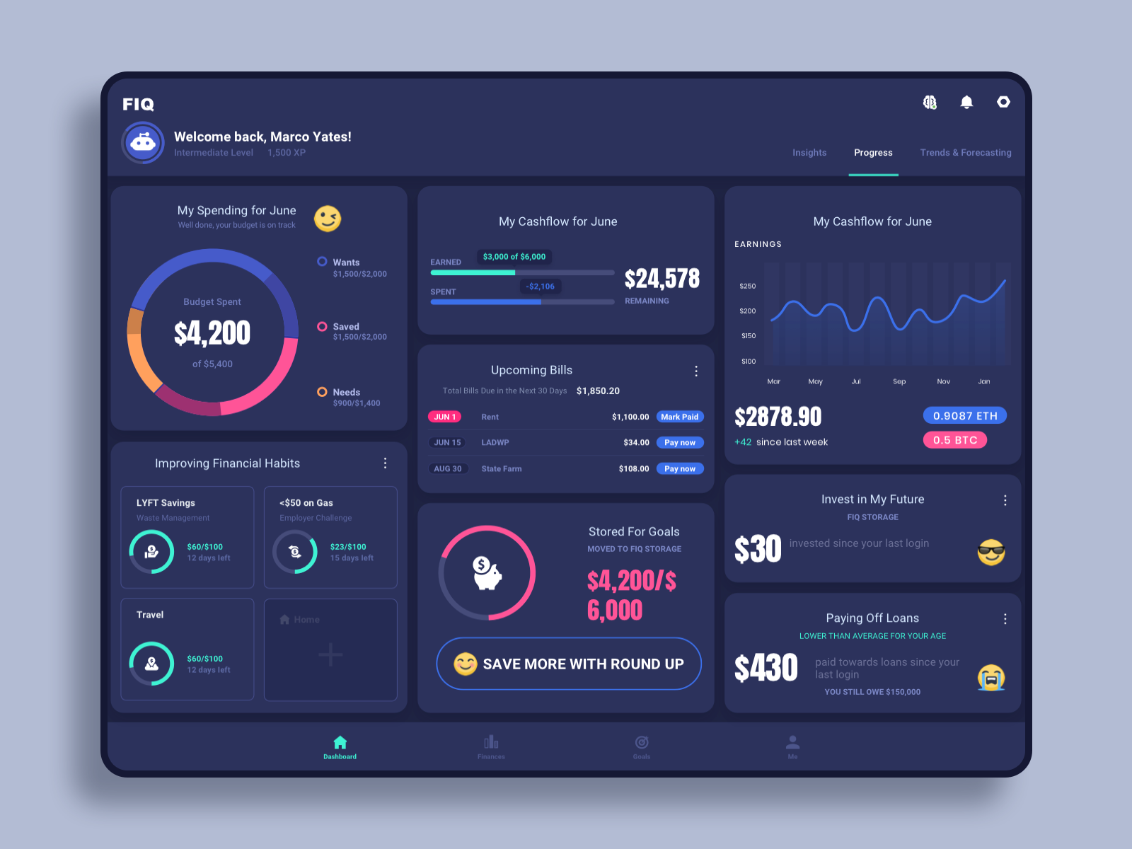
Now peek at this finance dashboard: dense, tight, electric.
Neither is wrong. But they mean different things. That’s design fluency.
Types of Negative Space in Design
To master white space, you need to know what kind of space you’re even working with. Not all gaps are created equal.
Negative Space vs Positive Space
Positive space is your content—the headline, the product shot, the checkout button. Negative space is everything else. The margin. The void. The quiet framing that makes the content click.
Negative Space vs White Space
Same concept, different vocab. “White space” is print-world lingo. “Negative space” comes from photography. Feel free to use whichever sounds smarter in the meeting. Just don’t pretend they’re different.
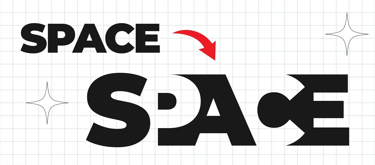
Micro vs Macro Negative Space
- Macro negative space = Big-picture spacing. Think: section dividers, margins, hero image padding.
- Micro negative space = The tiny stuff. Letter-spacing. Line height. Padding inside buttons.
Your typography spacing design lives or dies by micro negative space. Bad kerning = instant amateur hour.
Active vs Passive Negative Space
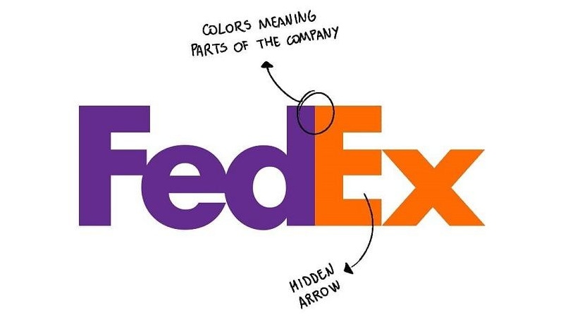
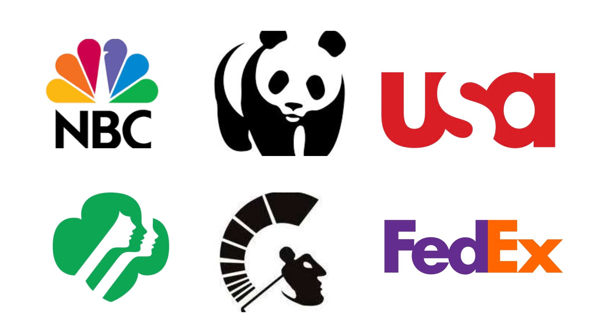
- Active negative space is intentional. Like the arrow in the FedEx logo or the gap that draws your eye to a call-to-action.
- Passive negative space just kind of… happens. Maybe your grid left a nice gap. Cool. It’s still doing a job, even if you didn’t plan it.
How to Use Negative Space Effectively
Less talk, more pixels. Here’s how to actually apply negative space best practices like a pro.
Typography and Layout
Typography is where negative space in design either sings or stumbles. Line height, letter spacing, paragraph gaps—this is your rhythm section. Tighten it too much, and it chokes. Loosen it too much, and it floats away.
Give CTAs room to breathe. Don’t be stingy with button padding. Big fingers + small tap areas = bad UX karma.
Balance & Flow
Good layouts don’t just “look nice.” They move. Like music. Use space to build pacing, tension, release. A wide margin isn’t wasted space—it’s an inhale before the exhale.
Also: asymmetry? Still legal. Sometimes your layout needs an awkward blank corner to feel balanced. If it looks too clean, mess it up. Controlled chaos > sterile symmetry.
Layout Tricks That Work
- Boost space around hero text or product shots. Let them own the screen.
- Give illustrations room to shine—don’t sandwich them between ads.
- Navigation bars? Don’t box them in. Let negative space define boundaries naturally.
This is how you build interfaces that feel premium. Quiet confidence beats busy bragging.
Examples of Negative Space in Design
Web Interfaces
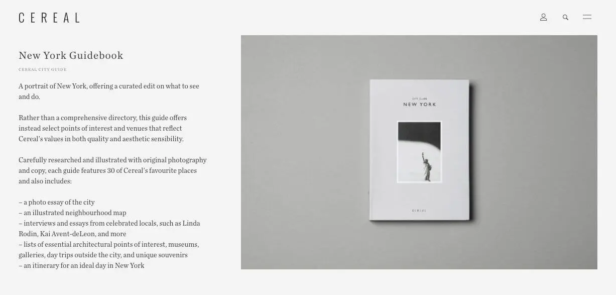
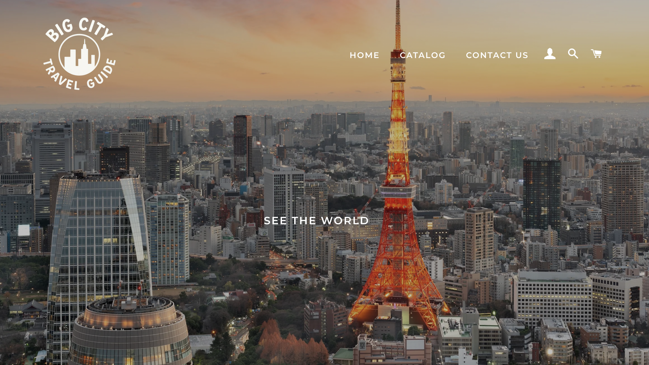
This Big City Guide landing page nails it: a fullscreen photo as both content and background. The image creates negative space that makes the central text pop—no outline, no shadow, no tricks.
Logos & Branding
You already know this one: the FedEx arrow. Hidden in plain sight. A textbook negative space example in design.
Brand guidelines also enforce padding zones around logos. That’s not a “nice to have.” It’s a visibility requirement. Without it, your logo dies in a sea of noise.
Common Mistakes with Negative Space
Underthinking (or Overthinking) It
Underused? Your layout looks like a Craigslist ad from 2006. Overused? Your homepage feels like an accidental Zen garden. You need a why for every gap.
If the space doesn’t serve structure, tone, or clarity—cut it. If a box feels crowded, loosen it.
Trying to “Fill” Everything
Clients will always ask: “Can we fit more in?” The answer is no. You’re not packing a suitcase. You’re designing a flow.
Sometimes, more space = more value. It signals confidence, calm, and control. The product feels better—even if the content didn’t change.
Summary: What Designers Really Need to Know
Here’s your cheat sheet for using negative space in design like a pro:
- It’s not emptiness. It’s intention.
- It’s what creates flow, rhythm, and clarity.
- There’s micro and macro space, active and passive.
- Good spacing makes typography readable, layouts intuitive, and brands memorable.
- It’s the design version of “saying more by showing less.”
The best designers don’t fill the canvas. They shape the air around the content. That’s where the magic is.
Recommended Reading
Want to dig deeper into all things design, UX, and structure? Check out these related posts:
Visual Dividers in User Interfaces: Types and Design Tips
Web Design: 16 Basic Types of Web Pages
Directional Cues in User Interfaces
How to Make User Interface Readable
Basic Types of Buttons in User Interfaces

