People say the world is a book and those who do not travel read only one page. It’s hard to argue since traveling is always a chance to learn new things, meet new people, and do something absolutely extraordinary. What’s more, a nice trip can become a source of life energy and inspiration. Today, travelers have more opportunities than ever before and the World Wide Web plays a significant role here. The Internet provides loads of information about various countries and their cultures helping travelers decide where to wend their way.
Tubik designer Tania Bashkatova loves traveling as much as design, so she often combines these passions to create sophisticated concepts devoted to travelings and nature. Today we present the case study on the design concept of the website for travelers called the Big City Guide.

Task
UI/UX design for onboarding landing page presenting a website about big cities all over the world.
Process
The Big City Guide (BCG) is one of the first works made in terms of Tubik UI Fridays. Those following Tubik team on Dribbble already know about our new tradition which is the set of creative sessions when the designers have a day to work on the design concepts out of current projects. The concepts are created within a particular general idea of a digital product but with all the passion and freedom for the designers’ artistic souls.
During one of these creative sessions, the task was given to design the landing page for the online resource providing information about big cities around the world. Typically for the design of landing pages, the designer decided to apply the expressive and informative potential of the background images. The objective set for the visual design was to convey the mood and the atmosphere via one photo for each city. The solution found for this aim was the animated widget with horizontal scrolling presenting three big cities in order to create an efficient visual perception of the information for the target readers. The three different capital cities were chosen to show how dissimilar styles can be united in one design.
The first page of the BCG concept presents Berlin. The city is filled with various sights so it was a difficult choice to make. The designer tested many pictures to find the one which would bring the right mood of the city. In the end, there were two variants.
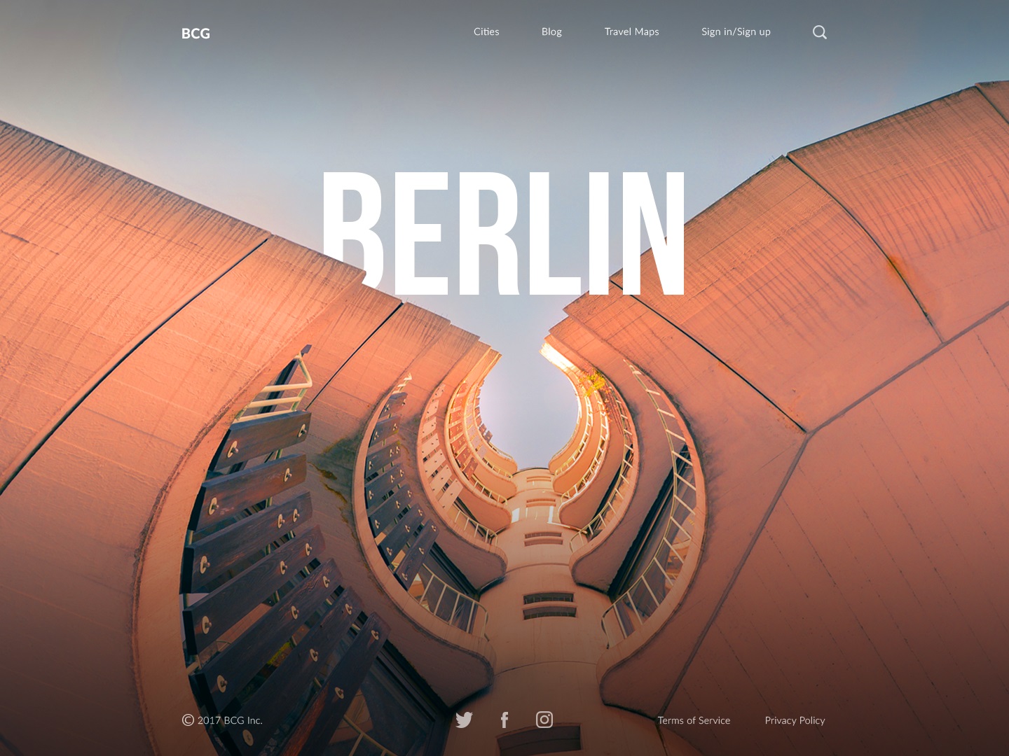
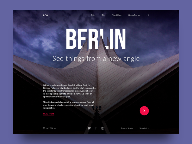
Both pictures make an effective design but the second conveys the atmosphere of solid and futuristic Berlin better so the designer favored it. The name of the city becomes the center of the composition, bold and quickly readable in strong uppercase letters. The word sets the high perspective of the famous tower. The letters are arranged among the spires in the way which gives the feeling they always were there.
The second featured city is Madrid. It is often thought that the Spanish capital city fully consists of medieval buildings but that’s not exactly true. Today Madrid is one of the modern European business centers, so the designer decided to present the modern side of the city. Here is one of the examples made while searching for the best fitting picture.
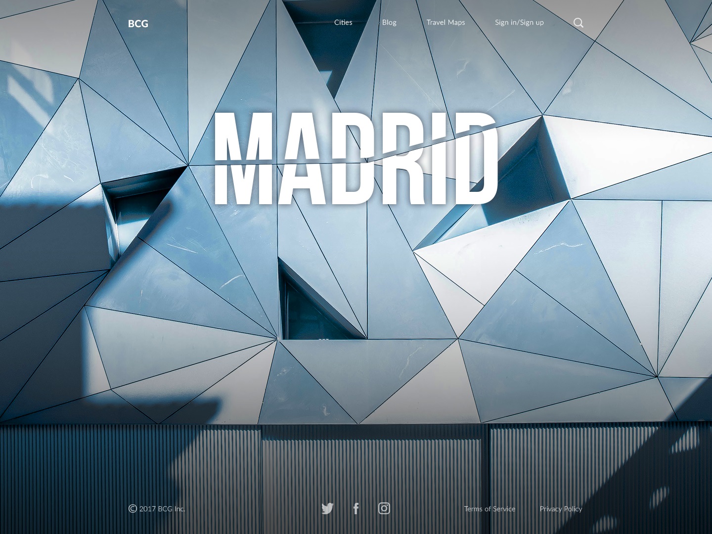
Yet the priority has been given to the bridge in a contemporary style. Keeping the consistent scheme with the previous page, the center of the composition remains the name of the city. The word shows a deep perspective with the modern construction echoing the form of the swirl or vortex. The subheading presents the motivating line that gives the mood of the energetic and bright city. Here is the final result.
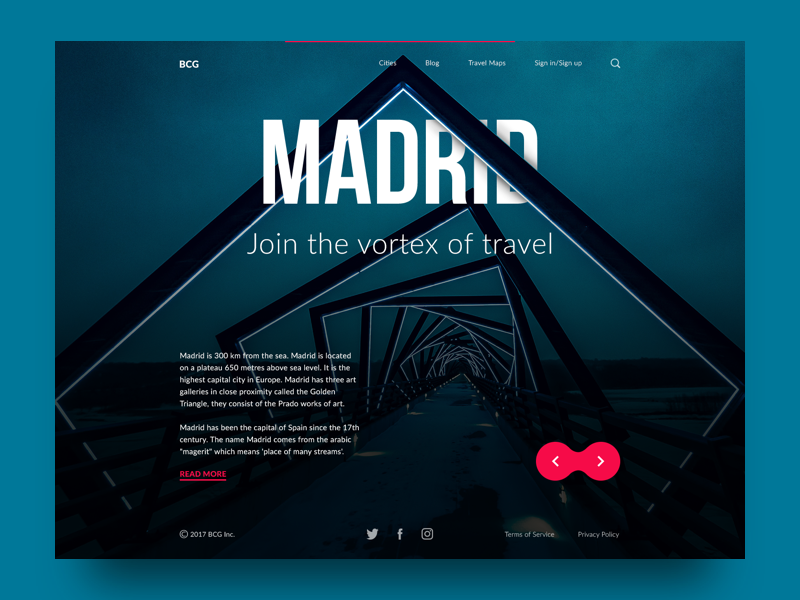
Every new day brings new knowledge. Searching for the perfect background photo the designer missed the fact that there is not only Madrid in Spain but also another one in Iowa, USA. The Internet played a joke with the designer mixing photos of two Madrids, so it’s impossible to distinguish them for those who haven’t visited all the corners of these places. Well, that’s good to take lessons from the errors, and this case gave us all the chance to learn something new.
The last city featured was Stockholm. It is full of magnificent ancient buildings and modern-styled places, so the designer experimented with various photos of the city places. Here is the example with the picture of the underground in Stockholm which presents the part of the creative search for the visual concept.
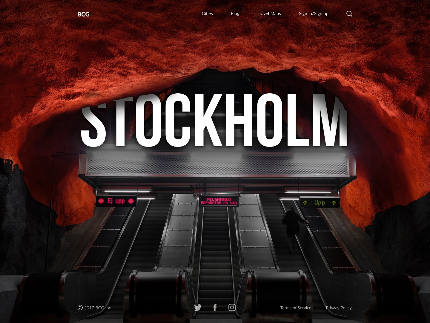
However, all the urban photos couldn’t convey the unique atmosphere of Stockholm. That’s why the designer comes from the other side. Stockholm is one of the biggest Scandinavian cities, so nothing can deliver the Nordic vibes better than its nature.
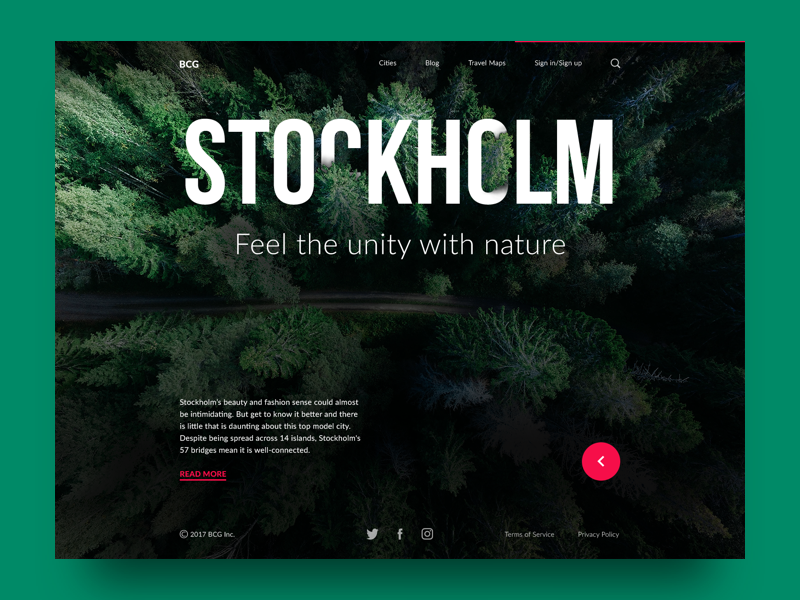
This is the final variant of the Stockholm page. The content elements on the page are placed similarly to the previous with the name of the city in the center. The word is harmonically inscribed into the thematic picture with deep and magnificent Nordic forest. The subheading presents the motivating line whose message naturally combines with the image and the associations set by the city.
The onboarding landing page applies simple structure recognizable for users. The left part of the header features a clickable logo BCG taking users to the home page. The header menu allows people to see the full list of cities, go to the blog or learn the maps. Also, the service provides the registration feature. The search icon completes the header.
The vital part of any city guide is the description copy. Since the pages are focused on the name of the city, a short copy is placed at the left bottom part of the page. CTA button under the text provides users with an opportunity to read more if they are interested in detailed information. The users can also find social network links easily in the footer.
The final stage of work on the landing page was the animation of the presented layouts, accomplished by motion designer Kirill Erokhin.
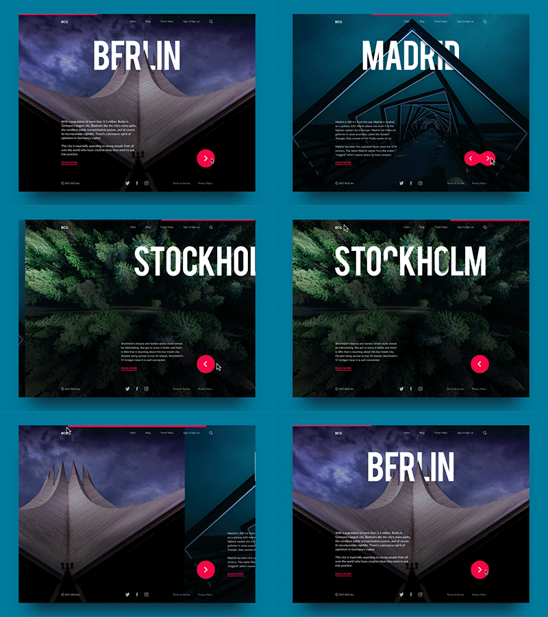
The static variants of pages have different colors of the background, but in the final animated version, all pages are united with one color. Smooth animation adds the dynamic nature of traveling and supports the feeling of consistent interaction. Navigation through the pages can be accomplished in two ways: via the navigation button and with the help of a progress bar placed on the top of the page. They both use the same contrast color to keep the visual consistency and make all the ways of navigation clear.
As we can see, despite the fact that all cities differ by style and energy they bring, the designer managed to keep them in a single tone creating the feeling of website unity. Moreover, such a construction of the landing page makes it flexible for further alterations, for example, adding more pages of the cities that are particularly popular with readers of the website.
Tubik UI Fridays go on for more concepts and case studies we will share with you soon. So, follow our blog and Dribbble not to miss the updates.
Useful Case Studies
If you are interested to see more practical case studies with creative flows for UI and UX design, here is the set of them from Tubik.
Slumber. Mobile UI Design for Healthy Sleeping
Letter Bounce. UI Design for Mobile Game
Real Racing. UX and UI Design for Mobile Game
Real Racing. Graphic Design for Mobile Game
Manuva. UI/UX Design for Gym Fitness App
Cuteen. UI/UX Design for Mobile Photo Editor
Tasty Burger.UI Design for Food Ordering App
Watering Tracker. UI Design for Home Needs
Night in Berlin. UI for Event App


