“Design is the silent ambassador of your brand” Paul Rand once mentioned. Our today’s case study unveils the story right about that: let us show you the stages of branding design for a small family-run winery. The graphic designer for the project was Serafima Shpin, and in the article, you will see the different stages of creating a visual brand, from the idea search to logo, packaging, printed stuff, and website.
Brand Positioning
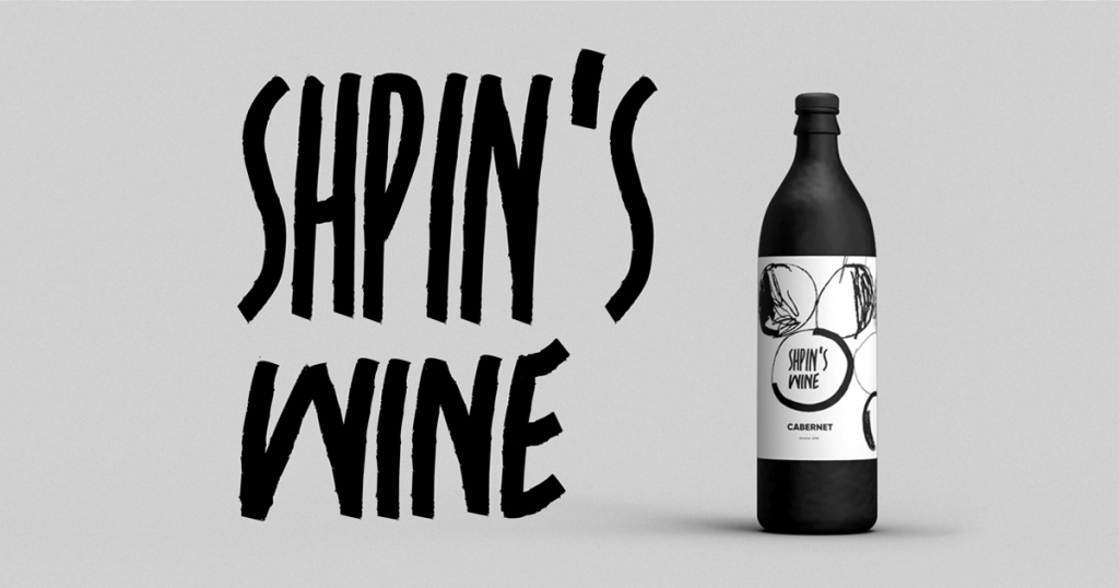
Shpin’s Wine is a brand that originates in a small winery, where the love of wine has grown into a family business. This activity involves the whole family in the process of creating a unique and exclusive wine. It is based on the tradition of classic winemaking. The concept of the brand is based on the idea of a family as a core: everything and everybody is interconnected in it; it is a single entity in which all elements complement and emphasize each other.
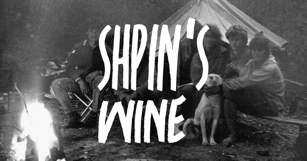
Shpin’s moves away from the standard perception of wine to originality: it catches the eye with its uncommon appearance details, from the authentic shape of the bottle to the label, also maintaining the classic taste of good-quality wine. It defines its customer as an intelligent, cultured, and progressive individual.
Idea Search
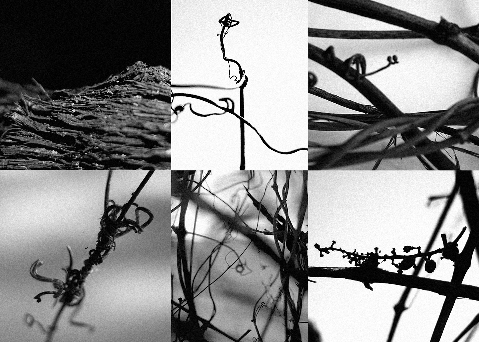
Grapes plant characterizes and highlights the entire visual design for the brand.
The solution is based on the structure of the vine, with all its features and unique multi-faceted forms: flexible twisting vines with their rough texture, twisted and whimsical tendrils, free and lush growth.
Logo
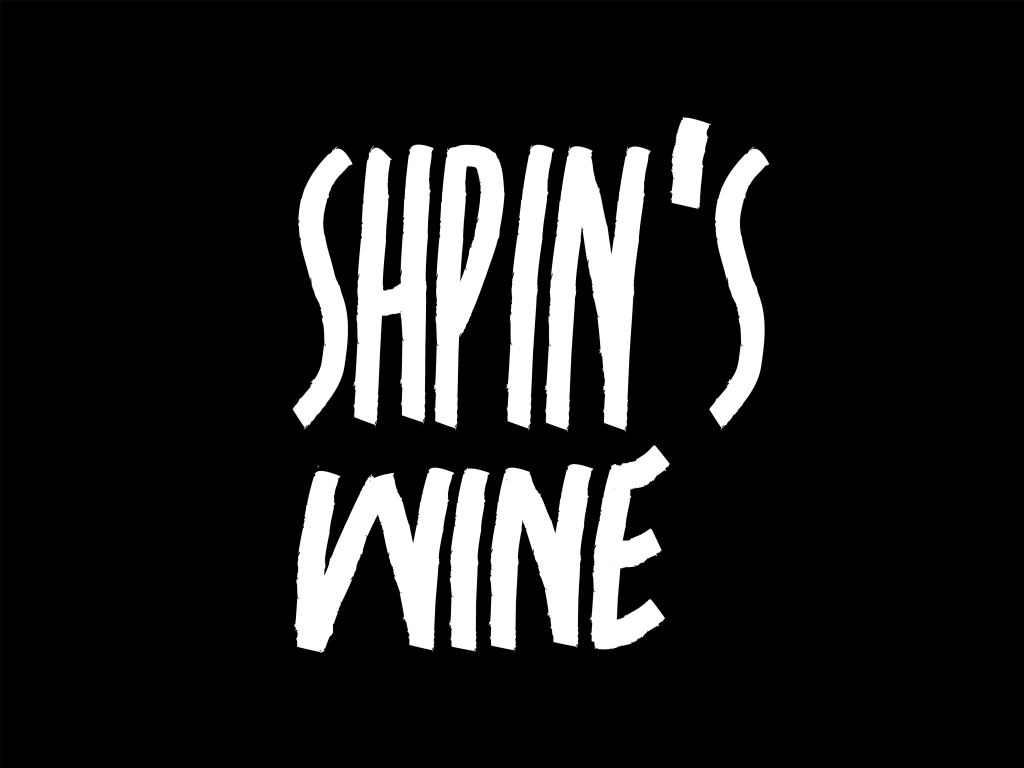
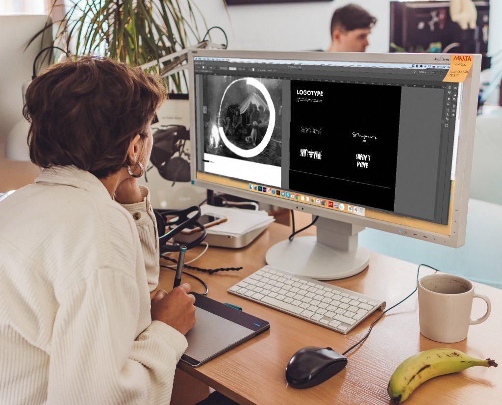
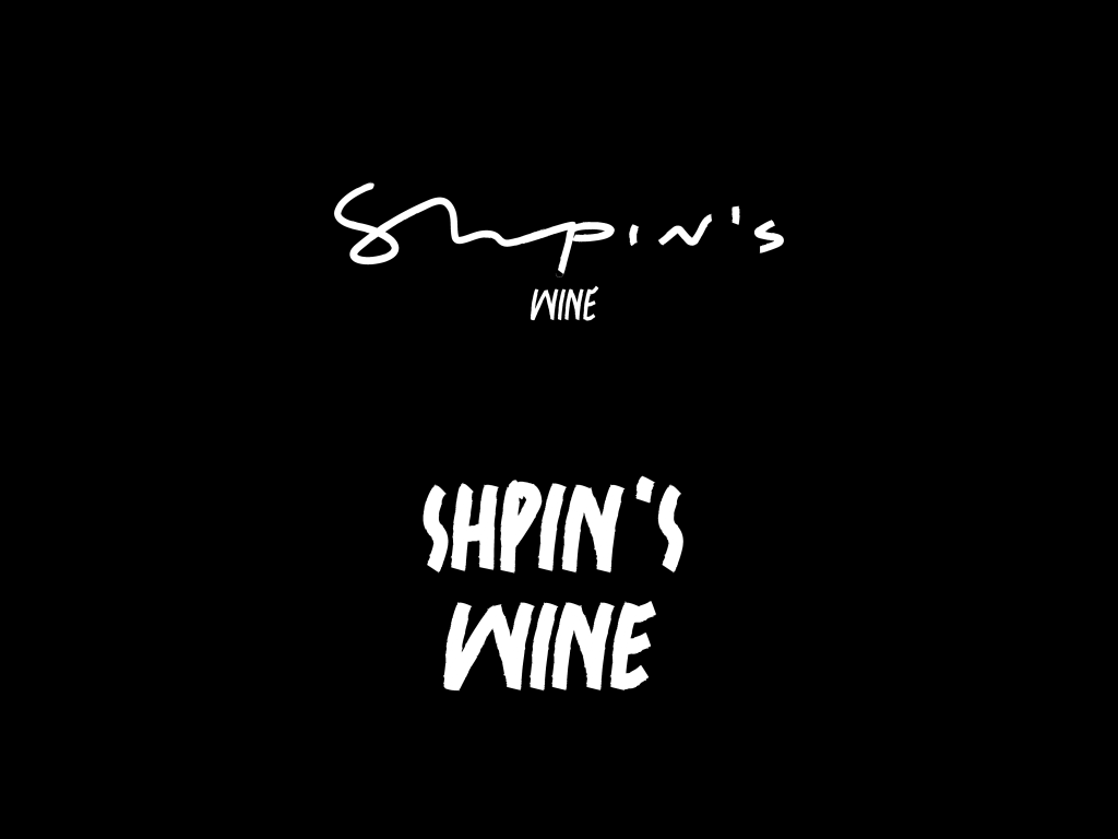
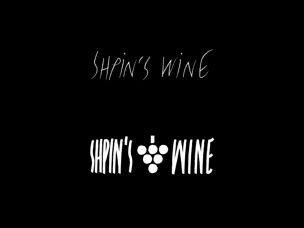
The authenticity of the vine set the main view of the logo, repeating its roughness and durable, stable old trunk.
Typeface
Gilroy was taken as an additional font. In the general dynamics of the label style, it stands out due to the static and stable form. This contrast helps to navigate the information parts of the label quickly and makes its reading easier.
Illustrations
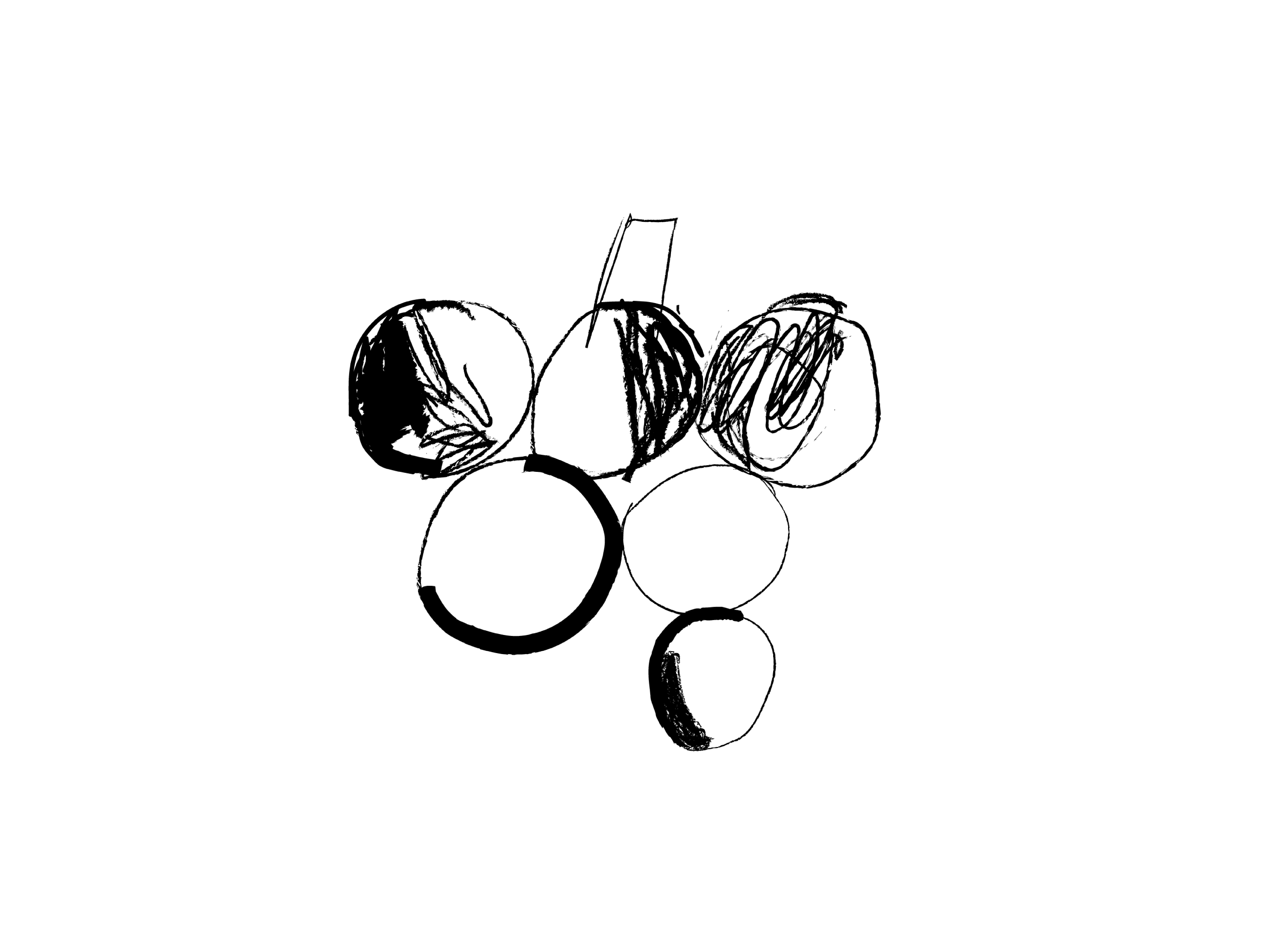
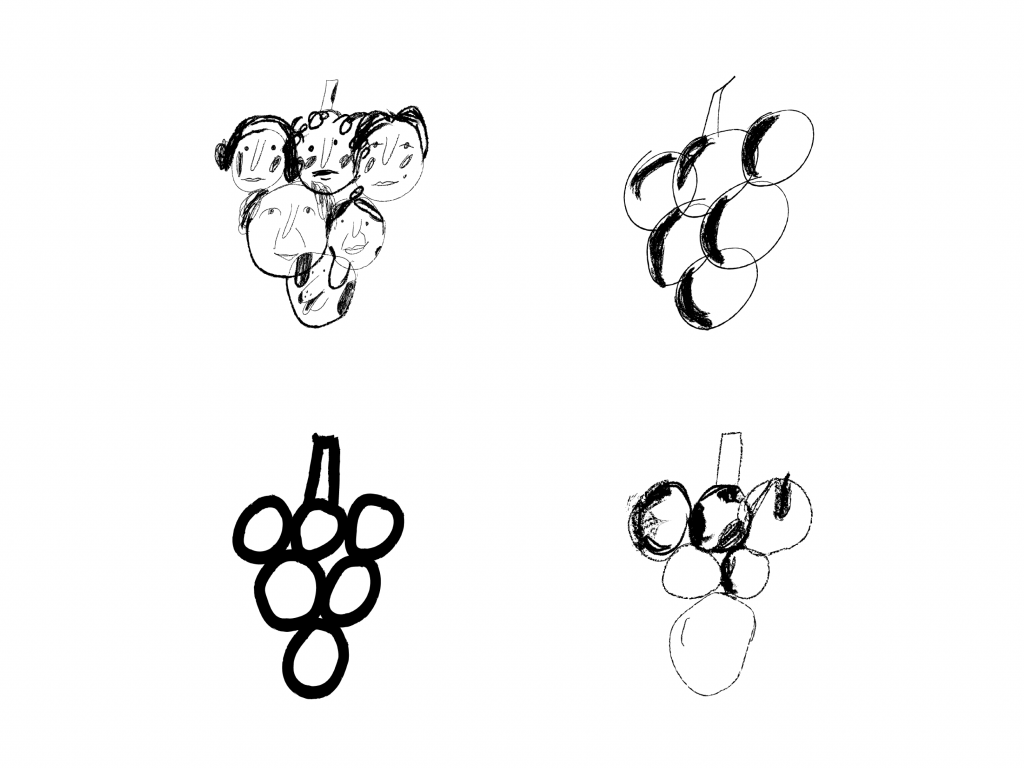
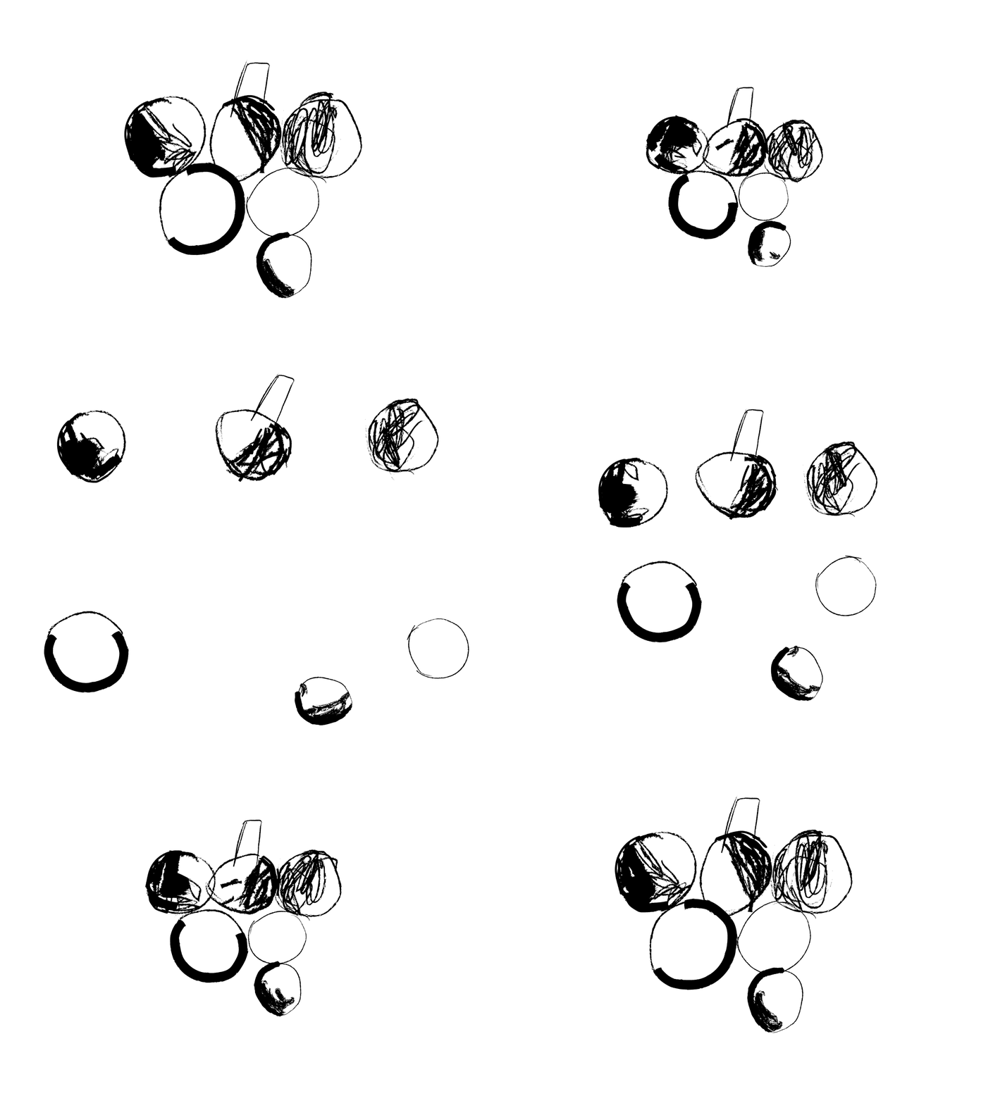
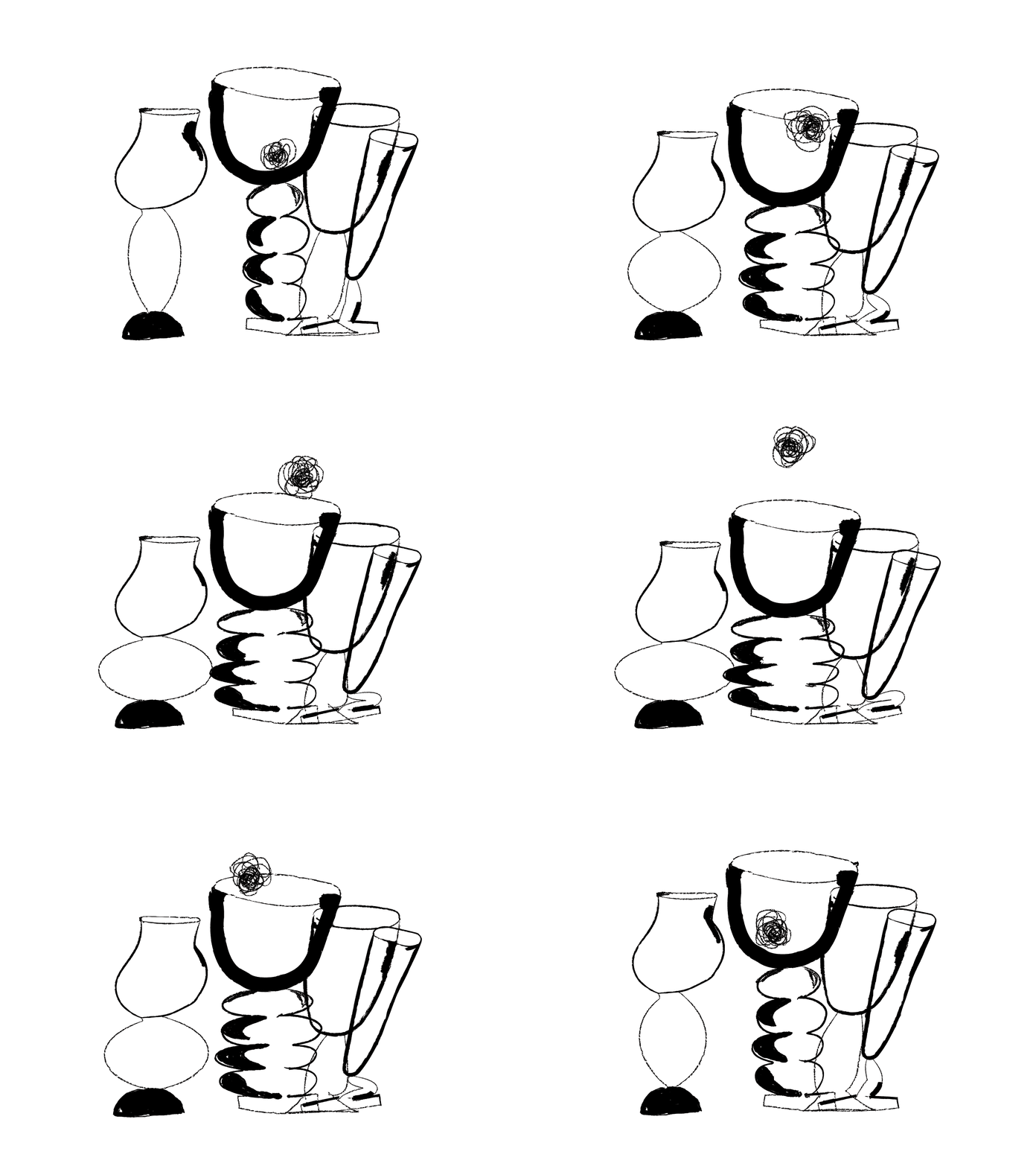
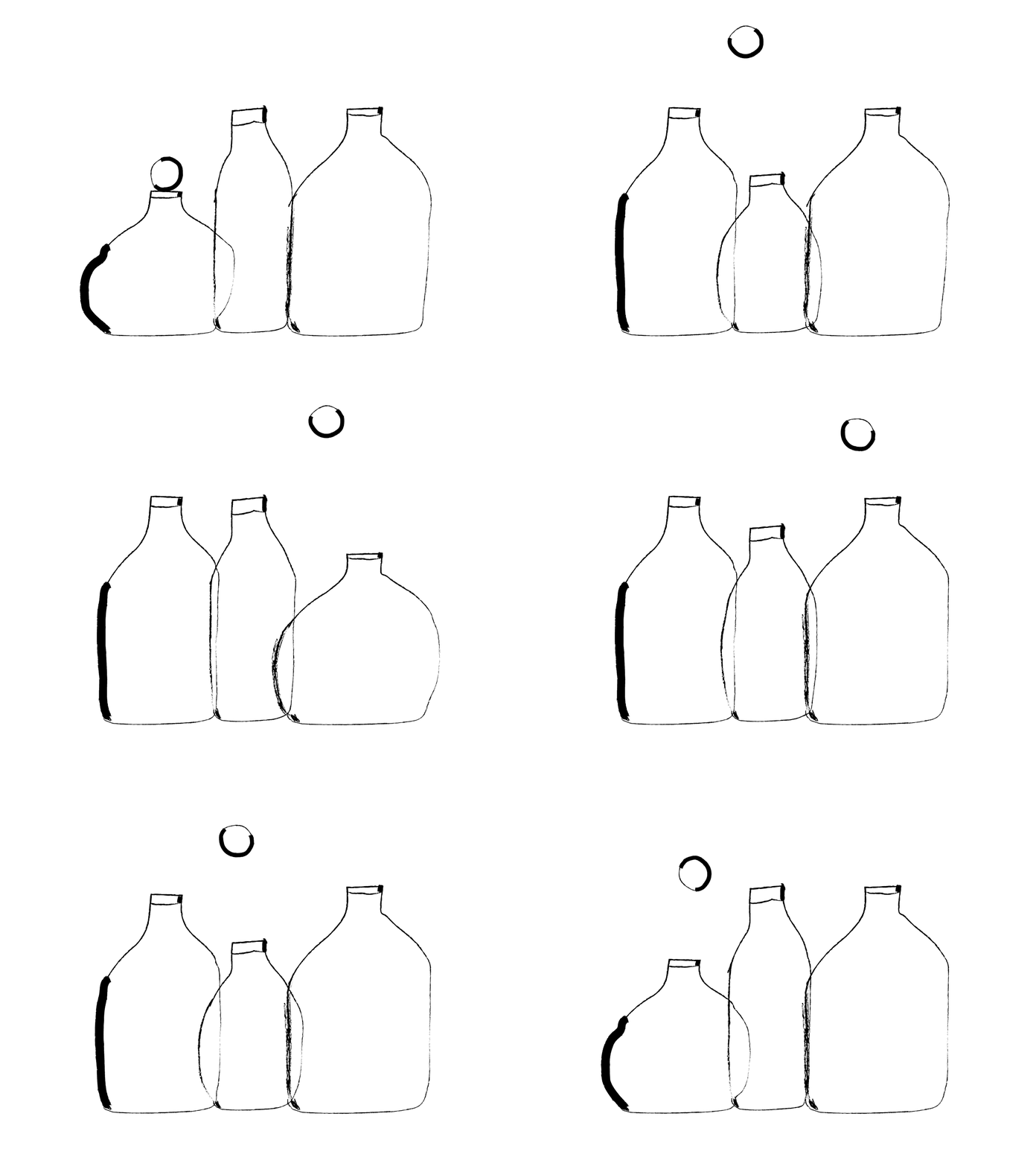
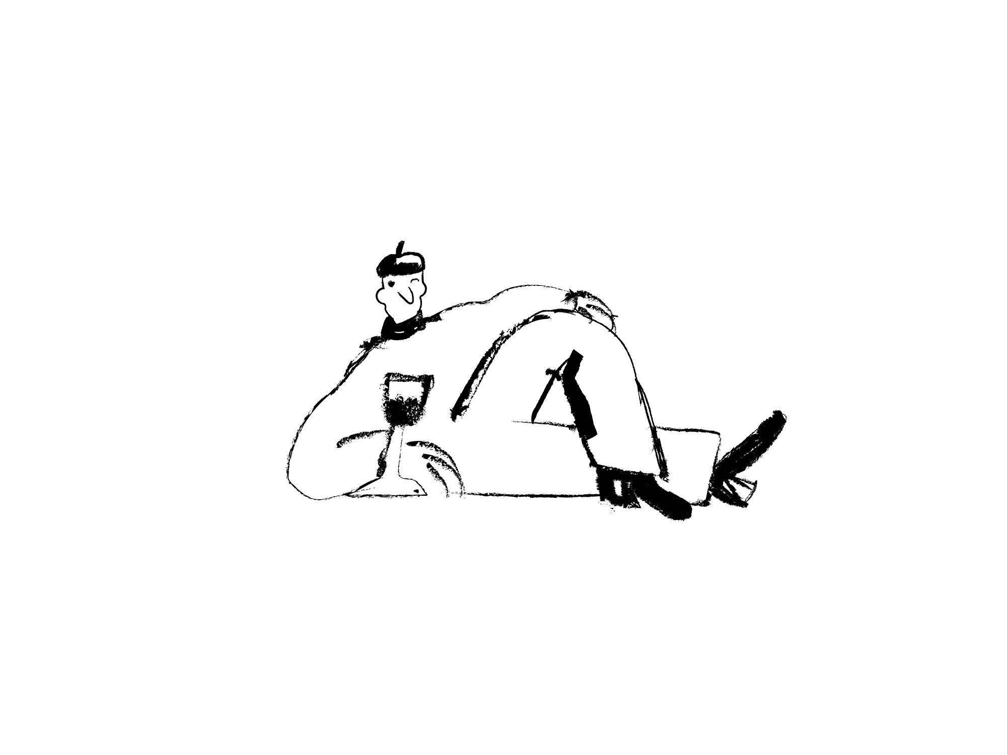
The illustrations reflect the freedom and originality of the exuberant tendrils, which defy the general characteristics or order having a new shape and appearance each time. For the main illustrations, three key objects traditionally associated with wine were chosen: grapes, glasses, and bottles.
Packaging
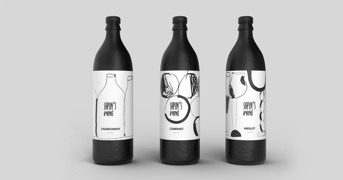
Bottles are designed based on the contrast of the dark bottle and white minimalist label featuring brand illustrations and clear readable information about the product.
Printed Stuff
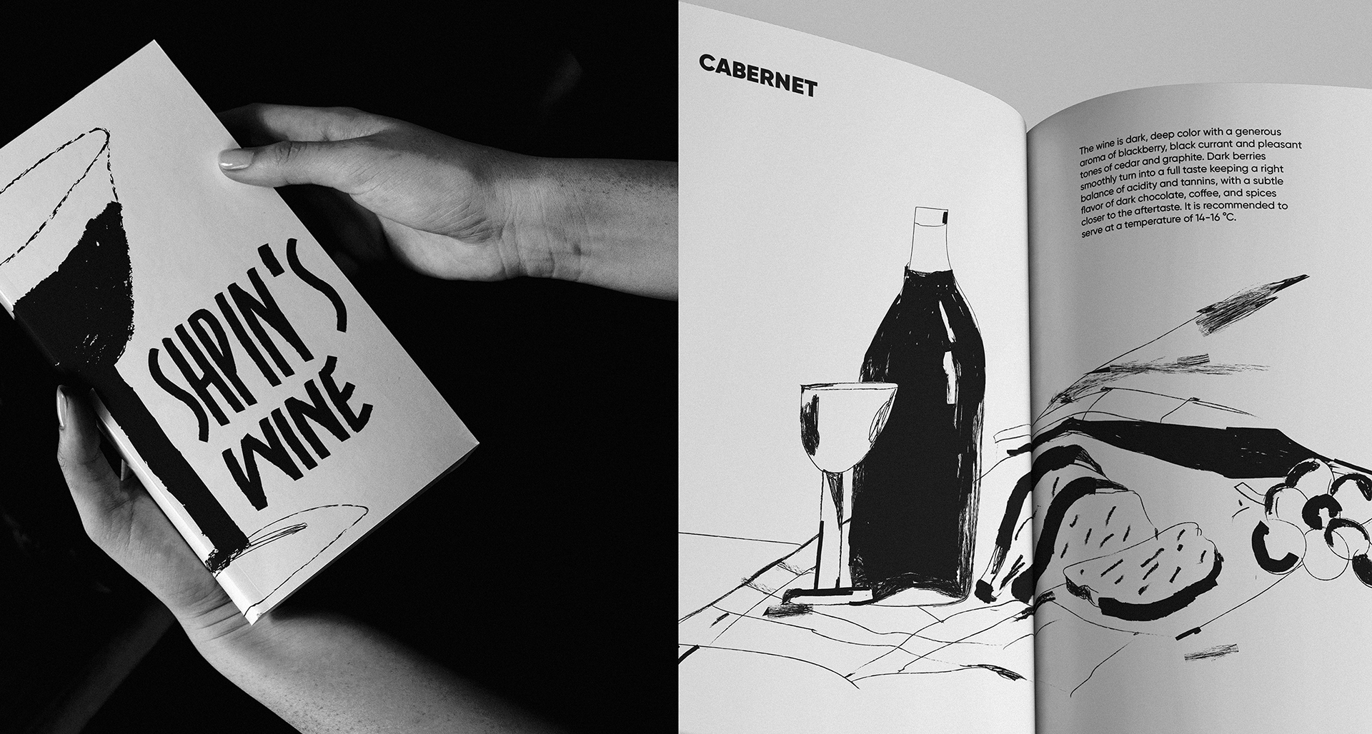
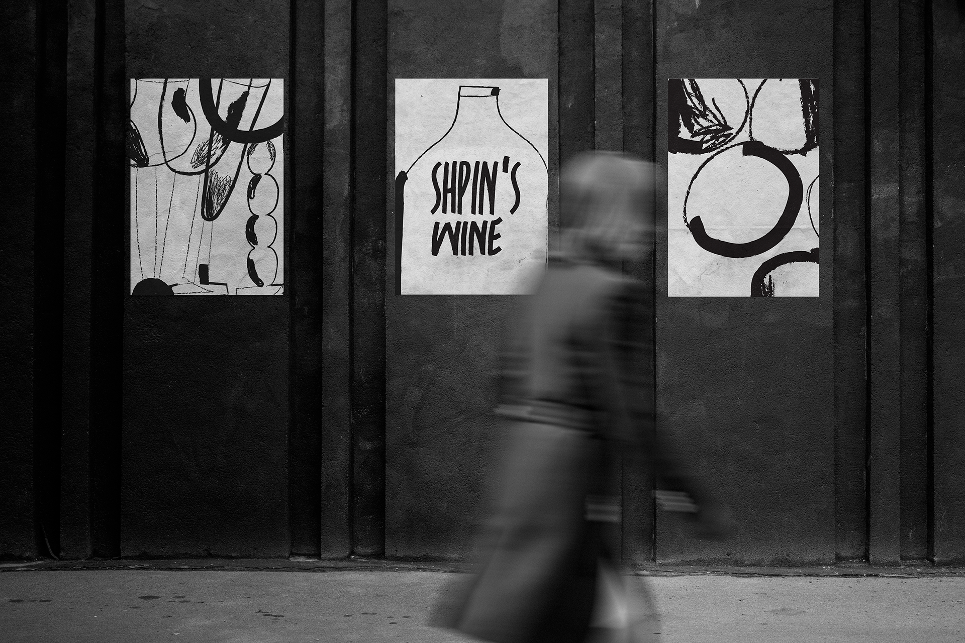
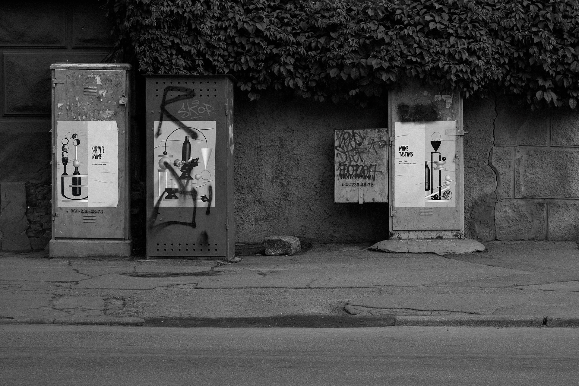
All design elements are complementary and at the same time flexible to integration into the different types of visual language: brochures, posters, and website interface.
Web Design
Working on web design based on design stylistics approved for the brand identity, the studio UI/UX designer Sergey Kucherenko offered two options.
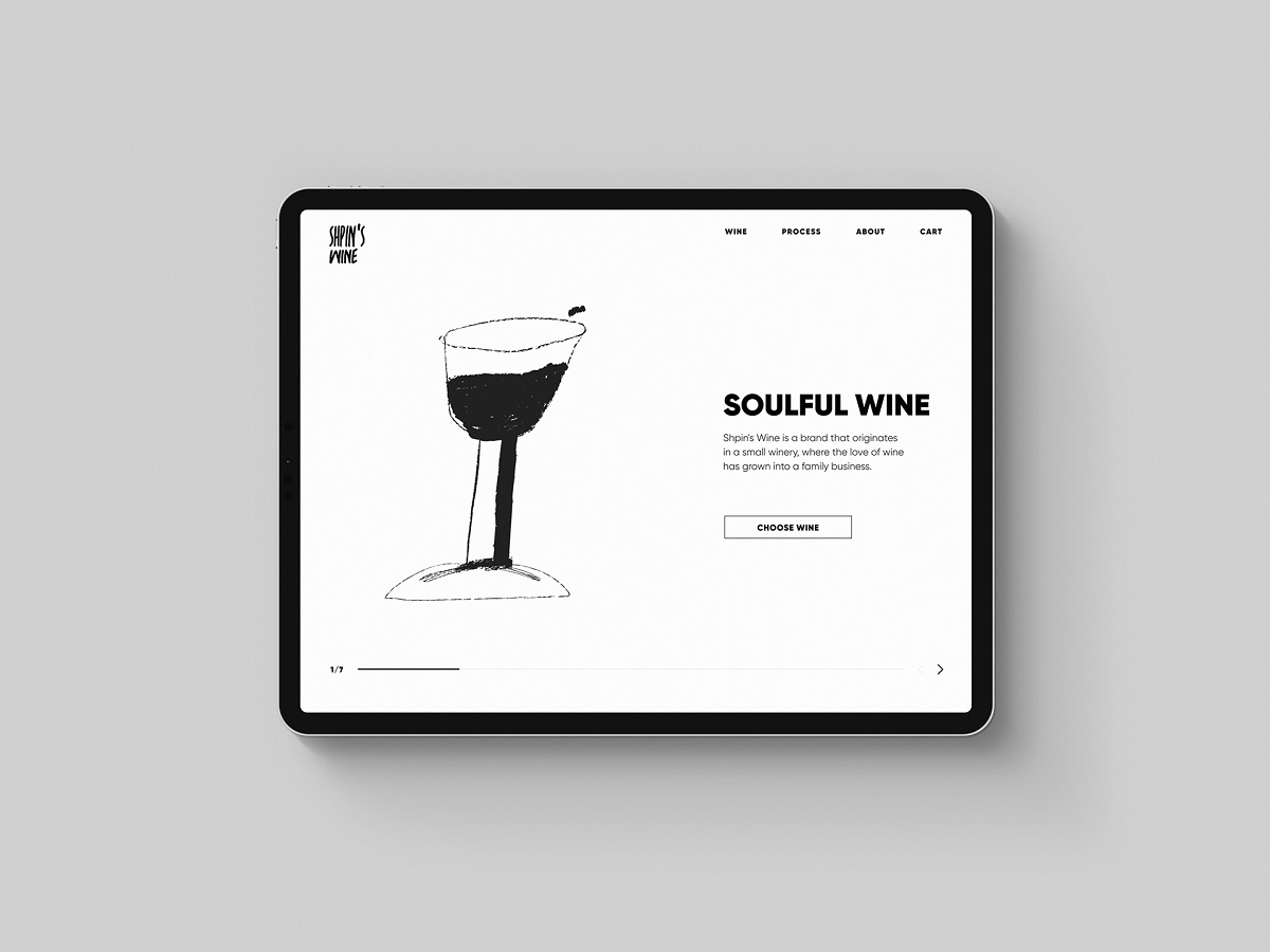
The first version of the website design performs in the monochromatic minimalist interface and original animated illustrations inspired by art, supporting the brand image as well as adding fun and emotion to the interaction process.
Another option for the website is based on the monochrome palette, minimalist navigation, and elegant scroll animation, supporting the brand image as well as adding emotion to the interaction process.
More Branding Design Case Studies
Quisine. Branding Design for Food Delivery Service
Logo Design: Collection of Creative Logos for a Variety of Brands
Dicey. Logo and Mascot Design for Party Game
MYWONY. Storytelling with Brand Intro Design
Inspora. Brand and UI Design for Virtual Stylist
AppShack. Logo Design for a Digital Agency
LunnScape. Identity Design for a Landscape Company


