
Choosing a UI color palette is tricky. It’s not like picking paint for your living room wall—unless your living room needs to convert users, guide flows, reduce bounce rates, and reinforce brand recognition in 0.3 seconds. In that case, maybe it is.
In web and mobile interface design, colors shape user perception, guide navigation, and subtly whisper (or scream) what your brand stands for. So if you’ve ever spent an hour tweaking a button from #0077FF to #006AD6 and back again, congrats: you’re doing it right.
Here are six practical, designer-to-designer tips for choosing UI colors that don’t just look good, but actually work.
Tip 1. The 60–30–10 Rule
The 60–30–10 rule comes from interior design, but works surprisingly well in digital interfaces. It’s a simple formula for visual hierarchy:
- 60% dominant color
- 30% secondary color
- 10% accent color
Think of the dominant 60% as the main background or card color (e.g., soft whites, charcoal grays). The 30% adds contrast—your navbars, side panels, or tab bars. The final 10% is reserved for emphasis: bright CTAs, icon accents, anything you want to highlight.
Our brains like a clear foreground and background, with a little pop of surprise. It’s a visual rhythm that feels composed, not chaotic. And when you skip this logic, your UI ends up looking like a first-year student’s Figma file—too loud, no focus, zero emotional pacing.

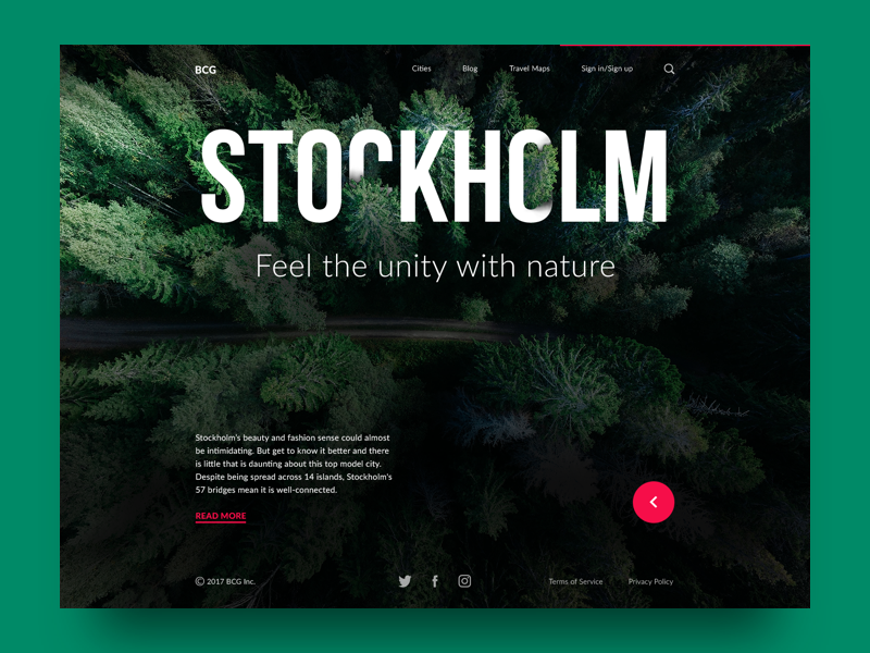
Digital Agency Landing Page
Tip 2. Color Contrast: Friend, Not Frenemy
Contrast is your best friend—until it turns into that friend who talks too loud at parties.
Good color contrast helps users distinguish elements, read text, and know where to click. It’s the backbone of accessibility. But bad contrast? That’s how your light-gray-on-white placeholder text becomes invisible on mobile at 2pm in bright sun.
At its best, contrast drives usability. Want people to click that button? Don’t bury it in a sea of same-tone neutrals. Give it a bold accent—a rich green against ivory, or a red-orange against navy.
But don’t go overboard. If everything screams, nothing gets heard. Excessive contrast across your entire UI feels aggressive, like a flashing banner ad from 2009.
Use contrast where it counts:
- Buttons
- Alerts
- Actionable text
- Empty state illustrations
Leave your body copy and background colors at a softer contrast ratio. Your users—and their retinas—will thank you.

Urban Sketcher App
Tip 3. Don’t Forget Color Psychology
As we’ve mentioned in our previous articles, color psychology is less about theory and more about user behavior in the wild. It’s why error messages are red, success states are green, and why landing pages that use soft blues tend to feel more “reliable.” These aren’t arbitrary choices—they’re decisions wired into human perception.
When users open your app or website, their eyes scan before their brains process. The colors hit first, sending subconscious signals. A deep navy might whisper “trust me”, a vibrant orange button might say “click me now” before your microcopy even finishes the pitch.
Designers who get this don’t rely on color to say something—they use it to suggest, to guide, to nudge. And users rarely notice it happening. That’s the power of good emotional design.
But effective use of color psychology in web design also means knowing when not to lean too hard on symbolism. Not every user experiences color the same way. Cultural background, age, and even screen settings influence perception. A red CTA might energize one audience and feel aggressive to another. That calming sage green might read as clinical or outdated if you’re not careful with contrast and pairing.
The trick isn’t to memorize what every color “means.” The trick is to understand what you want your user interface colors to do. Should your palette invite trust? Signal urgency? Inspire joy? Then test it, on real screens, in real lighting, with real people. Because even the most strategic hue won’t matter if it fails under fluorescent office light or feels off-brand in context.
Color psychology is less about getting people to feel the “right thing,” and more about getting them to feel something—something aligned with your product’s message and your user’s journey.
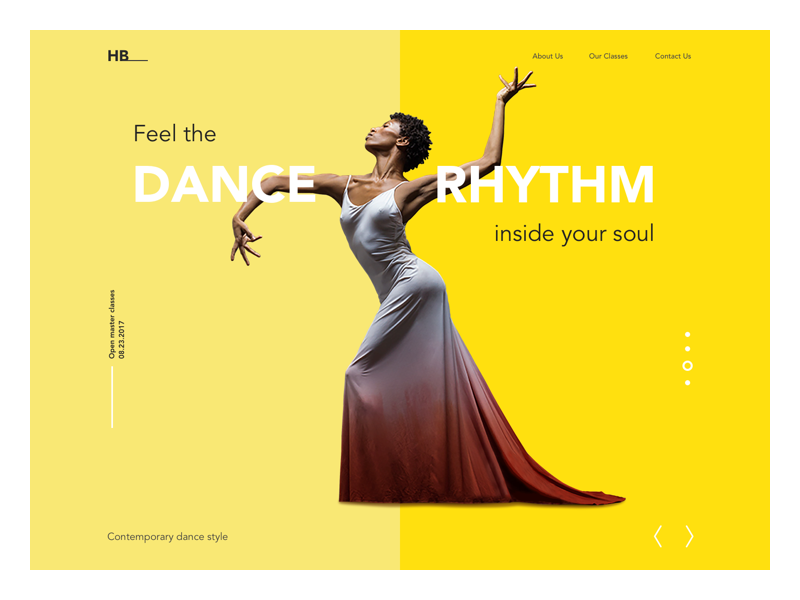
Dance Academy Website
Tip 4. Design for the World, Not Just Your Zip Code
If you’ve ever designed a UI for a global product, you know the moment: your “clean, peaceful” white-themed layout gets flagged in QA for looking funereal in East Asia. Or your vibrant yellow onboarding screen—meant to radiate joy—sends warning signals in France. Welcome to the world of cultural color perception.
Color is not a universal language. In fact, it’s one of the most culturally loaded tools in your UX toolkit. What reads as warm and energetic in one country might signal disrespect or mourning in another. If you’re designing for a multi-region product or even might localize later, color localization in UX is not optional—it’s table stakes.
Let’s be specific. In most of Europe and North America, white is tied to purity, simplicity, and weddings. But in many East Asian cultures, white is linked to death, grief, and loss. Same pigment, radically different UX impact.
And it’s not just about avoiding cultural faux pas. Smart use of international UI color strategies can actually deepen local engagement. A fintech app in India might find more resonance using saffron and green than blue and gray. A wellness brand in Brazil might do better leaning into vivid tropical palettes rather than pale minimalist pastels.
This isn’t about over-customizing either. You don’t need fifty regional color variants. But being aware of regional color symbolism helps you make intentional choices. You might opt for a flexible neutral base (say, cool beige or slate gray) and swap accent tones based on GEO preferences.
Better yet, validate your color palette through user testing across your top regions. Sometimes the issue won’t even be symbolism—it’ll be legibility under low-contrast sunlit conditions in Nairobi or outdated Android screens in Jakarta.
If you’re serious about global UX, this step matters. Color missteps might not crash your conversion rate, but they’ll slowly chip away at trust—and trust is everything in UI design.
Tip 5. Color Harmony Isn’t Optional
You can have the perfect brand color and still end up with a chaotic interface. Why? Because color harmony in UI design isn’t about liking a hue—it’s about making multiple hues behave together.
When colors clash, users feel it before they understand it. An interface might “look off” without anyone knowing why. That’s usually a harmony issue. And in web design, visual harmony equals cognitive ease. If your palette feels intuitive, users don’t question it—they just move, click, scroll.
Detailed information and examples of color harmony can be found in our article Color Theory: Brief Guide for Designers.
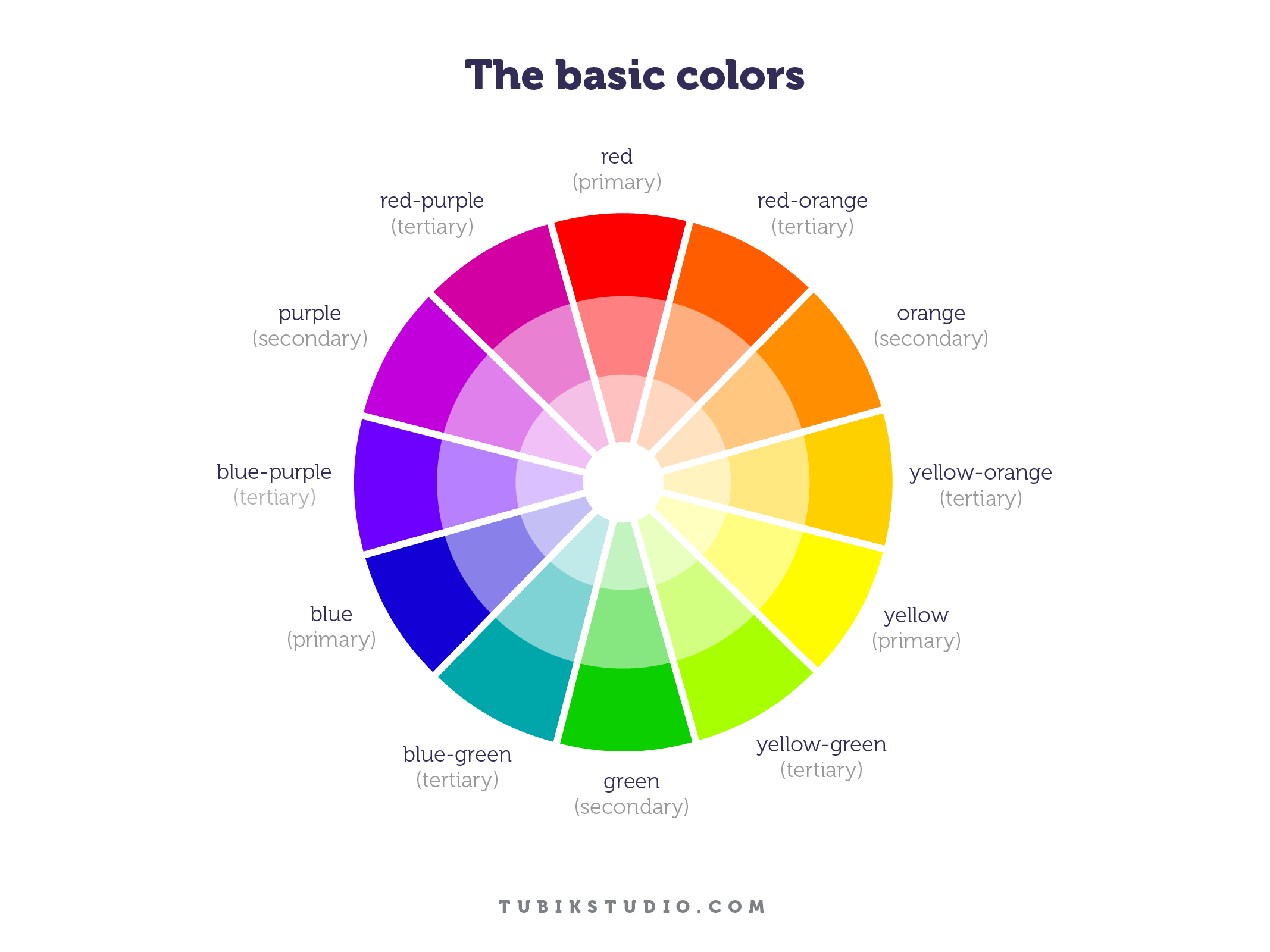
Luckily, designers have actual tools here. We’re not choosing blindly—we’re working with color schemes that have been tested for decades. Some of the most effective ones:
- Monochromatic (one color, multiple shades): sleek, safe, hard to mess up.
- Analogous (colors next to each other): subtle, natural, great for soft brands.
- Complementary (opposites): bold, high-impact, perfect for CTA buttons.
- Triadic or Tetradic: trickier, but powerful when balanced right.
The trick is knowing what emotional weight each combo carries—and how it impacts readability, focus, and user flow. Most modern UI color palettes start with one dominant tone and use others for accents, alerts, or hover states.
The goal isn’t to impress other designers—even if our egos would enjoy it. The goal is to make your users feel like everything just clicks. Because when UI color harmony works, nobody notices. And that’s the whole point.
Tip 6. Nature Is the Best Moodboard
Before you dive into yet another Pinterest spiral or Behance board full of neon gradients and AI-generated color wheels, step outside. No, seriously—go look at a tree.
The most intuitive, time-tested, emotionally resonant color palettes on Earth don’t come from trend decks. They come from nature. Natural color combinations are wired into us: the blue-orange of a sunset, the muted greens and browns of a forest trail, the icy contrast of snow against pine.
Designers who study nature’s logic often end up with UIs that feel strangely “right”—even when the color scheme itself isn’t trendy. That’s because nature understands balance, contrast, temperature, and tone in ways even the best color theory books struggle to explain.
Want a palette that feels grounded? Sample a late summer meadow. Need something fresh and modern? Try the tones of volcanic ash against fog. Looking for an emotional punch? Start with the sharp gold of autumn leaves.
This isn’t metaphor. It’s method. Use nature as your UI color reference. Screenshot a landscape. Color pick it. Build a palette. Then test it across dark mode, light mode, and actual devices. You’ll be surprised how often it just… works.
Because nature doesn’t guess. And neither should you.
Recommended Reading
Design doesn’t stop at color. Check out our other articles on strategy, structure, and the little details that make users stay:
Color Theory: Brief Guide For Designers
Light or Dark UI: Tips to Choose a Proper Color Scheme
Color in Design: Influence on Users’ Actions
Color in UI Design. Look on the Bright Side