There are, at last count, something like 1.1 billion websites floating around on the internet, according to Internet Live Stats—a number so absurd it barely means anything anymore. Back in 1991 there was one. One single website, glowing alone in the dark like a digital lighthouse. By September of 2014, per Netcraft’s web server survey, the count crossed a billion, dipped below that line for a while as dead sites got pruned, then stabilized above it again by March of 2016. The lesson buried in that timeline is simple enough: having a website used to be a flex. Now it is closer to having a phone number. Nobody congratulates you for owning one, but try explaining your absence.
Designers love to talk about why websites matter in the abstract, reaching for words like “presence” and “digital footprint” as if that clarifies anything for a person actually trying to build one. What actually explains the boom in personal websites and small business websites is far more mundane, and far more useful to understand, because the reasons people give tend to fall into a short, recognizable list. So, here it is, with the polite fictions stripped out.
Sell Something
E-commerce is the reason nobody needs explained to them, mostly because their bank account already explained it. Selling directly from a website, whether through a full-blown e-commerce website or just a checkout button bolted onto a personal blog, has become the default way small creators and large retailers move product. The unglamorous engine behind that shift is the modern content management system, which took over the plumbing of secure payments and SEO-friendly product pages without much fanfare, so a solo potter in Ohio can compete, technically, with a warehouse.
The tip worth stealing: your checkout flow is your storefront window, and most people design the homepage obsessively while leaving the cart page looking like a DMV form. Fix the cart before you fix the hero image.
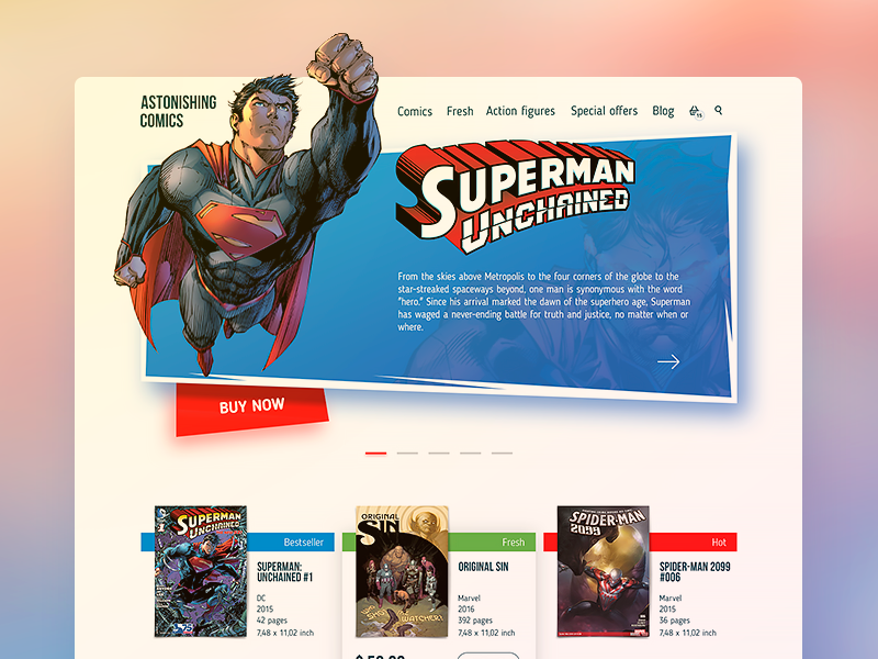
Design concept of an online comic bookshop
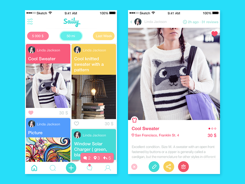
Design concept of an online auction
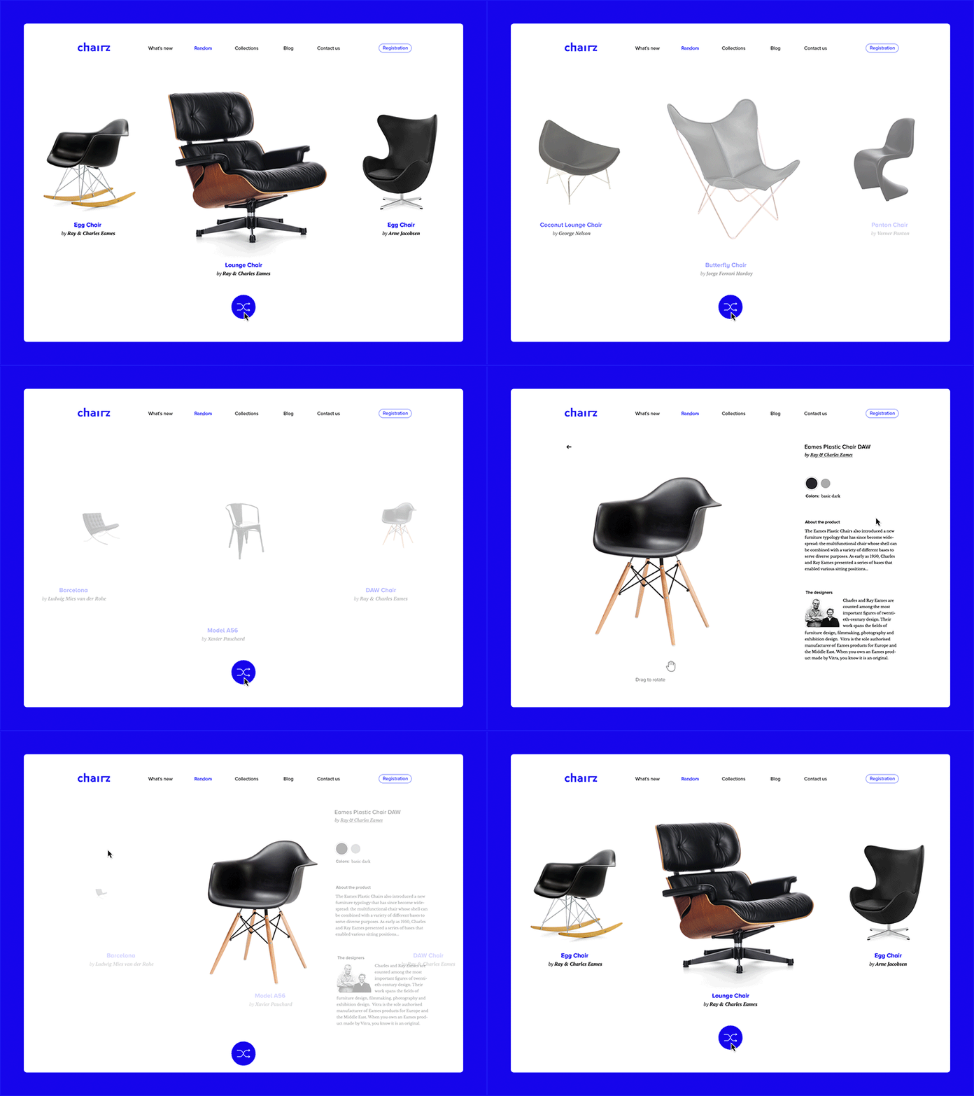
Design concept of the randomizer for an e-commerce platform
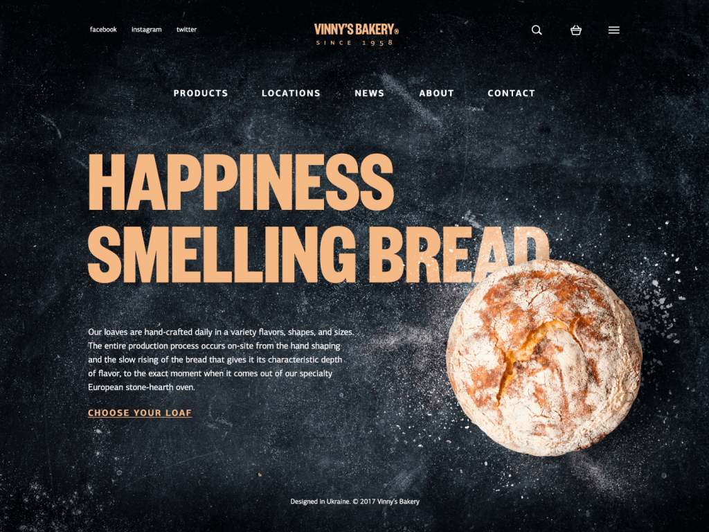
Design concept of the bakery enabling online orders
Prove You Exist
Business presentation is the category everyone forgets is its own thing, separate from selling. A landing page or a lean small business website exists to say, credibly, that this operation is real, here is what it does, here is how to reach it—no cart, no checkout, sometimes even no prices. The trick people miss is that a one-page site often works harder than a bloated ten-tab website builder special, because visitors decide whether to trust a business in about the time it takes to blink. So, cut the tabs. Say the thing. Put the contact information where a person can find it without excavating.
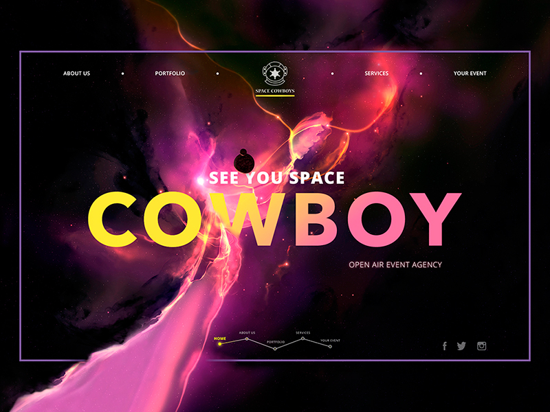
Web design concept for a company organizing open-air events
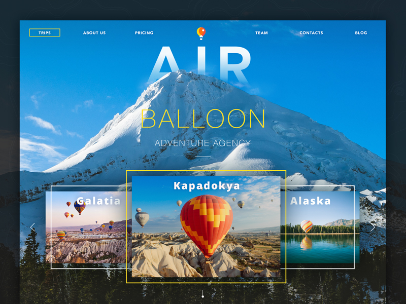
Web design concept for a company organizing hot-air-balloon rides
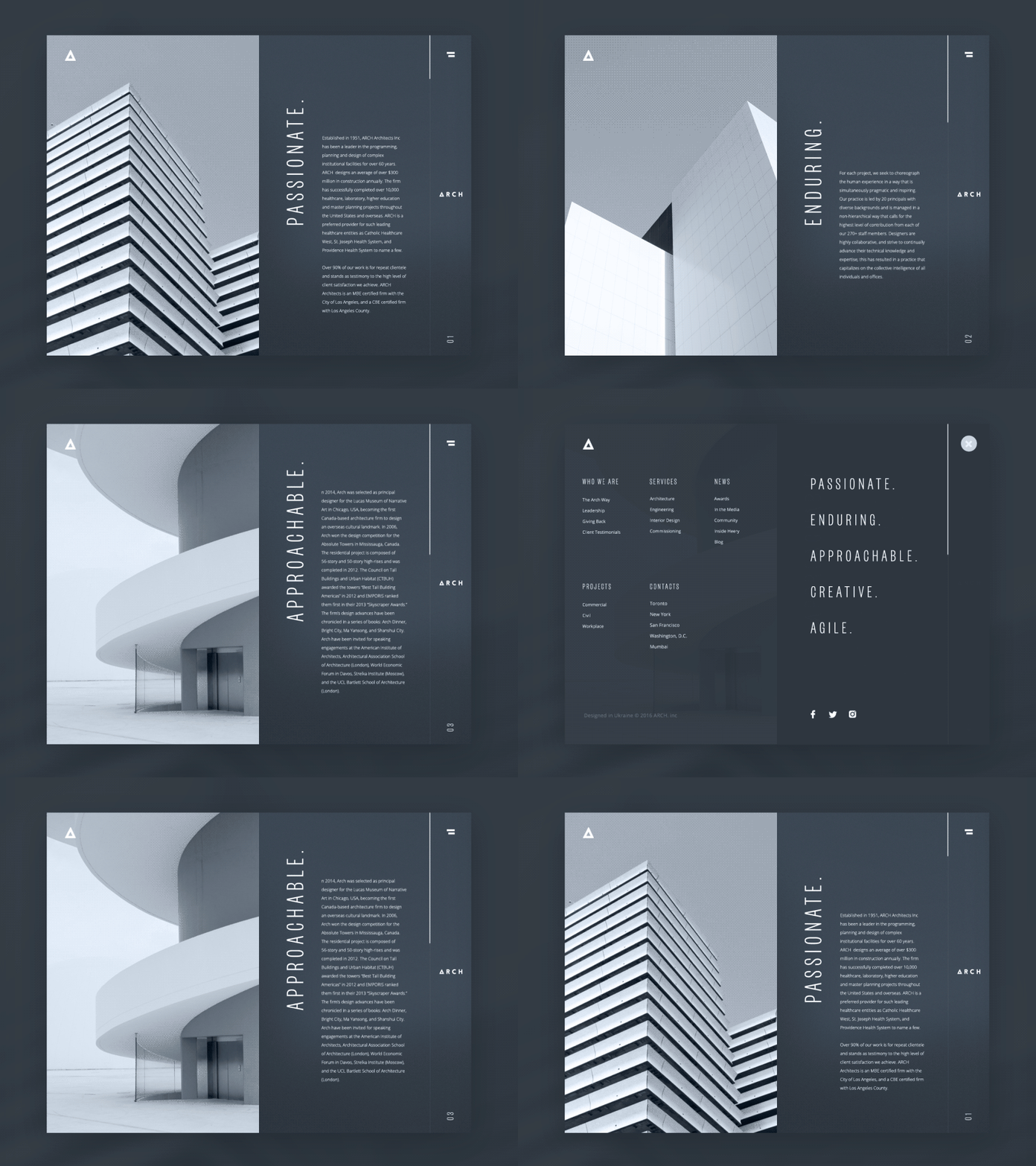
Web design concept for an architectural bureau
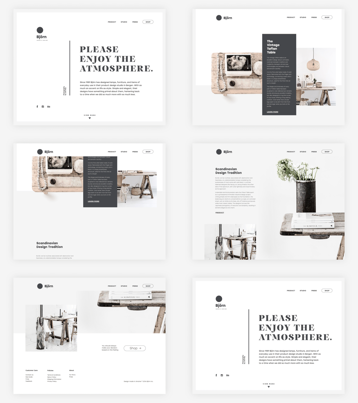
Design concept for the interior design studio
Say Something
Sharing information covers the blogs, digital magazines, and review sites that exist to publish, not to sell or pitch anyone. A blog platform built purely for publishing rewards a strange kind of patience, and the SEO payoff for niche content usually beats the payoff for generalist content by a wide margin, because the sites that last are the ones that pick a narrow lane and stay in it obsessively rather than trying to out-cover the entire internet. Readers can smell a generalist from three scrolls away.
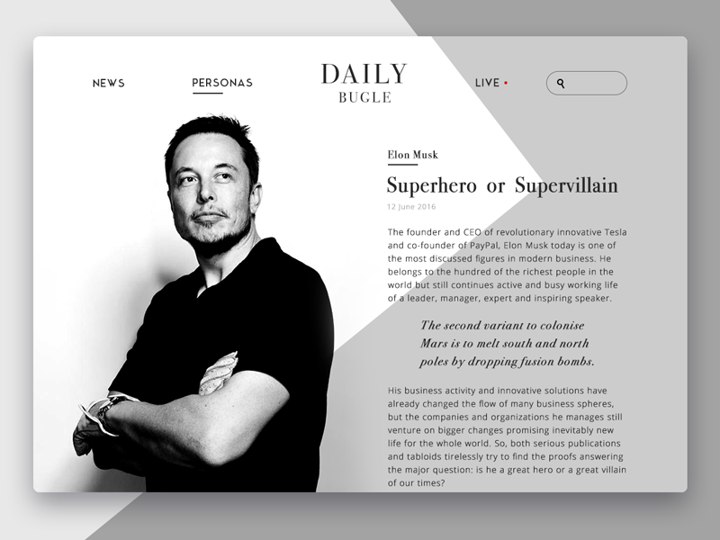
Design concept of online newspaper
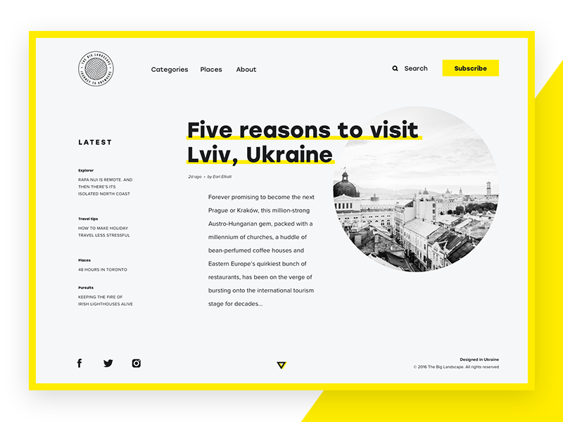
Design concept of the online magazine devoted to traveling
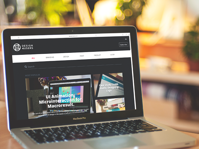
Web design for the Design4Users blog devoted to design news and trends
Teach Something
Education sites range from a teacher’s personal blog to a full online course platform, and the useful angle here is that credibility rarely comes from credentials alone. It comes from showing the work. An educational personal website that walks through actual process and actual missteps earns more trust than one that just lists a résumé and a headshot. If the goal is a teaching-focused website, resist the instinct to sound like a brochure. Sound like a person who has actually done the thing, in public, more than once.
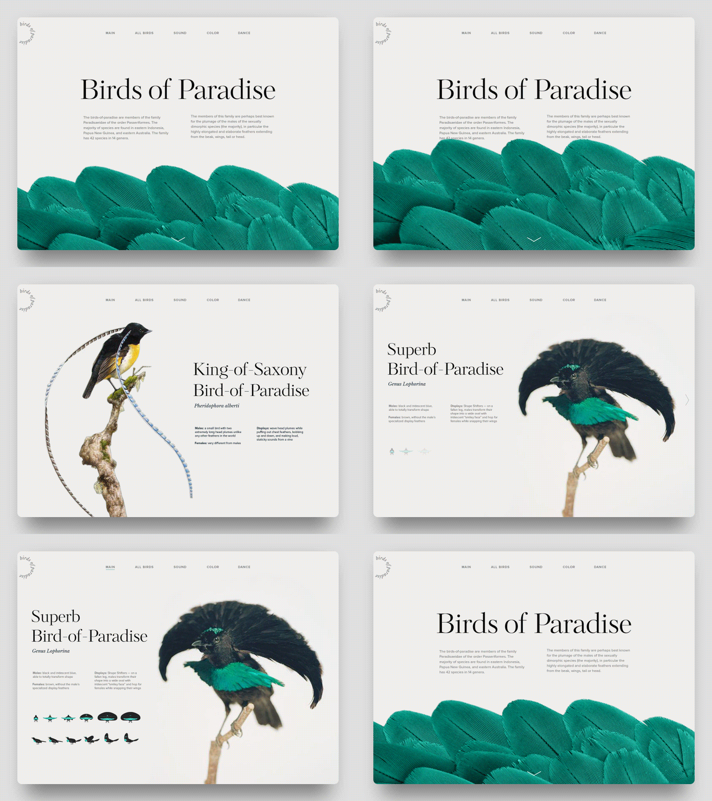
Web design for an online encyclopedia
Talk to People
Communication sites—the forums, discussion boards, and niche social platforms—are the oldest reason on this list and the one design writers discuss least, probably because moderation is unglamorous work compared to picking a font. A communication platform lives or dies on its structure, not its palette: threading, notifications, and the ability to find an old conversation without scrolling through geological time decide whether a community sticks around. No amount of clever web design compensates for a broken comment system.
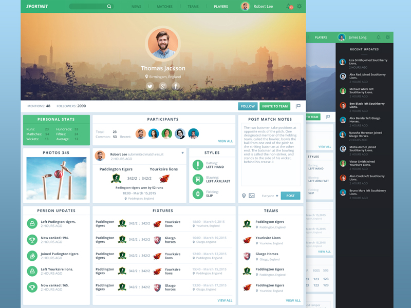
Design concept of a social network for sports fans
Just Because
Self-expression is the category that makes design people uncomfortable, because it resists metrics. Someone builds an online portfolio or a strange little personal website purely to see if a skill holds up in public, with no funnel and no client lurking underneath it. This is, truthfully, the healthiest reason on the list. It is also the one most likely to accidentally become a business later, once someone else notices what got made.
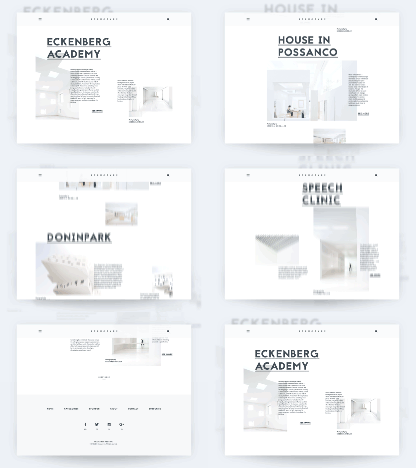
Design concept of a personal blog devoted to architecture
The Actual Point
None of these six reasons require an agency retainer, and none of them require permission from anyone. What they require is picking the right one before opening a website builder, because a site trying to sell, teach, and vent simultaneously usually fails at all three.
Pick a lane. Build for that lane. The internet has room for another billion sites, and it keeps rewarding the ones that know exactly what they are for.
Recommended Reading
Liked this? Good instincts. Here’s a stack of other case studies and design think pieces waiting, covering everything from typography arguments to branding takedowns:
Web Design: 16 Basic Types of Web Pages
The Big Guide into Different Types of Websites
Best Practices for Website Header Design
UX Design for E-Commerce: Principles and Strategies
Negative Space in Design: Tips and Best Practices
Light or Dark UI? Tips to Choose a Proper Color Scheme
Feel Homey. Handy Tips for Home Page Design
Hit the Spot: Design Strategies for Profitable Landing Pages