
Open your laptop right now and glance at the tabs. There’s probably a news article half-read. A shopping cart waiting for a decision you promised to make “tomorrow.” A design inspiration site you opened for reference and then totally forgot.
All of those are websites.
But they behave completely differently.
The internet looks like one endless surface, yet in practice it behaves more like a city. There are quiet libraries, crowded marketplaces, public squares full of noise, tiny specialty shops, and massive distribution centers that never sleep. Each space follows its own rules. You wouldn’t design a supermarket like a museum. The web works the same way.
Understanding website types is the first moment where design becomes strategy instead of decoration. Because once you know what kind of system you’re building, everything else starts to make sense: the grid density, the navigation depth, the amount of text people will tolerate, the speed of interaction.
Without that clarity, teams build pretty interfaces that solve nothing.
And the internet already has enough of those.
Let’s dive in!
What Are Different Types of Websites?
Different types of websites exist because people come to the web with different intentions—buying, learning, sharing, researching, or presenting themselves.
You check your bank balance while the barista is steaming milk.
You skim headlines at breakfast before your brain fully wakes up.
You open a designer’s portfolio five minutes before a client call because someone said, “you should see their work.”
You buy headphones on an e-commerce platform at midnight because the algorithm decided tonight is the night.
Each interaction solves a specific problem. The structure of the website follows that problem.
This is where many digital projects derail. Teams jump straight into layout discussions—hero images, card grids, animation styles—before asking the uncomfortable questions that actually shape the system:
- Who exactly will use this site?
- What task will they complete in the first 30 seconds?
- What behavior do we want them to repeat tomorrow?
- What makes this platform different from the thousand tabs already open on their laptop?
With more than 1.3 billion websites online, attention isn’t guaranteed. It has to be earned through relevance. In practical web design terms, that means understanding the type of website you’re building before designing anything.
Because the architecture of a portfolio, an online store, and a social platform follows entirely different logic. Different grids. Different content density. Different interaction patterns. Design without that clarity and you get a beautiful interface that nobody actually uses.
What Is a Website?
A website is a structured system of web pages designed to deliver content or functionality through a domain on the internet.
That definition sounds technical, but the lived experience is simpler. A website is a place where interaction happens.
You open a browser tab.
You type a domain name.
A system responds with pages—text, images, video, tools—organized around a purpose.
Behind that experience sits a stack of infrastructure: servers, databases, front-end frameworks, APIs. But from a design perspective, the interesting part lives closer to the surface.
It’s how that information is structured.
A well-designed website behaves like a clear building. You enter and immediately understand where things live. Navigation acts as the floor plan. Visual hierarchy acts as signage. Spacing acts as breathing room. Users don’t analyze these mechanics consciously. They feel them through movement.
You see it in micro-moments: a search bar placed exactly where your thumb expects it, a checkout button aligned to the natural reading flow, a navigation label that matches the words users already carry in their heads.
These tiny decisions—grid alignment, typography scale, spacing rhythm—determine whether a website feels intuitive or exhausting.
From a technical standpoint, websites can be categorized in many ways. But three lenses matter most when designers analyze them:
- Content behavior
- Purpose and functionality
- Responsiveness across devices
Let’s unpack each one.
What Is the Difference Between Static and Dynamic Websites?
Static websites show fixed content, while dynamic websites change content based on user behavior, data, or context. Think of the difference like visiting a poster versus entering a conversation.
A static website behaves like a printed brochure. The content is predetermined. Every visitor sees the same page. Updates happen manually.
Classic examples include:
- landing pages
- simple company websites
- event pages
- portfolio sites
From a development perspective, static websites are straightforward. Fewer moving parts means faster load times and easier hosting. But they offer limited interaction—you arrive, you read, you leave. That’s about it.
Dynamic websites operate differently.
The moment you log into an e-commerce platform, the page becomes personal. Recommended products appear based on past searches. Inventory updates in real time. Pricing changes during seasonal campaigns.
What you see is shaped by:
- location
- user account data
- browsing behavior
- time-sensitive content
Dynamic websites also support user-generated actions: filters, comments, uploads, personalization settings. Designing these systems is less about single pages and more about behavior logic.
How does the interface react when a user applies five filters at once?
How does the layout adapt when a database returns 500 search results?
What happens when someone refreshes the page during checkout?
These edge cases define the quality of the product.
Static websites communicate information. Dynamic websites facilitate interaction. Today, most modern platforms lean toward the dynamic side because users expect the web to respond. The internet is no longer a library. It’s a living system.
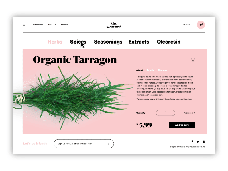
The Gourmet is an example of a dynamic e-commerce website
What Are the Main Types of Websites by Purpose?
The most common website types include personal, corporate, e-commerce, educational, directory, streaming, crowdfunding, social, and news platforms. Each type exists because it solves a different user problem.
Personal and Portfolio Websites
These websites present an individual’s work, identity, or expertise. For designers, photographers, developers, and writers, the portfolio site is essentially a digital handshake. Visitors decide whether they trust you in seconds.
Design priorities usually include:
- visual storytelling
- case studies
- credibility signals
- clear contact pathways
Presentation carries enormous weight here. Grid discipline, typography, and image hierarchy signal professionalism long before anyone reads the case studies.
If the portfolio feels careless, credibility evaporates.
Corporate Websites
Corporate websites represent companies rather than individuals.
Their goals typically include:
- presenting services
- explaining the company mission
- building credibility
- generating leads or partnerships
A good corporate website balances two audiences simultaneously:
- potential clients
- potential employees
This means the interface must support both conversion flows and cultural storytelling.
Done poorly, corporate sites become glossy marketing brochures. Done well, they function like transparent windows into how the company actually works.
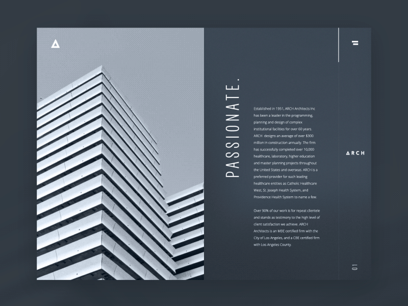
The example of a corporate website of an architectural bureau
E-Commerce Websites
E-commerce websites are designed to sell products or services online. Every interface decision here connects to conversion. Users move through a sequence: discover → compare → select → purchase → review.
Designers spend enormous energy optimizing these flows:
- product cards
- filtering systems
- checkout friction
- payment security cues
The entire system revolves around trust and speed. A misplaced button can cost millions. That sounds dramatic until you watch real user testing sessions. One confusing form field and people abandon carts instantly. Commerce design punishes ambiguity.
Sharing Platforms
Sharing websites allow users to upload and distribute content.
Typical examples include:
- photo libraries
- music platforms
- design asset marketplaces
- stock media websites
The interface challenge here is scale.
When thousands of files exist inside a single ecosystem, search and categorization become the backbone of usability. Metadata, tagging systems, and filtering tools determine whether content is discoverable. Without them, the platform collapses under its own archive.
Educational Websites
Educational platforms exist to teach. They range from simple online libraries to complex learning systems hosting courses, lectures, and certification programs.
Design priorities include:
- structured learning paths
- clear progress indicators
- content readability
- navigation clarity
Education design succeeds when cognitive load stays low. Information must unfold in digestible layers rather than overwhelming walls of text. Think of it as pacing knowledge.
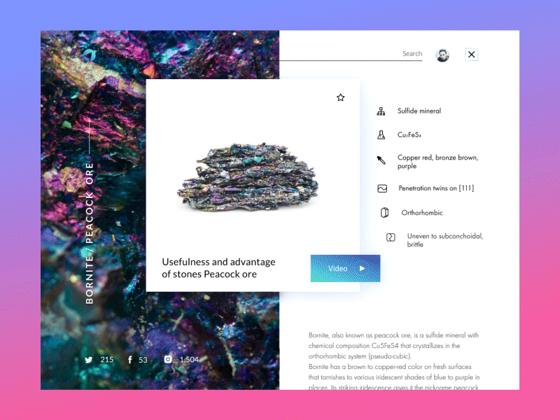
The example of an encyclopedia website
Directory Websites
Directory websites function like digital catalogs. They organize large amounts of structured data around a theme.
Examples include:
- local business listings
- service marketplaces
- event aggregators
- real estate directories
Users typically arrive with a specific search intent. That makes filtering, search precision, and result sorting the most critical parts of the interface. If discovery fails, the platform fails.
Video and Streaming Platforms
Streaming websites revolve around video content.
The interface must support:
- smooth playback
- recommendation algorithms
- content discovery
- binge-friendly navigation
Design decisions here revolve around time.
Users rarely visit for a single clip. They enter an ongoing viewing loop shaped by autoplay, suggestions, and watch history. The experience becomes a continuous stream rather than a collection of pages.
Crowdfunding Platforms
Crowdfunding websites help people raise money for projects, charities, or startups. Trust signals dominate the interface.
Designers highlight:
- campaign transparency
- progress indicators
- contributor testimonials
- payment security
A well-designed crowdfunding page builds emotional connection quickly while maintaining credibility. Users fund stories, not spreadsheets.
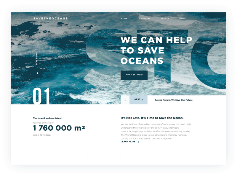
The example of charity website raising money for saving the oceans from pollution
Social Networking Websites
Social platforms exist to connect people. The content comes from users themselves. Messages, posts, comments, reactions—these interactions drive the entire system. The challenge for designers lies in balancing expression and moderation. Too many controls and the platform feels restrictive. Too few and chaos spreads quickly. Social networks live or die by community mechanics.
News Websites
News platforms deliver current information.
Their interface must handle two competing needs:
- speed of publishing
- clarity of reading
Readers often arrive through search engines or social links. That means headlines, typography, and visual hierarchy must communicate context instantly. Good news design respects attention. Bad news design buries facts under advertising noise.
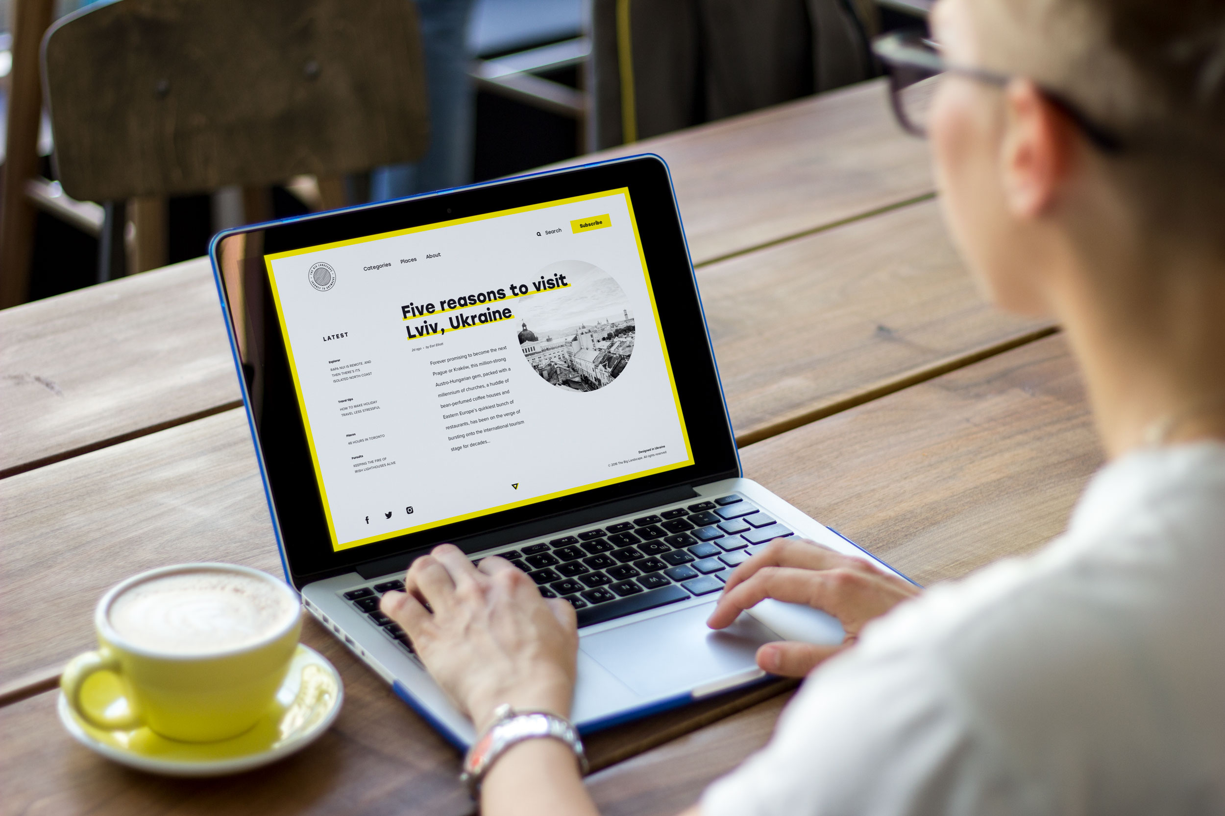
The Big Landscape is an example of an online magazine
Why Is Responsive Web Design Important?
Responsive design ensures a website works properly across different devices and screen sizes. The modern web lives primarily on phones. People check shipping updates in elevators. They scan restaurant menus on sidewalks. They confirm meeting times while walking between buildings. Interfaces must adapt to those conditions.
Historically, designers built websites primarily for desktop screens. Mobile versions were treated as secondary adaptations. That era is gone. Today, responsive design means planning layouts that reconfigure fluidly depending on screen size.
There are several approaches:
- Fixed layouts maintain identical dimensions across devices. These are rare today because they force users to zoom constantly.
- Fluid layouts scale proportionally. Elements stretch or shrink depending on available space.
- Responsive layouts take a more advanced approach. The structure itself shifts between breakpoints.
A multi-column desktop layout might collapse into a vertical stack on mobile. Navigation menus transform into expandable panels. Done well, responsive design feels invisible. Users never think about breakpoints. They simply move through content comfortably.
Search engines also reward this behavior. Google’s ranking systems prioritize mobile-friendly websites because most browsing now happens on phones. Ignoring responsive design today is equivalent to locking the front door of your store.
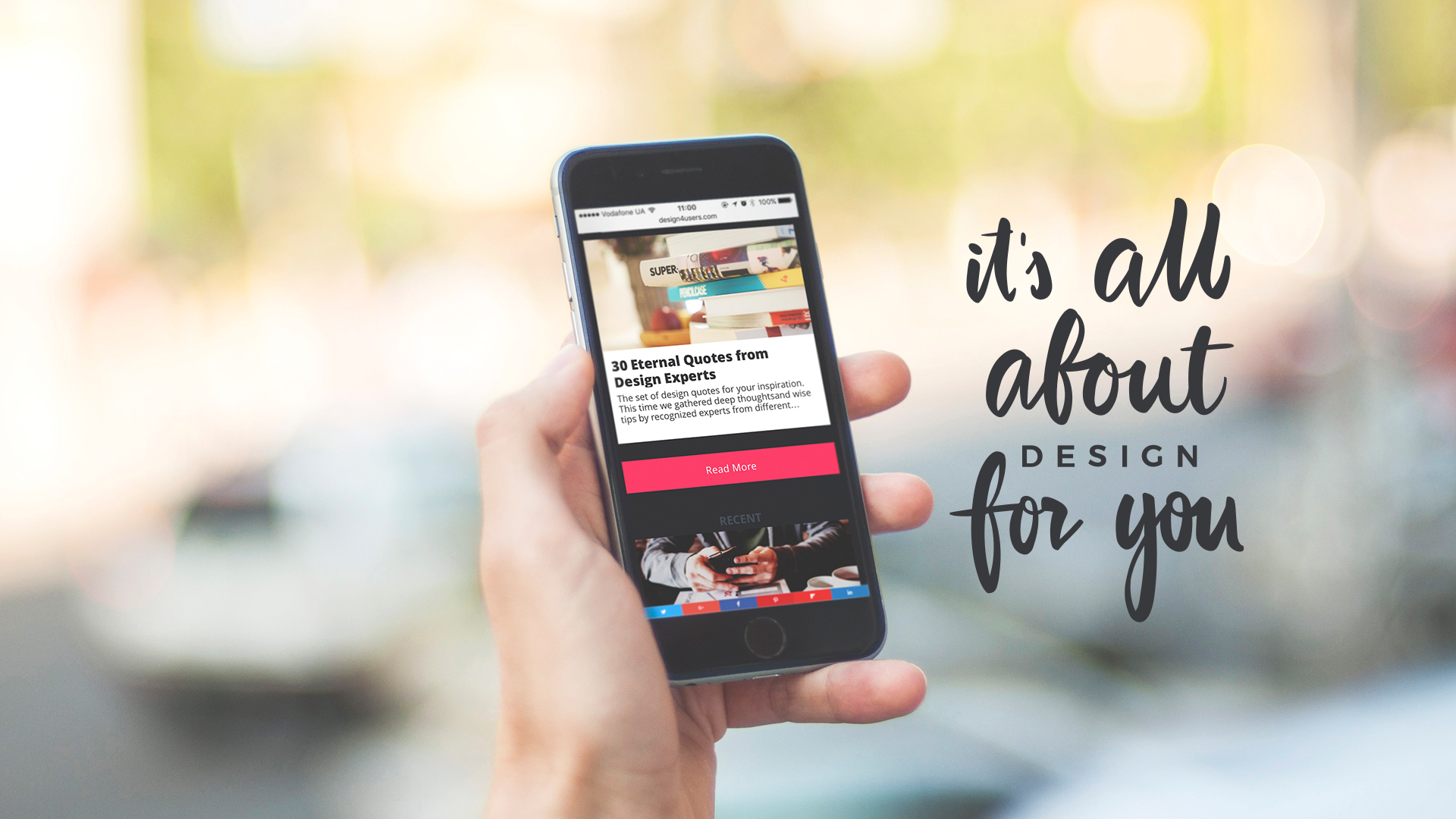
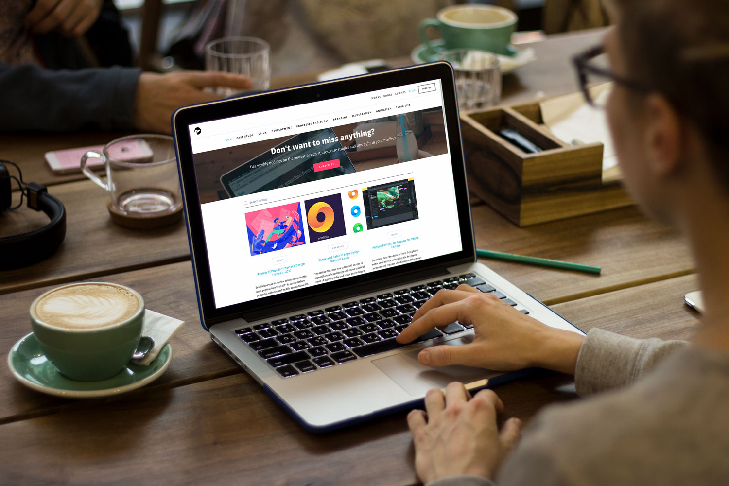
Design4Users Blog mobile adaptation
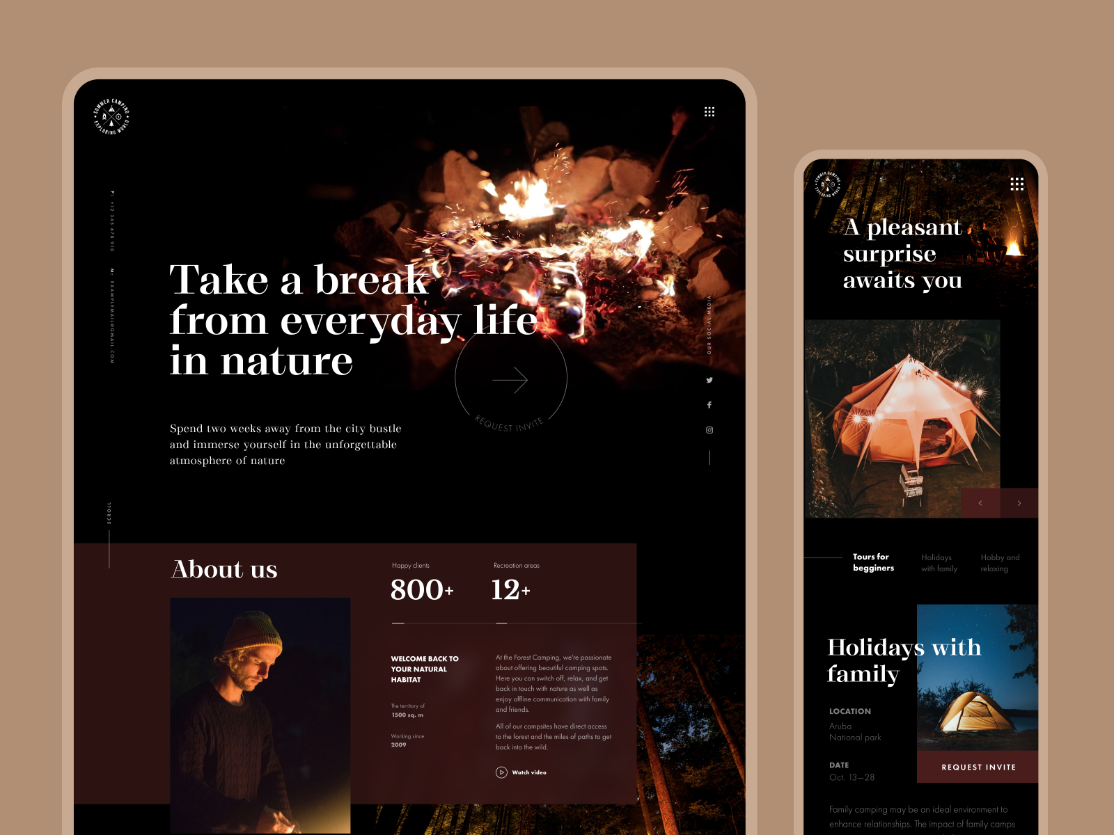
Mobile adaptation for the Forest Camping website
Is a Blog a Type of Website?
A blog can be both a standalone website and a content section inside a larger platform. Originally, blogs were independent digital journals. Individuals published articles, opinions, tutorials, or stories organized chronologically. Readers followed specific writers the way earlier generations followed columnists. Over time, something interesting happened. Search engines began rewarding fresh content. Websites that updated regularly gained visibility and authority. Companies realized blogs could function as knowledge engines inside their platforms.
Today, you’ll find blogs embedded inside:
- corporate websites
- e-commerce stores
- educational platforms
- product ecosystems
They serve several purposes:
- sharing expertise
- answering search queries
- building authority
- improving SEO performance
From a design perspective, blogs introduce a new layer to website architecture: editorial content.
That means supporting features like:
- article templates
- reading progress indicators
- comment systems
- content categorization
When designed well, a blog transforms a static website into a living publication.
Design4Users is a blog that presents an independent website
Tubik Blog is a part of the digital agency website
What Makes a Website Successful?
A successful website solves a real user problem clearly and consistently. Design alone cannot rescue a weak concept. You can align pixels perfectly. You can animate transitions beautifully. You can build the most elegant grid system imaginable. None of it matters if the platform offers no value.
Users arrive with intent. They want answers. Tools. Products. Connections. A website succeeds when the interface removes friction between the user and that goal. Everything else—visual style, animation, branding—supports that mission.
Designers sometimes romanticize the craft. But the internet is brutally practical. People stay where things work.
Final Truth
Today, websites aren’t pages. They’re behavior systems.
Every grid, navigation label, loading state, and micro-interaction shapes how people move through a digital product. Good web design isn’t decoration layered on top of content—it’s the architecture that guides real user behavior. The placement of a button, the rhythm of spacing, the hierarchy of typography, the responsiveness across devices: these details determine whether a website feels intuitive or frustrating.
Designers working in modern web design, UX design, and website architecture know this truth well. Interfaces succeed when they align with human patterns—how people scan pages, tap screens, compare options, and make decisions online.
Build pages and you get layouts.
Design behavior and you build web experiences that actually work.
Useful Articles
Here are some helpful posts about other aspects of web design.
Web Design: 16 Basic Types of Web Pages
Mobile UI Design: 15 Basic Types of Screens
Best Practices for Website Header Design
Negative Space in Design: Tips and Best Practices
UX Design Glossary: Affordances in User Interface
Light or Dark UI? Tips to Choose a Proper Color Scheme
Feel Homey. Handy Tips for Home Page Design
Hit the Spot: Design Strategies for Profitable Landing Pages
FAQ: Does a Small Business Need a Website?
9 Effective Tips on Visual Hierarchy
UI/UX Glossary. Web Design Issues
Welcome to read or download free e-books about Design for Business and Problem-Solving Web Design