The more experience we are getting in the field of design, the more questions are being accumulated from our customers, users of different products, and other designers. From the very start of our work, Tubik Studio designers have tried to attend different meet-ups and conferences in order to discuss actual problems as well as share experiences. Then we broadened our horizons and started blogging on Medium, Tumblr, and WordPress so that we could talk about our work in greater detail. Eventually, having started our own studio blog here, we’ve decided to reinforce the opportunities for anybody who wants to communicate with us.
That’s why today we start a new series of articles on our blog that is called FAQ. Here we will give the answers to the questions we are asked day by day. Every Thursday, you will be able to read the set of new exchanges here. Moreover, we are open, friendly, and welcoming for those who want to ask about something and see our answers here. All the opportunities to do it quickly and easily will be described below.
We have decided to open the set with the most frequent questions from our customers. So, let’s get started!
1.What do you need to start working on design? What should the customer provide to launch the process?
Sure, in different cases, there are different nuances, but generally, we have a kind of scheme for a pre-design stage aimed at getting the necessary data from the customer. This scheme can have different directions as customers can start with different background.
Sometimes, customers know a lot about design, its process, and peculiarities. They know exactly and in detail what kind of result they want to get. They immediately give us clear tasks and explanations. They can have a very specific problem to solve, which does not need complex approaches. In some cases, they even prepare examples of existing products whose styles they like or dislike to illustrate their preferences. In this situation, the process of creating technical design specifications can be faster and simpler. However, even in such cases, we always have a small set of questions that help us to understand the problem not only technically but also in the aspect of reasons and background. This stage of questioning is very important because if a designer has deeper information, he or she can sometimes offer other solutions to the problem, which will be more efficient. Our experience shows that it works.
There can be also customers who have a rather broad task and don’t know much about the design process. That is not a problem at all. That is actually the most natural reason why a person being a non-designer can ask for a designer’s help. So, it means only that we have to ask more questions, again not only technical but also general, about the product to understand what solution to offer. We have a lot of experience of that kind, and it has never been a problem.
There is also a number of customers who want to redesign existing versions of a site, application, page, logo, etc. In this case, sure, we are given not only the task description but also the existing version with explanations of whether the customer wants to change the whole concept or only particular details.
On the basis of the given materials and answers to the questions in brief forms we give to our customers at this stage, we decide on the general strategy, but the process is full of close collaboration with the customer on all the stages of the design process.
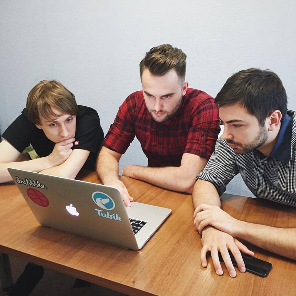
Designers always carefully analyze their tasks
2. How do you calculate the time and set deadlines for a project?
The general number of hours arranged for a project depends on the type of task. Estimation of timing is accomplished according to the assignment and the customer’s answers in our brief questionnaire. In any case, the general time calculated on a project includes Design Time and Revision Time. Revision time is time for iterations and analysis, so it is particularly important for complex projects on UI/UX design. Tasks of this sort need not only design itself but also deep analysis through iterations to make the result more efficient and, therefore, to get the client more satisfied.
To set convenient and realistic deadlines and make the process more productive, we split all the work planned for the project into carefully thought-out sprints, each with its own specific task and its own deadline.
3. What is the scheme of UX/UI design process?
There are four main parts of the design process: user experience (UX), prototyping, user interface (UI) and testing.
User experience stage is often the most confusing part, especially for those customers who are non-designers. When they are provided with the first UX screens, we sometimes get feedback showing they are terrified: why are the screens so simple? Why is the color scheme so decent? Why haven’t you used the shades corresponding to our website? How can THIS become a unique and attractive design? Hundreds of questions and sometimes negative remarks are very natural because the UX part stands rather far visually from what the customer will get as a final product.
When it happens, we take our time to tell the clients what UX is and how important is this part of their product. UX design is the heart and brain of a site or application, while UI is its skin and bones. And getting a product that is efficient and useful means starting with the heart and brain so that they could give the essence to its appearance.
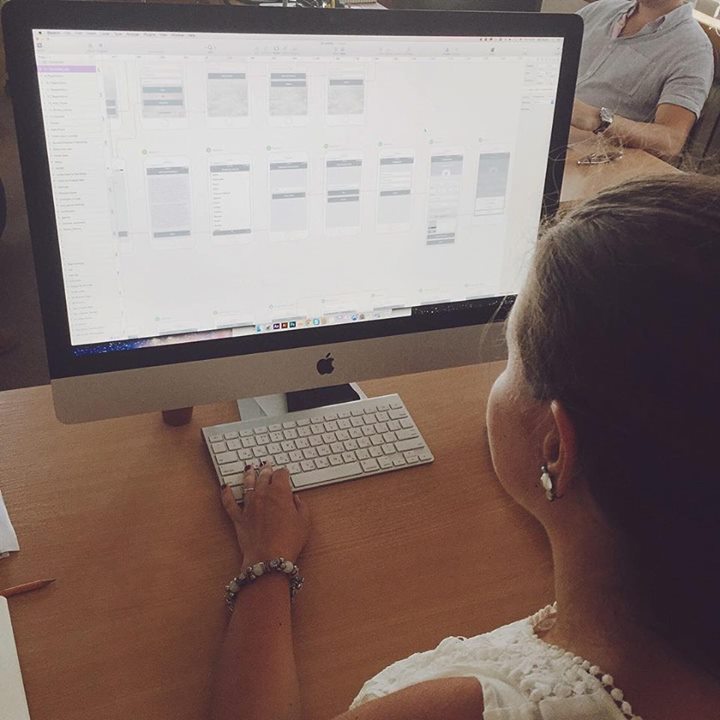
Working out UX screens
The UX stage is the period when a designer works with all the logic and functionality of an application or a website. It is time to create the layout, connections, and transitions, elements vital for creating conversions and making a product easy to use. All these things are analyzed and created considering the target audience of the website or application. The better is UX, the more subtle it will be. If the user doesn’t need to think too much and remember too many details, if everything works fast and every operation is clear, that is good UX. This is somehow the art of making things, which were seen as potentially difficult for a user, simple and subtle. That is why at this stage, we present the screens with their layout, features, and transitions in the form of simple schematic screens, usually in basic colors such as blue and white. This kind of presentation gives the opportunity to analyze only the utility and operability of the product, not being distracted by visual effects or details.
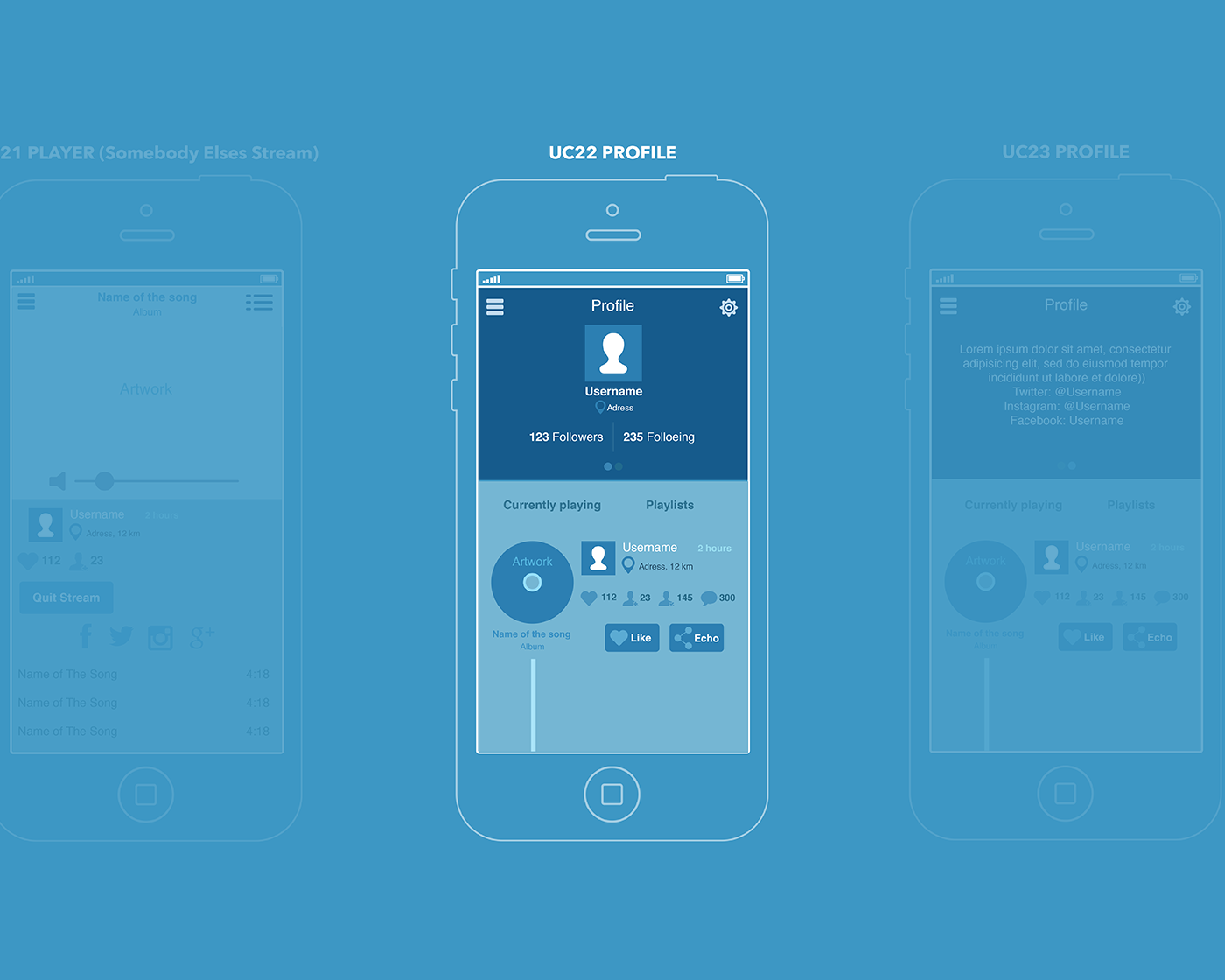
The example of presentation for the UX screen of a mobile application
When the general concept is accepted by the customer, we usually create a prototype as a great and high-performance tool for testing. Prototypes allow feeling transitions and functions of the product more realistically and reveal any bugs or difficulties at this stage before creating UI.
After the UX part is tested by a prototype, agreed upon, and the customer accepts the concept of layout, transitions, and features, the designer starts the UI part. This is the time when the newborn heart and brain of your product are clothed with its skin and bones. Here the product gets its real color scheme, forms, and features of the layout details, styles, animated elements, and so on.
And when the final version of UI for the product is agreed-upon with the customer, a designer takes some time for iterations and analysis that is needed to find out if all the solutions are not only attractive but also efficient.
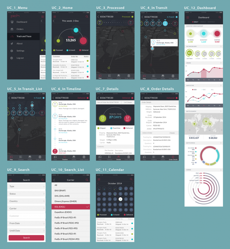
The example of the set of UX screens
To make the process clearer with the particular example, we have published the case study on UX/UI design here in our blog, showing how it proceeds, what job is done and how important it is to analyze and test the UX/UI solutions.
All the stages described are always accomplished in tight connection with the customer. Designers send updates and specify the details during the whole process so that the customer could always be aware of the process flow.
4. How many variants are you going to accomplish for one project?
Obviously, it depends on the task. For example, talking about the design of a logo, a designer can try loads of variants in the process of sketching and searching the general concepts. If you want to see how the whole logo design process flows, welcome to look through our case study on logo design.
When it comes to the projects on web or app design, then we usually work according to the following scheme. The designer assigned to the project carries out research and develops the first variant of one screen or one web-page which is highly saturated with details to understand the general direction of customer’s wishes and visualize an efficient solution for the problem. It is presented to the customer being appropriately framed up. If the customer approves the general direction for this one screen, then the designer can work on the rest. If the customer isn’t satisfied, the designer and the project manager working with him or her try to obtain maximum possible information to understand what is the reason for which the solution is not accepted. Then the designer provides redesign which sometimes needs some small alteration and in other cases a whole change of direction. In this way, up to three redesigns can be provided. Usually, it is more than enough because designers in the studio are very attentive to details and do their best to accomplish the task successfully.
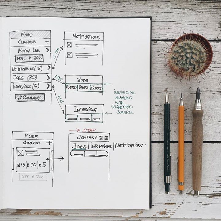
First sketches in search for a general solution
However, it should be mentioned that everything said above doesn’t mean the designer just does what the customer says without any analysis. The process of design is a really sophisticated mechanism and it is vital to remember that the final product will be used not only by the customer but first of all by users. Therefore, creating the product which looks great and satisfies the customer’s wishes but doesn’t correspond to the needs and tastes of the target audience means to create a dead product. Considering this, our designers always work in conditions of the open dialogue with the customers and are ready to explain some specific features of interface design and advocate the most optimal ones for the sake of successful result.
5. How do you collaborate with customers? What tools and software do you use for it?
As we have already mentioned before, the process of collaboration is essential for the successful and fast design process. There’s nothing more important for the efficient collaboration than fast and clear feedback so we apply well-known and greatly performing tools used by a lot of teams all over the world. The top leader of this list is Trello. We use it from the very start of our work both for collaboration with customers and fast effective internal information flow. It is simple, clear, reliable and multifunctional, that’s why customers also like the way it keeps things organized and under control.
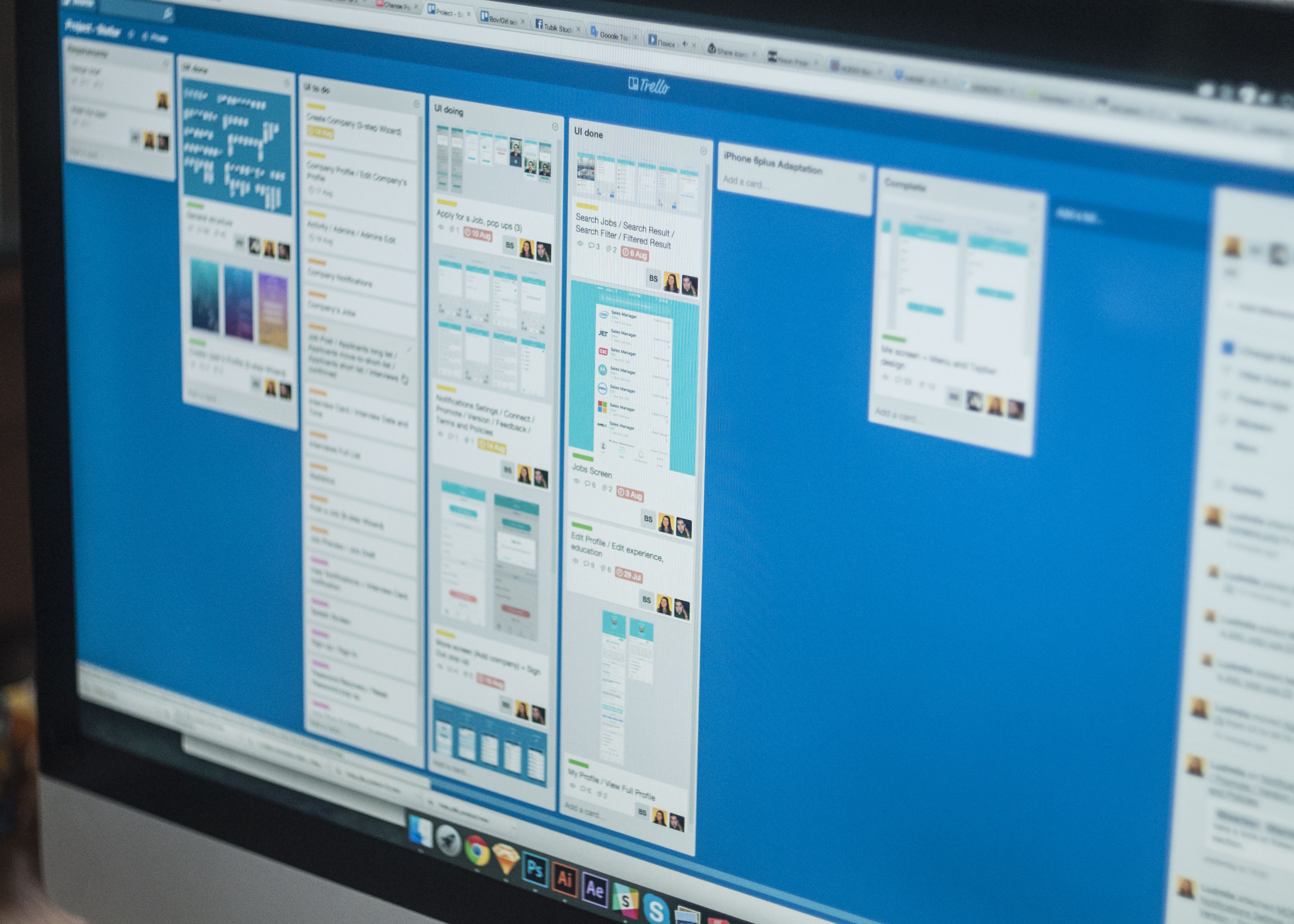
Working flow with Trello
When we need to communicate with our customers live, in most cases, we use Skype-calls or other conference calls software convenient for both sides. It also works efficiently as this tool doesn’t need special skills, is easy to use, well-known and available worldwide.
One more tool that is getting more and more popular here in the studio is Slack. It’s comfortable to use for chats, creating different channels of communication, saving links and files.
If we need to present our clients the screens for a mobile application, we use one more simple, but highly effective tool InVision. It is convenient to provide fast and productive collaboration in the chain of managers, designers and customers. It has proved itself as a great tool for teamwork.
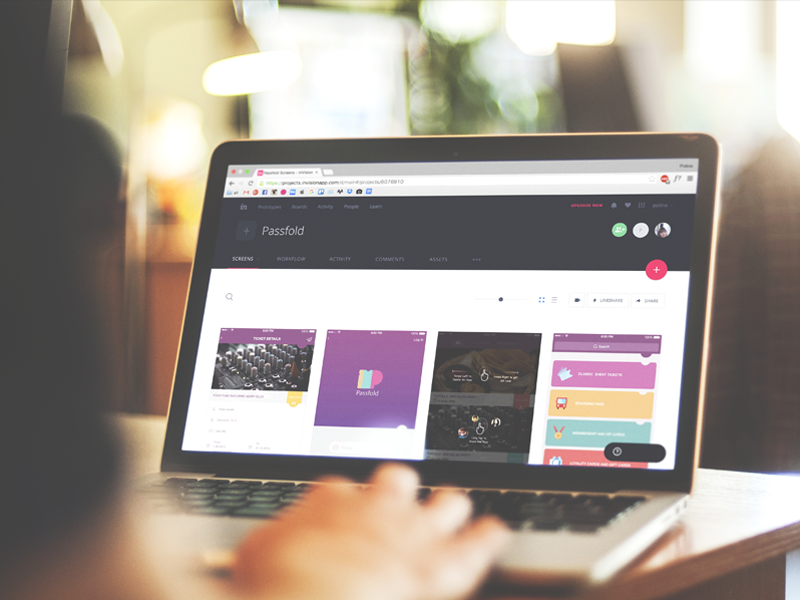
InVision used in the workflow
For some projects, we also use Asana and Basecamp, well-known instruments of organization and teamwork.
This is all for today. We’ll answer the next set of questions next Tuesday here on our blog. The FAQ platform is planned in several directions, so there will appear the questions frequently asked by customers, designers, and users. We are open to sharing our experience, so if you have any questions, feel free to ask them any time of day via direct message on our Facebook page or Twitter. We are looking forward to your questions!
See you next Thursday!


