Some stories aren’t told in courtrooms. They’re scribbled in the margins of legal briefs, whispered through cell bars, or stitched into the quiet resilience of those fighting for justice from the inside.
That’s the story we were invited to help tell.
Our long-standing partner Zealous—an organization amplifying justice movements through storytelling and media—reached out with a new collaboration. Together with the Jailhouse Lawyers Initiative at NYU School of Law, they were launching a campaign to spotlight jailhouse lawyers: incarcerated and formerly incarcerated individuals who study the law to advocate for themselves and their communities.
The campaign had many layers—policy, memory, movement—and we were brought in to shape one of its core pieces: an interactive visual timeline website that would trace the history, voices, and impact of jailhouse lawyers over the years.
It had to be informative. Emotional. Navigable. And alive.
Translating History into Design
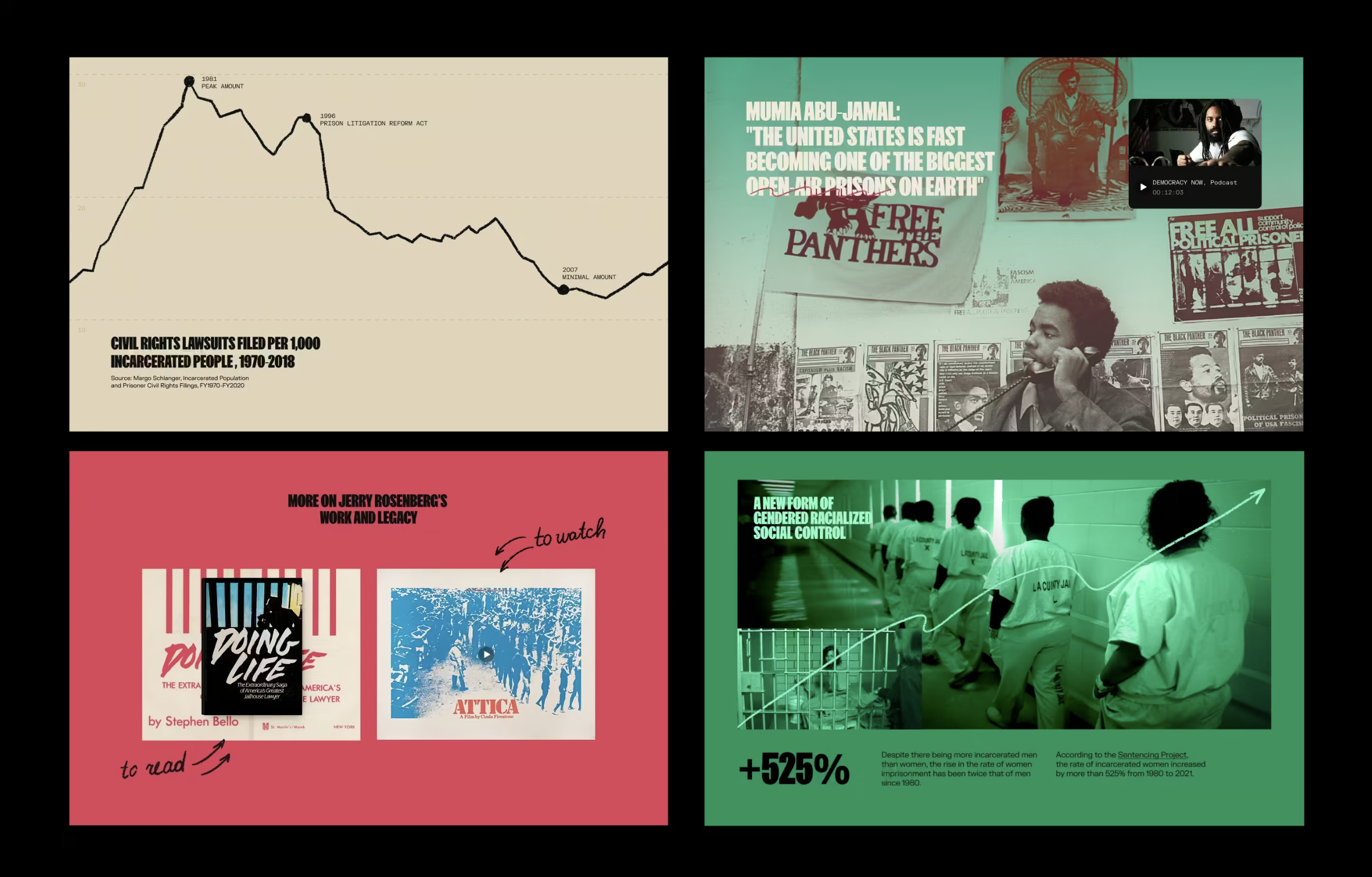
We began with research, not layouts. Pages of legal documentation, audio recordings, archival letters, and video interviews. What we received was not just reference—it was testimony. Rich with historical nuance and personal accounts that demanded a careful, intentional design approach.
Our task was to translate legal history into visual rhythm. Not oversimplified, not overly embellished. Something direct and respectful, yet visually striking enough to invite curiosity.
The visual direction was inspired by existing activist and legal design materials, but we didn’t want to copy. We aimed to elevate—to balance the weight of the subject matter with a clarity and tension that kept the viewer reading.
We looked at 70s legal posters. Protest art. Paperback law books. Movie title cards. The reference wall was a mix of grit and structure.
From Case Law to Collage: Building the Story Structure
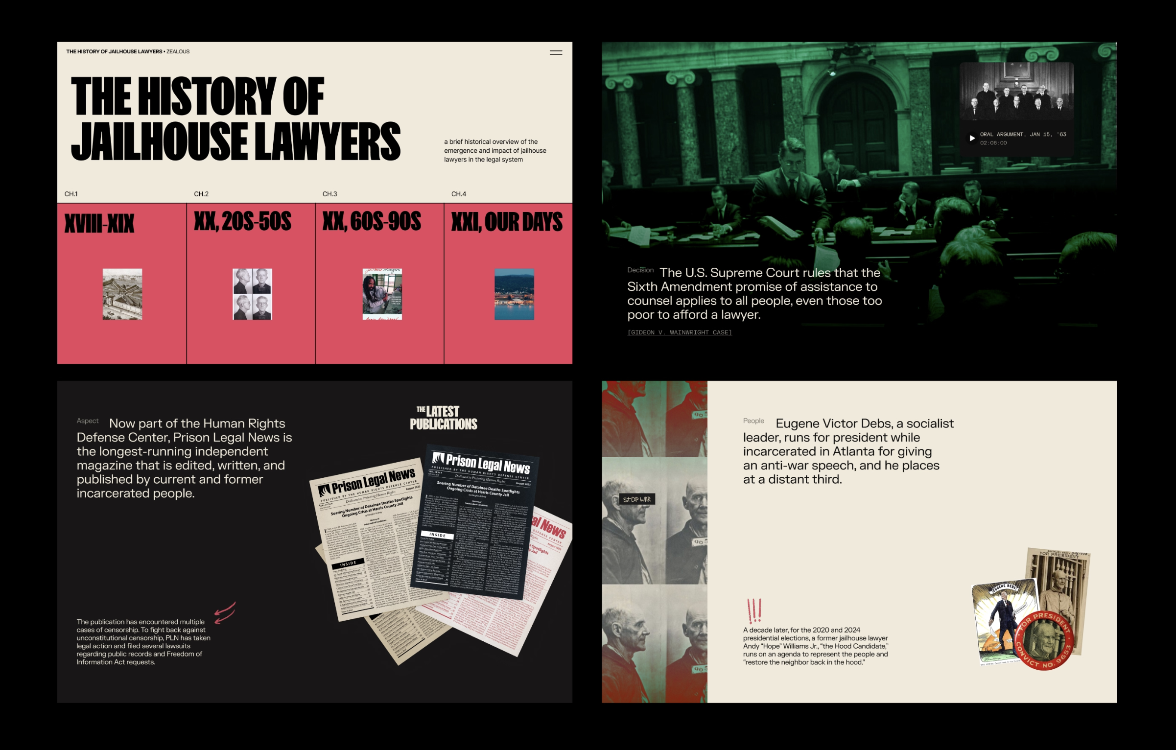
The core of the site is a horizontal-scroll timeline—each decade unspooling as the user moves sideways, not down. This wasn’t just a creative choice. It was a metaphor. Because this story doesn’t climb a ladder—it moves forward against resistance. Period by period, policy by policy.
Each section tells part of the movement’s evolution—with photographs, quotes, and stories pulled from legal records and personal archives. The challenge? Making dense legal text readable and emotionally resonant without losing factual precision.
To do that, we built:
- Visual anchors: Full-screen illustrations, document scans, collaged headlines—each designed to stop the scroll and ground the reader.
- Micro-narratives: Instead of one continuous history, we broke content into story blocks. Each had a beginning, middle, and end—letting users dip in and out without losing context.
- Authentic texture: We worked with handwritten annotations, scanned prison mail, and real case excerpts to make sure every visual felt human, not generic.
And when a quote or photo felt too clean, we roughed it up. Not to distort, but to reflect the reality behind the words.
Designed in Webflow. Built to Move.
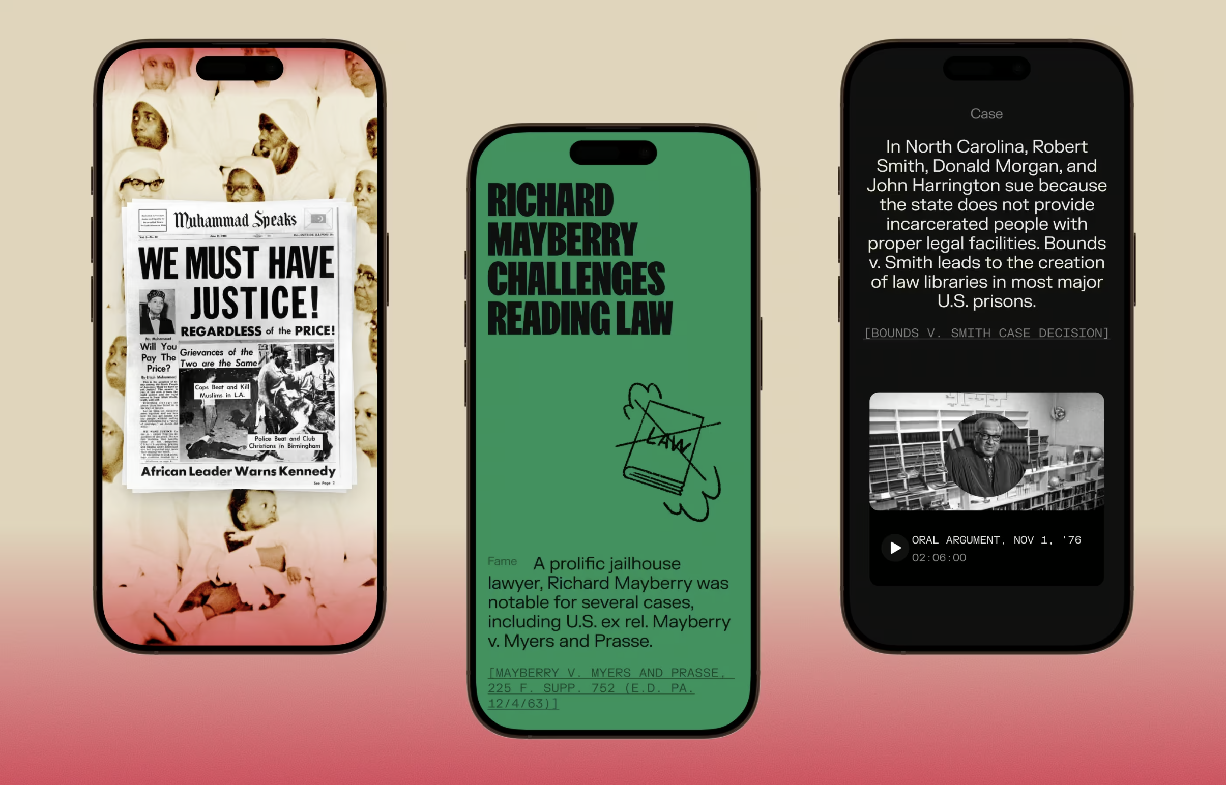
We built the full website in Webflow. That meant a close dance between design and development—especially when handling horizontal scroll and complex animations.
Since horizontal layouts don’t play by typical viewport rules, it was all about sizing and responsiveness.
So we split logic:
- Vertical elements sized with vw
- Horizontal sections sized with vh
That gave us precise control over spacing, padding, and scaling—across all devices, without distortion.
To support the scroll behavior, we integrated Lenis, an open-source scroll-smoothing library. Lightweight, flexible, and easy to customize, it gave us the control we needed to make horizontal navigation feel as fluid as flipping through a book.
When Native Tools Weren’t Enough
Some of the effects couldn’t be done with Webflow alone, so we wrote custom scripts:
- Animated headlines that reveal word-by-word as they scroll into view—built from scratch to work with horizontal layouts.
- Image swaps on hover in key moments—letting readers explore archival materials interactively.
- Stacked content cards that transition on click—mimicking the layering of legal cases and documents.
Elsewhere, we embedded After Effects GIFs to animate hand-drawn doodles and notes. These weren’t flourishes—they were signals. Little reminders that the people behind these stories were artists, thinkers, scribes.
One Page, Many Voices
Should we split the site into multiple pages? It was a question we asked early, and often. More pages could improve load time, but they risked fragmenting the narrative. Jailhouse law is a continuous struggle, so cutting it into pieces felt wrong.
So we kept it all on one page—and got meticulous with performance:
- WebP images for fast, high-quality visuals. It delivers the same visual quality as JPGs or PNGs at significantly smaller file sizes—often up to 30% lighter—which meant faster load times without sacrificing detail. Important when you’re showing scanned legal documents, textured collages, and layered visuals that need to retain nuance.
- Lazy loading for heavy assets. Using loading=”lazy” attributes and intersection observers, we deferred the loading of offscreen images and components until the user was about to see them. This reduced initial payload and gave us a smooth, progressive reveal, especially important for mobile networks and long horizontal scroll sections.
- Minified code and tight DOM structure. We compressed our HTML, CSS, and JS files, removing comments, whitespaces, and redundant selectors. But beyond that, we kept our DOM lean. No unnecessary wrappers. No nested divs where a class would do. Fewer nodes = less to render = faster paint times.
- No unnecessary offscreen elements. Every pixel on screen—and every one that might eventually appear—was intentional. We avoided hiding content with CSS that still existed in the DOM. This is a common performance pitfall in Webflow-based sites, especially with horizontal scroll pages, where preloading hidden sections can quietly bloat load times. We built around it.
The result is a single, unified experience—one that loads fast, scrolls smoothly, and holds its shape across devices. Desktop or mobile, touch or mouse, the story never breaks. Because when the content is about lives, laws, and legacies, the experience should never feel like a series of tabs. It should feel like turning pages in one long, unfolding truth.
Final Word
Design isn’t decoration. It’s alignment—between truth, emotion, and interaction. This wasn’t a campaign site. It was a living archive. A platform for voices that built their own knowledge behind bars and used it to fight for others.
At Tubik, we don’t measure success by visual trends. We measure it by how deeply the scroll lingers. How long a moment stays with you after the tab is closed.
Some stories deserve to be heard. Others, to be seen.
This one needed both.
Curious What Else We’re Building?
We build interfaces that make complex ideas feel simple—and stories you can scroll through, not just read. If you’re into thoughtful UX for bold, mission-driven work, take a look at our other case studies.
Case Study: UClay. Identity and Packaging Design for Ceramics and Pottery Brand
Case Study: Ammons’ Poetry. Creating Website About Poet’s Legacy
Case Study: 1260. Wine Brand Packaging Design with Medieval Vibes
Case Study: Drug Test Innocence. Website for Socially Impactful Online Resource
Case Study: Paris City Guide. Illustrations and Web Design for Tourism