Just imagine you worked hard, spent plenty of time creating a detailed prototype, and then a client rejected it saying that it isn’t even close to what he wanted. Sounds familiar, doesn’t it? Every designer at least once has been through such an unpleasant situation. Probably right now everyone expects some relevant advice on how to avoid this kind of situation but truly saying there is no perfect decision.
However, there are several methods helping to reduce risks of clients’ rejects as well as save designers’ time and nerves. Today’s article is devoted to a technique called mood boarding. Let’s see what mood boards are and how they can help in the designer’s workflow.
What’s a mood board?
The technique of moodboarding is popular not only in the design field but among many creative professionals. Mood board in design is literally a board (digital or material) which people filled with different kinds of things from photos to various textures so that they could visualize ideas and concepts.
Unlike wireframes and prototypes, mood boards don’t show a detailed picture of a future project. They are meant to transfer the right mood and bring the emotions expected from a product.
Mood boards are a useful tool helping designers effectively collaborate with clients and team members. Boards can be easily created within a tight timeframe and turn an abstract idea into a real one. This way designers can effectively share their ideas with others because visual material always works better than fluent phrases.
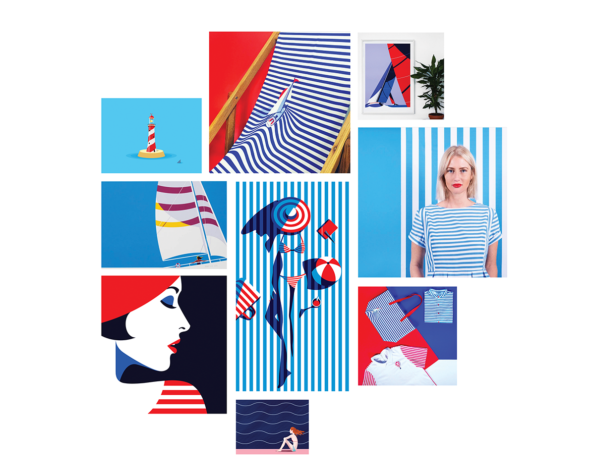
Graphic design mood board compiled by Tubik designer Ernest Asanov
How to create mood board?
Mood boards are a good way to experiment with a color palette, fonts, and style as well as plan the visual hierarchy of a project. Everyone decides for themselves what components to include in a mood board. UI/UX designers usually use the various samples so that they could characterize interface elements. There are several common types of mood boards. Let’s see what they are.
Free collage
Designers often collect free high-resolution photos so that they could use the material in future projects or elsewhere. These collections may come in handy for the mood board creation. A free collage consisting of beautiful photos is an effective way to transfer a mood of the design concept. Also, collages can be filled with illustrations, fonts, and color examples.
This type of mood board graphic design is the fastest and the easiest among the others. However, if a client is detail-oriented, they may not be excited with a free collage as an example of a future project.
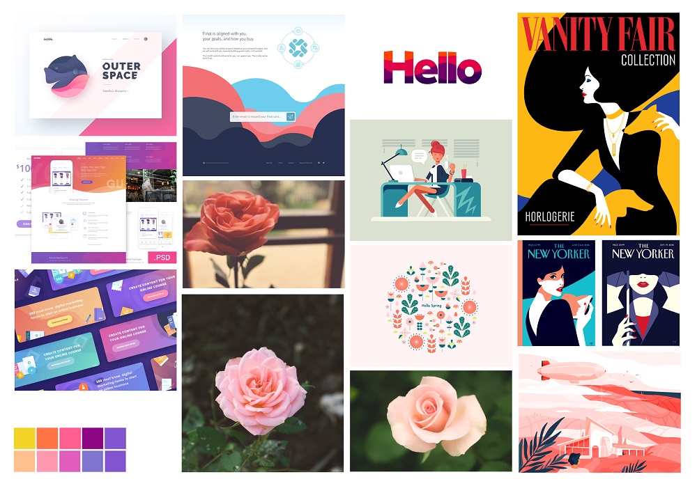
Mood board compiled by Tubik designer Ludmila Shevchenko
Reference collection
Another source of inspiration and a method for idea visualization is quality references. There are plenty of resources such as Behance and Dribbble where designers can find inspiring concepts and real projects with free access. Collection of design works united by a common style or any other feature can easily illustrate an idea for a new project. Moreover, such mood boards help clients effectively comprehend a concept because they can see similar references and imagine what their product will look like.
Template board
These mood boards are more like prototypes and wireframes. Their aim is to show the structure and visual hierarchy of a product. The difference is that UI elements on a template board are not detailed as in prototypes or schematic as in wireframes. Components are shown via random illustrations and photos presenting the layout of a digital product. In addition, images can be selected that way, so it would be easy to recognize the corresponding color palette. This method is faster than prototyping because it doesn’t require details.
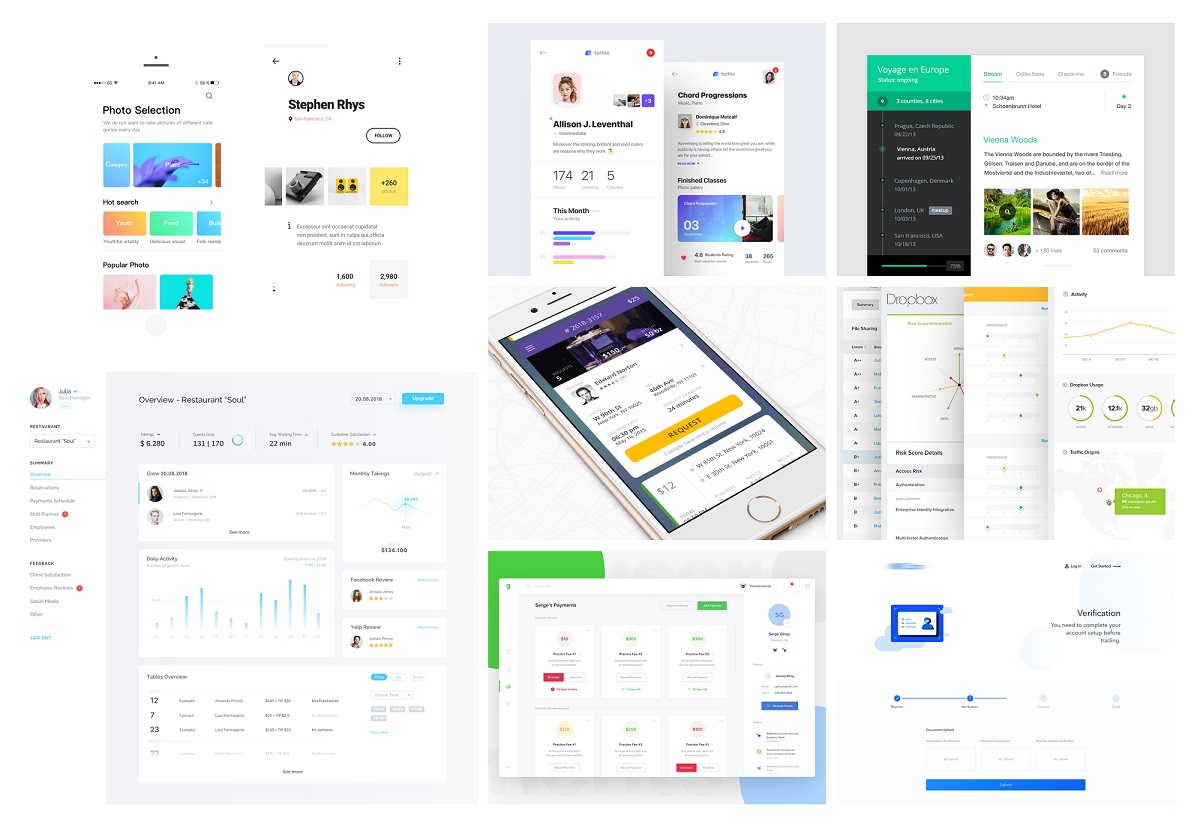
Mood board compiled by Tubik designer Ludmila Shevchenko
Why should UI/UX designers create mood boards?
Many of us may notice that wireframing and prototyping are always described as essential stages in design workflow while moodboards are rarely mentioned. Some may consider them as the waste of time or just entertainment. Nevertheless, there are many people who include moodboarding as a part of every creative process. But why do they choose the technique? Here we’ve gathered the list of reasons for designers.
1. To save time and effort.
The first and biggest advantage of mood boarding is that it doesn’t require much time. This means that in a few hours, or maybe less, designers can create a visual guide for clients presenting a concept. Mood boards for web design or branding concepts can be easily edited, saving both time and effort.
Such a guideline is a good foundation that allows quickly jumping to the next stage of prototyping. Moreover, designers save their nerves if a client is not satisfied with the outcome and demands a new concept because they don’t spend a whole day creating a detailed presentation.
2. To get inspired.
Of course, designers can’t always rely on inspiration because they have work to do, but things are done more effectively if the creator is inspired. Moodboarding is a good way to find ideas and enthusiasm. Beautiful photos and illustrations help to find the right mood and style. In addition, if you can, try to create a material mood board via things surrounding you. It is said that handwork has a powerful impact on creative thinking. So, why don’t you try?
3. To find the right color palette.
A collage can include photos, illustrations, and color samples, forming a compelling composition. By mixing images in different colors on a board, designers can experiment with a color palette even if UI elements are not ready yet.
4. To enhance communication with customers.
When a product is at the stage of an abstract idea, it is sometimes difficult for a designer and a customer to understand each other during discussions. For example, both sides can see a particular style a bit differently so it can cause an argument. That’s why it is always a good idea to have some visual references, such as a mood board.
5. To talk less and show more.
Continuing the point above, it should be said that any long report can’t explain your plans and ideas better than a visual presentation. Words can fail in shaping a picture in a client’s head but the visual material is a reliable guide helping customers to dive deeper into details and understand your ideas correctly.
Illustrate your ideas at the early stages so that clients could see what you plan and how their product is shaped up.
6. To find a style for a design.
If a creative team hasn’t received directives from clients about the style of the design, the task lays on a designer’s shoulders. To see how one or another style works, there is no need to build a detailed prototype for each of them. Add to a mood board different textures, experiment with types of illustration, test fonts, and change colors. It’s faster and more convenient to try options with a mood board than spend time changing prototypes one by one.
7. To involve clients in a process.
One of the ways of gaining clients’ trust is to let them feel they are deeply involved in a project. So, at this stage, if they wish, they can actively participate in the selection of styles and samples. Moodboarding is an easy technique that can be accomplished if you’re a non-designer.
Clients can be suggested to make a collage of photos and pictures, or maybe even references if they are not new at this. This way designers can easily learn clients’ tastes and preferences and see what they expect from the project.
Examples of mood boards for digital design projects
For the more practical presentation of the issue, we would like to show you the set of extended mood boards, compiled by Tubik designer Dima Panchenko for his projects on user interface design. He also practices adding the general notes presenting the mood board to the client which has a positive effect on the process of communication and choosing the concept for the project.
1. The mood board for setting the client’s preferences about the general stylistic concept of the screen.

2. The mood board presenting the vision of the style corresponding to the project requirements.

3. The moodboard with a variety of concepts for a sports app with the football theme.

Moodboarding can become a useful habit for every creative person. By knowing how to moodboard web design, mobile app concepts, logo ideas, or illustrations, professionals can raise the productivity of their creative flow. Designers can create mood boards to find inspiration or use them as an additional tool in their workflow. Stay tuned!
Recommended Reading
Types of Images in Web Interfaces
How to Design Effective Search in User Interfaces
Small Elements, Big Impact: Types and Functions of UI Icons
Basic Types of Buttons in User Interfaces
Visual Dividers in User Interfaces: Types and Design Tips
Directional Cues in User Interfaces
Copywriting for Mobile and Web Interfaces: Types of UI Copy


