1. Does your studio provide code for your designs?
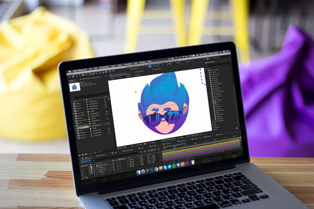
We are often asked this question on different stages of the design process as well as when we present various concepts. And the answer is that we DON’T provide any service of coding and development. At the present stage of our work Tubik Studio is positioned as an only-design studio providing a diversity of directions in the field. For the time of our practice, we have had loads of various tasks on UI/UX design, responsive web design, design of logos, illustrations, icons, interface animation. Studio work is formed in such a scheme so that designers could not only work on the actual projects but also improve and polish their skills, follow the latest trends in design, master the newest soft and hardware. We have the multifunctional team of designers, able to accomplish the assignments on the design of different complexity. However, for the time being, we have no developers on board. Today we are concentrated only on the wide variety of design tasks.
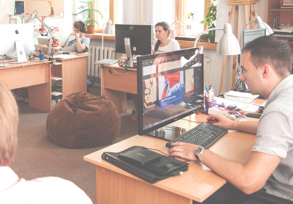
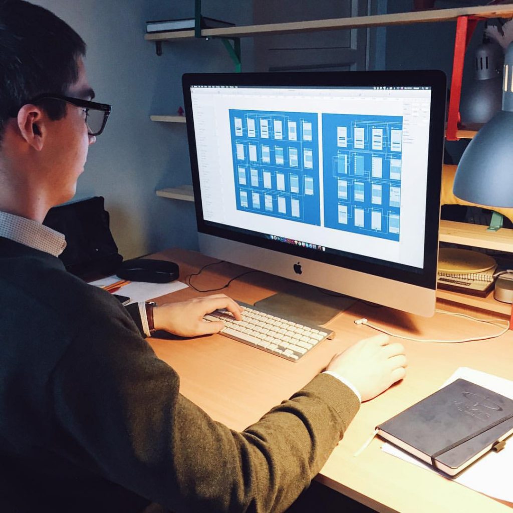
Tubik Studio designers discussing design in process
However, solving different design tasks we provide not only visual solutions but also a necessary set of descriptions and guides so that developers assigned to the task could use them on the stage of coding. Also, we carefully study and follow existing guidelines of design for iOS and Android to create the options of design which would not only satisfy the user and customer but enable the efficient process of concept code development.
2. Why is UX needed, if you can just design UI and that’s it?
This question is one of the top. The further the customer stands from the sphere of design, the more he or she will be inclined to ask this question. There are also some variations such as: “Why should I pay for UX?”, “Why should we waste time on UX?” and the like.
No wonder these questions are raised. It is natural. When we think about building the house, for example, we usually mean the process of physical appearance of the construction rather than tons of projects, drawings, and calculations made on paper. And yes, physically it’s possible to build the house without any project as well as it’s possible to create the interface out of thin air. However, in this case, you shouldn’t be surprised if one day the house will crack and collapse without any visible reasons as well as the app looking amazing and stylish won’t bring you any loyal users. If you want to have a reliable house, a durable mechanism, a powerful application or a highly-functional website, the recipe is the same – take your time for thorough planning and projecting. This is not going to waste your time, vice versa, it will save your time you would otherwise have to spend on the redesign and attempts to find out why your product doesn’t work properly.
That is the aim of UX part of design process. In general terms, the UX stage is about how the website or application works while UI is how it looks. Both these stages include work on successful interactions, but UX deals more with logic, connections and user behavior while UI stage provides a visual representation of all the concept. It means that ideally, the designer should first work on UX part with the concentration on a layout, making it more powerful, thought-out, clear and easy to use. Without this vital work, you highly risk creating a pure mess out of the user interface.
Visualization of UX process: screens and transitions
Worldwide famous guru of creating successful UX/UI Steven Krug in his book “Don’t Make Me Think: A Common Sense Approach to Web Usability” says that “…usability is about people and how they understand and use things, not about technology.” Our practice shows that this is absolute truth. And that is the idea which makes UX the core of successful user interface. UX is the basis letting your website, landing page or application attract and retain its audience. UX makes a journey around your app or site. In real life, if you need to reach the destination quickly, easily and saving your resources, you would prefer simple highway with a thought-out system of road signs and signposts to amazingly picturesque winded and confusing country road with an awful road surface. The same happens with users. They want to achieve their goals in a fast and easy way, and no fascinating features, decorations and original visual effects are going to cancel this basic wish.
So, it is very important to remember that website or application is not a piece of art just to observe and admire. First of all, it is a working product created to fulfill the needs of its target audience. It will bring home the bacon and obtain attention, popularity and loyalty only if users are happy and satisfied. Otherwise, even with the best visual presentation and fresh ideas on graphics, it will remain only a picture which does nothing useful.
That’s why we insist that good UX is the core and heart of any successful application or website. We have checked it in practice and it really works that way. Sure, this is not the only element of success; however, without it, all the other elements will bring much lower result.
3. What is responsive web design? Do I need it for my product?
The answer to this question is based on the audience you want to cover for your website. Would you like your users to use your site from any device and feel it positive, useful and convenient anyway? Sure, every customer would, being aware of the growing popularity of mobile devices. And in this case we should answer with confidence: yes, you obviously need a responsive web design for your site.
Great visualization of responsive web design concept (source – Wikimedia)
The idea behind responsive web design (RWD) is that the content and layout of a website should efficiently adapt according to the sizes and technical abilities of a device it is opened at. For most users, these changes are so subtle that it is easy to say “ Hey, guys, this is the same site on my smartphone which I looked through yesterday at my desktop. Nothing special has changed here!” And somehow these words can be the great praise of designer’s work. That will mean that the designer managed to keep all the meaningful elements and general layout of the desktop version efficiently and at the same time avoid making the page or layout elements too small, hardly seen or impossible to distinguish even on the much smaller screen of a mobile device. That is RWD in action.
Nowadays making the site non-mobile-friendly means to lose the part of the audience which likes surfing and using the internet sources “on the go”. It’s vital to consider that this part of the audience is mainly the most active part, non-afraid of technologies, fast in browsing necessary information and options, easy-going in making internet purchases and try new products. That’s why neglecting the idea of RWD can bring real loss to the product which otherwise could be highly efficient and bring high conversion rates.
Presentation of the visual solution of the same product on different devices.
Creating responsive web-design for a web-product means making it pleasant-looking, clear and functional in different sizing with optimal navigation that provides a high level of usability. This technique relieves an owner from the necessity to develop several versions of the site as it provides one site with fast adaptation to different technical conditions, so RWD is also generally cheaper than creating several versions of the site. Responsive web-design makes the site flexible, easy to manage and nice to use. Moreover, you don’t need to publish your content several times for different versions and it saves your time or human resources. If these are the features you want your product to obtain, consider responsive web design for your product from the earliest stages of its design and development. In addition, you will get higher positions in Google search engine as it supports the idea of RWD, so that is an important part of general search optimization of your product. Therefore, it’s up to you whether to apply RWD for your web-product or not, but consider all benefits before making your decision.
This is all for today. We’ll answer the next set of questions next Tuesday here on our blog. The FAQ platform is planned in several directions, so there will appear the questions, frequently asked by customers, designers, and users. We are open to share our experience, so if you have any questions, feel free to ask them any time of day via direct message on our Facebook page or Twitter. We are looking forward to your questions!
See you next Thursday!


