Have you ever felt the urge to leave the planned and predictable routine and do something impulsive? Maybe go to the random concert of an unknown band, or visit the exhibition you are walking by? Certainly, you know that feeling. Nowadays, people move in the circle of everyday drills, and the desire to drop everything naturally appears from time to time. But when the moment comes, we often don’t know the places to go or where to find interesting events. Here is how we have come up with the idea for a new mobile app concept called Night in Berlin.
Night in Berlin is one of the design projects accomplished in terms of Tubik UI Fridays. In one of the previous case studies, we talked about our new tradition of presenting the set of creative sessions when the designers have a day to work on the design concepts out of current projects. The concepts are created within a particular general idea of a digital product but with all the passion and freedom for the designers’ artistic souls. Today’s case study describes the creative process of the unusual mobile application design.
Task
UI\UX and motion design for a mobile event app.
UI Design
During UI Fridays, the designers sometimes receive objectives far from ordinary. In this way, the team has an opportunity to create something absolutely unique. This time, the task given to the designers was to design a mobile application of the future. To specify the task, the art director gave them the background story. The designers had to imagine themselves in Berlin of 2019 where every night is extremely eventful. Their objective was to create a design concept for the mobile application that would come in handy to people who love hanging out at night. When the task was set, Tubik designers Ludmila Shevchenko, Eugene Cameel, and Olga Popova started their work with art direction by Sergey Valiukh.
After active brainstorming, the designers’ team determined the concept of the app. It should be a simple application that enables people, who love socializing and visiting the latest events, to see the list of all the events, parties, exhibitions, and the like taking place in Berlin. In order to add the effect of bright, impulsive decisions, the list is shown at a particular time and only for the current day. The core thing the designers were supposed to keep in mind is that the application is meant for the users of the future, so the design needs to be absolutely original and extraordinary. Let’s see what the team managed to create.
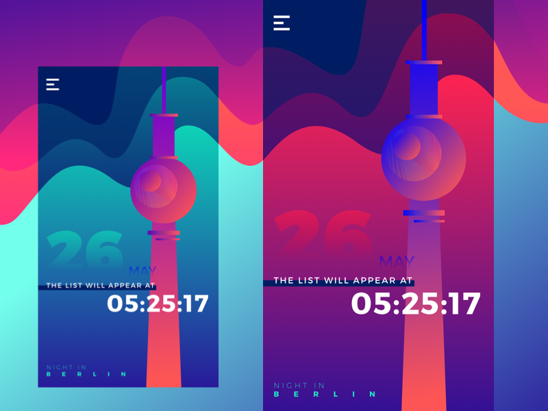
The first screen featured the onboarding with the countdown to the time when the list becomes available. The chosen gradient colors accurately convey the atmosphere of the night since they are associated with lights in nightclubs. The illustration of the Fernsehturm, the famous television tower in central Berlin, is made in the corresponding colors, so the design of the screen looks solid. The app’s name is situated at the bottom left part of the screen. All the functionality is hidden behind the hamburger menu button placed in the top left corner allowing to make the focus on the countdown.
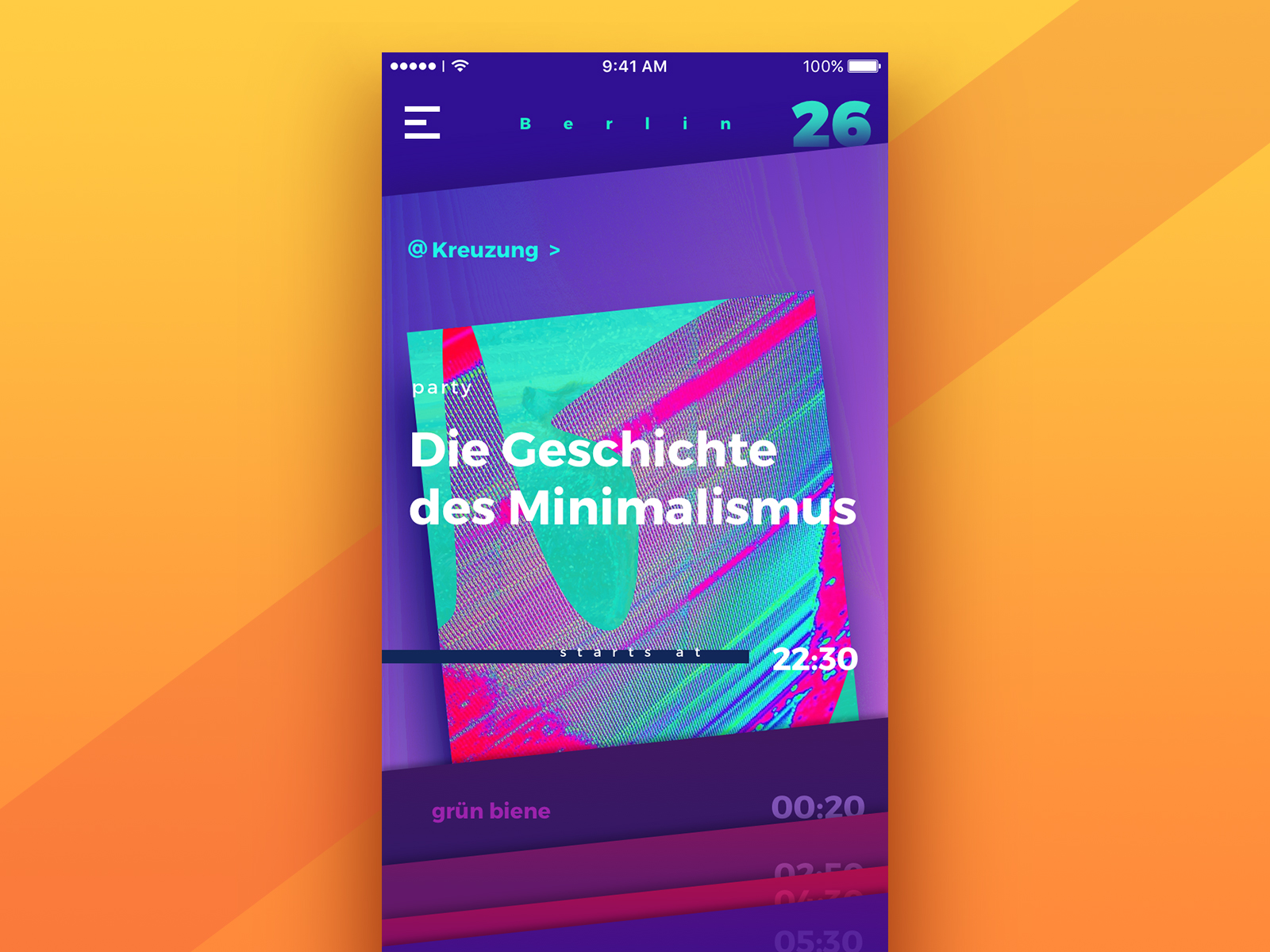
The screen above presents the list itself, informing the user about the variety of events. The data is organized along the cards for every event, which users can review by scrolling vertically. Each card shows the key details about the event: its type, title, and the time when it starts, as well as the thematic image in the background. Being interested, the user can tap on the card and see more details about the offer.
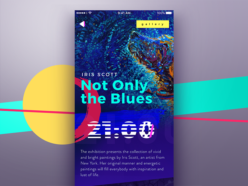
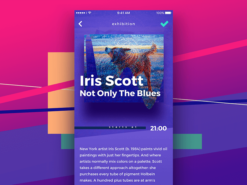
When the users tap on the event card, they see the event screen. This concept features the exhibition in the art gallery, which is marked in the top right corner. The name of the artist and the exhibition are situated in the center of the page. The background image presents actual artwork by the artists, so the users are able to quickly catch the style and artistic manner, read the description, and see the time when the event starts. All that combination provides the information to the user quickly, in a clear and stylish manner.
Motion Design
When the static variants of the screens were ready, motion designer Kirill Erokhin started working on the animations.
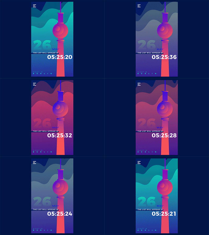
Here is the animated version of the onboarding screen. The major element is the countdown numbers which are smoothly animated. The background is moving similarly to haze, changing the colors.
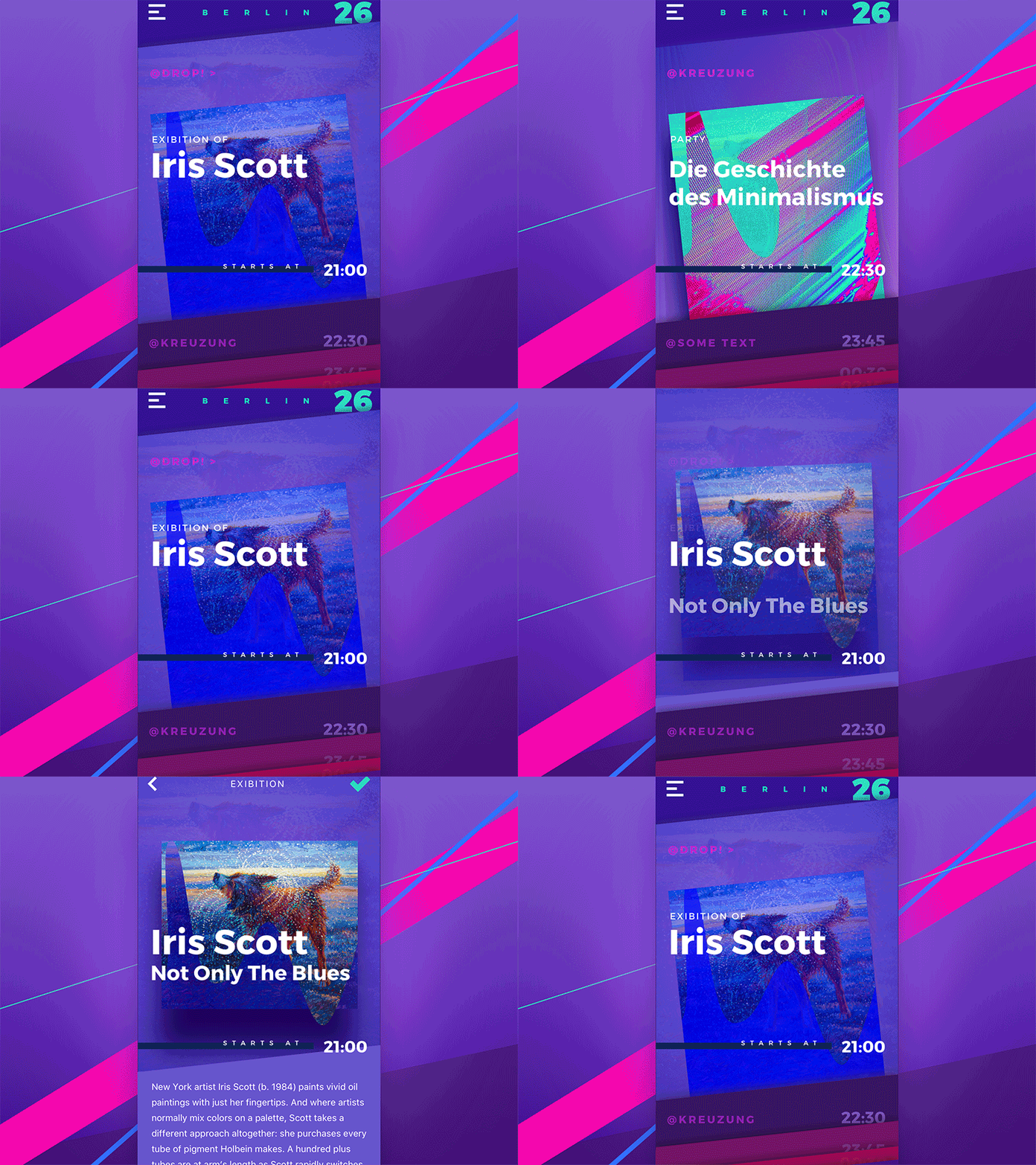
This animation presents the screen with a list of events showing user interactions. The data is organized along the cards for every event, which users can review by scrolling vertically. The user can tap on the card and see more details about the event. The arrow button on the top of the screen brings the user back to the list.
Working on design concepts of this kind gives designers a prominent chance to think out of the box. It stimulates their creativity which beams brighter when given regular practice. Follow our blog and check out our Dribbble page not to miss the updates on the Tubik UI Fridays. More concepts and case studies are coming very soon. Meanwhile, you can be interested in reviewing another case study for the creative design concept called Big City Guide. Stay tuned!
Useful Case Studies
If you are interested to see more practical case studies with creative flows for mobile UI design, here is the set of them from Tubik.
Slumber. Mobile UI Design for Healthy Sleeping
Bitex. UX Design for Stock Analysis App
Letter Bounce. UI Design for Mobile Game
Real Racing. UX and UI Design for Mobile Game
Real Racing. Graphic Design for Mobile Game
Manuva. UI/UX Design for Gym Fitness App
Cuteen. UI/UX Design for Mobile Photo Editor
Tasty Burger.UI Design for Food Ordering App
Watering Tracker. UI Design for Home Needs
Night in Berlin. UI for Event App


