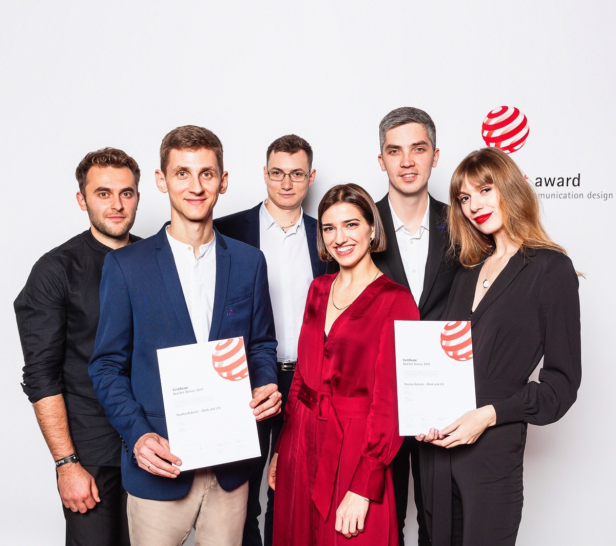
Today’s design case study shows the web interface that wasn’t made for clients: it was a purely creative project for the purpose of education and with a deep respect for a cinematography legend. Let us tell you the story of Kubrick Life website design, which has already got Site of the Day on FWA and Awwwards, is the winner of Webby Award 2019 in the category Movie & Film and Red Dot Award in Brands and Communication. The project was accomplished by studio designers Vladyslav Taran, Ksenia Lashko and Denys Koloskov.
Project
Design and animation for an educational website devoted to the life and movies of the famous film director Stanley Kubrick.
Idea
The initial idea was to create something extraordinary in terms of design and at the same time insightful in terms of content. It could be a website about a famous photographer, artist or anyone else connected with art. Stanley Kubrick and his great works eventually matched all our criteria to create an interesting piece of work that would be not only good to look at but also interesting to read. There was no commercial or business goal behind the project: only creativity and the wish to share something cool and useful with the others.
It was Stanley Kubrick’s 90th anniversary when we started to work on Kubrick Life in 2018. It was a great honor for us to be the ones who eternalize his art on a well-designed website. Considering that Stanley Kubrick is one of the most influential filmmakers in history, we thought that there are a lot of admirers who would be thrilled to learn more facts about him and his art. On the other hand, some people might get more interested in Stanley Kubrick once they check kubrick.life.
UX Design Process
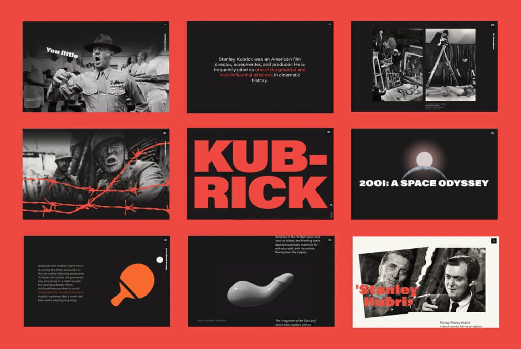
The idea was to create a complete and consistent story. Keeping in mind that Kubrick was a great filmmaker, the designers wanted the whole website to feel like a movie, allegorically.
The website features:
- the milestones of Kubrick’s life and career
- chronological filmography
- interesting numbers and facts about the filming process, cast and directors’ nature
- numerous archive photos and film episodes
- gamification elements
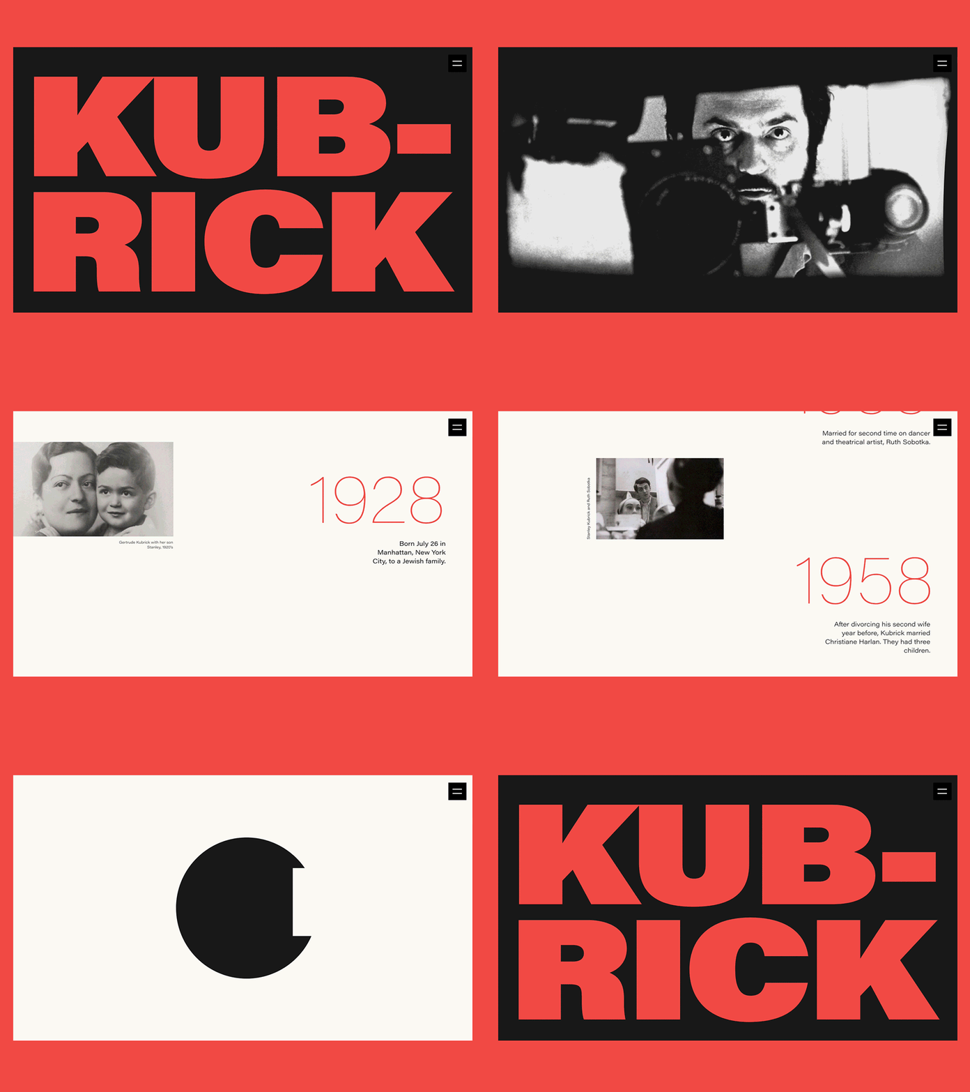
The narration was performed in chronological order and featured his films and some interesting facts to make the story of his life more enticing. From one movie story to the other, the readers get familiarized with Kubrick’s traits and techniques as a film director.
Stylistically, the designers added background noise, picked a quite old-school color palette and also worked thoroughly on typography to create this old movie-like feeling.
One of the things to mention is the scroll animations experienced by the readers along all the way. As the website performs as a huge long read, we needed to find a creative way to separate the films so we’ve come up with some unique animations for each film title. Another user-experience aspect is hidden stones like “Escape it” labyrinth that makes the interaction with a website more engaging and fun.
Among the hardest points for designers, there was that all the Kubrick’s films are of different genres and styles, they reveal different times as well. The most challenging aspect was to find a unified style to make all these films look consistent but still unique. They spent almost 3 months choosing the appropriate concept.
To reach “the movie effect” we used the infinite scroll as the main navigation element that takes us through the story of Kubrick’s life and filmography slide by slide. In the end, we found out that our long read is more than 300K pixels long! There is also handy side navigation for a more convenient experience. And some 3D graphics were specially created and integrated into the interface to make some episodes even more atmospheric.
The advantage of the creative team was the absence of time constraints because the project was in-studio and non-commercial. The only issue was to find the needed time and establish the point when the website could be considered done. Anyway, now when the website is live we are still working on polishing it.
The whole website has been built entirely on a Readymag platform with some custom HTML/JS/CSS code injections.
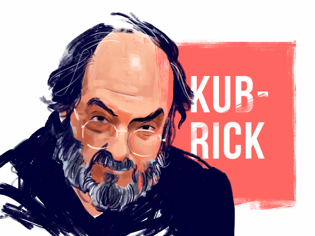
Also, one of our graphic designers Arthur Avakyan, being inspired by the website, created the stylized digital portrait of legendary Stanley Kubrick.
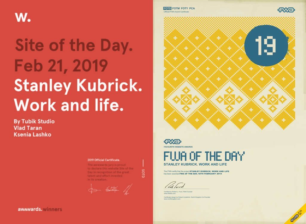
As soon as Kubrick Life was released, the creative team got the recognition from the community: it got the Site of the Day Award on The FWA as well as the Site of the Day and Developer Award on Awwwards.
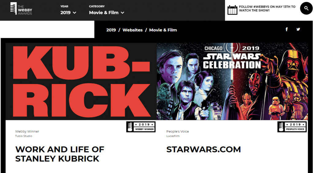
So, welcome to check all the details of Kubrick Life by yourself and learn why it got the Webby 2019.

Design Case Studies
If you are interested to see more practical case studies with creative flows for mobile and web design, here is the set of them from Tubik.
Nature Encyclopedia App. UI Design for Education
Florence App. Illustrations for Healthcare Service
Inspora. Brand and UI Design for Virtual Stylist
Bitex. UX Design for Stock Analysis App
Slumber. Mobile UI Design for Healthy Sleeping
Real Racing. UX and UI Design for Mobile Game


