
Abuk is Ukraine’s leading audiobook and podcast platform—home to an ever-growing library of carefully curated audio experiences, professionally recorded and voiced by actors, radio hosts, and cultural figures. In a market dominated by global giants, Abuk stands out for its deep local roots, editorial quality, and a user base that listens with intention.
Tubik has been collaborating with Abuk for years—but this case isn’t about the past. It’s about the latest update: a refined, more modern, and more functional design system built to reflect where the product is now—and where it’s heading.
This update focused on user experience across iOS, Android, and CarPlay, with improved structure, visual clarity, and long-term scalability in mind.
The Challenge: Rethink Without Reinventing
Back in 2021, Abuk’s interface was calm and functional. Minimalist typography, flat buttons, a quiet palette that emphasized content over UI. It worked.
But as the app grew—adding more users, titles, features, and environments (like CarPlay)—that quietness started to feel a little… too quiet. Not outdated, but under-expressive. Not broken, but definitely behind.
Our task:
- Modernize the visual system without disrupting the user’s muscle memory
- Make navigation more intuitive without increasing visual noise
- Polish the design language across mobile, web, and external integrations
- Build a design that feels premium—but doesn’t perform for attention
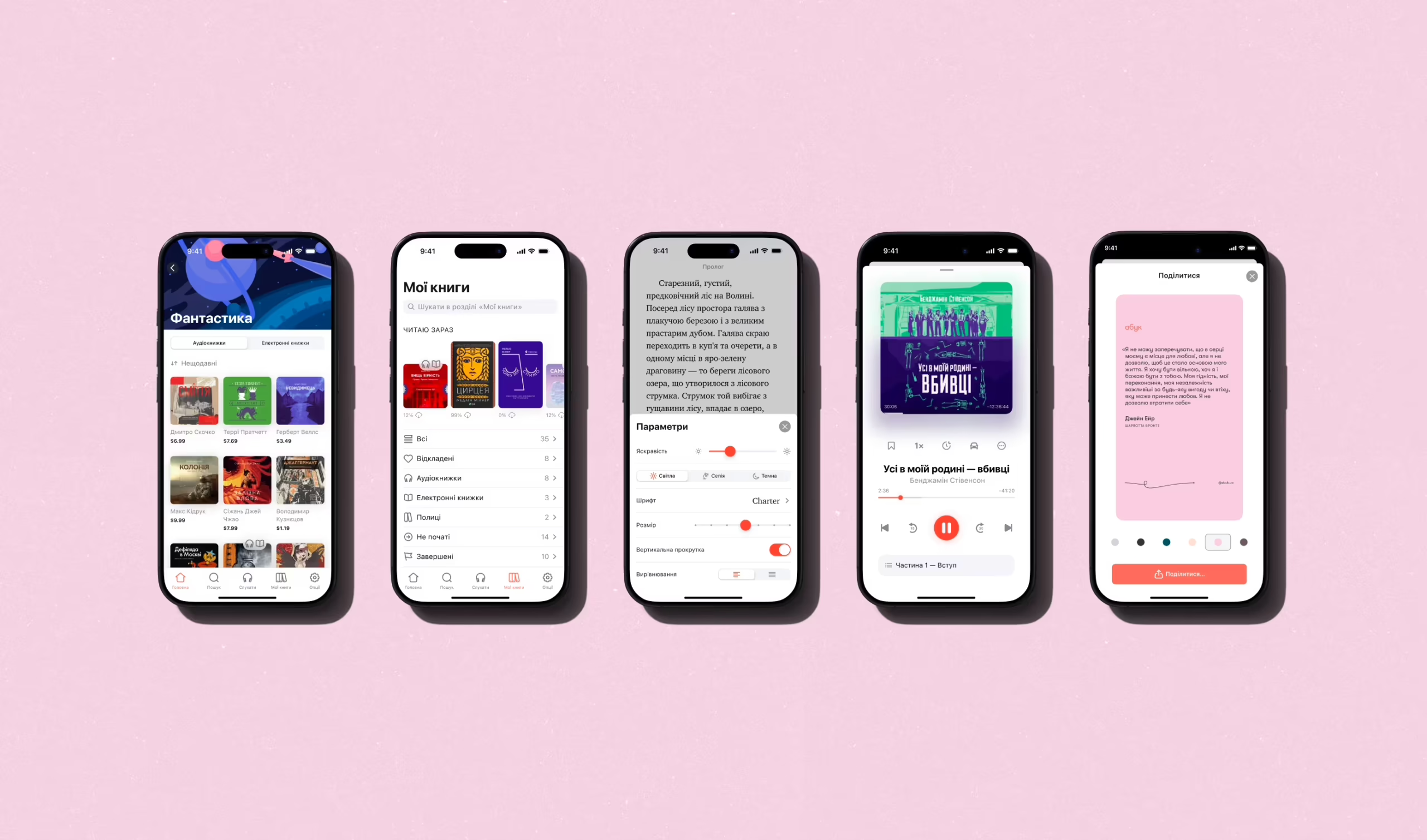
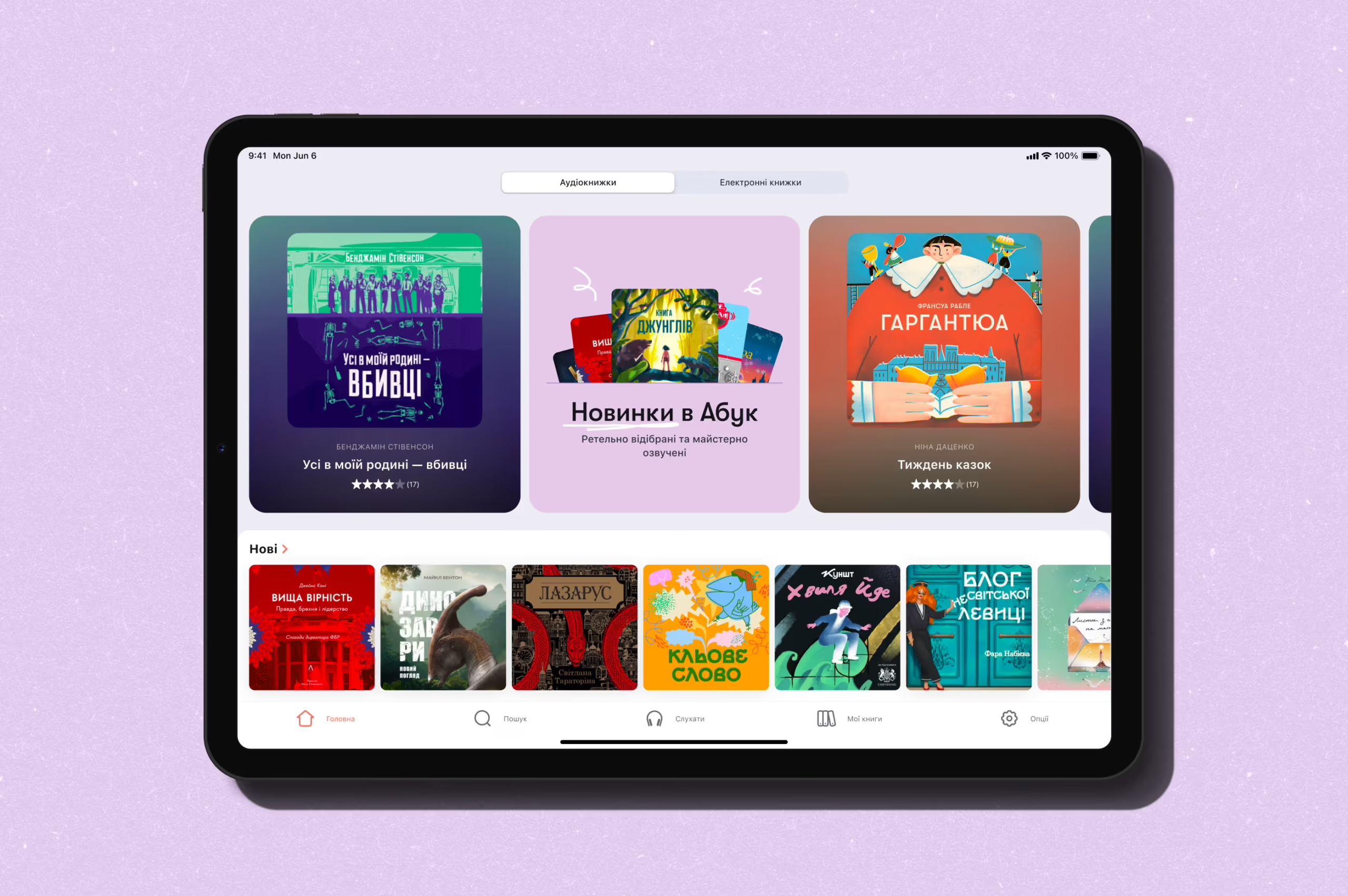
Home Screen, Reimagined
Let’s start where most users start: the home screen.
In the old version, the layout prioritized simplicity. Book covers dominated. Text was tucked below thumbnails. It worked well for content-first users, but didn’t offer much guidance. There was no sense of rhythm, no structure beyond the grid.
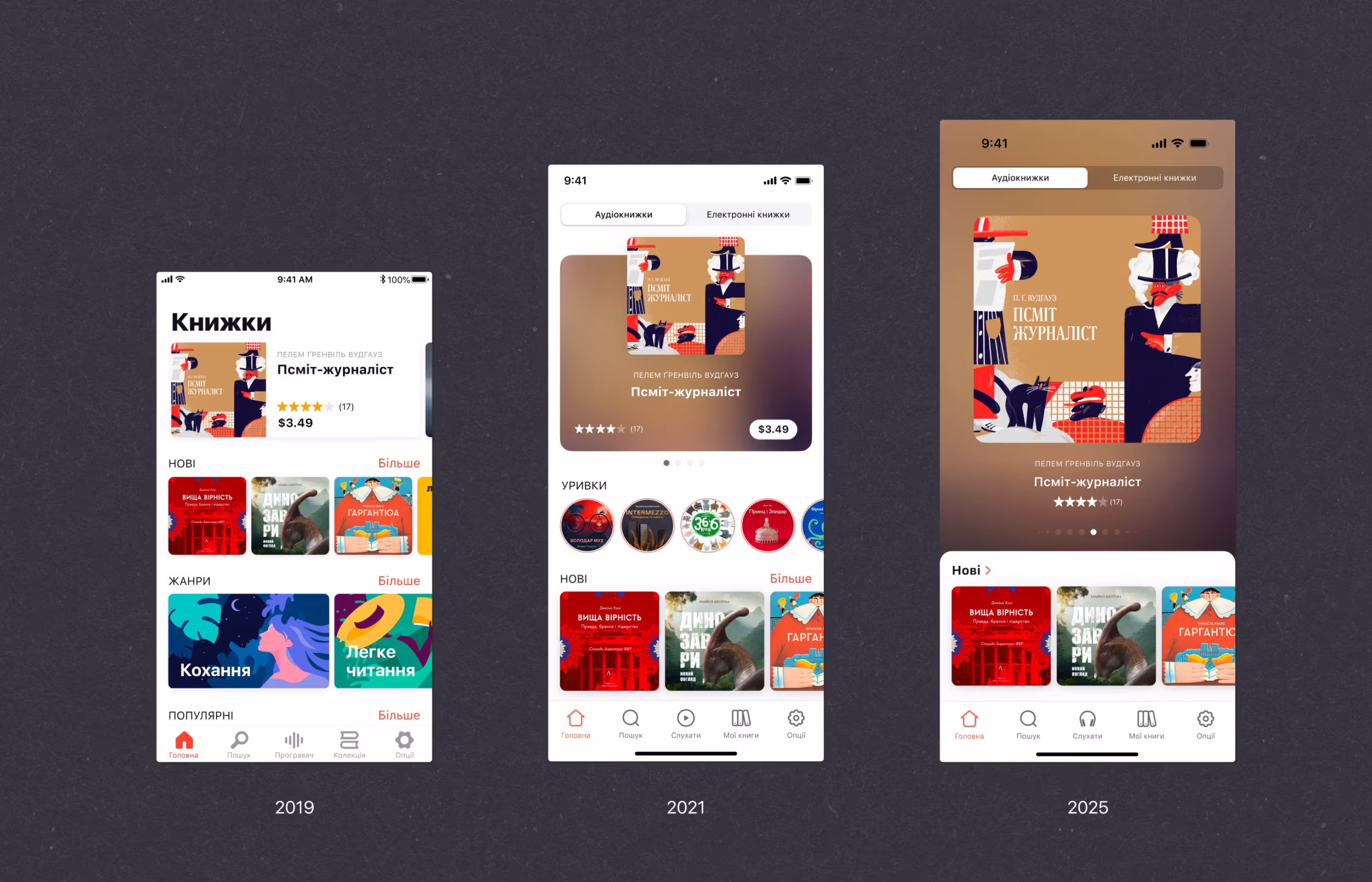
By 2025, we needed more from that space—without turning it into a dashboard. We introduced stronger typographic contrast, clearer sectioning, and breathing space—so now, you get more cues with less effort. It’s no longer a wall of rectangles. It’s a page that reads like a story: featured books, curated lists, personal recs, upcoming releases.
Designers will notice the shift in cards—from flat to subtly layered. Rounded edges, shadows with restraint, and micro-margins that respect both UI and eye fatigue. It doesn’t beg for taps, it suggests them.
In terms of color, we moved from passive neutrals to slightly warmer, deeper tones. Not bright. Not trendy. Just enough pigment to say, “Hey, you’re here—and we’re glad you are.” Like good lighting in a late-night bookstore.
The result is a home screen that feels intentional. It still gets out of the way—but now it also gives you a reason to stay.
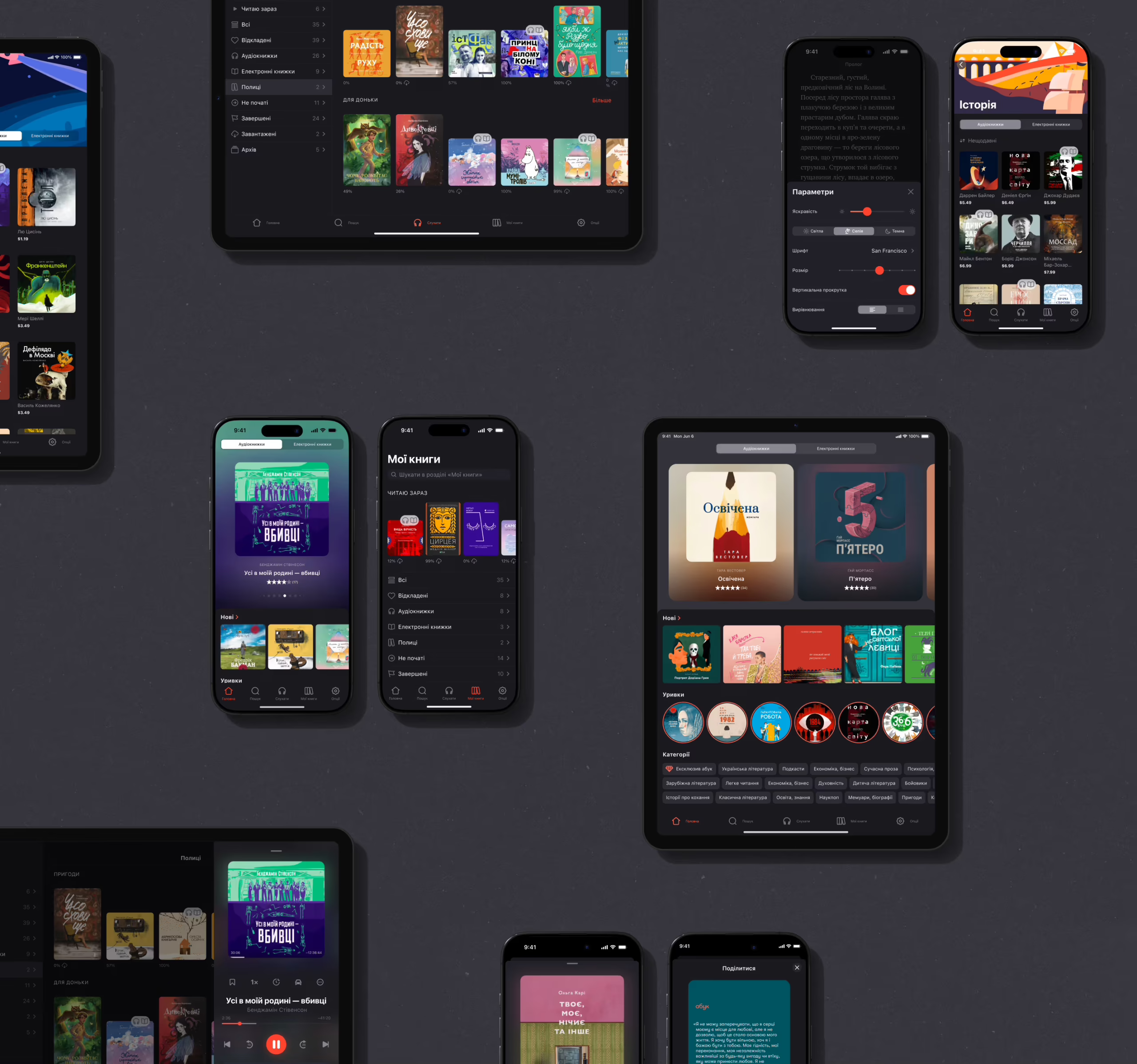
Listening-First UX
The redesigned player interface carries forward the same core values we’ve always designed around: minimal distractions, intuitive controls, and contextual clarity. But this time, every interaction feels sharper, more intentional.
CarPlay support introduced a new layer of complexity. Designing for that environment meant stripping things down to their absolute essence. We had to rethink how we signal progress, how we display titles, how we minimize risk—all while preserving brand clarity in an interface governed by Apple’s strict automotive guidelines.
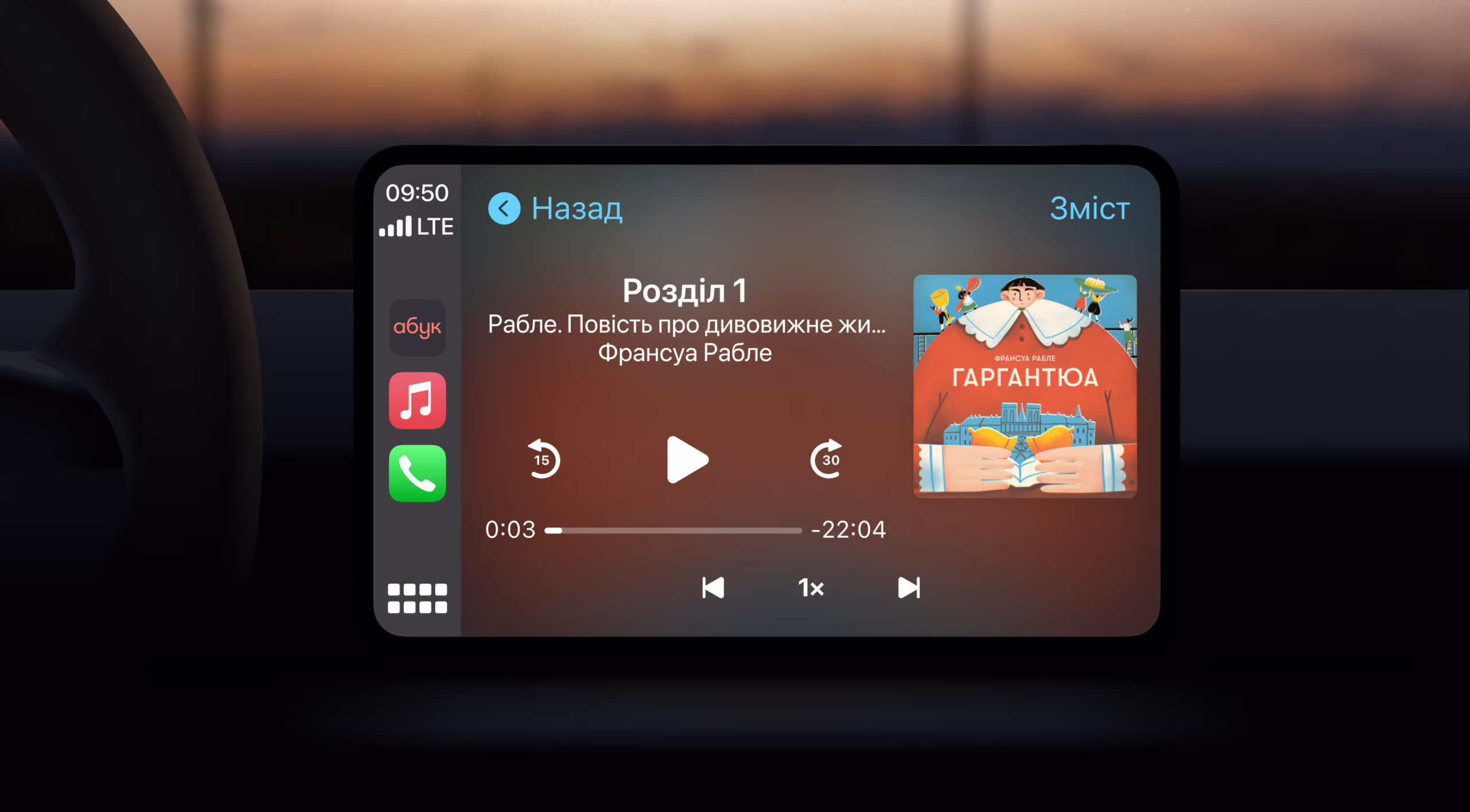
And recommendations? They’re less aggressive and more embedded into the natural scroll experience, offering subtle nudges rather than flashy suggestions. The outcome isn’t louder—it’s smarter. The app listens as closely as it speaks.
What Makes It Modern?
We didn’t slap on some gradients, curve the corners, and call it a day. What really changed was the app’s awareness. The way it pays attention—subtly, precisely—to how people actually use it. Where the thumb naturally rests. How long someone hovers before they tap. When their attention dips, or shifts, or needs a moment of silence.
Whether you’re on an iPhone, scrolling through CarPlay, or picking up where you left off on desktop, the tone stays the same. One language, many accents.
Even density got smarter. We managed to show more without shouting more—stacking useful content without the chaos, as if the screen suddenly understood how much was too much. That’s what modern means to us. Not decoration, but intention. Not interface, but atmosphere.
Reflections: What We Learned
Designing for audio means designing for presence. Not for clicks, not for performance. But for resonance. This redesign taught us that modern design doesn’t always mean new—it means aligned. With real users. Real moments. Real habits.
We didn’t build a brand-new app. We built a better surface for what was already working underneath. Abuk now holds its own against global players—without losing its voice. A voice that’s been downloaded over 500,000 times, played by 200,000 monthly users, and honored by EdTech Breakthrough and Forbes Next 250.
Not because it looks trendy.
But because it feels right.
Recommended Reading
If this story resonated with you, you might enjoy:
What’s Next: 10 UI Design Trends of 2026
Ecommerce UI/UX: 6 Web and Mobile Design Projects for Online Shopping
Der Baukasten: From Sketch to Scroll
Design for Fintech: UI/UX Projects for Finance and Business
11 Fancy and Practical UX Design Projects for Web and Mobile