Mobile apps live in people’s pockets. Which means they live inside daily rituals: the five-second glance while waiting for coffee, the half-awake scroll before bed, the quick tap during a grocery line. Designing for that space demands precision. Every pixel has to earn its place.
This small collection from the Tubik team gathers several mobile application concepts exploring how interface design can help users solve real problems with clarity and grace. Different domains. Different constraints. Same obsession: make the experience obvious enough that the user never stops to think about the interface.
Some projects also include landing pages—because an app rarely lives alone. Promotion, branding, and product storytelling begin long before the download button.
Let’s walk through a few examples.
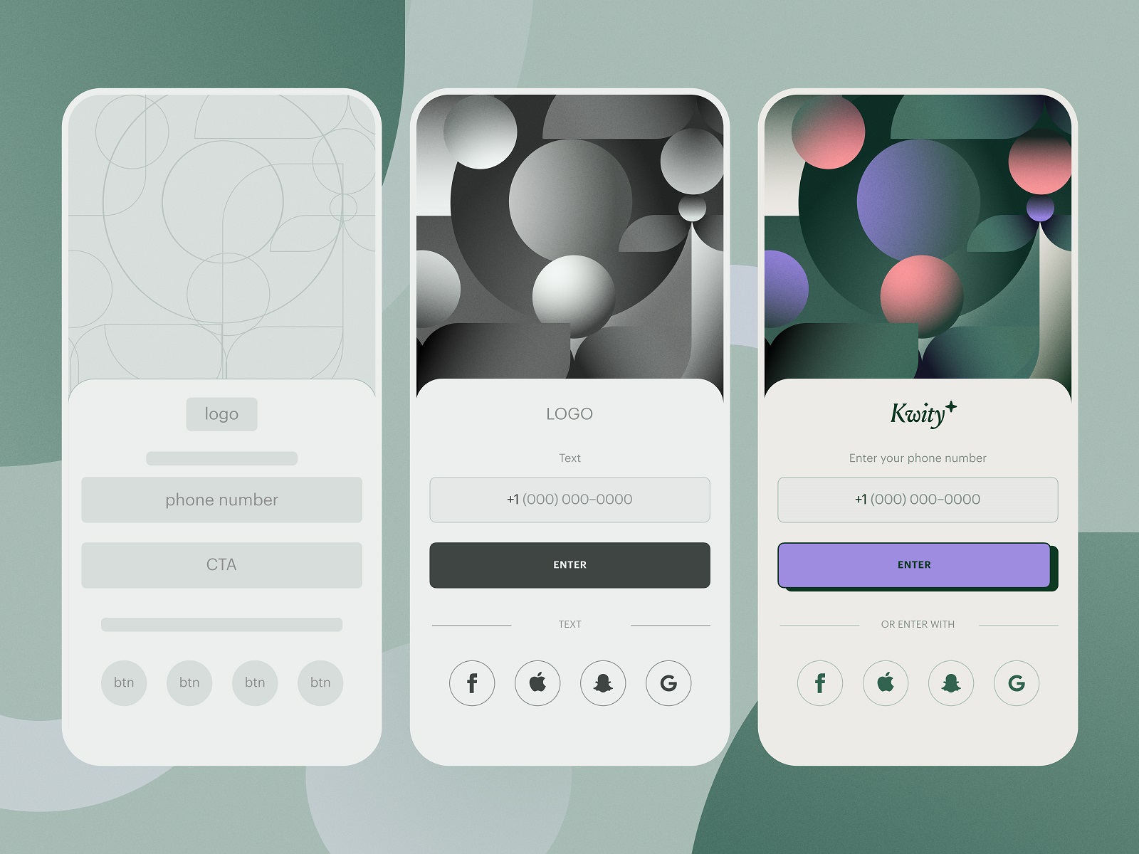
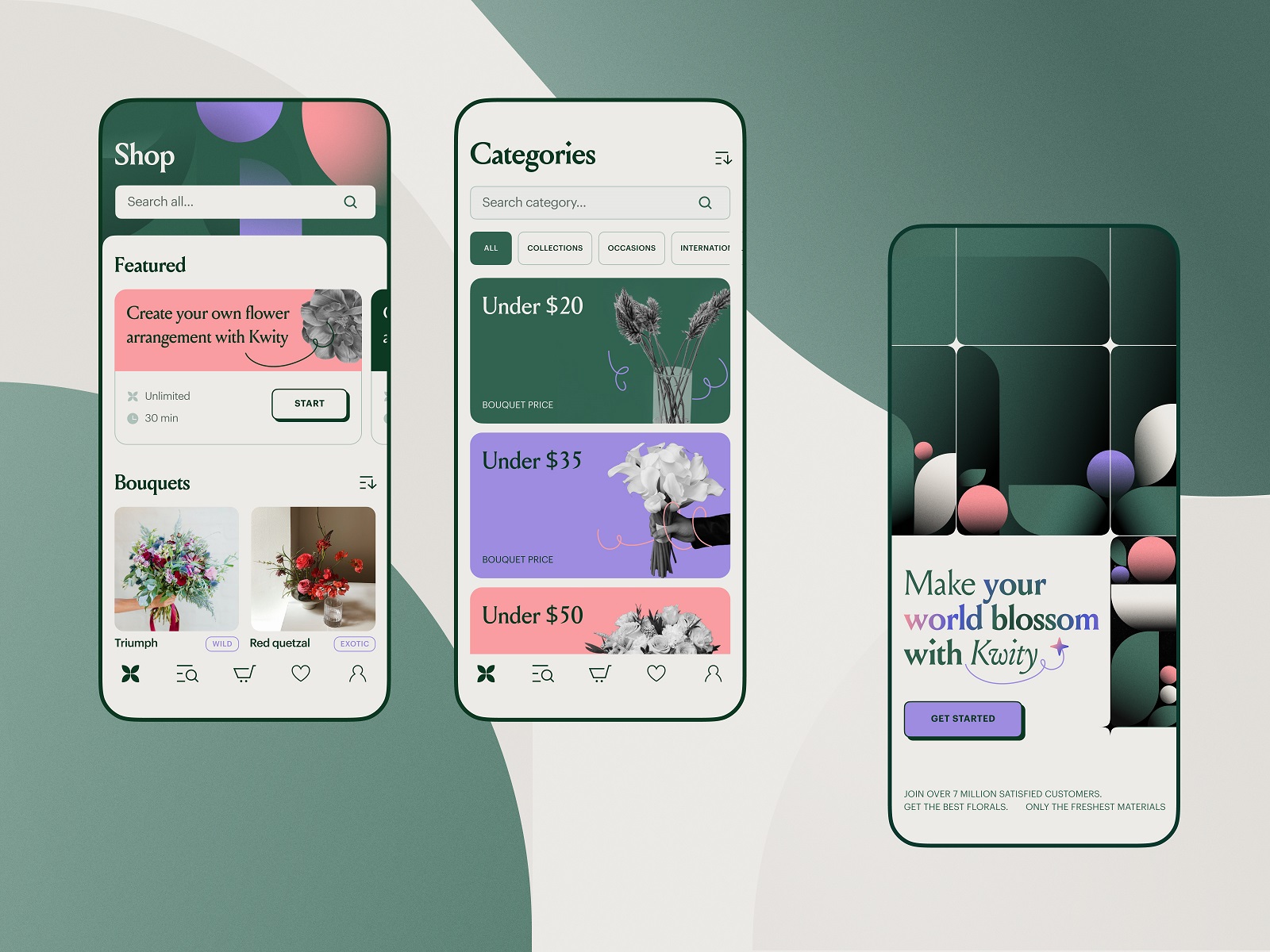
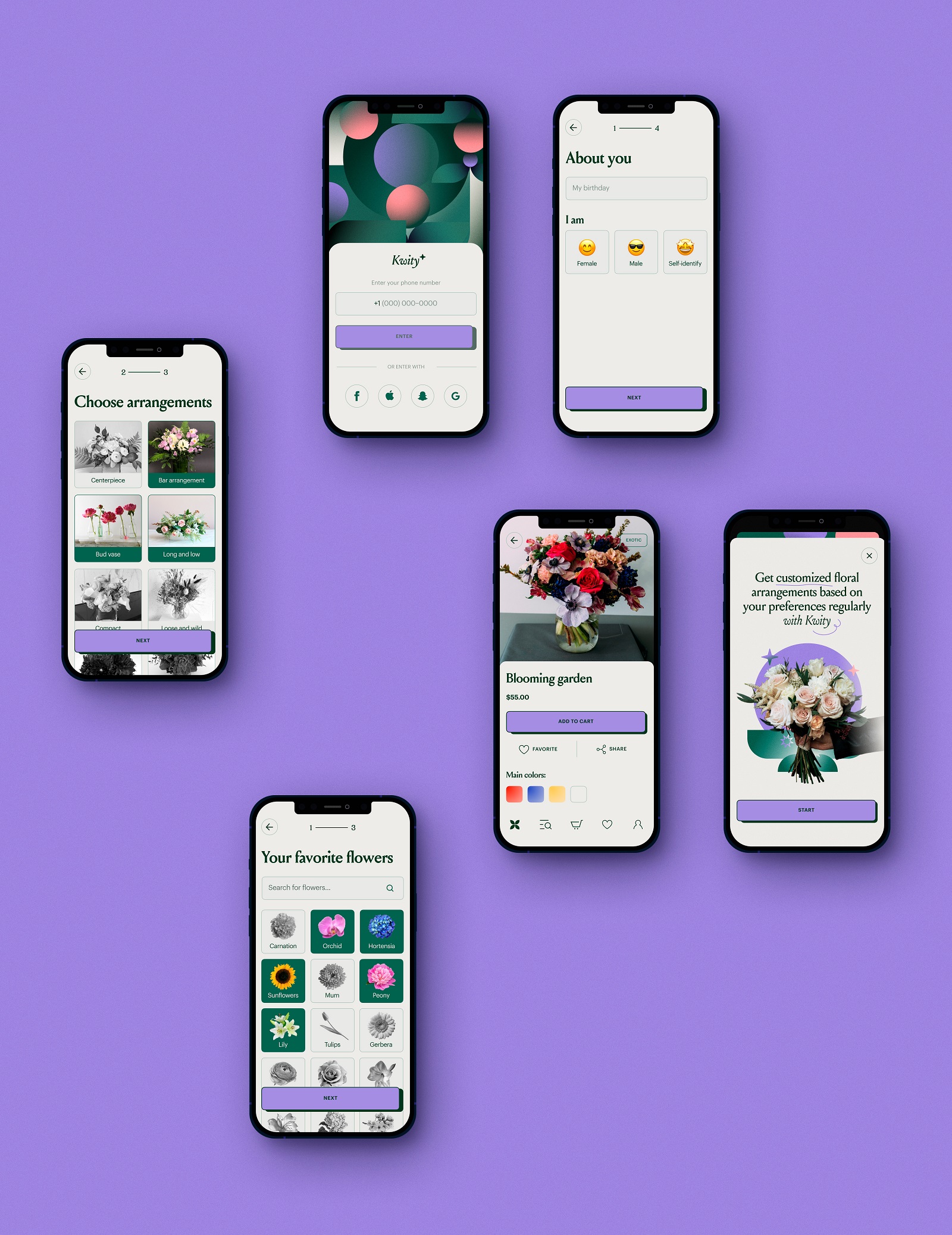
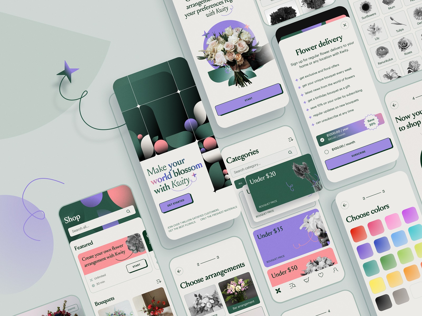
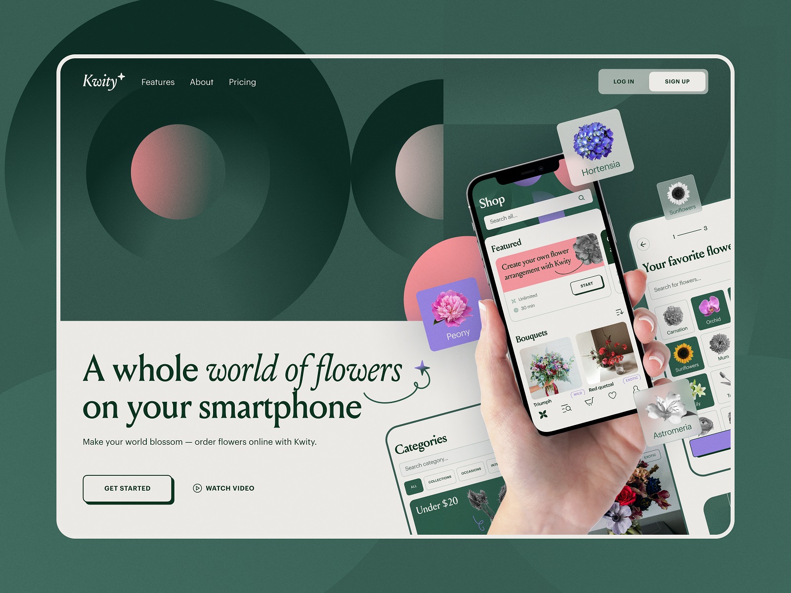
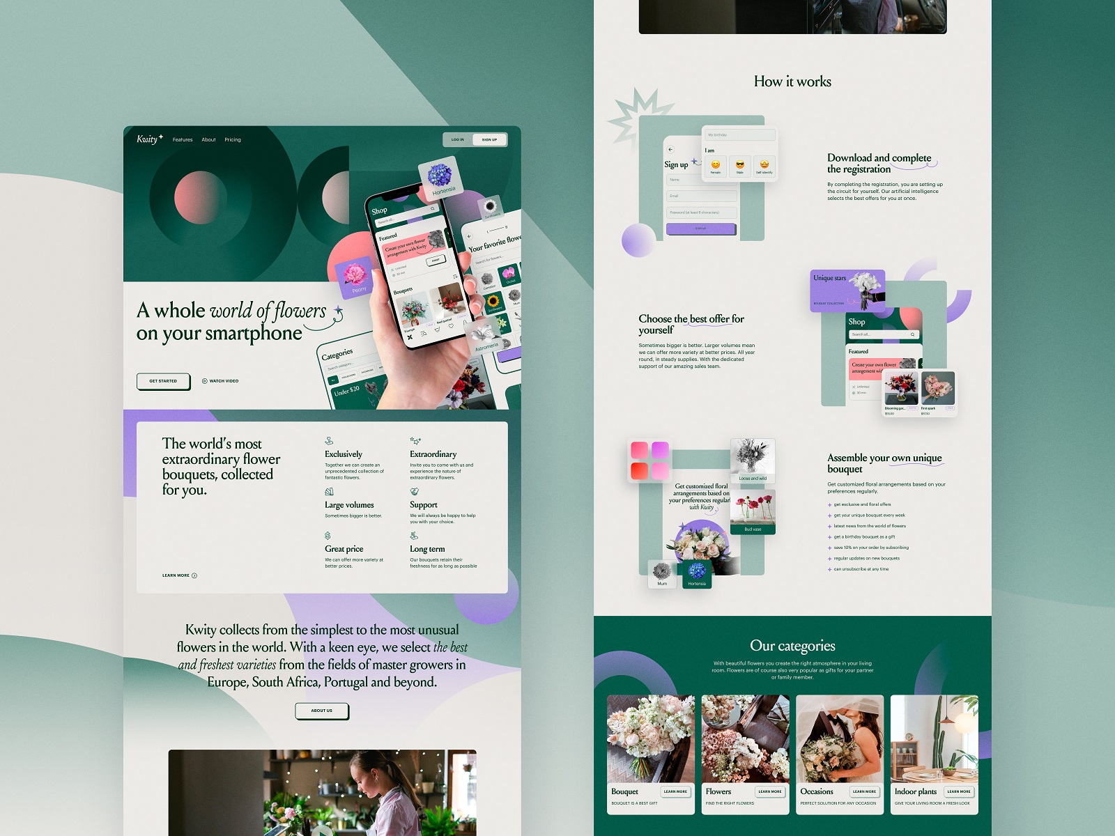
Flower Store Application
The internet sells flowers every day. Designing a flower shop app sounds straightforward until you start modeling the interaction. Bouquets aren’t products in the usual sense, they’re emotional gestures. Apology bouquets, birthday bouquets, “I forgot our anniversary” bouquets.
The concept focused on helping users compose arrangements quickly without drowning them in botanical complexity. Instead of overwhelming product grids, the interface leans on visual grouping and gentle color hierarchies that echo the natural logic of a garden: similar tones cluster together, seasonal flowers surface naturally, and bouquet combinations feel intuitive to assemble.
Navigation stays light. The user moves from flower selection to arrangement composition through small visual cues rather than heavy instruction. Large imagery carries most of the emotional weight—flowers do the selling, the interface simply organizes the moment.
Alongside the app concept, we explored a landing page designed to amplify the service online: a visual entry point where photography, typography, and bouquet previews establish the brand atmosphere before users even open the product.
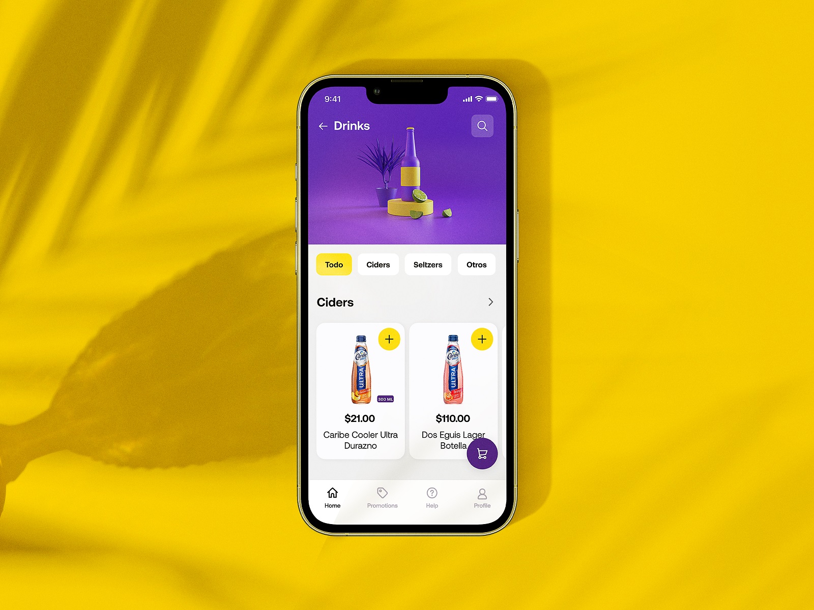
Drinks Delivery App
Some products run on efficiency. Others run on vibes.
Glup, a drinks delivery concept we created for Heineken Mexico, lives firmly in the second category. The idea was simple: order beer, snacks, and party essentials quickly and get them delivered before the music gets boring.
The visual direction leans bright and energetic. Bold color fields, chunky product cards, and playful motion cues mirror the social atmosphere the app supports. You open the app and immediately understand the mood.
But underneath the party aesthetic sits a carefully structured interaction model. Product categories stay shallow and easy to browse. Order flows minimize steps. Buttons are oversized for quick taps—because people using this app might not be interacting in perfectly calm conditions.
Our task included developing branding and UX design that carry the Heineken identity across the experience without turning the interface into a billboard. The brand shows up through tone, color, and rhythm rather than aggressive logo repetition.
Result: an ordering flow that feels as quick and casual as grabbing drinks from the fridge.
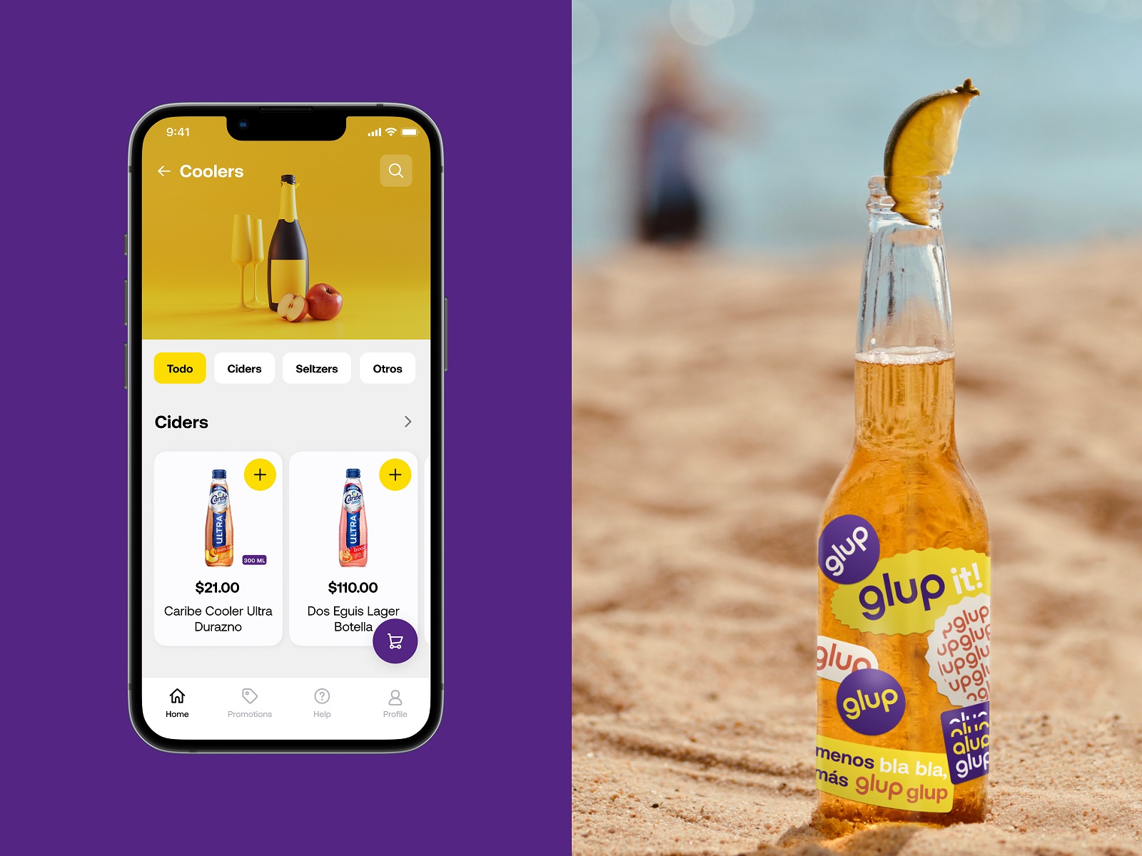
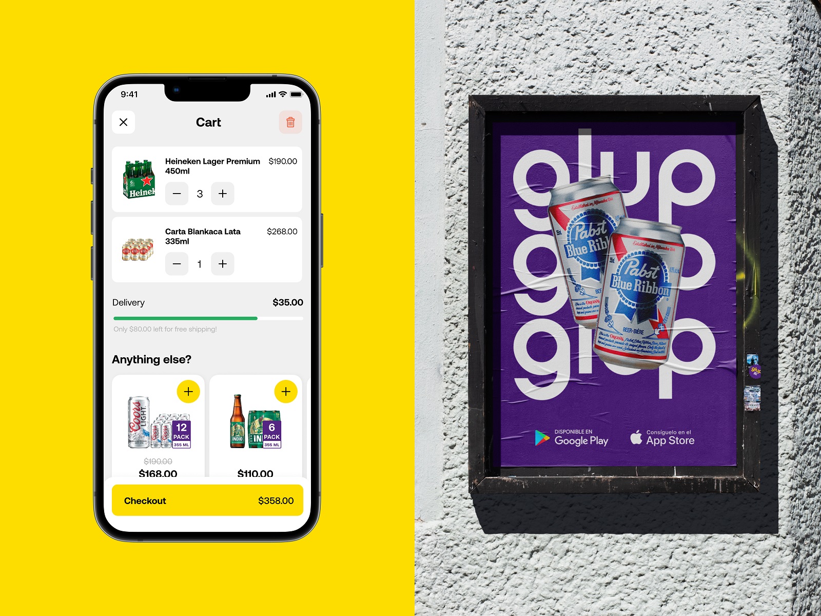
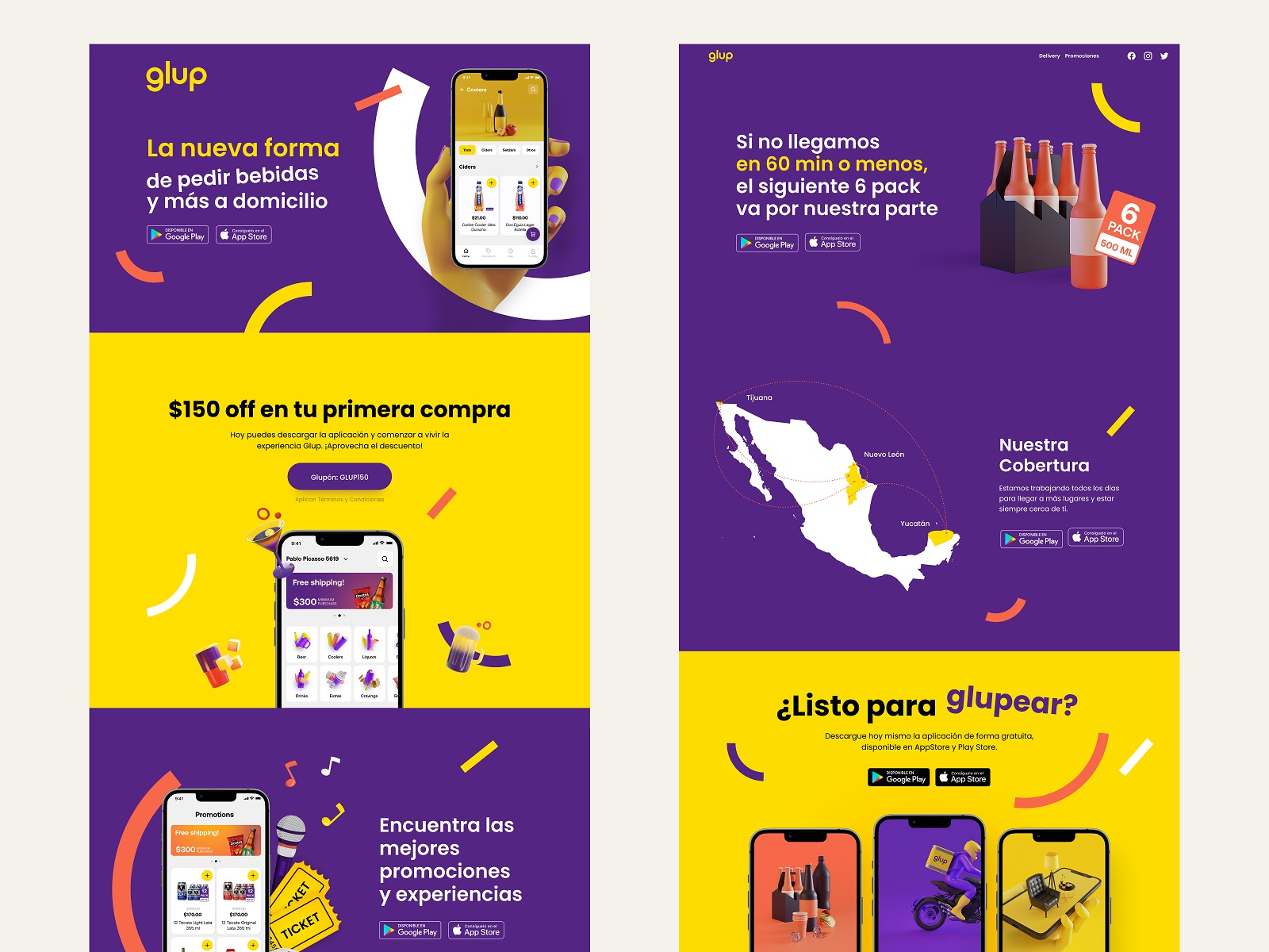
Learn more about the project in the Glup design case study.
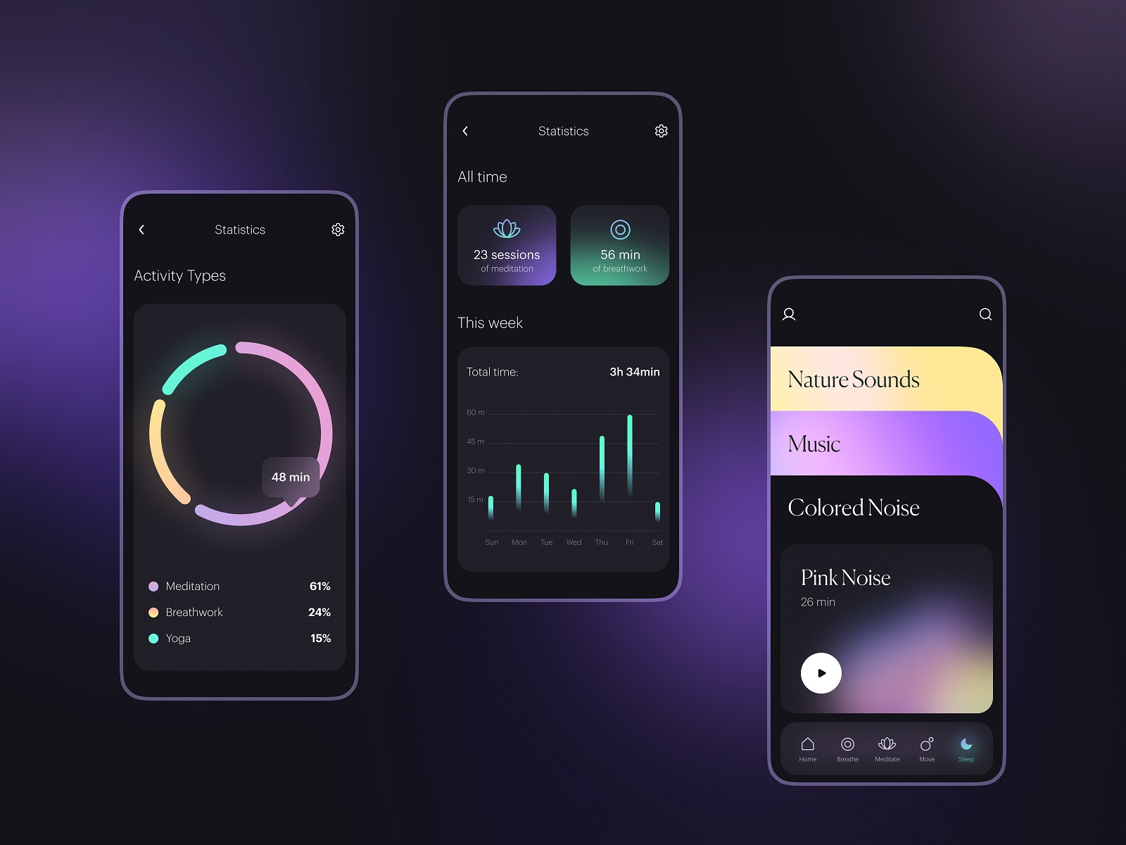
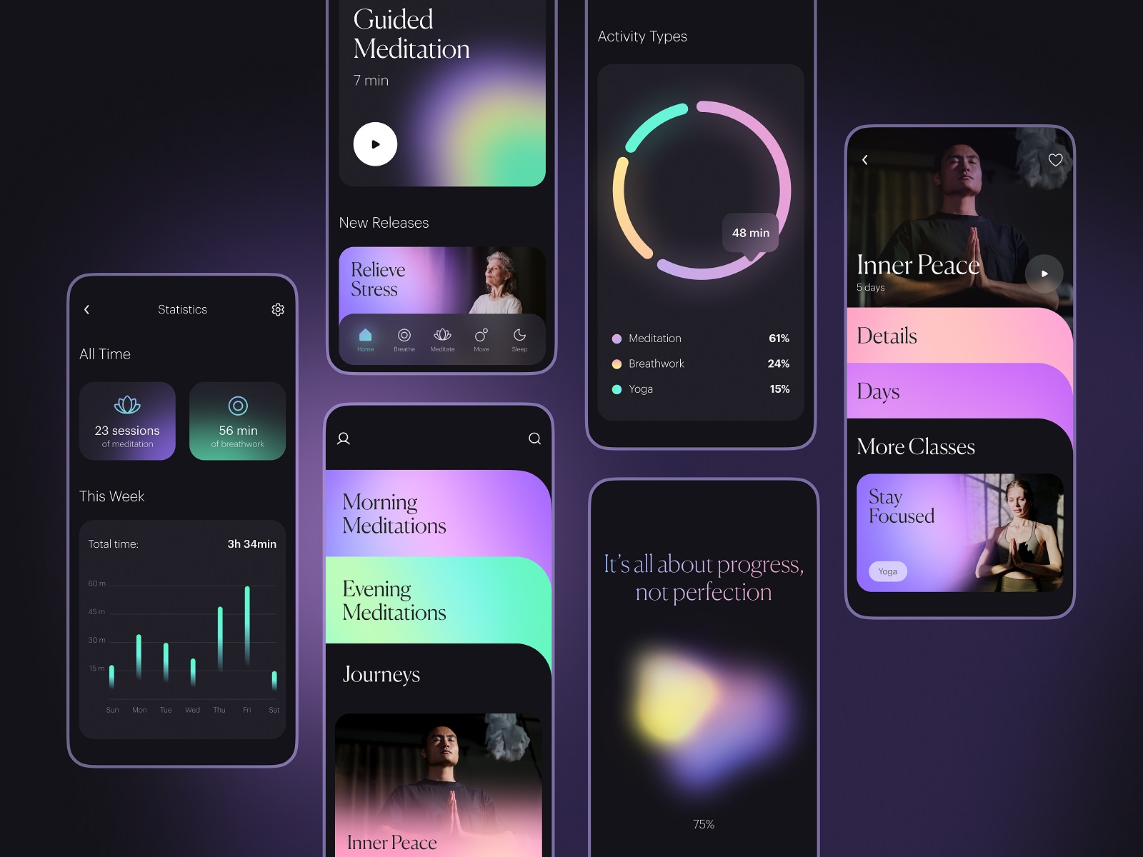
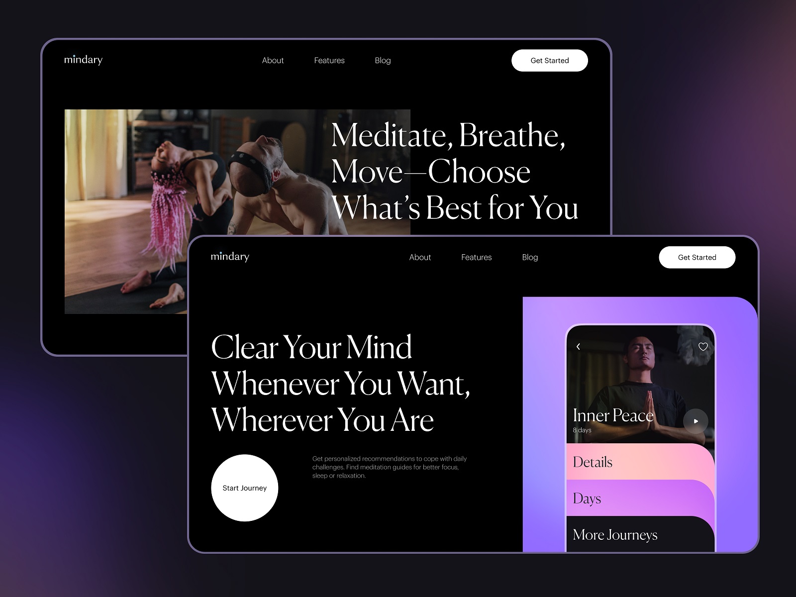
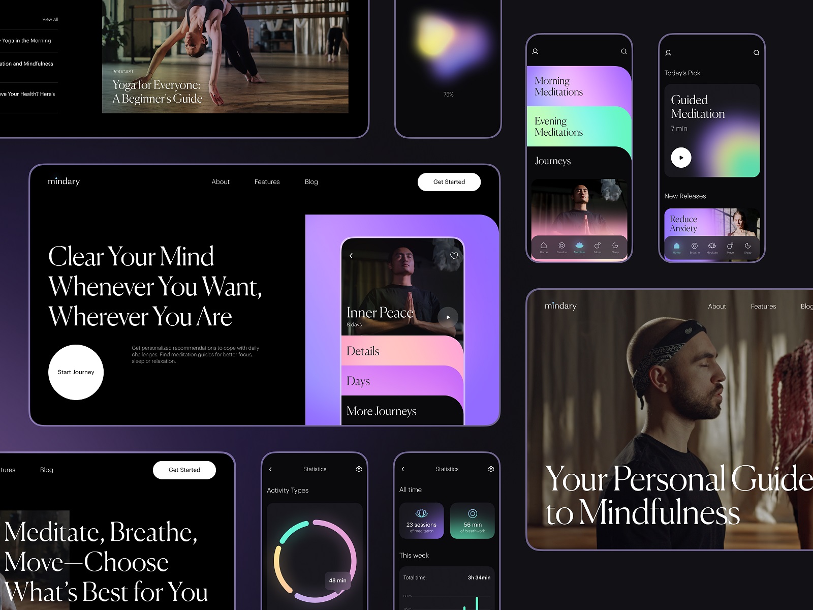
Mindfulness App
Calm interfaces demand discipline. Meditation and yoga apps live in a delicate space where visual noise breaks the entire premise. This concept focused on building an environment that encourages quiet attention without becoming sterile or overly minimal.
Color palettes stay soft and atmospheric. Deep gradients create visual depth without heavy decoration. Content—guided sessions, videos, breathing exercises—sits inside generous negative space so the interface feels breathable.
Motion plays a quiet role here. Subtle transitions slow the rhythm of interaction just enough to reinforce the mental shift users are looking for. Nothing flashy. Nothing distracting. Designing for mindfulness means understanding the psychological weight of small interface behaviors. Even animation speed can influence how calm the experience feels.
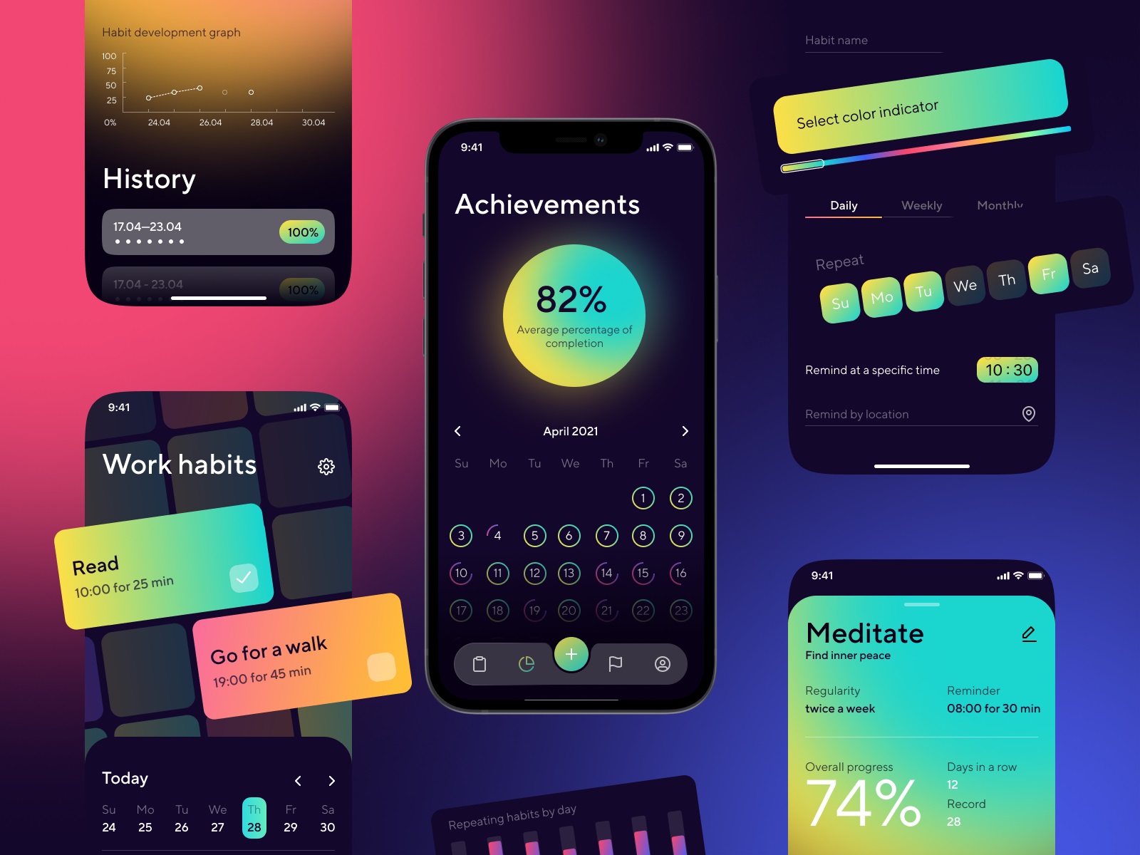
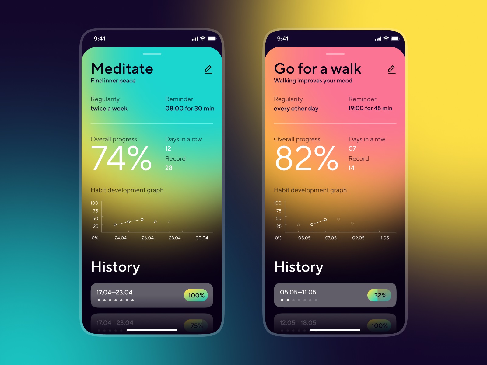
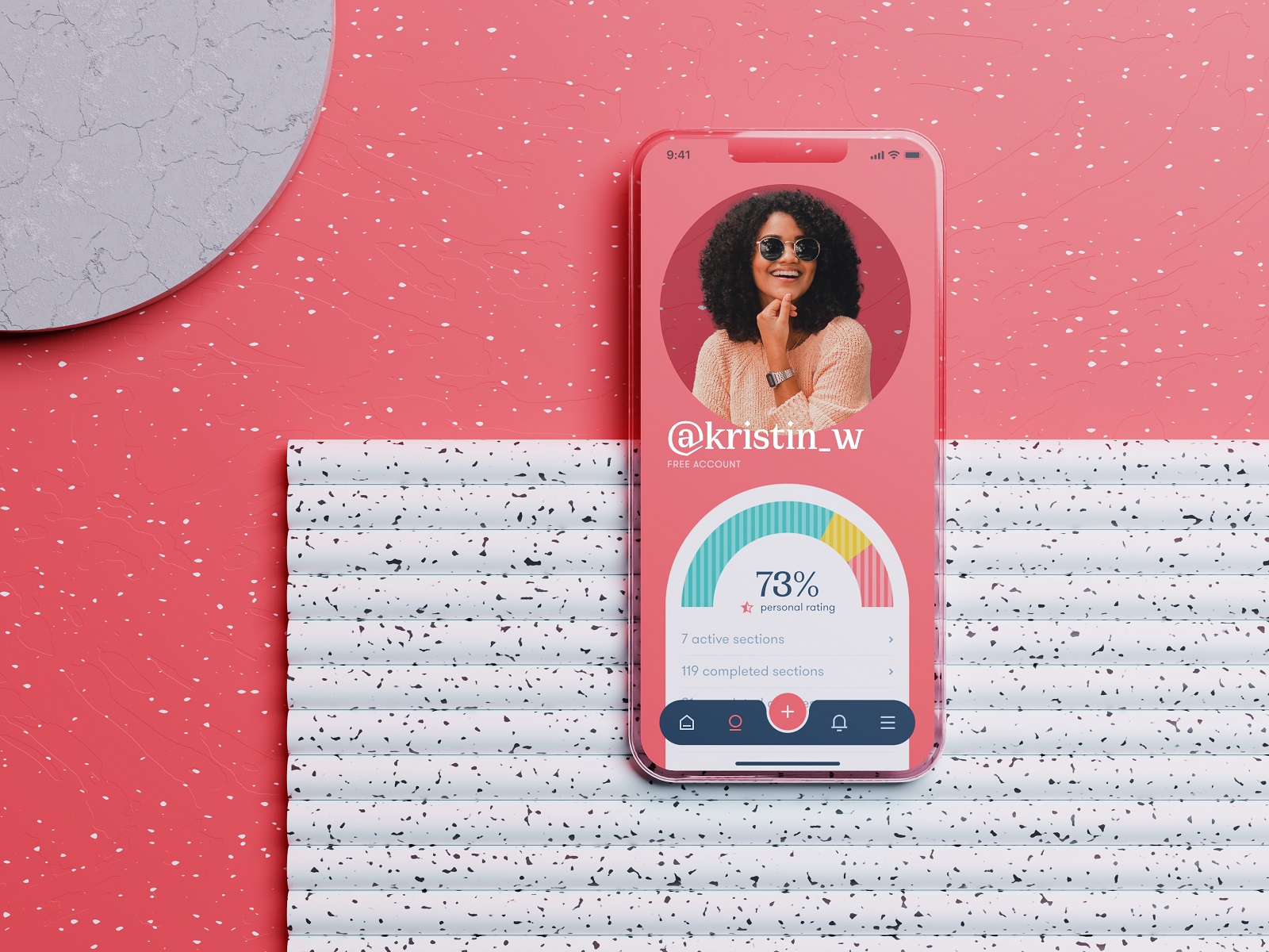
Habit Tracker
Habit-tracking apps succeed when they make progress visible and friction invisible. The concept here focused on a dark-theme interface built around strong visual hierarchy and simple progress feedback.
Daily habits appear as clear modular cards. Completion states update instantly. Streaks and statistics sit close enough to motivate but never dominate the screen. Navigation stays almost self-explanatory. Users of any age should understand where to tap within seconds. The app quietly supports discipline without lecturing the user about productivity.
Design decisions here revolve around rhythm: how often the user returns, how quickly they log actions, and how rewarding the interface feels in those tiny repeated moments.
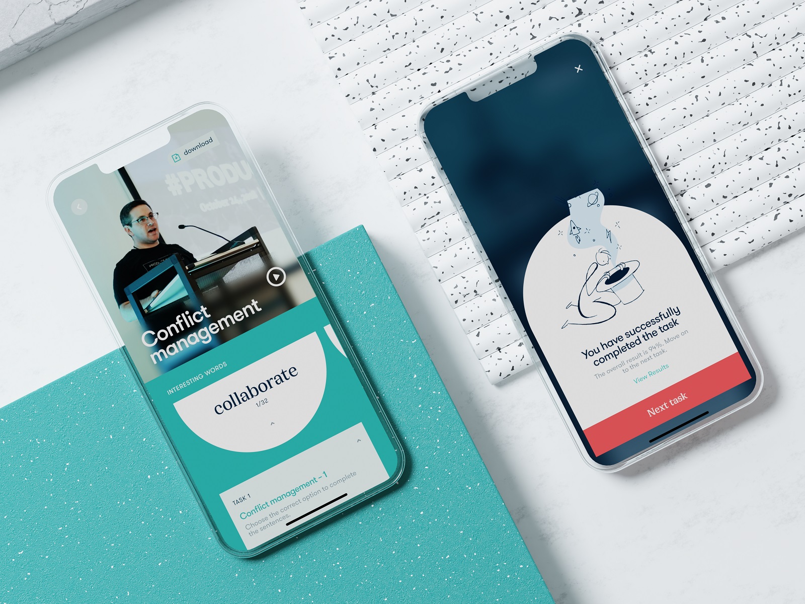
Music Learning App
Music education has a unique challenge: translating physical skill into digital guidance. This concept explores how a mobile interface can support users learning instruments through guided practice sessions. Lessons combine notation, audio feedback, and short instructional segments organized into approachable learning paths.
Interaction patterns prioritize clarity. Practice exercises remain visually clean so users focus on rhythm and movement rather than deciphering the interface. Feedback appears instantly—correct notes, timing suggestions, small prompts nudging the user forward.
The goal isn’t turning the phone into a music teacher. The goal is to remove the friction between curiosity and practice.
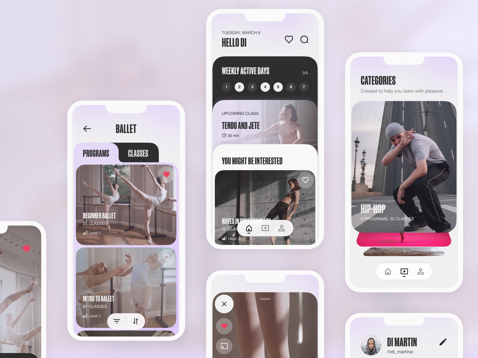
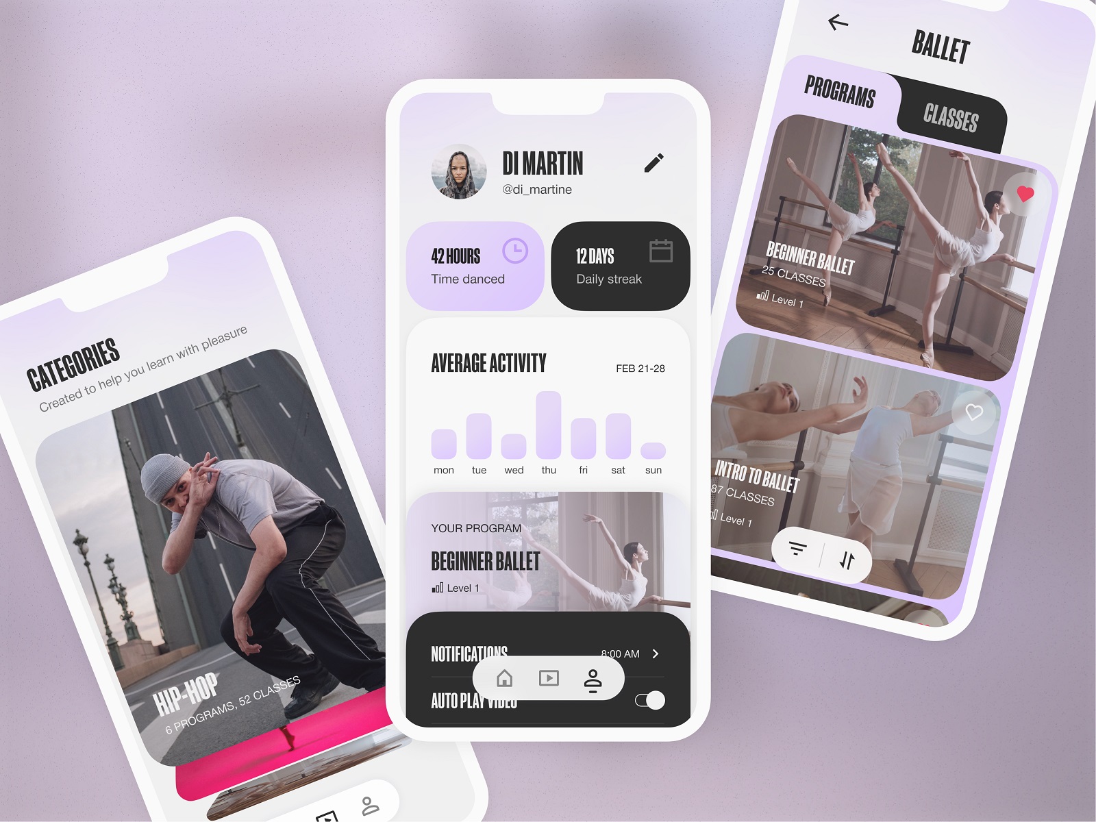
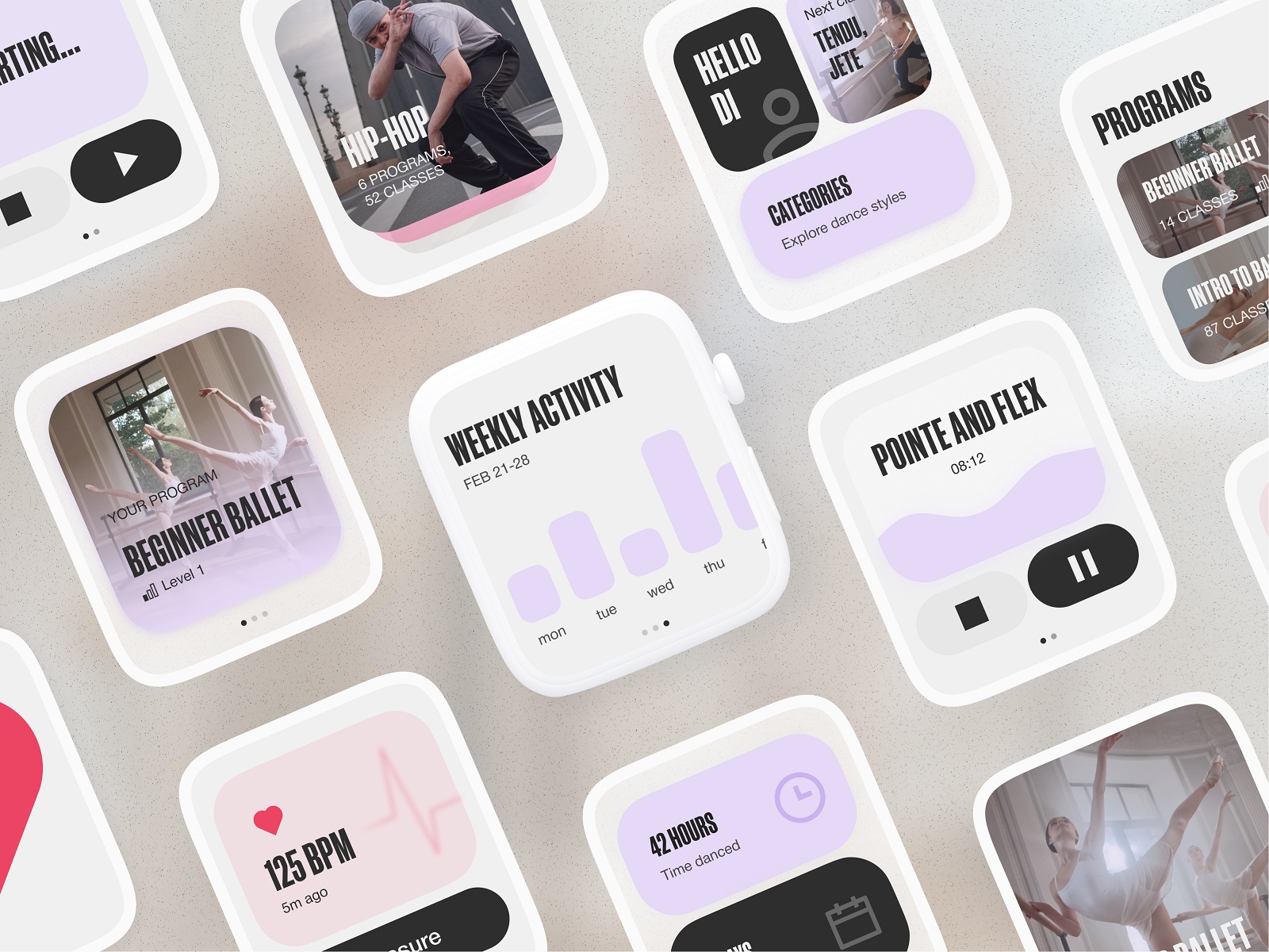
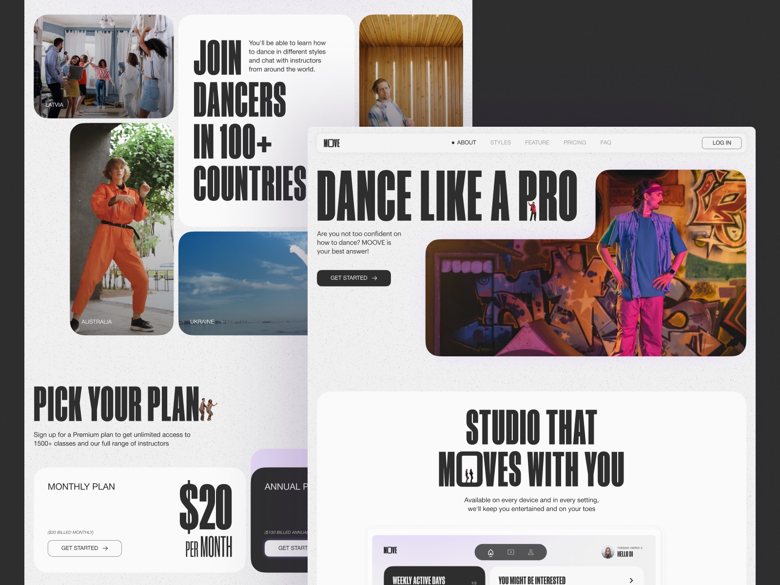
Dance Learning App
Dance is movement first, instruction second. This project explored a platform where users take dance classes across different styles through web and mobile products. Designing for movement means designing around video content—the true instructor of the experience.
Layouts remain open and uncluttered so choreography stays front and center. Photo and video materials shape the visual rhythm of the interface. Smooth transitions between lessons reinforce the sense of flow rather than stopping the experience every time a user navigates.
Consistency between web and mobile products was crucial. Users might start exploring classes on desktop and continue practicing on mobile later. The system had to feel familiar across both environments.
When choreography drives the experience, the interface quietly becomes the stage.
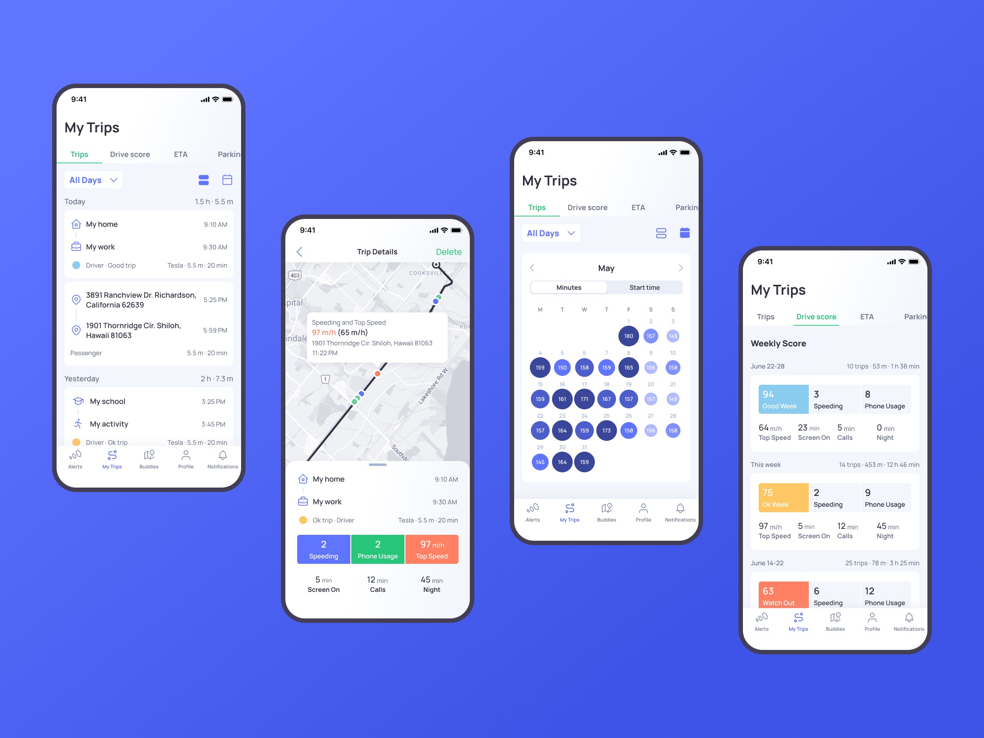
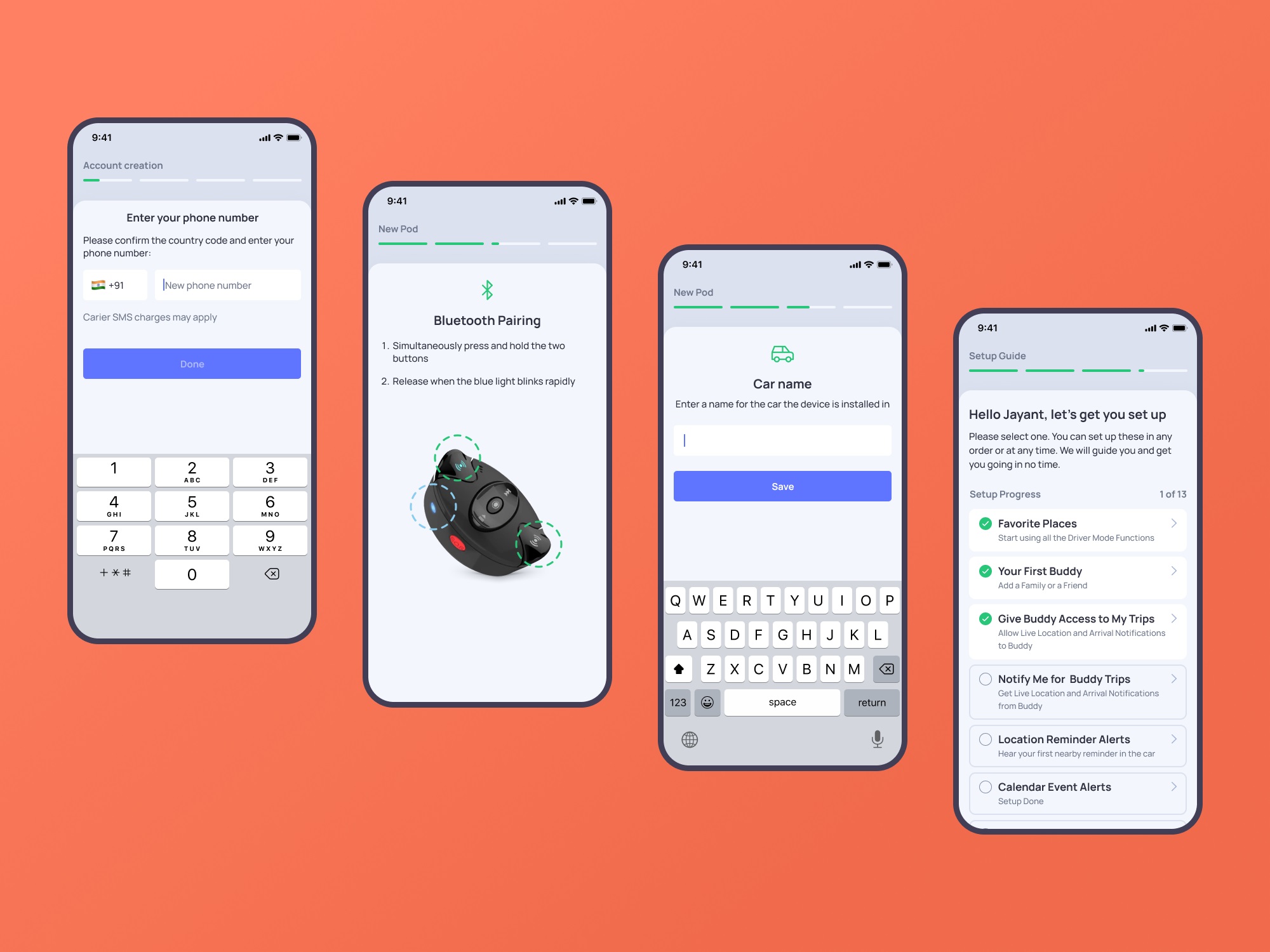
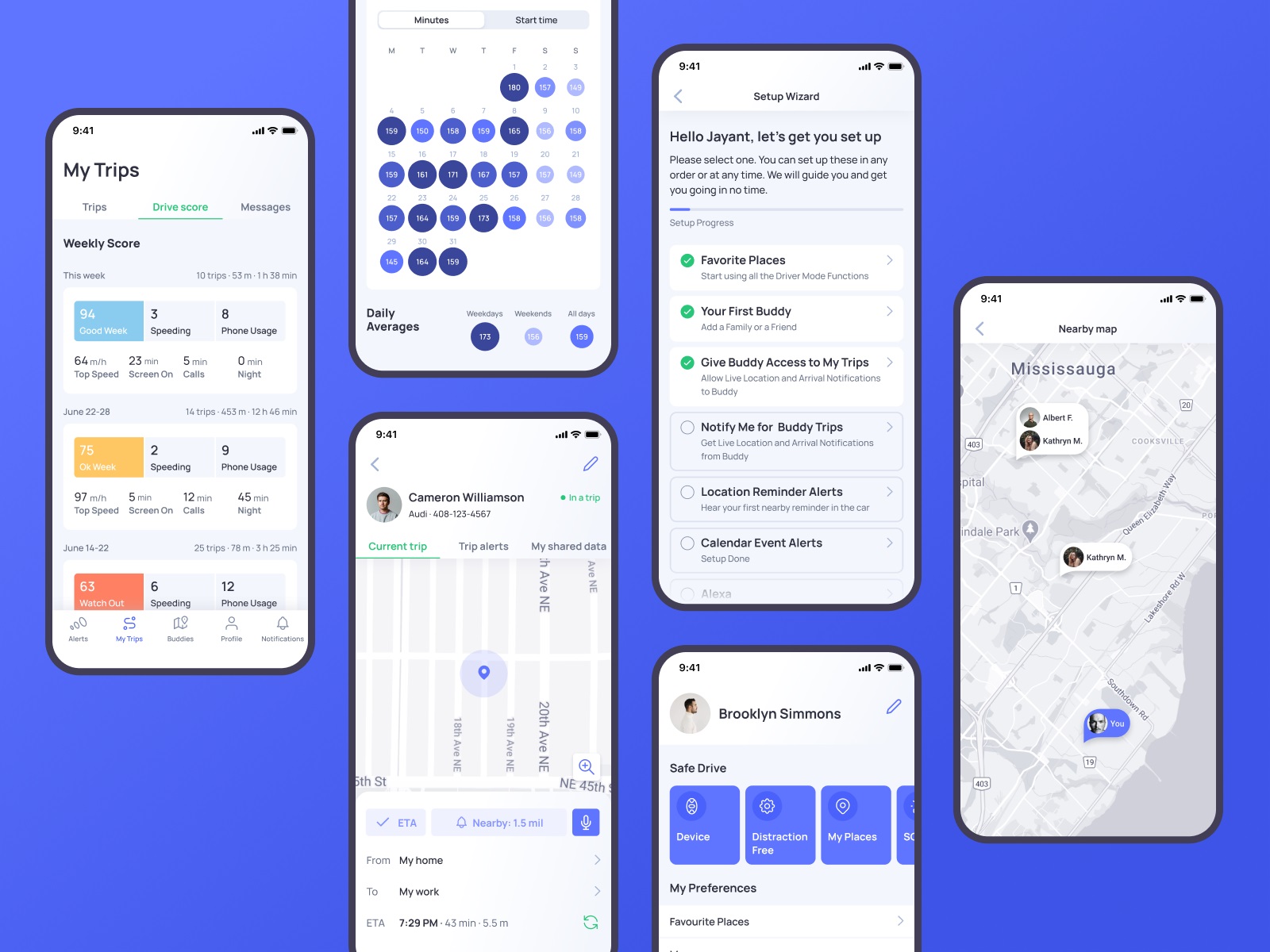
Safe Driving App
OtoZen tackles a different kind of design problem: safety. The product pairs a hardware device with a mobile application to transform any car into a distraction-free driving environment. The device connects via Bluetooth and installs within seconds—no wiring, no complicated setup.
Our role involved auditing and improving the mobile app’s UI and UX, designing custom graphics, and developing a supporting website to strengthen the product’s online presence.
Design decisions here revolve around attention management. Drivers cannot process complex visual information while on the road. Interfaces must stay glanceable. Status indicators, navigation cues, and alerts communicate instantly with minimal cognitive load.
When the product protects attention, the interface must respect it.
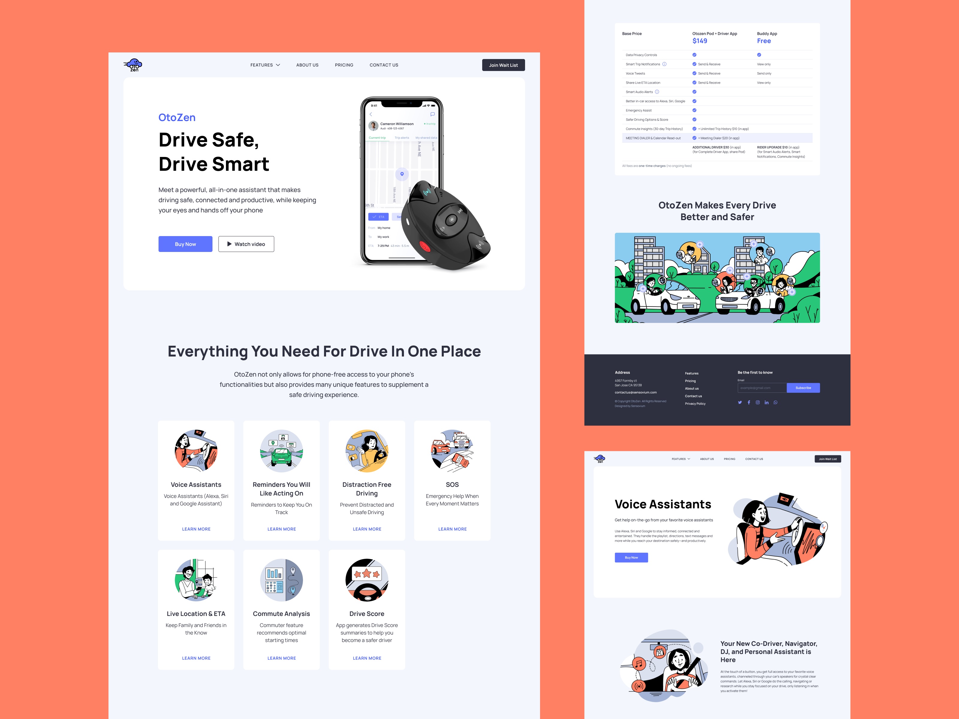
Learn more about the design process in the OtoZen app design case study.
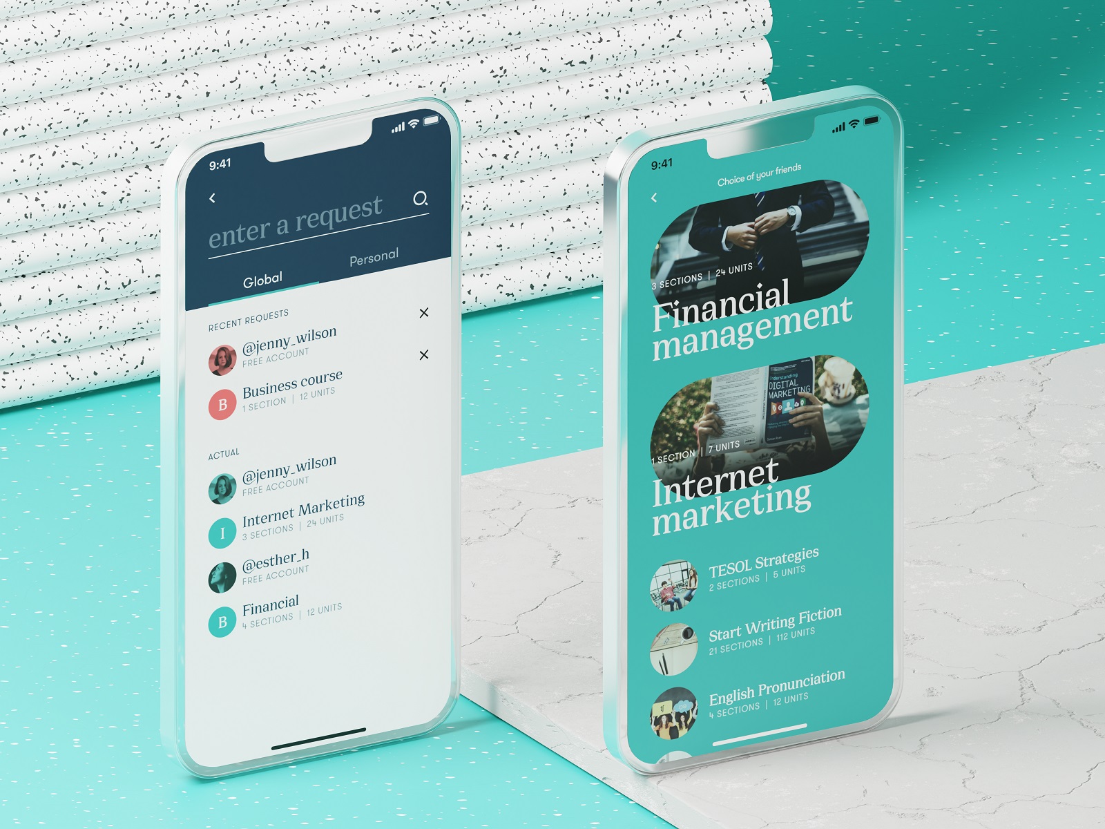
Education App
Learning platforms often collapse under their own ambition. Too many courses. Too many categories. Too many dashboards.
This education app concept focuses on clarity. Courses span everything from professional skills to broader personal development, yet the interface keeps the structure readable. Strong contrast, deliberate color combinations, and generous negative space create visual separation between modules. Content previews guide users naturally toward subjects that match their interests.
Navigation stays straightforward: explore, enroll, learn. No labyrinth of menus. Design’s role here is simple and difficult at the same time—turn a massive knowledge library into a place where curiosity feels effortless.
Final Thoughts
Good app design rarely announces itself. It hides inside the tap that lands exactly where your thumb expected, the animation that confirms an action without stealing attention, the layout that makes sense before the brain begins analyzing it. Across flowers, drinks, meditation, driving, learning, and music, the pattern stays the same.
Interfaces succeed when they quietly align with human behavior.
Everything else is decoration.
Recommended Reading
Still scrolling? Here are more case studies and design think pieces from the Tubik team:
Information Beautified: Media and Editorial Website Designs
UX Design for Traveling: Impressive Web Design Concepts
22 Impressive Web Design Concepts for Various Business Objectives
Mobile Design: 14 Stylish and User-Friendly App Design Concepts
Design for Sales: 10 Creative UI Designs for Ecommerce
Save the Planet: Web Designs on Environment and Ecological Issues
Steal the Show: Creative Web Design for Diverse Events
Web Design: 26 Examples of Creative Landing Pages
UI in Volume: 3D Graphics in Creative UI Design Concepts