There’s a version of data analytics that looks exactly like what you’d expect. Navy blue everything. A sans-serif font chosen by committee sometime somewhere in mid-2010s. Abstract hexagons floating over a stock photo of someone staring at a screen. And somewhere in the copy, the word “leverage.”
We’ve all seen it. And we’ve all immediately forgotten it.
When Knead That Dough came to us, we made each other a quiet promise: we would not make that kind of website.
About the Client
Knead That Dough does something genuinely valuable. They take the chaotic, multi-source, Excel-and-prayer data reality of hospitality and FMCG businesses—the kind where a restaurant owner is reconciling three different reports at 11pm on a Tuesday—and turn it into a single, beautiful, always-current dashboard. Check it on your commute. Understand your business before you finish your coffee. That’s a product with a soul.
Their audience is owners and founders of small to medium-sized businesses—typically 10 to 100 people—in the UK hospitality and FMCG space. Companies that don’t have a data department. Companies that never had one. Companies that are still generating most of their reports in Excel, reconciling numbers across systems that were never designed to talk to each other, and quietly hoping nobody asks them a question that requires a figure they don’t have.
The client came with experience and real results, but without an identity. They had clients. They had a service. They just didn’t have a brand. That’s where we came in.
The Challenge
Fear is the real brief in this industry. A 2020 Accenture report on data literacy found that 74% of employees feel overwhelmed or unhappy when working with data. A third of them will actively find a workaround rather than engage with it at all. They’re not lazy, just human. And if we’re being honest, nobody has ever made data feel like something you’d want to open.
Meanwhile, the analytics market has a serious identity crisis. You’ve got enterprise BI platforms that look like software from 2015. Generic consultancies hiding behind vague language about “data-driven transformation.” And a sea of niche tools that have discovered color but haven’t quite discovered personality. Nearly nothing in the space has a custom font, a real photographic language, or a voice that sounds like it was written by an actual person.
The brief, under all of it: make data feel less like a chore and more like something you’d look forward to. Make a sophisticated service feel clear, practical, and alive.
And that’s what we did.
Strategy & Brand Positioning
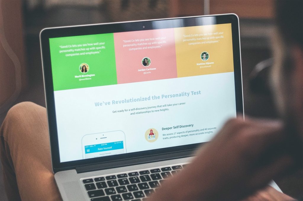
The insight that changed everything came almost in passing. The client mentioned that their users check the dashboard on their morning commute. On their phones. Because it looks that good and works that simply.
That single image—a business owner on the Tube, scrolling through their numbers the way you’d scroll the news, actually engaged—became the north star.
The brand essence we landed on was three words: Joy of Data. Not a tagline, but a design directive. Every visual and communication decision filters through it. Does this make data feel like something worth engaging with? Does it give the owner a sense of control rather than overwhelm? If yes, keep it. If not, cut it.
The brand personality that emerged—cool, creative, friendly, reliable—walked a careful line. Knead That Dough needed to communicate genuine technological competence and feel like a partner rather than a vendor. Not corporate, not jargon-heavy, not patronizing. The mission, as we came to articulate it: making data sexy. Getting the job nobody wanted done—done. Creating an alluring cover for something people had decided in advance to find boring.
The brand promises clients a specific feeling: productive, in control, smart, modern. Those aren’t soft marketing words. But they’re the exact opposite of what most small business owners feel when someone starts talking about BI infrastructure.
Visual Identity System
Knead That Dough has an unusual name—three words, each carrying weight—and the logo solution came from that constraint directly. Stack them. Three rows, clean rhythm, compact geometry. From that baseline came every subsequent iteration and symbol exploration. The structure was never in question; the craft was in making it feel inevitable.
The color system moved deliberately away from the overused blues blanketing the analytics industry. The graphic language avoided the usual tech clichés—no glowing network nodes, no abstract data flows, no dashboard screenshots full of numbers that exist to perform complexity rather than communicate anything.
Instead: simplified, minimal visual elements paired with photography that brought genuine human context into the frame. A person, a place, a business. Something that quietly says: this data belongs to someone. When you need to show a visualization, show the essence of it—stripped back until it’s clear—then surround it with something that feels real.
The result was a visual system flexible enough to stretch across website, marketing materials, and presentation assets, while still feeling like it came from one coherent point of view.
UX/UI & Website Design
The client came with a clear content structure already mapped: home, value proposition, social proof, integrations, call booking, footer. The puzzle was how to make an analytical service feel effortless to explore for someone who has never set up a data dashboard and isn’t entirely sure they want to.
The UX moved quickly because the narrative logic was already solid. The heavier lifting happened at the UI level—translating the brand identity directly into a design system for the site, using the established colors and graphic elements to create visual consistency across every page. That foundation meant fewer dead ends, fewer “which direction do we go?” moments. The brand had opinions, and those opinions made the website faster to build and more coherent to experience.
For communicating the service itself, the approach was restraint. Minimalist graphic elements, not elaborate visualizations. Enough to suggest the product’s intelligence without making the viewer feel like they need a data science degree to understand what they’re looking at. Combined with photography, it created something warmer and more grounded than the typical analytics service screenshot tour.
One interesting challenge: the integrations section. Knead That Dough connects with a wide range of platforms across different business categories. Making those browsable, searchable, and sortable in a way that felt lightweight turned out to be a more interesting problem than it first appeared.
The site was built on Webflow—deliberately, because a small business should own their own digital presence. Not be dependent on an agency every time a sentence needs changing.
What We Actually Built
Strip away the craft conversation and here’s what this project is:
A brand that makes a small hospitality or FMCG business feel like it has the data infrastructure of a company five times its size. A website that makes data consulting feel like something you’d want to buy rather than something you’d need to be persuaded into. An identity with a clear point of view that will still feel current in five years—because it was built on a real idea, not on whatever looked interesting that quarter.
The end of the endless Excel era, as the client puts it. One dashboard. One truth. Always updated. Readable on a phone on a Tuesday morning commute. That’s the whole thing. And it only works because someone decided data was allowed to look this good.
Recommended Reading
Make sure you also check out our other case studies if you enjoyed this one:
Netti Case Study: Measuring the Invisible
Case Study: UClay. Identity and Packaging Design for Ceramics and Pottery Brand
FarmSense Case Study: Fields, Sensors, and System Thinking