Most people understand money in one simple way: you work → you get paid. Except that’s not actually how payroll works.
In reality, most employees finish the work on Friday and see the money weeks later. The system runs on rigid payroll cycles built decades ago—slow, bureaucratic, and oddly detached from how modern life works. There’s a grocery run on Tuesday. A surprise dentist bill. An unexpected Saturday night out when all you wanted was to stay home and binge some Netflix.
Immediate sits in that awkward gap between how money is earned and how people actually need to use it. The platform allows employees to access wages they’ve already earned instead of waiting for the traditional payroll cycle to crawl forward.
Simple idea. Surprisingly complicated to explain.
When we began working on the Immediate website, we quickly realized the design challenge wasn’t about building another fintech landing page with blue gradients and stock charts. The real task was translating a new financial model into something that felt obvious within seconds. Something HR leaders could trust, payroll managers could understand, and employees could immediately recognize as useful.
Because when a product touches people’s income, confusion is expensive.
This case study walks through how we approached that challenge—from market research and communication strategy to visual direction, UX architecture, and implementation. Along the way, it reveals something interesting about fintech design: sometimes the most powerful interface decision is simply making a complicated system feel human again.
Let’s dive in!
About the Client
Immediate is a fintech platform that enables businesses to offer earned wage access—allowing employees to withdraw part of their already-earned salary before the traditional payday. Instead of waiting two or four weeks for payroll processing, workers can access their earnings when they actually need them. A small shift in timing, a massive shift in financial flexibility.
From the employer’s side, the platform operates as an employee benefit tool. Companies can offer on-demand wage access to improve retention, reduce financial stress among staff, and create a more supportive workplace environment.
From the employee’s perspective, it’s even simpler: you worked the hours, the money exists, and now you can access it.
One of Immediate’s differentiators lies in how flexible the system is on both sides of the equation. Employers can set guardrails around usage while employees gain unusually fast access to their funds. The platform also integrates with time tracking and payroll systems, which significantly reduces risk and improves reliability compared to competitors that rely on slower approval processes.
Emotionally, the brand needed to communicate something very specific: calm confidence.
Not flashy fintech disruption. Not crypto-bro energy. Something friendlier. Clearer. Trustworthy.
Money is stressful enough already.
![]()
The Brief
The website needed to speak to both audiences.
The homepage and product narrative primarily target employers—HR leaders, payroll managers, and business owners evaluating new workplace benefits. At the same time, the platform also serves employees directly through its mobile app, so the website had to acknowledge their experience as well.
Besides, the platform needed to show that earned wage access is not a risky financial experiment but a practical extension of systems companies already use.
Our early research into the fintech and payroll landscape revealed something interesting: most competitors were playing it extremely safe. The market included two broad categories: long-established platforms that had been around for years and newer companies trying to capture attention. But visually and structurally, the websites looked almost identical—dense fintech messaging, generic product diagrams, predictable UI patterns. The experience often felt copied from the same mediocre UX template.
Immediate itself wasn’t dramatically different in market age. But its product advantage was clear: speed. Employees could access their earned wages immediately without slow approval chains or manual processing. That difference deserved a clearer story.
From a design perspective, the opportunity was obvious. If everyone in the market looked the same, standing out didn’t require radical innovation. It required clarity, confidence, and a website that felt genuinely designed rather than assembled.
Strategy & Communication Approach
The core communication strategy was straightforward: explain the transformation from rigid payroll to flexible access.
Instead of overwhelming visitors with technical infrastructure details, the site introduces the story gradually. First, the everyday problem. Then the shift in logic. Then the product solution.
The structure needed to guide visitors through a familiar mental arc:
- payroll today
- why it creates friction
- how Immediate changes the timeline.
Financial services design often struggles with tone. Too emotional and the product feels unserious. Too corporate and people stop reading. Here we aimed for something in between: credible, calm, and human.
Employee wellbeing became an important narrative layer. Not as sentimental branding, but as a real operational benefit. Financial stress affects productivity, retention, and workplace satisfaction. Framing the product around that reality helped both audiences understand its value.
Visually, the direction wasn’t built around radical experimentation. Sometimes the smartest design move is simply making something nice to use.
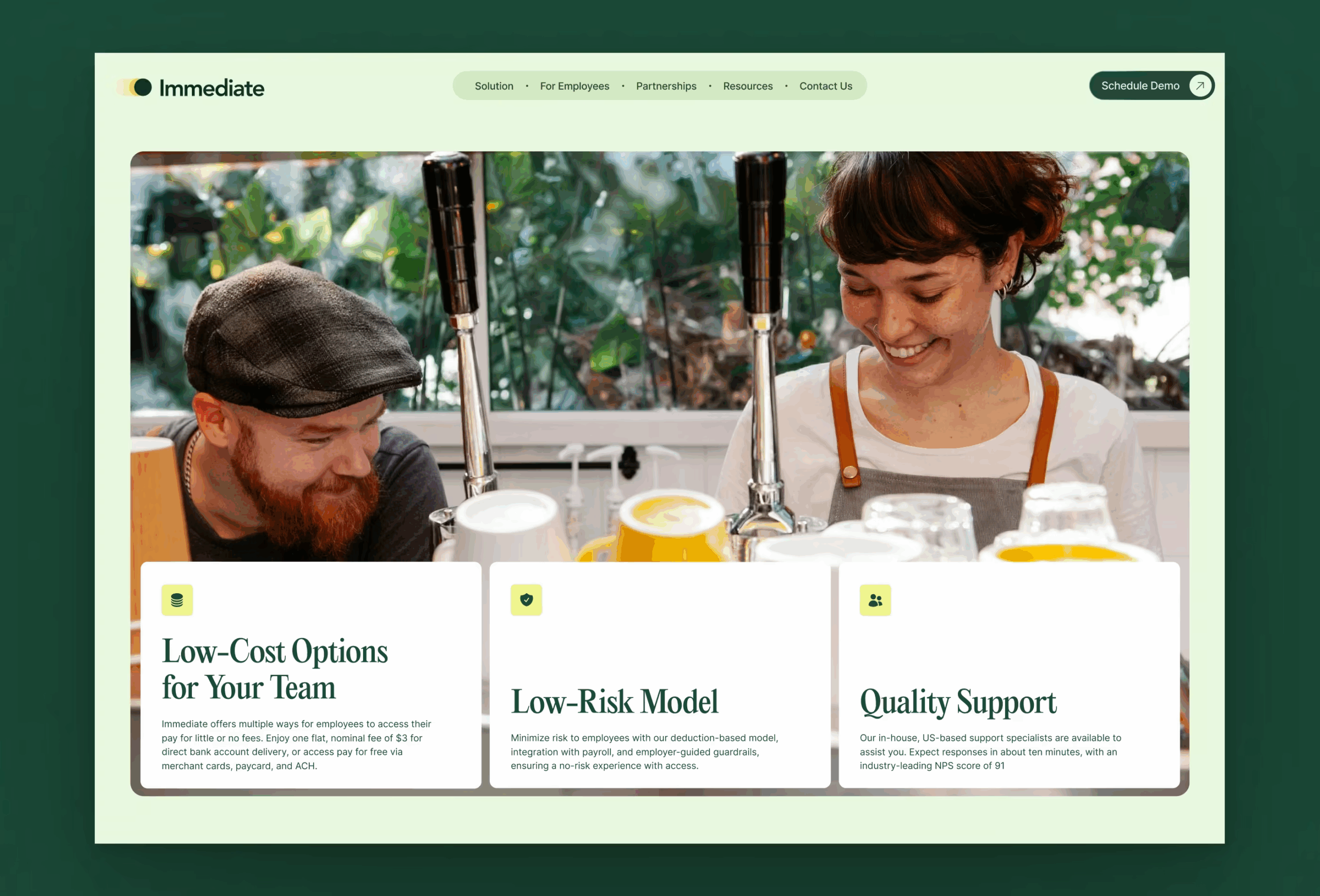
Early in the project the designer leading the work pushed strongly toward a green-dominant palette. Why green? Because green in finance carries immediate cognitive associations—money, safety, balance. The direction stuck, and the entire system began to organize itself around that foundation.
Not revolutionary. But effective.
Visual Direction & Website Identity
Fintech design often defaults to sterile abstraction—floating cubes, wireframe charts, anonymous dashboards. Immediate needed something warmer.
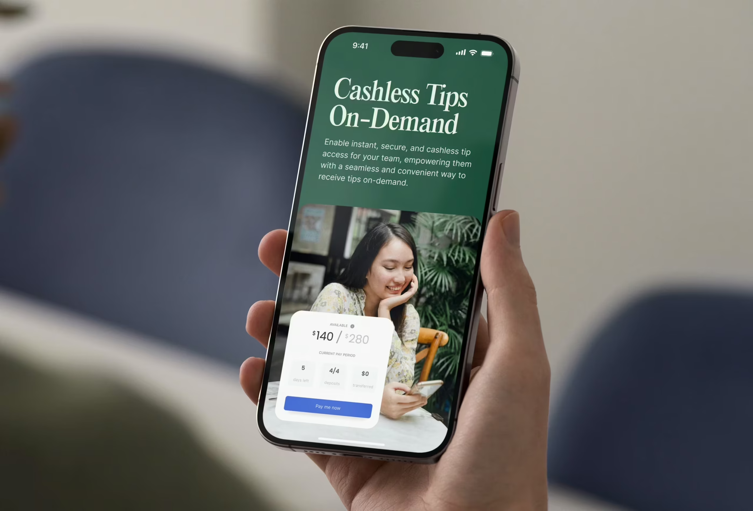
The visual system, therefore, leaned heavily into human presence. Photography shows people interacting with their phones in everyday contexts: commuting, sitting at a kitchen table, checking balances in moments that feel familiar rather than staged. This approach helped anchor the product in real life instead of abstract financial infrastructure.
The design process began with a collaborative exploration session where we mapped competitor weaknesses and the client’s preferences. Colors, typography, layouts, and visual references were separated into two simple lists: what works and what definitely doesn’t.
From those conversations, a clear set of design rules emerged.
Do:
- create an emotionally resonant experience
- maintain clear structural hierarchy
- prioritize accessibility and contrast
- keep the interface professional but approachable
- use generous white space.
Don’t:
- overload the layout with information
- rely on trendy gradients
- default to generic corporate fintech visuals.
The final visual identity balances clarity with warmth. A calm palette, confident typography, and plenty of breathing room create an environment where complex financial ideas feel easier to absorb.
UX Architecture & Content Structure
When a website introduces a new financial model, structure matters more than decoration. Users rarely read fintech sites from top to bottom. They scan, jump, and skim sections while half-thinking about something else—usually something that would be much simpler if their paycheck had already landed.
That’s why the UX architecture focused on fast comprehension.
The content hierarchy moves through several layers:
- immediate value proposition
- explanation of earned wage access
- benefits for employers
- employee experience
- trust signals and product credibility.
The overall sitemap remained largely the same as the pre-redesign version. The project didn’t require restructuring the entire platform architecture. Instead, the focus was on improving how information appeared within that structure. Small adjustments to hierarchy, section pacing, and visual emphasis dramatically improved readability.
Sometimes UX progress comes from radical re-architecture. Other times, it comes from making the existing structure finally behave.
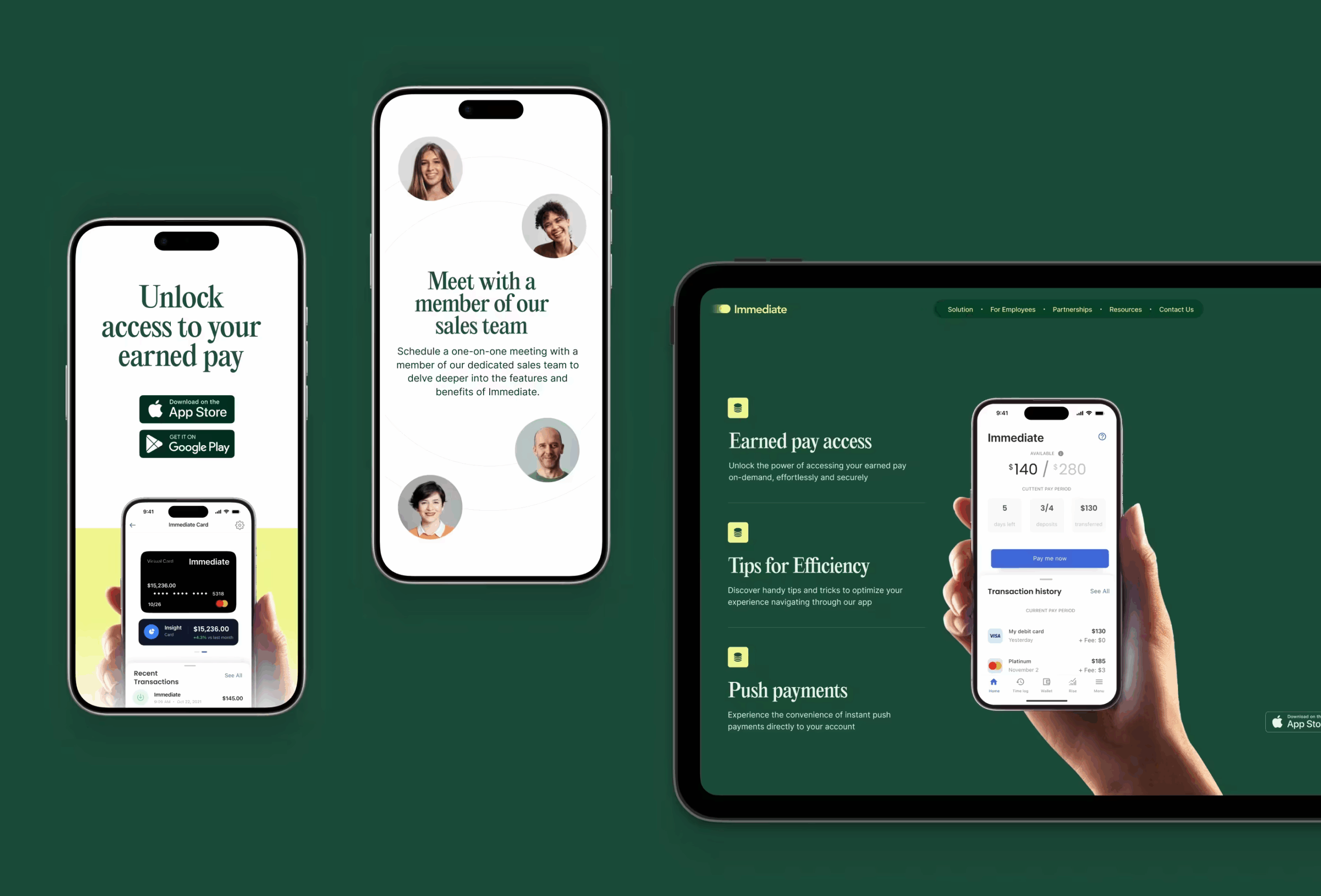
UI Design
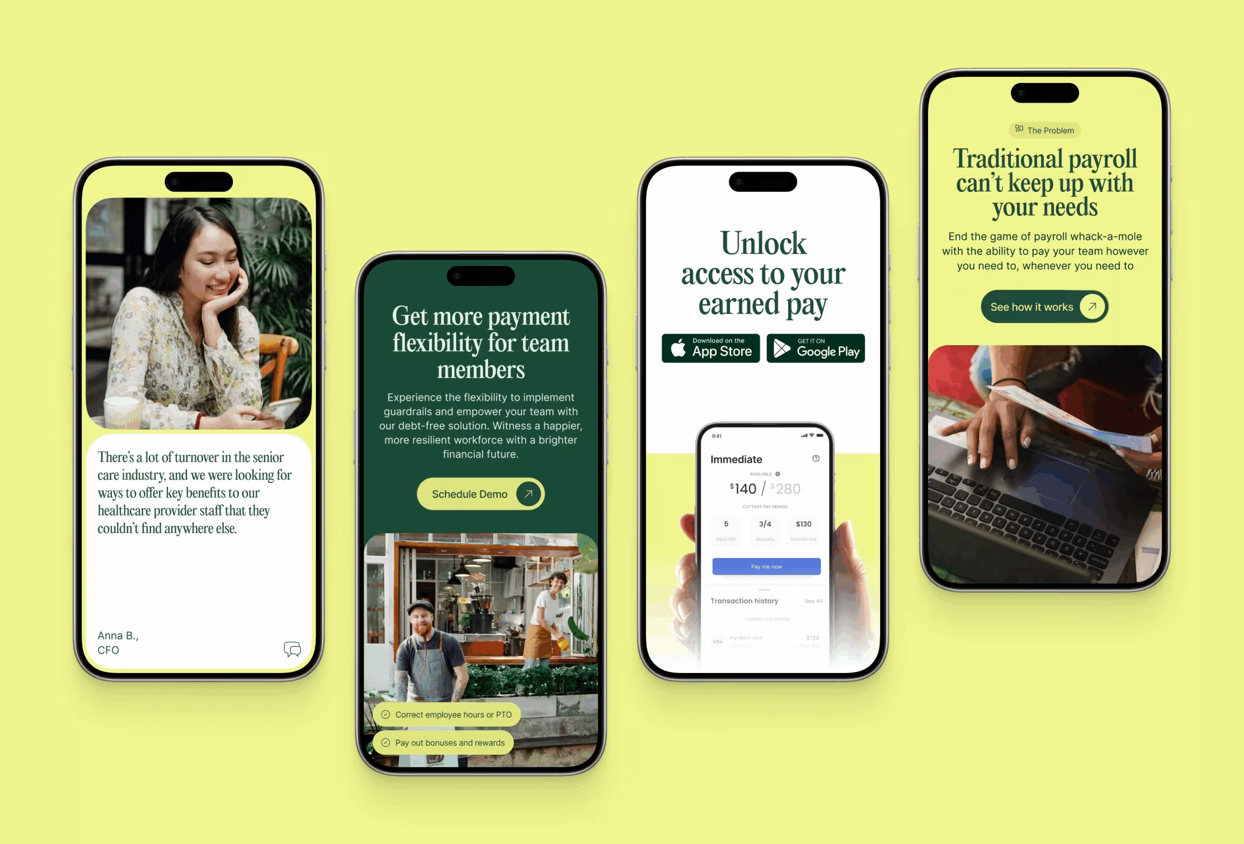
The UI layer carries the responsibility of turning abstract financial concepts into readable signals.
Several components played a central role:
- feature highlight blocks explaining platform capabilities
- benefit summaries that translate product mechanics into business outcomes
- visual previews of the employee mobile experience
- statistics and indicators that reinforce credibility.
Strong visual hierarchy became essential.
Large typography anchors key ideas while concise supporting text provides context. Calls-to-action are visually prominent but not aggressive. The interface invites exploration rather than shouting at visitors to convert.
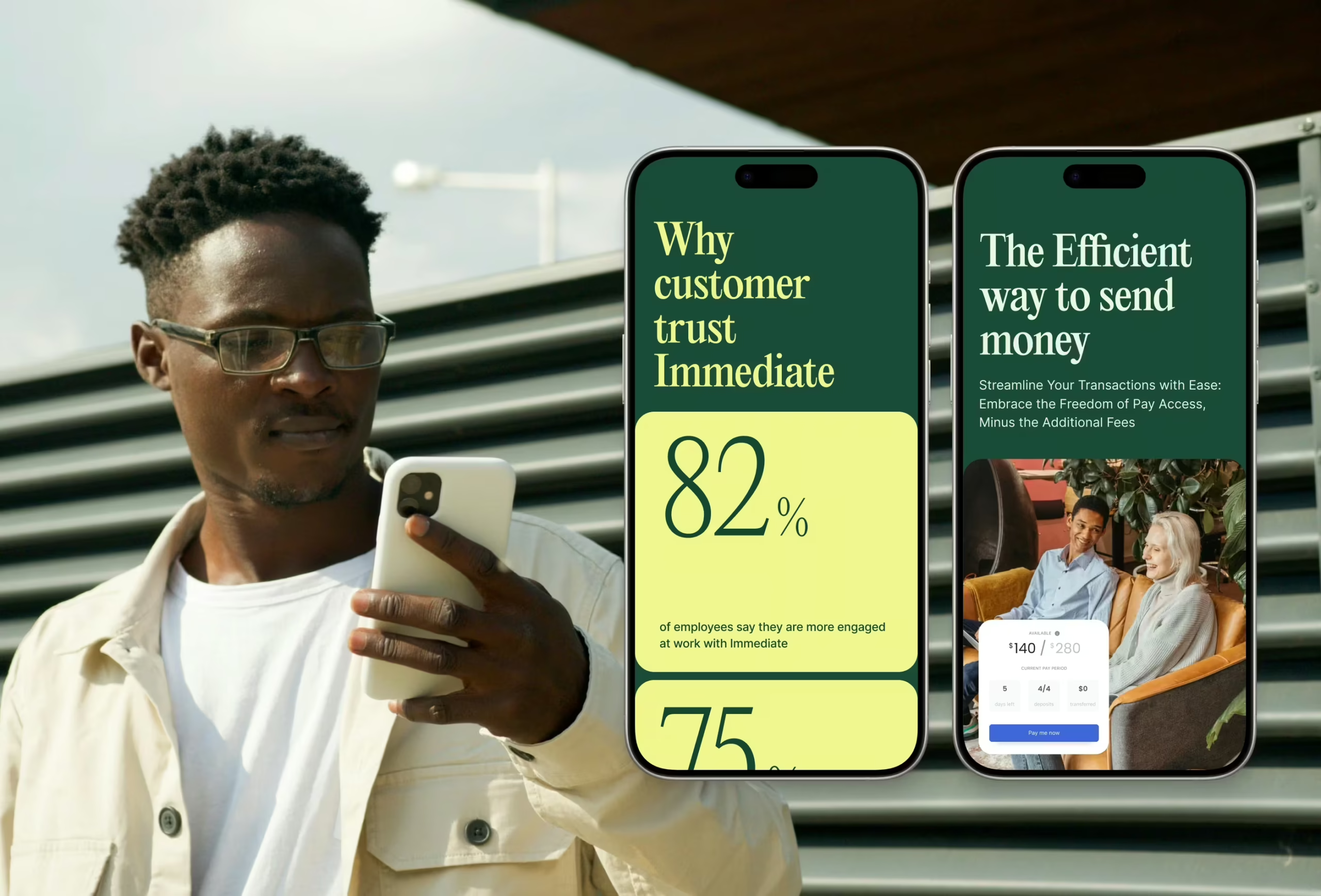
Employee-focused imagery reinforces the product’s human impact. These moments remind visitors that payroll isn’t merely financial infrastructure—it affects people’s daily lives. The UI avoids decorative complexity. Every element serves a purpose: help the reader understand faster.
Motion & Interaction Design
Motion plays a subtle supporting role in the Immediate website. There were no elaborate animation concepts or cinematic storytelling sequences. The site was built in Webflow, and most interactions rely on its native animation capabilities.
The focus remained on micro-motion that improves perceived quality. Elements softly reveal as the user scrolls. Images scale slightly to create depth. Parallax effects introduce gentle movement without distracting from content. Page transitions remain smooth and consistent, helping maintain rhythm across the experience. Call-to-action buttons include subtle interaction states to reinforce clickability.
None of these animations attempts to explain the product directly. Their job is simpler: make the interface feel alive.
Development & Implementation
The website was implemented using Webflow, which allowed the team to move quickly while maintaining strong control over layout and responsiveness.
The platform handled several practical requirements well:
- responsive behavior across devices
- smooth implementation of scroll animations
- efficient content management.
One interesting aspect of the project was scale.
This site contained a surprisingly large number of internal pages and became the project with the highest number of integrated HubSpot forms. Managing that ecosystem required careful structural planning to keep performance stable and navigation predictable.
Despite the complexity, performance remained smooth. Webflow handles lightweight animation and responsive layouts reliably, so the final experience runs without noticeable friction. Some design adjustments occurred during later development stages as the project evolved, but the core structure remained intact.
What This Project Taught Us
Designing fintech interfaces means designing trust. When a product deals with money, users approach it cautiously. Confusion instantly translates into doubt.
This project reinforced several lessons.
First: clarity beats cleverness. A product that introduces a new financial concept must explain itself faster than the reader’s skepticism appears.
Second: visual simplicity reduces perceived complexity. When a financial model looks organized, users assume it behaves that way too.
Third: emotional context matters even in infrastructure products. Payroll may sound mechanical, but the underlying problem—financial stress—is deeply human.
Finally, the project reminded us of a blunt design truth. People don’t judge financial platforms by how innovative they look. They judge them by how quickly they understand them.
And in fintech, understanding is the first form of trust.
Recommended Reading
Hungry for more? Check out our other case studies:
FarmSense Case Study: Fields, Sensors, and System Thinking
Fireside Case Study: Turning Sterile into Human
Case Study: Manatee Energy. Designing Warmth
Case Study: Orakle. Modern Web Design for Medical Education
Case Study: ABUK—Designing Ukraine’s Leading Audiobook Platform