In visual arts, it seems sometimes that color is the soul of everything, breathed in by the artist into a creation. Color is power, actually. It can change the mood of the image in a blink of an eye. It can encourage, warn, appeal, frighten, highlight, persuade, and so on and so forth. It can support the words or vice versa – steal their power. It can share an emotion without anything said. It can become a great weapon in the hand of a master.
No wonder, in the sphere of UI design color is among the key things of creating an efficient result. It is actually a multi-functional and diverse tool able to fulfill several needs simultaneously, such as the following:
- supporting recognizability and brand awareness;
- supporting readability;
- strengthening call-to-actions;
- satisfying aesthetic needs;
- sharpening navigation;
- enhancing intuitive interaction;
- beautifying visual solutions;
- creating a clear and harmonic style.
One of the lead designers in Tubik Studio, Ludmila Shevchenko is literally a person staying on the bright side of life every single moment of a day. If you check her portfolio on Dribbble, you will definitely see that even creating interfaces she is the artist always keen to take everything possible from the color and never afraid to experiment. Certainly, it doesn’t matter that working on the projects, she never creates minimalist or airy-light designs – when it’s needed and required, it’s done also with thorough attention to even the smallest color accents. However, when she creates concepts or projects, she is always avid to use all the power of color and brighten the world around. Today she has shared some of her ideas on using color in UI design based on her work on numerous design tasks for different target audiences.
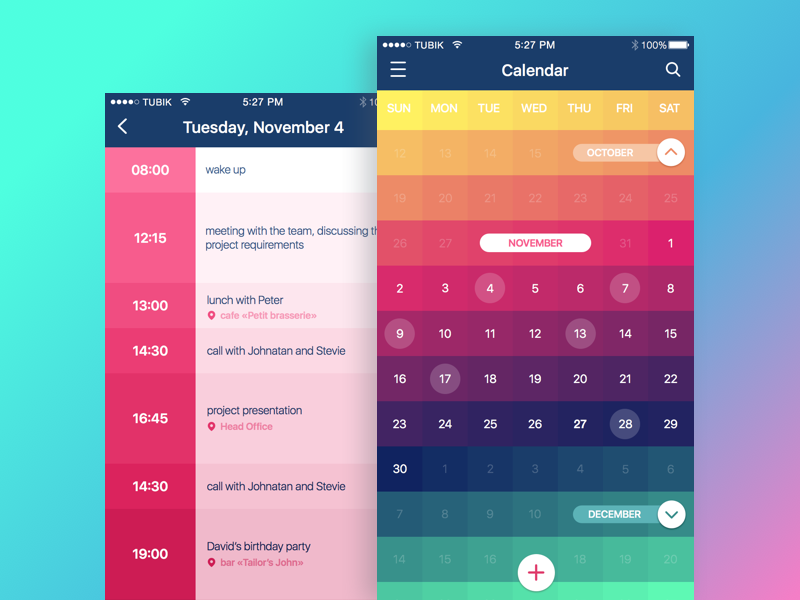
Calendar App
Working on the first variants of style for an app or a website often feels like a bit of magic and color choices and combinations are obviously the major part of this process. When asked what could be a fairy wand on this path, Ludmila says that she would make it out of four main components actually basic for any creative process: a good mood, a desire to transfer positive emotions and feelings, inspiration, and love for the job you do. This combination motivates to find great solutions being persistent and hard-working at this stage. This basic approach empowered with deep knowledge or art and readiness to search can bring out amazing and – what is more – efficient and user-friendly designs.
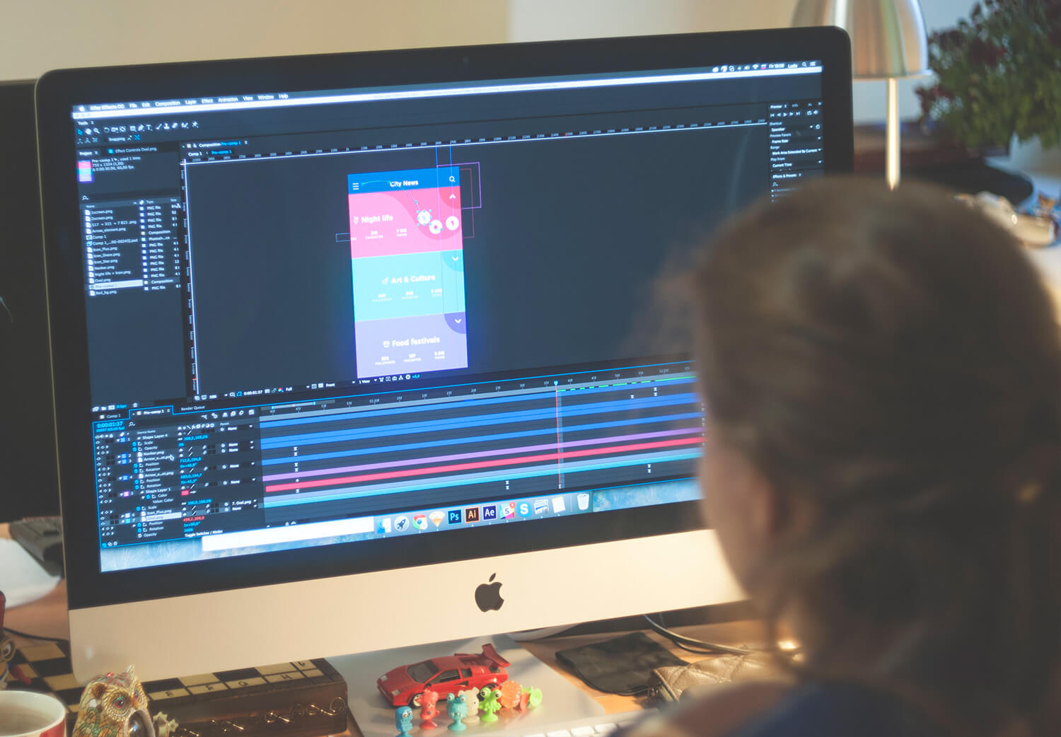
Ludmila working over a UI concept
Let’s look through some tips in the perspective of color choice and application in UI design.
Don’t be afraid of experiments
It’s not a secret that today designers have great support in color choice in the aspect of making color matches. One such helpful trait is a huge number of ready-made palettes of various combinations, sometimes even featured in sample screens and pages. Software and tools enabling a designer to catch different harmonic combinations between one breath and the other are getting more and more sophisticated and highly functional so they become a great help especially in cases of big workload and hot deadlines.
However, as usual, standing on the solid ground of ready-made solutions and standard well-checked combinations, designers should always be ready to add their own two cents as well as sometimes go far from the offered decisions. Don’t resist standard solutions; however, don’t see them as your Bible in design. Be ready and keen to experiment – this is a great way to develop your design skills and create something that is out of the box. Certainly, it doesn’t mean that this very moment you should start something revolutionary new, but still take your time for experimenting and thinking over new tricks. Stay wise but have no fear to let your creativity fly higher now and then.
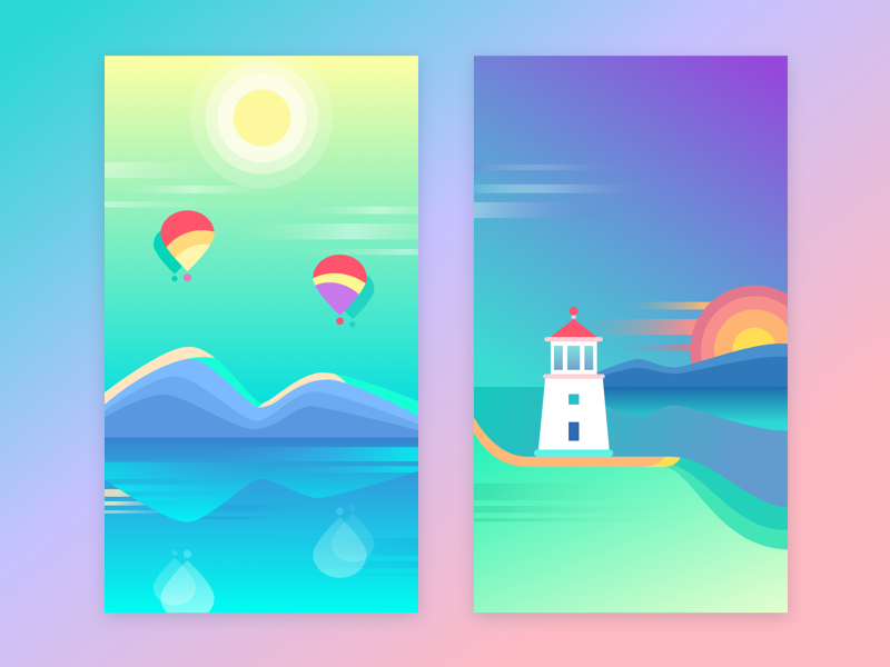
Colorful Wallpapers
Don’t set strict limits of the color palette in your portfolio
Your portfolio is actually your design face for the customers who do not know you personally. And for sure it’s only you who decides what this face will express. If you want to show only one side of your design style, if you want your potential customer to see you only smiling, or only deeply serious, or perhaps childish, then this tip is not for you. A limited color palette of portfolio works is one of the fastest ways to do it. Nevertheless, practice proves that showing diverse color choices and combinations in the portfolio in a harmonic way enhances the better presentation of design skills and higher chances of getting involved in interesting design projects.
Try gradients
Sure, this advice, as well as all the others, should be used wisely. It has to be mentioned that in many cases designers today prefer to avoid gradients working out colors for their designs. However, gradients are able to liven the accomplished task and strengthen the potential of color in different design solutions.
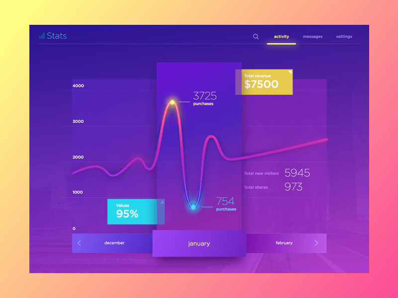
Stats Concept
Colors should feel clean in any combinations
Trying different color combinations and their functional features in creating user-friendly interfaces, it is very important to remember that in any case, in even the most venturesome color matches and blends should feel clean. No dirt on a screen or a page. Clarity enhances usability rate, supports readability, and makes all the colors do their best in their interface.
Try using colors as a background, not only in the work itself
It often happens that presenting their works, designers concentrate on the work itself not paying too much attention to the background colors. However, in many cases background color can become one more way to liven up the main image or screen and make it look even more efficient and expressive. Don’t miss the chance to try, perhaps it’s applicable right in your case.
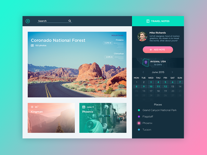
Travel Notes App
Check the efficiency of color choice via black-and-white
Talking about interfaces, whose aim is not just to transfer a visual message but also to enable easy and successful interactions with a product, a good way to check your solutions is the black-and-white look of the accomplished screen. Observing it, you will quickly understand if the elements, which have to be noticeable and functional, work like this or get lost without colors. Don’t neglect this easy way to check the efficiency of your design as it will not only reveal ineffective combinations but also will easily show you what are the potential problems of your interface for color-blind users.
Get inspired by the art
A great way to get inspired and transform this inspiration right into the interface design is art. Classic art, modern art, digital art. Watercolors, oils, charcoals, pastels. Any kind of manifesto of artistic creativity that appeals to your heartstrings. It is especially efficient in the perspective of color choice and application and useful in case of creative block. Finding the sources of inspiration in the works of artists who you like and admire is very helpful. Get inspired and try to create your interface like a piece of art. The results can be stunning not only for your clients but even for you personally.
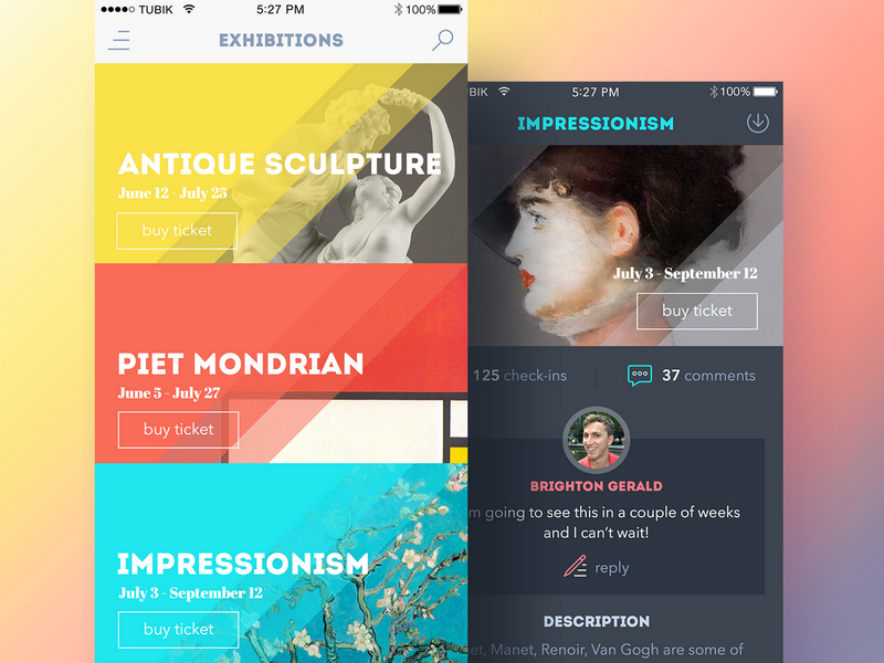
Art Gallery App
Keep attention to details
Famous American designer Charles Eames said: “The details are not the details. They make the design”. That is a key law of working over UI design for applications or websites, in particular when you choose and combine the color palette. Nothing should be left without your thorough analysis and attention. Color is one of the methods to make all the details visible and therefore efficient. Although, color shades and shadows become an effective way to strengthen the visual hierarchy of the elements and their interconnection.
Remember that usability is a key
Creating interfaces is never an act of pure creativity. It is the act of providing users with the product that will heal their pain and make their life happier. So, from the perspective of color choices and usage in UI, a designer should always remember that the interface should be highly usable and clear. All the slightest aspects of color choices should increase usability, utility, and harmony. Use color coding of categories, provide color markers, use color to improve and speed navigation – there are so many aspects that can become much more efficient and user-centered just with the help of the great power of color.
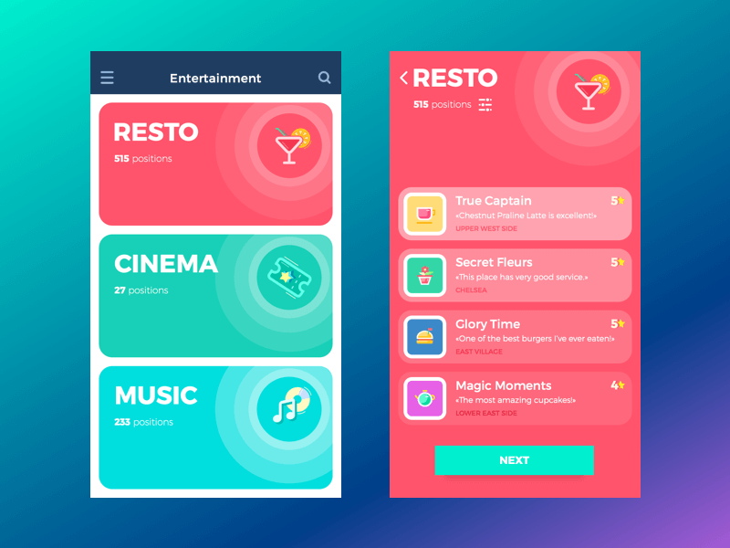
Entertainment App
Recommended reading
Here are some materials we could recommend for those who would like to get deeper into the topic of color in design:
Color in Design: Influence on Users’ Actions
Light or Dark UI: Tips to Choose a Proper Color Scheme
Color in Design: Influence on Users’ Actions
Design Glossary: Color. Terms and Definitions


