A good review starts with a question: Does this thing want to be used?
You can call it usability, heuristics, whatever the industry decided to name it this year, but at the core it’s simple—does the interface behave like a decent human? Does it guide? Does it respect your time?
That’s where I begin.
Visual Hierarchy, Accessibility, and Respect for the User
Then my eye slides to the visual hierarchy. Not in the abstract “design theory” sense, but in a practical, measurable way: What do I see first? Why? Is that the thing that actually matters? If not, we’ve got a problem. You’d be surprised how many potentially great products fall apart on that single point.
Accessibility follows close behind. Contrasts, tap areas, font scales, interaction states. The basics—which, ironically, are where a lot of designers try to get “creative.” But this part isn’t about flair. It’s about inclusion. It’s less craft, more hospitality. Are we letting real people in, or just the ones with perfect eyesight and the latest iPhone?
Then there’s cohesion with the brand. Not the “brand as a mystical creature” narrative—brand as a system. Does the interface follow the logic the company has already established—tone, spacing, grids, motion rules? Or does every screen feel like it was designed in isolation? You can tell instantly when elements weren’t built from the same worldview.
That’s how I used to explain the process to young designers. One-on-one, inside the team. Later, it became something bigger. Now, this approach lives inside Tubik Studio. It’s how we review—not just once at the end, but continuously, as part of how we think.
Reviewing Design Across Stages
The team’s approach shifts depending on what’s under review. A raw sketch needs questions. A prototype needs structure checks. An MVP needs careful analysis of its usability gaps. A launched product needs a full-body scan: product level, structure level, flow level, screen level. Each exposes a different kind of problem, and skipping a layer means missing something important.
Another place where most teams underestimate complexity is flows. You can have perfect visuals and still create a confusing experience if the transitions don’t support real decision-making. So we trace how a user would actually move: where they hesitate, where the system expects too much memory, where two steps could easily be one. That’s not theory. That’s retention, conversion, and whether people come back.
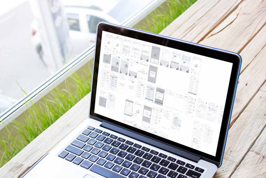
The final review ends up in Figma—annotated, structured, with reasoning tied to real principles and research. If something isn’t clear due to missing context, the designers leave direct questions. A good review is not a monologue; it’s an investigation.
And if you’re on the other end—the client, the product owner—context is your superpower. Tell the team about the product’s goal, the audience, the constraints, the complaints, the metrics you care about, the things in the design that quietly bother you. The more precise the picture, the more actionable the recommendations.
Because a design review isn’t about judging the work, it’s about revealing the parts that are holding the product back.
Strip away enough layers, and you’ll see it: every good interface is a series of decisions. Everything else is just decoration.


