
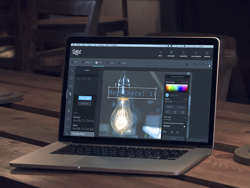
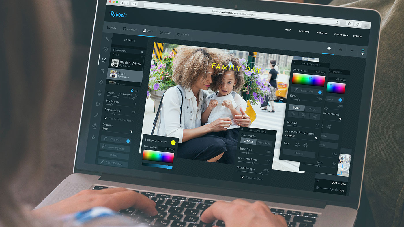
Designers know so much about graphic editing art, so it seems like a pleasure and honor for them to take part in the creation of photo editing services. There are many photo editors, both web and mobile but all of them stand for quality photos. They can be not only an independent digital product but also a part of applications or websites with wide functionality, such as Instagram. Realizing how complicated the process of image edition can be, design experts try to create an effective instrument that would make things easier. The article describes common UI screens for photo editing services. For graphic support, we used here some screens from our design project for Ribbet.
Home screen
Home screen, or main screen, is a core part of any user interface since it’s a place where users start to interact with a product. Its content and structure can vary depending on the type of photo editing service.
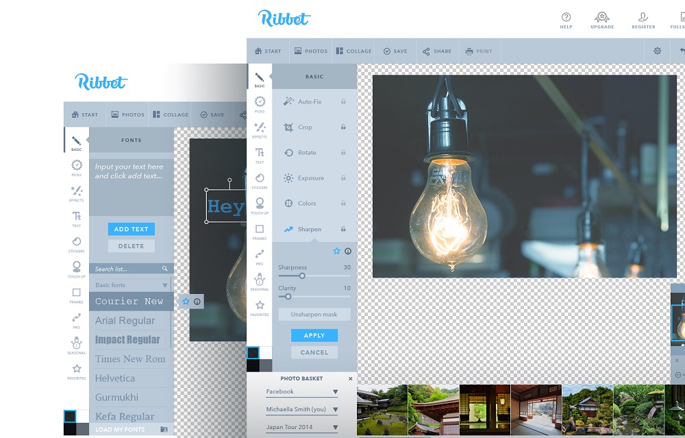
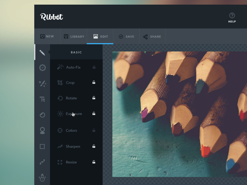
Web photo editors, along with desktop applications, usually apply the home screen as one major page where users can reach all the features. Traditionally, a photo is placed at the center of the layout so that users could see it in the details. Due to the size of web and desktop pages, designers can put the key functionality into a single page. They are often placed into the left sidebar, which allows controlling the space effectively and makes the interactions easier and faster. Moreover, if a photo editor isn’t oriented to professional designers or photographers and provides only the essential features, the instruments can be presented as minimalistic icons.
Mobile photo editing apps are not that simple to create and require deep attention to structure planning. Considering the fact that mobile devices have small screens, a mobile photo editor can’t include all the tools together, so designers need to separate them.
Let’s see the detailed description of the interfaces introducing the major tools.
Photo editing
The number of features in photo editors varies depending on the target audience. Some of them are created for experts in this field, which means the services need to provide a wide range of instruments so that professionals could do complicated transformations. On the other hand, there are many digital products that allow making photographs beautiful even if you don’t have special skills.
Traditionally, mobile editors are oriented toward the non-expert audience, so they usually don’t provide many tools at once. There is a list of image editing tools that are essential for this kind of application. Let’s look at the common functions and UI solutions, helping to represent them effectively.
Cropping
One of the basic features is cropping. It often happens that there is too much unwanted space around the object in a photo, and we need to remove it. Cropping is a quick way to get rid of unnecessary space in the photo, which takes minimum effort. Designers usually present a tool in a shape of a rectangle which users can scale and move. The spare area is darkened so that it could be easy to distinguish. Even if an app is oriented to users with a very basic level of tech literacy, it may be a good idea to add information about the size of a photo on the screen. It can be shown in pixels or inches, allowing users to see the size of the image after the operation. The action of cropping, as well as the other functionality, should be confirmed to avoid accidental changes.
Alignment and rotating
Taking photos, we don’t always have a chance to build a perfect composition since we often need to catch some important moments immediately, and an image may not look as good as we wish. That’s why photo editing apps need to provide the possibility to align images. The alignment screen requires some guides assisting to see if visual elements are placed even, so it usually contains a grid. To make the process effortless, designers place the horizontal scale with a slider in the middle of it. Users can move the slider to the left or right to bring the balance into a composition. In addition, a slider can be followed by the degree showing how much you inclined a picture.
If a photo is taken in a hurry, there is a chance it would be upside-down. Rotation feature may not always be presented as a separate screen. The tool can be combined with another one in a single layout since its functionality doesn’t take much place. It usually takes one or two icons in a shape of a rounded arrow which indicates the direction. Commonly, it’s combined with alignment or cropping screen.
Saturation and exposure settings
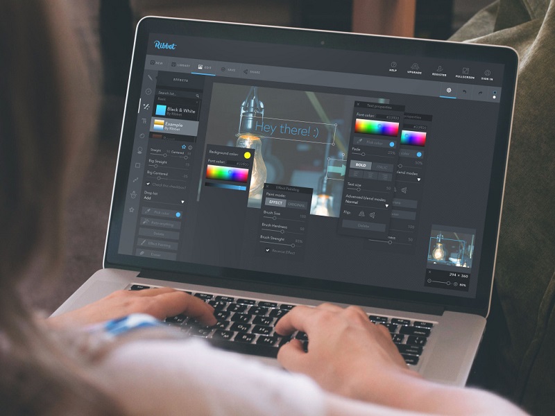
Color is a major factor influencing visual perception. To make photos more pleasant for the eyes, it’s vital to set the colors appropriately. The settings UI usually includes several horizontal scales with sliders. Each scale is responsible for a particular aspect which includes brightness, contrast, highlights, shadows, and lights. Also, photo editors often allow enhancing or decreasing certain colors. There are three common ways to present saturation settings. First is a long horizontal scale that applies all basic colors and can be chosen with a slider. Another option includes applying the color wheel with a wide range of colors. It helps users accurately choose the proper shades. And the third way is presenting several horizontal scales, which consist of two colors each. The color pair applies two opposite colors so that users could easily decrease the unnecessary dominating colors.
Filters and effects
Some users can’t stand bothering with color settings because it may take some time before they reach the desired outcome. That’s why photo editing apps provide a great spectrum of filters and effects. People can make a black-and-white or vintage photo with a tap, and it makes the process effortless, even for the most impatient users. Filters and effects UI is simple. A photo is placed at the center of the layout, and the filters are presented via miniatures at the bottom of the screen. Miniatures give an idea of how the filters and effects look so that users wouldn’t be forced to check all of them.
Frames
Photo frames existed long before digital photography, and they don’t lose their actuality. However, today people mostly use them as decoration for digital images. The layout of the frames interface is similar to filters and effects – the example of frames is shown as miniatures at the bottom. Also, the screen requires a tool that will help to regulate the width of frames, such as scale.
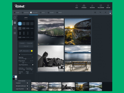
Collage
Collage is known as a collection of photos that are combined to make a single picture. Along with photos, a collage can usually include frames, stickers, text, or a custom background. This screen differs from the others because it applies several photos. Photo editor apps need to help users quickly create a pretty collage, so the key part of the layout is different templates.
Collage samples vary by the number of photos as well as the structure. Users can choose the perfect template and then download chosen pictures. The templates can be shown differently. Web photo editing services often apply a sidebar showing samples via clickable icons. As for mobile applications, the templates can be put on a separate screen so that users could see them well. When people choose a collage sample, the application leads them to the editing interface, where the creative process starts.
Effective UI for photo editing services helps non-designers make beautiful photos without significant effort. The designers’ task is to organize and present all the features that way so that everyone could do the editing intuitively.
Recommended reading
Web Design: 16 Basic Types of Web Pages
The Big Guide to Different Types of Websites
UI/UX Design Glossary. Navigation Elements
Basic Types of Buttons in User Interfaces
The Anatomy of a Web Page: 14 Basic Elements
Mobile UI Design: 15 Basic Types of Screens
Feel the Beat. UI Design for Music Streaming Services
Spectacular Design. Elements of Cinema App UI