

There’s a shift happening in design that doesn’t get named often enough. The dividing line between designer and builder is dissolving—not because tools have gotten easier, which they have, but because the market has stopped caring about the distinction. Clients want the thing made. Startups want to ship. And the designer who can hand off a Figma file and turn it into a live product is now a fundamentally different professional than the one who can’t.
No-code tools are what make this transition possible and expected. And for most of the last decade, if you were a designer getting serious about implementation, you made your way to Webflow eventually. It was the default.
Then Framer pivoted in 2022, and things got genuinely interesting.
At Tubik, we work across both platforms. Different tools do different things better, and pretending otherwise serves no one. This article is a practitioner’s reflection of how these two tools actually think, and more importantly, how they ask you to think.
The First Five Minutes
The entry point tells you everything.
Open Webflow for the first time, and the interface asks something of you immediately. Panels everywhere, layers of settings, no obvious entry point. You’ll watch tutorials before you build anything real. This is the price of a tool built close to the actual architecture of the web. But the toll is real. Open Framer and you feel, within minutes, like you already understand it. The canvas, the panels, the way elements behave—it’s Figma’s logic transposed into a builder.
Neither tool requires you to know HTML or CSS. But Webflow will eventually nudge you toward that thinking. Framer keeps that layer behind glass—accessible if you need it, invisible if you don’t. For a first-time user, Framer wins the first impression without much of a contest.
Two Different Mental Models
Surface-level, the interfaces look similar. Canvas in the center, structure on the left, settings on the right. The fundamental difference is in how each tool expects you to think.
Framer works like Figma. Frames, stacks, independent elements. Change one thing and nothing else breaks. This gives you the freedom to experiment without consequence—which sounds minor until you’re deep in a project and want to try an alternative version of something.
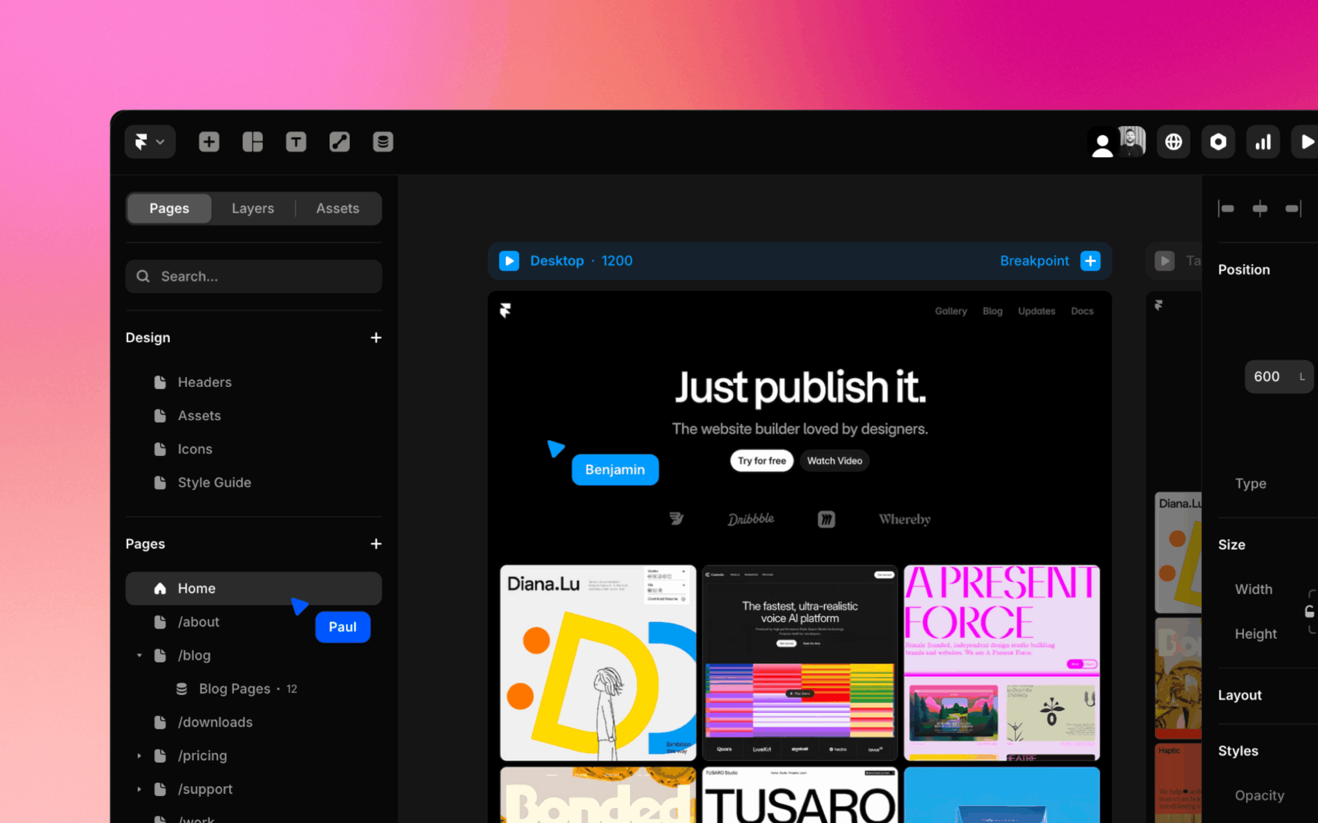
Framer interface
Webflow is built on classes. Change a class, and every element sharing it changes with it. This is the source of both its greatest efficiency and its most common frustration. The efficiency: once your class system is solid, the speed compounds. Adjust spacing in one place, and it updates everywhere. The frustration: experimentation becomes a commitment. Want to try an alternative hero section? In Framer, you copy it and do whatever you want. In Webflow, if you haven’t pre-duplicated your classes, you’ll start breaking the original. I’ve lost real hours to this. You either plan your class architecture in advance or pay for it later—and that cognitive overhead is real when you’re trying to move fast.
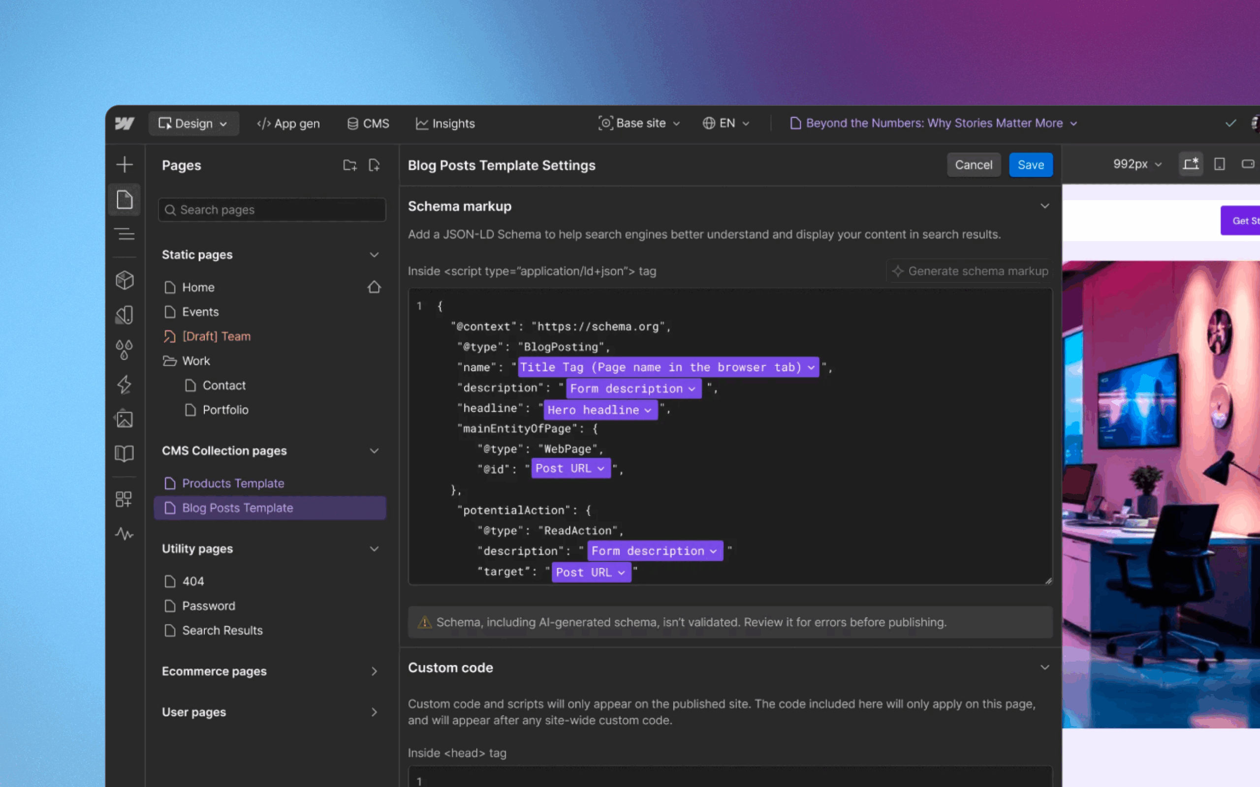
Webflow interface
Speed, Flexibility, and the Export No One Talks About
Framer is faster to start. Webflow is faster once you’re inside a mature system. Both are genuinely fast—at different moments in a project’s life.
On flexibility, Webflow still leads, for architectural reasons. It sits close to the actual web. You can connect HTML, CSS, JavaScript. Drop a custom component in via an Embed block. The seam between visual builder and custom code is thin and intuitive. Framer supports custom code too, but you’re working closer to React than to standard HTML—the patterns are less familiar, and the path requires more awareness.
Here’s a point that rarely surfaces in these comparisons, but it should: Webflow lets you leave.
We’ve had projects where we built in Webflow, exported the code, and handed it to a development team that rebuilt everything in their own environment. That exit existed. In Framer, it doesn’t. If the platform changes, if pricing shifts, if you simply outgrow it, you can’t take the project with you. For founders or agencies building long-term client work, that’s a business risk worth pricing into the decision before you’re committed.
Animations: Two Very Different Stories
Simple animations are where Framer earns real affection. The honest distinction: basic scroll and entrance animations are simply easier and faster to set up in Framer—fewer steps, less configuration, more immediate. In Webflow, the same results require more deliberate setup. Some effects, like a custom cursor, require custom code entirely.
Text effects used to fall into that category too, though Webflow’s native GSAP presets have closed that gap meaningfully. Parallax, hover states, fade-ins—Framer puts these within reach faster. You reach for them and they’re there. This changes the economics of small projects noticeably: fewer workarounds, fewer paywalled moments, fewer times creative momentum hits a billing wall.
Complex animations are a different conversation.
Webflow—particularly since GSAP tools were integrated natively—gives you something that feels closer to a motion graphics environment than a website builder. A visual timeline where every element lives on its own track, controlled frame by frame. I know designers who find this excessive, who feel it pulls the tool too far toward development. I’m not one of them. I like that control. I like being able to build exactly what I imagined, not approximate it.
Framer handles complex animation through component states, which works until it doesn’t. At a certain level of choreographic ambition, the model starts to feel like a ceiling rather than a canvas. You can see what you want to make, but you just can’t quite get there.
And then there’s page transitions—where Framer makes a genuinely impressive move.
Webflow’s rendering means every page is a fresh DOM load. Smooth transitions between pages have to be faked: an animation ending on one page, another beginning on the next, stitched together to create an illusion of continuity. It works, but it requires effort and still has seams.
Framer uses a layout template model—you define a persistent structure, header and footer stay fixed, only the content area changes. This enables real, native page transitions. The site stops feeling like pages and starts feeling like an application. I felt the practical weight of this on a project with a fixed sidebar and nested category navigation. In Webflow, it became a genuine construction—Finsweet Attributes, nested CMS, custom code, held together with architectural willpower. In Framer, the same structure was almost straightforward. The layout held, the sidebar stayed, and I just worked with the content inside it.
CMS, AI, and Pricing
For small and medium projects, the CMS conversation is almost a non-issue. Both tools handle the typical workload—collections, content pages, basic structures—without breaking a sweat. Framer’s interface is genuinely nicer to work in day-to-day. Cleaner, less fatiguing, the kind of UI that doesn’t make you feel like you’re filing taxes.
The gap opens when projects get complex. Large sites, content-heavy platforms, structures that need to scale without accumulating architectural debt—this is where Webflow’s CMS earns its reputation. Framer knows it and is moving: a recent update with advanced filtering is a meaningful step, not a cosmetic one. But the distance at scale is real for now.
AI is the section I almost didn’t write, because anything specific risks being wrong by next Friday. Both tools can now generate entire sites from a prompt—that baseline is table stakes at this point, and neither has fundamentally changed how I approach design work. But there’s a more interesting story inside Framer’s Workshop, and it’s worth unpacking.
Framer’s third-party component ecosystem is smaller than Webflow’s. That’s just the reality of a younger platform. What Workshop does is quietly compensate for that gap. Need an animated counter? A custom scroll effect? Something that in Webflow you’d solve with a plugin or a community snippet—in Framer, Workshop generates it as a ready-to-use component, with properties already wired up in the right panel. You describe what you need, it appears, you configure it visually. For a platform where the library of ready-made solutions is still catching up, this is a meaningful equalizer. It doesn’t change the workflow. It fills in the parts where the workflow would otherwise stall.
Webflow’s AI integrates more quietly, less dramatically, assisting from inside the workflow rather than announcing itself. Both clearly intend to go further.
Pricing is where direct comparison becomes almost meaningless. Framer’s tiers are transparent—you understand what you’re paying for, and the base plan is surprisingly capable. Webflow’s structure combines site plans and workspace plans in ways that compound in unexpected directions as teams and projects grow.
The honest pattern: Framer tends to win for solo designers and small projects. Webflow becomes more predictable—and often more cost-effective—as scope increases. Neither is universally cheaper. The right question is what you’re actually building, not which number looks smaller on the pricing page.
The Ecosystem Gap and the Technical Reality
Webflow’s ecosystem is larger for one simple reason: time. Years of third-party integrations, libraries, documented workarounds, and community solutions mean that nearly any problem you hit has a known path out. This feels abstract until you’re stuck at 11pm needing something to work—and then it feels like infrastructure.
Framer’s ecosystem is smaller but moving with unusual speed. During my month inside it, meaningful updates shipped multiple times. Framer Shaders for visual effects. Advanced CMS filtering. The Marketplace is growing, Framer University gives newcomers a real starting point, and a creator community is forming around the tool with genuine enthusiasm. The gap is real. So is the momentum.
On the more technical side—semantics, accessibility, performance—both tools cover the fundamentals. Semantic HTML, heading structures, ARIA attributes: present in both. Framer only added rem unit support in 2025, which drew fair criticism for years and is now largely resolved. As one example of how each platform approaches accessibility in its own way: Framer has built prefers-reduced-motion support directly into its animation system, so reduced-motion behavior works without any custom configuration. A small detail, but one that reflects the kind of considered, design-first thinking that characterizes how the tool moves.
Performance is another comparison point. I’ve run projects through Google PageSpeed Insights on both platforms, repeatedly, across different levels of complexity. Webflow consistently scores better on heavier projects. Framer’s React-adjacent architecture introduces a layer of abstraction that produces more code overhead—overhead that becomes visible as animations multiply and complexity grows. On simple sites, the difference is negligible. On complex, animation-heavy builds, it starts to matter. This isn’t a permanent condition—it’s where Framer is today—but it’s worth knowing before you commit a serious project to the platform.
When to Choose Which
If you want a practical framework rather than a philosophical one:
Framer is the right call for marketing sites, portfolios, startup launches, anything where the brief is “make it beautiful, make it fast, make it memorable.” When visual impact and speed of delivery matter more than architectural depth. When you want to experiment freely and ship without friction.
Webflow is the right call for SaaS products, content-heavy sites, multilingual platforms, projects where SEO is a core strategy, or anything that needs to scale in complexity over time. When you need a system that grows with you rather than one that moves fast at the start.
The tools reflect two different designer personalities, too. If you lead with creativity, visual thinking, and rapid iteration, Framer will feel right. If you lead with systems thinking, structural logic, and engineering discipline, Webflow will give you more of what you need.
Neither is wrong. They’re just optimized for different kinds of work and different kinds of minds.
What’s Actually Happening
The lazy narrative is that Framer is the future and Webflow is the new WordPress—heavy, aging, slowly becoming irrelevant. This is unfair and, I think, wrong.
Webflow is moving deliberately toward deeper development capability: React integrations, component systems, enterprise tooling, AI-generated code. It’s becoming something closer to a visual development environment. That’s a coherent strategy, even if it means accepting that a portion of the casual-designer audience drifts toward Framer.
Framer is closing technical gaps—performance, SEO, CMS depth—while protecting the thing that makes people love it: design quality, motion, simplicity, and a pace of development that makes you wonder when they sleep.
Neither will disappear. Neither should.
This isn’t really a story about which tool wins. It’s a story about two different answers to the same question: what does it mean to build for the web as a designer in 2026? One answer is system and control. The other is speed and creative freedom.
The choice between them is a choice about which kind of designer you are—and which kind of work you want to do more of.
Figure that out first. The tool selection follows on its own.
Recommended Reading
Liked this one? There’s plenty more to explore—discover other insights from Tubik Studio: