Manatee Energy came to us with a simple ambition: make heat-pump installation feel easy. Not abstractly easier, not “disrupted” into a vortex of buzzwords—genuinely intuitive, trustworthy, and friendly.
Their mission was both practical and idealistic. Help everyday users navigate one of the most opaque service experiences—energy retrofitting—and use software and smart automation to lower costs and raise clarity. In an industry crowded with monopolistic players and clunky workflows, they wanted to stand out by treating customers like, well, people.
So they asked us to design the full user experience. From architecture to interface, from survey flows to dashboards, from cheerful icons to Manny the Manatee—a mascot who ended up totally stealing the show (in a good way).
The result was a calm, transparent digital ecosystem that invites users in, holds their hand through a complex process, and still manages to make a technical energy upgrade feel as soft and smooth as… warm water.
About the Client
Manatee Energy is a consumer-first platform built around a very modern idea: you can automate a lot of the messy, sales-heavy overhead in heat pump installation—and use that saved cost to make things simpler, cleaner, and cheaper for the people who actually live in these homes.
They’re not trying to be flashy. In fact, part of their charm is how unpretentious the brand wanted to feel: helpful, warm, clear. Like a good neighbor who happens to know a lot about thermodynamics.
The name “Manatee” wasn’t a branding gimmick. In fact, it’s quite fitting: manatees love warm water, often gathering around pump stations in the wild—and, as it happens, they’re native to one of the founders’ homelands. That kind of natural metaphor felt perfect for a brand looking to build trust without too much noise.
The Core Challenge: Building Trust
Installing a heat pump is rarely plug-and-play. There’s a lot to factor in: old insulation, home age, local subsidies, technical specs that shift the price depending on which zip code you live in or how many windows you’ve got. The real challenge wasn’t complexity, though. It was trust.
How do you design a process where the quote you get upfront might be wildly different from the final cost—and still make users feel respected, informed, and in control? We knew our job wasn’t to eliminate complexity—that’s impossible. We just had to give it a better interface.
So we focused on three principles:
- Structure the journey clearly
- Be honest about where the numbers might flex
- And never, ever hide behind jargon
The Process: Building From Scratch, With Help
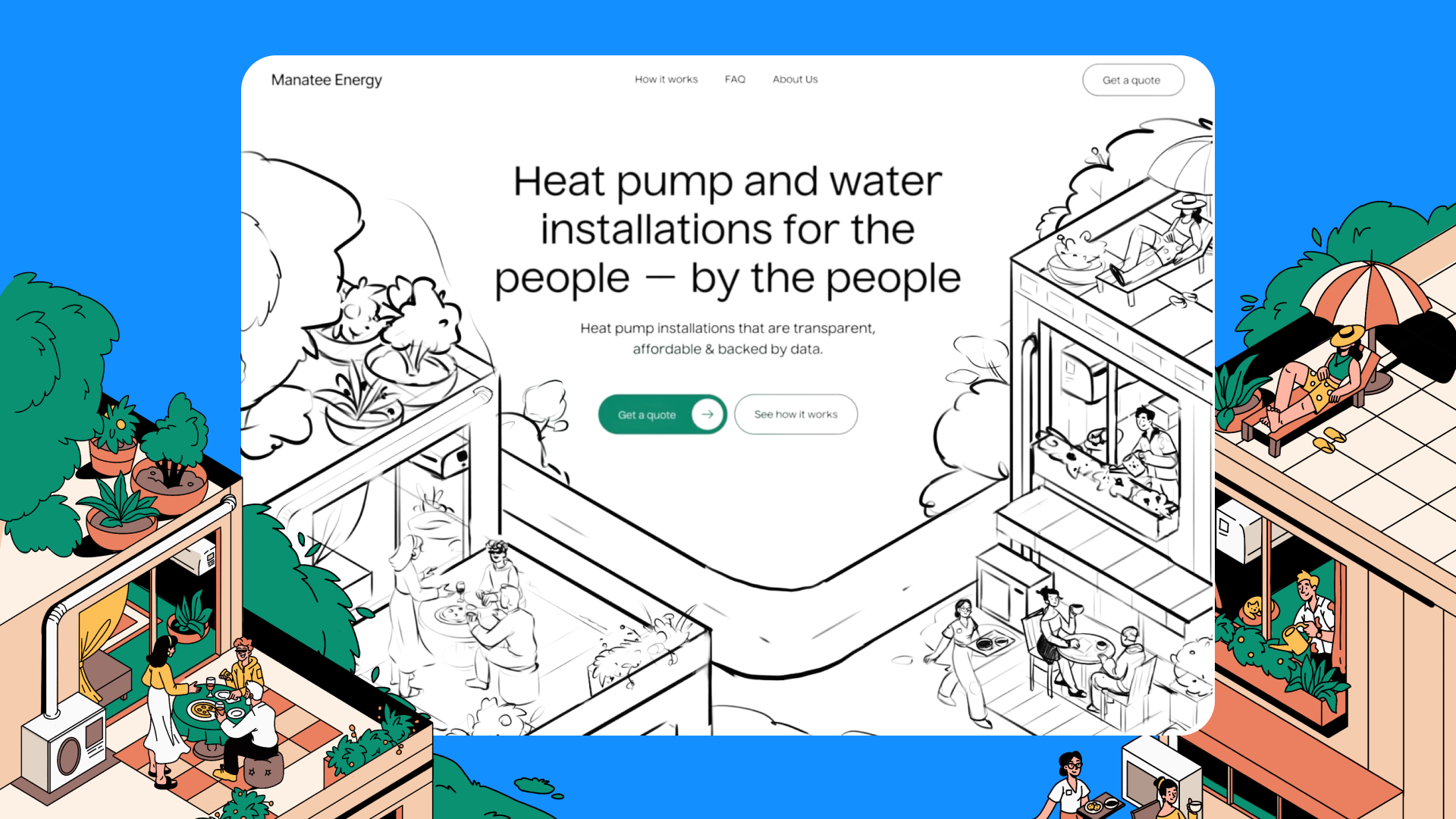
Manatee’s team came prepared, and that changed the nature of the work in a good way. For the website, they already had the full text. For the survey, the logic was largely mapped out. The story was already there. Our role was to shape it into something coherent, intuitive, and human.
The early sessions were collaborative rather than extractive. Instead of pulling information out of the client, we were refining it together. The website structure came together relatively smoothly because the messaging was already there. We focused on hierarchy, pacing, clarity—deciding what to surface upfront and what to introduce progressively. The content did a lot of heavy lifting; our job was to make it breathe.
The survey flow was similar. The core logic existed—we clarified nuances, tightened phrasing, and structured the steps so users wouldn’t feel interrogated. We weren’t redesigning the questions so much as designing how they unfold.
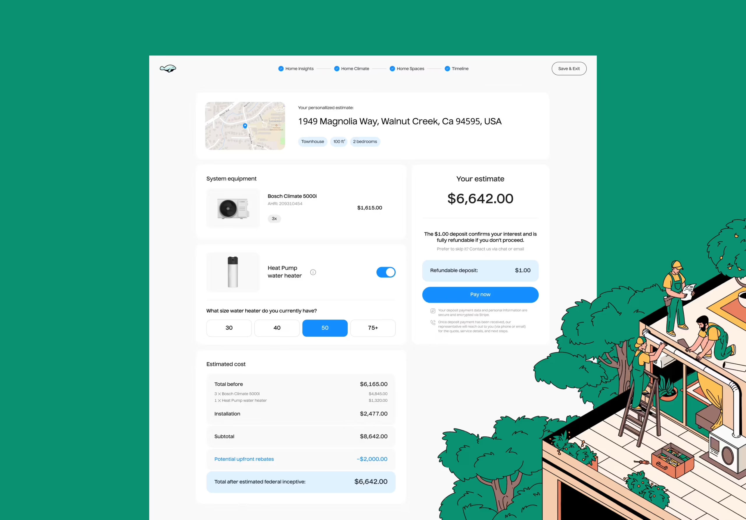
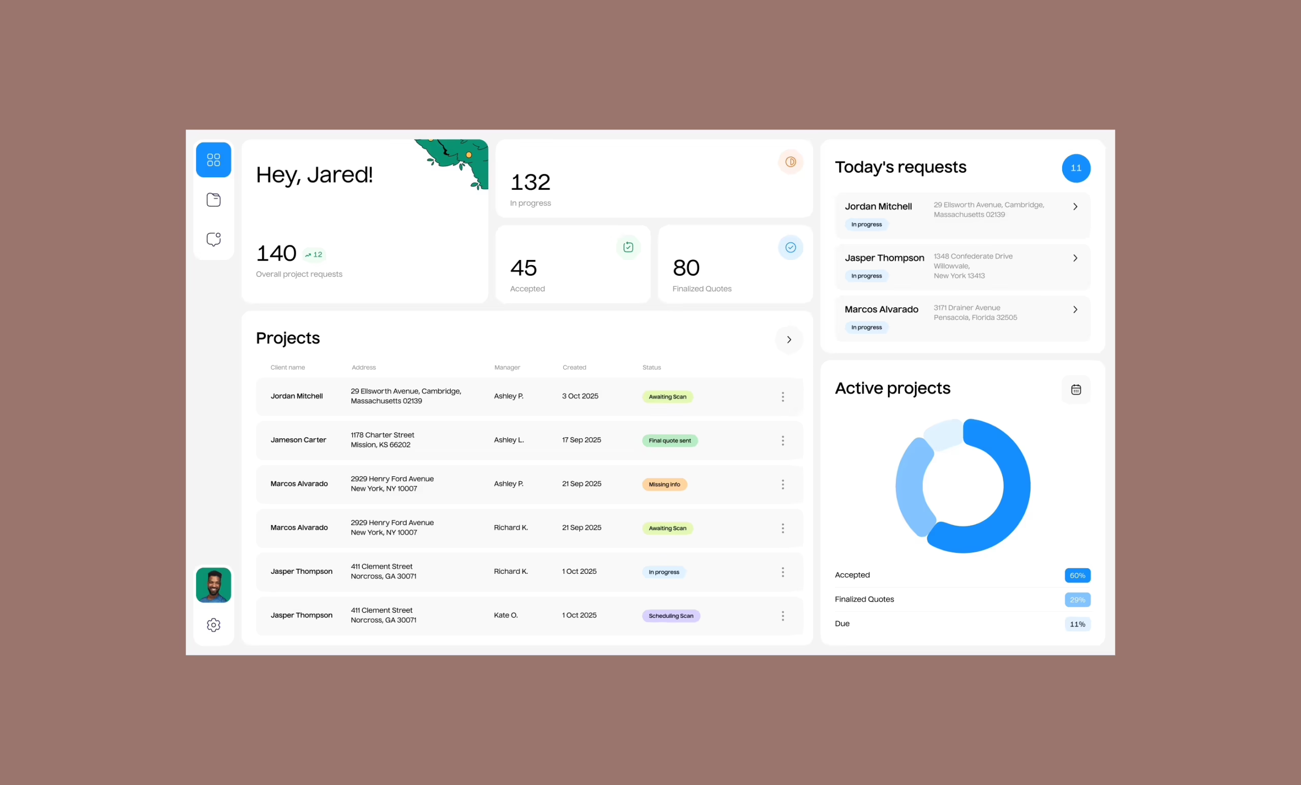
The real architectural challenge was the dashboard.
That’s where things became more layered. There were dependencies, conditional states, subsidy requirements, upload flows, expert bookings. And the complexity wasn’t always visible at first glance.
Here, the process became more iterative. The team shared low-fidelity mockups and rough internal logic. We asked questions. A lot of them. Sometimes very basic ones—the kind that sound obvious but expose assumptions:
- What happens if the preliminary estimate shifts significantly?
- What if a user hasn’t completed a required assessment yet?
- How does the system communicate waiting states?
We weren’t designing from scratch, but we were translating operational logic into interface logic. And that’s a very different job.
Product UX: Guiding Without Hand-Holding
From the start, we knew the tone had to be gentle—not juvenile, not sterile. The product isn’t fun, exactly. But it had to feel friendly.
To get there, we approached the user like good hosts—anticipating questions, offering context before confusion, and never leaving anyone wondering what happens next. That meant:
- Clear CTA paths (especially from website to survey)
- Explanatory tooltips and microcopy
- Progressive disclosure of information (we don’t bury you in forms upfront)
- A mascot who walks beside you, not in front
The survey was built with users in mind. Not “personas,” but real people who’ve never heard of SEER ratings or rebate assessments.
The dashboard was trickier—especially because we had to account for changing data states: sometimes you’re waiting for an expert visit, other times you’re uploading your Mass Save certificate, and sometimes you’re just checking the latest cost estimate.
Instead of overengineering it, we simplified and focused:
- Clear headers
- Smart grouping of tasks
- No mystery buttons
- Status updates that feel like updates, not corporate apologies
Every part of the experience—the website, the dashboard, the survey—was designed to feel like they belong to the same organism. Different functions, one voice.
And that voice had flippers.
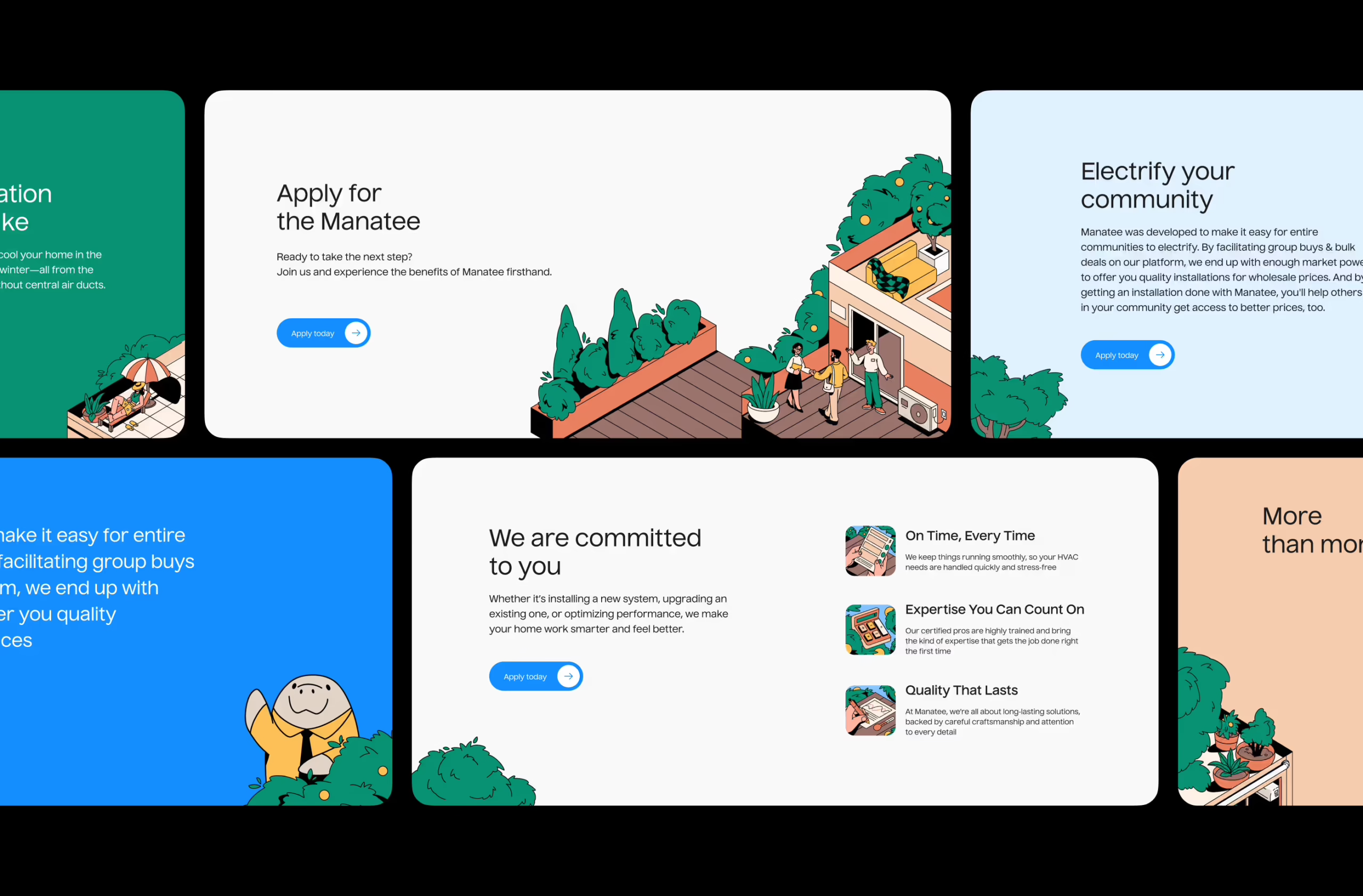
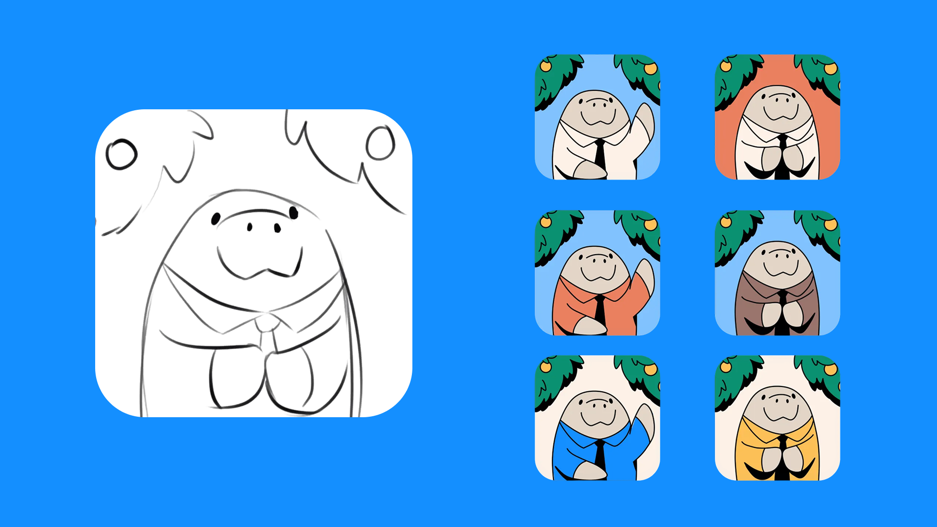
Visual Identity: Let There Be Manny
Manny the Manatee wasn’t in the original brief. He showed up during the survey design—when we realized that users needed someone on their side. A character to turn an otherwise cold series of data fields into something warm, visual, and memorable.
He’s not cloying. He doesn’t talk too much. But he’s there—quietly cheering you on from the corners of the interface, peeking out from help bubbles, showing up in confirmations. And sometimes, that’s all the user needs—a gentle presence.
The rest of the visual language followed suit:
- Rounded corners
- A breezy sky-blue base color
- Bushes, clouds, illustrated homes—not as decoration, but as contextual anchors
- Custom icons that simplify, not stylize
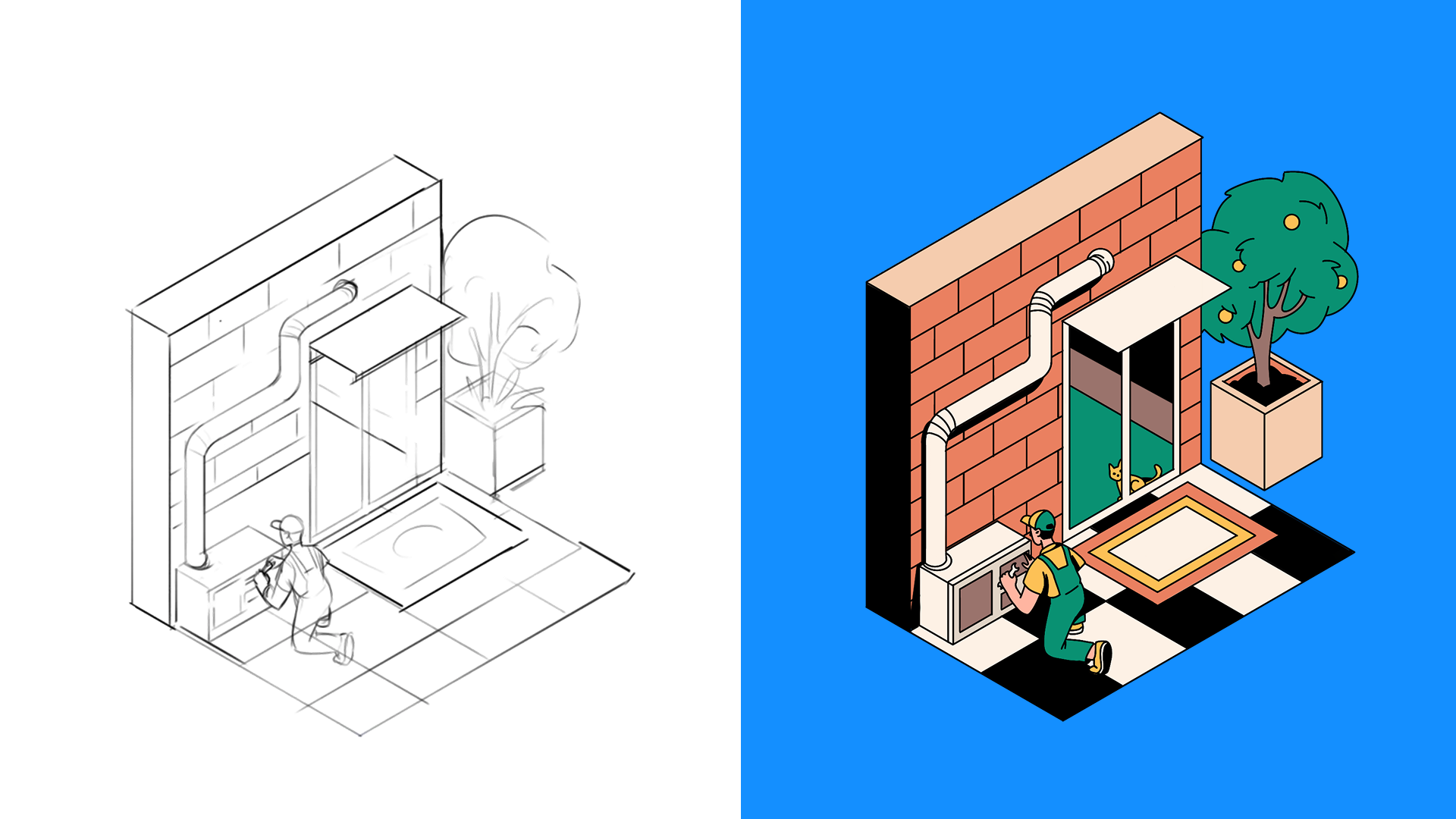
We chose illustration over photography not because it’s “on trend,” but because we had zero usable images of real installations. Instead of faking realism, we leaned into abstraction and made it intentional. Where we did need realism (like showing installed systems), we introduced it later through actual photos from the client’s growing portfolio. But by then, the visual voice was already set.
Our Reflections
Designing for infrastructure isn’t always fancy. But it is deeply human. You’re dealing with homes. Budgets. Families making long-term decisions. The kind of stuff where trust has to be earned through tone, rhythm, and detail.
A few things we took with us:
- Illustration isn’t filler when it does real explanatory work
- Tone is a design system. A gentle one, but it sets the rails
- If you’re going to use a mascot, use it sparingly—and give it a purpose
- People don’t need you to dumb things down. They need you to show them the map
And maybe our favorite lesson: even when the service is complicated, the design doesn’t have to be. You can be asking someone for utility bills, floor plans, and heat pump specs—but if the flow feels like a friend walking you through it over coffee, the stress drops.
Which means no big talk. No scary numbers. No tech jargon.
Just a gentle nudge, a warm tone, and maybe a manatee or two.
Recommended Reading
Curious how design shapes other complex digital ecosystems? Explore our case studies and design articles to see how we turn infrastructure, healthcare, and SaaS into human-first experiences. There’s always another story behind the interface!
Case Study: Orakle. Modern Web Design for Medical Education
Case Study: ABUK—Designing Ukraine’s Leading Audiobook Platform
SPYLT Case Study: Delicious by Design
Designing for Justice: Telling the Story of Jailhouse Lawyers
The Anatomy of a Good Design Review
Ecommerce UI/UX: 6 Web and Mobile Design Projects for Online Shopping