Healthcare websites are usually… predictable. Clean grids. A lot of white. Smiling professionals with folded arms. You scroll, you nod, and then you forget. Fireside was never meant to be that.
The project didn’t come from a pitch deck or a cold intro. It came from continuity. A client we had worked with before stepped into a new role and brought us along for the next chapter—Fireside. That kind of return says more than any testimonial ever could.
About The Client
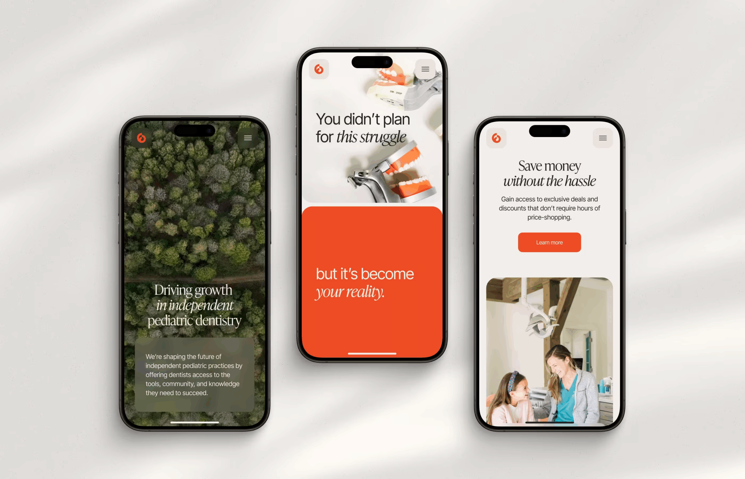
Fireside is the first membership-based community platform for pediatric dentists. It offers educational resources, expert support, and vendor discounts—practical tools that help professionals grow without unnecessary friction. But beyond that functionality, there was something more subtle: an identity built around warmth.
Dentistry carries emotional baggage. Anxiety. Clinical coldness. The sound of metal instruments and the smell of antiseptic. Fireside actively rejects that narrative—its name alone signals comfort, conversation, shared space. A gathering, not an appointment. That metaphor became our conceptual anchor.
The Brief
When Fireside approached Tubik, they needed a digital presence from scratch—an ecosystem capable of supporting their long-term brand development. The website would become a visual foundation for future products. An “all-in-one” task, sort of.
There was very little to inherit. No existing information architecture, minimal text, a few sentences here and there. Some early color palette suggestions that didn’t quite align with the warmth implied by the name, like the light blue that felt sterile, almost reminiscent of latex gloves. That was not the emotion we were after. The only thing we kept was the red accent—it had energy, gravity. But everything else needed reconsideration.
The design references shared with us leaned heavily into animation and interaction storytelling. Many examples relied on photography-heavy layouts—yet at the time we began the design process, we had no visual assets. Photography arrived much later, when the design was already complete.
Which meant one thing: narrative would carry the experience.
The core challenge was delicate. We had to create a light, emotionally accessible website that conveyed community and trust while preserving medical credibility. The client’s goal extended beyond aesthetics—they needed a cohesive visual language that could later expand into all brand touchpoints.
When you build without legacy constraints, you also build without guardrails. That freedom demands sharper thinking. There are no templates to lean on, no structural shortcuts.
Building the Structure
We began with the sitemap. Every page, every entry point had to be defined from zero. Homepage. Services. Team. Contact. Simple categories. Clear logic.
Clarity over complexity became our quiet mantra.
Without extensive content to guide us, the structure itself had to communicate meaning. We broke services into digestible blocks rather than overwhelming paragraphs. Each section was shaped to answer the core questions every professional asks within seconds:
What do they do?
Can I trust them?
What value will I get?
How do I join?
The homepage needed to build trust in under ten seconds, without showcasing a fully developed product. So we leaned into positioning. A concise introduction. A recognition of industry pain points. A promise of support in multiple forms.
Progressive disclosure played a central role—essential information first, details deeper. The storytelling moved from describing the offering in one or two clear sentences, to acknowledging professional challenges, to presenting solutions in accessible formats.
Call-to-action placement followed simple logic. Not aggressive. Not repetitive. Additional CTAs only at meaningful decision points—after persuasive content or clarifying facts. No shouting, no flashing urgency, no artificial pressure. Just timely invitations, placed where conviction naturally begins to form.
Without rich visual assets, animation and motion became the connective tissue. Scroll-based transitions guided users forward, creating the feeling of following a path. They weren’t jumping between disconnected blocks of content, but moving through a narrative.
Finding the Right Visual Direction
The visual direction started with one accidental discovery: a stock video of a woman spinning in a field of flowers. There was music, wind, and movement. A softness that felt almost rebellious against everything dentistry usually represents—clinical lights, sterile surfaces, faces hidden behind masks.
We placed that video into the hero section—and suddenly the metaphor behind Fireside stopped being abstract. Now, it had rhythm.
From that moment, we built everything outward. We kept the red accent because it carried warmth and presence. Then we layered in pastels and a deep green that echoed the landscapes we leaned into—mountains, forests, open horizons. The palette moved away from clinical blue and toward something grounded, human, and steady.
In our conversations with the client, we aligned on one key principle: no literal dental clichés. No exaggerated smiles. No campy symbolism. We aimed for environmental imagery that suggested connection without spelling it out. Professional, but not rigid. Aspirational, but not theatrical.
We searched for the right photography with almost obsessive care. At first, it was all stock—carefully selected nature scenes chosen for atmosphere rather than literal relevance. Each image carried intention. Later, when the client provided real dental photography, we wove it into the system deliberately. The project shifted again, became more tangible and anchored. Nature and profession agreed to coexist instead of competing.
We treated white space as a structural tool. It allowed key statements to land without distraction. We varied layouts across sections to maintain visual rhythm, adjusting scale, density, and emphasis so the scroll never felt mechanical.
When minimalism felt too silent, we reintroduced the logo as a subtle background presence—a reminder of identity without forcing attention. Every decision aimed to keep the atmosphere cohesive.
UX/UI for Trust and Action
Comfort and conversion are not opposites. They move together.
We designed the navigation hierarchy to feel self-explanatory from the first glance—no guessing games or buried categories. Core sections stayed visible and predictable, so users didn’t have to spend mental energy figuring out where to click next.
As users scrolled, media supported the narrative. Videos, imagery, and transitions followed the logic of the story instead of competing with it. Each service explanation lived inside structured, readable blocks with deliberate spacing and typographic hierarchy. Headlines carried the promise, supporting text clarified it. Nothing felt crammed, and nothing required decoding.
We also paid special attention to microcopy. Every small line—form labels, button text, short explanatory notes—carried a tone of reassurance. We avoided language that sounded instructional or institutional. Instead of commanding, we guided. Instead of asserting authority, we offered support. That shift in phrasing may seem subtle, but it shapes emotional perception.
Booking was simplified through intentionally short forms. We asked only what mattered, no unnecessary fields or layered complexity disguised as thoroughness. The process felt straightforward because it was.
Mobile responsiveness wasn’t an afterthought either. We understood that this audience doesn’t browse in perfect office setups—they scroll between appointments, during short and rare breaks, in transitional moments. The interface had to adapt fluidly to smaller screens without losing hierarchy or rhythm. So we made sure touch targets remained comfortable, text blocks stayed readable, and the whole flow remained intact.
User-centered design here meant honoring attention as a limited resource.
Webflow: From Concept to Reality
We built the live site in Webflow, which gave us the flexibility to translate the visual system into a structured, scalable environment without sacrificing precision. Every spacing rule, every animation curve, every color nuance had to survive the jump from Figma to browser intact.
We developed a system of reusable components: navigation blocks, service sections, CTA modules, media wrappers. This modular approach kept the interface consistent while allowing flexibility across pages.
Animations and transitions were implemented with intention. Scroll behavior had to feel fluid, not mechanical. Timing mattered—too fast and it feels gimmicky, too slow and it drags. We calibrated interactions so movement supported the narrative instead of distracting from it.
We also compressed media, refined loading behavior, and minimized unnecessary scripts to keep the experience light. Because speed is not a technical metric alone—it shapes perception. A slow site contradicts the promise of ease.
Throughout implementation, design and development moved in sync. Details were refined in real time. That invisible alignment between intent and execution is what makes a digital product feel effortless—and effortlessness is never accidental.
What Stayed With Us
Healthcare doesn’t have to feel like a cold waiting room. It feels that way when efficiency wins every argument and empathy never gets a seat at the table. Designing for Fireside showed us that structure and warmth can collaborate.
We were reminded that decoration doesn’t create comfort. Structure does. When content flows logically, people stop scanning defensively, they settle in. And when friction disappears, trust doesn’t need fanfare—it grows quietly.
Starting from zero has a way of exposing lazy thinking. There’s nowhere to hide when you’re inventing the framework yourself. Every headline, every block, every transition has to justify its existence. Which was both humbling and clarifying.
And lightness? Lightness isn’t a pastel palette or generous white space. It’s restraint. It’s choosing not to overwhelm. It’s credibility delivered without raising your voice.
Fireside reminded us that the most convincing digital experiences don’t try to impress. They make you feel at ease—and that’s much harder to design than it looks.
Recommended Reading
If this case resonates with you, you might also enjoy exploring:
Case Study: Manatee Energy. Designing Warmth
Case Study: Orakle. Modern Web Design for Medical Education
Case Study: ABUK—Designing Ukraine’s Leading Audiobook Platform